vue 的进度条组件
先看效果:
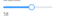
要想实现如上图的,进度跳效果,有两种方式,首先介绍第一种:
1、自己用 div 写一个,代码如下
<template>

    <div class="mfc-slider-runway" ref="runway">

        <div class="mfc-slider-bar" :style="{width:w}"></div>

        <div class="mfc-slider-button-wrap" :style="{left:w}"  ref="thumb">

            <div class="mfc-slider-button" ></div>

        </div>

    </div>

</template>

<script>

 //进度条组件

 export  default{

     props:{

         min:{  //最小值

             type:Number,

             default:0

         },

         max:{   //最大值

             type:Number,

             default:100

         },

         step:{      //每步的值为多少

             type:Number,

             default:1

         },

         value:{    // v-model  的初始值

             type:Number,

             default:0

         }

     },

     data(){

         return {

             startX:0,

             moveRun:false,

             maxWidth:0,

             left:0

         };

     },

     computed:{

       w(){

           var  maxWidth = this.maxWidth ;

           if( !maxWidth){

                return 0;

           }

           if(this.min > this.value){

               this.value = this.min;

               this.$emit("input",  this.value);

           }

           if(this.max < this.value){

               this.value = this.max;

               this.$emit("input",  this.value);

           }

           var s =   ((this.value - this.step - this.min) / (this.max - this.min))*maxWidth;  //上限

           var e = ((this.value + this.step- this.min ) / (this.max - this.min))*maxWidth;  //下限

           var left = this.left;

           if(left < s || left > e){

               //说明value 的值,与 left 容差太大,需要调和,用于外部的 v-model 初始化

               console.log("计算容差---");

               left =  ( (this.value- this.min )/ (this.max - this.min))*maxWidth;

           }

           return  (left / maxWidth)*100  + "%";

       }

     },

     mounted(){

         var $thumb = $(this.$refs.thumb);

         $thumb.on("mousedown",this.mousedown.bind(this));

         $(window).on("mouseup",this.mouseup.bind(this));

         this.maxWidth = $(this.$refs.runway).width();  //总共要走的 px 像素

         var value = this.value

         if(this.min > value){

             value = this.min;

         }

         if(this.max < value){

             value = this.max;

         }

         this.$emit("input",  value);

     },

     methods:{

         mousedown(e){

             e.preventDefault();

             e.stopPropagation();

             this.startX =   e.clientX ;

             this.moveRun = true;

             $(window).on("mousemove",this.mousemove.bind(this))

         },

         mouseup(e){

             this.moveRun = false;

             $(window).off("mousemove",this.mousemove.bind(this))

         },

         mousemove(e){

             e.preventDefault();

             e.stopPropagation();

             if(this.moveRun){

                 var x = e.clientX;

                 var startX = this.startX;

                 this.slide(startX,x);

                 this.startX = x;

             }

         },

         slide(start,end){

             var miss = end - start;

             if(miss == 0){

                 return ;

             }

             var maxWidth = $(this.$refs.runway).width();

             if(maxWidth == 0){

                return ;

             }

             var $thumb = $(this.$refs.thumb);

             this.offsetLeft =   $thumb.offset().left -  $thumb.position().left

             var left = end - this.offsetLeft;

             this.maxWidth = maxWidth;

            if(left < 0){

                left = 0;

            }

            if(left >  maxWidth){

                left  = maxWidth;

            }

            this.left = left;

             //----根据  step 的大小,换算出最终的 value 值

             var value = (left / maxWidth) * (this.max - this.min) + this.min;

             var v = Math.floor(value / this.step);

             value = v*this.step + Math.ceil(value  - v);

             if(this.min > value){

                 value = this.min;

             }

             if(this.max < value){

                 value = this.max;

             }

             this.$emit("input",value);

         }

     },

     destroyed(){

         $(this.$refs.thumb).off("mousedown",this.mousedown.bind(this));

         $(window).on("mouseup",this.mouseup.bind(this));

     }

 }

</script>

<style lang="less">

    div.mfc-slider-runway{

        width: 100%;

        height: 6px;

        margin: 10px 0;

        background-color: #e4e7ed;

        border-radius: 3px;

        position: relative;

        cursor: pointer;

        vertical-align: middle;

        div.mfc-slider-bar{

            height: 6px;

            background-color: #409eff;

            border-top-left-radius: 3px;

            border-bottom-left-radius: 3px;

            position: absolute;

            left: 0;

        }

        div.mfc-slider-button-wrap{

            height: 36px;

            width: 36px;

            text-align: center;

            position: absolute;

            z-index: 1001;

            top: -15px;

            transform: translateX(-50%) ;

            background-color: transparent;

            text-align: center;

            user-select: none;

            line-height: normal;

            div.mfc-slider-button{

                width: 16px;

                height: 16px;

                border: 2px solid #409eff;

                background-color: #fff;

                border-radius: 50%;

                transition: .2s;

                user-select: none;

                position: absolute;

                left: 0;

                right: 0;

                top:0;

                bottom: 0;

                margin: auto;

                &:hover{

                    transform: scale(1.2);

                    cursor: grab;

                 }

            }

        }

    }

</style>
使用:
   import rangeSlide from "./component/range-slide.vue";

                <range-slide v-model="test"></range-slide>

                <div>

                    {{test}}

                </div>
2、可以使用 input 的新属性 type=range , 然后通过css修改样式
css:
input[type=range] {

  box-sizing: border-box;

  -webkit-appearance: none;

  -moz-appearance: none;

  appearance: none;

  width: 100%;

  margin: 0;

  padding: 0 2px;

  /* Add some L/R padding to ensure box shadow of handle is shown */

  overflow: hidden;

  border: 0;

  border-radius: 1px;

  outline: none;

  background: -webkit-linear-gradient(#649efd, #649efd) no-repeat center;

  background: linear-gradient(#649efd, #649efd) no-repeat center;

  /* Use a linear gradient to generate only the 2px height background */

  background-size: 100% 2px;

  pointer-events: none;

  vertical-align: middle;

}

input[type=range]:active,

input[type=range]:focus {

  outline: none;

}

input[type=range]::-webkit-slider-thumb {

  height: 18px;

  width: 18px;

  border-radius: 18px;

  background-color: #fff;

  position: relative;

  margin: 5px 0;

  /* Add some margin to ensure box shadow is shown */

  cursor: pointer;

  -webkit-appearance: none;

  appearance: none;

  pointer-events: all;

  box-shadow: 0 1px 4px 0.5px rgba(0, 0, 0, 0.25);

}

input[type=range]::-webkit-slider-thumb::before {

  content: ' ';

  display: block;

  position: absolute;

  top: 13px;

  left: 100%;

  width: 2000px;

  height: 2px;

}

.multi-range {

  position: relative;

  height: 32px;

}

.multi-range input[type=range] {

  position: absolute;

}

.multi-range input[type=range]:nth-child(1)::-webkit-slider-thumb::before {

  background-color: red;

}

.multi-range input[type=range]:nth-child(2) {

  background: none;

}

.multi-range input[type=range]:nth-child(2)::-webkit-slider-thumb::before {

  background-color: grey;

}
使用:
              <div class="multi-range">

                  <input type="range">

              </div>
小结: 因为 input 的 range属性,兼容不是很好,所以,最好还是自己写,但是自己写会遇见很多坑,比如,value值和step的初始化设置,可能会将 value 设置为一个永远也取不到的值,比如 value初始化为 2 , step又为 5
vue 的进度条组件的更多相关文章
- vue 圆形进度条组件解析
项目简介 本组件是vue下的圆形进度条动画组件 自由可定制,几乎全部参数均可设置 源码简单清晰 面向人群 急于使用vue圆形进度条动画组件的同学.直接下载文件,拷贝代码即可运行. 喜欢看源码,希望了解 ...
- 手把手教你实现一个 Vue 进度条组件!
最近在个人的项目中,想对页面之间跳转的过程进行优化,想到了很多文档或 npm 等都用到的页面跳转进度条,于是便想自己去实现一个,特此记录. 来看下 npm 搜索组件时候的效果: so 下面咱们一起动手 ...
- 基于Vue的事件响应式进度条组件
写在前面 找了很多Vue 进度条组件!,都不包含拖拽和点击事件,input range倒是原生包含input和change事件,但是直接基于input range做进度条的话,样式部分需要做大量调整和 ...
- vue+element UI + axios封装文件上传及进度条组件
1.前言 之前在做项目的时候,需要实现一个文件上传组件并且需要有文件上传进度条,现将之前的实现过程简单记录一下,希望可以帮助到有需要的人. 项目用的是Vue框架,UI库使用的是element UI,前 ...
- 详解Bootstrap进度条组件
在网页中,进度条的效果并不少见,如:平分系统.加载状态等,进度条组件使用了css3的transition和animation属性来完成一些特效,这些特效在IE9及IE9以下版本.Firefox的老版本 ...
- 【Android 应用开发】 自定义 圆形进度条 组件
转载著名出处 : http://blog.csdn.net/shulianghan/article/details/40351487 代码下载 : -- CSDN 下载地址 : http://down ...
- 数字进度条组件NumberProgressBar
数字进度条组件NumberProgressBar NumberProgressBar是一款数字进度条组件.它不仅可以通过进度条的变化展现进度,还可以通过跟随文字精确表示进度值.开发者可以对进度条进行 ...
- progressbar进度条组件
Progressbar 进度条组件 通过$.fn.progressbar.fn.defaults重写默认的defaults进度条(progressbar)提供了一种显示长时间操作进度的反馈.进度可被更 ...
- 【progress】 进度条组件说明
progress 进度条组件 原型: <progress percent="[Float(0-100)]" show-info="[Boolean]" b ...
随机推荐
- 华为S12700 NQA配置
首先,nqa功能是需要授权的. 以下以ICMP配置方式示例: 在配置ICMP测试之前,需要NQA客户端与被测试设备间路由可达.(ICMP测试提供类似于普通ping命令的功能,但输出信息更为丰富.) 请 ...
- VBA二次学习笔记(2)——两个Excel表内容比较
说明(2018-9-3 22:38:58): 1. 就是之前问同事要来的作业,有两个格式一样的Excel文件,一个是正确答案,一个是员工作答的.通过代码将两个文件进行比对,把不同之处列出来. 正文: ...
- [转]decorators.xml的用法
原文地址:https://blog.csdn.net/laozhuxiao/article/details/54342121 简介: sitemesh应用Decorator模式,用filter截取re ...
- LiveSwitch白皮书
https://www.frozenmountain.com/media/1224/frozen-mountain-software-liveswitch-white-paper.pdf —————— ...
- Windows系统配置.bat启动spring boot项目jar
背景:项目用spring boot构建,maven管理,本地测试好之后打成jar包,在dos窗口可以通过:java -jar demo.jar来启动demo项目,一旦关闭该dos窗口demo项目也被停 ...
- SpringBoot------自动装配Mapper报错
如图: 解决方法: 转载: https://blog.csdn.net/j754379117/article/details/71639043
- C - The kth great number 优先队列
Xiao Ming and Xiao Bao are playing a simple Numbers game. In a round Xiao Ming can choose to write d ...
- 3D Slicer Reconstruct CT/MRI
3D Slicer Reconstruct CT/MRI 1. Load DCM file of your CT/MRI 2. Go to Volume Rendering, click the ey ...
- 使用 intro.js 库
使用 render() { const reducer = this.props.testReducer; return ( <React.Fragment> <button dat ...
- 浏览器(或客户端)触发,后台运行php脚本
既我从浏览器这端触发服务器上的php脚本,要想让服务器端的php脚本一直执行,我得把该网页一直开着,这样就达不到我不开电脑不开网页进行爬取的目的,因此查找了些资料,得知 ignore_user_abo ...