
CSS 按钮特效(二)
1 案例
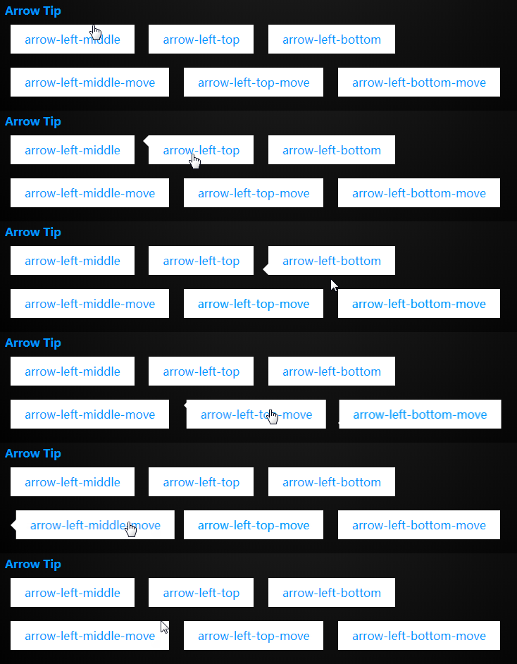
2. HTML 代码
<div class="arrow arrow-left-middle">

    arrow-left-middle

</div>

<div class="arrow arrow-left-top">

    arrow-left-top

</div>

<div class="arrow arrow-left-bottom">

    arrow-left-bottom

</div>

<div class="arrow arrow-left-middle-move">

    arrow-left-middle-move

</div>

<div class="arrow arrow-left-top-move">

    arrow-left-top-move

</div>

<div class="arrow arrow-left-bottom-move">

    arrow-left-bottom-move

</div>
3. CSS 代码
.arrow{

    box-sizing: content-box;

    border:;

    margin:10px 0.5em;

    cursor: pointer;

    box-sizing: border-box;

    display: inline-block;

    color: #09f;

    background: white;

    padding: 10px 20px;

    text-align: center;

    /* 设置相对定位 */

    position: relative;

    transition: all 0.3s;

    /* 设置层次 会被before after在上面 */

    z-index:;

}

/* 设置位置和border的颜色-需要与 4(4面) * 3(上中下) * 2(移动) = 24 */

.arrow-left-top:before,

.arrow-left-top-move:before,

.arrow-left-middle:before,

.arrow-left-middle-move:before,

.arrow-left-bottom:before,

.arrow-left-bottom-move:before{

    transition: all 0.3s;

    content: '';

    border-style: solid;

    width:;

    height:;

    display: block;

    position: absolute;

    margin:auto;

}

.arrow-left-top:before,

.arrow-left-top-move:before,

.arrow-left-middle:before,

.arrow-left-middle-move:before,

.arrow-left-bottom:before,

.arrow-left-bottom-move:before{

    border-width:0.5em 0.5em 0.5em 0;

    border-color:transparent white transparent transparent;

}

/* 中间 */

.arrow-left-middle-move:before,

.arrow-left-middle:before{

    /* top 与 bottom 都为0 就会在中间 margin:auto; */

    top:;

    bottom:;

    left:;

}

/*顶部*/

.arrow-left-top:before,

.arrow-left-top-move:before{

    top:;

    left:;

}

/*底部*/

.arrow-left-bottom:before,

.arrow-left-bottom-move:before{

    bottom:;

    left:;

}

.arrow-left-middle-move:hover:before,

.arrow-left-top-move:hover:before,

.arrow-left-bottom-move:hover:before,

.arrow-left-middle:hover:before,

.arrow-right-middle-move:hover,

.arrow-left-top:hover:before,

.arrow-right-top-move:hover,

.arrow-right-bottom-move:hover,

.arrow-left-bottom:hover:before{

    transform: translateX(-0.5em);

}

.arrow-right-middle-move:hover:before,

.arrow-right-top-move:hover:before,

.arrow-right-bottom-move:hover:before,

.arrow-right-middle:hover:before,

.arrow-left-middle-move:hover,

.arrow-right-top:hover:before,

.arrow-left-top-move:hover,

.arrow-left-bottom-move:hover,

.arrow-right-bottom:hover:before{

    transform: translateX(0.5em);

}
4 .练习
目前只是做了左边的效果。按照这种效果总共有24个。可以把css的类进行拆分并且把其他3面的写出来
CSS 按钮特效(二)的更多相关文章
- css 按钮悬停效霓虹灯特效
css 按钮悬停效霓虹灯特效 <!DOCTYPE html> <html lang="en"> <head> <meta charset=
- js,jquery,css,html5特效
包含js,jquery,css,html5特效,源代码 本文地址:http://www.cnblogs.com/roucheng/p/texiao.html 2017新年快乐特效 jQuery最新最全 ...
- ybutton 高端大气上档次华丽的按钮特效
小菜偶然在某网站中看到一款非常华丽的按钮特效,感觉十分有必要抄袭下来,以备日后使用. 简单描述一下按钮的效果:鼠标移到按钮上的时候,会出现灯光闪过的效果,非常的高端. 但遗憾的,这么牛逼的效果,仅仅兼 ...
- 10个超漂亮的CSS 3D特效
10个超漂亮的CSS 3D特效 一.总结 一句话总结: 后面有空得好好练一练,也可以作为录课素材 二.10个超漂亮的CSS 3D特效 转自或参考:10个超漂亮的CSS 3D特效https://blog ...
- CSS 按钮
总结有关按钮的各种样式 ㈠基本按钮样式 看一下没有进行css样式设计时按钮的样子与进行样式设计的按钮样子 <!DOCTYPE html> <html> <head> ...
- 7款外观迷人的HTML5/CSS3 3D特效按钮特效
下面我整理了7款外观都十分迷人的HTML5/CSS3 3D按钮特效,有几个还挺实用的,分享给大家. 1.CSS3超酷3D弹性按钮 按钮实现非常简单 之前我们分享过几款不错的CSS3 3D立体按钮,比如 ...
- 《基于JQuery和CSS的特效整理》系列分享专栏
<基于JQuery和CSS的特效整理>已整理成PDF文档,点击可直接下载至本地查阅https://www.webfalse.com/read/201724.html 文章 一款基于jQue ...
- 漂亮的CSS按钮样式集以及在线生成工具
以前我们制作一样带带阴影.圆角或3D感的按钮都需要用图片来制作,但CSS3出来后就可以不用图片了,由于是代码写的按钮样式,在Retina上浏览依然清晰美观.虽然不错,但我们写一个阴影+质感的按钮还是挺 ...
- 基于jQuery点击加载动画按钮特效
分享一款基于jQuery点击加载动画按钮特效.这是一款基于jQuery+CSS3实现的鼠标点击按钮加载动画特效代码.效果图如下: 在线预览 源码下载 实现的代码. html代码: <div ...
随机推荐
- element-ui自定义table表头
场景描述: 这个需求的场景很简单,表头自定义居中显示 <el-table-column show-overflow-tooltip prop="telephone" labe ...
- JAVA分布式架构
- 深入理解windows系统内的GMT和时区
http://www.itshanghai.net/technology/wdzl_windowsxp/ UTC(Universal Time Coordinated)是通用协调时,这两者几乎是一 ...
- html自动换行
对于div,p等块级元素 正常文字的换行(亚洲文字和非亚洲文字)元素拥有默认的white-space:normal,当定义的宽度之后自动换行html css 1.(IE浏览器)连续的英文字符和阿拉伯数 ...
- [转载]【BlackHat 2017】美国黑客大会首日议题汇总,演讲PPT下载也在这里
今年是 Black Hat 举办的第 20 个年头,高温酷暑也挡不住全世界黑客和安全人员奔赴拉斯维加斯的热情.毕竟这可是一年一度的盛大狂欢啊.今年的 BHUSA 从美国东部时间时间 7 月 22 日( ...
- 华为OJ1964-求解立方根(牛顿迭代法)
一.题目描述 描述: 计算一个数字的立方根,不使用库函数. 函数原型double getCubeRoot(double input) 输入: 待求解参数 double类型 输出: 输出参数的立方根,保 ...
- gdb 调试利器
1. gdb 调试利器 GDB是一个由GNU开源组织公布的.UNIX/LINUX操作系统下的.基于命令行的.功能强大的程序调试工具.对于一名Linux下工作的c++程序猿,gdb是不可缺少的工具: 1 ...
- 第1章 SQL核心
第1章 SQL核心正在更新内容,请稍后
- android.app.Fragment与android.support.v4.app.Fragment不一致
在看法中用到的Fragment在类型转换的时候非常easy出现这样的问题: 对照代码: class MyFragmentPagerAdapter extends FragmentPagerAdapte ...
- HTTP要点概述:十,内容协商
一,内容协商(Content Negotiation) 同一个Web网站可能存在很多份相同内容的页面,比如英文版和中文版的Web页面,它们内容上相同,但是使用语言不同.比如大家进入英文版的google ...