CSS 按钮
总结有关按钮的各种样式
㈠基本按钮样式
看一下没有进行css样式设计时按钮的样子与进行样式设计的按钮样子
<!DOCTYPE html>
<html>
<head>
<meta charset="utf-8">
<title>基本按钮样式</title>
<style>
.button {
background-color: skyblue;
border: none;
color: white;
padding: 15px 30px;
text-align: center;
text-decoration: none;
display: inline-block;
font-size: 18px;
margin: 4px 2px;
cursor: pointer;
}
</style>
</head>
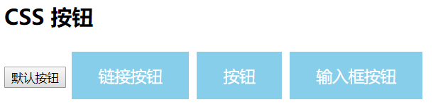
<body> <h2>CSS 按钮</h2> <button>默认按钮</button>
<a href="#" class="button">链接按钮</a>
<button class="button">按钮</button>
<input type="button" class="button" value="输入框按钮"> </body>
</html>
效果图:
看,这就是两者之间的区别,接下来详细的介绍每一个样式添加后的样子。
注:cursor: pointer:光标呈现为指示链接的指针(一只手)。
㈡按钮颜色
使用 background-color 属性来设置按钮颜色:
<!DOCTYPE html>
<html>
<head>
<meta charset="utf-8">
<title>样色样式</title>
<style>
.button {
background-color: green;
border: none;
color: white;
padding: 15px 32px;
text-align: center;
text-decoration: none;
display: inline-block;
font-size: 16px;
margin: 4px 2px;
cursor: pointer;
} .button2 {background-color: blue;} /* Blue */
.button3 {background-color: red;} /* Red */
.button4 {background-color: #e7e7e7; color: black;} /* Gray */
.button5 {background-color: black;}
</style>
</head>
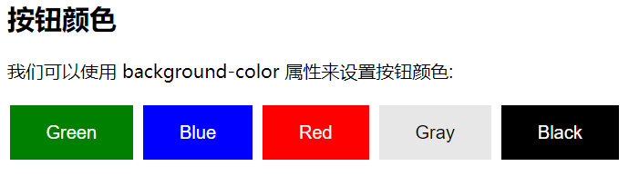
<body> <h2>按钮颜色</h2>
<p>我们可以使用 background-color 属性来设置按钮颜色:</p> <button class="button">Green</button>
<button class="button button2">Blue</button>
<button class="button button3">Red</button>
<button class="button button4">Gray</button>
<button class="button button5">Black</button> </body>
</html>
效果图:
㈢按钮大小
可以使用 font-size 属性来设置按钮大小:
<!DOCTYPE html>
<html>
<head>
<meta charset="utf-8">
<title>大小样式)</title>
<style>
.button {
background-color: deeppink;
border: none;
color: white;
padding: 15px 32px;
text-align: center;
text-decoration: none;
display: inline-block;
font-size: 16px;
margin: 4px 2px;
cursor: pointer;
} .button1 {font-size: 10px;}
.button2 {font-size: 12px;}
.button3 {font-size: 16px;}
.button4 {font-size: 20px;}
.button5 {font-size: 24px;}
</style>
</head>
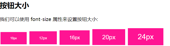
<body> <h2>按钮大小</h2>
<p>我们可以使用 font-size 属性来设置按钮大小:</p> <button class="button button1">10px</button>
<button class="button button2">12px</button>
<button class="button button3">16px</button>
<button class="button button4">20px</button>
<button class="button button5">24px</button> </body>
</html>
效果图:
㈣圆角按钮
可以使用 border-radius 属性来设置圆角按钮:
<!DOCTYPE html>
<html>
<head>
<meta charset="utf-8">
<title>圆角样式</title>
<style>
.button {
background-color: #FF3333;
border: none;
color: white;
padding: 15px 32px;
text-align: center;
text-decoration: none;
display: inline-block;
font-size: 16px;
margin: 4px 2px;
cursor: pointer;
} .button1 {border-radius: 4px;}
.button2 {border-radius: 8px;}
.button3 {border-radius: 12px;}
.button4 {border-radius: 16px;}
.button5 {border-radius: 50%;}
</style>
</head>
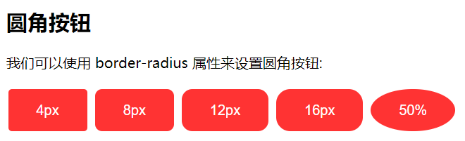
<body> <h2>圆角按钮</h2>
<p>我们可以使用 border-radius 属性来设置圆角按钮:</p> <button class="button button1">4px</button>
<button class="button button2">8px</button>
<button class="button button3">12px</button>
<button class="button button4">16px</button>
<button class="button button5">50%</button> </body>
</html>
效果图:
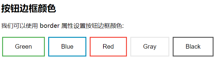
㈤按钮边框颜色
可以使用 border 属性设置按钮边框颜色:
<!DOCTYPE html>

<html>

<head>

<meta charset="utf-8">

<title>按钮边框样式</title>

<style>

.button {

    background-color: green;

    border: none;

    color: white;

    padding: 15px 32px;

    text-align: center;

    text-decoration: none;

    display: inline-block;

    font-size: 16px;

    margin: 4px 2px;

    cursor: pointer;

}

.button1 {

    background-color: white;

    color: black;

    border: 2px solid #4CAF50;

}

.button2 {

    background-color: white;

    color: black;

    border: 2px solid #008CBA;

}

.button3 {

    background-color: white;

    color: black;

    border: 2px solid #f44336;

}

.button4 {

    background-color: white;

    color: black;

    border: 2px solid #e7e7e7;

}

.button5 {

    background-color: white;

    color: black;

    border: 2px solid #555555;

}

</style>

</head>

<body>

<h2>按钮边框颜色</h2>

<p>我们可以使用 border 属性设置按钮边框颜色:</p>

<button class="button button1">Green</button>

<button class="button button2">Blue</button>

<button class="button button3">Red</button>

<button class="button button4">Gray</button>

<button class="button button5">Black</button>

</body>

</html>
效果图:

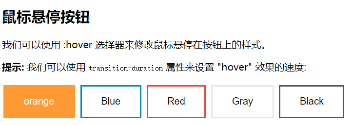
㈥鼠标悬停按钮
可以使用 :hover 选择器来修改鼠标悬停在按钮上的样式。
使用 transition-duration 属性来设置 "hover" 效果的速度
<!DOCTYPE html>

<html>

<head>

<meta charset="utf-8">

<title>悬停按钮样式</title>

<style>

.button {

    background-color: #FF9933;

    border: none;

    color: white;

    padding: 16px 32px;

    text-align: center;

    text-decoration: none;

    display: inline-block;

    font-size: 16px;

    margin: 4px 2px;

    -webkit-transition-duration: 0.5s; /* Safari */

    transition-duration: 0.5s;

    cursor: pointer;

}

.button1 {

    background-color: white;

    color: black;

    border: 2px solid #FF9933;

}

.button1:hover {

    background-color:#FF9933;

    color: white;

}

.button2 {

    background-color: white;

    color: black;

    border: 2px solid #008CBA;

}

.button2:hover {

    background-color: #008CBA;

    color: white;

}

.button3 {

    background-color: white;

    color: black;

    border: 2px solid #f44336;

}

.button3:hover {

    background-color: #f44336;

    color: white;

}

.button4 {

    background-color: white;

    color: black;

    border: 2px solid #e7e7e7;

}

.button4:hover {background-color: #e7e7e7;}

.button5 {

    background-color: white;

    color: black;

    border: 2px solid #555555;

}

.button5:hover {

    background-color: #555555;

    color: white;

}

</style>

</head>

<body>

<h2>鼠标悬停按钮</h2>

<p>我们可以使用 :hover 选择器来修改鼠标悬停在按钮上的样式。</p>

<p><strong>提示:</strong> 我们可以使用 <code>transition-duration</code> 属性来设置 "hover" 效果的速度:</p>

<button class="button button1">orange</button>

<button class="button button2">Blue</button>

<button class="button button3">Red</button>

<button class="button button4">Gray</button>

<button class="button button5">Black</button>

</body>

</html>
效果图:
㈦按钮阴影
可以使用 box-shadow 属性来为按钮添加阴影:
<!DOCTYPE html>

<html>

<head>

<meta charset="utf-8">

<title>阴影样式</title>

<style>

.button {

    background-color: #FF33CC; /* Green */

    border: none;

    color: white;

    padding: 15px 32px;

    text-align: center;

    text-decoration: none;

    display: inline-block;

    font-size: 16px;

    margin: 4px 2px;

    cursor: pointer;

    -webkit-transition-duration: 0.55s; /* Safari */

    transition-duration: 0.5s;

}

.button1 {

    box-shadow: 0 8px 16px 0 rgba(0,0,0,0.2), 0 6px 20px 0 rgba(0,0,0,0.19);

}

.button2:hover {

    box-shadow: 0 12px 16px 0 rgba(0,0,0,0.3),0 17px 50px 0 rgba(0,0,0,0.19);

}

</style>

</head>

<body>

<h2>按钮阴影</h2>

<p>我们可以使用 box-shadow 属性来为按钮添加阴影:</p>

<button class="button button1">阴影按钮</button>

<button class="button button2">鼠标悬停后出现阴影</button>

</body>

</html>
效果图:
鼠标没有悬停时的样子:
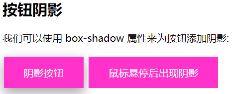
鼠标悬停后的样子:

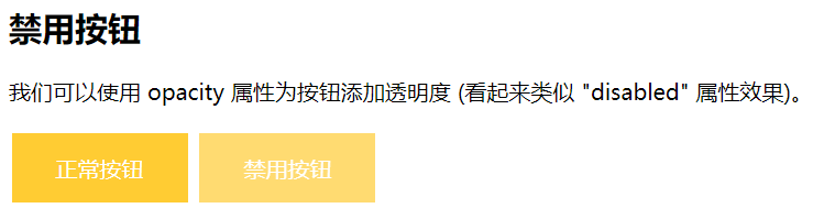
㈧禁用按钮
可以使用 opacity 属性为按钮添加透明度 (看起来类似 "disabled" 属性效果)。
可以添加 cursor 属性并设置为 "not-allowed" 来设置一个禁用的图片:
<!DOCTYPE html>

<html>

<head>

<meta charset="utf-8">

<title>禁用样式</title>

<style>

.button {

    background-color: #FFCC33; /* Green */

    border: none;

    color: white;

    padding: 15px 32px;

    text-align: center;

    text-decoration: none;

    display: inline-block;

    font-size: 16px;

    margin: 4px 2px;

    cursor: pointer;

}

.disabled {

    opacity: 0.7;

    cursor: not-allowed;

}

</style>

</head>

<body>

<h2>禁用按钮</h2>

<p>我们可以使用 opacity 属性为按钮添加透明度 (看起来类似 "disabled" 属性效果)。</p>

<button class="button">正常按钮</button>

<button class="button disabled">禁用按钮</button>

</body>

</html>
效果图:
㈨按钮宽度
默认情况下,按钮的大小有按钮上的文本内容决定( 根据文本内容匹配长度 )。 我们可以使用 width 属性来设置按钮的宽度:
如果要设置固定宽度可以使用像素 (px) 为单位,如果要设置响应式的按钮可以设置为百分比。
<!DOCTYPE html>

<html>

<head>

<meta charset="utf-8">

<title>宽度样式</title>

<style>

.button {

    background-color: #993366;

    border: none;

    color: white;

    padding: 15px 32px;

    text-align: center;

    text-decoration: none;

    display: inline-block;

    font-size: 16px;

    margin: 4px 2px;

    cursor: pointer;

}

.button1 {width: 250px;}

.button2 {width: 50%;}

.button3 {

    padding-left: 0;

    padding-right: 0;

    width: 100%;

}

</style>

</head>

<body>

<h2>按钮宽度</h2>

<p>默认情况下,按钮的大小有按钮上的文本内容决定( 根据文本内容匹配长度 )。 我们可以使用 width 属性来设置按钮的宽度:</p>

<p><strong>提示:</strong>  如果要设置固定宽度可以使用像素 (px) 为单位,如果要设置响应式的按钮可以设置为百分比。</p>

<button class="button button1">250px</button><br>

<button class="button button2">50%</button><br>

<button class="button button3">100%</button>

</body>

</html>
效果图:

㈩按钮组
移除外边距并添加 float:left 来设置按钮组:
<!DOCTYPE html>

<html>

<head>

<meta charset="utf-8">

<title>按钮组</title>

<style>

.button {

    background-color: #33CCCC; /* Green */

    border: none;

    color: white;

    padding: 15px 32px;

    text-align: center;

    text-decoration: none;

    display: inline-block;

    border-radius: 8px;

    font-size: 16px;

    cursor: pointer;

    float: left;

}

.button:hover {

    background-color: #3399CC;

}

</style>

</head>

<body>

<h2>按钮组</h2>

<p>移除外边距并添加 float:left 来设置按钮组:</p>

<button class="button">Button</button>

<button class="button">Button</button>

<button class="button">Button</button>

<button class="button">Button</button>

<p style="clear:both"><br>记住要清除浮动,否则下一个 p 元素的按钮也会显示在同一行。</p>

</body>

</html>
效果图:

(十一)带边框按钮组
可以使用 border 属性设置按钮边框颜色:
<!DOCTYPE html>

<html>

<head>

<meta charset="utf-8">

<title>按钮边框颜色样式</title>

<style>

.button {

    background-color: #4CAF50;

    border: none;

    color: white;

    padding: 15px 32px;

    text-align: center;

    text-decoration: none;

    display: inline-block;

    font-size: 16px;

    margin: 4px 2px;

    cursor: pointer;

}

.button1 {

    background-color: white;

    color: black;

    border: 2px solid #4CAF50;

}

.button2 {

    background-color: white;

    color: black;

    border: 2px solid #008CBA;

}

.button3 {

    background-color: white;

    color: black;

    border: 2px solid #f44336;

}

.button4 {

    background-color: white;

    color: black;

    border: 2px solid #e7e7e7;

}

.button5 {

    background-color: white;

    color: black;

    border: 2px solid #555555;

}

</style>

</head>

<body>

<h2>按钮边框颜色</h2>

<p>我们可以使用 border 属性设置按钮边框颜色:</p>

<button class="button button1">Green</button>

<button class="button button2">Blue</button>

<button class="button button3">Red</button>

<button class="button button4">Gray</button>

<button class="button button5">Black</button>

</body>

</html>
效果图:
(十二)按钮动画
示例1:鼠标移动到按钮上后添加箭头标记:
<!DOCTYPE html>

<html>

<head>

<meta charset="utf-8">

<title>箭头动画效果</title>

<style>

.button {

  display: inline-block;

  border-radius:8px;

  background-color: #33FFFF;

  border: none;

  color: #FFFFFF;

  text-align: center;

  font-size: 28px;

  padding: 20px;

  width: 200px;

  transition: all 0.5s;

  cursor: pointer;

  margin: 5px;

}

.button span {

  cursor: pointer;

  display: inline-block;

  position: relative;

  transition: 0.5s;

}

.button span:after {

  content: '→';

  position: absolute;

  opacity: 0;

  top: 0;

  right: -20px;

  transition: 0.5s;

}

.button:hover span {

  padding-right: 25px;

}

.button:hover span:after {

  opacity: 1;

  right: 0;

}

</style>

</head>

<body>

<h2>按钮动画</h2>

<button class="button" style="vertical-align:middle"><span>Hover </span></button>

</body>

</html>
效果图:

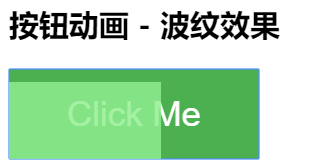
示例2:点击时添加 "波纹" 效果:
<!DOCTYPE html>

<html>

<head>

<meta charset="utf-8">

<title>波纹动画</title>

<style>

.button {

    position: relative;

    background-color: #4CAF50;

    border: none;

    font-size: 28px;

    color: #FFFFFF;

    padding: 20px;

    width: 200px;

    text-align: center;

    -webkit-transition-duration: 0.4s; /* Safari */

    transition-duration: 0.4s;

    text-decoration: none;

    overflow: hidden;

    cursor: pointer;

}

.button:after {

    content: "";

    background: #90EE90;

    display: block;

    position: absolute;

    padding-top: 300%;

    padding-left: 350%;

    margin-left: -20px!important;

    margin-top: -120%;

    opacity: 0;

    transition: all 0.8s

}

.button:active:after {

    padding: 0;

    margin: 0;

    opacity: 1;

    transition: 0s

}

</style>

</head>

<body>

<h2>按钮动画 - 波纹效果</h2>

<button class="button">Click Me</button>

</body>

</html>
效果图:
示例3:点击时添加 "压下" 效果:
<!DOCTYPE html>

<html>

<head>

<meta charset="utf-8">

<title>按压样式</title>

<style>

.button {

  display: inline-block;

  padding: 15px 25px;

  font-size: 24px;

  cursor: pointer;

  text-align: center;

  text-decoration: none;

  outline: none;

  color: #fff;

  background-color: #CC00CC;

  border: none;

  border-radius: 15px;

  box-shadow: 0 9px #999;

}

.button:hover {background-color: #CC0099;}

.button:active {

  background-color: #CC0099;

  box-shadow: 0 5px #666;

  transform: translateY(4px);

}

</style>

</head>

<body>

<h2>按钮动画 - "按压效果"</h2>

<button class="button">Click Me</button>

</body>

</html>
效果图:
按压前:
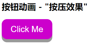
按压后:

参考:https://www.runoob.com/css3/css3-buttons.html
CSS 按钮的更多相关文章
- 漂亮的CSS按钮样式集以及在线生成工具
以前我们制作一样带带阴影.圆角或3D感的按钮都需要用图片来制作,但CSS3出来后就可以不用图片了,由于是代码写的按钮样式,在Retina上浏览依然清晰美观.虽然不错,但我们写一个阴影+质感的按钮还是挺 ...
- css 样式(checkbox开关、css按钮)
checkbox开关 css .iosCheck { /* Blue edition */ } .iosCheck input { display: none; } .iosCheck i { dis ...
- css 按钮悬停效霓虹灯特效
css 按钮悬停效霓虹灯特效 <!DOCTYPE html> <html lang="en"> <head> <meta charset=
- BUTTONS V. 2.0.0——CSS按钮库
BUTTONS-V2-CSS库样式职责 CSS库样式职责分离优点 模块样式命名更清晰化 易于维护.扩展性强 动画效果——修改样式后有过度效果,默认样式 源码如下 <!DOCTYPE html&g ...
- css按钮自适应
原理:利用a标签和i标签各自一个背景组合成为按钮,达到自适应. <!DOCTYPE html> <html> <head> <meta charset=&qu ...
- 好看的CSS按钮
<!DOCTYPE HTML PUBLIC "-//W3C//DTD HTML 4.01 Transitional//EN" "http://www.w3.org/ ...
- css按钮口诀 - CSS BUG顺口溜
在进行CSS网页布局时遇到BUG,请认真阅读以下内容,非常容易记忆的,不知道哪位高人把CSS BUG编成了顺口溜了!看看好不好记住呢? 一.IE边框若显若无,须注意,定是高度设置已忘记: 二.浮动产生 ...
- bootstrap -- css -- 按钮
本文中提到的按钮样式,适用于:<a>, <button>, 或 <input> 元素上 但最好在 <button> 元素上使用按钮 class,避免跨浏 ...
- 手写css按钮组
css: .lf{float:left} .btn{ width:60px; height:24px; color:#fff; border-radius:4px; cursor:pointer; b ...
随机推荐
- 基于硬件的消息队列中间件 Solace 简介之二
前言...... 前面简单介绍了Solace来自于哪家公司, 主要能做哪些事情. 本篇主要进一步介绍Solace作为消息传递的中间件如何工作的. 传统意义上来讲, 每当我们谈到消息中间件时, 首先想到 ...
- linux运维、架构之路-Lnmp架构部署
一.Lnmp架构原理 二. Lnmp架构软件安装 1.Nginx安装脚本 #!/bin/bash useradd -s /sbin/nologin -M www mkdir -p /server/to ...
- python网络爬虫(12)去哪网酒店信息爬取
目的意义 爬取某地的酒店价格信息,示例使用selenium在Firefox中的使用. 来源 少部分来源于书.python爬虫开发与项目实战 构造 本次使用简易的方案,模拟浏览器访问,然后输入字段,查找 ...
- CALL apoc.cypher.doIt创建动态节点的时候怎么指定多个标签?
下面的创建节点实例,请教一下CALL apoc.cypher.doIt如何创建多个标签?现在的方式是只能指定一个标签! UNWIND [{name:"sdasdsad234fdgsasdfa ...
- Java排序--排序算法(内排序)
常用内排序算法 我们通常所说的排序算法往往指的是内部排序算法,即需要排序的数据在计算机内存中完成整个排序的过程,当数据率超大或排序较为繁琐时常借助于计算机的硬盘对大数据进行排序工作,称之为外部排序算法 ...
- nginx相关知识点
1.nginx -V 可以查看nginx的安装目录等目录信息 2.nginx -v 查看版本 3.路径 /usr/local/etc/nginx/nginx.conf (配置文件路径) /usr/lo ...
- python内置函数简单归纳
做python小项目的时候发现熟练运用python内置函数,可以节省很多的时间,在这里整理一下,便于以后学习或者工作的时候查看.函数的参数可以在pycharm中ctrl+p查看. 1.abs(x):返 ...
- vue-时间插件,效果见图
<template> <div class="select-time-wrapper"> <h5 class="titie"> ...
- webpack 四个核心概念
webpack 是当下最热门的前端资源模块化和打包工具.它可以将许多松散的模块(如 CommonJs 模块. AMD 模块. ES6 模块.CSS.图片. JSON.Coffeescript. LES ...
- 微信小程序获得高度
wx.getSystemInfo({ success: (res) => { wx.createSelectorQuery().select('#scrollbox').boundingClie ...