
SvelteUI:运用svelte3构建的网页版UI组件库(升级版)
距离上次分享的svelte-ui 1.0已经一月有余,这次带来全新升级完整版svelte-ui 2.0。
这次优化并新增15+个组件。在开发之初借鉴了element-ui组件库,所以在组件结构及语法上比较类似,这样使用起来就比较容易。
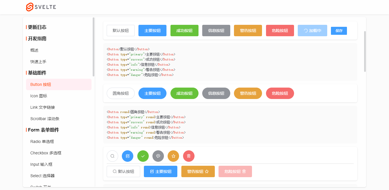
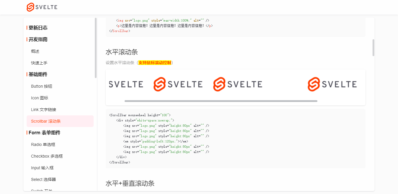
由于svelte.js前端新框架在国内逐步累积了一批开发者,可是基于svelte组件库却没有几个用的比较顺手,所以干脆开干一番,就开发了这个svelte-ui组件库。一来为了学习累积新技术,而来检验下svelte框架到底如何。方便在以后的开发中快速提高工作效率!


◆ 引入组件
引入组件的方式没变,还是和之前一样。
import {

    Button,

    Input,

    Switch,

    Select,

    Form,

    ...

} from 'svelte-ui'
<Select bind:value={selectVal} size="small">

    <Option label="Option1" value="a1"></Option>

    <Option label="Option2" value="a2"></Option>

    <Option label="Option3" value="a3"></Option>

</Select>
<Form bind:model={formObj} labelWidth="80px" size="small" labelPosition="right">

    <FormItem label="活动名称">

        <Input bind:value={formObj.name} />

    </FormItem>

    <FormItem label="活动区域">

        <Select bind:value={formObj.region} clearable>

            <Option label="区域1" value="beijing" />

            <Option label="区域2" value="shanghai" />

        </Select>

    </FormItem>

    <FormItem label="即时配送">

        <Switch bind:checked={formObj.delivery} />

    </FormItem>

    <FormItem label="活动性质">

        <CheckboxGroup bind:checked={formObj.type}>

            <Checkbox label="美食/餐厅线上活动" border />

            <Checkbox label="亲子主题" border />

            <Checkbox label="品牌推广" border />

        </CheckboxGroup>

    </FormItem>

    <FormItem label="特殊资源">

        <RadioGroup bind:checked={formObj.resource}>

            <Radio label="线上品牌商赞助" button />

            <Radio label="线下场地免费" button />

        </RadioGroup>

    </FormItem>

    <FormItem label="活动详情">

        <Input bind:value={formObj.summary} type="textarea" rows={3} />

    </FormItem>

    <FormItem>

        <Button type="primary">立即创建</Button>

        <Button>取消</Button>

    </FormItem>

</Form>
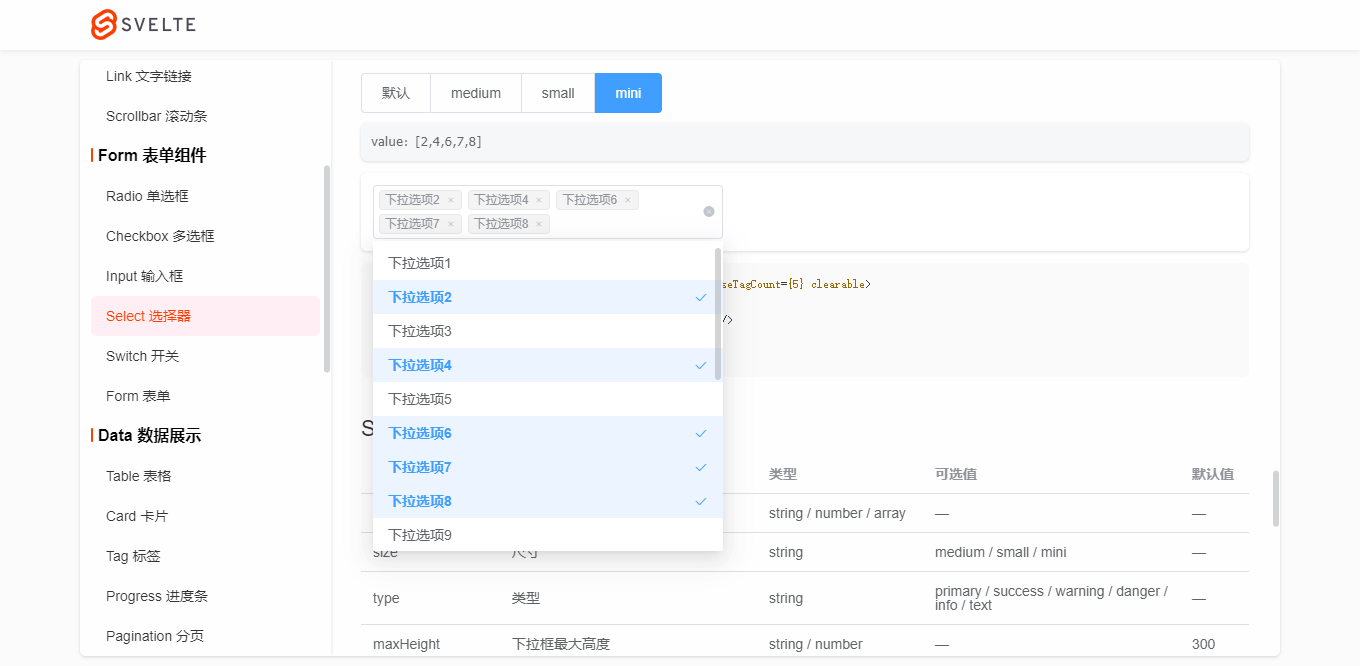
Select下拉框组件还支持多选/清除/合并等功能。
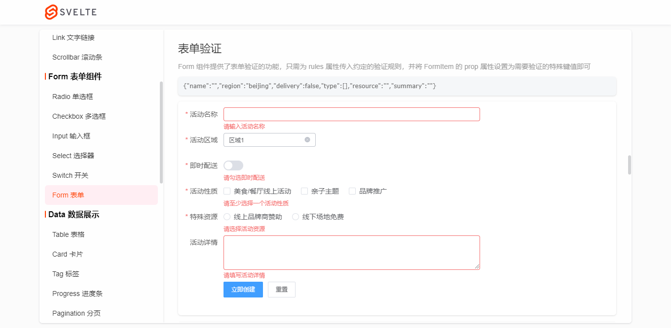
Form组件支持提交表单rule验证及自定义验证规则。目前有input / textarea / switch / radio / checkbox等组件支持组合验证。
let ruleFormDom

let formRules = {

    name: '',

    region: '',

    delivery: false,

    type: [],

    resource: '',

    summary: '',

}

let rules = {

    name: [

        { required: true, message: '请输入活动名称', trigger: 'blur' },

        { min: 3, max: 5, message: '长度在 3 到 5 个字符', trigger: 'change' }

    ],

    region: [

        { required: true, message: '请选择活动区域', trigger: 'change' }

    ],

    type: [

        { type: 'array', required: true, message: '请至少选择一个活动性质', trigger: 'change' }

    ],

    resource: [

        { required: true, message: '请选择活动资源', trigger: 'change' }

    ],

    // summary: [

    //     { required: true, message: '请填写活动详情', trigger: 'blur' }

    // ]

}

function onSubmitRules() {

    ruleFormDom.validate((valid) => {

        if(valid) {

            console.log('submit!')

        }else {

            console.log('error submit!')

            return false

        }

    })

}

function onResetRules() {

    formRules = {

        name: '',

        region: '',

        delivery: false,

        type: [],

        resource: '',

        summary: '',

    }

    ruleFormDom.resetFields()

}

<Form bind:model={formRules} rules={rules} bind:this={ruleFormDom}>

    <FormItem label="活动名称" prop="name">

        <Input bind:value={formRules.name} />

    </FormItem>

    <FormItem label="活动区域" prop="region">

        <Select bind:value={formRules.region} clearable>

            <Option label="区域1" value="beijing" />

            <Option label="区域2" value="shanghai" />

        </Select>

    </FormItem>

    <FormItem label="即时配送" prop="delivery" required message="请勾选即时配送" trigger="change">

        <Switch bind:checked={formRules.delivery} />

    </FormItem>

    <FormItem label="活动性质" prop="type">

        <CheckboxGroup bind:checked={formRules.type}>

            <Checkbox label="美食/餐厅线上活动" />

            <Checkbox label="亲子主题" />

            <Checkbox label="品牌推广" />

        </CheckboxGroup>

    </FormItem>

    <FormItem label="特殊资源" prop="resource">

        <RadioGroup bind:checked={formRules.resource}>

            <Radio label="线上品牌商赞助" />

            <Radio label="线下场地免费" />

        </RadioGroup>

    </FormItem>

    <FormItem label="活动详情" prop="summary" rules={[{ required: true, message: '请填写活动详情', trigger: 'blur' }]}>

        <Input bind:value={formRules.summary} type="textarea" rows={3} />

    </FormItem>

    <FormItem>

        <Button type="primary" on:click={onSubmitRules}>立即创建</Button>

        <Button on:click={onResetRules}>重置</Button>

    </FormItem>

</Form>
Table表格组件新增了诸多特性,固定表头/列、水平/垂直滚动条、单选/多选、尺寸/边框/隔行换色、自定义样式等功能。
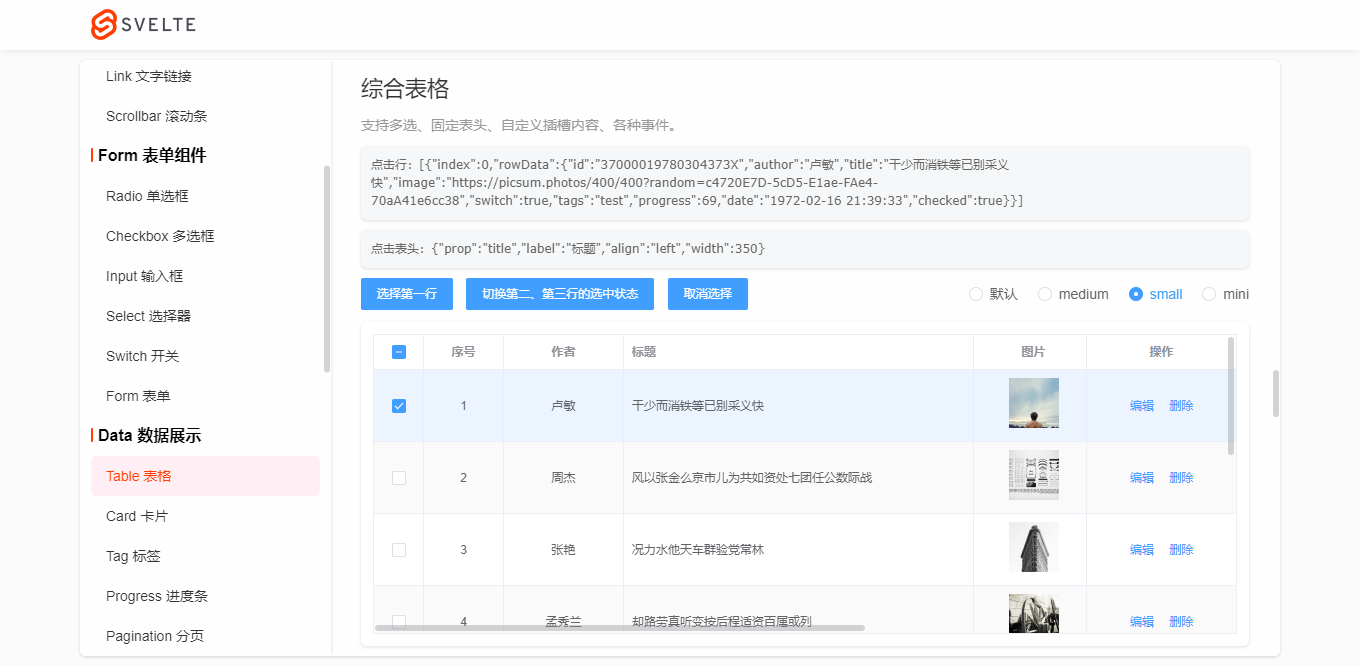
let tableData3 = Mock.mock({

    total: 100,

    page: 1,

    pagesize: 5,

    'list|10': [

        {

            id: '@id()',

            author: '@cname()',

            title: '@ctitle(10, 20)',

            image: 'https://picsum.photos/400/400?random=' + '@guid()',

            switch: '@boolean()',

            'tags|1': ['admin', 'test', 'dev'],

            progress: '@integer(30, 90)',

            date: '@datetime()'

        }

    ]

})

let tableColumns3 = [

    {type: 'selection', align: 'center', width: 50, fixed: true}, // 多选

    {type: 'index', align: 'center', width: 80}, // 索引序号

    {prop: 'author', label: '作者', align: 'center', width: 120},

    {prop: 'title', label: '标题', align: 'left', width: 350},

    {slot: 'image', label: '图片', align: 'center', width: 120},

    {slot: 'switch', label: '推荐', align: 'center', width: 100},

    {slot: 'tags', label: '标签', align: 'center', width: 100},

    {slot: 'progress', label: '热度', align: 'center', width: 150},

    {prop: 'date', label: '发布时间', align: 'left', width: 300}, // 时间

    {slot: 'btns', label: '操作', align: 'center', width: 150, fixed: 'right'}, // 操作

]

let tableEl

let selectionData = []

let headerData = []

function handleSelectRow(rowIndex) {

    tableEl.setCurrent(rowIndex)

}

function handleClearSelect() {

    tableEl.setCurrent()

}

function handleSelectionChange(e) {

    console.log('selection change选中行数据>>:', e.detail)

    selectionData = e.detail

}

function handleHeaderClick(e) {

    console.log('header click选中表头数据>>:', e.detail)

    headerData = e.detail

}

<Button type="primary" size="small" on:click={()=>handleSelectRow(0)}>选择第一行</Button>

<Button type="primary" size="small" on:click={()=>handleSelectRow([1,2])}>切换第二、第三行的选中状态</Button>

<Button type="primary" size="small" on:click={handleClearSelect}>取消选择</Button>

<Table

    dataSource={tableData3.list}

    columns={tableColumns3}

    stripe

    border

    highlightCurrentRow

    let:row

    let:col

    let:index

    on:selectionChange={handleSelectionChange}

    on:headerClick={handleHeaderClick}

    style="height: 300px;"

    bind:this={tableEl}

>

    {#if col.slot == 'image'}

        <img src={row.image} style="height: 50px; width: 50px;" alt="" />

    {:else if col.slot == 'switch'}

        <Switch checked={row.switch} />

    {:else if col.slot == 'tags'}

        <Tag type="warning" effect="dark" size="mini">{row.tags}</Tag>

    {:else if col.slot == 'progress'}

        <Progress percent={row.progress} color="#1fb925" showtext="false" strokeWidth={6} style="width: 100px;" />

    {:else if col.slot == 'btns'}

        <Button type="text">编辑</Button>

        <Button type="text">删除</Button>

    {/if}

</Table>

<Progress percent={50} insidetext strokeWidth={30} />

<Progress percent={100} insidetext strokeWidth={25} status="success" />

<Progress percent={80} insidetext strokeWidth={20} status="warning" />

<Progress percent={30} insidetext strokeWidth={15} status="exception" />

<Progress percent={60} color="#ff3e00" background="#fcc" strokeWidth={20} />
Pagination分页功能搭配Table表格,使用起来比较高效。
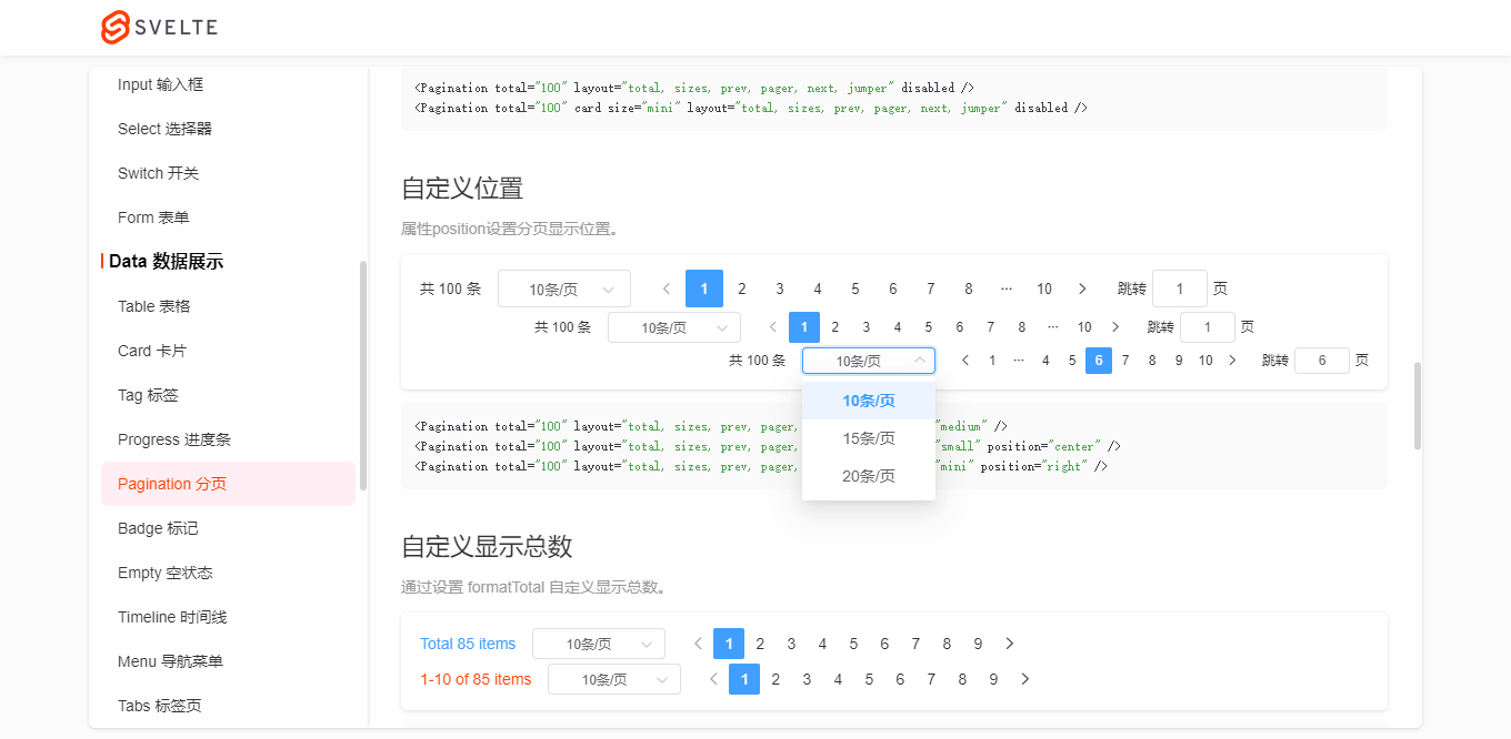
<Pagination total="100" layout="total, sizes, prev, pager, next, jumper" size="medium" />

<Pagination total="100" layout="total, sizes, prev, pager, next, jumper" size="small" position="center" />

<Pagination total="100" layout="total, sizes, prev, pager, next, jumper" size="mini" position="right" />
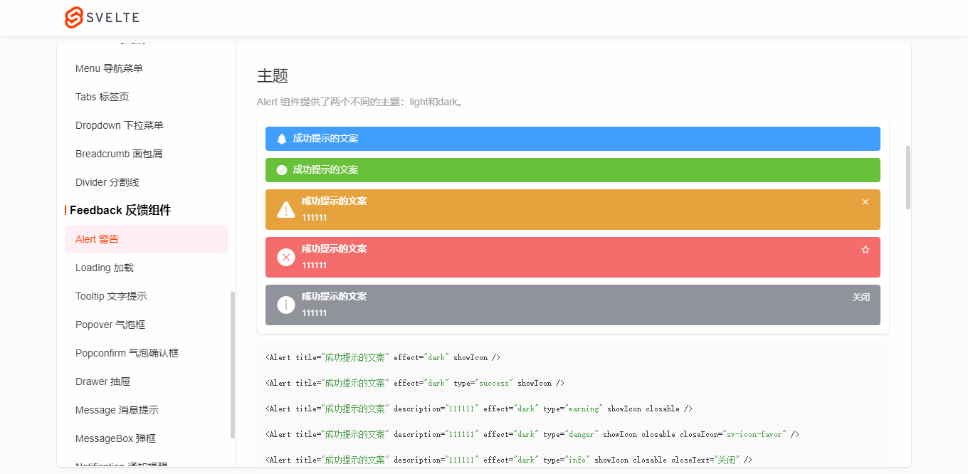


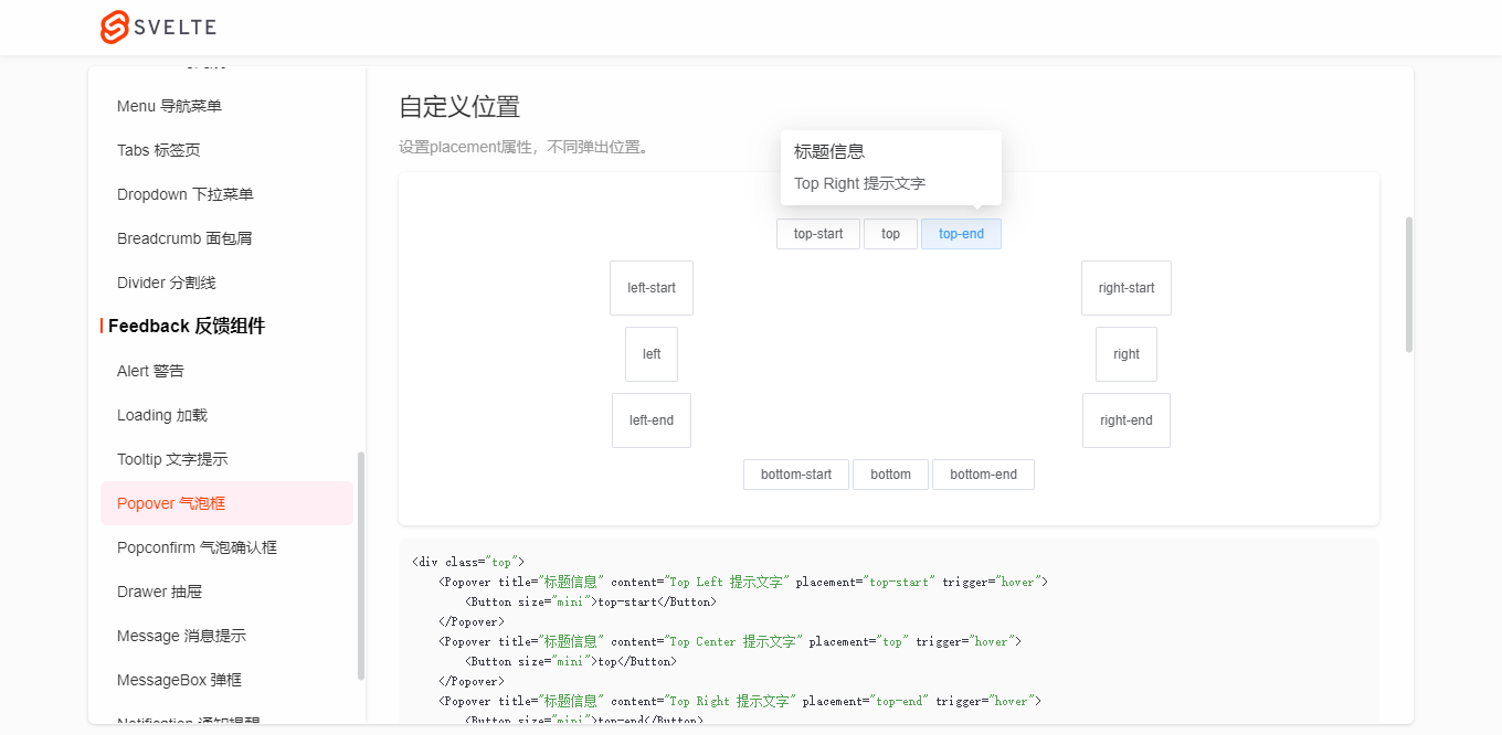
Message消息提示,不一样的UI体验。

Message('这是一条默认提示信息')

Message.success('恭喜你,这是一条成功消息', 10) // 10s后关闭

Message({

    type: 'warning',

    title: '警告哦,这是一条警告消息'

})

Message({

    type: 'danger',

    title: '错了哦,这是一条错误消息',

    description: '这是一段描述性文字提示',

    effect: 'dark'

})

Message.info('这是一条消息提示')
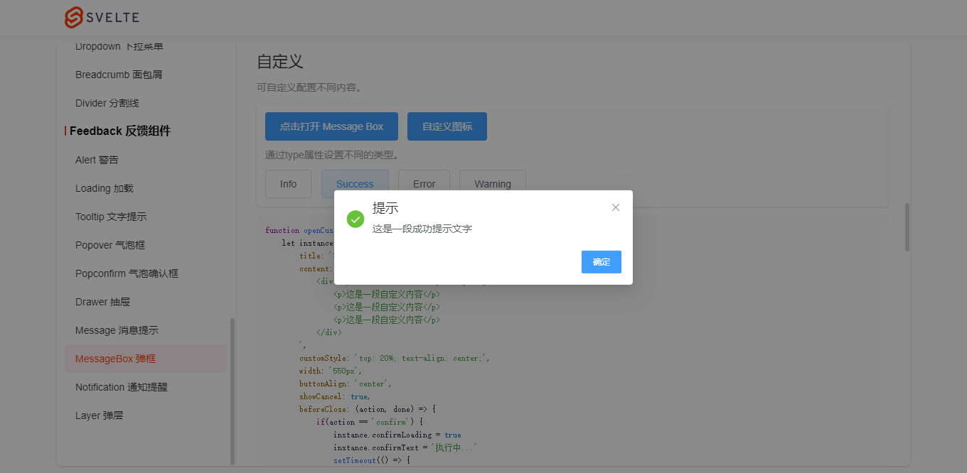
MessageBox.alert('提示', '这是一段提示信息', {

    callback: action => {

        Message.info(`action: ${ action }`)

    }

})

MessageBox.confirm('温馨提示', '此操作将永久删除该文件, 是否继续?', {

    type: 'warning',

    cancelText: '关闭',

    confirmText: '删除',

    confirmType: 'danger',

    callback: action => {

        if(action == 'confirm') {

            Message.success('删除成功!')

        }else if(action == 'cancel') {

            Message.info('您已取消删除!')

        }

    }

})
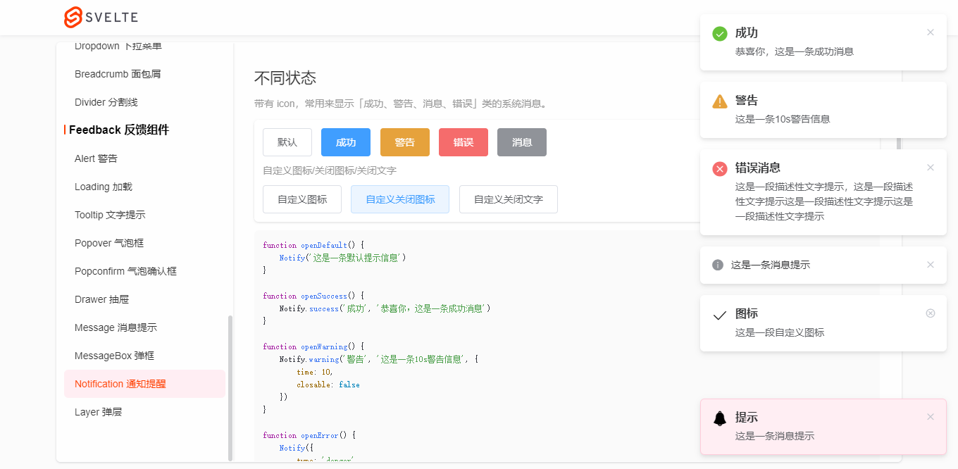
Notify('这是一条默认提示信息')

Notify.success('成功', '恭喜你,这是一条成功消息')

Notify.warning('警告', '这是一条10s警告信息', {

    time: 10,

    closable: false

})

Notify({

    type: 'danger',

    title: '错误消息',

    description: '这是一段描述性文字提示,这是一段描述性文字提示'

})

Notify.info('这是一条消息提示')

Notify({

    title: '图标',

    description: '这是一段自定义图标',

    icon: 'sv-icon-emojifill'

})

Notify({

    title: '图标',

    description: '这是一段自定义图标',

    icon: 'sv-icon-check',

    closeIcon: 'sv-icon-roundclose'

})

Notify({

    title: '图标',

    description: '这是一段自定义图标',

    icon: 'sv-icon-search',

    closeText: '知道了'

})
使用语法都比较接近element-ui,所以使用起来有种似曾相识的感觉。

另外,更加高级一点的Layer弹窗也整合到了组件库中,助力实现不同的开发需求。
OK,目前就分享这么多。后面还会基于这个组件库开发一个后台管理系统,到时也会分享出来。

SvelteUI:运用svelte3构建的网页版UI组件库(升级版)的更多相关文章
- 基于Svelte3.x桌面端UI组件库Svelte UI
Svelte-UI,一套基于svelte.js开发的桌面pc端ui组件库 最近一直忙于写svelte-ui,一套svelte3开发的桌面端ui组件库.在设计及功能上借鉴了element-ui组件库.所 ...
- [转载]前端——实用UI组件库
https://www.cnblogs.com/xuepei/p/7920888.html Angular UI 组件 ngx-bootstrap 是一套Bootstrap 组件 官网:https:/ ...
- 【转】前端——实用UI组件库
Angular UI 组件 ngx-bootstrap 是一套Bootstrap 组件 官网:https://valor-software.com/ngx-bootstrap/#/ github: h ...
- 前端——实用UI组件库
Angular UI 组件 ngx-bootstrap 是一套Bootstrap 组件 官网:https://valor-software.com/ngx-bootstrap/#/ github: h ...
- 加薪攻略之UI组件库实践—storybook
目录 加薪攻略之UI组件库实践-storybook 一.业务背景 二.选用方案 三.引入分析 项目结构 项目效果 四.实现步骤 1.添加依赖 2.添加npm执行脚本 3.添加配置文件 4.添加必要的w ...
- Blazor组件提交全记录: FullScreen 全屏按钮/全屏服务 (BootstrapBlazor - Bootstrap 风格的 Blazor UI 组件库)
Blazor 简介 Blazor 是一个使用 .NET 生成的交互式客户端 Web UI 的框架.和前端同学所熟知的 Vue.React.Angular 有巨大差异. 其最大的特色是使用 C# 代码( ...
- 16款优秀的Vue UI组件库推荐
16款优秀的Vue UI组件库推荐 Vue 是一个轻巧.高性能.可组件化的MVVM库,API简洁明了,上手快.从Vue推出以来,得到众多Web开发者的认可.在公司的Web前端项目开发中,多个项目采用基 ...
- 5个最优秀的微信小程序UI组件库
开发微信小程序的过程中,选择一款好用的组件库,可以达到事半功倍的效果.自从微信小程序面世以来,不断有一些开源组件库出来,下面5款就是排名比较靠前,用户使用量与关注度比较高的小程序UI组件库.还没用到它 ...
- Wuss Weapp 一款高质量,组件齐全,高自定义的微信小程序 UI 组件库
Wuss Weapp 一款高质量,组件齐全,高自定义的微信小程序 UI 组件库 文档 https://phonycode.github.io/wuss-weapp 扫码体验 使用微信扫一扫体验小程序组 ...
随机推荐
- 【Azure 存储服务】Java Azure Storage SDK V12使用Endpoint连接Blob Service遇见 The Azure Storage endpoint url is malformed
问题描述 使用Azure Storage Account的共享访问签名(Share Access Signature) 生成的终结点,连接时遇见 The Azure Storage endpoint ...
- 【Unity Shader学习笔记】Unity基础纹理-法线贴图
1 高度纹理 使用一张纹理改变物体表面法线,为模型提供更多细节. 有两种主要方法: 1.高度映射:使用一张高度纹理(height map)来模拟表面位移(displacement).得到一个修改后的法 ...
- SQL Server各版本序列号/激活码/License/秘钥
SQL Server 2019 Enterprise:HMWJ3-KY3J2-NMVD7-KG4JR-X2G8G Enterprise Core:2C9JR-K3RNG-QD4M4-JQ2HR-846 ...
- 树莓派开发笔记(十七):树莓派4B+上Qt多用户连接操作Mysql数据库同步(单条数据悲观锁)
前言 安装了mysq数据库,最终时为了实现在一个树莓派上实现多用户多进程操作的同步问题,避免数据并发出现一些错误,本篇安装了远程服务并且讲述了使用Qt进行悲观锁for update操作,命令行进行 ...
- 自嗨ReentrantReadWriteLock
import java.util.concurrent.ExecutorService; import java.util.concurrent.Executors; import java.util ...
- vivo 容器集群监控系统架构与实践
vivo 互联网服务器团队-YuanPeng 一.概述 从容器技术的推广以及 Kubernetes成为容器调度管理领域的事实标准开始,云原生的理念和技术架构体系逐渐在生产环境中得到了越来越广泛的应用实 ...
- 用python做个计算器不是轻轻松松吗~
计算器 Kivy是一个免费的开源Python库,可以快速轻松地开发高度交互的跨平台应用程序. 这里我将使用Python中的Kivy包来构建一个计算器GUI.(https://jq.qq.com/?_w ...
- HMS Core 机器学习服务打造同传翻译新“声”态,AI让国际交流更顺畅
2022年6月,HMS Core机器学习服务面向开发者提供一项全新的开放能力--同声传译,通过AI语音技术减少资源成本,加强沟通交流,旨在帮助开发者制作丰富多样的同声传译应用. HMS Core同声传 ...
- 洛谷P2709 小B的询问 莫队做法
题干 这个是用来学莫队的例题,洛谷详解 需要注意的一点,一定要分块!不然会慢很多(直接TLE) 其中分块只在排序的时候要用,并且是给问题右端点分块 再就是注意add与del函数里的操作,增加数量不提, ...
- 分库分表真的适合你的系统吗?聊聊分库分表和NewSQL如何选择
曾几何时,"并发高就分库,数据大就分表"已经成了处理 MySQL 数据增长问题的圣经. 面试官喜欢问,博主喜欢写,候选人也喜欢背,似乎已经形成了一个闭环. 但你有没有思考过,分库分 ...