
Matplotlib---柱状图、直方图(高斯分布)
# _*_ coding: gbk _*_

# @Author: Wonde

# bar 直方图

import matplotlib.pyplot as plt  # 绘图

from matplotlib.font_manager import FontProperties  # 管理字体

font = FontProperties(fname=r'STLITI.TTF')  # 设置字体 设置路径即可

plt.style.use('ggplot')  # 样式可选,默认ggplot和classic

# print(plt.style.available)  #查看可以使用的背景样式

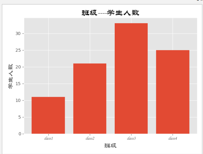
classes = ['class1', 'class2', 'class3', 'class4']  # x轴数据

studentnum = [11, 21, 33, 25]    # y轴数据

classes_index = range(len(classes))  # 传一个可迭代对象range是一个可迭代对象,目的是为了让非数字的X轴均匀分布,通过索引实现

#画布设计

fig = plt.figure()  #实例化一个对象

ax1 = fig.add_subplot(1, 1, 1)  # 将一个画布分为几(1)行(1)列以及选定第(1)张add_subplot(1, 1, 1)

ax1.bar(classes_index, studentnum)  # 设置一些参数

# def bar(self, x, height, width=0.8, bottom=None, *, align="center",**kwargs):

# 设置刻度值的显示位置

ax1.xaxis.set_ticks_position('bottom')  # 刻度 x的刻度在底部,y的刻度在左边

ax1.yaxis.set_ticks_position('left')

#设置X轴的刻度和数据,X轴因为不是具体数据,故用他所在的数组位置进行等差取值。

plt.xticks(classes_index, classes, rotation=0, fontsize=12, FontProperties=font)

# 设置x和y轴以及标题栏的名字

plt.xlabel('班级', FontProperties=font, Fontsize=15)

plt.ylabel('学生人数', FontProperties=font, Fontsize=15)

plt.title('班级----学生人数', FontProperties=font, Fontsize=19)

plt.show()
****************************************************************************************************************************************************
# _*_ coding: gbk _*_

# @Author: Wonde

# bar 直方图

import matplotlib.pyplot as plt  # 绘图

from matplotlib.font_manager import FontProperties  # 管理字体

font = FontProperties(fname=r'STLITI.TTF')  # 设置字体 设置路径即可

plt.style.use('ggplot')  # 样式可选,默认ggplot和classic

# print(plt.style.available)  #查看可以使用的背景样式

classes = ['class1', 'class2', 'class3', 'class4']  # x轴数据

studentnum = [11, 21, 33, 25]    # y轴数据

classes_index = range(len(classes))  # 传一个可迭代对象range是一个可迭代对象

#画布设计

fig = plt.figure()  #实例化一个对象

ax1 = fig.add_subplot(1, 1, 1)  # 将一个画布分为几(1)行(1)列以及选定第(1)张add_subplot(1, 1, 1)

ax1.barh( classes_index, studentnum)  # 设置一些参数

#     def barh(self, y, width, height=0.8, left=None, *, align="center",**kwargs):

# 设置刻度值的显示位置

ax1.xaxis.set_ticks_position('bottom')  # 刻度 x的刻度在底部,y的刻度在左边

ax1.yaxis.set_ticks_position('left')

# yticks设置y轴的刻度值 和数据,此时Y轴是班级,不是一个具体数值,所以需要用索引来做均分间隔。

plt.yticks(classes_index, classes, rotation=0, fontsize=12, FontProperties=font)

# 设置x和y轴以及标题栏的名字

plt.xlabel('学生人数', FontProperties=font, Fontsize=15)

plt.ylabel('班级', FontProperties=font, Fontsize=15)

plt.title('班级----学生人数', FontProperties=font, Fontsize=19)

plt.show()

重在理解!!!
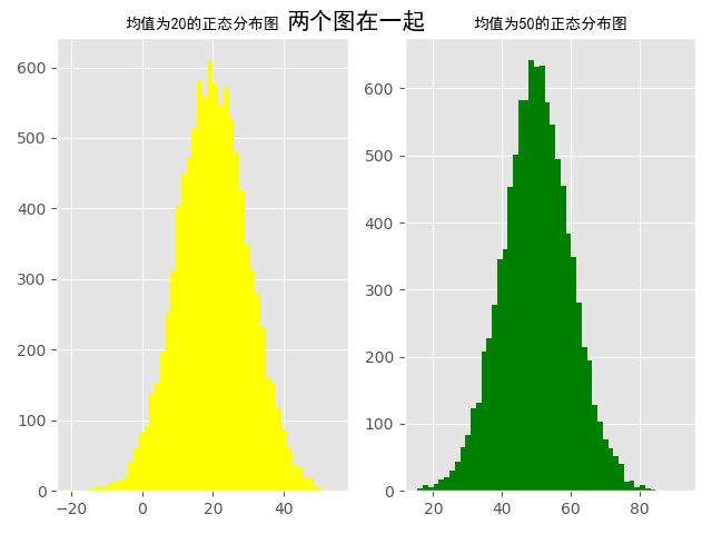
高斯分布,又称为正态分布。秘籍的直方图可以绘制出高斯分布图
# _*_ coding: gbk _*_

# @Author: Wonder

import numpy as np

import matplotlib.pyplot as plt

from matplotlib.font_manager import FontProperties

font = FontProperties(fname='simhei.ttf')

plt.style.use('ggplot')

num1, num2, sigama = , ,

# 构造符合均值为20的正态分布,以及均值为50的正态分布。

x1 = num1 + sigama * np.random.randn()  # 10000为构造随机数的个数

x2 = num2 + sigama * np.random.randn()

fig = plt.figure()  # 初始化画板

ax1 = fig.add_subplot(, , )

ax1.hist(x1, bins=, color='yellow')  # bins=50表示分成50份,即会有50个直方图组成正态分布大图

ax2 = fig.add_subplot()

ax2.hist(x2, bins=, color='green')

fig.suptitle('两个图在一起', fontproperties=font, fontweight='bold',

             fontsize=)  # fontweight为字体粗细,bold为粗体,fontproperties字体属性

ax1.set_title('均值为20的正态分布图', fontproperties=font)

ax2.set_title('均值为50的正态分布图', fontproperties=font)

plt.show()
Matplotlib---柱状图、直方图(高斯分布)的更多相关文章
- numpy和matplotlib绘制直方图
使用 Matplotlib Matplotlib 中有直方图绘制函数:matplotlib.pyplot.hist()它可以直接统计并绘制直方图.你应该使用函数 calcHist() 或 np.his ...
- NumPy使用 Matplotlib 绘制直方图
NumPy - 使用 Matplotlib 绘制直方图 NumPy 有一个numpy.histogram()函数,它是数据的频率分布的图形表示. 水平尺寸相等的矩形对应于类间隔,称为bin,变量hei ...
- matplotlib 柱状图、饼图;直方图、盒图
#-*- coding: utf-8 -*- import matplotlib.pyplot as plt import numpy as np import matplotlib as mpl m ...
- matplotlib绘制直方图【柱状图】
代码: def drawBar(): xticks = ['A', 'B', 'C', 'D', 'E']#每个柱的下标说明 gradeGroup = {'A':200,'B':250,'C':330 ...
- matplotlib柱状图、面积图、直方图、散点图、极坐标图、箱型图
一.柱状图 1.通过obj.plot() 柱状图用bar表示,可通过obj.plot(kind='bar')或者obj.plot.bar()生成:在柱状图中添加参数stacked=True,会形成堆叠 ...
- 【Python】模块学习之matplotlib柱状图、饼状图、动态图及解决中文显示问题
前言 众所周知,通过数据绘图,我们可以将枯燥的数字转换成容易被人们接受的图表,从而让人留下更加深刻的印象.而大多数编程语言都有自己的绘图工具,matplotlib就是基于Python的绘图工具包,使用 ...
- matplotlib柱状图-【老鱼学matplotlib】
柱状图在平常的图表中是非常常用的图,本节我们来看下如何来显示柱状图. 代码为: import numpy as np import pandas as pd import matplotlib.pyp ...
- 关于matplotlib绘制直方图偏移的问题
在使用pyplot绘制直方图的时候我发现了一个问题,在给函数.hist()传参的时候,如果传入的组数不是刚刚好(就是说这个组数如果是使用(最大值-最小值)/组距计算出来,而这个数字不是整除得来而是取整 ...
- Python:matplotlib绘制直方图
使用hist方法来绘制直方图: 绘制直方图,最主要的是一个数据集data和需要划分的区间数量bins,另外你也可以设置一些颜色.类型参数: plt.hist(np.random.randn(1 ...
随机推荐
- 进程共享变量#pragma data_seg用法
#pragma data_seg介绍 用#pragma data_seg建立一个新的数据段并定义共享数据,其具体格式为: #pragma data_seg ("shareddata" ...
- [未解决]报错:SSLError
参考网友解决的方法 任何报SSLError类的错,解决方法: 引入ssl模块 import ssl 在url链接代码上方添加语句: ssl._create_default_https_context ...
- 天道神诀---FTP服务
FTP 2种模式 主动模式(默认) 客户端以1024-65535之间某一端口发送指令到服务端的21端口,并建立连接.服务端接受到以后,以20端口去连接客户端,建立一条新的链接并传输数据 被动模式 客户 ...
- 在vue中获取微信支付code及code被占用问题的解决?
这个地方坑比较多,查看网上并没有详细的文档,新手一般写到这里很痛苦.这里我只介绍一下我解决的方案,虽然它不是最好的,但是可行的方案: 总体分两步 1)跳到微信支付链接,它会自动拼接上code 2)获取 ...
- RHEL5/6/7中常用命令及命令之间的差异
System basics Task RHEL5 RHEL6 RHEL7 View subscription information /etc/sysconfig/rhn/systemid /etc/ ...
- laravel passport client_credentials
我是使用 Laravel 5.4 + Dingo Api + passport/jwt 两个验证方式 目前需要用到 passport 的 client_credentials 获取 token成功之后 ...
- Java ArrayList使用技巧 - 两个ArrayList去除重复的元素
方法一.ArrayList中提供的removeAll方法(效率最低) List1.removeAll(mSubList); 方法二.双重循环(比方法一效率高) 双重循环分为内外两层循环,经过测试,将元 ...
- bzoj1012题解
[解题思路] 强制在线线段树/树状数组,没什么好说的..复杂度O(mlog2m)(线段树)或O(mlog22m)(树状数组). [参考代码] (还naive的时候写的zkw真是翔..) #includ ...
- NX二次开发-UFUN批量操作图层状态UF_LAYER_set_many_layers_status
NX11+VS2013 #include <uf.h> #include <uf_ui.h> #include <uf_layer.h> UF_initialize ...
- detours编译与windows下makefile学习
1.编译 windows环境命令行编译很少用,detours需要使用命令行编译,刚好试试,过程如下: 1.为了能够在所有目录中使用nmake命令,需要设置环境变量Path D:\Program Fil ...