Writing a Reusable Custom Control in WPF
In my previous post, I have already defined how you can inherit from an existing control and define your own reusable chunk. The reusable XAML code that I have defined there is actually a composition of one of more existing elements in a common design surface. But sometimes you must define a new behaviour for your reusable component which does not belong to any of the already existing behaviors. Custom controls can help you in this. You can define a new behaviour for your Custom control which can have a default look and feel defined for it, and obviously which can be changed using Template for the user who is using the control. In this post I am going to provide you step by step approach on defining a Custom Control for your application.
Note: If you are really new to WPF, please read my WPF Tutorial before going further.
Steps to Create a new Custom Control
Creating a custom control is very simple. Just in your project right click and add a new Item. In the dialog box that appears, choose Custom Control template and Name it. I call it here as SimpleControl.

Once you have added the control, it adds up a new class to your project which inherits from Control. The Template also provides you with some initial help to define your own control. Lets remove all the comments for now and start building a control.
Download Sample Code
In this control, I will show you all the components that you need for a Control so that it would help you guide each of the components individually.
Components that comprises a Custom Control
There are a number of components that you need to use inside your custom control which represents the behaviour for your control. Lets define each of them one by one before creating a Control.
1. Property : Properties are one of the most important component for a control. In WPF, we use properties to define certain characteristics of a control. You can use either CLR properties or a Dependency Property. As you must know already a dependency property is a new Property System introduced with WPF, which holds a container of all the properties you define for a single instance of your control and which supports Property Value Inheritence, Animation, Templates, Styles, etc. Toread more about Dependency Property check my article.
Example :
public static readonly DependencyProperty ColorProperty = DependencyProperty.Register("Color",

    typeof(Color),

    typeof(SimpleControl),

    new PropertyMetadata(Colors.Green));

public Color Color

{

    get

    {

        return (Color)this.GetValue(ColorProperty);

    }

    set

    {

        this.SetValue(ColorProperty, value);

    }

}
Here we have defined a new dependency Property called color, which will represent the initial BackColor of the control. The Default value for the Property is defined as Green.
2. Commands : It is important to define a command for your Control rather than using a method. Commands lets you use CommandBinding on a control just like your Button Class. The Command generally invoke certain set of action defined using ICommand interface. It also creates an Inversion of Control to invoke some user code as well, during the event.
Example :
static SimpleControl()

        {

            CommandManager.RegisterClassCommandBinding(typeof(SimpleControl),

                new CommandBinding(SimpleControl.CustomCommand, OnCustomCommand));

        }

        static void OnCustomCommand(object sender, ExecutedRoutedEventArgs e)

        {

            //Need to first retrieve the control

            SimpleControl invoker = sender as SimpleControl;

            //Do whatever you need

        }

        public static readonly ICommand CustomCommand = new RoutedUICommand("CustomCommand", "CustomCommand",

                                                        typeof(SimpleControl),

                                                        new InputGestureCollection(

                                                            new InputGesture[] {

                                                                new KeyGesture(Key.Enter),

                                                                new MouseGesture(MouseAction.LeftClick) }

                                                                )

                                                          );
Here I have defined a Command called CustomCommand. As you can notice I have used Static Constructor to register my command and static eventHandler so that it is more efficient. You can easily retrieve the actual object easily from sender.
3. RoutedEvents : Events are another most important thing for a control. You can define your own event for the control, but it should be RoutedEvent to ensure that WPF model supports them internally. RoutedEvent supports event routing, that the event can bubble or tunnel to the complete Visual Tree, when the event is raised. The FrameworkElement has a complete set of methods to use in defining a RoutedEvent.
Example :
public static readonly RoutedEvent InvertCallEvent = EventManager.RegisterRoutedEvent("InvertCall",

    RoutingStrategy.Bubble, typeof(RoutedEventHandler), typeof(SimpleControl));

public event RoutedEventHandler InvertCall

{

    add { AddHandler(InvertCallEvent, value); }

    remove { RemoveHandler(InvertCallEvent, value); }

}

private void OnInvertCall()

{

    RoutedEventArgs args = new RoutedEventArgs(InvertCallEvent);

    RaiseEvent(args);

}
Just like dependency property system, WPF event system also holds a collection of Events which appropriately raises the event for a particular control when some specific operation is executed. The WPF event system can take part on EventSetters, Triggers etc. You have noticed that you can use Addhandler and RemoveHandler from the Event Accessor to add or remove an event for a particular control. The RaiseEvent is used to raise an event for a particular control.
4. Handling an Event : Sometimes your control might require to handle an Event that already comes from Control. For instance, the Button class handles an event called MouseDown to create an event Click to it. In such a scenario you can use RegisterClassHandler method to handle an event.
Example :
static SimpleControl()

{

    EventManager.RegisterClassHandler(typeof(SimpleControl), Mouse.MouseDownEvent, new MouseButtonEventHandler(OnMouseDown));

}

static void OnMouseDown(object sender, MouseButtonEventArgs e)

{

    SimpleControl invoker = sender as SimpleControl;

    //Do handle event

    //Raise your event

    invoker.OnInvertCall();

    //Do Rest

}
Now here I have used RegisterClassHandler to handle the event. This will handle the MouseDown event for the control and invoke InvertCall event defined as RoutedEvent.
5. TemplatePart : For every control you should specify the rules how the UI for the control should look like. Template allows the user of your control to modify the look and feel, but using TemplatePart you can define the part of a control which you can change behaviour from within the control. Say for instance, if your control has a border, and your control wants to change its color when Mouse is hovered over the control, you can call the part attribute to apply this change which will be shown for any Template your user define later on, provided it should name the same part name.
Note: Currently PartNames are not actually checked for Templates, so you can omit a part
Example :
[TemplatePart(Name="PART_MainBorder", Type=typeof(Border))]

[TemplatePart(Name="PART_body", Type= typeof(ContentControl))]

public class SimpleControl : Control

{

    Border MainBorder;

    ContentControl Body;

    public override void OnApplyTemplate()

    {

        base.OnApplyTemplate();

        if (this.Template != null)

        {

            Border mainBorder = this.Template.FindName("PART_MainBorder", this) as Border;

            if (mainBorder != MainBorder)

            {

                //First unhook existing handler

                if (MainBorder != null)

                {

                    MainBorder.MouseEnter -= new MouseEventHandler(MainBorder_MouseEnter);

                    MainBorder.MouseLeave -= new MouseEventHandler(MainBorder_MouseLeave);

                }

                MainBorder = mainBorder;

                if (MainBorder != null)

                {

                    MainBorder.MouseEnter += new MouseEventHandler(MainBorder_MouseEnter);

                    MainBorder.MouseLeave += new MouseEventHandler(MainBorder_MouseLeave);

                }

            }

            Body = this.Template.FindName("PART_body", this) as ContentControl;

        }

    }

void MainBorder_MouseLeave(object sender, MouseEventArgs e)

{

    Border thisBorder = sender as Border;

    if (thisBorder != null)

    {

        thisBorder.Background = new SolidColorBrush(Colors.Red);

        if (Body != null)

        {

            Run r = new Run("Mouse Left!");

            r.Foreground = new SolidColorBrush(Colors.White);

            Body.Content = r;

        }

    }

}

void MainBorder_MouseEnter(object sender, MouseEventArgs e)

{

    Border thisBorder = sender as Border;

    if (thisBorder != null)

    {

        thisBorder.Background = new SolidColorBrush(Colors.Blue);

        if (Body != null)

        {

            Run r = new Run("Mouse Entered!");

            r.Foreground = new SolidColorBrush(Colors.White);

            Body.Content = r;

        }

    }

}
So here I have created two TemplatePart one named PART_MainBorder and another PART_body. In your Generic template you must define this TemplateParts so that the default control acts perfectly. The User can also redefine the template and once the user redefines it, it can also use these Part names to call a specific control inside, so that your control can apply something inside of it. In this example I have used a border, which will change its color to Red when Mouse is entered inside of it, and to Blue when it is left. You should note that I have used Template.FindName and passed the current instance of the control. This is important because Templates are generally shared by more than one instance.
When a Template is applied to a control it calls OnApplyTemplate. Make sure you are tolerant enough to handle bad templates, as you can see, I have checked every time if the object is available before doing anything with it as WPF ignores bad templates and your control might end up with a bad NullReferenceException somewhere if you dont gracefully eliminate the same.
Now in your actual Window, you should declare the template for the Control and define each of the PartNames you specify here.
6. Themes : Yes your control should define a default Theme at least to make sure it at least appears when an object is created. At the basic level, when you add a new Custom Control to your project, you should add a style for Generic.XAML that is added up on the Themes folder. The AseemblyInfo also adds up a assembly level attribute which identifies where the default Theme template resides.
The Theme folder will by default hold a Generic.xaml. Lets add a default Style for our control.
<Style TargetType="{x:Type local:SimpleControl}">

    <Setter Property="HorizontalAlignment" Value="Center" />

    <Setter Property="VerticalAlignment" Value="Center" />

    <Setter Property="Template">

        <Setter.Value>

            <ControlTemplate TargetType="local:SimpleControl">

                <Border x:Name="PART_MainBorder" Width="{TemplateBinding Width}" Height="{TemplateBinding Height}">

                    <ContentControl x:Name="PART_body"

                                    HorizontalAlignment="{TemplateBinding HorizontalAlignment}"

                                    VerticalAlignment="{TemplateBinding VerticalAlignment}" >

                    </ContentControl>

                </Border>

            </ControlTemplate>

        </Setter.Value>

    </Setter>

</Style>
Now as you can see this is a simple Style that will be applied to each control we instantiate in our application.
Creating the Sample
Now as we have already created our control lets add this control in MainWindow.
<Window x:Class="CustomControlExample.MainWindow"

        xmlns="http://schemas.microsoft.com/winfx/2006/xaml/presentation"

        xmlns:x="http://schemas.microsoft.com/winfx/2006/xaml"

        xmlns:local="clr-namespace:CustomControlExample"

        Title="MainWindow" Height="350" Width="525">

    <Grid>

        <Grid.RowDefinitions>

            <RowDefinition/>

            <RowDefinition />

        </Grid.RowDefinitions>

        <local:SimpleControl Width="90" Height="90" >

        </local:SimpleControl>

        <local:SimpleControl Width="90" Height="90" Grid.Row="1" Color="Crimson">

            <local:SimpleControl.Template>

                <ControlTemplate>

                    <Border x:Name="PART_MainBorder">

                        <Button x:Name="PART_body" HorizontalAlignment="Center" VerticalAlignment="Center" Background="Black"></Button>

                    </Border>

                </ControlTemplate>

            </local:SimpleControl.Template>

        </local:SimpleControl>

    </Grid>

</Window>
So here basically I add two controls in two rows of a Grid. The first one taking up the Default Template it provides, and the second one creates its own template. You can specify the Template Part in your own template as shown in the declaration which interact with the control itself.
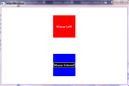
Now if you run the sample it shows two rectangular box, one with all default values and another with custom template.
Bit Further
There are also few things that deals with Design Support of Visual Studio and Expression Blend for a control. You can either build separate dlls for design time support for your control with .design.dll or within the same assembly. The design time support can add custom Adorners which can help in layout the control in Visual Designer or Expression Blend. To build a design time support for a control you need to inherit from IRegisterMetaData and build an AttributeTableMetaData, which will work for the Designer. I will talk about it later in a separate post.
Download the Sample Code
Conclusion
You should remember, creating a Custom control does require a lot of effort. So if you looking for just look and feel, you can get a workaround to this using custom template or inheriting from other existing Controls. But if you are building your own Custom behaviour or a library of control, then you should go for Custom Control. Also remember, custom control is Themable, Templatable and also supports inheritence, so you should always consider writing your control gracefully and hitting every possible aspect that your control might come across.
I hope this sample code will help you. If you want, you can read my WPF Tutorial too from here and subscribe to my blog too.
Writing a Reusable Custom Control in WPF的更多相关文章
- Recommended Practices for WPF Custom Control Developers
I have always found that there isn’t enough documentation about Custom Control development in WPF. M ...
- ClassLibary和WPF User Control LIbary和WPF Custom Control Libary的异同
说来惭愧,接触WPF这么长时间了,今天在写自定义控件时遇到一个问题:运行界面中并没有显示自定义控件,经调试发现原来没有加载Themes中的Generic.xaml. 可是为什么在其他solution中 ...
- WPF中的Generic.xaml, theme以及custom control
原文:WPF中的Generic.xaml, theme以及custom control 在Visual Studio中创建自定义控件时,所有控件都将添加到/Themes/Generic.xaml. 最 ...
- .NET Core学习笔记(2)—— WPF使用UWP Custom Control
自.NET Core 3.0开始,某软加入了对WPF的支持.同时对XAML Islands也做了进一步加强.在.NET Core 3.0之前,我们只能在WPF程序中,通过两种方式有限制地使用Stand ...
- Developing your first FNC custom control
Friday, May 13, 2016 Some weeks ago, we released the TMS FNC UI Pack, a set of Framework Neutral Com ...
- WinForm中Component Class、User Control及Custom Control的区别和使用建议
reference: http://blog.csdn.net/redstonehe/article/details/1536549 .NET Framework 为您提供了开发和实现新控件的能力.除 ...
- WinForm中Component Class、User Control及Custom Control的区别和使用-转
转http://www.cnblogs.com/jhtchina/archive/2010/11/28/1028591.html NET Framework 为您提供了开发和实现新控件的能力.除了常见 ...
- Custom Control
How to create custom control http://www.silverlightshow.net/items/Creating-a-Silverlight-Custom-Cont ...
- WinForm中Component Class、User Control及Custom Control的区别和使用
NET Framework 为您提供了开发和实现新控件的能力.除了常见的用户控件外,现在您会发现,您可以编写能执行自身绘图的自定义控件,甚至还可以通过继承扩展现有控件的功 能.确定创建何种类型的控件可 ...
随机推荐
- PHP use关键字概述
PHP中的use关键字的用法. 很多开源系统如osCommerce框架中,都会在其源码中找到use这个关键字,如osCommerce框架中就在index.php文件中出现了这段源码:use osCom ...
- Shiro系列(1) - 权限管理的介绍与原理
1. 什么是权限管理 一般来说,只要有用户参与,那么该系统都会需要权限管理,权限管理实现了对用户访问系统 指定功能的限制,按照管理员定义的安全规则或权限策略,限制用户只能访问自己被授权的那些资源路径 ...
- 最新Windows下c++读写锁SRWLock介绍
https://blog.csdn.net/MoreWindows/article/details/7650574 https://blog.csdn.net/chenzhjlf/article/de ...
- JAVA CAS原理深度分析 volatile,偏向锁,轻量级锁
JAVA CAS原理深度分析 http://blog.csdn.net/hsuxu/article/details/9467651 偏向锁,轻量级锁 https://blog.csdn.net/zqz ...
- 技术范儿的 Keep 发力AI赛道,为什么“虚拟教练”会更懂你?
http://www.tmtpost.com/3363367.html 摘要: 虚拟教练技术会整合到一些业务场景和硬件产品中收费,但是收费的具体情况彭跃辉还暂未透露. 图片来源于Unsplash 自去 ...
- 安全管理中心(SOC)引导企业信息安全建设的思路
SOC即企业安全管理中心,该模型可帮助企业信息安全人员在进行安全建设方面提供整体性的参考.如下所示,以下模型分为数据采集部分收集了各类设备及日志等数据,这些数据收集到了以后提供给SOC安全管理中心,而 ...
- [SQL in Azure] Tutorial: AlwaysOn Availability Groups in Azure (GUI)
http://msdn.microsoft.com/en-us/library/azure/dn249504.aspx Tutorial: AlwaysOn Availability Groups i ...
- Linux系统磁盘满解决方案
1.查看磁盘使用率 df -lh 执行结果: 2.定位最大文件目录 du -h --max-depth=1 执行结果: 3.定位最大文件 ls -lhS 执行结果: 4.备注 配合du -h --ma ...
- RSS Reader in PC & iPhone
PC上当然是用feedly web版.但出乎意料的是,iPhone上最好用的居然是safari版QQ邮箱...
- 【C/C++】C/C++中Static的作用详述
在C语言中,static的字面意思很容易把我们导入歧途,其实它的作用有三条. ❶先来介绍它的第一条也是最重要的一条:隐藏.当我们同时编译多个文件时,所有未加static前缀的全局变量和函数都具有全局可 ...