day 59 Bootstrap学习
---恢复内容开始---
简介
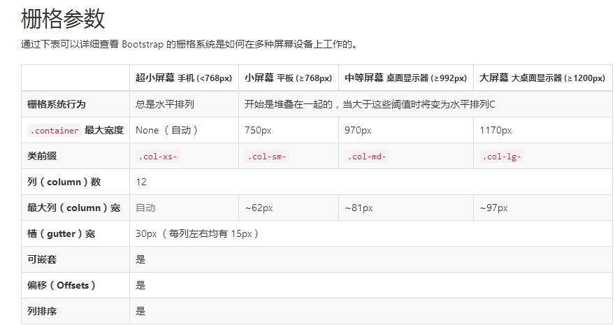
栅格系统用于通过一系列的行(row)与列(column)的组合来创建页面布局,你的内容就可以放入这些创建好的布局中。下面就介绍一下 Bootstrap 栅格系统的工作原理:
- “行(row)”必须包含在
.container(固定宽度)或.container-fluid(100% 宽度)中,以便为其赋予合适的排列(aligment)和内补(padding)。 - 通过“行(row)”在水平方向创建一组“列(column)”。
- 你的内容应当放置于“列(column)”内,并且,只有“列(column)”可以作为行(row)”的直接子元素。
- 类似
.row和.col-xs-4这种预定义的类,可以用来快速创建栅格布局。Bootstrap 源码中定义的 mixin 也可以用来创建语义化的布局。 - 通过为“列(column)”设置
padding属性,从而创建列与列之间的间隔(gutter)。通过为.row元素设置负值margin从而抵消掉为.container元素设置的padding,也就间接为“行(row)”所包含的“列(column)”抵消掉了padding。 - 负值的 margin就是下面的示例为什么是向外突出的原因。在栅格列中的内容排成一行。
- 栅格系统中的列是通过指定1到12的值来表示其跨越的范围。例如,三个等宽的列可以使用三个
.col-xs-4来创建。 - 如果一“行(row)”中包含了的“列(column)”大于 12,多余的“列(column)”所在的元素将被作为一个整体另起一行排列。
- 栅格类适用于与屏幕宽度大于或等于分界点大小的设备 , 并且针对小屏幕设备覆盖栅格类。 因此,在元素上应用任何
.col-md-*栅格类适用于与屏幕宽度大于或等于分界点大小的设备 , 并且针对小屏幕设备覆盖栅格类。 因此,在元素上应用任何.col-lg-*不存在, 也影响大屏幕设备。
通过研究后面的实例,可以将这些原理应用到你的代码中。
媒体查询
实例:流式布局容器
将最外面的布局元素 .container 修改为 .container-fluid,就可以将固定宽度的栅格布局转换为 100% 宽度的布局。
<div class="container-fluid">

  <div class="row">

    ...

  </div>

</div>
实例:手机、平板、桌面
在上面案例的基础上,通过使用针对平板设备的 .col-sm-* 类,我们来创建更加动态和强大的布局吧。
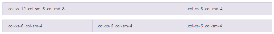
<div class="row">

  <div class="col-xs-12 col-sm-6 col-md-8">.col-xs-12 .col-sm-6 .col-md-8</div>

//可以给每一个column来设置对于不同设备的显示效果,

  <div class="col-xs-6 col-md-4">.col-xs-6 .col-md-4</div>

</div>

<div class="row">

  <div class="col-xs-6 col-sm-4">.col-xs-6 .col-sm-4</div>

  <div class="col-xs-6 col-sm-4">.col-xs-6 .col-sm-4</div>

  <!-- Optional: clear the XS cols if their content doesn't match in height -->

  <div class="clearfix visible-xs-block"></div>

  <div class="col-xs-6 col-sm-4">.col-xs-6 .col-sm-4</div>

</div>
除了列在分界点清除响应, 您可能需要 重置偏移, 后推或前拉某个列。请看此栅格实例。
<div class="row">

  <div class="col-sm-5 col-md-6">.col-sm-5 .col-md-6</div>

  <div class="col-sm-5 col-sm-offset-2 col-md-6 col-md-offset-5">.col-sm-5 .col-sm-offset-2 .col-md-6 .col-md-offset-0</div>

</div>

//当是sm的显示器时,向右推2个栅格位  当是md 时,向右推5个栅格

<div class="row">

  <div class="col-sm-6 col-md-5 col-lg-6">.col-sm-6 .col-md-5 .col-lg-6</div>

  <div class="col-sm-6 col-md-5 col-md-offset-2 col-lg-6 col-lg-offset-0">.col-sm-6 .col-md-5 .col-md-offset-2 .col-lg-6 .col-lg-offset-0</div>

</div>
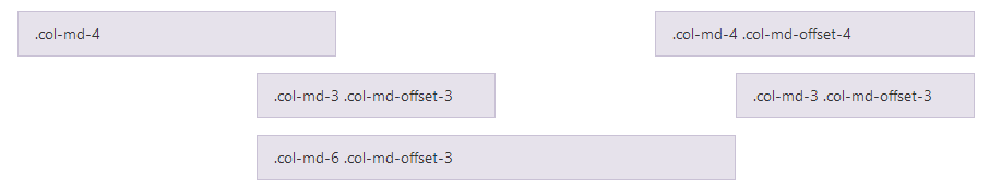
列偏移
使用 .col-md-offset-* 类可以将列向右侧偏移。这些类实际是通过使用 * 选择器为当前元素增加了左侧的边距(margin)。例如,.col-md-offset-4 类将 .col-md-4 元素向右侧偏移了4个列(column)的宽度。
嵌套列
为了使用内置的栅格系统将内容再次嵌套,可以通过添加一个新的 .row 元素和一系列 .col-sm-* 元素到已经存在的 .col-sm-* 元素内。被嵌套的行(row)所包含的列(column)的个数不能超过12(其实,没有要求你必须占满12列)。
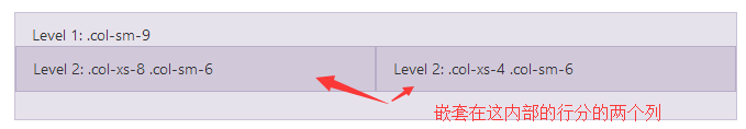
<div class="row">

  <div class="col-sm-9">

    Level 1: .col-sm-9

    <div class="row">

      <div class="col-xs-8 col-sm-6">

        Level 2: .col-xs-8 .col-sm-6

      </div>

      <div class="col-xs-4 col-sm-6">

        Level 2: .col-xs-4 .col-sm-6

      </div>

    </div>

  </div>

</div>
列排序
通过使用 .col-md-push-* 和 .col-md-pull-* 类就可以很容易的改变列(column)的顺序。

<div class="row">

  <div class="col-md-9 col-md-push-3">.col-md-9 .col-md-push-3</div>

//push 推

  <div class="col-md-3 col-md-pull-9">.col-md-3 .col-md-pull-9</div>

// pull 拉

</div>
排版
标题
表格
表单
基本实例
单独的表单控件会被自动赋予一些全局样式。所有设置了 .form-control 类的 <input>、<textarea> 和 <select> 元素都将被默认设置宽度属性为 width: 100%;。 将 label 元素和前面提到的控件包裹在 .form-group 中可以获得最好的排列。
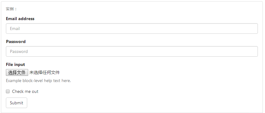
重要表单代码
<form>

  <div class="form-group">

    //将表单内容包裹在 form-group中 里边所有的

    <label for="exampleInputEmail1">Email address</label>

    <input type="email" class="form-control" id="exampleInputEmail1" placeholder="Email">

  </div>

  <div class="form-group">

    <label for="exampleInputPassword1">Password</label>

    <input type="password" class="form-control" id="exampleInputPassword1" placeholder="Password">

  </div>

  <div class="form-group">

    <label for="exampleInputFile">File input</label>

    <input type="file" id="exampleInputFile">

    <p class="help-block">Example block-level help text here.</p>

  </div>

  <div class="checkbox">

    <label>

      <input type="checkbox"> Check me out

    </label>

  </div>

  <button type="submit" class="btn btn-default">Submit</button>

</form>
内联表单
为 <form> 元素添加 .form-inline 类可使其内容左对齐并且表现为 inline-block 级别的控件。只适用于视口(viewport)至少在 768px 宽度时(视口宽度再小的话就会使表单折叠)。
可能需要手动设置宽度
在 Bootstrap 中,输入框和单选/多选框控件默认被设置为 width: 100%; 宽度。在内联表单,我们将这些元素的宽度设置为width: auto;,因此,多个控件可以排列在同一行。根据你的布局需求,可能需要一些额外的定制化组件。
一定要添加 label 标签
如果你没有为每个输入控件设置 label 标签,如果没有屏幕阅读器将无法正确识别。对于这些内联表单,你可以通过为 label 设置 .sr-only 类将其隐藏。还有一些辅助技术提供label标签的替代方案,比如 aria-label、aria-labelledby 或 title 属性。如果这些都不存在,屏幕阅读器可能会采取使用 placeholder 属性,如果存在的话,使用占位符来替代其他的标记,但要注意,这种方法是不妥当的。
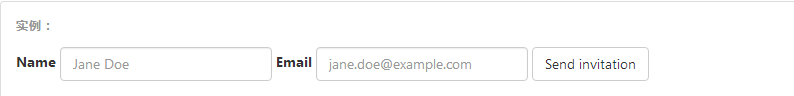
<form class="form-inline">

  <div class="form-group">

    <label for="exampleInputName2">Name</label>

    <input type="text" class="form-control" id="exampleInputName2" placeholder="Jane Doe">

  </div>

  <div class="form-group">

    <label for="exampleInputEmail2">Email</label>

    <input type="email" class="form-control" id="exampleInputEmail2" placeholder="jane.doe@example.com">

  </div>

  <button type="submit" class="btn btn-default">Send invitation</button>

</form>

<!DOCTYPE html>

<html lang="en">

<head>

    <meta charset="UTF-8">

    <meta http-equiv="X-UA-Compatible" content="IE=edge">

    <meta name="viewport" content="width=device-width, initial-scale=1">

    <title>Title</title>

    <link rel="stylesheet" href="bootstrap-3.3.7-dist/css/bootstrap.min.css">

</head>

<body>

<div class="container">

    <form class="form-inline">

        <div class="form-group">

            <label for="pasw">密码</label>

            <input type="password" id="pasw" class="form-control" placeholder="password">

        </div>

        <div class="form-group">

            <label for="exampleinputemail">邮箱地址</label>

            <input type="email" id="exampleinputemail" class="form-control" placeholder="email">

        </div>

    <div class="form-group">

            <label ></label>

            <!--checkbox不用跟label绑定,-->

            <input type="checkbox"  class="form-control" >我已阅读

        </div>

    <button  type="submit" style="background-color: #2459a2;" >提交</button>

    </form>

</div>

</body>

</html>
默认外观(堆叠在一起) 单选和多选框的写法
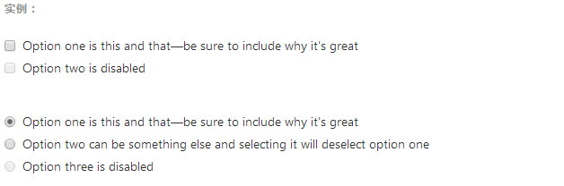
注意:写法也是用label 来包裹,与text password 不太相同 如下
<div class="checkbox">
<label>
<input type="checkbox" value="">
Option one is this and that—be sure to include why it's great
</label>
</div>
<div class="checkbox disabled">
<label>
<input type="checkbox" value="" disabled>
Option two is disabled
</label>
</div> <div class="radio">
<label>
<input type="radio" name="optionsRadios" id="optionsRadios1" value="option1" checked>
Option one is this and that—be sure to include why it's great
</label>
</div>
<div class="radio">
<label>
<input type="radio" name="optionsRadios" id="optionsRadios2" value="option2">
Option two can be something else and selecting it will deselect option one
</label>
</div>
<div class="radio disabled">
<label>
<input type="radio" name="optionsRadios" id="optionsRadios3" value="option3" disabled>
Option three is disabled
</label>
</div>
内联单选和多选框
通过将 .checkbox-inline 或 .radio-inline 类应用到一系列的多选框(checkbox)或单选框(radio)控件上,可以使这些控件排列在一行。
---恢复内容结束---
day 59 Bootstrap学习的更多相关文章
- Bootstrap~学习笔记索引
回到占占推荐博客索引 bootstrap已经用了有段时间了,感觉在使用上还是比较容易接受的,在开发人员用起来上,也还好,不用考虑它的兼容性,手机,平台,PC都可以有效的兼容. bootstrap官方a ...
- Bootstrap学习(3)
Bootstrap 图片 Bootstrap 对图片的支持.Bootstrap 提供了三个可对图片应用简单样式的 class: .img-rounded:添加 border-radius:6px 来 ...
- BootStrap学习(2)
使用Bootstrap添加代码框 可先看:简介.引入.包下载等:http://www.cnblogs.com/0201zcr/p/4900062.html Bootstrap 允许您以两种方式显示代码 ...
- Bootstrap 学习(1)
简介 Bootstrap,来自 Twitter,是目前最受欢迎的前端框架.Bootstrap 是基于 HTML.CSS.JAVASCRIPT 的,它简洁灵活,使得 Web 开发更加快捷. Bootst ...
- 前端框架——BootStrap学习
BootStrap简单总结下:1.栅格系统,能够很好的同时适应手机端和PC端(及传说中的响应式布局) 2.兼容性好 接下来是对BootStrap学习的一些基础案例总结和回顾: 首先引入:bootstr ...
- bootstrap学习总结-css样式设计(一)
由于项目需要,所以打算好好学习下bootstrap框架,之前了解一点,框架总体不难,但涉及到的东西还是很多,想要熟练掌握它,还是要多练练. 一:bootstrap是什么? bs是什么? 即前端页面搭 ...
- Bootstrap学习笔记(二) 表单
在Bootstrap学习笔记(一) 排版的基础上继续学习Bootstrap的表单,编辑器及head内代码不变. 3-1 基础表单 单中常见的元素主要包括:文本输入框.下拉选择框.单选按钮.复选按钮.文 ...
- BootStrap学习之先导篇——响应式网页
Bootstrap学习之前,要知道响应式网页的原理. 1.什么是响应式网页? 一个页面,可以根据浏览设备的不同,以及特性的不同,而自动改变布局.大小等.使得在不同的设备上上都可以呈现优秀的界面. 优点 ...
- bootstrap学习笔记之为导航条添加标题、二级菜单及状态 http://www.imooc.com/code/3120
为导航条添加标题.二级菜单及状态 加入导航条标题 在Web页面制作中,常常在菜单前面都会有一个标题(文字字号比其它文字稍大一些),其实在Bootstrap框架也为大家做了这方面考虑,其通过" ...
随机推荐
- java有关构造器的面试题详解
1,编译器只会提供自动提供一个默认的无参数的构造函数 2,如果程序员没有给类A没有提供构造函数,则编译器会自动提供一个默认的无参数的构造函数,如果用户提供了自己的构造函数,则编译器就不在提供默认的无参 ...
- [Linux]Linux下yaf发送IPV4和IPV6的IPfix
一.IPFIX与NetFlow 一.IPFIX 全称IP Flow Information Export,即IP流信息输出,是网络流量监测的国际标准.IPFIX是IETF的一个工作组,它的主要工作就是 ...
- 十九. Python基础(19)--异常
十九. Python基础(19)--异常 1 ● 捕获异常 if VS异常处理: if是预防异常出现, 异常处理是处理异常出现 异常处理一般格式: try: <............. ...
- 深入理解java虚拟机---java虚拟机内存管理(六)
java虚拟机栈的理解 虚拟机栈就是我们所熟知的栈内存,栈内存属于线程独有的.而在栈内存中的局部变量表中存储的引用类型只是存储对象的内存地址.对象的创建在堆内存中,即对象在线程共享区中. 局部变量表: ...
- HashMap中hashCode()和equals()重要性
Java中HashMap根据hashCode()和equals()方法来获取键值对的索引,同时也通过这两个方法由key值获取value值.如果没有这两个方法,那么当有两个相同的 hash值时,可能会被 ...
- DevExpress v18.1新版亮点——CodeRush for VS篇(二)
用户界面套包DevExpress v18.1日前正式发布,本站将以连载的形式为大家介绍各版本新增内容.本文将介绍了CodeRush for Visual Studio v18.1 的新功能,快来下载试 ...
- tensorflow-优化器
优化器可以通俗的理解成梯度下降那一套流程. 梯度下降 基本流程 a. 损失函数 b. 求导,计算梯度 c. 更新参数 d. 迭代下一批样本 可以对照着理解tf. tf 优化器 正常使用流程 a. 创建 ...
- kubernetes 环境搭建(ubuntu16.04)
通过kubeadm安装kubernetes的教程:1: 首先在每台机器上安装: docker(1.12), kubeadm(1.6), kubectl, kubelet, kubernetes-cni ...
- FutureTask
因为实现了runnable接口,所以重写了run方法 Future接口如果用在多线程中,实现类一般是有一个volatile的属性,用来标志状态,比如state,如果事情做完了,那么会设置state为成 ...
- webstorm安装流程
第一步:双击安装目录 修改安装目录 尽量不要放在C盘 第二步: 把汉化包 直接复制文件到WebStorm安装目录中lib文件夹中即可,重新打开WebStorm就可以了