BootStrap学习(2)
使用Bootstrap添加代码框
可先看:简介、引入、包下载等:http://www.cnblogs.com/0201zcr/p/4900062.html
Bootstrap 允许您以两种方式显示代码:
- 第一种是 <code> 标签。如果您想要内联显示代码,那么您应该使用 <code> 标签。
- 第二种是 <pre> 标签。如果代码需要被显示为一个独立的块元素或者代码有多行,那么您应该使用 <pre> 标签。
请确保当您使用 <pre> 和 <code> 标签时,开始和结束标签使用了 unicode 变体: <(代表“<”) 和 >(代表">")。
让我们来看看下面的实例:
<!DOCTYPE html>
<html>
<head>
<meta http-equiv="Content-Type" content="text/html; charset=UTF-8">
<title>Bootstrap 实例 - 代码</title>
<link href="http://libs.baidu.com/bootstrap/3.0.3/css/bootstrap.min.css" rel="stylesheet">
<script src="http://libs.baidu.com/jquery/2.0.0/jquery.min.js"></script>
<script src="http://libs.baidu.com/bootstrap/3.0.3/js/bootstrap.min.js"></script>
</head>
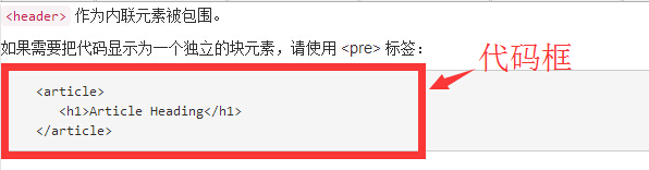
<body> <p><code><header></code> 作为内联元素被包围。</p>
<p>如果需要把代码显示为一个独立的块元素,请使用 <pre> 标签:</p>
<pre>
<article>
<h1>Article Heading</h1>
</article>
</pre> </body>
</html>
结果:
Bootstrap 按钮的使用
任何带有 class .btn 的元素都会继承圆角灰色按钮的默认外观。但是 Bootstrap 提供了一些选项来定义按钮的样式,具体如下表所示:
以下样式可用于<a>, <button>, 或 <input> 元素上:
| 类 | 描述 |
|---|---|
| .btn | 为按钮添加基本样式 |
| .btn-default | 默认/标准按钮 |
| .btn-primary | 原始按钮样式(未被操作) |
| .btn-success | 表示成功的动作 |
| .btn-info | 该样式可用于要弹出信息的按钮 |
| .btn-warning | 表示需要谨慎操作的按钮 |
| .btn-danger | 表示一个危险动作的按钮操作 |
| .btn-link | 让按钮看起来像个链接 (仍然保留按钮行为) |
| .btn-lg | 制作一个大按钮 |
| .btn-sm | 制作一个小按钮 |
| .btn-xs | 制作一个超小按钮 |
| .btn-block | 块级按钮(拉伸至父元素100%的宽度) |
| .active | 按钮被点击 |
| .disabled | 禁用按钮 |
下面的实例演示了上面所有的按钮 class:
<!DOCTYPE html>

<html>

<head>

    <!-- 设置html中能显示中文  -->

    <meta http-equiv="Content-Type" content="text/html; charset=UTF-8">

   <title>Bootstrap 实例 - 按钮选项</title>

   <link rel="stylesheet" href="http://apps.bdimg.com/libs/bootstrap/3.3.0/css/bootstrap.min.css">

   <script src="http://apps.bdimg.com/libs/jquery/2.1.1/jquery.min.js"></script>

   <script src="http://apps.bdimg.com/libs/bootstrap/3.3.0/js/bootstrap.min.js"></script>

</head>

<body>

<!-- 标准的按钮 -->

<button type="button" class="btn btn-default">默认按钮</button>

<!-- 提供额外的视觉效果,标识一组按钮中的原始动作 -->

<button type="button" class="btn btn-primary">原始按钮</button>

<!-- 表示一个成功的或积极的动作 -->

<button type="button" class="btn btn-success">成功按钮</button>

<!-- 信息警告消息的上下文按钮 -->

<button type="button" class="btn btn-info">信息按钮</button>

<!-- 表示应谨慎采取的动作 -->

<button type="button" class="btn btn-warning">警告按钮</button>

<!-- 表示一个危险的或潜在的负面动作 -->

<button type="button" class="btn btn-danger">危险按钮</button>

<!-- 并不强调是一个按钮,看起来像一个链接,但同时保持按钮的行为 -->

<button type="button" class="btn btn-link">链接按钮</button>

</body>

</html>
结果如下图所示:

改变按钮大小
下表列出了获得各种大小按钮的 class:
| Class | 描述 |
|---|---|
| .btn-lg | 这会让按钮看起来比较大。 |
| .btn-sm | 这会让按钮看起来比较小。 |
| .btn-xs | 这会让按钮看起来特别小。 |
| .btn-block | 这会创建块级的按钮,会横跨父元素的全部宽度。 |
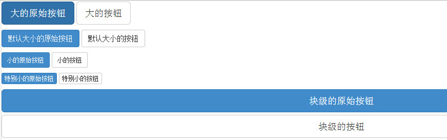
下面的实例演示了上面所有的按钮 class:
<!DOCTYPE html>

<html>

<head>

    <!-- 设置html中能显示中文  -->

    <meta http-equiv="Content-Type" content="text/html; charset=UTF-8">

   <title>Bootstrap 实例 - 按钮大小</title>

   <link rel="stylesheet" href="http://apps.bdimg.com/libs/bootstrap/3.3.0/css/bootstrap.min.css">

   <script src="http://apps.bdimg.com/libs/jquery/2.1.1/jquery.min.js"></script>

   <script src="http://apps.bdimg.com/libs/bootstrap/3.3.0/js/bootstrap.min.js"></script>

</head>

<body>

<p>

   <button type="button" class="btn btn-primary btn-lg">

      大的原始按钮

   </button>

   <button type="button" class="btn btn-default btn-lg">

      大的按钮

   </button>

</p>

<p>

   <button type="button" class="btn btn-primary">

      默认大小的原始按钮

   </button>

   <button type="button" class="btn btn-default">

      默认大小的按钮

   </button>

</p>

<p>

   <button type="button" class="btn btn-primary btn-sm">

      小的原始按钮

   </button>

   <button type="button" class="btn btn-default btn-sm">

      小的按钮

   </button>

</p>

<p>

   <button type="button" class="btn btn-primary btn-xs">

      特别小的原始按钮

   </button>

   <button type="button" class="btn btn-default btn-xs">

      特别小的按钮

   </button>

</p>

<p>

   <button type="button" class="btn btn-primary btn-lg btn-block">

      块级的原始按钮

   </button>

   <button type="button" class="btn btn-default btn-lg btn-block">

      块级的按钮

   </button>

</p>

</body>

</html>
结果如下图所示:
改变按钮状态
Bootstrap 提供了激活、禁用等按钮状态的 class,下面将进行详细讲解。
激活状态
按钮在激活时将呈现为被按压的外观(深色的背景、深色的边框、阴影)。
下表列出了让按钮元素和锚元素呈激活状态的 class:
| 元素 | Class |
|---|---|
| 按钮元素 | 添加 .active class 来显示它是激活的。 |
| 锚元素 | 添加 .active class 到 <a> 按钮来显示它是激活的。 |
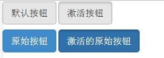
下面的实例演示了这点:
<!DOCTYPE html>

<html>

<head>

    <!-- 设置html中能显示中文  -->

    <meta http-equiv="Content-Type" content="text/html; charset=UTF-8">

   <title>Bootstrap 实例 - 按钮激活状态</title>

   <link rel="stylesheet" href="http://apps.bdimg.com/libs/bootstrap/3.3.0/css/bootstrap.min.css">

   <script src="http://apps.bdimg.com/libs/jquery/2.1.1/jquery.min.js"></script>

   <script src="http://apps.bdimg.com/libs/bootstrap/3.3.0/js/bootstrap.min.js"></script>

</head>

<body>

<p>

   <button type="button" class="btn btn-default btn-lg ">

      默认按钮

   </button>

   <button type="button" class="btn btn-default btn-lg active">

      激活按钮

   </button>

</p>

<p>

   <button type="button" class="btn btn-primary btn-lg ">

      原始按钮

   </button>

   <button type="button" class="btn btn-primary btn-lg active">

      激活的原始按钮

   </button>

</p>

</body>

</html>
显示如下图所示:
禁用状态
当您禁用一个按钮时,它的颜色会变淡 50%,并失去渐变。
下表列出了让按钮元素和锚元素呈禁用状态的 class:
| 元素 | Class |
|---|---|
| 按钮元素 | 添加 disabled 属性 到 <button> 按钮。 |
| 锚元素 | 添加 disabled class 到 <a> 按钮。 注意:该 class 只会改变 <a> 的外观,不会改变它的功能。在这里,您需要使用自定义的 JavaScript 来禁用链接。 |
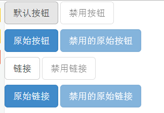
下面的实例演示了这点:
<!DOCTYPE html>

<html>

<head>

    <!-- 设置html中能显示中文  -->

    <meta http-equiv="Content-Type" content="text/html; charset=UTF-8">

   <title>Bootstrap 实例 - 按钮禁用状态</title>

   <link rel="stylesheet" href="http://apps.bdimg.com/libs/bootstrap/3.3.0/css/bootstrap.min.css">

   <script src="http://apps.bdimg.com/libs/jquery/2.1.1/jquery.min.js"></script>

   <script src="http://apps.bdimg.com/libs/bootstrap/3.3.0/js/bootstrap.min.js"></script>

</head>

<body>

<p>

   <button type="button" class="btn btn-default btn-lg">

      默认按钮

   </button>

   <button type="button" class="btn btn-default btn-lg" disabled="disabled">

      禁用按钮

   </button>

</p>

<p>

   <button type="button" class="btn btn-primary btn-lg ">

      原始按钮

   </button>

   <button type="button" class="btn btn-primary btn-lg" disabled="disabled">

      禁用的原始按钮

   </button>

</p>

<p>

   <a href="#" class="btn btn-default btn-lg" role="button">

      链接

   </a>

   <a href="#" class="btn btn-default btn-lg disabled" role="button">

      禁用链接

   </a>

</p>

<p>

   <a href="#" class="btn btn-primary btn-lg" role="button">

      原始链接

   </a>

   <a href="#" class="btn btn-primary btn-lg disabled" role="button">

      禁用的原始链接

   </a>

</p>

</body>

</html>
显示结果如下:
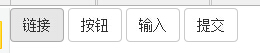
按钮标签
您可以在 <a>、<button> 或 <input> 元素上使用按钮 class。但是建议您在 <button> 元素上使用按钮 class,避免跨浏览器的不一致性问题。
下面的实例演示了这点:
<!DOCTYPE html>

<html>

<head>

    <!-- 设置html中能显示中文  -->

    <meta http-equiv="Content-Type" content="text/html; charset=UTF-8">

   <title>Bootstrap 实例 - 按钮标签</title>

   <link rel="stylesheet" href="http://apps.bdimg.com/libs/bootstrap/3.3.0/css/bootstrap.min.css">

   <script src="http://apps.bdimg.com/libs/jquery/2.1.1/jquery.min.js"></script>

   <script src="http://apps.bdimg.com/libs/bootstrap/3.3.0/js/bootstrap.min.js"></script>

</head>

<body>

<a class="btn btn-default" href="#" role="button">链接</a>

<button class="btn btn-default" type="submit">按钮</button>

<input class="btn btn-default" type="button" value="输入">

<input class="btn btn-default" type="submit" value="提交">

</body>

</html>
显示结果如下:
Bootstrap学习(3):http://www.cnblogs.com/0201zcr/p/4905234.html
致谢:感谢您的阅读!
BootStrap学习(2)的更多相关文章
- Bootstrap~学习笔记索引
回到占占推荐博客索引 bootstrap已经用了有段时间了,感觉在使用上还是比较容易接受的,在开发人员用起来上,也还好,不用考虑它的兼容性,手机,平台,PC都可以有效的兼容. bootstrap官方a ...
- Bootstrap学习(3)
Bootstrap 图片 Bootstrap 对图片的支持.Bootstrap 提供了三个可对图片应用简单样式的 class: .img-rounded:添加 border-radius:6px 来 ...
- Bootstrap 学习(1)
简介 Bootstrap,来自 Twitter,是目前最受欢迎的前端框架.Bootstrap 是基于 HTML.CSS.JAVASCRIPT 的,它简洁灵活,使得 Web 开发更加快捷. Bootst ...
- 前端框架——BootStrap学习
BootStrap简单总结下:1.栅格系统,能够很好的同时适应手机端和PC端(及传说中的响应式布局) 2.兼容性好 接下来是对BootStrap学习的一些基础案例总结和回顾: 首先引入:bootstr ...
- bootstrap学习总结-css样式设计(一)
由于项目需要,所以打算好好学习下bootstrap框架,之前了解一点,框架总体不难,但涉及到的东西还是很多,想要熟练掌握它,还是要多练练. 一:bootstrap是什么? bs是什么? 即前端页面搭 ...
- Bootstrap学习笔记(二) 表单
在Bootstrap学习笔记(一) 排版的基础上继续学习Bootstrap的表单,编辑器及head内代码不变. 3-1 基础表单 单中常见的元素主要包括:文本输入框.下拉选择框.单选按钮.复选按钮.文 ...
- BootStrap学习之先导篇——响应式网页
Bootstrap学习之前,要知道响应式网页的原理. 1.什么是响应式网页? 一个页面,可以根据浏览设备的不同,以及特性的不同,而自动改变布局.大小等.使得在不同的设备上上都可以呈现优秀的界面. 优点 ...
- bootstrap学习笔记之为导航条添加标题、二级菜单及状态 http://www.imooc.com/code/3120
为导航条添加标题.二级菜单及状态 加入导航条标题 在Web页面制作中,常常在菜单前面都会有一个标题(文字字号比其它文字稍大一些),其实在Bootstrap框架也为大家做了这方面考虑,其通过" ...
- bootstrap学习笔记之基础导航条 http://www.imooc.com/code/3111
基础导航条 在Bootstrap框中,导航条和导航从外观上差别不是太多,但在实际使用中导航条要比导航复杂得多.我们先来看导航条中最基础的一个--基础导航条. 使用方法: 在制作一个基础导航条时,主要分 ...
随机推荐
- 【原创】SQLServer将数据导出为SQL脚本的方法
最近很多同学问到一个问题,如何将MSSQLServer的数据库以及里面的数据导出为SQL脚本,主要问的是MSSQLServer2000和2005,因为2008的管理器已经有了这个功能,2000和200 ...
- 字符串模板替换方法 MessageFormat.format
String content = "ab,cc,{名称},{密码},{日期},dd,ff"; String array[] = {userName, password, forma ...
- 七个结构模式之代理模式(Proxy Pattern)
定义: 给某一个对象提供一个代理或者占位符,并由代理类来控制对原对象的访问.代理对象在客户端和实际对象之间启到了中介作用,并且强调了代理类对原对象的控制作用.例如:安全代理.缓冲代理.远程代理等. 结 ...
- 搭建自己的ngrok服务(国内直接可用http://qydev.com/#)
ngrok 服务可以分配给你一个域名让你本地的web项目提供给外网访问, 特别适合向别人展示你本机的web demo 以及调试一些远程的API (比如微信公众号,企业号的开发) ngrok的官方服务可 ...
- DOM相关知识点以及原型
DOM(增删改查): 查询 1.获取元素 1.1标准DOM API document.getElementById document.getElementsByTagName document.get ...
- Voix.js – 使用声音来控制和操纵你的网站
我们通常使用鼠标和键盘(在移动端使用触摸)来操作网站,如今 Voix.js 能够让我们使用声音控制网站,很酷吧?它可以启动和停止侦听麦克风,在检测到一个给定的关键字时触发绑定的特定事件.Voix.js ...
- C++11新特性 lambda表达式
C++11 添加了了一个名为lambda表达式的功能,可以用于添加匿名函数 语法: [capture_block](parameter) mutable exception_specification ...
- AngularJS学习笔记之依赖注入
最近在看AngularJS权威指南,由于各种各样的原因(主要是因为我没有money,好讨厌的有木有......),于是我选择了网上下载电子版的(因为它不要钱,哈哈...),字体也蛮清晰的,总体效果还不 ...
- JavaScript强化教程——JavaScript 总结
本教程中我们向您讲授了如何向 html 页面添加 JavaScript,使得网站的动态性和交互性更强. 你已经学习了如何创建对事件的响应,验证表单,以及如何根据不同的情况运行不同的脚本. 你也学到了如 ...
- Windows下安装scikit-learn
Windows下安装scikit-learn 准备工作 Python (>= 2.6 or >= 3.3), Numpy (>= 1.6.1) Scipy (>= 0.9), ...