
利用js来画图形(例如:条状图,圆饼图等)
背景:java开发的过程中,需要对数据进行可视化,这样方便客户理解此时的数据状态
语言:java,js,window7,echarts包文件
sample的例子下面的参照
https://www.echartsjs.com/examples/en/editor.html?c=line-sections
html
<!DOCTYPE html>

<html lang="en" xmlns:th="http://www.thymeleaf.org">

<head>

<meta name="viewport" charset="UTF-8"

	content="target-densitydpi=device-dpi, width=device-width, initial-scale=1, user-scalable=no, minimum-scale=1.0, maximum-scale=1.0" />

<title></title>

<meta name="viewport"

	content="width=device-width, initial-scale=1, minimum-scale=1, maximum-scale=1" />

<script th:src="@{jquery/js/jquery-3.2.0.min.js}" type="text/javascript"></script>

<script th:src="@{echarts/js/echarts.js}" type="text/javascript"></script>

<script th:src="@{js/testCharts.js}" type="text/javascript"></script>

</head>

<body>

	<div id="conditions">

		<table>

			<tr>

				<td><label>検索条件:</label></td>

				<td><input type="radio" name="month" id="month"

					onclick="choseMonthOrDay(this)" /><label>月</label>

				</td>

				<td><input type="radio" name="month" id="month"

					onclick="choseMonthOrDay(this)" /><label>年</label>

				</td>

				<td><input type="button" onclick="beforRet()"

					style="background-color: #3987e4; width: 83px; height: 44px; border: 0;"

					value="戻る"></input></td>

			</tr>

		</table>

	</div>

	<div id="chart"></div>

	<!-- 	<div id="chart"></div> -->

</body>

</html>
js
$(document).ready(function() {

//	$("#conditions").css("height", $(window).height()*0.1);

//	$("#conditions").css("background-color", "#000000");

//	alert($(window).width())

	$("#chart").css("height", $(window).height()*0.8);

	window.onresize = function() {

//		$("#chart").css("height", $(window).height()*0.1);

		$("#conditions").css("height", $(window).height()*0.8);

	}

	var dataList

	$.ajax({

		url : "/testCharts/selectData",

		type : 'post',

		data : {

			"habitSeq" : "2",

			"value" : "01"

		},

		cache : false,

		async : true,

		success : function(data) {

			dataList = JSON.parse(data);

			chartsDisplay(dataList)

		}

	});

})

function chartsDisplay(dataList) {

	if (dataList.length != 0) {

		var xAxisList = new Array();

		var yAxisList = new Array();

		for (var i = 0; i < dataList.length; i++) {

			xAxisList[i] = (dataList[i]["maxInsDateTime"]);

			yAxisList[i] = (dataList[i]["totalPrice"]);

		}

		var echart = echarts.init(document.getElementById('chart'));

		var option = {

			baseOption : {

				title : {

					text : '店舗売上状況',

					subtext : '売上分析'

				},

				legend : {

					data : [ '当月売上', '金額' ]

				},

				xAxis : {

					data : xAxisList

				// [ '周一', '周二', '周三', '周四', '周五', '周六', '周日' ]

				},

				yAxis : {

				},

				tooltip : {

					show : true,

					formatter : '売上:{a}<br />日付:{b}<br />値:{c}'

				},

				series : [ {

					name : '当月売上',

					type : 'bar',

					data : yAxisList ,// [ 200, 312, 431, 241, 175, 275,

											// 369

					// ],

					markPoint : {

						data : [ {

							type : 'max',

							name : '最大値'

						}, {

							type : 'min',

							name : '最小値'

						} ]

					},

					markLine : {

						data : [ {

							type : 'average',

							name : '平均値',

							itemStyle : {

								normal : {

									color : 'green'

								}

							}

						} ]

					}

				}, {

					name : '金額',

					type : 'line',

					data :  yAxisList , // [ 321, 432, 543, 376, 286, 298,

											// 400

					// ],

					markPoint : {

						data : [ {

							type : 'max',

							name : '最大値'

						}, {

							type : 'min',

							name : '最小値'

						} ]

					},

					markLine : {

						data : [ {

							type : 'average',

							name : '平均値',

							itemStyle : {

								normal : {

									color : 'blue'

								}

							}

						} ]

					}

				} ]

			},

			media : [ {

				// 小与1000像素时候响应

				query : {

					maxWidth : 1000

				},

				option : {

					title : {

						show : true,

						text : '测试一下'

					}

				}

			} ]

		};

		// 每次窗口大小改变的时候都会触发onresize事件,这个时候我们将echarts对象的尺寸赋值给窗口的大小这个属性,从而实现图表对象与窗口对象的尺寸一致的情况

		window.onresize = echart.resize*0.8;

		echart.setOption(option);

	}

}
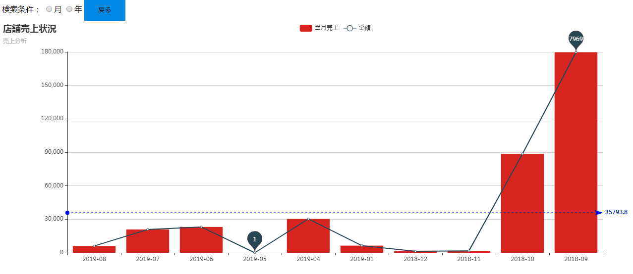
效果:
’
利用js来画图形(例如:条状图,圆饼图等)的更多相关文章
- HighCharts之2D堆条状图
HighCharts之2D堆条状图 1.HighCharts之2D堆条状图源码 StackedBar.html: <!DOCTYPE html> <html> <head ...
- HighCharts之2D条状图
HighCharts之2D条状图 1.HighCharts之2D条状图源码 bar.html: <!DOCTYPE html> <html> <head> < ...
- Excel 2010高级应用-条状图(五)
Excel 2010高级应用-条状图(五) 基本操作如下: 1.新建一个Excel空白文档,并命名条状图 2.单击"插入",找到条状图的样图 3.选择其中一种类型的条状图样图,在空 ...
- Flex实现双轴条状图
1.问题背景 一般的,柱状图可以实现双轴图,但是如何实现双轴条状图? 2.实现实例 <?xml version="1.0" encoding="utf-8" ...
- python中matplotlib绘图封装类之折线图、条状图、圆饼图
DrawHelper.py封装类源码: import matplotlib import matplotlib.pyplot as plt import numpy as np class DrawH ...
- Matplotlib基本图形之饼状图
Matplotlib基本图形之饼状图 饼状图特点: 饼状图显示一个数据系列中各项大小与各项总和的比例饼状图的数据点显示为整个饼状图的百分比 示例代码 import os import time imp ...
- d3.js(v5.7)树状图
一.新建画布 二.数据处理 三.绘制连接线 图示: 四.绘制节点.文字 图示: 五.总结 path元素:其实就是定义了绘图的坐标点,从哪开始,移动到哪,怎样移动(命令) 具体可百度(或许以后我会总结一 ...
- maplotlib python 玩具绘图 横向纵向条状图
from matplotlib import font_manager#解决zh-han图形汉字乱码 my_font = font_manager.FontProperties(fname=" ...
- MS Chart 条状图【转】
private void Form1_Load(object sender, EventArgs e) { string sql1 = "select 类别,coun ...
随机推荐
- 微信程序开发之-WeixinJSBridge调用
微信的WeixinJSBridge还是很厉害的,虽然官方文档只公布了3个功能,但是还内置的很多功能没公布,但是存在.今天就好好和大家聊聊 功能1------发送给好友 代码如下: functi ...
- CentOS6.5配置
关闭防火墙 查看防火墙状态 /etc/init.d/iptables status 停止 /etc/init.d/iptables stop 开机不启动 chkconfig iptables off ...
- postgres高可用学习篇一:如何通过patroni如何管理3个postgres节点
环境: CentOS Linux release 7.6.1810 (Core) 内核版本:3.10.0-957.10.1.el7.x86_64 node1:192.168.216.130 node2 ...
- Spring源码窥探之:注解方式的AOP原理
AOP入口代码分析 通过注解的方式来实现AOP1. @EnableAspectJAutoProxy通过@Import注解向容器中注入了AspectJAutoProxyRegistrar这个类,而它在容 ...
- 对于模块加载:ES6、CommonJS、AMD、CMD的区别
运行和编译的概念 编译包括编译和链接两步. 编译,把源代码翻译成机器能识别的代码或者某个中间状态的语言. 比如java只有JVM识别的字节码,C#中只有CLR能识别的MSIL.还简单的作一些比如检查有 ...
- etcd增删改查
方法
在实际开发中LayoutInflater这个类还是非常有用的,它的作用类似于findViewById().不同点是LayoutInflater是用来找res/layout/下的xml布局文件,并且实例 ...