炫酷的 CSS 形状(值得收藏)
在今日头条中看到炫酷的 CSS 形状,就记录一下:
1.圆形
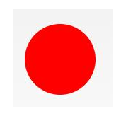
#circle {

 width: 100px;

 height: 100px;

 background: red;

 border-radius: 50%

}
2.椭圆形
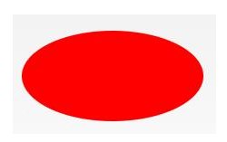
#oval {

width: 200px;

height: 100px;

background: red;

border-radius: 100px / 50px;

}
3.上三角

#triangle-up {

 width:;

 height:;

 border-left: 50px solid transparent;

 border-right: 50px solid transparent;

 border-bottom: 100px solid red;

}
4.星星 (5角)
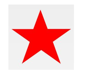
#star-five {

margin: 50px 0;

position: relative;

display: block;

color: red;

width: 0px;

height: 0px;

border-right: 100px solid transparent;

border-bottom: 70px solid red;

border-left: 100px solid transparent;

transform: rotate(35deg);

}

#star-five:before {

border-bottom: 80px solid red;

border-left: 30px solid transparent;

border-right: 30px solid transparent;

position: absolute;

height:;

width:;

top: -45px;

left: -65px;

display: block;

content: '';

transform: rotate(-35deg);

}

#star-five:after {

position: absolute;

display: block;

color: red;

top: 3px;

left: -105px;

width: 0px;

height: 0px;

border-right: 100px solid transparent;

border-bottom: 70px solid red;

border-left: 100px solid transparent;

transform: rotate(-70deg);

content: '';

}
5.爱心

#heart {

position: relative;

width: 100px;

height: 90px;

}

#heart:before,

#heart:after {

position: absolute;

content: "";

left: 50px;

top:;

width: 50px;

height: 80px;

background: red;

border-radius: 50px 50px 0 0;

transform: rotate(-45deg);

transform-origin: 0 100%;

}

#heart:after {

left:;

transform: rotate(45deg);

transform-origin: 100% 100%;

}
6.对话泡泡
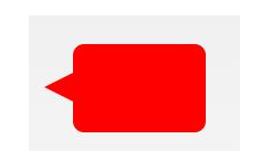
#talkbubble {

 width: 120px;

 height: 80px;

 background: red;

 position: relative;

 -moz-border-radius: 10px;

 -webkit-border-radius: 10px;

 border-radius: 10px;

}

#talkbubble:before {

 content: "";

 position: absolute;

 right: 100%;

 top: 26px;

 width:;

 height:;

 border-top: 13px solid transparent;

 border-right: 26px solid red;

 border-bottom: 13px solid transparent;

}
7.徽章丝带

#badge-ribbon {

 position: relative;

 background: red;

 height: 100px;

 width: 100px;

 border-radius: 50px;

}

#badge-ribbon:before,

#badge-ribbon:after {

 content: '';

 position: absolute;

 border-bottom: 70px solid red;

 border-left: 40px solid transparent;

 border-right: 40px solid transparent;

 top: 70px;

 left: -10px;

 transform: rotate(-140deg);

}

#badge-ribbon:after {

 left: auto;

 right: -10px;

 transform: rotate(140deg);

}
8.放大镜
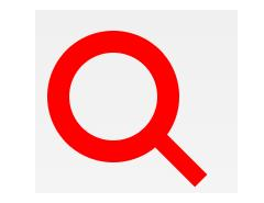
#magnifying-glass {

 font-size: 10em;

 display: inline-block;

 width: 0.4em;

 box-sizing: content-box;

 height: 0.4em;

 border: 0.1em solid red;

 position: relative;

 border-radius: 0.35em;

}

#magnifying-glass:before {

 content: "";

 display: inline-block;

 position: absolute;

 right: -0.25em;

 bottom: -0.1em;

 border-width:;

 background: red;

 width: 0.35em;

 height: 0.08em;

 transform: rotate(45deg);

}
9.锁

#lock {

 font-size: 8px;

 position: relative;

 width: 18em;

 height: 13em;

 border-radius: 2em;

 top: 10em;

 box-sizing: border-box;

 border: 3.5em solid red;

 border-right-width: 7.5em;

 border-left-width: 7.5em;

 margin: 0 0 6rem 0;

}

#lock:before {

 content: "";

 box-sizing: border-box;

 position: absolute;

 border: 2.5em solid red;

 width: 14em;

 height: 12em;

 left: 50%;

 margin-left: -7em;

 top: -12em;

 border-top-left-radius: 7em;

 border-top-right-radius: 7em;

}

#lock:after {

 content: "";

 box-sizing: border-box;

 position: absolute;

 border: 1em solid red;

 width: 5em;

 height: 8em;

 border-radius: 2.5em;

 left: 50%;

 top: -1em;

 margin-left: -2.5em;

}
更多炫酷的 CSS 形状的原链接:https://www.toutiao.com/i6693373488746463747/
炫酷的 CSS 形状(值得收藏)的更多相关文章
- >炫酷的计时器效果Canvas绘图与动画<
>炫丽的计时器效果Canvas绘图与动画< 虽然我是学习java的,但是因为最近使用html5的关系,多学习了一下前端知识. 现在,我要介绍的计时器是十分炫酷的,使用画布完成. 喜欢htm ...
- 45个值得收藏的 CSS 形状
摘要: CSS炫技. 原文:45个值得收藏的 CSS 形状 作者:前端小智 Fundebug经授权转载,版权归原作者所有. CSS能够生成各种形状.正方形和矩形很容易,因为它们是 web 的自然形状. ...
- 前端学习——css基础知识,选择器与html模板、值得收藏的html标签
一.css需要的html(采用html5标准) DTD,文档类型声明: <!Doctype html> 文本编码声明: <meta charset="utf-8" ...
- 纯CSS炫酷的3D旋转
<html><head><meta charset="utf-8"><title>纯CSS炫酷的3D旋转</title> ...
- 学习animate.css包含了一组炫酷、有趣、跨浏览器的动画
1.animate.css包含了一组炫酷.有趣.跨浏览器的动画,可以在你的项目中直接使用. 第一步:引入animate.css样式文件或者引入某些平台的CDN文件: <head> < ...
- div+css样式命名规则,值得收藏
div+css样式命名规则,值得收藏 头:header 内容:content/container 尾:footer 导航:nav 侧栏:sidebar 栏目:column 页面外围控制整体布局宽度:w ...
- 使用css实现炫酷的横屏滚动效果
炫酷的横屏滚动效果css实现 DEMO: https://codepen.io/kobako/pen/BxVLLm 我们对滚动条都不陌生.平时浏览的网页,进度条通常是垂直方向的,内容从上往下排列.但是 ...
- 炫酷的CSS3抖动样式:CSS Shake
CSS Shake是一个使用CSS3实现的动画样式,使用SASS编写,利用它我们可以实现多种不同样式的抖动效果(如下面的GIF图像): 炫酷的CSS3抖动样式:CSS Shake 这是一个很微小的动画 ...
- 百度前端技术学院2018笔记 之 利用 CSS animation 制作一个炫酷的 Slider
前言 题目地址 利用 CSS animation 制作一个炫酷的 Slider 思路整理 首先页面包含三种东西 一个是type为radio的input其实就是单选框 二是每个单选框对应的label 三 ...
随机推荐
- STM32F407 IO引脚复用器和映射 个人笔记
基本概念 stm32有一些内置外设,每个外设有一个复用功能AF(Alternate functions). stm32的每个io引脚东路有一个16路复用器,该复用器一端连该引脚,另外16端连AF0~A ...
- mongodb shell 无法删除问题
1.MongoDB Shell中退格键使用的问题. 利用SecureCRT工具访问linux的时候,在使用MongoDB的交互式shell的时候,退格键(Backspace)无法使用,导致无 法修改输 ...
- 常见问题:Linux安装Python3步骤、Windows无法利用pip
Linux安装python3.6和第三方库的步骤: 我的Linux是CentOS 6.5版本 Linux下大部分系统默认自带python2.x的版本,最常见的是python2.6或python2.7, ...
- [NOIP2008] 提高组 洛谷P1149 火柴棒等式
题目描述 给你n根火柴棍,你可以拼出多少个形如“A+B=C”的等式?等式中的A.B.C是用火柴棍拼出的整数(若该数非零,则最高位不能是0).用火柴棍拼数字0-9的拼法如图所示: 注意: 加号与等号各自 ...
- web文件管理系统和日志实时监控工具
https://blog.csdn.net/xuesong123/article/details/52752384
- Meeting 加虚拟边
Bessie and her friend Elsie decide to have a meeting. However, after Farmer John decorated his fence ...
- 深入理解hadoop(三)
Hadoop多用户作业调度器 hadoop 最初是为批处理作业设计的,当时只采用了一个简单的FIFO调度机制分配任务,随着hadoop的普及以及应用的用户越来越多,基于FIFO的单用户调度机制不能很好 ...
- Ubuntu 16.04安装Intel显卡驱动(解决Intel HD Graphics 630显卡驱动问题)
一般Ubuntu都默认包含了Intel显卡的驱动,如果没有,那么先确定是不是显卡太高,比如I7第7代的CPU核显在Ubuntu 16.04中是没有的,导致画面会很卡,原因是Linux 4.4内核不包含 ...
- C#写的NoSQL开源项目/系统(系列)
http://www.cnblogs.com/unruledboy/archive/2013/01/07/CSharpNoSQL.html 闲扯 好久没写开源项目了,也没写对新开源项目的介绍,今晚看了 ...
- mainboard
MAINBOARD ★ CPU(type, speed, amount, cache, slot or socket, fan) ★ RAM(the most capacity, amount, fr ...