ChartControl 折线图 柱状图
https://documentation.devexpress.com/#WindowsForms/CustomDocument8117
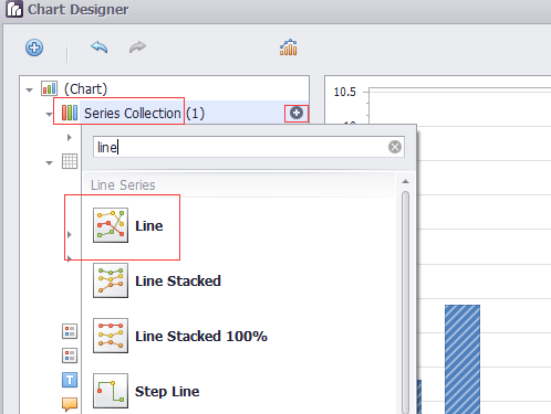
添加折线图(柱状图)
拖动ChartControl到Form上
在Series Collection中添加Line(或Bar)
DevExpress.XtraCharts.Series series1 = new DevExpress.XtraCharts.Series();

   DevExpress.XtraCharts.LineSeriesView lineSeriesView1 = new DevExpress.XtraCharts.LineSeriesView();

  series1.View = lineSeriesView1;
   this.chartControl1.SeriesSerializable = new DevExpress.XtraCharts.Series[] {

        series1,

        series2,

        series3,

        series4};
Legend
位置
AlignmentHorizontal 设置为Center
AlignmentVertical 设置为BottomOutside
Direction 设置为LeftToRight
  this.chartControl1.Legend.AlignmentHorizontal = DevExpress.XtraCharts.LegendAlignmentHorizontal.Center;

            this.chartControl1.Legend.AlignmentVertical = DevExpress.XtraCharts.LegendAlignmentVertical.BottomOutside;

            this.chartControl1.Legend.Direction = DevExpress.XtraCharts.LegendDirection.LeftToRight;
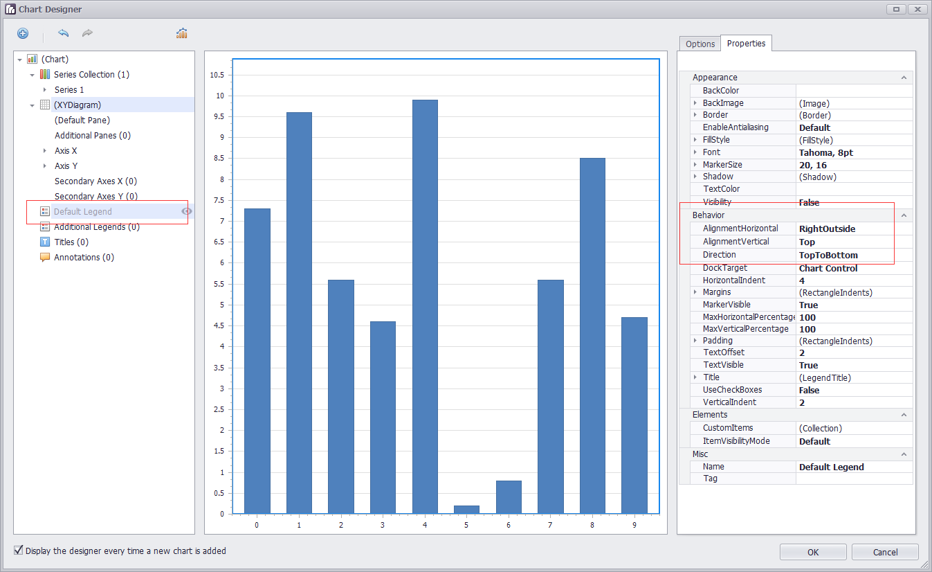
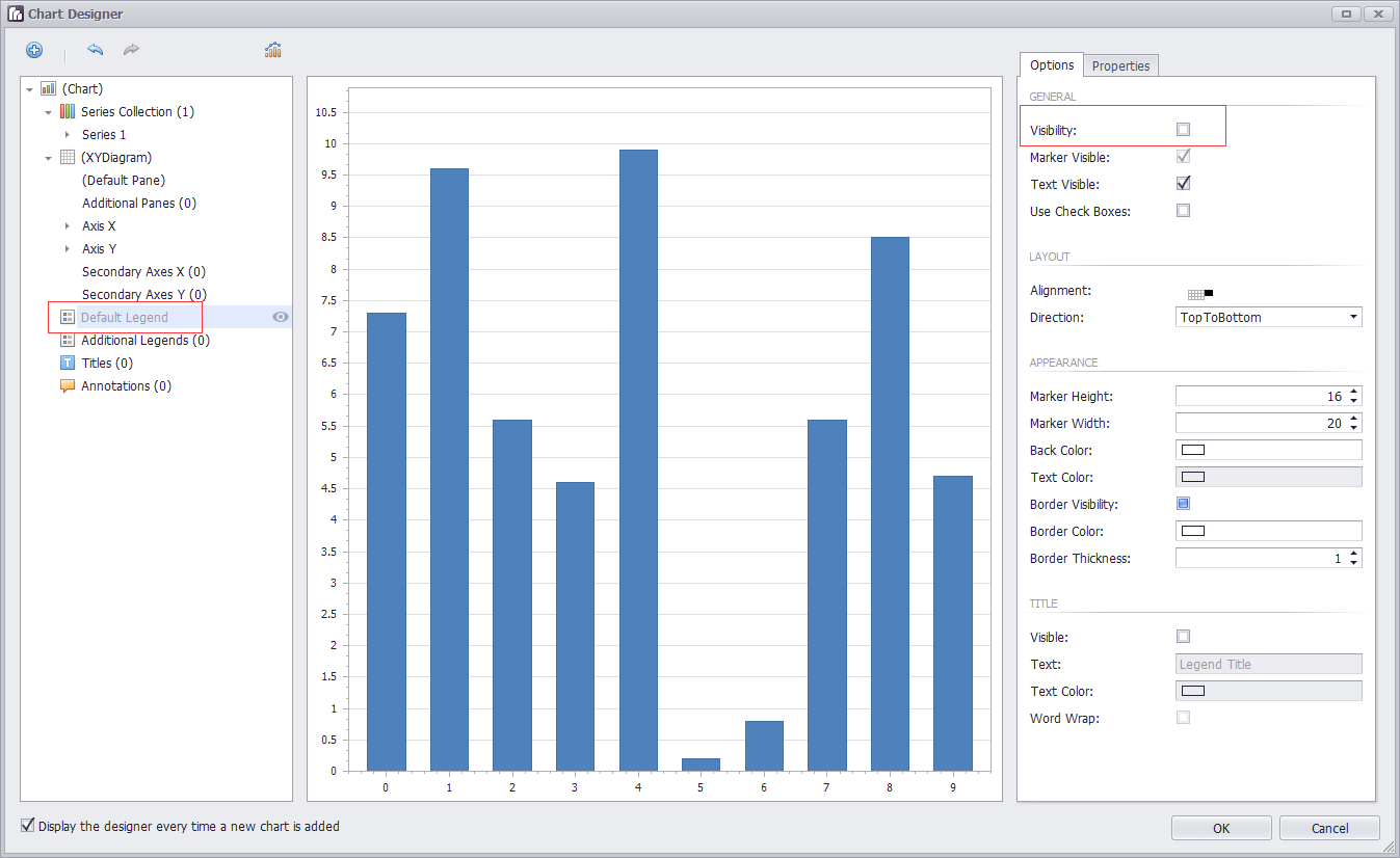
可见性
直接在界面上选中Legend,设置Visibility
曲线上的点显示
设置Marker Visibility
  series1.LegendText = "空调用电";

            series1.Name = "Series 1";

            lineSeriesView1.MarkerVisibility = DevExpress.Utils.DefaultBoolean.True;
调整: 可以直接设置series1.Name = "空调用电"; 这样的话,鼠标在悬浮的时候,显示某一列的数据时,对应曲线名字可以对应上。无需设置LegendText
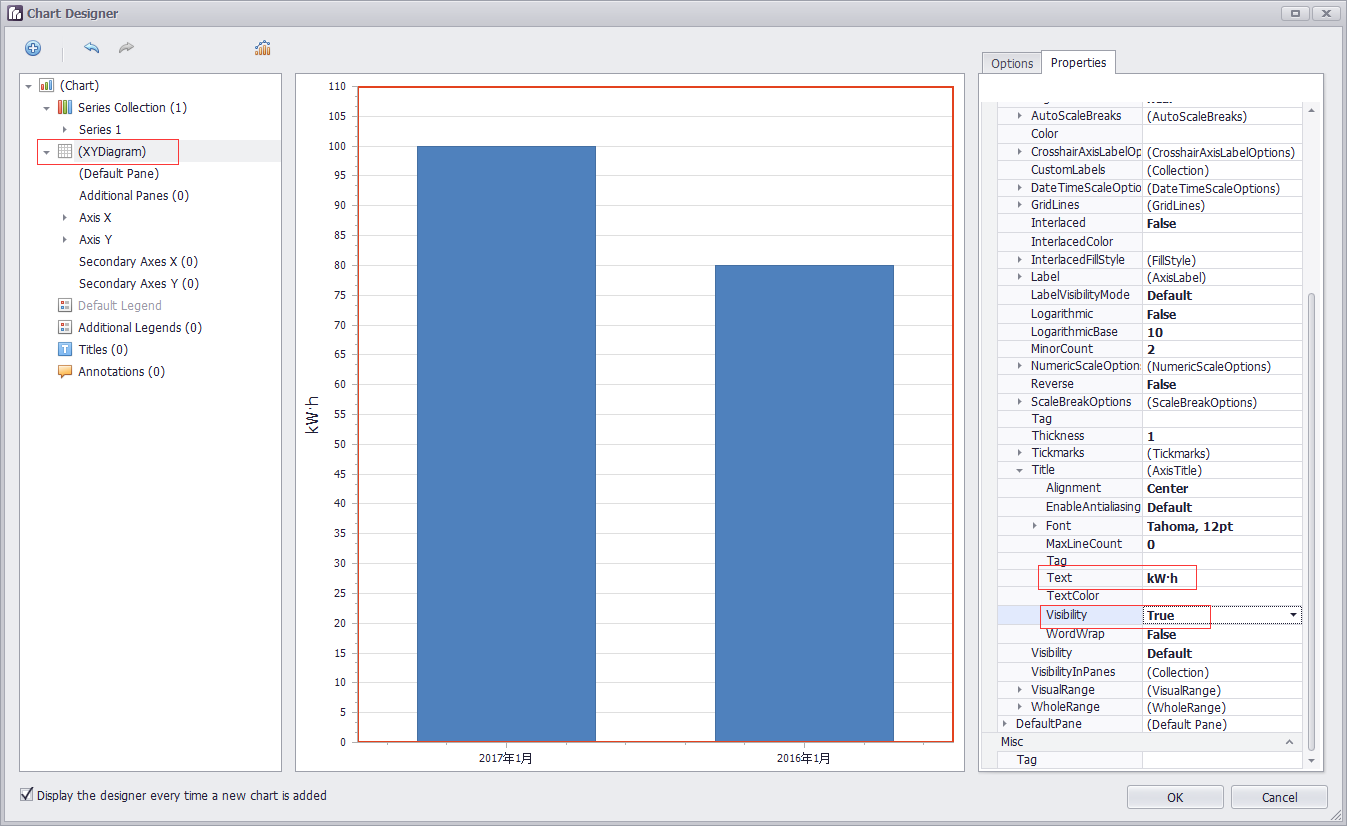
坐标轴
https://documentation.devexpress.com/#WindowsForms/CustomDocument5779
坐标轴标题
DevExpress.XtraCharts.XYDiagram xyDiagram1 = new DevExpress.XtraCharts.XYDiagram();
xyDiagram1.AxisX.Title.Text = "时间";

            xyDiagram1.AxisX.Title.Visibility = DevExpress.Utils.DefaultBoolean.True;

            xyDiagram1.AxisX.VisibleInPanesSerializable = "-1";

            xyDiagram1.AxisY.Title.Text = "用电量(KW·h)";

            xyDiagram1.AxisY.Title.Visibility = DevExpress.Utils.DefaultBoolean.True;

            xyDiagram1.AxisY.VisibleInPanesSerializable = "-1";

            this.chartControl1.Diagram = xyDiagram1;
坐标轴类型
https://documentation.devexpress.com/#WindowsForms/CustomDocument5799
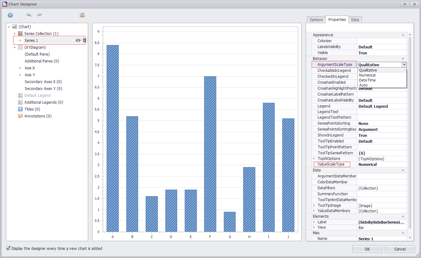
首先设置曲线的ArgumentScaleType 【横轴是argument,纵轴是value】
series1.ArgumentScaleType = DevExpress.XtraCharts.ScaleType.DateTime;
设置好之后,坐标轴那边会自动出现DateTimeScaleOptions的属性
横轴自定义(同比,环比) series1.ArgumentScaleType = DevExpress.XtraCharts.ScaleType.Qualitative;
坐标轴范围
https://documentation.devexpress.com/#WindowsForms/CustomDocument5803
Visual Ranges and Whole Ranges
坐标轴的滑动
            xyDiagram1.EnableAxisXScrolling = true;

            xyDiagram1.EnableAxisYScrolling = true;
            xyDiagram1.AxisY.VisualRange.Auto = false;

            xyDiagram1.AxisY.VisualRange.MaxValueSerializable = "10";

            xyDiagram1.AxisY.VisualRange.MinValueSerializable = "0";

            xyDiagram1.AxisY.WholeRange.Auto = false;

            xyDiagram1.AxisY.WholeRange.MaxValueSerializable = "100";

            xyDiagram1.AxisY.WholeRange.MinValueSerializable = "0";
Visual Range的范围小于WholeRange的范围确保了有滑动的可能
获取坐标轴
XYDiagram diagram = chart.Diagram as XYDiagram;

if (diagram != null) {

    diagram.AxisY.Title.Text = "Population mid-year, millions";

}
图表的标题
Titles处add一个
            DevExpress.XtraCharts.ChartTitle chartTitle1 = new DevExpress.XtraCharts.ChartTitle();

            chartTitle1.Text = "图表标题";

            this.chartControl1.Titles.AddRange(new DevExpress.XtraCharts.ChartTitle[] {

            chartTitle1});
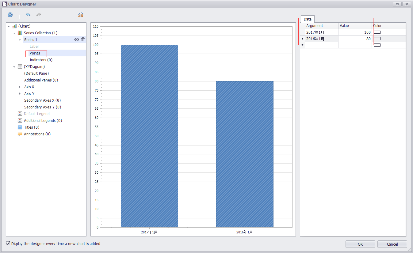
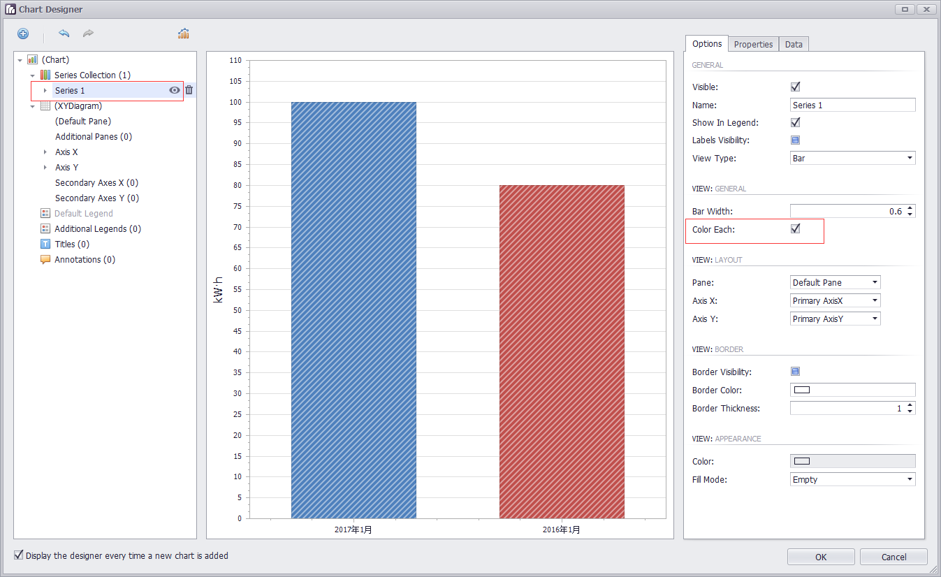
柱状图
设置柱子
选中Series,展开,选中Points,设置Data中的Argument和Value
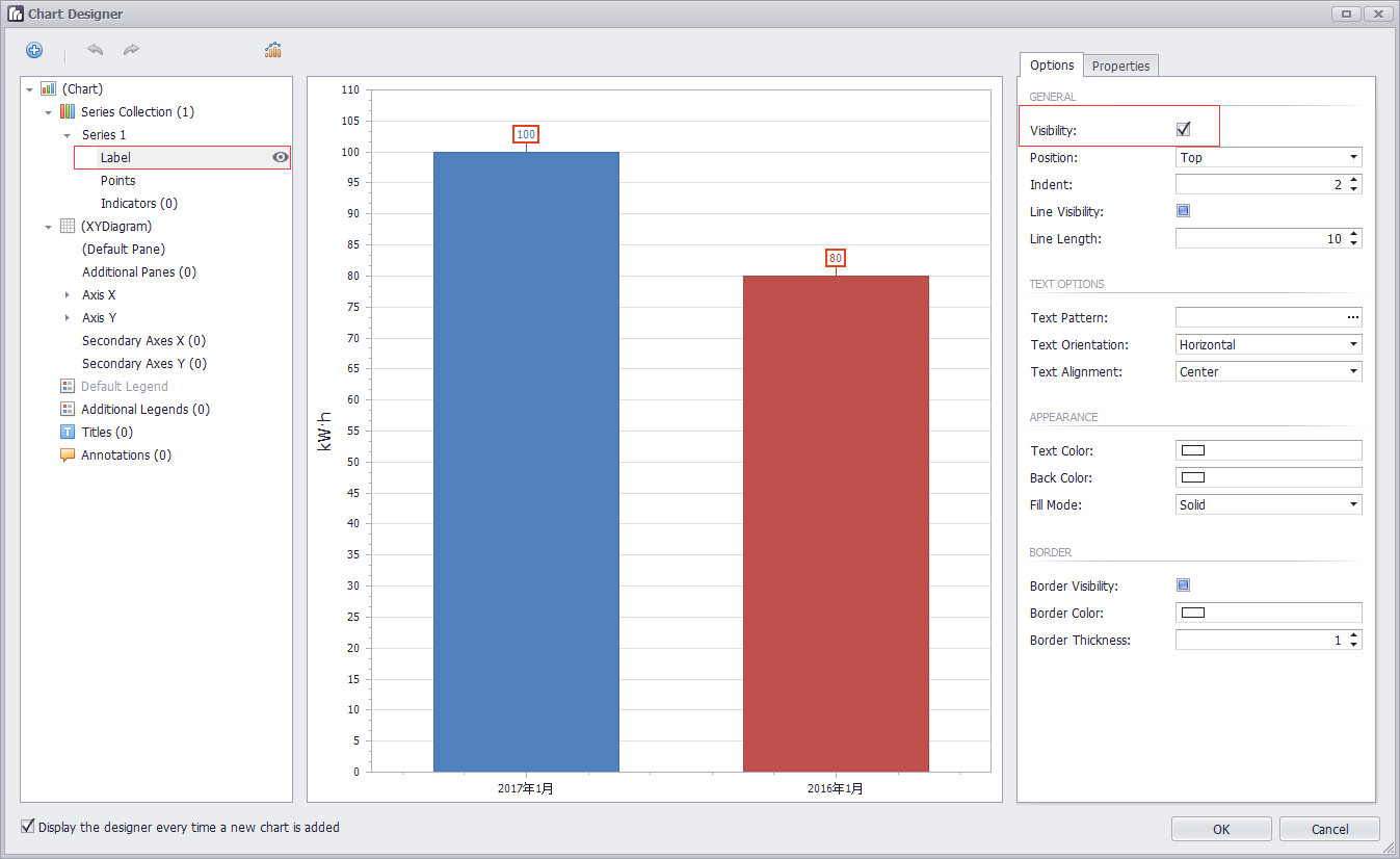
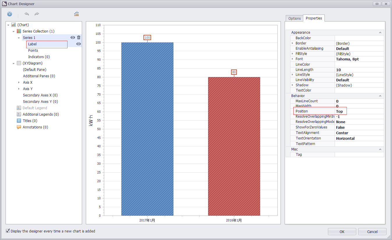
设置数值显示的位置
case "Top":
label.Position = BarSeriesLabelPosition.Top;
设置柱子的颜色
每一个柱子的颜色不同: 只需要在run designer界面,设置ColorEach就会自动生成如下代码
DevExpress.XtraCharts.SideBySideBarSeriesView sideBySideBarSeriesView1 = new DevExpress.XtraCharts.SideBySideBarSeriesView();
sideBySideBarSeriesView1.ColorEach = true;
series1.View = sideBySideBarSeriesView1;
动态设置柱状图横轴上的点
chartControl1.Series[0].Points[0].Argument = dateTime.ToString($"yyyy年第{week}周");
chartControl1.Series[0].Points[1].Argument = dateTime.AddDays(-7).ToString($"yyyy年第{week1}周");
==========================================
关于刻度
https://documentation.devexpress.com/#WindowsForms/CustomDocument18209
Tickmarks are dashes of different sizes and shapes that mark scale values with the specific step.
There are two types of tickmarks - major tickmarks that are able to display related scale values and minor tickmarks,
which are dashes of a smaller size without text, located between two neighboring major tickmarks (see the figure below).
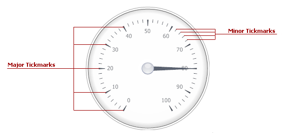
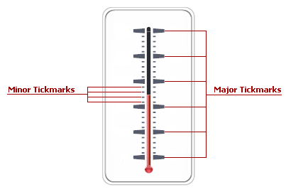
To specify the number of tickmarks, use the ArcScale.MajorTickCount and ArcScale.MinorTickCount properties (the LinearScale.MajorTickCount and LinearScale.MinorTickCount properties for linear scales).
MajorTickCount 控制从头到尾的大刻度的数量,假如范围从-20到40。要六等分,那么大刻度的数量是60/6+1=7
MinorTickCount 控制两个大刻度之间小刻度的数量,,假如小刻度的单位是1的话。那么小刻度的数量是10/1-1=9
Just like many other gauge elements, tickmarks can be painted using a specific brush object, assigned to the related properties within the ArcScaleComponent.AppearanceMajorTickmark(LinearScaleComponent.AppearanceMajorTickmark) and ArcScaleComponent.AppearanceMinorTickmark (LinearScaleComponent.AppearanceMinorTickmark) property sections.
Scales have two sets of properties that manage tickmarks of each type - the ArcScale.MajorTickmark and ArcScale.MinorTickmark properties
(the LinearScale.MajorTickmark and LinearScale.MinorTickmark properties for linear scales). These sections provide access to such properties as:
- IMajorTickmark.ShowTick (IMinorTickmark.ShowTick) - gets or sets if the tickmark dash should be displayed;
- IMajorTickmark.ShapeType (IMinorTickmark.ShapeType) - specifies the shape of the tickmark dash if dashes are displayed;
- IMajorTickmark.ShowText - allows you to display scale values for major tickmarks;
- IMajorTickmark.ShowFirst and IMajorTickmark.ShowLast - gets or sets if tickmarks for minimum and/or maximum values are enabled.
ChartControl 折线图 柱状图的更多相关文章
- v-charts 绘制柱状图、条形图、水球图、雷达图、折线图+柱状图,附官网地址
v-charts 官网地址:https://v-charts.js.org/#/ 柱状图: <template> <ve-histogram :data="chartDat ...
- 百度推出的echarts,制表折线图柱状图饼图等的超级工具(转)
一.简介: 1.绘制数据图表,有了它,想要网页上绘制个折线图.柱状图,从此easy. 2.使用这个百度的echarts.js插件,是通过把图片绘制在canvas上在显示在页面上. 官网对echarts ...
- 06. Matplotlib 2 |折线图| 柱状图| 堆叠图| 面积图| 填图| 饼图| 直方图| 散点图| 极坐标| 图箱型图
1.基本图表绘制 plt.plot() 图表类别:线形图.柱状图.密度图,以横纵坐标两个维度为主同时可延展出多种其他图表样式 plt.plot(kind='line', ax=None, figsiz ...
- OpenGL——折线图柱状图饼图绘制
折线图绘制代码: #include<iostream> //旧版本 固定管线 #include<Windows.h> #include <GL/glut.h> // ...
- G2 基本使用 折线图 柱状图 饼图 基本配置
G2的基本使用 1.浏览器引入 <!-- 引入在线资源 --> <script src="https://gw.alipayobjects.com/os/lib/antv ...
- echarts双y轴折线图柱状图混合实时更新图
先看下效果,自己用ps做了张gif图,发现很好玩啊..不喜勿喷 自己下载个echarts.min.js 直接上代码: <!DOCTYPE html><html><head ...
- echarts折线图柱状图的坐标轴的颜色及样式的设置
基本用法请查看echarts官网. 一.图例legend的设置. 1.字体和颜色的设置 textStyle:{ fontSize:15, color:'#fff' } 2.样式的设置 legend: ...
- JavaScript数据可视化编程学习(一)Flotr2,包含简单的,柱状图,折线图,饼图,散点图
一.基础柱状图 二.基础的折线图 三.基础的饼图 四.基础的散点图 一.基础柱状图 如果你还没有想好你的数据用什么类型的图表来展示你的数据,你应该首先考虑是否可以做成柱状图.柱状图可以表示数据的变化过 ...
- Qt数据可视化(散点图、折线图、柱状图、盒须图、饼状图、雷达图)开发实例
目录 散点图 折线图 柱状图 水平柱状图 水平堆叠图 水平百分比柱状图 盒须图 饼状图 雷达图 Qt散点图.折线图.柱状图.盒须图.饼状图.雷达图开发实例. 在开发过程中我们会使用多各种各样的图 ...
随机推荐
- Java jdbc 连接oracle之三(封装工具类)
driver = oracle.jdbc.driver.OracleDriver url = jdbc:oracle:thin:@192.168.10.105:1521:orcl user = LF ...
- eclipse配置项目
project facets -> dynamic web module 2.5 java -> 1.6 deployment assembly -> webapp Web Proj ...
- lua 类支持属性不能被修改
背景 lua是类是借助表的来实现的, 类被定义后, 在使用场景下, 不希望被修改.如果被修改, 则影响的类的原始定义, 影响所有使用类的地方. 例如: --- router.lua class fil ...
- NOI 09:奇数求和
描述 计算非负整数 m 到 n(包括m 和 n )之间的所有奇数的和,其中,m 不大于 n,且n 不大于300.例如 m=3, n=12, 其和则为:3+5+7+9+11=35. 输入 两个数 m 和 ...
- AIX UNIX 系统管理、维护与高可用集群建设——数据库结构设计
在对数据库类应用进行优化的过程中我们了解到一个原则,即思想上要从结构设计抓起,按照下面的顺序: 1.数据库逻辑结构设计和物理设计. 2.数据库对象部署和SQL代码编写. 3.数据库实例性能调整和优化. ...
- 使用git 更新线上代码
先本地代码合并://1合并分支git branch//2查看taggit tag //3添加tagcloud_crm]$ git tag -a v1.0.2 -m "0902"// ...
- eclipse设置汉化
1. 打开eclipse->help->install new software 2. 打开http://www.eclipse.org/babel/downloads.php,,,找到相 ...
- 创建支持eclipse的多模块maven项目
通过maven可以创建多个关联模块的项目(Multiple Module Projects).由一个总的模块,下面包含多个子模块(子模块还可以包含子模块). 这种maven功能能支持大型的项目构建,往 ...
- 接口测试第十二课(fidller过滤)(转)
转自: 经常有人问我,如何只抓手机上某个应用的请求包?在使用fiddler抓手机包的过程中,fiddler会话框上瞬间就满屏了,因为它不仅抓到手机上的请求数据包,也抓到了PC端的网络请求包.这时候很难 ...
- python之编写登陆接口(第一天)
作业:编写登陆接口 输入用户名密码 认证成功后显示欢迎信息 输错三次后锁定 针对此实例写了有二种类型的脚本,略有不同,具体如下: 帐号文件account.txt内容如下: sam 123 david ...