css3弹性盒子模型——回顾。
1.box-flex属性规定框的子元素是否可伸缩其尺寸。
父元素必须要声明display:box;子元素才可以用box-flex。
语法:box-flex:value;
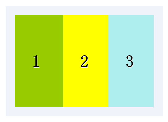
示例:
<style>
.test_box {display: -moz-box;display: -webkit-box;display:box;width: 800px;margin: 40px auto;padding: 20px;
background: #f0f3f9;}
.list {padding: 0 1em; font: bold 36px/200px monaco;text-shadow: 1px 1px #eee;}
.list_one { -moz-box-flex: 1;-webkit-box-flex: 1;box-flex: 1;background-color: yellow;}
.list_two{-moz-box-flex: 2;-webkit-box-flex: 2;box-flex: 2;background-color: #99CC00;}
.list_three {-moz-box-flex: 1;-webkit-box-flex: 1;box-flex: 1;background-color: paleturquoise;}
</style>
<div class="test_box">
<div class="list list_two">1</div>
<div class="list list_one">2</div>
<div class="list list_three">3</div>
</div>
结果: 图片
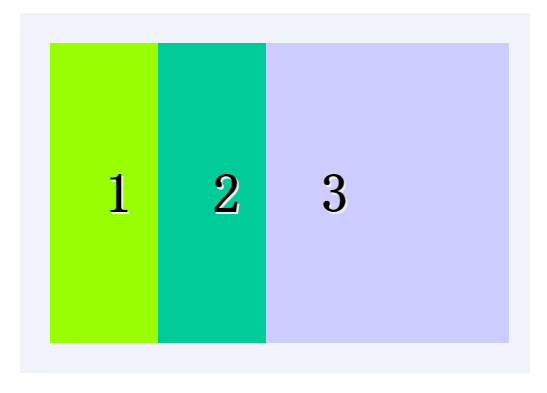
可以指定某个子元素的宽度,剩下的部分平分。
示例:
<style>
.test_box {display: -moz-box;display: -webkit-box;display: box;width: 800px;margin: 40px auto;padding: 20px;
background: #f0f3f9;}
.list {padding: 0 1em;font: bold 36px/200px monaco;
text-shadow: 1px 1px #eee;}
.list_one {-moz-box-flex: 1;-webkit-box-flex: 1;box-flex: 1;background: #00CC99;}
.list_two {-moz-box-flex: 2;-webkit-box-flex: 2;box-flex: 2;background: #99FF00;}
.list_w300 { width: 300px; background: #CCCCFF}
</style>
<div class="test_box">
<div class="list list_two">1</div>
<div class="list list_one">2</div>
<div class="list list_w300">3</div>
</div>
结果: 图片
2.box-orient
用来确定子元素的方向,是横着还是竖着。
可选值:horizontal | vertical | inline-axis | box-axis | inherit inline-axis是默认的 horizonta inline-axis 是一样的让元素横着 vertical
box-axis 是一样的让元素纵列。
示例:
<style>
.test_box {width: 300px; margin: 0 auto;display: -moz-box;
display: -webkit-box;display: box;box-orient:horizontal;padding: 20px;background: #f0f3f9;}
.list{padding: 0 1em;font: bold 36px/120px monaco; text-shadow: 1px 1px #eee;-webkit-box-flex: 1;}
.one{background: #99FF00;}
.two{background: #00CC99}
.three{background:#CCCC00}
</style>
<div class="test_box">
<div class="list one">1</div>
<div class="list two">2</div>
<div class="list three">3</div>
</div>
结果:如图

3.box-direction
用来确定子元素的排列顺序。可选值:
onrmal | revers | inherit onrmal是默认值按着正常顺序排列,从左到右
从前到后,revers表示反转。
示例:
<style>
.test_box {display: -moz-box;display: -webkit-box;display: box;-moz-box-direction:reverse;-webkit-box-direction:reverse;
box-direction:reverse;width: 300px;margin: 20px auto;padding: 10px;background: #f0f3f9;}
.list {padding: 0 1em;font: bold 36px/150px monaco;text-shadow: 1px 1px #eee;}
.list_one {-moz-box-flex: 1;-webkit-box-flex: 1;box-flex: 1;background: yellow;}
.list_two{-moz-box-flex: 2;-webkit-box-flex: 2;box-flex: 2;background: #99CC00;}
.three{background: #CCCCFF}
</style>
<div class="test_box">
<div class="list list_two">1</div>
<div class="list list_one">2</div>
<div class="list list_one three">3</div>
</div>
结果: 如图

4.box-align与box-pack
决定盒子内部剩余空间怎么使用,行为效果为对齐方式。
box-align 为垂直方向上的空间利用,box-pack 为水平方向上的空间利用。
box-align 可选参数: start | end | center | baseline | stretch
stretch为默认父标签的高度有多高,子元素就有多高。start表示底边对齐
end 为底部对齐,center居中对齐,baseline 基线对齐。
示例:
<style>
.test_box {margin: 0 auto;display: -moz-box;display: -webkit-box;
display: -o-box;display: box;-moz-box-align:end;
-webkit-box-align:end; -o-box-align:end; box-align:end;
width: 300px;height: 200px;padding: 20px;background: #f0f3f9;}
.list {padding: 0 1em;font: bold 36px/120px monaco;text-shadow: 1px 1px #eee;}
.one{background: #99FF00;}
.two{background: #00CC99}
.three{background:#CCCC00}
</style>
<div class="test_box">
<div class="list one">1</div>
<div class="list two" style="line-height:200px;">2</div>
<div class="list three">3</div>
</div>
结果:如图

box-pack可选值: start | end | center | justify
start为默认值, justify表示两端对齐。
示例:
<style>
.test_box {margin: 0 auto;display: -moz-box;display: -webkit-box;
display: -o-box;display: box;-moz-box-pack:justify;
-webkit-box-pack:justify; -o-box-pack:justify; box-pack:justify;
width: 300px;height: 200px;padding: 20px;background: #f0f3f9;}
.list {padding: 0 1em;font: bold 36px/120px monaco;
text-shadow: 1px 1px #eee;}
.one{background: #99FF00;}
.two{background: #00CC99}
.three{background:#CCCC00}
</style>
<div class="test_box">
<div class="list one">1</div>
<div class="list two" style="line-height:200px;">2</div>
<div class="list three">3</div>
</div>
结果:如图

5.box-lines
用来决定子元素是否可以换行显示,有两个可以选的值:single | mutiple
single 默认值,不换行。mutiple 换行多行显示。
示例:
<style>
.test_box {margin: 0 auto;display: -moz-box;display: -webkit-box;
display: -o-box;display: box;-moz-box-lines:multiple;
-webkit-box-lines:multiple;-o-box-lines:multiple;
box-lines:multiple; width: 300px;
height: 200px;padding: 20px;background: #f0f3f9;}
.list {padding: 0 1em;font: bold 36px/120px monaco;text-shadow: 1px 1px #eee;}
.one{background: #99FF00;}
.two{background: #00CC99}
.three{background:#CCCC00}
</style>
<div class="test_box">
<div class="list one">1</div>
<div class="list two" style="line-height:200px;">2</div>
<div class="list three">3</div>
</div>
结果:如图

6.box-ordinal-group
改变子元素的顺序,值为数字,数字越小越排在前面。
示例:
<style>
.test_box {display: -moz-box;display: -webkit-box;display: box;
width: 300px;margin: 40px auto;padding: 20px;background: #f0f3f9;}
.list {padding: 0 1em;font: bold 36px/200px monaco;text-shadow: 1px 1px #eee;}
.list_one {-moz-box-flex: 1;-webkit-box-flex: 1; box-flex: 1;
-moz-box-ordinal-group: 1;-webkit-box-ordinal-group: 1;box-ordinal-group: 1;background: #99CC00;}
.list_two{-moz-box-flex: 2;-webkit-box-flex: 2;box-flex: 2;-moz-box-ordinal-group: 2;-webkit-box-ordinal-group: 2;
box-ordinal-group: 2;background: #CC33CC;}
.three{ background: #CCCC00}
</style>
<div class="test_box">
<div class="list list_two">1</div>
<div class="list list_one">2</div>
<div class="list list_one three">3</div>
</div>
结果:如图

demo下载https://github.com/ningmengxs/css3.git
css3弹性盒子模型——回顾。的更多相关文章
- css3弹性盒子模型之box-flex
css3弹性盒子模型之box-flex 浏览器支持 目前没有浏览器支持 box-flex 属性. Firefox 支持替代的 -moz-box-flex 属性. Safari.Opera 以及 Chr ...
- css3弹性盒子模型
当下各种手机,平板尺寸不一,如果盒模型只能固定尺寸,不能随意压缩,将不能很好的迎合这个时代.所以css3推出了新的盒模型——弹性盒子模型(Flexible Box Model). 弹性盒模型可以水平布 ...
- CSS3中的弹性盒子模型
介绍 在css2当中,存在标准模式下的盒子模型和IE下的怪异盒子模型.这两种方案表示的是一种盒子模型的渲染模式.而在css3当中,新增加了弹性盒子模型,弹性盒子模型是一种新增加的强大的.灵活的布局方案 ...
- CSS3弹性盒模型flexbox布局基础版
原文链接:http://caibaojian.com/using-flexbox.html 最近看了社区上的一些关于flexbox的很多文章,感觉都没有我这篇文章实在,最重要的兼容性问题好多人都没有提 ...
- css3基础教程:CSS3弹性盒模型
今天给大家分享一篇关于CSS3基础教程 文章,主要是讲CSS3弹性盒模型.弹性布局的主要思想是让容器有能力来改变项目的宽度和高度,以填满可用空间(主要是为了容纳所有类型的显示设备和屏幕尺寸)的能力. ...
- CSS3弹性盒模型布局模块介绍
来源:Robert’s talk原文:http://robertnyman.com/2010/12/02/css3-flexible-box-layout-module-aka-flex-box-in ...
- flexbox弹性盒子模型
这几天在做移动端的web开发,遇到了一些问题,之前没有折腾过这方面的东西,这次好好吸收下 css3的flexbox--弹性盒子模型,这个盒模型决定了一个盒子在其他盒子中的分布方式及如何处理可用的空间. ...
- CSS box-flex属性,然后弹性盒子模型简介
今天做项目的时候发现一个css3的新属性flex 一.什么是flex 它的作用是能够按照设置好的规则来排列容器内的项目,而不必去计算每一个项目的宽度和边距.甚至是在容器的大小发生改变的时候,都可以重新 ...
- CSS box-flex属性,然后弹性盒子模型简介(转)
一.淡淡的开头语 昨天趁着不想工作的时间间隙闲逛24ways,在My CSS Wish List一文中,见到了个新鲜的CSS属性,就是题目中的box-flex,以前没有见过,顿生疑惑,不知是骡子还是马 ...
随机推荐
- 关于LCD以及BMP和RGB565
源: 关于LCD以及BMP和RGB565
- Mysql中Insert into xxx on duplicate key update问题
要点:Insert into xxx on duplicate key update可以在唯一索引重复的情况下,进行更新操作. (1) 插入里边的字段应该只有一个 唯一索引: ...
- 使用LIBUSB实现和自定义通讯设备通讯--MFC代码在末尾
LIBUSB是一款简单好用的USB通讯开发库,一般HID设备用该库通讯能大大降低开发周期,使用如下,首先需要为设备安装驱动 在libusb的bin目录下有一个inf_wirzed.exe的文件,该文件 ...
- 必须熟悉的vim快捷键操作
转载请表明出处http://www.dabu.info/?p=801 Vim/Vi 没有菜单,只有命令 Vim/Vi 工作模式介绍:插入模式 和 命令模式 是vi的两个基本模式.——插入模式 ,是用 ...
- S3C2440 ADC详解
S3C2440拥有八通道的十位ADC, 最大转换率为2.5MHz A/D转换器时钟下的500KSPS.A/D转换器支持片上采样-保持功能和掉电模式的操作. 八个通道中有四个通道适用于电阻屏的触摸屏触摸 ...
- phpcms的网页替换
//替换首页header:loge里面的首页不用替换<!DOCTYPE html PUBLIC "-//W3C//DTD XHTML 1.0 Transitional//EN" ...
- HDU 1255 覆盖的面积 ——(线段树+扫描线)
又做了一题扫描线以后对节点的覆盖标记理解的更加深刻了. 代码如下: #include <stdio.h> #include <algorithm> #include <s ...
- c#中反射
在.Net 中,程序集(Assembly)中保存了元数据(MetaData)信息,因此就可以通过分析元数据来获取程序集中的内容,比如类,方法,属性等,这大大方便了在运行时去动态创建实例. MSDN解释 ...
- 笔记整理--socket_server
epoll精髓 - 彭帅 - 博客园 - Google Chrome (2013/10/11 20:47:52) epoll精髓 在linux的网络编程中,很长的时间都在使用select来做事件触发. ...
- 基于Python,scrapy,redis的分布式爬虫实现框架
原文 http://www.xgezhang.com/python_scrapy_redis_crawler.html 爬虫技术,无论是在学术领域,还是在工程领域,都扮演者非常重要的角色.相比于其他 ...