[转]bootstrap栅格系统的属性及使用
本文转自:https://www.cnblogs.com/LJYqq/p/6791512.html
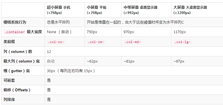
栅格系统
媒体查询
在栅格系统中,我们在 Less 文件中使用以下媒体查询(media query)来创建关键的分界点阈值。
 小屏幕(平板,大于等于 768px)

@media (min-width: @screen-sm-min) { ... }

 中等屏幕(桌面显示器,大于等于 992px)

@media (min-width: @screen-md-min) { ... }

 大屏幕(大桌面显示器,大于等于 1200px)

@media (min-width: @screen-lg-min) { ... }

我们偶尔也会在媒体查询代码中包含 max-width 从而将 CSS 的影响限制在更小范围的屏幕大小之内。
@media (max-width: @screen-xs-max) { ... }
@media (min-width: @screen-sm-min) and (max-width: @screen-sm-max) { ... }
@media (min-width: @screen-md-min) and (max-width: @screen-md-max) { ... }
@media (min-width: @screen-lg-min) { ... }
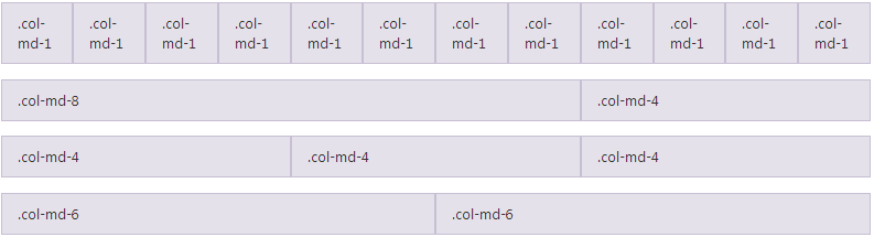
栅格参数
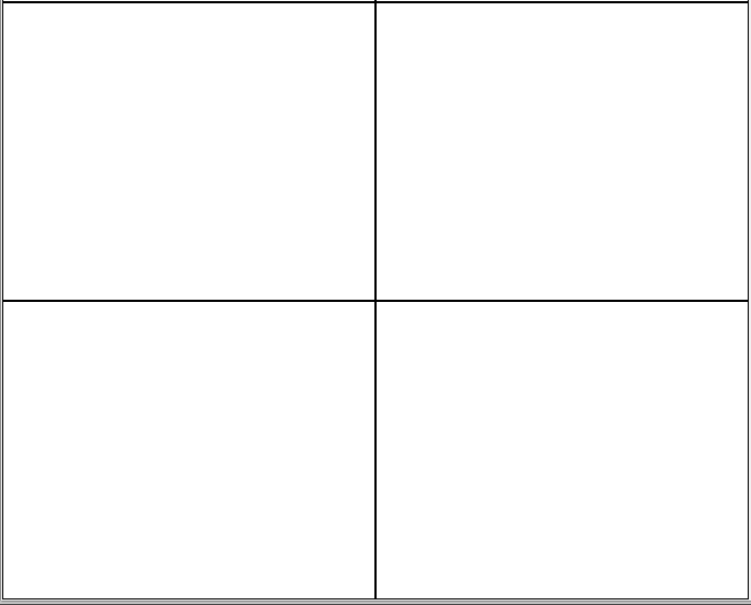
实例:从堆叠到水平排列
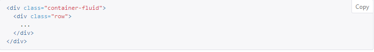
实例:流式布局容器
将最外面的布局元素 .container 修改为 .container-fluid,就可以将固定宽度的栅格布局转换为 100% 宽度的布局。
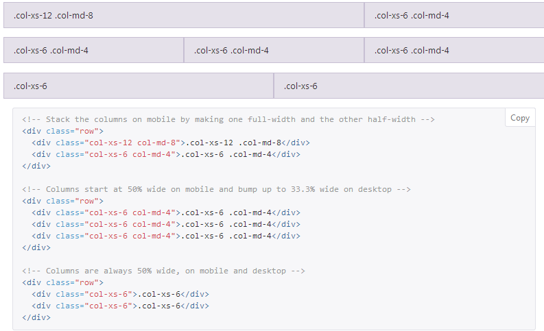
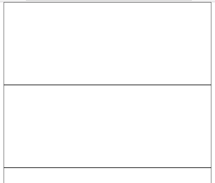
实例:移动设备和桌面屏幕
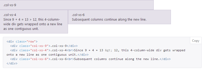
实例:多余的列(column)将另起一行排列
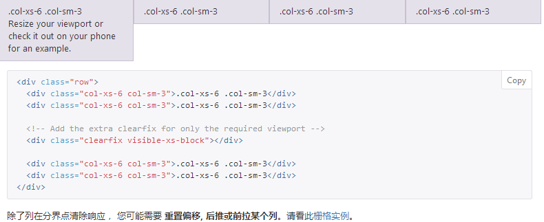
响应式列重置
即便有上面给出的四组栅格class,你也不免会碰到一些问题,例如,在某些阈值时,某些列可能会出现比别的列高的情况。为了克服这一问题,建议联合使用 .clearfix 和 响应式工具类。
列偏移
使用 .col-md-offset-* 类可以将列向右侧偏移。这些类实际是通过使用 * 选择器为当前元素增加了左侧的边距(margin)。例如,.col-md-offset-4 类将 .col-md-4 元素向右侧偏移了4个列(column)的宽度。
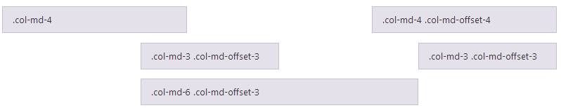
<div class="row">
<div class="col-md-4">.col-md-4</div>
<div class="col-md-4 col-md-offset-4">.col-md-4 .col-md-offset-4</div>
</div>
<div class="row">
<div class="col-md-3 col-md-offset-3">.col-md-3 .col-md-offset-3</div>
<div class="col-md-3 col-md-offset-3">.col-md-3 .col-md-offset-3</div>
</div>
<div class="row">
<div class="col-md-6 col-md-offset-3">.col-md-6 .col-md-offset-3</div>
</div>
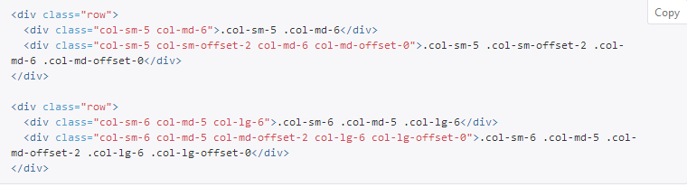
You can also override offsets from lower grid tiers with .col-*-offset-0 classes

<div class="row">
  <div class="col-xs-6 col-sm-4">
  </div>
  <div class="col-xs-6 col-sm-4">
  </div>
  <div class="col-xs-6 col-xs-offset-3 col-sm-4 col-sm-offset-0">
  </div>
</div>
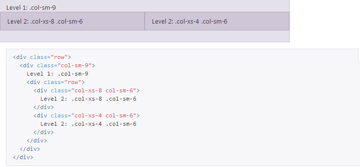
嵌套列
为了使用内置的栅格系统将内容再次嵌套,可以通过添加一个新的 .row 元素和一系列 .col-sm-* 元素到已经存在的 .col-sm-*元素内。被嵌套的行(row)所包含的列(column)的个数不能超过12(其实,没有要求你必须占满12列)。
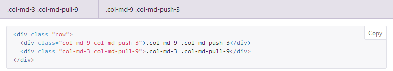
列排序
通过使用 .col-md-push-* 和 .col-md-pull-* 类就可以很容易的改变列(column)的顺序。
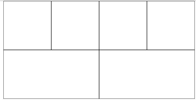
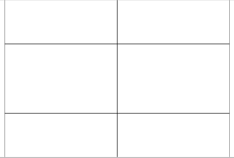
<head>
        <meta charset="UTF-8">
        <title></title>
        <link rel="stylesheet" href="css/bootstrap.css" />
        <style type="text/css">
            .row div{
                height: 300px;
                border: 2px solid black;
            }


        </style>


    </head>
    <body>

        <div class="container">
            <div class="row">
                <div class="col-sm-12 col-xs-6 col-lg-3  col-md-6"></div>
                <div class="col-sm-12 col-xs-6 col-lg-3  col-md-6"></div>
                <div class="col-sm-12 col-xs-6 col-lg-3  col-md-6"></div>
                <div class="col-sm-12 col-xs-6 col-lg-3  col-md-6"></div>
                <div class="col-sm-12 col-xs-6 col-lg-6  col-md-6"></div>
                <div class="col-sm-12 col-xs-6 col-lg-6  col-md-6"></div>
            </div>
        </div>
    </body>
[转]bootstrap栅格系统的属性及使用的更多相关文章
- bootstrap栅格系统的属性及使用
栅格系统 媒体查询 在栅格系统中,我们在 Less 文件中使用以下媒体查询(media query)来创建关键的分界点阈值. 小屏幕(平板,大于等于 768px) @media (min-width: ...
- 巧用 BootStrap --- 栅格系统(布局)轻松搞定网页响应式布局!
摘要:Bootstrap 为我们提供了一套响应式.移动设备优先的流式栅格系统,合理的使用栅格系统将会使得网站页面布局变得更加简单,在设置了媒体查询之后,响应式网站也无需再单独写了.接下来我以Boots ...
- Bootstrap 栅格系统初识
以下理论内容copy自bootstrap中文网(一个不错的bootstrap学习网站). 栅格系统 Bootstrap 提供了一套响应式.移动设备优先的流式栅格系统,随着屏幕或视口(viewport) ...
- 第二百三十五节,Bootstrap栅格系统
Bootstrap栅格系统 学习要点: 1.移动设备优先 2.布局容器 3.栅格系统 本节课我们主要学习一下 Bootstrap 的栅格系统,提供了一套响应式.移动设备优先的流 式栅格系统. 一.移动 ...
- Bootstrap栅格系统详解,响应式布局
Bootstrap栅格系统详解 栅格系统介绍 Bootstrap 提供了一套响应式.移动设备优先的流式栅格系统,随着屏幕或视口(viewport)尺寸的增加,系统会自动分为最多12列. 栅格系统用于通 ...
- Bootstrap 栅格系统(转载)
源地址:http://www.cnblogs.com/linjiqin/p/3559800.html Bootstrap 栅格系统 目录1.简介2.栅格选项3.列偏移4.嵌套列5.列排序 1.简介Bo ...
- Bootstrap栅格系统(布局)
栅格系统(布局) Bootstrap内置了一套响应式.移动设备优先的流式栅格系统,随着屏幕设备或视口(viewport)尺寸的增加,系统会自动分为最多12列. 我在这里是把Bootstrap中的栅格系 ...
- 初学bootstrap ---栅格系统
<!DOCTYPE html> <html lang="en"> <head> <meta charset="UTF-8&quo ...
- 入门——Bootstrap栅格系统
作为刚接触到Bootstrap框架的新手一枚,刚开始对Bootstrap中的栅格系统一脸懵逼,后来经过反复的上网查找资料以及自己一直在练习,总算对栅格系统了解个差不多,所以我将我所了解的当成是日记写下 ...
随机推荐
- 分形之谢尔宾斯基(Sierpinski)四面体
前面讲了谢尔宾斯基三角形,这一节的将对二维三角形扩展到三维,变成四面体.即将一个正四面体不停地拆分,每个正四面体可以拆分成四个小号的正四面体.由二维转变到三维实现起来麻烦了许多.三维的谢尔宾斯基四面体 ...
- Scott-Knott test 配置与使用
安装最新版本的 R R安装镜像 Download R 3.3.0 for Windows (62 megabytes, 32/64 bit) 理由 Scott-Knott 包由 R 3.2.5 编译的 ...
- ubuntu16.04 LTS把下载源改为阿里云的源
为什么要切换下载源到国内的源上? Ubuntu的中国服务器下载速度很慢,我们可以尝试修改软件更新源,这样下载和更新软件的速度会加快很多. 一.linux系统版本: ubuntukylin-16.04- ...
- mysql rand
在where语句中,rand有时候会出现多条记录
- Markdown中怎么上传图片
在网站中使用了Markdown编辑器,但是不能支持图片的直接粘贴
- 托管博客到coding或者github
1. 部署网站到github的pages服务 参考: <在Github上面搭建Hexo博客(一):部署到Github> <Hexo搭建独立博客,托管到Github和Coding上教程 ...
- QT中的一些信号
QLineEdit: 通过改变QLineEdit的echoMode(),可以设置其属性,比如以密码的形式输入. 文本的长度可以由maxLength()限制,可以通过使用validator()或者inp ...
- JavaScript基础(1)-ECMAScript
一.JavaScript简介 1.JavaScript历史背景 布兰登 • 艾奇(Brendan Eich,1961年-),1995年在网景公司,发明的JavaScript. 刚开始JavaScrip ...
- Doxygen的使用,配置及实例
Doxygen是一种开源跨平台的,以类似JavaDoc风格描述的文档系统,可以从一套归档源文件开始,生成文档 下载Doxygen + Graphviz Doxygen可以生成动态文档 Graphviz ...
- Python上下文管理协议:__enter__和__exit__
上下文管理器(context manager)是Python2.5开始支持的一种语法,用于规定某个对象的使用范围.一旦进入或者离开该使用范围,会有特殊操作被调用 (比如为对象分配或者释放内存).它的语 ...