
【Matplotlib】绘图常见设置说明
说明:此贴会不定期进行更新!
设置1:图像的大小设置。
如果已经存在figure对象,可以通过以下代码设置尺寸大小:
f.set_figheight(15)

f.set_figwidth(15)
若果通过.sublots()命令来创建新的figure对象, 可以通过设置figsize参数达到目的。
f, axs = plt.subplots(2,2,figsize=(15,15))
设置2:刻度和标注特殊设置
描述如下:在X轴标出一些重要的刻度点,当然实现方式有两种:直接在X轴上标注和通过注释annotate的形式标注在合适的位置。
其中第一种的实现并不是很合适,此处为了学习的目的一并说明下。
先说第一种:

正常X轴标注不会是这样的,为了说明此问题特意标注成这样,如此看来 0.3 和 0.4的标注重叠了,当然了解决重叠的问题可以通过改变figure 的size实现,显然此处并不想这样做。
怎么解决呢,那就在 0.3 和 0.4之间再设置一个刻度,有了空间后不显示即可。
代码如下:
# -*- coding: utf-8 -*-

import matplotlib.pyplot as plt

fig = plt.figure(figsize=(3, 3))

ax = fig.add_subplot(1, 1, 1, frameon=False)

ax.set_xlim(-0.015, 1.515)

ax.set_ylim(-0.01, 1.01)

ax.set_xticks([0, 0.3, 0.4, 1.0, 1.5])

#增加0.35处的刻度并不标注文本,然后重新标注0.3和0.4处文本

ax.set_xticklabels([0.0, "", "", 1.0, 1.5])

ax.set_xticks([0.35], minor=True)

ax.set_xticklabels(["0.3 0.4"], minor=True)

#上述设置只是增加空间,并不想看到刻度的标注,因此次刻度线不予显示。

for line in ax.xaxis.get_minorticklines():

line.set_visible(False)

ax.grid(True)

plt.show()
最终图像形式如下:

当然最合理的方式是采用注释的形式,比如:

代码如下:
# -*- coding: utf-8 -*-

import matplotlib.pyplot as plt

import numpy as np

# Plot a sinc function

delta=2.0

x=np.linspace(-10,10,100)

y=np.sinc(x-delta)

# Mark delta

plt.axvline(delta,ls="--",color="r")

plt.annotate(r"$\delta$",xy=(delta+0.2,-0.2),color="r",size=15)

plt.plot(x,y)
设置3:增加X轴与Y轴间的间隔,向右移动X轴标注一点点即可
显示效果对比:
设置前:

设置后:

两张的图像的差别很明显,代码如下:
# -*- coding: utf-8 -*-

import matplotlib.pyplot as plt

fig = plt.figure()

ax = fig.add_subplot(111)

plot_data=[1.7,1.7,1.7,1.54,1.52]

xdata = range(len(plot_data))

labels = ["2009-June","2009-Dec","2010-June","2010-Dec","2011-June"]

ax.plot(xdata,plot_data,"b-")

ax.set_xticks(range(len(labels)))

ax.set_xticklabels(labels)

ax.set_yticks([1.4,1.6,1.8])

# grow the y axis down by 0.05

ax.set_ylim(1.35, 1.8)

# expand the x axis by 0.5 at two ends

ax.set_xlim(-0.5, len(labels)-0.5)

plt.show()
设置4:移动刻度标注
上图说明需求:

通过设置 set_horizontalalignment()来控制标注的左右位置:
for tick in ax2.xaxis.get_majorticklabels():

	tick.set_horizontalalignment("left")
当然标注文本的上下位置也是可以控制的,比如:
ax2.xaxis.get_majorticklabels()[2].set_y(-.1)
当然控制刻度标注的上下位置也可以用labelpad参数进行设置:
pl.xlabel("...", labelpad=20)
或:
ax.xaxis.labelpad = 20
具体设置请查阅官方文档,完整的代码如下:
# -*- coding: utf-8 -*-

import matplotlib.pyplot as plt

import numpy as np

import datetime

# my fake data

dates = np.array([datetime.datetime(2000,1,1) + datetime.timedelta(days=i) for i in range(365*5)])

data = np.sin(np.arange(365*5)/365.0*2*np.pi - 0.25*np.pi) + np.random.rand(365*5) /3

# creates fig with 2 subplots

fig = plt.figure(figsize=(10.0, 6.0))

ax = plt.subplot2grid((2,1), (0, 0))

ax2 = plt.subplot2grid((2,1), (1, 0))

## plot dates

ax2.plot_date( dates, data )

# rotates labels

plt.setp( ax2.xaxis.get_majorticklabels(), rotation=-45 )

# shift labels to the right

for tick in ax2.xaxis.get_majorticklabels():

	tick.set_horizontalalignment("right")

plt.tight_layout()

plt.show()
设置5:调整图像边缘及图像间的空白间隔
图像外部边缘的调整可以使用plt.tight_layout()进行自动控制,此方法不能够很好的控制图像间的间隔。
如果想同时控制图像外侧边缘以及图像间的空白区域,使用命令:
plt.subplots_adjust(left=0.2, bottom=0.2, right=0.8, top=0.8,hspace=0.2, wspace=0.3)
设置6:子图像统一标题设置。
效果如下(subplot row i):
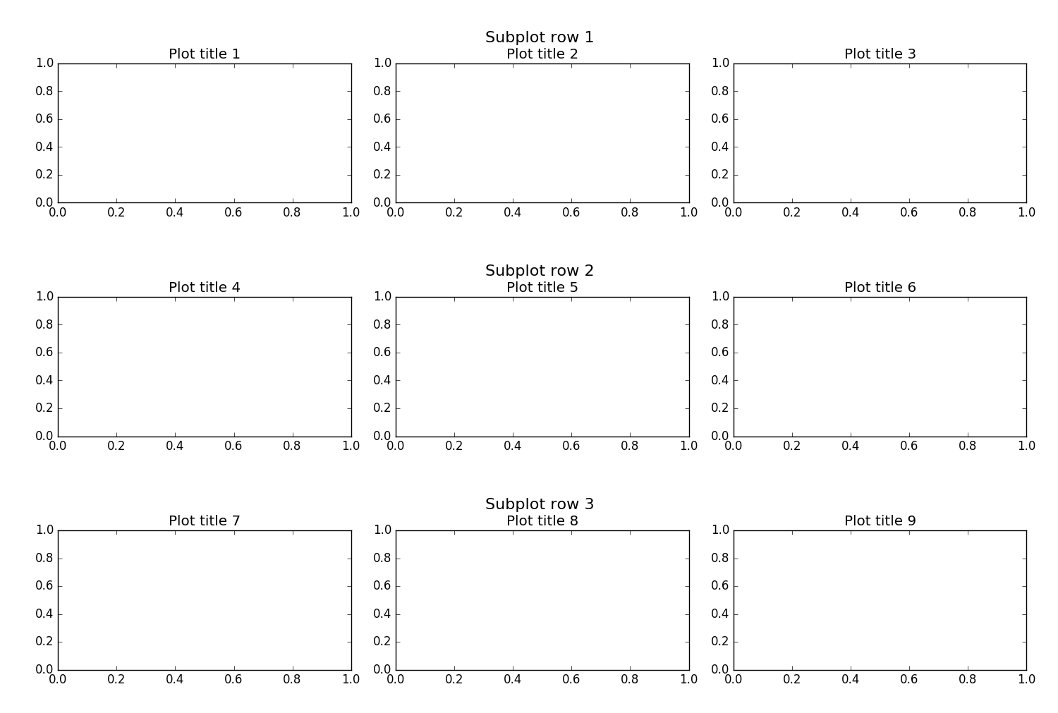
思路其实创建整个的子图像,然后将图像的刻度、标注等部分作不显示设置,仅仅显示图像的 title。
代码如下:
import matplotlib.pyplot as plt

fig, big_axes = plt.subplots(figsize=(15.0, 15.0) , nrows=3, ncols=1, sharey=True)

for row, big_ax in enumerate(big_axes, start=1):

    big_ax.set_title("Subplot row %s \n" % row, fontsize=16)

    # Turn off axis lines and ticks of the big subplot

    # obs alpha is 0 in RGBA string!

    big_ax.tick_params(labelcolor=(0,0,0,0), top='off', bottom='off', left='off', right='off')

    # removes the white frame

    big_ax._frameon = False

for i in range(1,10):

    ax = fig.add_subplot(3,3,i)

    ax.set_title('Plot title ' + str(i))

fig.set_facecolor('w')

plt.tight_layout()

plt.show()
设置7:图像中标记线和区域的绘制
效果如下:

代码如下:
import numpy as np

import matplotlib.pyplot as plt

t = np.arange(-1, 2, .01)

s = np.sin(2*np.pi*t)

plt.plot(t, s)

# draw a thick red hline at y=0 that spans the xrange

l = plt.axhline(linewidth=4, color='r')

# draw a default hline at y=1 that spans the xrange

l = plt.axhline(y=1)

# draw a default vline at x=1 that spans the yrange

l = plt.axvline(x=1)

# draw a thick blue vline at x=0 that spans the upper quadrant of

# the yrange

l = plt.axvline(x=0, ymin=0.75, linewidth=4, color='b')

# draw a default hline at y=.5 that spans the middle half of

# the axes

l = plt.axhline(y=.5, xmin=0.25, xmax=0.75)

p = plt.axhspan(0.25, 0.75, facecolor='0.5', alpha=0.5)

p = plt.axvspan(1.25, 1.55, facecolor='g', alpha=0.5)

plt.axis([-1, 2, -1, 2])

plt.show()
参考:####
- http://stackoverflow.com/questions/16162514/how-can-i-move-a-tick-label-onlywithout-moving-corresponding-tick
- http://stackoverflow.com/questions/28615887/how-to-move-a-ticks-label-in-matplotlib
- http://stackoverflow.com/questions/31928209/matplotlib-fixed-spacing-between-left-edge-of-figure-and-y-axis
- http://stackoverflow.com/questions/6406368/matplotlib-move-x-axis-label-downwards-but-not-x-axis-ticks
- http://matplotlib.org/examples/pylab_examples/axhspan_demo.html
【Matplotlib】绘图常见设置说明的更多相关文章
- python实战学习之matplotlib绘图续
学习完matplotlib绘图可以设置的属性,还需要学习一下除了折线图以外其他类型的图如直方图,条形图,散点图等,matplotlib还支持更多的图,具体细节可以参考官方文档:https://matp ...
- Matplotlib绘图双纵坐标轴设置及控制设置时间格式
双y轴坐标轴图 今天利用matplotlib绘图,想要完成一个双坐标格式的图. fig=plt.figure(figsize=(20,15)) ax1=fig.add_subplot(111) ax1 ...
- matplotlib 绘图
http://blog.csdn.net/jkhere/article/details/9324823 都打一遍 5 matplotlib-绘制精美的图表 matplotlib 是python最著名的 ...
- matplotlib绘图的基本操作
转自:Laumians博客园 更简明易懂看Matplotlib Python 画图教程 (莫烦Python)_演讲•公开课_科技_bilibili_哔哩哔哩 https://www.bilibili. ...
- python中利用matplotlib绘图可视化知识归纳
python中利用matplotlib绘图可视化知识归纳: (1)matplotlib图标正常显示中文 import matplotlib.pyplot as plt plt.rcParams['fo ...
- matplotlib绘图基本用法-转自(http://blog.csdn.net/mao19931004/article/details/51915016)
本文转载自http://blog.csdn.net/mao19931004/article/details/51915016 <!DOCTYPE html PUBLIC "-//W3C ...
- python实战学习之matplotlib绘图
matplotlib 是最流行的Python底层绘图库,主要做数据可视化图表 可以将数据可视化,能够更直观的呈现数据 matplotlib绘图基本要点 首先实现一个简单的绘图 # 导入pyplot f ...
- 数据分析07 /matplotlib绘图
数据分析07 /matplotlib绘图 目录 数据分析07 /matplotlib绘图 1. 绘制线性图:plt.plot() 2. 绘制柱状图:plt.bar() 3. 绘制直方图:plt.his ...
- Python Matplotlib绘图基础
Matplotlib绘图基础 1.Figure和Subplot import numpy as np import matplotlib.pyplot as plt #创建一个Figure fig = ...
随机推荐
- 实习小记-python 内置函数__eq__函数引发的探索
乱写__eq__会发生啥?请看代码.. >>> class A: ... def __eq__(self, other): # 不论发生什么,只要有==做比较,就返回True ... ...
- JMeter学习(六)集合点
JMeter也有像LR中的集合点,本篇就来介绍下JMeter的集合点如何去实现. JMeter里面的集合点通过添加定时器来完成. 注意:集合点的位置一定要在Sample之前. 集合点:简单来理解一下, ...
- 6月27日 OGDF不同的布局算法
检查不同布局算法 备注 CircularLayout 可以非连通 FastMultipoleMultilevelEmbedder FMMMLayout 可以非连通 StressMajoriz ...
- 分布式监控系统Zabbix-3.0.3-完整安装记录(6)-微信报警部署
Zabbix可以通过多种方式把告警信息发送到指定人,常用的有邮件,短信报警方式. 现在由于微信使用的广泛度,越来越多的企业开始使用zabbix结合微信作为主要的告警方式,这样可以及时有效的把告警信息推 ...
- ftp虚拟账号登陆
配置使用虚拟用户登录的FTP服务器,可以避免使用操作系统帐号作为FTP用户带来的一些安全问题,也便于通过数据库或其它程序来进行管理.废话不多说,这里记录下ftp虚拟账号登陆的部署过程及其中遇到的问题: ...
- iOS原生地图开发进阶——使用导航和附近兴趣点检索
iOS原生地图开发进阶——使用导航和附近兴趣点检索 iOS中的mapKit框架对国际化的支持非常出色.在前些篇博客中,对这个地图框架的基础用法和标注与覆盖物的添加进行了详细的介绍,这篇博客将介绍两个更 ...
- RDLC使用手册_RDLC报表部署
原文:http://blog.csdn.net/lwjnumber/article/details/6590545 9. RDLC报表部署(限于rdlc报表 windows应用程序) 1) R ...
- Linux非root用户安装jdk和tomcat
转载自:http://blog.csdn.net/wuyigong111/article/details/17410661,进行部分修改 创建一个用户 sgmm,并在其用户目录里面安装 jdk和tom ...
- ajax中加上AntiForgeryToken防止CSRF攻击
经常看到在项目中ajax post数据到服务器不加防伪标记,造成CSRF攻击 在Asp.net Mvc里加入防伪标记很简单在表单中加入Html.AntiForgeryToken()即可. Html.A ...
- 自定义progressBar的旋转圆圈
在手工打造下拉刷新功能 自带的progressBar太丑了 做个也不费事,一个简单的圆形 旋转动画加type是sweep的gradient渐变 <rotate //旋转动画xmlns:andro ...