css怎么实现雪人
冬天来了,怎么能少的了雪人呢,不管是现实中还是程序员的代码中统统都的安排上,那就一次安排几个雪人兄弟,咱们先看效果图:
有喜欢的就赶紧cv拿走吧!!!
其详细代码如下:
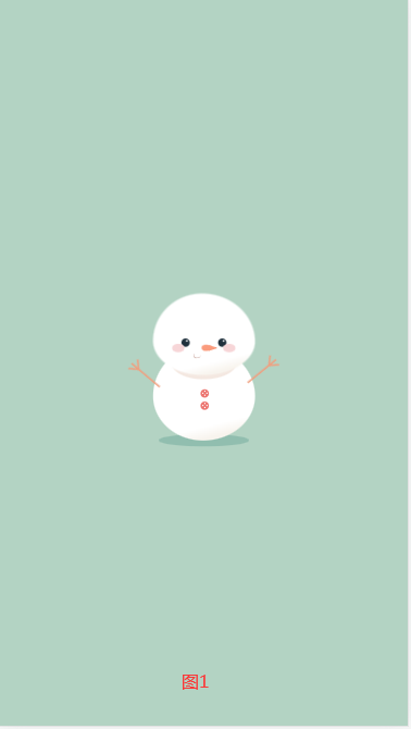
图1
html部分:
		<div class="snowman">

		  <div class="snowman-face"></div>

		  <div class="snowman-nose"></div>

		  <div class="mouth"></div>

		  <div class="buttons"></div>

		  <div class="arm right"></div>

		  <div class="arm left"></div>

		</div>

		<div class="shadow"></div>
css部分:
			* {

			  margin: 0;

			  padding: 0;

			}

			body {

			  height: 100vh;

			  width: 100vw;

			  background: #b3d3c3;

			  display: flex;

			  flex-direction: column;

			  justify-content: center;

			  align-items: center;

			}

			.snowman {

			  position: relative;

			  background: linear-gradient(

			    166deg,

			    rgba(255, 255, 255, 1) 78%,

			    rgba(248, 244, 238, 1) 88%

			  );

			  height: 23vmin;

			  width: 25vmin;

			  border-radius: 48% 52% 51% 49% / 53% 53% 47% 47%;

			  top: 9vmin;

			}

			.snowman::after {

			  position: absolute;

			  content: "";

			  background: linear-gradient(

			    166deg,

			    rgba(255, 255, 255, 1) 78%,

			    rgba(248, 244, 238, 1) 88%

			  );

			  height: 20vmin;

			  width: 25vmin;

			  border-radius: 48% 52% 51% 49% / 58% 59% 41% 42%;

			  top: -13vmin;

			}

			.snowman::before {

			  position: absolute;

			  content: "";

			  background: #f4e8e1;

			  height: 10vmin;

			  width: 16vmin;

			  border-radius: 48% 52% 51% 49% / 58% 59% 41% 42%;

			  left: 4.5vmin;

			  top: -2vmin;

			}

			.snowman-face {

			  position: relative;

			  background: #20313d;

			  height: 2vmin;

			  width: 2vmin;

			  border-radius: 50%;

			  top: -2vmin;

			  left: 7vmin;

			  box-shadow: 9vmin 0 #20313d;

			  z-index: 1;

			  animation: blink 6s infinite;

			}

			.snowman-face::after {

			  position: absolute;

			  content: "";

			  background: white;

			  height: 0.4vmin;

			  width: 0.4vmin;

			  border-radius: 50%;

			  left: 1.1vmin;

			  top: 0.4vmin;

			  box-shadow: 9vmin 0 white;

			}

			.snowman-nose {

			  position: relative;

			  background: #fa9b7d;

			  height: 2.5vmin;

			  width: 1.5vmin;

			  border-radius: 50% 50% 50% 50% / 60% 60% 40% 40%;

			  left: 12.5vmin;

			  top: -3vmin;

			  transform: rotate(90deg);

			  z-index: 1;

			}

			.snowman-nose::after {

			  position: absolute;

			  content: "";

			  border-top: 0.7vmin solid transparent;

			  border-left: 2vmin solid #fa9b7d;

			  border-bottom: 0.7vmin solid transparent;

			  left: -0.25vmin;

			  top: -0.9vmin;

			  transform: rotate(-90deg);

			}

			.snowman-nose::before {

			  position: absolute;

			  content: "";

			  background: transparent;

			  height: 1.5vmin;

			  width: 1vmin;

			  border-radius: 50% 60% 70% 40% / 50% 50% 60% 20%;

			  border-right: 0.3vmin solid #d1b4ae;

			  border-bottom: 0.3vmin solid #d1b4ae;

			  top: 2.8vmin;

			  left: 2vmin;

			  transform: rotate(-10deg);

			}

			.buttons {

			  position: relative;

			  background: #ec7671;

			  height: 2vmin;

			  width: 2vmin;

			  border-radius: 50%;

			  top: 6vmin;

			  left: 11.7vmin;

			  box-shadow: 0 3vmin #ec7671;

			}

			.buttons::after {

			  position: absolute;

			  content: "";

			  background: white;

			  color: white;

			  height: 0.3vmin;

			  width: 0.3vmin;

			  border-radius: 50%;

			  left: 0.9vmin;

			  top: 0.3vmin;

			  box-shadow: -0.5vmin 0.5vmin, 0.5vmin 0.5vmin, 0 1vmin, 0 3vmin,

			    -0.5vmin 3.5vmin, 0.5vmin 3.5vmin, 0 4vmin;

			}

			.buttons::before {

			  position: absolute;

			  content: "";

			  background: #f7d6d8;

			  height: 2vmin;

			  width: 3vmin;

			  border-radius: 50%;

			  left: -7vmin;

			  top: -11.1vmin;

			  box-shadow: 12.5vmin 0 #f7d6d8;

			  animation: fix 6s infinite;

			  z-index: 1;

			}

			.arm {

			  position: relative;

			  background: #f09f7f;

			  height: 9vmin;

			  width: 0.4vmin;

			  top: -5vmin;

			  left: 26.5vmin;

			  transform: rotate(50deg);

			}

			.arm::after {

			  position: absolute;

			  content: "";

			  background: #f09f7f;

			  height: 2.5vmin;

			  width: 0.4vmin;

			  left: 0.7vmin;

			  top: 0vmin;

			  transform: rotate(35deg);

			}

			.arm::before {

			  position: absolute;

			  content: "";

			  background: #f09f7f;

			  height: 2.5vmin;

			  width: 0.4vmin;

			  left: -0.8vmin;

			  top: 0.2vmin;

			  transform: rotate(-45deg);

			}

			.left {

			  transform: scaleX(-1) rotate(50deg);

			  left: -2vmin;

			  top: -13vmin;

			}

			.right {

			  animation: wave 2s infinite;

			}

			.shadow {

			  position: relative;

			  background: #91beaf;

			  height: 3vmin;

			  width: 22vmin;

			  border-radius: 50%;

			  top: 7.5vmin;

			  z-index: -1;

			}

			@keyframes blink {

			  0%,

			  9%,

			  11%,

			  19%,

			  21%,

			  69%,

			  71%,

			  100% {

			    transform: scaleY(1);

			  }

			  10%,

			  20%,

			  70% {

			    transform: scaleY(0);

			  }

			}

			@keyframes wave {

			  50% {

			    transform-origin: 10%;

			    transform: rotate(75deg) translate(2vmin, -1vmin);

			  }

			}
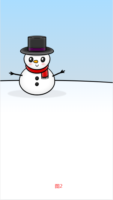
图2
html部分:
		<div class="canvas">

		  <div class="hill"></div>

		  <div class="shadow"></div>

		  <div class="body">

		    <div class="button"></div>

		    <div class="button"></div>

		    <div class="arm"></div>

		    <div class="arm"></div>

		  </div>

		  <div class="thread"></div>

		  <div class="scarf-hanging"></div>

		  <div class="scarf"></div>

		  <div class="head">

		    <div class="cheek"></div>

		    <div class="cheek"></div>

		    <div class="eye"></div>

		    <div class="eye"></div>

		    <div class="mouth"></div>

		    <div class="nose"></div>

		  </div>

		  <div class="hat-base"></div>

		  <div class="hat-top"></div>

		</div>
css部分:
			body {

			  margin: 0;

			  height: 100vh;

			  overflow: hidden;

			  background: linear-gradient(#adf, #ddd);

			}

			.canvas {

			  width: 80vmin;

			  height: 80vmin;

			  position: absolute;

			  top: 50%;

			  left: 50%;

			  transform: translate(-50%, -50%);

			}

			.canvas *,

			.canvas *::before,

			.canvas *::after {

			  position: absolute;

			  box-sizing: border-box;

			  display: block;

			}

			.head {

			  width: 43%;

			  height: 33%;

			  background:radial-gradient(170% 100% at 50% 0%, #0005, #0001 37%, #0000 0);

			  background-color: #fff;

			  border-radius: 100% / 90% 90% 110% 110%;

			  top: 24%;

			  left: 50%;

			  transform: translateX(-50%);

			  box-shadow:

			    inset 2vmin 0 6vmin 1vmin #fffa,

			    inset -2vmin 0 6vmin 1vmin #fffa,

			    inset 0 0 4vmin 1vmin #0004,

			    0 0.25vmin 0 1vmin;

			}

			.body {

			  width: 59%;

			  height: 50%;

			  background:

			    linear-gradient(45deg, #0000 45%, #0002 0 55%, #0000 0) no-repeat 118% 47% / 20% 20%,

			    linear-gradient(-45deg, #0000 45%, #0002 0 55%, #0000 0) no-repeat -15% 45% / 20% 20%,

			    radial-gradient(100% 100% at 50% 0%, #0001 34%, #0000 0);

			  background-color: #fff;

			  border-radius: 100% / 110% 110% 90% 90%;

			  bottom: 0%;

			  left: 50%;

			  transform: translateX(-50%);

			  box-shadow:

			     inset 3vmin 0 5vmin #fffa,

			    inset -3vmin 0 5vmin #fffa,

			    inset 0 0 6vmin #0004,

			    0 0.25vmin 0 1vmin;

			}

			.scarf {

			  width: 37%;

			  height: 25%;

			  border-radius: 50%;

			  background: #d00;

			  box-shadow:

			    inset 3vmin 1vmin 3vmin -2vmin #fffa,

			    inset -3vmin 2vmin 3vmin -2vmin #fffa,

			    inset 0 -1vmin 2vmin #8008,

			    0 0.25vmin 0 1vmin;

			  top: 38%;

			  left: 50%;

			  transform: translate(-50%);

			}

			.scarf-hanging {

			  width: 10%;

			  height: 20%;

			  background: #d00;

			  top: 50%;

			  left: 58%;

			  border-radius: 100% 100% 100% 100% / 20% 140% 30% 10%;

			  transform: rotate(-3deg);

			  box-shadow:

			    inset 3vmin 1vmin 3vmin -2vmin #fff7,

			    inset -3vmin 2vmin 3vmin -2vmin #fff7,

			    inset 0 -1vmin 2vmin #8008,

			    0 0.25vmin 0 1vmin;

			}

			.thread {

			  top: 67%;

			  left: 56.5%;

			  width: 13.33%;

			  height: 7%;

			  border-radius: 100% / 50%;

			  transform: rotate(-4deg);

			  background:

			    repeating-linear-gradient(to right, #0000 0 7%, #000 7.5% 14%, #0000 0 14.5%)

			}

			.button {

			  box-shadow: 0 0.25vmin 0 0.8vmin;

			  background:

			    radial-gradient(circle at 35% 35%, #fff3 20%, #0000 )

			    ;

			  background-color: black;

			  width: 7%;

			  height: 9%;

			  border-radius: 100% 90% 110% 100%;

			  top: 40%;

			  left: 50%;

			  transform: translateX(-50%);

			}

			.button + .button {

			  top: 60%;

			  transform: translateX(-50%) rotate(20deg);

			}

			.eye {

			  --pos: 20%;

			  box-shadow:

			    inset 0 0 1vmin 0.125vmin #000,

			    inset -0.5vmin -0.5vmin 1vmin #000,

			    inset -1.5vmin -1vmin 2vmin #fffb,

			    0.25vmin 1.25vmin 0 0.8vmin #0002,

			    0 0.25vmin 0 0.8vmin;

			  background-color: #222;

			  width: 13%;

			  height: 22%;

			  border-radius: 100% 90% 110% 100%;

			  top: 38%;

			  left: var(--pos);

			  transform: rotate(10deg);

			  overflow: hidden;

			}

			.eye + .eye {

			  left: auto;

			  right: var(--pos);

			}

			.eye::before {

			  content: "";

			  width: 45%;

			  height: 50%;

			  background: #fff;

			  border-radius: 100%;

			  top: 15%;

			  left: 10%;

			  transform: rotate(15deg);

			  box-shadow: 0 0 3vmin 1.5vmin #000;

			}

			.mouth {

			  width: 12%;

			  height: 16%;

			  border-radius: 100% 90% 110% 100%;

			  top: 70%;

			  left: 50%;

			  transform: translate(-50%) rotate(3deg);

			  border:0.6vmin solid;

			  border-bottom-width: 0.9vmin;

			  clip-path: polygon(-20% 40%, 120% 30%, 120% 120%, -20% 120%)

			}

			.nose {

			  width: 15%;

			  height: 11%;

			  background:linear-gradient(#ff05, #0000, #d805);

			  background-color: #fa0;

			  border-radius: 150% 60% 60% 150% / 100%;

			  left: 45%;

			  top: 55%;

			  transform: translate(-50%, 0);

			  box-shadow: -0.0625vmin 0 0 0.7vmin

			}

			.nose::before,

			.nose::after {

			  content: "";

			  width: 40%;

			  height: 80%;

			  border-radius: 100%;

			  border-right: 0.5vmin solid darkorange;

			  top: 50%;

			  left: 45%;

			  transform: translate(-50%, -50%);

			}

			.nose::after {

			  width: 25%;

			  height: 60%;

			  left: 25%;

			}

			.cheek {

			  width: 25%;

			  height: 18%;

			  background: red;

			  border-radius: 50%;

			  background: radial-gradient(farthest-side, #f003, #0000);

			  top: 65%;

			  left: 12%;

			}

			.cheek + .cheek {

			  left: auto;

			  right: 12%;

			}

			.cheek::before,

			.cheek::after {

			  content: "";

			  width: 30%;

			  height: 35%;

			  border-radius: 100%;

			  border-top: 0.5vmin solid #f004;

			  top: 50%;

			  left: 40%;

			  transform: translate(-50%, -50%) rotate(-40deg);

			}

			.cheek::after {

			  transform: translate(-10%, -35%) rotate(-20deg);

			}

			.arm {

			  width: 40%;

			  height: 20%;

			  border-radius: 0% 50% 50% 50%;

			  top: 30%;

			  right: 5%;

			  transform: translateX(100%) rotate(-25deg);

			  box-shadow: 0 -2.5vmin 0 -1vmin

			}

			.arm::before,

			.arm::after {

			  content: "";

			  width: 30%;

			  height: 1.5vmin;

			  background: black;

			  border-radius: 0 100% 100% 0;

			  right: -5%;

			  top: -1.25vmin

			}

			.arm::after {

			  transform-origin: left center;

			  transform: rotate(-30deg);

			  width: 25%;

			  right: 5%;

			}

			.arm + .arm {

			  left: 12%;

			  top: 10%;

			  border-radius: 15% 50% 50% 50%;

			  transform: scaleX(-1) translateX(100%) rotate(-10deg) scaleY(-1);

			}

			.hat-base {

			  width: 55%;

			  height: 14%;

			  background: #333;

			  border-radius: 100% / 120% 120% 90% 90%;

			  box-shadow:

			    inset 2vmin -1.5vmin 4vmin 0.5vmin #fff5,

			    inset -2vmin -1.5vmin 4vmin 0.5vmin #fff5,

			    inset 0 0 5vmin 2vmin #000,

			    inset 0 -2vmin 4vmin 1vmin #000,

			    0 0.25vmin 0 1vmin

			    ;

			  left: 50%;

			  transform: translateX(-50%);

			  top: 18%;

			}

			.hat-top {

			  width: 29%;

			  height: 25%;

			  background:

			    radial-gradient(300% 50% at 50% 0, #000 18%, #0000 0),

			    radial-gradient(200% 100% at 50% 0, #0000 0 80%, #000 0 82%, purple 0)

			    ;

			  background-color: #333;

			  box-shadow:

			    inset 0 1vmin 1vmin -1vmin #fff8,

			    inset 1.5vmin 1.5vmin 3vmin 0.25vmin #fff5,

			    inset -2vmin 1.5vmin 3vmin 0.25vmin #fff3,

			    inset 0 0 5vmin 1vmin #0007,

			    inset 0 -2vmin 4vmin 1vmin #0007,

			    0 0.1vmin 0 1vmin

			    ;

			  border-radius: 100% / 10% 10% 10% 5%;

			  left: 50%;

			  top: 1%;

			  transform: translate(-50%, 0);

			  overflow: hidden;

			}

			.hat-top::before {

			  content: "";

			  width: 100%;

			  height: 100%;

			  background:

			    radial-gradient(300% 50% at 50% 0, #0000 18%, #000 18.5% 24%, #0000 24.5%)

			}

			.shadow {

			  width: 100%;

			  height: 15%;

			  background: #0001;

			  border-radius: 50%;

			  bottom: -6%;

			  filter: blur(0.5vmin)

			}

			.hill {

			  width: 200vmax;

			  height: 100vmax;

			  background: linear-gradient(aliceblue, #fff 25%);

			  top: 75%;

			  left: 50%;

			  transform: translate(-50%, 0);

			  border-radius: 100% / 20%;

			  border: 1.25vmin solid;

			}
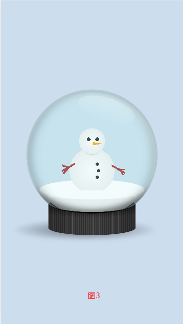
图3
html部分:
		<div class="canvas">

		  <div class="shadow"></div>

		  <div class="base"></div>

		  <div class="bowl">

		    <div class="snowflake"></div>

		    <div class="snowflake"></div>

		    <div class="snowflake"></div>

		    <div class="snowflake"></div>

		    <div class="snowflake"></div>

		    <div class="snowflake"></div>

		    <div class="snowflake"></div>

		    <div class="snowflake"></div>

		    <div class="snowflake"></div>

		    <div class="snowflake"></div>

		    <div class="snowflake"></div>

		    <div class="snowflake"></div>

		    <div class="snowflake"></div>

		    <div class="snowflake"></div>

		    <div class="snowflake"></div>

		    <div class="snowflake"></div>

		    <div class="snowflake"></div>

		    <div class="snowflake"></div>

		    <div class="snowflake"></div>

		    <div class="snowflake"></div>

		    <div class="snowflake"></div>

		    <div class="snowflake"></div>

		    <div class="snowflake"></div>

		    <div class="snowflake"></div>

		    <div class="snowflake"></div>

		    <div class="snowflake"></div>

		    <div class="snowflake"></div>

		    <div class="snowflake"></div>

		    <div class="snowflake"></div>

		    <div class="snowflake"></div>

		    <div class="snow"></div>

		    <div class="ground"></div>

		    <!-- Something here :) -->

		    <div class="something">

		    </div>

		    <!-- end of something -->

		  </div>

		  <div class="bowl">

		    <div class="reflection"></div>

		  </div>

		  <div class="base"></div>

		</div>
css部分:
			html {

			  background: #cde;

			}

			.canvas {

			  --size: 80vmin;

			  width: var(--size);

			  aspect-ratio: 1;

			  position: absolute;

			  top: 50%;

			  left: 50%;

			  transform: translate(-50%, -50%);

			}

			@keyframes shake {

			  0%, 50%, 100% {

			    transform: translate(-50%, -50%) rotate(0deg) translate(0, 0);

			  }

			  25% {

			    transform: translate(-50%, -50%) rotate(4deg) translate(0, -10%);

			  }

			  75% {

			    transform: translate(-50%, -50%) rotate(-6deg) translate(0, -12%);

			  }

			}

			.canvas:active {

			  animation: shake 1s infinite;

			}

			.canvas div,

			.canvas div::before,

			.canvas div::after {

			  position: absolute;

			  box-sizing: border-box;

			  display: block;

			}

			.base {

			  width: 60%;

			  height: 26%;

			  bottom: 0;

			  left: 20%;

			  border-radius: 100% / 40%;

			  background:

			    radial-gradient(100% 50% at 50% 14%, #000, #0000 80%),

			    linear-gradient(to right, #0004, #0000, #0004);

			  background-color: #222;

			}

			.base ~ .base {

			  -webkit-mask: radial-gradient(100% 50% at 50% 14%, #0000 50%, #000 51%);

			  mask: radial-gradient(100% 50% at 50% 14%, #0000 50%, #000 51%);

			  background:

			    radial-gradient(150% 112% at 50% 0%, #000 38%, #0000 0),

			    radial-gradient(100% 50% at 50% 14%, #000, #0000 80%),

			    linear-gradient(to right, #0004, #0000, #0004),

			    repeating-linear-gradient(to right, #444 0 1.2%, #666 1.4%, #333 0 2.4%);

			  z-index: 3;

			}

			.bowl {

			  top: 0;

			  left: 5%;

			  width: 90%;

			  height: 90%;

			  background-color: #beeeef33;

			  border-radius: 50%;

			  overflow: hidden;

			}

			.bowl + .bowl {

			  z-index: 2;

			  background: #beeeef33;

			  box-shadow:

			    inset 0 0 2vmin #fff8,

			    inset 3vmin 0 5vmin #0003,

			    inset -3vmin 0 5vmin #0003,

			    inset 0 -20vmin 3vmin -14vmin #0007

			    ;

			}

			.ground {

			  width: 80%;

			  height: 15%;

			  border-radius: 50%;

			  background: white;

			  top: 69%;

			  left: 50%;

			  transform: translateX(-50%);

			}

			.snow {

			  width: 97.5%;

			  height: 95%;

			  border-radius: 50%;

			  background: linear-gradient(#0000 79%, #eee 0);

			  top: 50%;

			  left: 50%;

			  transform: translate(-50%, -50%);

			  box-shadow:

			    inset -2vmin 2vmin 4vmin -2vmin #fffa,

			    inset 2vmin 0 4vmin -2vmin #0001;

			}

			.reflection {

			  width: 45%;

			  height: 18%;

			  background: #f003;

			  background: linear-gradient(#fff4, #fff0);

			  border-radius: 50%;

			  top: 13%;

			  left: 60%;

			  transform: rotate(17deg) translateX(-50%);

			}

			.canvas:active .shadow {

			  opacity: 0;

			}

			.shadow {

			  width: 100%;

			  height: 15%;

			  background: radial-gradient(farthest-side, #0008, #0000);

			  border-radius: 50%;

			  bottom: -4%;

			  left: -5%;

			  filter: blur(1vmin);

			}

			@keyframes snowfall {

			  to {

			    transform: translate(0, calc(var(--size) * 0.77));

			  }

			}

			.snowflake {

			  left: 50%;

			  top: -5%;

			  width: 2%;

			  height: 2%;

			  background: white;

			  border-radius: 50%;

			  abox-shadow: inset 0.25vmin -0.25vmin 0.25vmin #0002;

			  animation: snowfall 4s 1 forwards;

			}

			.snowflake:nth-child(3n) {

			  z-index: 1;

			}

			.snowflake:nth-child(1)  { left: 25%; animation-delay: 1s; }

			.snowflake:nth-child(2)  { left: 20%; animation-delay: 2s; }

			.snowflake:nth-child(3)  { left: 30%; animation-delay: 3s; }

			.snowflake:nth-child(4)  { left: 40%; animation-delay: 4s; }

			.snowflake:nth-child(5)  { left: 50%; animation-delay: 5s; }

			.snowflake:nth-child(6)  { left: 60%; animation-delay: 1.5s; }

			.snowflake:nth-child(7)  { left: 70%; animation-delay: 2.5s; }

			.snowflake:nth-child(8)  { left: 80%; animation-delay: 3.5s; }

			.snowflake:nth-child(9)  { left: 75%; animation-delay: 4.5s; }

			.snowflake:nth-child(11) { left: 28%; animation-delay: 5.5s; }

			.snowflake:nth-child(12) { left: 19%; animation-delay: 0.5s; }

			.snowflake:nth-child(13) { left: 38%; animation-delay: 1.2s; }

			.snowflake:nth-child(14) { left: 48%; animation-delay: 2.2s; }

			.snowflake:nth-child(15) { left: 58%; animation-delay: 3.2s; }

			.snowflake:nth-child(16) { left: 68%; animation-delay: 4.2s; }

			.snowflake:nth-child(17) { left: 78%; animation-delay: 1.7s; }

			.snowflake:nth-child(18) { left: 82%; animation-delay: 2.7s; }

			.snowflake:nth-child(19) { left: 65%; animation-delay: 3.7s; }

			.snowflake:nth-child(20) { left: 54%; animation-delay: 4.7s; }

			.snowflake:nth-child(21) { left: 24%; animation-delay: 0.25s; }

			.snowflake:nth-child(22) { left: 24%; animation-delay: 0.5s; }

			.snowflake:nth-child(23) { left: 34%; animation-delay: 0.75s; }

			.snowflake:nth-child(24) { left: 44%; animation-delay: 0.6s; }

			.snowflake:nth-child(25) { left: 54%; animation-delay: 2.75s; }

			.snowflake:nth-child(26) { left: 64%; animation-delay: 1.75s; }

			.snowflake:nth-child(27) { left: 74%; animation-delay: 3.75s; }

			.snowflake:nth-child(28) { left: 84%; animation-delay: 1.4s; }

			.snowflake:nth-child(29) { left: 74%; animation-delay: 2.4s; }

			.snowflake:nth-child(30) { left: 17%; animation-delay: 3.4s; }

			.canvas:active .snowflake {

			  animation: none;

			}

			.something {

			  width: 50%;

			  height: 50%;

			  left: 50%;

			  bottom: 23%;

			  transform: translate(-50%, 0);

			  background:

			    radial-gradient(circle at 45% 22%, #222 3%, #0000 0),

			    radial-gradient(circle at 58% 22%, #222 3%, #0000 0),

			    radial-gradient(circle at 58% 60%, #222 3%, #0000 0),

			    radial-gradient(circle at 60% 70%, #222 2.75%, #0000 0),

			    radial-gradient(circle at 58% 80%, #222 2.5%, #0000 0),

			    conic-gradient(at 100% 50%, #0000 260deg, orange 0 280deg, #0000 0) 60% 25% / 15% 15%,

			    linear-gradient(30deg, #0000 40%, brown 0 50%, #0000 0) 100% 70% / 20% 20%,

			    linear-gradient(0deg, #0000 40%, brown 0 60%, #0000 0) 100% 70% / 10% 10%,

			    linear-gradient(60deg, #0000 40%, brown 0 55%, #0000 0) 100% 74% / 10% 10%,

			    linear-gradient(-30deg, #0000 40%, brown 0 50%, #0000 0) 5% 67% / 20% 20%,

			    linear-gradient(20deg, #0000 40%, brown 0 60%, #0000 0) 5% 65% / 10% 10%,

			    linear-gradient(130deg, #0000 40%, brown 0 60%, #0000 0) 6% 72% / 10% 10%,

			    radial-gradient(circle at 50% 25%, #fff, #eee 22%, #0000 0),

			    radial-gradient(circle at 50% 30%, #000, #0000 20%),

			    radial-gradient(circle at 50% 70%, #fff, #eee 40%, #0000 0)

			    ;

			  background-repeat: no-repeat;

			}
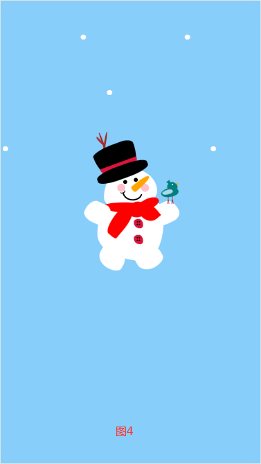
图4
html部分:
		<a class="snow">

		  <a class="flake"> . </a>

		  <a class="flake"> . </a>

		  <a class="flake"> . </a>

		  <a class="flake"> . </a>

		  <a class="flake"> . </a>

		  <a class="flake"> . </a>

		  <a class="flake"> . </a>

		  <a class="flake"> . </a>

		  <a class="flake"> . </a>

		  <a class="flake"> . </a>

		</a>

		<div class="face">

		  <div class="nose"></div>

		  <div class="eye1"></div>

		  <div class="eye2"></div>

		  <div class="body"></div>

		  <div class="blush1"></div>

		  <div class="blush2"></div>

		  <div class="hat"></div>

		  <div class="hat2"></div>

		  <div class="hat3"></div>

		  <div class="mouth"></div>

		  <div class="mouth_small"></div>

		  <div class="hand1"></div>

		  <div class="hand2"></div>

		  <div class="feet1"></div>

		  <div class="feet2"></div>

		  <div class="mustache"></div>

		  <div class="mustache"></div>

		  <div class="button1"></div>

		  <div class="button2"></div>

		  <div class="button3"></div>

		  <div class="scarf1"></div>

		  <div class="scarf2"></div>

		  <div class="scarf3"></div>

		  <div class="scarf4"></div>

		  <div class="scarf5"></div>

		  <div class="dot1"></div>

		  <div class="dot2"></div>

		  <div class="dot3"></div>

		  <div class="dot4"></div>

		  <div class="dot5"></div>

		  <div class="dot6"></div>

		  <div class="dot7"></div>

		  <div class="dot8"></div>

		  <div class="tree1"></div>

		  <div class="tree2"></div>

		  <div class="tree3"></div>

		  <div class="tree4"></div>

		  <div class="bird1"></div>

		  <div class="bird2"></div>

		  <div class="bird3"></div>

		  <div class="bird4"></div>

		  <div class="bird5"></div>

		  <div class="bird6"></div>

		  <div class="bird7"></div>

		  <div class="bird8"></div>

		  <div class="bird9"></div>

		  <div class="bird10"></div>

		  <div class="bird11"></div>

		  <div class="bird12"></div>

		  <div class="bird13"></div>

		</div>
css部分:
			body {

			  height: 100vh;

			  overflow: hidden;

			  position: relative;

			  background-color: lightskyblue;

			  text-align: center;

			}

			p{

			  color: #fff;

			  font-size: 34px;

			  position: absolute;

			  top: 8%;

			  left: 50%;

			  transform: translateX(-50%);

			  text-shadow: 0 0 5px #fff,

			  0 0 10px rgb(57, 154, 211),

			  0 0 15px rgb(104, 166, 202),

			  0 0 20px #c5d7e2,

			  0 0 35px #c5d7e2,

			  0 0 40px #fff,

			  0 0 50px #fff,

			  0 0 75px #fff;

			}

			div {

			  position: absolute;

			  left: 50%;

			  top: 50%;

			  transform: translate(-50%, -50%);

			}

			.face {

			  width: 200px;

			  height: 150px;

			  background: white;

			  top: 40%;

			  border-radius: 46% 57% 65% 32% / 76% 59% 42% 26%;

			}

			.eye1,

			.eye2 {

			  width: 15px;

			  height: 15px;

			  background: black;

			  border-radius: 50%;

			}

			.eye1 {

			  top: 35%;

			  left: 40%;

			}

			.eye2 {

			  top: 30%;

			  left: 60%;

			}

			.blush1, .blush2 {

			  width: 30px;

			  height: 30px;

			  background: pink;

			  border-radius: 50%;

			  transform: rotate(90deg);

			}

			.blush1 {

			  top: 40%;

			  left: 70%;

			}

			.blush2 {

			  top: 40%;

			  left: 25%;

			}

			.nose {

			  width: 25px;

			  height: 80px;

			  background: orange;

			  top: 12%;

			  left: 63%;

			  transform: rotate(50deg);

			  border-radius: 50% 50% 40% 40% / 100% 100% 10% 10%;

			  z-index: 2;

			}

			.teeth1, .teeth2 {

			  width: 30px;

			  height: 30px;

			  background: white;

			  z-index: -1;

			  border-radius: 5px;

			}

			.teeth1 {

			  top: 125%;

			  left: 30%;

			}

			.teeth2 {

			  top: 125%;

			  left: 70%;

			}

			.body {

			  width: 250px;

			  height: 250px;

			  background: white;

			  top: 150%;

			  border-radius: 40% 30% 30% 70% / 60% 40% 60% 40%;

			  z-index: -1;

			}

			.feet1, .feet2 {

			  width: 100px;

			  height: 80px;

			  background: white;

			  top: 200%;

			  z-index: -1;

			}

			.feet1 {

			  transform: rotate(30deg);

			  left: -10%;

			  border-radius: 50% 50% 59% 66% / 36% 65% 38% 65%;

			}

			.feet2 {

			  transform: rotate(-30deg);

			  left: 60%;

			  border-radius: 50% 50% 59% 66% / 36% 65% 38% 65%;

			}

			.hat {

			  width: 145px;

			  height: 40px;

			  background: crimson;

			  border-radius: 46% 57% 65% 32% / 100% 100% 0% 0%;

			  top: -20px;

			  left: 60px;

			  transform: translate(-50%, 0) rotate(160deg);

			  z-index: -1;

			}

			.hat3 {

			  width: 160px;

			  height: 130px;

			  background: black;

			  border-radius: 46% 57% 65% 32% / 100% 100% 20% 20%;

			  top: -90px;

			  left: 50px;

			  transform: translate(-50%, 0) rotate(160deg);

			  z-index: -2;

			}

			.hat2 {

			  width: 200px;

			  height: 50px;

			  background: black;

			  border-radius: 40% 40% 40% 40% / 40% 40% 40% 40%;

			  top: -10px;

			  left: 70px;

			  transform: translate(-50%, 0) rotate(-20deg);

			  z-index: -1;

			}

			.mustache {

			  width: 100px;

			  height: 80px;

			  background: white;

			  border-radius: 50% 50% 59% 66% / 100% 100% 56% 51%;

			  top: 155px;

			  left: 20%;

			  transform-origin: top right;

			  transform: translate(-100%, 0) rotate(25deg);

			  z-index: 1;

			}

			.mustache+.mustache {

			  left: 170px;

			  border-radius: 50% 50% 59% 66% / 100% 100% 56% 51%;

			  transform-origin: top left;

			  transform: rotate(-25deg);

			}

			.mouth {

			  width: 65px;

			  height: 50px;

			  border: 5px solid black;

			  border-radius: 50%;

			  top: 63px;

			  left: 70px;

			  z-index: 1;

			  transform: rotate(5deg);

			  clip-path: polygon(0% 55%, 100% 55%, 100% 100%, 0% 100%);

			}

			.mouth_small {

			  width: 15px;

			  height: 10px;

			  border: 3px solid black;

			  border-radius: 50%;

			  top: 80px;

			  left: 60px;

			  z-index: 1;

			  transform: rotate(-25deg);

			  clip-path: polygon(0% 55%, 100% 55%, 100% 100%, 0% 100%);

			}

			.button1,.button2 {

			  width: 35px;

			  height: 35px;

			  background: crimson;

			}

			.button1 {

			  top: 180%;

			  left: 65%;

			  border-radius: 50% 50% 31% 66% / 36% 65% 38% 65%;

			}

			.button2 {

			  top: 140%;

			  left: 65%;

			  border-radius: 50% 50% 31% 66% / 36% 65% 38% 65%;

			}

			.dot1,.dot2,.dot3,.dot4,.dot5,.dot6,.dot7,.dot8 {

			  width: 5px;

			  height: 5px;

			  background: black;

			  border-radius: 50%;

			}

			.dot1 {

			  top: 175%;

			  left: 63%;

			}

			.dot2 {

			  top: 175%;

			  left: 67%;

			}

			.dot3 {

			  top: 182%;

			  left: 63%;

			}

			.dot4 {

			  top: 182%;

			  left: 67%;

			}

			.dot5 {

			  top: 135%;

			  left: 63%;

			}

			.dot6 {

			  top: 135%;

			  left: 67%;

			}

			.dot7 {

			  top: 142%;

			  left: 63%;

			}

			.dot8 {

			  top: 142%;

			  left: 67%;

			}

			.scarf1,.scarf2,.scarf3,.scarf4,.scarf5 {

			  background: red;

			}

			.scarf1 {

			  width: 160px;

			  height: 40px;

			  top: 100%;

			  left: 40%;

			  border-radius: 50% 50% 31% 66% / 36% 65% 38% 65%;

			}

			.scarf2 {

			  width: 100px;

			  height: 40px;

			  top: 80%;

			  left: 55%;

			  transform: rotate(-30deg);

			  border-radius: 50% 50% 31% 66% / 36% 65% 38% 65%;

			}

			.scarf3 {

			  width: 70px;

			  height: 60px;

			  top: 85%;

			  left: 45%;

			  transform: rotate(-30deg);

			  border-radius: 50% 50% 31% 66% / 36% 65% 38% 65%;

			}

			.scarf4 {

			  width: 60px;

			  height: 130px;

			  top: 90%;

			  left: 16%;

			  transform: rotate(40deg);

			  border-radius: 50% 50% 31% 45% / 36% 65% 5% 65%;

			}

			.scarf5 {

			  width: 60px;

			  height: 70px;

			  top: 90%;

			  left: 70%;

			  transform: rotate(-40deg);

			  z-index: 1;

			  border-radius: 50% 50% 31% 66% / 36% 65% 0% 65%;

			}

			.tree1 ,.tree2,.tree3 {

			  background: brown;

			  border-radius: 50% 50% 31% 66% / 36% 65% 38% 65%;

			  z-index: -3;

			}

			.tree1 {

			  width: 7px;

			  height: 125px;

			  top: -90%;

			  left: 0%;

			  transform: rotate(-20deg);

			}

			.tree2 {

			  width: 7px;

			  height: 85px;

			  top: -90%;

			  left: 0%;

			  transform: rotate(10deg);

			}

			.tree3 {

			  width: 7px;

			  height: 35px;

			  top: -80%;

			  left: -10%;

			  transform: rotate(-40deg);

			}

			.bird1 {

			  width: 65px;

			  height: 35px;

			  background: teal;

			  top: 50%;

			  left: 108%;

			  border-radius: 50% 50% 31% 66% / 36% 65% 38% 65%;

			  transform: rotate(-20deg);

			  z-index: -3;

			}

			.bird2 {

			  width: 35px;

			  height: 35px;

			  background: teal;

			  top: 35%;

			  left: 120%;

			  border-radius: 50% 50% 31% 66% / 36% 65% 38% 65%;

			  transform: rotate(-40deg);

			  z-index: -3;

			}

			.bird3 {

			  width: 15px;

			  height: 15px;

			  background: orange;

			  top: 36%;

			  left: 134%;

			  clip-path: polygon(50% 0%, 0% 100%, 100% 100%);

			  transform: rotate(70deg);

			  z-index: -5;

			}

			.bird4 {

			  width: 5px;

			  height: 5px;

			  background: white;

			  top: 40%;

			  left: 128%;

			  border-radius: 50%;

			  transform: rotate(90deg);

			}

			.bird5 {

			  width: 25px;

			  height: 2px;

			  background: brown;

			  top: 80%;

			  left: 115%;

			  border-radius: 10px;

			  transform: rotate(-90deg);

			}

			.bird6 {

			  width: 25px;

			  height: 2px;

			  background: brown;

			  top: 78%;

			  left: 123%;

			  border-radius: 10px;

			  transform: rotate(-90deg);

			}

			.bird7 {

			  width: 40px;

			  height: 17px;

			  background: lightblue;

			  top: 55%;

			  left: 110%;

			  border-radius: 50% 50% 31% 66% / 36% 65% 38% 65%;

			  transform: rotate(-20deg);

			}

			.bird8 {

			  width: 20px;

			  height: 7px;

			  background: teal;

			  top: 35%;

			  left: 118%;

			  border-radius: 50% 50% 31% 66% / 36% 65% 38% 65%;

			  transform: rotate(20deg);

			}

			.bird9 {

			  width: 2px;

			  height: 15px;

			  background: brown;

			  top: 80%;

			  left: 120%;

			  border-radius: 50% 50% 31% 66% / 36% 65% 38% 65%;

			  transform: rotate(10deg);

			  z-index: 2;

			}

			.bird10 {

			  width: 2px;

			  height: 15px;

			  background: brown;

			  top: 80%;

			  left: 121.5%;

			  border-radius: 50% 50% 31% 66% / 36% 65% 38% 65%;

			  transform: rotate(-10deg);

			  z-index: 2;

			}

			.bird11 {

			  width: 2px;

			  height: 15px;

			  background: brown;

			  top: 80%;

			  left: 128%;

			  border-radius: 50% 50% 31% 66% / 36% 65% 38% 65%;

			  transform: rotate(10deg);

			  z-index: 2;

			}

			.bird12 {

			  width: 2px;

			  height: 15px;

			  background: brown;

			  top: 80%;

			  left: 129.5%;

			  border-radius: 50% 50% 31% 66% / 36% 65% 38% 65%;

			  transform: rotate(-10deg);

			  z-index: 2;

			}

			.bird13 {

			  width: 20px;

			  height: 7px;

			  background: teal;

			  top: 35%;

			  left: 118%;

			  border-radius: 50% 50% 31% 66% / 36% 65% 38% 65%;

			  transform: rotate(80deg);

			}

			a {

			  color: white;

			  font-size: 150px

			}

			@keyframes fall {

			  0% {

			    top: -20%;

			  }

			  100% {

			    top: 100%;

			  }

			}

			.flake {

			  position: fixed;

			  top: -20%;

			  animation: fall 10s linear infinite;

			}

			.flake:nth-last-of-type(0) {

			  left: 0%;

			  animation-delay: 0s;

			}

			.flake:nth-last-of-type(1) {

			  left: 0%;

			  animation-delay: 0s;

			}

			.flake:nth-last-of-type(2) {

			  left: 10%;

			  animation-delay: 3s;

			}

			.flake:nth-last-of-type(3) {

			  left: 20%;

			  animation-delay: 5s;

			}

			.flake:nth-last-of-type(4) {

			  left: 30%;

			  animation-delay: 2s;

			}

			.flake:nth-last-of-type(5) {

			  left: 40%;

			  animation-delay: 1s;

			}

			.flake:nth-last-of-type(6) {

			  left: 50%;

			  animation-delay: 4s;

			}

			.flake:nth-last-of-type(7) {

			  left: 60%;

			  animation-delay: 3s;

			}

			.flake:nth-last-of-type(8) {

			  left: 70%;

			  animation-delay: 2s;

			}

			.flake:nth-last-of-type(9) {

			  left: 80%;

			  animation-delay: 0s;

			}

			.flake:nth-last-of-type(10) {

			  left: 90%;

			  animation-delay: 6s;

			}
一次性可以收获到这么多可爱的小雪人很开心吧,那就留下你的大拇指吧,哈哈哈哈哈啊哈哈哈哈哈哈
一次性可以收获到这么多可爱的小雪人很开心吧,那就留下你的大拇指吧,哈哈哈哈哈啊哈哈哈哈哈哈
一次性可以收获到这么多可爱的小雪人很开心吧,那就留下你的大拇指吧,哈哈哈哈哈啊哈哈哈哈哈哈
css怎么实现雪人的更多相关文章
- Matplotlib数据可视化(3):文本与轴
在一幅图表中,文本.坐标轴和图像的是信息传递的核心,对着三者的设置是作图这最为关心的内容,在上一篇博客中虽然列举了一些设置方法,但没有进行深入介绍,本文以围绕如何对文本和坐标轴进行设置展开(对图像 ...
- Web开发——CSS基础
参考: 参考:http://css.doyoe.com/ 参考:http://www.w3school.com.cn/cssref/index.asp 参考:https://www.w3cschool ...
- 2014圣诞节一款纯css3实现的雪人动画特效
在2014年的圣诞节,爱编程小编给大家分分享一款纯css3实现的雪人动画特效.该实例实现一个雪人跳动的特效,效果图如下: 在线预览 源码下载 实现的代码. html代码: <span cla ...
- CSS的未来
仅供参考 前言 完成<CSS核心技术与实战>这本书,已有一个多月了,而这篇文章原本是打算写在那本书里面的,但本章讲解的内容,毕竟属于CSS未来的范畴,而这一切都还不能够确定下来,所以这一章 ...
- 前端极易被误导的css选择器权重计算及css内联样式的妙用技巧
记得大学时候,专业课的网页设计书籍里面讲过css选择器权重的计算:id是100,class是10,html标签是5等等,然后全部加起来的和进行比较... 我只想说:真是误人子弟,害人不浅! 最近,在前 ...
- 前端css兼容性与易混淆的点
一.常用的骨灰级清除浮动 .clearfix:after { content: "."; display: block; height:; clear: both; visibil ...
- 理解CSS外边距margin
前面的话 margin是盒模型几个属性中一个非常特殊的属性.简单举几个例子:只有margin不显示当前元素背景,只有margin可以设置为负值,margin和宽高支持auto,以及margin具有 ...
- 理解CSS视觉格式化
前面的话 CSS视觉格式化这个词可能比较陌生,但说起盒模型可能就恍然大悟了.实际上,盒模型只是CSS视觉格式化的一部分.视觉格式化分为块级和行内两种处理方式.理解视觉格式化,可以确定得到的效果是应 ...
- 谈谈一些有趣的CSS题目(十二)-- 你该知道的字体 font-family
开本系列,谈谈一些有趣的 CSS 题目,题目类型天马行空,想到什么说什么,不仅为了拓宽一下解决问题的思路,更涉及一些容易忽视的 CSS 细节. 解题不考虑兼容性,题目天马行空,想到什么说什么,如果解题 ...
随机推荐
- nit是虱子的卵
如题.[牛津] (egg of a) louse or other parasitic insect 虱或其他寄生虫(的卵). 忘了在那个帖子里说nit: 虱子了. 为了凑字数,迄今为止六级/考研单词 ...
- 大数据学习day26----hive01----1hive的简介 2 hive的安装(hive的两种连接方式,后台启动,标准输出,错误输出)3. 数据库的基本操作 4. 建表(内部表和外部表的创建以及应用场景,数据导入,学生、分数sql练习)5.分区表 6加载数据的方式
1. hive的简介(具体见文档) Hive是分析处理结构化数据的工具 本质:将hive sql转化成MapReduce程序或者spark程序 Hive处理的数据一般存储在HDFS上,其分析数据底 ...
- 重磅丨腾讯云开源业界首个 etcd 一站式治理平台 Kstone
Kstone 开源 在 CNCF 云原生基金会举办的2021年12月9日 KubeCon China大会上,腾讯云容器 TKE 团队发布了 Kstone etcd 治理平台开源项目. Kstone ...
- 'this' pointer in C++
The 'this' pointer is passed as a hidden argument to all nonstatic member function calls and is avai ...
- linux shell学习之shell流程控制
在linux shell编程中,流程控制结构与语句,也算是shell脚本中的重点了,不了解的朋友,跟随脚本小编一起来学习下吧. linux控制流结构学习. 一,shell控制流结构 1.控制结构 ...
- String类型和包装类型作为参数传递时,是属于值传递还是引用传递呢?
原理知识: 如果参数类型是原始类型,那么传过来的就是这个参数的一个副本,也就是这个原始参数的值,这个跟之前所谈的传值是一样的.如果在函数中改变了副本的 值不会改变原始的值. 如果参数类型是引用类型,那 ...
- Log4j2再发新版本2.16.0,完全删除Message Lookups的支持,加固漏洞防御
昨天,Apache Log4j 团队再次发布了新版本:2.16.0! 2.16.0 更新内容 默认禁用JNDI的访问,用户需要通过配置log4j2.enableJndi参数开启 默认允许协议限制为:j ...
- InnoDB学习(五)之MVCC多版本并发控制
MVCC多版本并发控制,是一种数据库管理系统并发控制的方法.MVCC多版本并发控制下,数据库中的数据会有多个版本,分别对应不同的事务,从而达到事务之间并发数据的隔离.MVCC最大的优势是读不加锁,读写 ...
- (转)Zookeeper原理和作用
本周末学习zookeeper,原理和安装配置 本文参考: http://www.ibm.com/developerworks/cn/opensource/os-cn-zookeeper/ http:/ ...
- [BUUCTF]PWN——ez_pz_hackover_2016
ez_pz_hackover_2016 题目附件 解题步骤: 例行检查,32位,开启了RELRO保护,二进制的保护机制看这里 由于没有开启nx保护,对于这题一开始想到的是利用写入shellcode来获 ...