移动端 1px 像素边框问题的解决方案(Border.css)
前言
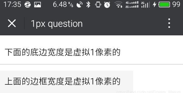
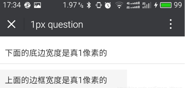
关于什么是移动端1像素边框问题,先上两张图,大家就明白了。
解决方案
将以下代码放在border.css文件中,然后引入
常用className

border:整个盒子都有边框

border-top:上边框

border-right:右边框

border-bottom:下边框

border-left:左边框

**使用:<div class="border-top"></div>**
border.css【注意】
使用时注意:该class名字只作用于(display:block)的块级元素上,其它看不到效果
想改变边框颜色的话,将代码中的所有颜色统一全部替换成你需要的颜色
代码:
@charset "utf-8";

.border,

.border-top,

.border-right,

.border-bottom,

.border-left,

.border-topbottom,

.border-rightleft,

.border-topleft,

.border-rightbottom,

.border-topright,

.border-bottomleft {

    position: relative;

}

.border::before,

.border-top::before,

.border-right::before,

.border-bottom::before,

.border-left::before,

.border-topbottom::before,

.border-topbottom::after,

.border-rightleft::before,

.border-rightleft::after,

.border-topleft::before,

.border-topleft::after,

.border-rightbottom::before,

.border-rightbottom::after,

.border-topright::before,

.border-topright::after,

.border-bottomleft::before,

.border-bottomleft::after {

    content: "\0020";

    overflow: hidden;

    position: absolute;

}

/* border

 * 因,边框是由伪元素区域遮盖在父级

 * 故,子级若有交互,需要对子级设置

 * 定位 及 z轴

 */

.border::before {

    box-sizing: border-box;

    top: ;

    left: ;

    height: %;

    width: %;

    border: 1px solid #eaeaea;

    transform-origin:  ;

}

.border-top::before,

.border-bottom::before,

.border-topbottom::before,

.border-topbottom::after,

.border-topleft::before,

.border-rightbottom::after,

.border-topright::before,

.border-bottomleft::before {

    left: ;

    width: %;

    height: 1px;

}

.border-right::before,

.border-left::before,

.border-rightleft::before,

.border-rightleft::after,

.border-topleft::after,

.border-rightbottom::before,

.border-topright::after,

.border-bottomleft::after {

    top: ;

    width: 1px;

    height: %;

}

.border-top::before,

.border-topbottom::before,

.border-topleft::before,

.border-topright::before {

    border-top: 1px solid #eaeaea;

    transform-origin:  ;

}

.border-right::before,

.border-rightbottom::before,

.border-rightleft::before,

.border-topright::after {

    border-right: 1px solid #eaeaea;

    transform-origin: % ;

}

.border-bottom::before,

.border-topbottom::after,

.border-rightbottom::after,

.border-bottomleft::before {

    border-bottom: 1px solid #eaeaea;

    transform-origin:  %;

}

.border-left::before,

.border-topleft::after,

.border-rightleft::after,

.border-bottomleft::after {

    border-left: 1px solid #eaeaea;

    transform-origin:  ;

}

.border-top::before,

.border-topbottom::before,

.border-topleft::before,

.border-topright::before {

    top: ;

}

.border-right::before,

.border-rightleft::after,

.border-rightbottom::before,

.border-topright::after {

    right: ;

}

.border-bottom::before,

.border-topbottom::after,

.border-rightbottom::after,

.border-bottomleft::after {

    bottom: ;

}

.border-left::before,

.border-rightleft::before,

.border-topleft::after,

.border-bottomleft::before {

    left: ;

}

@media (max--moz-device-pixel-ratio: 1.49), (-webkit-max-device-pixel-ratio: 1.49), (max-device-pixel-ratio: 1.49), (max-resolution: 143dpi), (max-resolution: .49dppx) {

    /* 默认值,无需重置 */

}

@media (min--moz-device-pixel-ratio: 1.5) and (max--moz-device-pixel-ratio: 2.49), (-webkit-min-device-pixel-ratio: 1.5) and (-webkit-max-device-pixel-ratio: 2.49), (min-device-pixel-ratio: 1.5) and (max-device-pixel-ratio: 2.49), (min-resolution: 144dpi) and (max-resolution: 239dpi), (min-resolution: .5dppx) and (max-resolution: .49dppx) {

    .border::before {

        width: %;

        height: %;

        transform: scale(.);

    }

    .border-top::before,

    .border-bottom::before,

    .border-topbottom::before,

    .border-topbottom::after,

    .border-topleft::before,

    .border-rightbottom::after,

    .border-topright::before,

    .border-bottomleft::before {

        transform: scaleY(.);

    }

    .border-right::before,

    .border-left::before,

    .border-rightleft::before,

    .border-rightleft::after,

    .border-topleft::after,

    .border-rightbottom::before,

    .border-topright::after,

    .border-bottomleft::after {

        transform: scaleX(.);

    }

}

@media (min--moz-device-pixel-ratio: 2.5), (-webkit-min-device-pixel-ratio: 2.5), (min-device-pixel-ratio: 2.5), (min-resolution: 240dpi), (min-resolution: .5dppx) {

    .border::before {

        width: %;

        height: %;

        transform: scale(.);

    }

    .border-top::before,

    .border-bottom::before,

    .border-topbottom::before,

    .border-topbottom::after,

    .border-topleft::before,

    .border-rightbottom::after,

    .border-topright::before,

    .border-bottomleft::before {

        transform: scaleY(.);

    }

    .border-right::before,

    .border-left::before,

    .border-rightleft::before,

    .border-rightleft::after,

    .border-topleft::after,

    .border-rightbottom::before,

    .border-topright::after,

    .border-bottomleft::after {

        transform: scaleX(.);

    }

}
.
移动端 1px 像素边框问题的解决方案(Border.css)的更多相关文章
- 【H5开发基础】移动端1像素边框问题的解决方案
自从乔帮主提出retina屏以来.可练就了不少前端兄弟的像素眼,有强迫症的伙伴们日子可就煎熬了.为了画出真正的1像素边框,前端猿们也是受尽各浏览器的虐待了. 关于什么是移动端1像素边框问题,先上两张图 ...
- 移动端一像素边框解决方案[css scale]
新建一个border.css的文件,然后将代码复制粘贴,然后引用border.css样式文件,然后给需要添加边框的元素,加相应的类样式. tips: border-bottom[一像素下边框]:bor ...
- 移动端1px像素解决方式,从1px像素问题剖析像素及viewport
在移动端web开发过程中,如果你对边框设置border:1px,会发现,边框在某些手机机型上面显示的1px比实际感觉会变粗,这也就是1像素问题.如下图是对桌面浏览器和移动端border设置1px的比较 ...
- 移动端1px的边框
我们知道,在移动端存在物理像素(physical pixel)和设备独立像素(density-independent pixel)的概念.物理像素也称为设备像素,它是显示设备中一个最微小的物理部件,每 ...
- 移动端1px线适配问题-------适配各种编译CSS工具 stylus sass styled-componet实现方法
其实在stylus与sass中实现移动端1像素线各个手机设备的适配问题的原理是一样的, 首先我还是先介绍一下原理和所依赖的方法 原理:其实他们都是通过css3的媒体查询来实现的 步骤思路: 1.给目标 ...
- stylus解决移动端1像素边框的问题
首先 我是借用了yo框架的border和他的媒体查询组合 这两个分别是在yo>lib>core>classes>_border.scss(用来获取yo框架封装的border) ...
- 移动web 1像素边框
实现方法 border-image 图片 实现 这篇文章是腾讯github上的解决方案border-image来实现的 链接走起 <使用border-image实现类似iOS7的1px底边> ...
- 移动端1px边框解决方案
在retina屏中,像素比为2(iPhone6/7/8)或3(iPhone6Plus/7Plus/8Plus),1px的边框看起来比真的1px更宽. 使用伪类加transform的方式 元素本身不定义 ...
- 移动端1px边框实现
问题描述:移动端iPhone上的1px边框看起来像2px那么粗.问题分析:不同的手机有不同的像素密度,在window对象中有一个devicePixelRatio属性,它可以反应设备的像素与css中的像 ...
随机推荐
- List中的ArrayList和LinkedList源码分析
List是在面试中经常会问的一点,在我们面试中知道的仅仅是List是单列集合Collection下的一个实现类, List的实现接口又有几个,一个是ArrayList,还有一个是LinkedLis ...
- 快速搭建Linux-0.11实验环境
搭这个实验环境主要是为了学习Linux-0.11的代码,那就需要修改代码再次编译来验证自己的想法.主要的实验环境来自实验楼,但是在那上面毕竟不方便,所以就以实验楼上的为基础在自己的虚拟机上搭建一个环境 ...
- OpenCV4.1.2 QRCode解码体验测评(附源码+支持中文)
目前官方Release的OpenCV最新版本为4.1.2,偶然看到更新信息里面QRCode解码性能有提升,所以迫不及待想尝试一下,因为上次测试了4.0版本的效果不太好. 下载和配置OpenCV的步骤此 ...
- scrapy中间件中发送邮件
背景介绍:之前写过通过通过scrapy的扩展发送邮件,在爬虫关闭的时候发送邮件.那个时候有个问题就是MailSender对象需要return出去.这次需要在中间件中发送邮件,但是中间件中不能随便使用r ...
- Java爬虫利器HTML解析工具-Jsoup
Jsoup简介 Java爬虫解析HTML文档的工具有:htmlparser, Jsoup.本文将会详细介绍Jsoup的使用方法,10分钟搞定Java爬虫HTML解析. Jsoup可以直接解析某个URL ...
- AntDesign vue学习笔记(五)导航菜单动态加载
一般的后台系统都有一个树形导航菜单,具体实现如下,主要参考https://my.oschina.net/u/4131669/blog/3048416 "menuList": [ { ...
- Luogu5611 Ynoi2013 D2T2/牛客挑战赛32F 最大子段和 分块、分治
传送门 之前一直咕着的,因为一些特殊的原因把这道题更掉算了-- 有一个对值域莫队+线段树的做法,复杂度\(O(n\sqrt{n} \log n)\)然而牛客机子实在太慢了没有希望(Luogu上精细实现 ...
- ASP.NET Core应用程序的参数配置及使用(转载)
本文结构 提前准备 参数配置方式 appsettings.json 环境变量 命令行参数 在控制器中使用配置参数 注入IConfiguration对象 注入IOptions对象 总结 应用程序的开发不 ...
- VSCode 命令
淘宝 NPM 镜像 https://npm.taobao.org/ Ctrl+~ 显示终端 npm start 启动项目 cnpm install 安装模块
- 上传文件大小与时间 Web.Config文件 httpRuntime 限制
httpRuntime <httpRuntime executionTimeout="90" maxRequestLength="40960" useF ...