CSS 按钮
总结有关按钮的各种样式
㈠基本按钮样式
看一下没有进行css样式设计时按钮的样子与进行样式设计的按钮样子
<!DOCTYPE html>

<html>

<head>

<meta charset="utf-8">

<title>基本按钮样式</title>

<style>

.button {

    background-color: skyblue;

    border: none;

    color: white;

    padding: 15px 30px;

    text-align: center;

    text-decoration: none;

    display: inline-block;

    font-size: 18px;

    margin: 4px 2px;

    cursor: pointer;

}

</style>

</head>

<body>

<h2>CSS 按钮</h2>

<button>默认按钮</button>

<a href="#" class="button">链接按钮</a>

<button class="button">按钮</button>

<input type="button" class="button" value="输入框按钮">

</body>

</html>
效果图:
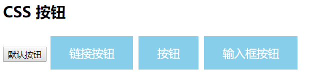
看,这就是两者之间的区别,接下来详细的介绍每一个样式添加后的样子。
注:cursor: pointer:光标呈现为指示链接的指针(一只手)。
㈡按钮颜色
使用 background-color 属性来设置按钮颜色:
<!DOCTYPE html>
<html>
<head>
<meta charset="utf-8">
<title>样色样式</title>
<style>
.button {
background-color: green;
border: none;
color: white;
padding: 15px 32px;
text-align: center;
text-decoration: none;
display: inline-block;
font-size: 16px;
margin: 4px 2px;
cursor: pointer;
} .button2 {background-color: blue;} /* Blue */
.button3 {background-color: red;} /* Red */
.button4 {background-color: #e7e7e7; color: black;} /* Gray */
.button5 {background-color: black;}
</style>
</head>
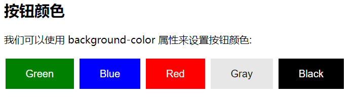
<body> <h2>按钮颜色</h2>
<p>我们可以使用 background-color 属性来设置按钮颜色:</p> <button class="button">Green</button>
<button class="button button2">Blue</button>
<button class="button button3">Red</button>
<button class="button button4">Gray</button>
<button class="button button5">Black</button> </body>
</html>
效果图:
㈢按钮大小
可以使用 font-size 属性来设置按钮大小:
<!DOCTYPE html>
<html>
<head>
<meta charset="utf-8">
<title>大小样式)</title>
<style>
.button {
background-color: deeppink;
border: none;
color: white;
padding: 15px 32px;
text-align: center;
text-decoration: none;
display: inline-block;
font-size: 16px;
margin: 4px 2px;
cursor: pointer;
} .button1 {font-size: 10px;}
.button2 {font-size: 12px;}
.button3 {font-size: 16px;}
.button4 {font-size: 20px;}
.button5 {font-size: 24px;}
</style>
</head>
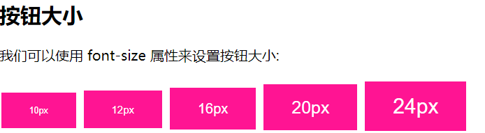
<body> <h2>按钮大小</h2>
<p>我们可以使用 font-size 属性来设置按钮大小:</p> <button class="button button1">10px</button>
<button class="button button2">12px</button>
<button class="button button3">16px</button>
<button class="button button4">20px</button>
<button class="button button5">24px</button> </body>
</html>
效果图:
㈣圆角按钮
可以使用 border-radius 属性来设置圆角按钮:
<!DOCTYPE html>
<html>
<head>
<meta charset="utf-8">
<title>圆角样式</title>
<style>
.button {
background-color: #FF3333;
border: none;
color: white;
padding: 15px 32px;
text-align: center;
text-decoration: none;
display: inline-block;
font-size: 16px;
margin: 4px 2px;
cursor: pointer;
} .button1 {border-radius: 4px;}
.button2 {border-radius: 8px;}
.button3 {border-radius: 12px;}
.button4 {border-radius: 16px;}
.button5 {border-radius: 50%;}
</style>
</head>
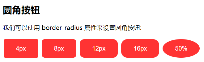
<body> <h2>圆角按钮</h2>
<p>我们可以使用 border-radius 属性来设置圆角按钮:</p> <button class="button button1">4px</button>
<button class="button button2">8px</button>
<button class="button button3">12px</button>
<button class="button button4">16px</button>
<button class="button button5">50%</button> </body>
</html>
效果图:
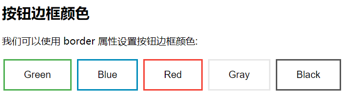
㈤按钮边框颜色
可以使用 border 属性设置按钮边框颜色:
<!DOCTYPE html>

<html>

<head>

<meta charset="utf-8">

<title>按钮边框样式</title>

<style>

.button {

    background-color: green;

    border: none;

    color: white;

    padding: 15px 32px;

    text-align: center;

    text-decoration: none;

    display: inline-block;

    font-size: 16px;

    margin: 4px 2px;

    cursor: pointer;

}

.button1 {

    background-color: white;

    color: black;

    border: 2px solid #4CAF50;

}

.button2 {

    background-color: white;

    color: black;

    border: 2px solid #008CBA;

}

.button3 {

    background-color: white;

    color: black;

    border: 2px solid #f44336;

}

.button4 {

    background-color: white;

    color: black;

    border: 2px solid #e7e7e7;

}

.button5 {

    background-color: white;

    color: black;

    border: 2px solid #555555;

}

</style>

</head>

<body>

<h2>按钮边框颜色</h2>

<p>我们可以使用 border 属性设置按钮边框颜色:</p>

<button class="button button1">Green</button>

<button class="button button2">Blue</button>

<button class="button button3">Red</button>

<button class="button button4">Gray</button>

<button class="button button5">Black</button>

</body>

</html>
效果图:

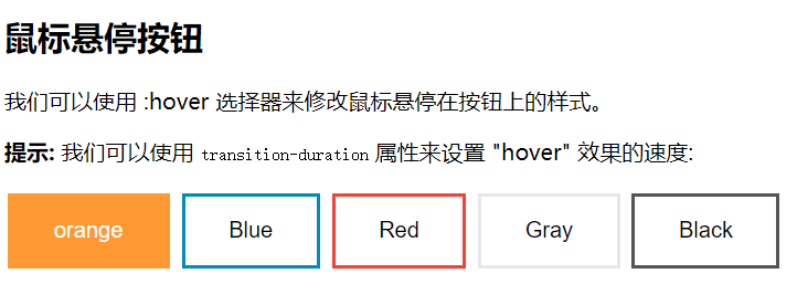
㈥鼠标悬停按钮
可以使用 :hover 选择器来修改鼠标悬停在按钮上的样式。
使用 transition-duration 属性来设置 "hover" 效果的速度
<!DOCTYPE html>

<html>

<head>

<meta charset="utf-8">

<title>悬停按钮样式</title>

<style>

.button {

    background-color: #FF9933;

    border: none;

    color: white;

    padding: 16px 32px;

    text-align: center;

    text-decoration: none;

    display: inline-block;

    font-size: 16px;

    margin: 4px 2px;

    -webkit-transition-duration: 0.5s; /* Safari */

    transition-duration: 0.5s;

    cursor: pointer;

}

.button1 {

    background-color: white;

    color: black;

    border: 2px solid #FF9933;

}

.button1:hover {

    background-color:#FF9933;

    color: white;

}

.button2 {

    background-color: white;

    color: black;

    border: 2px solid #008CBA;

}

.button2:hover {

    background-color: #008CBA;

    color: white;

}

.button3 {

    background-color: white;

    color: black;

    border: 2px solid #f44336;

}

.button3:hover {

    background-color: #f44336;

    color: white;

}

.button4 {

    background-color: white;

    color: black;

    border: 2px solid #e7e7e7;

}

.button4:hover {background-color: #e7e7e7;}

.button5 {

    background-color: white;

    color: black;

    border: 2px solid #555555;

}

.button5:hover {

    background-color: #555555;

    color: white;

}

</style>

</head>

<body>

<h2>鼠标悬停按钮</h2>

<p>我们可以使用 :hover 选择器来修改鼠标悬停在按钮上的样式。</p>

<p><strong>提示:</strong> 我们可以使用 <code>transition-duration</code> 属性来设置 "hover" 效果的速度:</p>

<button class="button button1">orange</button>

<button class="button button2">Blue</button>

<button class="button button3">Red</button>

<button class="button button4">Gray</button>

<button class="button button5">Black</button>

</body>

</html>
效果图:
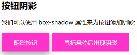
㈦按钮阴影
可以使用 box-shadow 属性来为按钮添加阴影:
<!DOCTYPE html>

<html>

<head>

<meta charset="utf-8">

<title>阴影样式</title>

<style>

.button {

    background-color: #FF33CC; /* Green */

    border: none;

    color: white;

    padding: 15px 32px;

    text-align: center;

    text-decoration: none;

    display: inline-block;

    font-size: 16px;

    margin: 4px 2px;

    cursor: pointer;

    -webkit-transition-duration: 0.55s; /* Safari */

    transition-duration: 0.5s;

}

.button1 {

    box-shadow: 0 8px 16px 0 rgba(0,0,0,0.2), 0 6px 20px 0 rgba(0,0,0,0.19);

}

.button2:hover {

    box-shadow: 0 12px 16px 0 rgba(0,0,0,0.3),0 17px 50px 0 rgba(0,0,0,0.19);

}

</style>

</head>

<body>

<h2>按钮阴影</h2>

<p>我们可以使用 box-shadow 属性来为按钮添加阴影:</p>

<button class="button button1">阴影按钮</button>

<button class="button button2">鼠标悬停后出现阴影</button>

</body>

</html>
效果图:
鼠标没有悬停时的样子:
鼠标悬停后的样子:

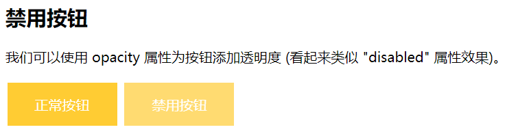
㈧禁用按钮
可以使用 opacity 属性为按钮添加透明度 (看起来类似 "disabled" 属性效果)。
可以添加 cursor 属性并设置为 "not-allowed" 来设置一个禁用的图片:
<!DOCTYPE html>

<html>

<head>

<meta charset="utf-8">

<title>禁用样式</title>

<style>

.button {

    background-color: #FFCC33; /* Green */

    border: none;

    color: white;

    padding: 15px 32px;

    text-align: center;

    text-decoration: none;

    display: inline-block;

    font-size: 16px;

    margin: 4px 2px;

    cursor: pointer;

}

.disabled {

    opacity: 0.7;

    cursor: not-allowed;

}

</style>

</head>

<body>

<h2>禁用按钮</h2>

<p>我们可以使用 opacity 属性为按钮添加透明度 (看起来类似 "disabled" 属性效果)。</p>

<button class="button">正常按钮</button>

<button class="button disabled">禁用按钮</button>

</body>

</html>
效果图:
㈨按钮宽度
默认情况下,按钮的大小有按钮上的文本内容决定( 根据文本内容匹配长度 )。 我们可以使用 width 属性来设置按钮的宽度:
如果要设置固定宽度可以使用像素 (px) 为单位,如果要设置响应式的按钮可以设置为百分比。
<!DOCTYPE html>

<html>

<head>

<meta charset="utf-8">

<title>宽度样式</title>

<style>

.button {

    background-color: #993366;

    border: none;

    color: white;

    padding: 15px 32px;

    text-align: center;

    text-decoration: none;

    display: inline-block;

    font-size: 16px;

    margin: 4px 2px;

    cursor: pointer;

}

.button1 {width: 250px;}

.button2 {width: 50%;}

.button3 {

    padding-left: 0;

    padding-right: 0;

    width: 100%;

}

</style>

</head>

<body>

<h2>按钮宽度</h2>

<p>默认情况下,按钮的大小有按钮上的文本内容决定( 根据文本内容匹配长度 )。 我们可以使用 width 属性来设置按钮的宽度:</p>

<p><strong>提示:</strong>  如果要设置固定宽度可以使用像素 (px) 为单位,如果要设置响应式的按钮可以设置为百分比。</p>

<button class="button button1">250px</button><br>

<button class="button button2">50%</button><br>

<button class="button button3">100%</button>

</body>

</html>
效果图:

㈩按钮组
移除外边距并添加 float:left 来设置按钮组:
<!DOCTYPE html>

<html>

<head>

<meta charset="utf-8">

<title>按钮组</title>

<style>

.button {

    background-color: #33CCCC; /* Green */

    border: none;

    color: white;

    padding: 15px 32px;

    text-align: center;

    text-decoration: none;

    display: inline-block;

    border-radius: 8px;

    font-size: 16px;

    cursor: pointer;

    float: left;

}

.button:hover {

    background-color: #3399CC;

}

</style>

</head>

<body>

<h2>按钮组</h2>

<p>移除外边距并添加 float:left 来设置按钮组:</p>

<button class="button">Button</button>

<button class="button">Button</button>

<button class="button">Button</button>

<button class="button">Button</button>

<p style="clear:both"><br>记住要清除浮动,否则下一个 p 元素的按钮也会显示在同一行。</p>

</body>

</html>
效果图:

(十一)带边框按钮组
可以使用 border 属性设置按钮边框颜色:
<!DOCTYPE html>

<html>

<head>

<meta charset="utf-8">

<title>按钮边框颜色样式</title>

<style>

.button {

    background-color: #4CAF50;

    border: none;

    color: white;

    padding: 15px 32px;

    text-align: center;

    text-decoration: none;

    display: inline-block;

    font-size: 16px;

    margin: 4px 2px;

    cursor: pointer;

}

.button1 {

    background-color: white;

    color: black;

    border: 2px solid #4CAF50;

}

.button2 {

    background-color: white;

    color: black;

    border: 2px solid #008CBA;

}

.button3 {

    background-color: white;

    color: black;

    border: 2px solid #f44336;

}

.button4 {

    background-color: white;

    color: black;

    border: 2px solid #e7e7e7;

}

.button5 {

    background-color: white;

    color: black;

    border: 2px solid #555555;

}

</style>

</head>

<body>

<h2>按钮边框颜色</h2>

<p>我们可以使用 border 属性设置按钮边框颜色:</p>

<button class="button button1">Green</button>

<button class="button button2">Blue</button>

<button class="button button3">Red</button>

<button class="button button4">Gray</button>

<button class="button button5">Black</button>

</body>

</html>
效果图:
(十二)按钮动画
示例1:鼠标移动到按钮上后添加箭头标记:
<!DOCTYPE html>

<html>

<head>

<meta charset="utf-8">

<title>箭头动画效果</title>

<style>

.button {

  display: inline-block;

  border-radius:8px;

  background-color: #33FFFF;

  border: none;

  color: #FFFFFF;

  text-align: center;

  font-size: 28px;

  padding: 20px;

  width: 200px;

  transition: all 0.5s;

  cursor: pointer;

  margin: 5px;

}

.button span {

  cursor: pointer;

  display: inline-block;

  position: relative;

  transition: 0.5s;

}

.button span:after {

  content: '→';

  position: absolute;

  opacity: 0;

  top: 0;

  right: -20px;

  transition: 0.5s;

}

.button:hover span {

  padding-right: 25px;

}

.button:hover span:after {

  opacity: 1;

  right: 0;

}

</style>

</head>

<body>

<h2>按钮动画</h2>

<button class="button" style="vertical-align:middle"><span>Hover </span></button>

</body>

</html>
效果图:

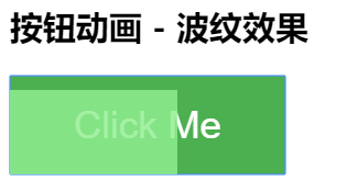
示例2:点击时添加 "波纹" 效果:
<!DOCTYPE html>

<html>

<head>

<meta charset="utf-8">

<title>波纹动画</title>

<style>

.button {

    position: relative;

    background-color: #4CAF50;

    border: none;

    font-size: 28px;

    color: #FFFFFF;

    padding: 20px;

    width: 200px;

    text-align: center;

    -webkit-transition-duration: 0.4s; /* Safari */

    transition-duration: 0.4s;

    text-decoration: none;

    overflow: hidden;

    cursor: pointer;

}

.button:after {

    content: "";

    background: #90EE90;

    display: block;

    position: absolute;

    padding-top: 300%;

    padding-left: 350%;

    margin-left: -20px!important;

    margin-top: -120%;

    opacity: 0;

    transition: all 0.8s

}

.button:active:after {

    padding: 0;

    margin: 0;

    opacity: 1;

    transition: 0s

}

</style>

</head>

<body>

<h2>按钮动画 - 波纹效果</h2>

<button class="button">Click Me</button>

</body>

</html>
效果图:
示例3:点击时添加 "压下" 效果:
<!DOCTYPE html>

<html>

<head>

<meta charset="utf-8">

<title>按压样式</title>

<style>

.button {

  display: inline-block;

  padding: 15px 25px;

  font-size: 24px;

  cursor: pointer;

  text-align: center;

  text-decoration: none;

  outline: none;

  color: #fff;

  background-color: #CC00CC;

  border: none;

  border-radius: 15px;

  box-shadow: 0 9px #999;

}

.button:hover {background-color: #CC0099;}

.button:active {

  background-color: #CC0099;

  box-shadow: 0 5px #666;

  transform: translateY(4px);

}

</style>

</head>

<body>

<h2>按钮动画 - "按压效果"</h2>

<button class="button">Click Me</button>

</body>

</html>
效果图:
按压前:
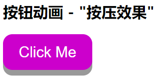
按压后:

参考:https://www.runoob.com/css3/css3-buttons.html
CSS 按钮的更多相关文章
- 漂亮的CSS按钮样式集以及在线生成工具
以前我们制作一样带带阴影.圆角或3D感的按钮都需要用图片来制作,但CSS3出来后就可以不用图片了,由于是代码写的按钮样式,在Retina上浏览依然清晰美观.虽然不错,但我们写一个阴影+质感的按钮还是挺 ...
- css 样式(checkbox开关、css按钮)
checkbox开关 css .iosCheck { /* Blue edition */ } .iosCheck input { display: none; } .iosCheck i { dis ...
- css 按钮悬停效霓虹灯特效
css 按钮悬停效霓虹灯特效 <!DOCTYPE html> <html lang="en"> <head> <meta charset=
- BUTTONS V. 2.0.0——CSS按钮库
BUTTONS-V2-CSS库样式职责 CSS库样式职责分离优点 模块样式命名更清晰化 易于维护.扩展性强 动画效果——修改样式后有过度效果,默认样式 源码如下 <!DOCTYPE html&g ...
- css按钮自适应
原理:利用a标签和i标签各自一个背景组合成为按钮,达到自适应. <!DOCTYPE html> <html> <head> <meta charset=&qu ...
- 好看的CSS按钮
<!DOCTYPE HTML PUBLIC "-//W3C//DTD HTML 4.01 Transitional//EN" "http://www.w3.org/ ...
- css按钮口诀 - CSS BUG顺口溜
在进行CSS网页布局时遇到BUG,请认真阅读以下内容,非常容易记忆的,不知道哪位高人把CSS BUG编成了顺口溜了!看看好不好记住呢? 一.IE边框若显若无,须注意,定是高度设置已忘记: 二.浮动产生 ...
- bootstrap -- css -- 按钮
本文中提到的按钮样式,适用于:<a>, <button>, 或 <input> 元素上 但最好在 <button> 元素上使用按钮 class,避免跨浏 ...
- 手写css按钮组
css: .lf{float:left} .btn{ width:60px; height:24px; color:#fff; border-radius:4px; cursor:pointer; b ...
随机推荐
- [转] Python中的装饰器(decorator)
想理解Python的decorator首先要知道在Python中函数也是一个对象,所以你可以 将函数复制给变量 将函数当做参数 返回一个函数 函数在Python中和变量的用法一样也是一等公民,也就是高 ...
- [转帖]Intro Guide to Dockerfile Best Practices
Intro Guide to Dockerfile Best Practices By Tibor Vass July 02 2019 https://blog.docker.com/2019/ ...
- (5.3)mysql高可用系列——mysql复制之复制的参数
参考:https://www.iteye.com/blog/shift-alt-ctrl-2269539 详情 [1]参数 #[1.1]基本参数 bind-address=192.168.1.201 ...
- 【C++】A trick I learned:put boilerplate code into constructor of a struct
I learned this trick from hitonanode's submission on AtCoder. The trick is like struct fast_ios { fa ...
- JavaSSM框架精选50道面试题
JavaSSM框架精选50道面试题 2019年02月13日 19:04:43 EerhtSedah 阅读数 7760更多 分类专栏: 面试题 版权声明:本文为博主原创文章,遵循CC 4.0 BY- ...
- Redis: 缓存过期、缓存雪崩、缓存穿透、缓存击穿(热点)、缓存并发(热点)、多级缓存、布隆过滤器
Redis: 缓存过期.缓存雪崩.缓存穿透.缓存击穿(热点).缓存并发(热点).多级缓存.布隆过滤器 2019年08月18日 16:34:24 hanchao5272 阅读数 1026更多 分类专栏: ...
- 设置adb shell的环境变量
1.设置adb系统变量 adb D:\androidStudio\platform-tools;D:\androidStudio\tools 2.设置path系统变量 path D:\android ...
- 浅析java中clone()方法
本文转载自:http://blog.csdn.net/mengxiangyue/article/details/6818611 Java中我们可能都遇到过这样的情况,在我们将一个对象做为参数传给一个函 ...
- 记一些使用mpvue时遇到的问题
一.在mpvue中使用vuex(和在vue中使用不同) 1.vue中使用vuex,在main.js中: import store from './store' new Vue({ store }) ...
- TypeScript 和 JavaScript 的区别
TypeScript 和 JavaScript 是目前项目开发中较为流行的两种脚本语言,我们已经熟知 TypeScript 是 JavaScript 的一个超集.JavaScript 和 TypeSc ...