
好看的CSS按钮
<!DOCTYPE HTML PUBLIC "-//W3C//DTD HTML 4.01 Transitional//EN" "http://www.w3.org/TR/html4/loose.dtd">

<html>

 <head>

  <title> New Document </title>

  <meta name="Generator" content="EditPlus">

  <meta name="Author" content="">

  <meta name="Keywords" content="">

  <meta name="Description" content="">

<link rel="stylesheet" type="text/css" href="style.css" />

 </head>

 <body>

  <div class="demo">

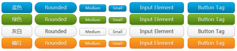
        <a href="#" class="button blue">蓝色</a>

        <a href="#" class="button blue bigrounded">Rounded</a>

        <a href="#" class="button blue medium">Medium</a>

        <a href="#" class="button blue small">Small</a>

        <input class="button blue" type="button" value="Input Element" />

        <button class="button blue">Button Tag</button>

    </div>

    <div class="demo">

        <a href="#" class="button green">绿色</a>

        <a href="#" class="button green bigrounded">Rounded</a>

        <a href="#" class="button green medium">Medium</a>

        <a href="#" class="button green small">Small</a>

        <input class="button green" type="button" value="Input Element" />

        <button class="button green">Button Tag</button>

    </div>

    <div class="demo">

        <a href="#" class="button white">灰白</a>

        <a href="#" class="button white bigrounded">Rounded</a>

        <a href="#" class="button white medium">Medium</a>

        <a href="#" class="button white small">Small</a>

        <input class="button white" type="button" value="Input Element" />

        <button class="button white">Button Tag</button>

    </div>

    <div class="demo">

        <a href="#" class="button orange">橘红</a>

        <a href="#" class="button orange bigrounded">Rounded</a>

        <a href="#" class="button orange medium">Medium</a>

        <a href="#" class="button orange small">Small</a>

        <input class="button orange" type="button" value="Input Element" />

        <button class="button orange">Button Tag</button>

    </div>

 </body>

</html>
.button {

    display: inline-block;

    outline: none;

    cursor: pointer;

    text-align: center;

    text-decoration: none;

    font: 16px/100% 'Microsoft yahei',Arial, Helvetica, sans-serif;

    padding: .5em 2em .55em;

    text-shadow: 0 1px 1px rgba(0,0,0,.3);

    -webkit-border-radius: .5em;

    -moz-border-radius: .5em;

    border-radius: .5em;

    -webkit-box-shadow: 0 1px 2px rgba(0,0,0,.2);

    -moz-box-shadow: 0 1px 2px rgba(0,0,0,.2);

    box-shadow: 0 1px 2px rgba(0,0,0,.2);

}

.button:hover {

    text-decoration: none;

}

.button:active {

    position: relative;

    top: 1px;

}

.bigrounded {

    -webkit-border-radius: 2em;

    -moz-border-radius: 2em;

    border-radius: 2em;

}

.medium {

    font-size: 12px;

    padding: .4em 1.5em .42em;

}

.small {

    font-size: 11px;

    padding: .2em 1em .275em;

}

/* blue */

.blue {

    color: #d9eef7;

    border: solid 1px #0076a3;

    background: #0095cd;

    background: -webkit-gradient(linear, left top, left bottom, from(#00adee), to(#0078a5));

    background: -moz-linear-gradient(top,  #00adee,  #0078a5);

    filter:  progid:DXImageTransform.Microsoft.gradient(startColorstr='#00adee', endColorstr='#0078a5');

}

.blue:hover {

    background: #007ead;

    background: -webkit-gradient(linear, left top, left bottom, from(#0095cc), to(#00678e));

    background: -moz-linear-gradient(top,  #0095cc,  #00678e);

    filter:  progid:DXImageTransform.Microsoft.gradient(startColorstr='#0095cc', endColorstr='#00678e');

}

.blue:active {

    color: #80bed6;

    background: -webkit-gradient(linear, left top, left bottom, from(#0078a5), to(#00adee));

    background: -moz-linear-gradient(top,  #0078a5,  #00adee);

    filter:  progid:DXImageTransform.Microsoft.gradient(startColorstr='#0078a5', endColorstr='#00adee');

}

/* green */

.green {

    color: #e8f0de;

    border: solid 1px #538312;

    background: #64991e;

    background: -webkit-gradient(linear, left top, left bottom, from(#7db72f), to(#4e7d0e));

    background: -moz-linear-gradient(top,  #7db72f,  #4e7d0e);

    filter:  progid:DXImageTransform.Microsoft.gradient(startColorstr='#7db72f', endColorstr='#4e7d0e');

}

.green:hover {

    background: #538018;

    background: -webkit-gradient(linear, left top, left bottom, from(#6b9d28), to(#436b0c));

    background: -moz-linear-gradient(top,  #6b9d28,  #436b0c);

    filter:  progid:DXImageTransform.Microsoft.gradient(startColorstr='#6b9d28', endColorstr='#436b0c');

}

.green:active {

    color: #a9c08c;

    background: -webkit-gradient(linear, left top, left bottom, from(#4e7d0e), to(#7db72f));

    background: -moz-linear-gradient(top,  #4e7d0e,  #7db72f);

    filter:  progid:DXImageTransform.Microsoft.gradient(startColorstr='#4e7d0e', endColorstr='#7db72f');

}

/* white */

.white {

    color: #606060;

    border: solid 1px #b7b7b7;

    background: #fff;

    background: -webkit-gradient(linear, left top, left bottom, from(#fff), to(#ededed));

    background: -moz-linear-gradient(top,  #fff,  #ededed);

    filter:  progid:DXImageTransform.Microsoft.gradient(startColorstr='#ffffff', endColorstr='#ededed');

}

.white:hover {

    background: #ededed;

    background: -webkit-gradient(linear, left top, left bottom, from(#fff), to(#dcdcdc));

    background: -moz-linear-gradient(top,  #fff,  #dcdcdc);

    filter:  progid:DXImageTransform.Microsoft.gradient(startColorstr='#ffffff', endColorstr='#dcdcdc');

}

.white:active {

    color: #999;

    background: -webkit-gradient(linear, left top, left bottom, from(#ededed), to(#fff));

    background: -moz-linear-gradient(top,  #ededed,  #fff);

    filter:  progid:DXImageTransform.Microsoft.gradient(startColorstr='#ededed', endColorstr='#ffffff');

}

/* orange */

.orange {

    color: #fef4e9;

    border: solid 1px #da7c0c;

    background: #f78d1d;

    background: -webkit-gradient(linear, left top, left bottom, from(#faa51a), to(#f47a20));

    background: -moz-linear-gradient(top,  #faa51a,  #f47a20);

    filter:  progid:DXImageTransform.Microsoft.gradient(startColorstr='#faa51a', endColorstr='#f47a20');

}

.orange:hover {

    background: #f47c20;

    background: -webkit-gradient(linear, left top, left bottom, from(#f88e11), to(#f06015));

    background: -moz-linear-gradient(top,  #f88e11,  #f06015);

    filter:  progid:DXImageTransform.Microsoft.gradient(startColorstr='#f88e11', endColorstr='#f06015');

}

.orange:active {

    color: #fcd3a5;

    background: -webkit-gradient(linear, left top, left bottom, from(#f47a20), to(#faa51a));

    background: -moz-linear-gradient(top,  #f47a20,  #faa51a);

    filter:  progid:DXImageTransform.Microsoft.gradient(startColorstr='#f47a20', endColorstr='#faa51a');

}
 650) this.width=650;" src="http://img1.51cto.com/attachment/201312/143640728.png" title="QQ截图20131214143617.png" alt="143640728.png" />
好看的CSS按钮的更多相关文章
- 漂亮的CSS按钮样式集以及在线生成工具
以前我们制作一样带带阴影.圆角或3D感的按钮都需要用图片来制作,但CSS3出来后就可以不用图片了,由于是代码写的按钮样式,在Retina上浏览依然清晰美观.虽然不错,但我们写一个阴影+质感的按钮还是挺 ...
- css 样式(checkbox开关、css按钮)
checkbox开关 css .iosCheck { /* Blue edition */ } .iosCheck input { display: none; } .iosCheck i { dis ...
- CSS 按钮
总结有关按钮的各种样式 ㈠基本按钮样式 看一下没有进行css样式设计时按钮的样子与进行样式设计的按钮样子 <!DOCTYPE html> <html> <head> ...
- css 按钮悬停效霓虹灯特效
css 按钮悬停效霓虹灯特效 <!DOCTYPE html> <html lang="en"> <head> <meta charset=
- BUTTONS V. 2.0.0——CSS按钮库
BUTTONS-V2-CSS库样式职责 CSS库样式职责分离优点 模块样式命名更清晰化 易于维护.扩展性强 动画效果——修改样式后有过度效果,默认样式 源码如下 <!DOCTYPE html&g ...
- css按钮自适应
原理:利用a标签和i标签各自一个背景组合成为按钮,达到自适应. <!DOCTYPE html> <html> <head> <meta charset=&qu ...
- 四个好看的CSS样式表格
文章来源 http://www.cnphp6.com/archives/58020 1. 单像素边框CSS表格 这是一个非经常常使用的表格样式. 源码: 2. 带背景图的CSS样式表格 和上面差点儿相 ...
- 有用好看的CSS+JS+table 导航
预览效果图 watermark/2/text/aHR0cDovL2Jsb2cuY3Nkbi5uZXQv/font/5a6L5L2T/fontsize/400/fill/I0JBQkFCMA==/dis ...
- html网页什么样的字体最好看,css设置各种中文字体样式代码
css代码如下:{ font-family:"Microsoft YaHei",微软雅黑,"MicrosoftJhengHei",华文细黑,STHeiti,Mi ...
随机推荐
- yii基础应用目录结构
basic/ 应用根目录 composer.json Composer 配置文件, 描述包信息 config/ 包含应用配置及其它配置 console.php 控制台应用配置信息 web.php We ...
- pycharm使用错误排查
1.pip安装扩展包报错 creating build/temp.linux-x86_64-3.4 x86_64-linux-gnu- -Wformat -Werror=format-security ...
- lottery概率问题
问题:1~n编号的彩票,要买全,等概率条件下平均要买几张要求写出算法. 回答:已经买了m张时,买中剩下的概率为1-m/n,则要买的张数为1/(1-m/n)n=2,s=1+1/(1-1/2);n=3,s ...
- 【BZOJ-4269】再见Xor 高斯消元 + 线性基
4269: 再见Xor Time Limit: 10 Sec Memory Limit: 512 MBSubmit: 131 Solved: 81[Submit][Status][Discuss] ...
- Nuget-使用图形化界面打包自己的类库
到NuGet相对于我们最重要的功能是能够搭建自己的NuGet服务器,实现公司内部类库的轻松共享更新.在安装好NuGet扩展后,我们已经能够通过NuGet轻松下载自己需要的类库,下面来说一说如何将自己的 ...
- xcoj 1208 矩阵
赛场上一开始以为是递推,交了一发希望以为能卡着线过(毕竟是O(5N)的),结果WA了. 又以为是dp,最后半小时尝试各种YY...各种WA 实际上取每次transfer中最大的概率然后递推是不对的.. ...
- kickstart note
KickStart是一种无人职守安装方式 PXE + kickstart + DHCP + TFTP 1.挂载光盘 mount /dev/sr0 /mnt/iso cp -rf /mnt/iso/* ...
- hihocoder 1347 小h的树上的朋友
传送门 时间限制:18000ms单点时限:2000ms内存限制:512MB 描述 小h拥有$n$位朋友.每位朋友拥有一个数值$V_i$代表他与小h的亲密度.亲密度有可能发生变化.岁月流逝,小h的朋友们 ...
- AngularJs $cacheFactory 缓存服务
可能之前的api写的有些枯燥吧,因为不烧脑,不需要很多逻辑思维来做处理,那么之后的文章会有趣很多,慢慢的开始烧脑了,准备好大量脑细胞的死亡吧~ 先来篇简单的缓存服务. 本文将api文档里的$cac ...
- Codeforces Intel Code Challenge Final Round (Div. 1 + Div. 2, Combined) A. Checking the Calendar(水题)
传送门 Description You are given names of two days of the week. Please, determine whether it is possibl ...