WPF实现树形下拉列表框(TreeComboBox)
前言
树形下拉菜单是许多WPF应用程序中常见的用户界面元素,它能够以分层的方式展示数据,提供更好的用户体验。本文将深入探讨如何基于WPF创建一个可定制的树形下拉菜单控件,涵盖从原理到实际实现的关键步骤。
一、需求分析
树形下拉菜单控件的核心是将ComboBox与TreeView结合起来,以实现下拉时的树状数据展示。在WPF中,可以通过自定义控件模板、样式和数据绑定来实现这一目标。
我们首先来分析一下ComboBox控件的模板。
<ControlTemplate x:Key="ComboBoxTemplate" TargetType="{x:Type ComboBox}">

    <Grid x:Name="templateRoot" SnapsToDevicePixels="true">

        <Grid.ColumnDefinitions>

            <ColumnDefinition Width="*"/>

            <ColumnDefinition MinWidth="{DynamicResource {x:Static SystemParameters.VerticalScrollBarWidthKey}}" Width="0"/>

        </Grid.ColumnDefinitions>

        <Popup x:Name="PART_Popup" AllowsTransparency="true" Grid.ColumnSpan="2" IsOpen="{Binding IsDropDownOpen, Mode=TwoWay, RelativeSource={RelativeSource Mode=TemplatedParent}}" Margin="1" Placement="Bottom" PopupAnimation="{DynamicResource {x:Static SystemParameters.ComboBoxPopupAnimationKey}}">

            <theme:SystemDropShadowChrome x:Name="shadow" Color="Transparent" MinWidth="{Binding ActualWidth, ElementName=templateRoot}" MaxHeight="{TemplateBinding MaxDropDownHeight}">

                <Border x:Name="dropDownBorder" Background="{DynamicResource {x:Static SystemColors.WindowBrushKey}}" BorderBrush="{DynamicResource {x:Static SystemColors.WindowFrameBrushKey}}" BorderThickness="1">

                    <ScrollViewer x:Name="DropDownScrollViewer">

                        <Grid x:Name="grid" RenderOptions.ClearTypeHint="Enabled">

                            <Canvas x:Name="canvas" HorizontalAlignment="Left" Height="0" VerticalAlignment="Top" Width="0">

                                <Rectangle x:Name="opaqueRect" Fill="{Binding Background, ElementName=dropDownBorder}" Height="{Binding ActualHeight, ElementName=dropDownBorder}" Width="{Binding ActualWidth, ElementName=dropDownBorder}"/>

                            </Canvas>

                            <ItemsPresenter x:Name="ItemsPresenter" KeyboardNavigation.DirectionalNavigation="Contained" SnapsToDevicePixels="{TemplateBinding SnapsToDevicePixels}"/>

                        </Grid>

                    </ScrollViewer>

                </Border>

            </theme:SystemDropShadowChrome>

        </Popup>

        <ToggleButton x:Name="toggleButton" Background="{TemplateBinding Background}" BorderBrush="{TemplateBinding BorderBrush}" BorderThickness="{TemplateBinding BorderThickness}" Grid.ColumnSpan="2" IsChecked="{Binding IsDropDownOpen, Mode=TwoWay, RelativeSource={RelativeSource Mode=TemplatedParent}}" Style="{StaticResource ComboBoxToggleButton}"/>

        <ContentPresenter x:Name="contentPresenter" ContentStringFormat="{TemplateBinding SelectionBoxItemStringFormat}" ContentTemplate="{TemplateBinding SelectionBoxItemTemplate}" Content="{TemplateBinding SelectionBoxItem}" ContentTemplateSelector="{TemplateBinding ItemTemplateSelector}" HorizontalAlignment="{TemplateBinding HorizontalContentAlignment}" IsHitTestVisible="false" Margin="{TemplateBinding Padding}" SnapsToDevicePixels="{TemplateBinding SnapsToDevicePixels}" VerticalAlignment="{TemplateBinding VerticalContentAlignment}"/>

    </Grid>

</ControlTemplate>
从以上代码可以看出,其中的Popup控件就是下拉部分,那么按照常理,我们在Popup控件中放入一个TreeView控件即可实现该需求,但是现实情况远没有这么简单。我们开发一个控件,不仅要从外观上实现功能,还需要考虑数据绑定、事件触发、自定义模板等方面的问题,显然,直接放置一个TreeView控件虽然也能实现功能,但是从封装的角度看,它并不优雅,使用也不方便。那么有没有更好的方法满足以上需求呢?下面提供另一种思路,其核心思想就是融合ComboBox控件与TreeView控件模板,让控件既保留TreeView的特性,又拥有ComboBox的外观。
二、代码实现
2.1 编辑TreeView模板;
2.2 提取ComboBox的模板代码;
2.3 将ComboBox的模板代码移植到TreeView模板中;
2.4 将TreeView模板包含ItemsPresenter部分的关键代码放入ComboBox模板中的Popup控件内;
以下为融合后的xaml代码
<ControlTemplate TargetType="{x:Type local:TreeComboBox}">

    <Grid x:Name="templateRoot" SnapsToDevicePixels="true">

        <Grid.ColumnDefinitions>

            <ColumnDefinition Width="*" />

            <ColumnDefinition Width="0" MinWidth="{DynamicResource {x:Static SystemParameters.VerticalScrollBarWidthKey}}" />

        </Grid.ColumnDefinitions>

        <Popup

                            x:Name="PART_Popup"

                            Grid.ColumnSpan="2"

                            MaxHeight="{TemplateBinding MaxDropDownHeight}"

                            Margin="1"

                            AllowsTransparency="true"

                            IsOpen="{Binding IsDropDownOpen, Mode=TwoWay, RelativeSource={RelativeSource Mode=TemplatedParent}}"

                            Placement="Bottom"

                            PopupAnimation="{DynamicResource {x:Static SystemParameters.ComboBoxPopupAnimationKey}}">

            <Border

                                x:Name="PART_Border"

                                Width="{Binding RelativeSource={RelativeSource AncestorType=local:TreeComboBox}, Path=ActualWidth}"

                                Background="{DynamicResource {x:Static SystemColors.WindowBrushKey}}"

                                BorderBrush="{DynamicResource {x:Static SystemColors.WindowFrameBrushKey}}"

                                BorderThickness="1"

                                SnapsToDevicePixels="true">

                <ScrollViewer

                                    x:Name="_tv_scrollviewer_"

                                    Padding="{TemplateBinding Padding}"

                                    Background="{TemplateBinding Background}"

                                    CanContentScroll="false"

                                    Focusable="false"

                                    HorizontalScrollBarVisibility="{TemplateBinding ScrollViewer.HorizontalScrollBarVisibility}"

                                    SnapsToDevicePixels="{TemplateBinding SnapsToDevicePixels}"

                                    VerticalScrollBarVisibility="{TemplateBinding ScrollViewer.VerticalScrollBarVisibility}">

                    <ItemsPresenter />

                </ScrollViewer>

            </Border>

        </Popup>

        <ToggleButton

                            x:Name="toggleButton"

                            Grid.ColumnSpan="2"

                            Background="{TemplateBinding Background}"

                            BorderBrush="{TemplateBinding BorderBrush}"

                            BorderThickness="{TemplateBinding BorderThickness}"

                            IsChecked="{Binding IsDropDownOpen, Mode=TwoWay, RelativeSource={RelativeSource Mode=TemplatedParent}}"

                            Style="{StaticResource ComboBoxToggleButton}" />

        <ContentPresenter

                            x:Name="contentPresenter"

                            Margin="{TemplateBinding Padding}"

                            HorizontalAlignment="{TemplateBinding HorizontalContentAlignment}"

                            VerticalAlignment="{TemplateBinding VerticalContentAlignment}"

                            Content="{TemplateBinding SelectionBoxItem}"

                            ContentTemplate="{TemplateBinding SelectionBoxItemTemplate}"

                            IsHitTestVisible="False" />

    </Grid>

    <ControlTemplate.Triggers>

        <Trigger Property="IsEnabled" Value="false">

            <Setter TargetName="PART_Border" Property="Background" Value="{DynamicResource {x:Static SystemColors.ControlBrushKey}}" />

        </Trigger>

        <Trigger Property="VirtualizingPanel.IsVirtualizing" Value="true">

            <Setter TargetName="_tv_scrollviewer_" Property="CanContentScroll" Value="true" />

        </Trigger>

        <MultiTrigger>

            <MultiTrigger.Conditions>

                <Condition Property="IsGrouping" Value="true" />

                <Condition Property="VirtualizingPanel.IsVirtualizingWhenGrouping" Value="false" />

            </MultiTrigger.Conditions>

            <Setter Property="ScrollViewer.CanContentScroll" Value="false" />

        </MultiTrigger>

    </ControlTemplate.Triggers>

</ControlTemplate>
以下为使用控件的代码。
<TreeComboBox

                Width="315"

                MinHeight="30"

                Padding="5"

                HorizontalAlignment="Center"

                VerticalAlignment="Top"

                VerticalContentAlignment="Stretch"

                IsAutoCollapse="True"

                ItemsSource="{Binding Collection}">

    <TreeComboBox.SelectionBoxItemTemplate>

        <ItemContainerTemplate>

            <Border>

                <TextBlock VerticalAlignment="Center" Text="{Binding Property1}" />

            </Border>

        </ItemContainerTemplate>

    </TreeComboBox.SelectionBoxItemTemplate>

    <TreeComboBox.ItemTemplate>

        <HierarchicalDataTemplate ItemsSource="{Binding Collection}">

            <TextBlock

                            Margin="5,0,0,0"

                            VerticalAlignment="Center"

                            Text="{Binding Property1}" />

        </HierarchicalDataTemplate>

    </TreeComboBox.ItemTemplate>

</TreeComboBox>
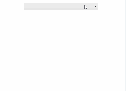
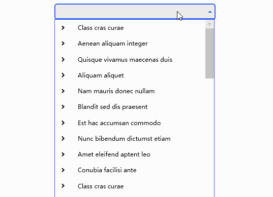
三、运行效果
3.1 单选效果

3.2 多选效果
四、个性化外观
当控件默认外观无法满足需求时,我们可以通过编辑样式的方式来实现个性化外观,也可以引用第三方UI库样式,以下为使用MaterialDesign的效果。
4.1 单选效果
4.2 多选效果

WPF实现树形下拉列表框(TreeComboBox)的更多相关文章
- 【WPF】树形结构TreeView的用法(MVVM)
TreeView控件的用法还是有蛮多坑点的,最好记录一下. 参考项目: https://www.codeproject.com/Articles/26288/Simplifying-the-WPF-T ...
- 《深入浅出WPF》 学习笔记
<深入浅出WPF> 序言 1. 什么是WPF 2. 为什么要学习WPF 第一章 XAML概览 1. XAML是什么? 2. XAML有哪些优点 第二章 从零起步认识XAML 1. 新 ...
- C#图片色彩的纠正-上
WPF(C#)图片色彩的纠正-上 WPF(C#)图片色彩的纠正-下 前言 对图片进行色彩的纠正,其实与WPF是没有什么关系的,为什么标题又是“WPF(C#)图片色彩的纠正”呢,因为这些图片色彩的纠正功 ...
- 循序渐进VUE+Element 前端应用开发(26)--- 各种界面组件的使用(2)
在我们使用Vue+Element开发前端的时候,往往涉及到很多界面组件的使用,其中很多直接采用Element官方的案例即可,有些则是在这个基础上封装更好利用.更少代码的组件:另外有些则是直接采用第三方 ...
- WPF:使用Json.NET在TreeView中树形显示JSON数据
原文 WPF:使用Json.NET在TreeView中树形显示JSON数据 据 读者可以参考这个开源的可以树形显示XML和JSON的工具: Mgen Object 603:XML/JSON树形显示小工 ...
- Asp.Net Mvc自定义控件之树形结构数据生成表格 - WPF特工队内部资料
最近项目中有一个需求,将树形结构的数据,以表格的形式展示在页面中,下图是最终呈现效果: 源码: @{ Layout = null; } <!DOCTYPE html> <html&g ...
- WPF树形菜单--递归与非递归遍历生成树结构的集合
一.新建了WPF项目作为测试,使用TreeView控件进行界面展示. 第一步创建实体类TreeEntity: public class TreeEntity { private int _mid; p ...
- wpf 菜单样式和绑定树形数据
前言 在wpf开发中,经常会使用到Menu和ContentMenu.但是原生的样式比较简陋,对于比较追求界面美好的人来说是十分不友好的.那么,这就涉及到对Menu的样式修改了.与此同时,我们还希望Me ...
- WPF下递归生成树形数据绑定到TreeView上
最终效果图:(用于学习类的效果 图片丑了点,看官莫怪) 新建窗体 然后在前端适当位置插入如下代码: <TreeView x:Name="> <TreeView.ItemTe ...
- 【WPF】1、 基本控件的简介
WPF一直都是断断续续的使用.偶尔用到一下.但是每次间隔比较长,需要重新学习,就写了这篇日志.以后有问题,看这个就可以了解各大概,然后针对细节再另外想办法. 微软的东西真心好,如果什么都不懂,可以直接 ...
随机推荐
- 记一次 splice 导致 io.Copy 阻塞的排查过程
记一次 splice 导致 io.Copy 阻塞的排查过程 简而言之,net.TCPConn 的 ReadFrom 零拷贝实现 splice 在 1.21.0 - 1.21.4 删除了 SPLICE_ ...
- 如何渲染最原始的yuv视频数据?
一.整体思路 我们在用纹理增加细节那篇文章中提到过,要将图片渲染在屏幕上,首先要拿到图片的像素数组数据,然后将像素数组数据通过纹理单元传递到片段着色器中,最后通过纹理采样函数将纹理中对应坐标的颜色值采 ...
- timeit测试函数执行时间
def list_append(): l = [] for i in range(5000): l.append(i) def list_insert(): l = [] for i in range ...
- celery中异步延迟执行任务apply_anysc的用法
描述 首先说下异步任务执行delay()和apply_anysc()两者区别,其实两者都是执行异步任务的方法,delay是apply_anysc的简写.所以delay中传递的参数会比apply_any ...
- abc模块的用法
首先需要了解的是一个基类(父类),abc.ABCMeta.这个是用于实现抽象类的一个基础类 抽象方法的使用,在相应的方法之前一行加上@abstractmethod之后,从新的一行开始定义相应的方法.实 ...
- 【系统选型】企业即时通讯(IM)软件调研及供应商对比评估
企业即时通讯(IM)软件调研及供应商对比评估 1.概览 1.1 即时通讯 即时通讯(Instant messaging,简称IM)是一个终端服务,允许两人或多人使用网路即时的传递文字讯息.档案.语音与 ...
- EF Invalid column name 'Discriminator' Invalid column name 'TagCode'.
参考资料:Invalid column name 'TagCode'. 该异常和Discriminator没关系,一般原因:1.数据库中字段和实体类字段不一致导致的2.创建新增继承于数据库对应的实体类 ...
- kafka节点故障恢复原理
Kafka的LEO和HW LEO LEO是Topic每一个副本的最后的偏移量offset+1 HW(高水位线) High WaterMark是所有副本中,最小的LEO Follower副本所在节点宕机 ...
- NodeJS本地公用类库
git + npm link 先来看一下npm install 文档. npm 支持安装 git 仓库,支持 git , git+ssh , git+http , git+https , or git ...
- 聊聊微信小程序的流式(stream)响应请求
场景:类似ChatGPT的逐字显示效果. 流程:服务端我用Python的flask框架(向外提供API接口)实现,服务部署在replit上,Python调用azure 的chatgpt服务(需要申请) ...