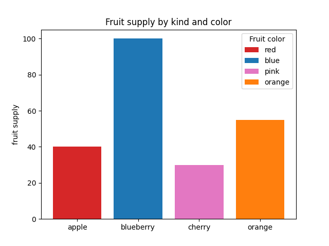
matplotlib 图表生成
条形颜色演示
import matplotlib.pyplot as plt

'''

将plt.subplots()函数的返回值赋值给fig和ax俩个变量

plt.subplots()是一个函数,返回一个包含figure和axes对象的元组

'''

fig, ax = plt.subplots()

fruits = ['apple', 'blueberry', 'cherry', 'orange']

counts = [40, 100, 30, 55]

bar_labels = ['red', 'blue', 'pink', 'orange']

bar_colors = ['tab:red', 'tab:blue', 'tab:pink', 'tab:orange']

'''

ax.bar(x,height,width,bottom,align)

x:一个标量序列,代表柱状图的x坐标,默认x取值是每个柱状图所在的中点位置,或者也可以是柱状图左侧边缘位置

hegiht:一个标量或者是标量序列,代表柱状图的高度

width:可选参数,标量或类数组,柱状图的默认宽度值为0.8

bottom可选参数,柱状图的y坐标默认为None

algin有俩个可选项{center,edge},默认为center,该参数决定x值位于柱状图的位置

'''

# ax.bar(fruits, counts, label=bar_labels, color=bar_colors)

ax.bar(fruits, counts, label=bar_labels, color=bar_colors)

#添加y轴标题

ax.set_ylabel('fruit supply')

#图表标题

ax.set_title('Fruit supply by kind and color')

ax.legend(title='Fruit color')

# plt.savefig('./q1.jpg')`
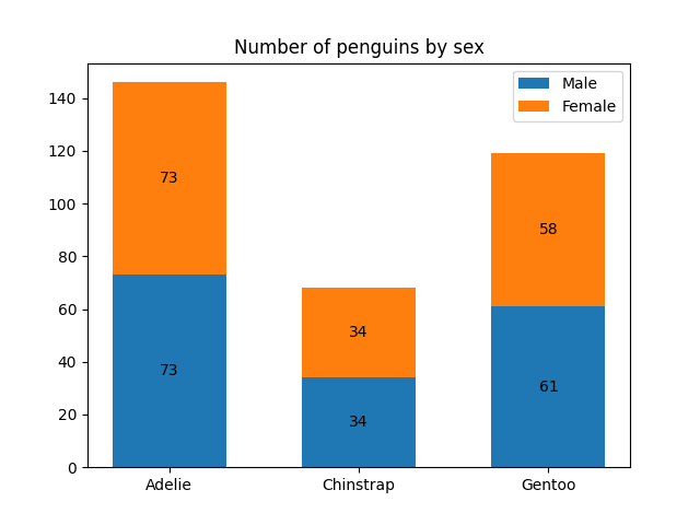
条形标签演示
import matplotlib.pyplot as plt

import numpy as np

species = ('Adelie', 'Chinstrap', 'Gentoo')

sex_counts = {

    'Male': np.array([73, 34, 61]),

    'Female': np.array([73, 34, 58]),

}

width = 0.6  # the width of the bars: can also be len(x) sequence

fig, ax = plt.subplots()

'''

np.zeros函数的作用

返回来一个给定形状和类型的用0填充的数组

zeros(shape,dtype=float,order='C')

shape:形状

dtype:数据类型,可选参数

order:可选参数,c 行优先,f列优先

'''

bottom = np.zeros(3)

# print(bottom)

for sex, sex_count in sex_counts.items():

    p = ax.bar(species, sex_count, width, label=sex, bottom=bottom)

    bottom += sex_count

    ax.bar_label(p, label_type='center')

ax.set_title('Number of penguins by sex')

#ax.legend()

ax.legend()

plt.show()
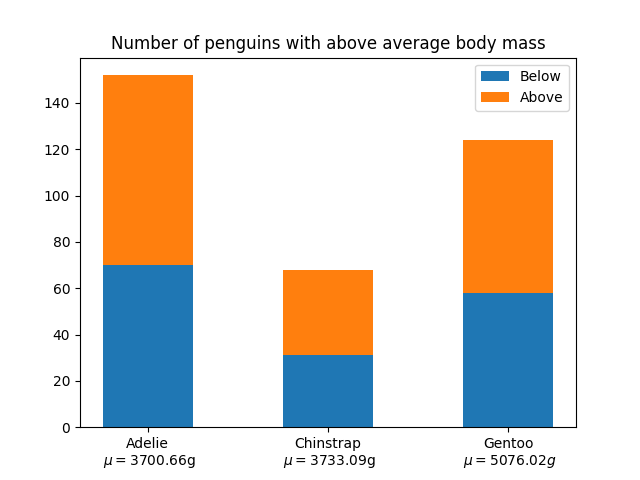
堆积条形图
import matplotlib.pyplot as plt

import numpy as np

# data from https://allisonhorst.github.io/palmerpenguins/

species = (

    "Adelie\n $\\mu=$3700.66g",

    "Chinstrap\n $\\mu=$3733.09g",

    "Gentoo\n $\\mu=5076.02g$",

)

weight_counts = {

    "Below": np.array([70, 31, 58]),

    "Above": np.array([82, 37, 66]),

}

width = 0.5

fig, ax = plt.subplots()

bottom = np.zeros(3)

for boolean, weight_count in weight_counts.items():

    p = ax.bar(species, weight_count, width, label=boolean, bottom=bottom)

    bottom += weight_count

ax.set_title("Number of penguins with above average body mass")

ax.legend(loc="upper right")

plt.show()
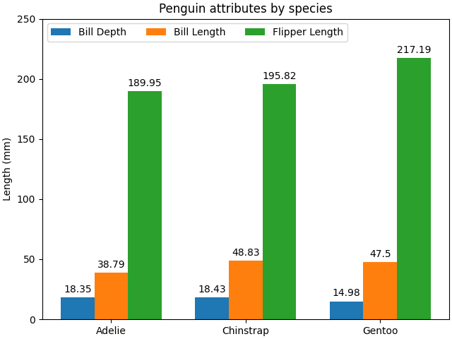
带标签的分组条形图
# data from https://allisonhorst.github.io/palmerpenguins/

import matplotlib.pyplot as plt

import numpy as np

species = ("Adelie", "Chinstrap", "Gentoo")

penguin_means = {

    'Bill Depth': (18.35, 18.43, 14.98),

    'Bill Length': (38.79, 48.83, 47.50),

    'Flipper Length': (189.95, 195.82, 217.19),

}

x = np.arange(len(species))  # the label locations

width = 0.25  # the width of the bars

multiplier = 0

fig, ax = plt.subplots(layout='constrained')

for attribute, measurement in penguin_means.items():

    offset = width * multiplier

    rects = ax.bar(x + offset, measurement, width, label=attribute)

    ax.bar_label(rects, padding=3)

    multiplier += 1

# Add some text for labels, title and custom x-axis tick labels, etc.

ax.set_ylabel('Length (mm)')

ax.set_title('Penguin attributes by species')

ax.set_xticks(x + width, species)

ax.legend(loc='upper left', ncols=3)

ax.set_ylim(0, 250)

plt.show()
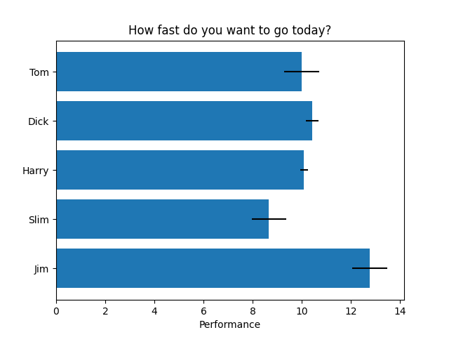
水平条形图
import matplotlib.pyplot as plt

import numpy as np

# Fixing random state for reproducibility

np.random.seed(19680801)

fig, ax = plt.subplots()

# Example data

people = ('Tom', 'Dick', 'Harry', 'Slim', 'Jim')

y_pos = np.arange(len(people))

performance = 3 + 10 * np.random.rand(len(people))

error = np.random.rand(len(people))

ax.barh(y_pos, performance, xerr=error, align='center')

ax.set_yticks(y_pos, labels=people)

ax.invert_yaxis()  # labels read top-to-bottom

ax.set_xlabel('Performance')

ax.set_title('How fast do you want to go today?')

plt.show()
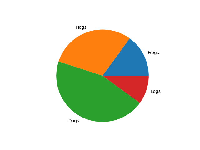
饼状图
import matplotlib.pyplot as plt

labels = 'Frogs', 'Hogs', 'Dogs', 'Logs'

sizes = [15, 30, 45, 10]

fig, ax = plt.subplots()

ax.pie(sizes, labels=labels)
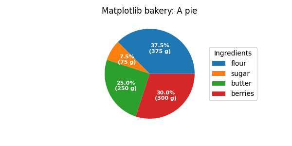
饼图和圆环图
import matplotlib.pyplot as plt

import numpy as np

fig, ax = plt.subplots(figsize=(6, 3), subplot_kw=dict(aspect="equal"))

recipe = ["375 g flour",

          "75 g sugar",

          "250 g butter",

          "300 g berries"]

data = [float(x.split()[0]) for x in recipe]

ingredients = [x.split()[-1] for x in recipe]

def func(pct, allvals):

    absolute = int(np.round(pct/100.*np.sum(allvals)))

    return f"{pct:.1f}%\n({absolute:d} g)"

wedges, texts, autotexts = ax.pie(data, autopct=lambda pct: func(pct, data),

                                  textprops=dict(color="w"))

ax.legend(wedges, ingredients,

          title="Ingredients",

          loc="center left",

          bbox_to_anchor=(1, 0, 0.5, 1))

plt.setp(autotexts, size=8, weight="bold")

ax.set_title("Matplotlib bakery: A pie")

plt.show()
matplotlib 图表生成的更多相关文章
- 一行代码让matplotlib图表变高大上
1 简介 matplotlib作为Python生态中最流行的数据可视化框架,虽然功能非常强大,但默认样式比较简陋,想要制作具有简洁商务风格的图表往往需要编写众多的代码来调整各种参数. 而今天要为大家介 ...
- 2018.03.29 python-matplotlib 图表生成
'''Matplotlib -> 一个python版的matlab绘图接口,以2D为主,支持python,numpy,pandas基本数据结构,高效图标库''' import numpy as ...
- matplotlib图表介绍
Matplotlib 是一个python 的绘图库,主要用于生成2D图表. 常用到的是matplotlib中的pyplot,导入方式import matplotlib.pyplot as plt 一. ...
- [Python] Matplotlib 图表的绘制和美化技巧
目录 在一张画布中绘制多个图表 加图表元素 气泡图 组合图 直方图 雷达图 树状图 箱形图 玫瑰图 在一张画布中绘制多个图表 Matplotlib模块在绘制图表时,默认先建立一张画布,然后在画布中显示 ...
- Python tkinter库将matplotlib图表显示在GUI窗口上,并实时更新刷新数据
代码 1 ''' 2 使用matplotlib创建图表,并显示在tk窗口 3 ''' 4 import matplotlib.pyplot as plt 5 from matplotlib.pylab ...
- JFreeChart 图表生成实例(饼图、柱状图、折线图、时序图)
import java.awt.BasicStroke; import java.awt.Color; import java.io.FileOutputStream; import java.io. ...
- matplotlib图表组成元素
一.函数 1.plot() -- 展示变量的趋势与变化 用法: plt.plot(x,y,ls="-",lw=2,label="plot figure" ...
- Matplotlib 图表的样式参数
1. import numpy as np import pandas as pd import matplotlib.pyplot as plt % matplotlib inline # 导入相关 ...
- Matplotlib 图表的基本参数设置
1.图名,图例,轴标签,轴边界,轴刻度,轴刻度标签 # 图名,图例,轴标签,轴边界,轴刻度,轴刻度标签等 df = pd.DataFrame(np.random.rand(10,2),columns= ...
- python matplotlib 图表局部放大
import matplotlib.pyplot as plt from mpl_toolkits.axes_grid1.inset_locator import zoomed_inset_axes ...
随机推荐
- Chinese Bank Card and Credit Card ID
Regular match expression: [^0-9]((3|4|5|6|9)\d{15,18})[^0-9] Rule characteristics: first number:3 or ...
- python之if语句处理列表
目录 检查特殊元素 确定列表不是空的 使用多个列表 检查特殊元素 在我们上期讲的python之史上最详细if教程就提到过有关于列表的关系运算符 那我们现在来创建并且打印一个列表先 list_1 = [ ...
- Modbus通用串口转PROFINET IO网关TS-180 在锅炉厂智能温湿度监控系统中的应用
背景: 现代科学技术和工业的迅速发展,不断促进着自动化控制技术及设备通信技术的创新和发展.当前,PLC.DCS.智能仪表等已广泛应用到现场生产控制系统中,本应用案例是在锅炉行业的温湿度监控系统中,西门 ...
- 链表K个节点的组内逆序调整问题
链表K个节点的组内逆序调整问题 作者:Grey 原文地址: 博客园:链表K个节点的组内逆序调整问题 CSDN:链表K个节点的组内逆序调整问题 题目描述 LeetCode 25. Reverse Nod ...
- HBuilderx 创建 、运行uniapp项目
uni-app官网介绍的 通过 HBuilderX 可视化界面 跟着小颖来创建一个自己的小程序 创建小程序 依次点击HBuilderx 左上方的按钮:文件->新建->项目 然后打开该界面, ...
- 数据驱动决策,Datainside引领可视化报告新时代
数据驱动决策已经成为当今社会中的重要趋势,而Datainside作为一家数据可视化报告平台,正引领着可视化报告的新时代.下面是关于Datainside平台的详细描述. 数据集成与连接 Datainsi ...
- 必知必会Java
你好,我是阿光. 最近想着把工作中使用过的java命令都梳理一下,方便日后查阅.虽然这类文章很多,但自己梳理总结后,还是会有一些新的收获.这也是这篇笔记的由来. 今天先聊聊 jps 命令. 命令概述 ...
- [洛谷P3959][NOIP2017提高组] 宝藏
[NOIP2017 提高组] 宝藏 题目描述 参与考古挖掘的小明得到了一份藏宝图,藏宝图上标出了 \(n\) 个深埋在地下的宝藏屋, 也给出了这 \(n\) 个宝藏屋之间可供开发的 \(m\) 条道路 ...
- [ABC265A] Apple
Problem Statement A fruit store sells apples. You may perform the following operations as many times ...
- 学习tinyriscv(1):安装tinyriscv的工具链
因为毕设是CPU的低功耗设计,所以开始看cpu,打算还是先从这个tinyriscv学起,昨天把环境下好了,第一步是用git去clone代码,这个首先要下载git,然后在目标文件夹鼠标右键,选择&quo ...