Seaborn分布数据可视化---直方图/密度图
直方图\密度图
直方图和密度图一般用于分布数据的可视化。
distplot
用于绘制单变量的分布图,包括直方图和密度图。
sns.distplot(

    a,

    bins=None,

    hist=True,

    kde=True,

    rug=False,

    fit=None,

    hist_kws=None,

    kde_kws=None,

    rug_kws=None,

    fit_kws=None,

    color=None,

    vertical=False,

    norm_hist=False,

    axlabel=None,

    label=None,

    ax=None,

)

Docstring:

Flexibly plot a univariate distribution of observations.

This function combines the matplotlib ``hist`` function (with automatic

calculation of a good default bin size) with the seaborn :func:`kdeplot`

and :func:`rugplot` functions. It can also fit ``scipy.stats``

distributions and plot the estimated PDF over the data.

Parameters

----------

a : Series, 1d-array, or list.

    Observed data. If this is a Series object with a ``name`` attribute,

    the name will be used to label the data axis.

bins : argument for matplotlib hist(), or None, optional

    Specification of hist bins, or None to use Freedman-Diaconis rule.

hist : bool, optional

    Whether to plot a (normed) histogram.

kde : bool, optional

    Whether to plot a gaussian kernel density estimate.

rug : bool, optional

    Whether to draw a rugplot on the support axis.

fit : random variable object, optional

    An object with `fit` method, returning a tuple that can be passed to a

    `pdf` method a positional arguments following an grid of values to

    evaluate the pdf on.

{hist, kde, rug, fit}_kws : dictionaries, optional

    Keyword arguments for underlying plotting functions.

color : matplotlib color, optional

    Color to plot everything but the fitted curve in.

vertical : bool, optional

    If True, observed values are on y-axis.

norm_hist : bool, optional

    If True, the histogram height shows a density rather than a count.

    This is implied if a KDE or fitted density is plotted.

axlabel : string, False, or None, optional

    Name for the support axis label. If None, will try to get it

    from a.namel if False, do not set a label.

label : string, optional

    Legend label for the relevent component of the plot

ax : matplotlib axis, optional

    if provided, plot on this axis

Returns

-------

ax : matplotlib Axes

    Returns the Axes object with the plot for further tweaking.

See Also

--------

kdeplot : Show a univariate or bivariate distribution with a kernel

          density estimate.

rugplot : Draw small vertical lines to show each observation in a

          distribution.
kdeplot
用于绘制单变量或双变量的核密度图。
sns.kdeplot(

    data,

    data2=None,

    shade=False,

    vertical=False,

    kernel='gau',

    bw='scott',

    gridsize=100,

    cut=3,

    clip=None,

    legend=True,

    cumulative=False,

    shade_lowest=True,

    cbar=False,

    cbar_ax=None,

    cbar_kws=None,

    ax=None,

    **kwargs,

)

Docstring:

Fit and plot a univariate or bivariate kernel density estimate.

Parameters

----------

data : 1d array-like

    Input data.

data2: 1d array-like, optional

    Second input data. If present, a bivariate KDE will be estimated.

shade : bool, optional

    If True, shade in the area under the KDE curve (or draw with filled

    contours when data is bivariate).

vertical : bool, optional

    If True, density is on x-axis.

kernel : {'gau' | 'cos' | 'biw' | 'epa' | 'tri' | 'triw' }, optional

    Code for shape of kernel to fit with. Bivariate KDE can only use

    gaussian kernel.

bw : {'scott' | 'silverman' | scalar | pair of scalars }, optional

    Name of reference method to determine kernel size, scalar factor,

    or scalar for each dimension of the bivariate plot. Note that the

    underlying computational libraries have different interperetations

    for this parameter: ``statsmodels`` uses it directly, but ``scipy``

    treats it as a scaling factor for the standard deviation of the

    data.

gridsize : int, optional

    Number of discrete points in the evaluation grid.

cut : scalar, optional

    Draw the estimate to cut * bw from the extreme data points.

clip : pair of scalars, or pair of pair of scalars, optional

    Lower and upper bounds for datapoints used to fit KDE. Can provide

    a pair of (low, high) bounds for bivariate plots.

legend : bool, optional

    If True, add a legend or label the axes when possible.

cumulative : bool, optional

    If True, draw the cumulative distribution estimated by the kde.

shade_lowest : bool, optional

    If True, shade the lowest contour of a bivariate KDE plot. Not

    relevant when drawing a univariate plot or when ``shade=False``.

    Setting this to ``False`` can be useful when you want multiple

    densities on the same Axes.

cbar : bool, optional

    If True and drawing a bivariate KDE plot, add a colorbar.

cbar_ax : matplotlib axes, optional

    Existing axes to draw the colorbar onto, otherwise space is taken

    from the main axes.

cbar_kws : dict, optional

    Keyword arguments for ``fig.colorbar()``.

ax : matplotlib axes, optional

    Axes to plot on, otherwise uses current axes.

kwargs : key, value pairings

    Other keyword arguments are passed to ``plt.plot()`` or

    ``plt.contour{f}`` depending on whether a univariate or bivariate

    plot is being drawn.

Returns

-------

ax : matplotlib Axes

    Axes with plot.

See Also

--------

distplot: Flexibly plot a univariate distribution of observations.

jointplot: Plot a joint dataset with bivariate and marginal distributions.
rugplot
用于在坐标轴上绘制数据点,显示数据分布情况,一般结合distplot和kdeplot一起使用。
sns.rugplot(a, height=0.05, axis='x', ax=None, **kwargs)

Docstring:

Plot datapoints in an array as sticks on an axis.

Parameters

----------

a : vector

    1D array of observations.

height : scalar, optional

    Height of ticks as proportion of the axis.

axis : {'x' | 'y'}, optional

    Axis to draw rugplot on.

ax : matplotlib axes, optional

    Axes to draw plot into; otherwise grabs current axes.

kwargs : key, value pairings

    Other keyword arguments are passed to ``LineCollection``.

Returns

-------

ax : matplotlib axes

    The Axes object with the plot on it.
一维数据可视化
distplot()
#直方图distplot()
#参数:bins->箱数, hist->是否显示箱曲线, kde->是否显示密度曲线, norm_hist->直方图是否按照密度来表示
#rug->是否显示数据分布情况, vertical->是否水平显示,label->设置图例, axlabel->设置x轴标注
rs = np.random.RandomState(123) #设定随机种子
datas = pd.Series(rs.randn(100)) #创建包含100个随机数据的Series
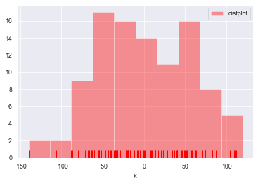
sns.distplot(a=datas, bins=10, hist=True, kde=False, norm_hist=False,
rug=True, vertical=False, color='r', label='distplot', axlabel='x')
plt.legend()
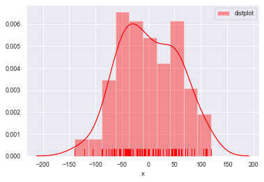
#kde=True设置密度曲线

sns.distplot(a=datas, bins=10, hist=True, kde=True, norm_hist=False,

             rug=True, vertical=False, color='r', label='distplot', axlabel='x')

plt.legend()

#norm_hist设置直方图按照密度曲线显示,实现hist=True 加 kde=True 共同的效果

sns.distplot(a=datas, bins=10, norm_hist=True,

             rug=True, vertical=False, color='r', label='distplot', axlabel='x')

plt.legend()
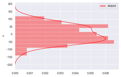
#rug=False不显示频率分布,vertical=False横向放置图形

sns.distplot(a=datas, bins=10, norm_hist=True,

             rug=False, vertical=False, color='r', label='distplot', axlabel='x')

plt.legend()
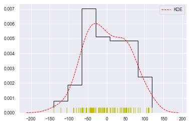
#总体参数设置

sns.distplot(datas, rug=True,

             #rug_kws设置数据频率分布颜色

             rug_kws={'color':'y'},

             #kde_kws设置密度曲线颜色、线宽、标注、线型

             kde_kws={'color':'r', 'lw':1, 'label':'KDE', 'linestyle':'--'},

             #hist_kws设置箱子的风格、线宽、透明度、颜色

             #histtype包括’bar'、‘barstacked’,'step','stepfilled'

             hist_kws={'histtype':'step', 'linewidth':1, 'alpha':1, 'color':'k'})
kdeplot()
#密度图 -- kdeplot()
#shade--> 填充设置
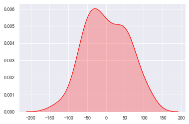
sns.kdeplot(datas, shade=True, color='r', vertical=False)
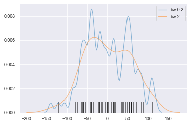
#bw --> 拟合参数

sns.kdeplot(datas, bw=5, label='bw:0.2',

            linestyle='-', linewidth=1.2, alpha=0.5)

sns.kdeplot(datas, bw=20, label='bw:2',

            linestyle='-', linewidth=1.2, alpha=0.5)

#rugplot()设置频率分布图

sns.rugplot(datas, height=0.1, color='k', alpha=0.5)
二维数据可视化
kdeplot()
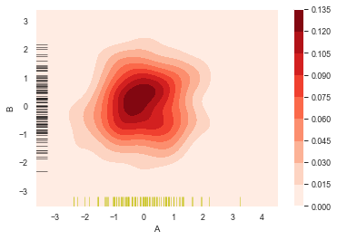
#二维数据密度图
rs = np.random.RandomState(12345)
df = pd.DataFrame(rs.randn(100,2),
columns=['A','B'])
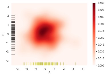
sns.kdeplot(df['A'],df['B'],
cbar = True, #设置显示颜色图例条
shade = True, #是否填充
cmap = 'Reds', #设置调色盘
shade_lowest = 'False', #设置最外围颜色是否显示
n_levels = 10) #设置曲线个数(越多越平滑)
#分别设置x,y轴的频率分布图
sns.rugplot(df['A'], color='y', axis='x', alpha=0.5)
sns.rugplot(df['B'], color='k', axis='y', alpha=0.5)
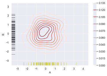
sns.kdeplot(df['A'],df['B'],

            cbar = True,

            shade = False,            #不填充

            cmap = 'Reds',

            shade_lowest = 'False',

            n_levels = 10)

#分别设置x,y轴的频率分布图

sns.rugplot(df['A'], color='y', axis='x', alpha=0.5)

sns.rugplot(df['B'], color='k', axis='y', alpha=0.5)
sns.kdeplot(df['A'],df['B'],

            cbar = True,

            shade = True,

            cmap = 'Reds',

#             shade_lowest = 'False',  #设置最外围颜色是否显示,与shade配合使用

            n_levels = 10)           #设置曲线个数(越多越平滑)

#分别设置x,y轴的频率分布图

sns.rugplot(df['A'], color='y', axis='x', alpha=0.5)

sns.rugplot(df['B'], color='k', axis='y', alpha=0.5)

sns.kdeplot(df['A'],df['B'],

            cbar = True,

            shade = True,

            cmap = 'Reds',

#             shade_lowest = 'False',  #设置最外围颜色是否显示,与shade配合使用

            n_levels = 100)           #设置曲线个数(越多则边界渐变越平滑)

#分别设置x,y轴的频率分布图

sns.rugplot(df['A'], color='y', axis='x', alpha=0.5)

sns.rugplot(df['B'], color='k', axis='y', alpha=0.5)
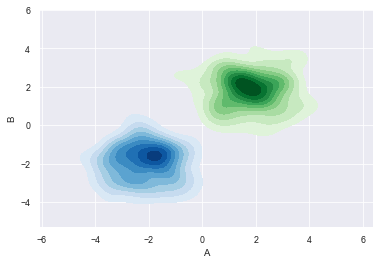
#多个密度图

#创建两个DataFrame数组

rs1 = np.random.RandomState(12)

rs2 = np.random.RandomState(21)

df1 = pd.DataFrame(rs1.randn(100,2)+2, columns=['A','B'])

df2 = pd.DataFrame(rs2.randn(100,2)-2, columns=['A','B'])

#创建密度图

sns.kdeplot(df1['A'], df1['B'], cmap='Greens',

            shade=True, shade_lowest=False)

sns.kdeplot(df2['A'], df2['B'], cmap='Blues',

            shade=True, shade_lowest=False)
Seaborn分布数据可视化---直方图/密度图的更多相关文章
- Python图表数据可视化Seaborn:1. 风格| 分布数据可视化-直方图| 密度图| 散点图
conda install seaborn 是安装到jupyter那个环境的 1. 整体风格设置 对图表整体颜色.比例等进行风格设置,包括颜色色板等调用系统风格进行数据可视化 set() / se ...
- seaborn分布数据可视化:直方图|密度图|散点图
系统自带的数据表格(存放在github上https://github.com/mwaskom/seaborn-data),使用时通过sns.load_dataset('表名称')即可,结果为一个Dat ...
- Echarts数据可视化series-radar雷达图,开发全解+完美注释
全栈工程师开发手册 (作者:栾鹏) Echarts数据可视化开发代码注释全解 Echarts数据可视化开发参数配置全解 6大公共组件详解(点击进入): title详解. tooltip详解.toolb ...
- Echarts数据可视化series-line线图,开发全解+完美注释
全栈工程师开发手册 (作者:栾鹏) Echarts数据可视化开发代码注释全解 Echarts数据可视化开发参数配置全解 6大公共组件详解(点击进入): title详解. tooltip详解.toolb ...
- Echarts数据可视化series-graph关系图,开发全解+完美注释
全栈工程师开发手册 (作者:栾鹏) Echarts数据可视化开发代码注释全解 Echarts数据可视化开发参数配置全解 6大公共组件详解(点击进入): title详解. tooltip详解.toolb ...
- seaborn线性关系数据可视化:时间线图|热图|结构化图表可视化
一.线性关系数据可视化lmplot( ) 表示对所统计的数据做散点图,并拟合一个一元线性回归关系. lmplot(x, y, data, hue=None, col=None, row=None, p ...
- Matplotlib学习---用matplotlib画直方图/密度图(histogram, density plot)
直方图用于展示数据的分布情况,x轴是一个连续变量,y轴是该变量的频次. 下面利用Nathan Yau所著的<鲜活的数据:数据可视化指南>一书中的数据,学习画图. 数据地址:http://d ...
- 用Python的Plotly画出炫酷的数据可视化(含各类图介绍,附代码)
前言 本文的文字及图片来源于网络,仅供学习.交流使用,不具有任何商业用途,版权归原作者所有,如有问题请及时联系我们以作处理. 作者: 我被狗咬了 在谈及数据可视化的时候,我们通常都会使用到matplo ...
- R绘图(1): 在散点图边缘加上直方图/密度图/箱型图
当我们在绘制散点图的时候,可能会遇到点特别多的情况,这时点与点之间过度重合,影响我们对图的认知.为了更好地反映特征,我们可以加上点的密度信息,比如在原来散点所在的位置将密度用热图的形式呈现出来,再比如 ...
- python-两个筛子数据可视化(直方图)
""" 作者:zxj 功能:模拟掷骰子,两个筛子数据可视化 版本:3.0 日期:19/3/24 """ import random impo ...
随机推荐
- Python3中的“联动”现象
技术背景 在python中定义一个列表时,我们一定要注意其中的可变对象的原理.虽然python的语法中没有指针,但是实际上定义一个列表变量时,是把变量名指到了一个可变对象上.如果此时我们定义另外一个变 ...
- 【Azure App Service】同一个App Service下创建多个测试站点的方式
问题描述 在一个App Service中,部署多个应用,每个应用相互独立,类似与IIS中在根目录下创建多个子应用的情况. 问题解答 可以的.通过App Service Configuration页面, ...
- 【Azure Cloud Service(Extended Support)】如何使用外延服务迁移应用?
问题一:迁移到云服务扩展后,之前经典版的云服务的部署槽会变成单一的部署槽,关于两个云服务扩展版之间的部署交换能否提供一个演示? 对于具有双槽的云服务(Classic),根据文档中的建议,在迁移到云服务 ...
- 【Azure Service Fabric】关于Service Fabric的相关问题
问题一:Service Fabric 是否支持Private Link? 在Azure Private Endpoint文档中,罗列出了 Azure 上支持 Private Link 的服务.Serv ...
- Linux系统查看主机性能
查看主机的CPU性能: cat /proc/cpuinfo cat /proc/meminfo |grep MemTotal 内存信息 查看物理cpu个数:cat /proc/cpuinfo ...
- vim技巧--提取文本与文本替换
前几天遇到一个使用情景,需要从一个包含各个读取代码文件路径及名字的文件中把文件路径提取出来,做一个filelist,这里用到了文本的提取和替换,这里做个小总结记录一下. 从网上找了一个作者写的代码用来 ...
- 酷呆桌面 CooDesker 桌面整理工具 - 软件推荐
酷呆桌面 CooDesker 桌面整理工具 - 软件推荐 推荐理由 满足了我对桌面映射到某一目录的需求,这样桌面就真的干净了 免费且没有广告 可进入目录继续延展,双击空白地方返回上一层,非常方便 5M ...
- vscode 切换主侧栏可见性 原Ctrl+B 我改为了 Alt+P
vscode 切换主侧栏可见性 原Ctrl+B 我改为了 Alt+P ctrl+b 总是想不起来
- react start 后 url 后面不带/ 解决思路
> navigator@0.1.0 dev H:\2020home\giteez\navigator > node scripts/start.js Compiled successful ...
- Dreamweaver基础教程:系列介绍
目录 前言 Dreamweaver 软件介绍 软件安装 学习支持 相关资料 前言 我一直对前端的一些技术比较感兴趣,之前有用过GitHub上的开源项目部署了自己的导航网站猿导航,但并没有系统的去深入学 ...