手把手使用 SVG + CSS 实现渐变进度环效果
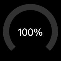
效果
轨道
使用 svg 画个轨道

  <svg viewBox="0 0 100 100">

    <circle cx="50" cy="50" r="40" fill="none" stroke-width="10" stroke="#333"></circle>

  </svg>
简单的说,就是使用 circle 画个圆。需要注意的是,轨道实际是 circle 的 stroke,所以目标 svg 尺寸是 100,则圆的半径是 40,而 stroke 为 10。
接着,按设计,轨道只需要 3/4 个圆即可:

<!-- 3/4 track before rotate -->

<!-- circumference = radius * 2 * PI = 40 * 2 * Math.PI = 251.3274 -->

<!-- stroke-dasharray left = circumference * percent = 251.3274 * 0.75 = 188.4955 -->

<!-- stroke-dasharray right = circumference * (1 - percent) = 251.3274 * (1 - 0.75) = 62.8318 -->

  <svg viewBox="0 0 100 100">

    <circle cx="50" cy="50" r="40" fill="none" stroke-width="10" stroke-dasharray="188.4955,62.8318" stroke="#333"></circle>

  </svg>
为了实现这轨道,这个时候需要用到 stroke-dasharray。
为了更好理解这里 stroke-dasharray 的作用,先画一个 line:

  <svg viewBox="0 0 300 10" style="display: block;">

    <line x1="0" y1="5" x2="300" y2="5" stroke-width="10" stroke="#333" stroke-dasharray="75,25"></line>

  </svg>
简单的说,上面 line 长 300,每画一段 75 的 stroke,接着留空一段 25,如此重复,正好重复 3 次,刚好铺满了 300 的长度。
应用到 circle 也是如此,只是它是绕着圆,逆时针的画 stroke,类比的举例:
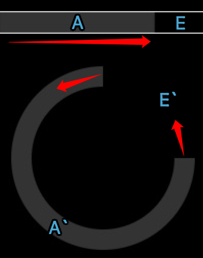
stroke-dasharray 的是长度,这里就需要通过计算周长,得出 A 与 E 分别是多长:
周长 = 半径 * 2 * PI = 40 * 2 * Math.PI = 251.3274
A = 周长 * 3/4 = 251.3274 * 0.75 = 188.4955
E = 周长 * 1/4 = 251.3274 * 0.25 = 62.8318
现在还要使用 transform 旋转 135 度以满足需求:

<!-- 3/4 track after rotate 135deg -->

  <svg viewBox="0 0 100 100">

    <circle cx="50" cy="50" r="40" fill="none" stroke-width="10" stroke-dasharray="188.4955,62.8318" transform="rotate(135, 50, 50)" stroke="#333"></circle>

  </svg>
进度条
先画一个纯色的进度条:
body {

  background: black;

}

.gauge {

  position: relative;

  display: inline-block;

}

.gauge > svg {

  width: 200px;

  height: 200px;

}

.gauge > span {

  color: #fff;

  position: absolute;

  top: 50%;

  left: 0;

  width: 100%;

  text-align: center;

  transform: translate(0, -50%);

  font-size: 2em;

}
<!-- stroke-dasharray left = circumference * 0.75 * percent = 188.4955 * 0.10 = 18.8495 -->
<!-- stroke-dasharray right = circumference * 0.75 * (1 - percent) + circumference * (1 - 0.75) = 188.4955 * (1 - 0.10) + 62.8318 = 232.4778 -->
<div class="gauge">
<svg viewBox="0 0 100 100">
<circle cx="50" cy="50" r="40" fill="none" stroke-width="10" stroke-dasharray="188.4955,62.8318" transform="rotate(135, 50, 50)" stroke="#333"></circle>
<circle cx="50" cy="50" r="40" fill="none" stroke-width="10" stroke-dasharray="18.8495,232.4778" transform="rotate(135, 50, 50)" stroke="#ffff00"></circle>
</svg>
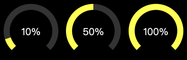
<span>10%</span>
</div>
<!-- stroke-dasharray left = circumference * 0.75 * percent = 188.4955 * 0.50 = 94.2477 -->
<!-- stroke-dasharray right = circumference * 0.75 * (1 - percent) + circumference * (1 - 0.75) = 188.4955 * (1 - 0.50) + 62.8318 = 157.0795 -->
<div class="gauge">
<svg viewBox="0 0 100 100">
<circle cx="50" cy="50" r="40" fill="none" stroke-width="10" stroke-dasharray="188.4955,62.8318" transform="rotate(135, 50, 50)" stroke="#333"></circle>
<circle cx="50" cy="50" r="40" fill="none" stroke-width="10" stroke-dasharray="94.2477,157.0795" transform="rotate(135, 50, 50)" stroke="#ffff00"></circle>
</svg>
<span>50%</span>
</div>
<!-- stroke-dasharray left = circumference * 0.75 * percent = 188.4955 * 1.00 = 94.2477 -->
<!-- stroke-dasharray right = circumference * 0.75 * (1 - percent) + circumference * (1 - 0.75) = 188.4955 * (1 - 1.00) + 62.8318 = 157.0795 -->
<div class="gauge">
<svg viewBox="0 0 100 100">
<circle cx="50" cy="50" r="40" fill="none" stroke-width="10" stroke-dasharray="188.4955,62.8318" transform="rotate(135, 50, 50)" stroke="#333"></circle>
<circle cx="50" cy="50" r="40" fill="none" stroke-width="10" stroke-dasharray="188.4955,62.8318" transform="rotate(135, 50, 50)" stroke="#ffff00"></circle>
</svg>
<span>100%</span>
</div>
有个很重要的前提,例如图中的 10%、50%、100% 的百分比,是基于那 3/4 轨道的,不是整个圆,所以计算 stroke-dasharray 的时候,实际考虑的是 3 个部分:
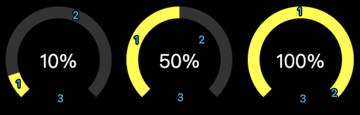
10%
A = s1 = 周长 * 3/4 * progress = 251.3274 * 0.75 * 0.10 = 18.8495
E = s2 + s3 = 周长 * 3/4 * (1 - progress) + 周长 * 1/4 = 251.3274 * 0.75 * (1 - 0.10) + 251.3274 * 0.25 = 232.4778
50%
A = s1 = 周长 * 3/4 * progress = 251.3274 * 0.75 * 0.50 = 94.2477
E = s2 + s3 = 周长 * 3/4 * (1 - progress) + 周长 * 1/4 = 251.3274 * 0.75 * (1 - 0.50) + 251.3274 * 0.25 = 157.0796
100%
A = s1 = 周长 * 3/4 * progress = 251.3274 * 0.75 * 1.00 = 188.4955
E = s2 + s3 = 周长 * 3/4 * (1 - progress) + 周长 * 1/4 = 251.3274 * 0.75 * (1 - 1.00) + 251.3274 * 0.25 = 62.8318
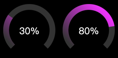
渐变

渐变由最初的从左到右,跟随轨道的 rotate,最后变成从右上到左下,也就意味着,此处的渐变并不是跟随轨道从 0 到 100%,仅实现了类似的感觉的模拟。
<!-- progress bar with gradient -->

<!-- stroke-dasharray left = circumference * 0.75 * percent = 188.4955 * 0.30 = 94.2477 -->

<!-- stroke-dasharray right = circumference * 0.75 * (1 - percent) + circumference * (1 - 0.75) = 188.4955 * (1 - 0.30) + 62.8318 = 157.0795 -->

<div class="gauge">

  <svg viewBox="0 0 100 100">

    <circle cx="50" cy="50" r="40" fill="none" stroke-width="10" stroke-dasharray="188.4955,62.8318" transform="rotate(135, 50, 50)" stroke="#333"></circle>

    <circle cx="50" cy="50" r="40" fill="none" stroke-width="10" stroke-dasharray="56.5486,194.7786" transform="rotate(135, 50, 50)" stroke="url(#gauge-gradient)"></circle>

  </svg>

  <span>30%</span>

</div>

<!-- stroke-dasharray left = circumference * 0.75 * percent = 188.4955 * 0.80 = 94.2477 -->

<!-- stroke-dasharray right = circumference * 0.75 * (1 - percent) + circumference * (1 - 0.75) = 188.4955 * (1 - 0.80) + 62.8318 = 157.0795 -->

<div class="gauge">

  <svg viewBox="0 0 100 100">

    <circle cx="50" cy="50" r="40" fill="none" stroke-width="10" stroke-dasharray="188.4955,62.8318" transform="rotate(135, 50, 50)" stroke="#333"></circle>

    <circle cx="50" cy="50" r="40" fill="none" stroke-width="10" stroke-dasharray="150.7964,100.5308" transform="rotate(135, 50, 50)" stroke="url(#gauge-gradient)"></circle>

  </svg>

  <span>80%</span>

</div>
动画
最后,为了实现“效果”中的动画,需要 CSS 配合 JS 实现:
<!-- with animation -->

<div class="gauge">

  <svg viewBox="0 0 100 100">

    <circle cx="50" cy="50" r="40" fill="none" stroke-width="10" stroke-dasharray="188.4955,62.8318" transform="rotate(135, 50, 50)" stroke="#333"></circle>

    <circle id="circle" cx="50" cy="50" r="40" fill="none" stroke-width="10" stroke-dasharray="0,251.3274" transform="rotate(135, 50, 50)" stroke="url(#gauge-gradient3)"></circle>

  </svg>

  <span>100%</span>

</div>
#circle {

  transition: all 1s linear;

}
(function() {

  const radius = 40;

  const trackPercent = 0.75

  const circumference = 40 * 2 * Math.PI;

  const percent = 1.00;

  const strokeDasharrayLeft = circumference * trackPercent * percent

  const strokeDasharrayRight = circumference * trackPercent * (1 - percent) + circumference * (1 - trackPercent)

  const circle = document.querySelector('#circle');

  function change() {

    const strokeDasharray = circle.getAttribute('stroke-dasharray').split(',')

    const left = parseFloat(strokeDasharray[0])

    const right = parseFloat(strokeDasharray[1])

    if (left === 0) {

      circle.setAttribute('stroke-dasharray', `${strokeDasharrayLeft},${strokeDasharrayRight}`)

    } else {

      circle.setAttribute('stroke-dasharray', `0,251.3274`)

    }

  }

  setTimeout(function() {

    setInterval(function() {

      change()

    }, 1000)

    change()

  }, 0)

})();
JS 的主要作用就是动态的计算 stroke-dasharray,并配合 CSS 的 transition all 即可实现。
Done!
手把手使用 SVG + CSS 实现渐变进度环效果的更多相关文章
- CSS 实现滚动进度条效果
参考:https://www.w3cplus.com/css/pure-css-create-scroll-indicator.html 前言:细化总结.参考的文章作者已经写的很详细了.这里在从初学者 ...
- 炫!一组单元素实现的 CSS 加载进度提示效果
之前的文章个大家分享过各种类型的加载效果(Loading Effects),这里再给大家奉献一组基于单个元素实现的 CSS 加载动画集合.这些加载效果都是基于一个 DIV 元素实现的,十分强悍. 温馨 ...
- 使用SVG + CSS实现动态霓虹灯文字效果
效果图: 原理:多个SVG描边动画使用不同的animation-delay即可! 对于一个形状SVG元素或文本SVG元素,可以使用stroke-dasharray来控制描边的间隔样式,并且可以用str ...
- svg 直线水平渐变为什么没有效果,必须得是一条倾斜的不水平的直线才有渐变效果呢??
参考:https://blog.csdn.net/u012260672/article/details/80905631 对x1=x2(没有宽度)或者y1=y2(没有高度)的直线(line以及path ...
- svg和css3创建环形渐变进度条
在负责的项目中,有一个环形渐变读取进度的效果的需求,于是在网上查阅相关资料整理一下.代码如下: <!DOCTYPE html> <html lang="en"&g ...
- canvas锥形渐变进度条
从一个渐变圆角进度条浅出画一个圆 开始 这一切需要从一个(简单)的需求开始,在最开始对设计第一眼看到这张图的时候,感觉挺简单的嘛,直接用echarts饼图模拟出来一个就好了 echarts 然后上ec ...
- N 种仅仅使用 HTML/CSS 实现各类进度条的方式
本文将介绍如何使用 HTML/CSS 创建各种基础进度条及花式进度条及其动画的方式,通过本文,你可能可以学会: 通过 HTML 标签 <meter> 创建进度条 通过 HTML 标签 &l ...
- 【iOS】环形渐变进度条实现
之前有人在找渐变进度条的效果,闲来无事就顺手写了一个,然后画了视图层级,方便讲解. 环境信息: Mac OS X 10.10.3 Xcode 6.3.1 iOS 8.3 效果图: 源码下载地址: ht ...
- 简单实用的纯CSS百分比圆形进度条插件
percircle是一款简单实用的纯CSS百分比圆形进度条插件.你不需要做任何设置,只需要按该圆形进度条插件提供的标准HTML结构来编写代码,就可以生成一个漂亮的百分比圆形进度条. 首先要做的就是引入 ...
- 自定义控件之圆形颜色渐变进度条--SweepGradient
前几天在群里面有人找圆形可颜色渐变进度条,其中主要的知识点是SweepGradient: mSweepGradient = new SweepGradient(240, 360, new int[] ...
随机推荐
- PHP 程序员转 Go 语言的经历分享
大家好,我是码农先森. 之前有朋友让我分享从 PHP 转 Go 的经历,这次它来了.我主要从模仿.进阶.应用这三个方面来描述转 Go 的经历及心得.模仿是良好的开端,进阶是艰难的成长,应用是认知的提升 ...
- oracle数据库与oracle实例
1 oracle数据库分类 1.1 单租户数据库 ORACLE12C之前的oracle数据库都是单租户数据库.单租户数据库是独立和完整的数据库,包括ORACLE的元数据和应用的数据. 1.2 容器数据 ...
- Asp.net core Swashbuckle Swagger 的常用配置
背景 .net core Swashbuckle Swagger 官方文档:https://github.com/domaindrivendev/Swashbuckle.AspNetCore 我们发现 ...
- python selenium.remote远程连接时间达10分钟
问题: 在机器A搭建了selenium-grid的环境,hub以4444端口号启动,并在4444下注册了子node,端口4445,浏览器配置chrome 使用代码进行远程连接,并创建会话: 传入的se ...
- Pycharm创建的虚拟环境,使用命令行指定库的版本进行安装
Pycharm创建的项目,使用了虚拟环境,对库的版本进行管理:有些项目的对第三方库的版本 要求不同,可使用虚拟环境进行管理 直接想通过pip命令安装,直接看第3点 操作步骤: 1.找到当前项目的虚拟环 ...
- UIController转为SwiftUI
在UIKit转到SwiftUI的过渡时期中,项目中会遇到不得不用到二者混合使用的情景,苹果这时提供了相关API让iOSer更好地适应这个时期. UIViewControllerRepresentabl ...
- 实验13.Nat转发telnet实验
# 实验13.Nat转发telnet实验 本节用于测试NAT服务,用于将流量转发到内网的指定设备上. 实验组 配置路由器 由于之前配置过ospf,所以这次用直接指静态练手,首先确保全网畅通 R3 GW ...
- selenium的各种操作
import time from selenium.webdriver import Edge from selenium.webdriver.common.by import By from sel ...
- 【资料分享】全志科技T507-H评估板规格书(4核ARM Cortex-A53,主频1.416GHz)
1 评估板简介 创龙科技TLT507-EVM是一款基于全志科技T507-H处理器设计的4核ARM Cortex-A53国产工业评估板,主频高达1.416GHz,由核心板和评估底板组成.核心板CPU.R ...
- Linux运行等级
Linux运行级别 Linux system存在7个运行级别 运行级别0:所有进程终止,机器将有序停止,关机时就处于这个运行级别 运行级别1:单用户模式(root用户进行维护),系统中所有的服务也不会 ...