详解Bootstrap进度条组件
在网页中,进度条的效果并不少见,如:平分系统、加载状态等,进度条组件使用了css3的transition和animation属性来完成一些特效,这些特效在IE9及IE9以下版本、Firefox的老版本中并不支持,Opera 12 不支持 animation 属性。
进度条和其他独立组件一样,开发者可以根据自己的需要选择对应的版本:
LESS: progress-bars.less
SASS: _progress-bars.scss
基础进度条
实现原理:
需要两个容器,外容器使用类名.progress,子容器使用类名.progress-bar;其中.progress用来设置进度条容器的背景色,容器的高度,间距等;而.progress-bar设置进度方向,进度条的背景色和过度效果;下面是css源码:
.progress {

  height: 20px;

  margin-bottom: 20px;

  overflow: hidden;

  background-color: #f5f5f5;

  border-radius: 4px;

  -webkit-box-shadow: inset 0 1px 2px rgba(0, 0, 0, .1);

          box-shadow: inset 0 1px 2px rgba(0, 0, 0, .1);

}
.progress-bar {

  float: left;

  width: 0;

  height: 100%;

  font-size: 12px;

  line-height: 20px;

  color: #fff;

  text-align: center;

  background-color: #428bca;

  -webkit-box-shadow: inset 0 -1px 0 rgba(0, 0, 0, .15);

          box-shadow: inset 0 -1px 0 rgba(0, 0, 0, .15);

  -webkit-transition: width .6s ease;

          transition: width .6s ease;

}
例子:
<div class="progress">

         <div class="progress-bar" style="width:30%;" role="progressbar" aria-valuenow="30" aria-valuemin="0" aria-valuemax="100">

             <span class="sr-only">30%</span>

         </div>

     </div>

role属性作用:告诉搜索引擎这个div的作用是进度条;
aria-valuenow=”30”属性作用:当前进度条的进度为40%;
aria-valuemin=”0”属性作用:进度条的最小值为0%;
aria-valuemax=”100”属性作用:进度条的最大值为100%;
可以将设置了.sr-only类的<span>标签从进度条组件中移除,而让当前进度显示出来;
<div class="progress">

        <div class="progress-bar" style="width:40%;" role="progressbar" aria-valuenow="40" aria-valuemin="0" aria-valuemax="100" >40%</div>

    </div>

彩色进度条
彩色进度条和警告进度条一样,为了能给用户一个更好的体验,也根据不同的状态配置了不同的进度条颜色,主要包括以下四种:
progress-bar-info:表示信息进度条,蓝色
progress-bar-success:表示成功进度条,绿色
progress-bar-warning:表示警告进度条,黄色
progress-bar-danger:表示错误进度条,红色
css源码:
.progress-bar-success {

  background-color: #5cb85c;

}

.progress-bar-info {

  background-color: #5bc0de;

}

.progress-bar-warning {

  background-color: #f0ad4e;

}

.progress-bar-danger {

  background-color: #d9534f;

}
使用方法:
只需要在基础进度条上增加对应的类名即可
例子:
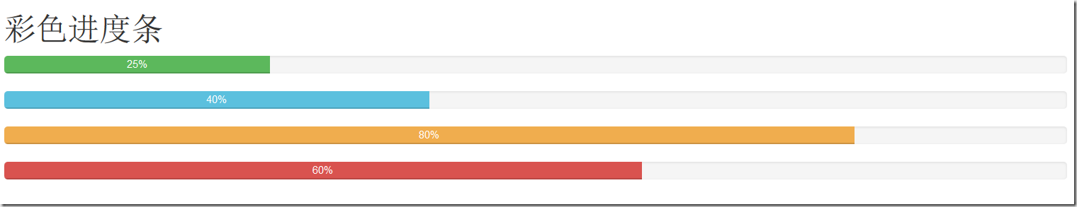
<h1>彩色进度条</h1>

     <div class="progress">

         <div class="progress-bar progress-bar-success" style="width:25%;" role="progressbar" aria-valuenow="25" aria-valuemin="0" aria-valuemax="100">25%</div>

     </div>

     <div class="progress">

         <div class="progress-bar progress-bar-info" style="width:40%;" role="progressbar" aria-valuenow="40" aria-valuemax="100" aria-valuemin="0">40%</div>

     </div>

     <div class="progress">

         <div class="progress-bar progress-bar-warning" style="width:80%;" role="progressbar" aria-valuenow="25" aria-valuemin="0" aria-valuemax="100">80%</div>

     </div>

     <div class="progress">

         <div class="progress-bar progress-bar-danger" style="width:60%;" role="progressbar" aria-valuenow="40" aria-valuemax="100" aria-valuemin="0">60%</div>

      </div>
效果如下:
条纹进度条
条纹进度条采用css3的线性渐变来实现,并未借助任何图片,使用条纹进度条只需在进度条的容器.progress基础上追加类名”progress-striped”,如果要进度条纹像彩色进度一样,具有彩色效果,只需在进度条上增加相应得颜色类名
下面是.progress-striped样式源码:
.progress-striped .progress-bar {

  background-image: -webkit-linear-gradient(45deg, rgba(255, 255, 255, .15) 25%, transparent 25%, transparent 50%, rgba(255, 255, 255, .15) 50%, rgba(255, 255, 255, .15) 75%, transparent 75%, transparent);

  background-image:linear-gradient(45deg, rgba(255, 255, 255, .15) 25%, transparent 25%, transparent 50%, rgba(255, 255, 255, .15) 50%, rgba(255, 255, 255, .15) 75%, transparent 75%, transparent);

  background-size: 40px 40px;

}
条纹进度对应的每种状态也有不同的颜色
.progress-striped .progress-bar-success {

  background-image: -webkit-linear-gradient(45deg, rgba(255, 255, 255, .15) 25%, transparent 25%, transparent 50%, rgba(255, 255, 255, .15) 50%, rgba(255, 255, 255, .15) 75%, transparent 75%, transparent);

  background-image:linear-gradient(45deg, rgba(255, 255, 255, .15) 25%, transparent 25%, transparent 50%, rgba(255, 255, 255, .15) 50%, rgba(255, 255, 255, .15) 75%, transparent 75%, transparent);

}

.progress-striped .progress-bar-info {

  background-image: -webkit-linear-gradient(45deg, rgba(255, 255, 255, .15) 25%, transparent 25%, transparent 50%, rgba(255, 255, 255, .15) 50%, rgba(255, 255, 255, .15) 75%, transparent 75%, transparent);

  background-image:linear-gradient(45deg, rgba(255, 255, 255, .15) 25%, transparent 25%, transparent 50%, rgba(255, 255, 255, .15) 50%, rgba(255, 255, 255, .15) 75%, transparent 75%, transparent);

}

.progress-striped .progress-bar-warning {

  background-image: -webkit-linear-gradient(45deg, rgba(255, 255, 255, .15) 25%, transparent 25%, transparent 50%, rgba(255, 255, 255, .15) 50%, rgba(255, 255, 255, .15) 75%, transparent 75%, transparent);

  background-image:linear-gradient(45deg, rgba(255, 255, 255, .15) 25%, transparent 25%, transparent 50%, rgba(255, 255, 255, .15) 50%, rgba(255, 255, 255, .15) 75%, transparent 75%, transparent);

}

.progress-striped .progress-bar-danger {

  background-image: -webkit-linear-gradient(45deg, rgba(255, 255, 255, .15) 25%, transparent 25%, transparent 50%, rgba(255, 255, 255, .15) 50%, rgba(255, 255, 255, .15) 75%, transparent 75%, transparent);

  background-image:linear-gradient(45deg, rgba(255, 255, 255, .15) 25%, transparent 25%, transparent 50%, rgba(255, 255, 255, .15) 50%, rgba(255, 255, 255, .15) 75%, transparent 75%, transparent);

}
下面来看看条纹进度条的运用:
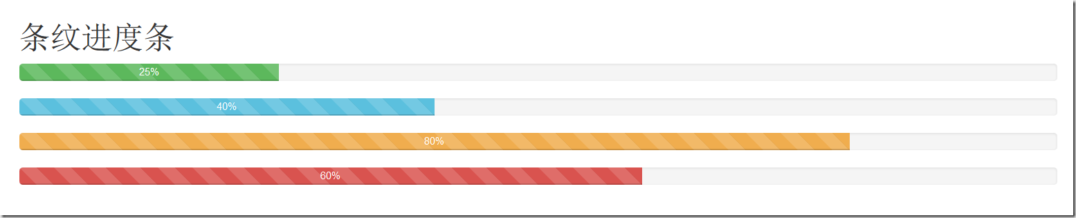
<h1>条纹进度条</h1>

     <div class="progress progress-striped">

         <div class="progress-bar progress-bar-success" style="width:25%;" role="progressbar" aria-valuenow="25" aria-valuemin="0" aria-valuemax="100">25%</div>

     </div>

     <div class="progress progress-striped">

         <div class="progress-bar progress-bar-info" style="width:40%;" role="progressbar" aria-valuenow="40" aria-valuemax="100" aria-valuemin="0">40%</div>

     </div>

     <div class="progress progress-striped">

         <div class="progress-bar progress-bar-warning" style="width:80%;" role="progressbar" aria-valuenow="25" aria-valuemin="0" aria-valuemax="100">80%</div>

     </div>

     <div class="progress progress-striped">

         <div class="progress-bar progress-bar-danger" style="width:60%;" role="progressbar" aria-valuenow="40" aria-valuemax="100" aria-valuemin="0">60%</div>

     </div>
动态条纹进度条
在进度条.progress 、.progress-striped两个类的基础上在加入类名.active就能实现动态条纹进度条。
其实现原理主要是通过css3的animation来完成。首先通过@keyframes创建了一个progress-bar-stripes的动画,这个动画主要做了一件事,就是改变背景图像的位置,也就是 background-position的值。因为条纹进度条是通过CSS3的线性渐变来制作的,而linear-gradient实现的正是对应背景中的背景图片
下面是css源码:
@-webkit-keyframes progress-bar-stripes {

  from {

    background-position: 40px 0;

  }

  to {

    background-position: 0 0;

  }

}

@keyframes progress-bar-stripes {

  from {

    background-position: 40px 0;

  }

  to {

    background-position: 0 0;

  }

}
@keyframes仅仅是创建了一个动画效果,如果要让进度条真正的动起来,我们需要通过一定的方式调用@keyframes创建的动画 “progress-bar-stripes”,并且通过一个事件触发动画生效。在Bootstrap框架中,通过给进度条容器“progress”添加一个类名“active”,并让文档加载完成就触“progress-bar-stripes”动画生效
调用动画对应的样式代码如下:
.progress.active .progress-bar {

  -webkit-animation: progress-bar-stripes 2s linear infinite;

  animation: progress-bar-stripes 2s linear infinite;

}
例子:
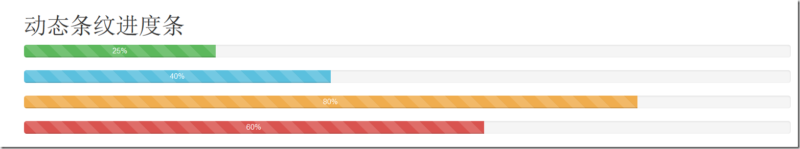
<h1>动态条纹进度条</h1>

     <div class="progress progress-striped active">

         <div class="progress-bar progress-bar-success" style="width:25%;" role="progressbar" aria-valuenow="25" aria-valuemin="0" aria-valuemax="100">25%</div>

     </div>

     <div class="progress progress-striped active">

         <div class="progress-bar progress-bar-info" style="width:40%;" role="progressbar" aria-valuenow="40" aria-valuemax="100" aria-valuemin="0">40%</div>

     </div>

     <div class="progress progress-striped active">

         <div class="progress-bar progress-bar-warning" style="width:80%;" role="progressbar" aria-valuenow="25" aria-valuemin="0" aria-valuemax="100">80%</div>

     </div>

     <div class="progress progress-striped active">

         <div class="progress-bar progress-bar-danger" style="width:60%;" role="progressbar" aria-valuenow="40" aria-valuemax="100" aria-valuemin="0">60%</div>

     </div>
效果如下(由于是直接从网页上结果来的图,这里并看不到它的动态效果):
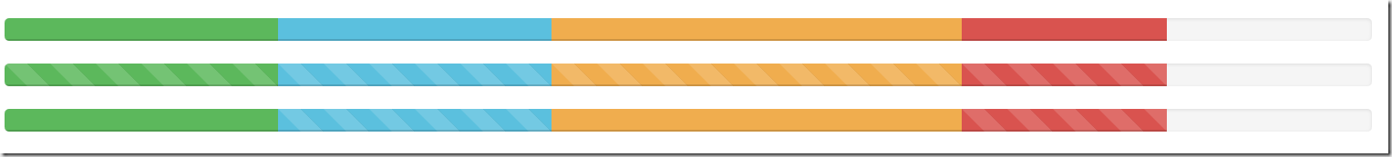
层叠进度条:
层叠进度可以将不容状态的进度条放在一起,按水平方式排列
例子:
<div class="progress">

    <div class="progress-bar progress-bar-success" style="width:20%"></div>

    <div class="progress-bar progress-bar-info" style="width:10%"></div>

    <div class="progress-bar progress-bar-warning" style="width:30%"></div>

    <div class="progress-bar progress-bar-danger" style="width:15%"></div>

</div>

除了层叠彩色进度条之外,还可以层叠条纹进度条,或者说条纹进度条和彩色进度条混合层叠,仅需要在“progress”容器中添加对应的进度条,同样要注意,层叠的进度条之和不能大于100%。
下面来看一个例子:
<div class="progress">

    <div class="progress-bar progress-bar-success" style="width:20%"></div>

    <div class="progress-bar progress-bar-info" style="width:20%"></div>

    <div class="progress-bar progress-bar-warning" style="width:30%"></div>

    <div class="progress-bar progress-bar-danger" style="width:15%"></div>

</div>

<div class="progress">

    <div class="progress-bar progress-bar-success progress-bar-striped" style="width:20%"></div>

    <div class="progress-bar progress-bar-info progress-bar-striped" style="width:20%"></div>

    <div class="progress-bar progress-bar-striped progress-bar-warning" style="width:30%"></div>

    <div class="progress-bar progress-bar-danger progress-bar-striped" style="width:15%"></div>

</div>

<div class="progress">

    <div class="progress-bar progress-bar-success" style="width:20%"></div>

    <div class="progress-bar progress-bar-info progress-bar-striped" style="width:20%"></div>

    <div class="progress-bar progress-bar-warning" style="width:30%"></div>

    <div class="progress-bar progress-bar-danger progress-bar-striped" style="width:15%"></div>

</div>
详解Bootstrap进度条组件的更多相关文章
- 详解Bootstrap表单组件
表单常见的元素主要包括:文本输入框.下拉选择框.单选框.复选框.文本域.按钮等.下面是不同的bootstrap版本: LESS: forms.less SASS: _forms.scss boot ...
- 详解Bootstrap列表组组件
列表组可以用来制作列表清单.垂直导航等效果,也可以配合其他的组件制作出更漂亮的组件,列表组在bootstrap框架中也是一个独立的组件,所以也对应有自己独立源码: LESS:list-group.le ...
- Bootstrap 进度条媒体对象和 Well 组件
一.Well 组件 这个组件可以实现简单的嵌入效果. //嵌入效果 <div class="well"> Bootstrap </div> //有 lg 和 ...
- 第二百四十一节,Bootstrap进度条媒体对象和 Well 组件
第二百四十一节,Bootstrap进度条媒体对象和 Well 组件 学习要点: 1.Well 组件 2.进度条组件 3.媒体对象组件 本节课我们主要学习一下 Bootstrap 的三个组件功能:Wel ...
- Bootstrap进度条
前面的话 在网页中,进度条的效果并不少见,比如一个评分系统,比如加载状态等,通过简单.灵活的进度条,可以为当前工作流程或动作提供实时反馈.本文将详细介绍Bootstrap进度条 基本样式 Bootst ...
- 【Android 应用开发】 自定义 圆形进度条 组件
转载著名出处 : http://blog.csdn.net/shulianghan/article/details/40351487 代码下载 : -- CSDN 下载地址 : http://down ...
- 数字进度条组件NumberProgressBar
数字进度条组件NumberProgressBar NumberProgressBar是一款数字进度条组件.它不仅可以通过进度条的变化展现进度,还可以通过跟随文字精确表示进度值.开发者可以对进度条进行 ...
- vue 的进度条组件
先看效果: 要想实现如上图的,进度跳效果,有两种方式,首先介绍第一种: 1.自己用 div 写一个,代码如下 <template> <div class="mfc-slid ...
- 手把手教你实现一个 Vue 进度条组件!
最近在个人的项目中,想对页面之间跳转的过程进行优化,想到了很多文档或 npm 等都用到的页面跳转进度条,于是便想自己去实现一个,特此记录. 来看下 npm 搜索组件时候的效果: so 下面咱们一起动手 ...
随机推荐
- 时间转换为yyyymmdd
Convert.ToDateTime(tbinpici.Text).ToString("yyyyMMdd")
- jsp学习---mvc模式介绍和el表达式,jstl标签库的使用入门
一.mvc模式介绍 下图是常用的mvc分层模式: 项目中的包命名规则,一般如下: com.amos.domain 封装JavaBean,一般我喜欢用model命名这个包com.amos.dao 封装d ...
- win7添加鼠标右键关联
背景: hfs升级把右键给升没了 搜索了下 都是如何删除的 但没有怎么添加 添加: 保存如下内容为.reg 然后双击导入即可 Windows Registry Editor Version 5.00 ...
- OA项目之导出
要导出页的前台: <asp:Button runat="server" ID="btnExport" Text="导出" CssCla ...
- [R] 回归拟合
如下示例 > fit <- lm(y~x, data = data01) > summary(fit) Call: lm(formula = data01$P ~ data01$M, ...
- 烧写AT91Bootstrap不能连接SAM-BA的解决方法
AT91与SAM-BA的连接是由于芯片内有一段固化的代码运行起来后才会检测到目标板并建立连接. 假设现在你烧写了Bootstrap进去,芯片上电后发现有可运行的代码,从而就不执行片内固化的那个代 ...
- windows server 2008 - 创建域和本机用户
/* * ===================================================================================== * Filenam ...
- php array转json、xml
class Encode{ public static function jsonEncode($code,$message,$data){ $result = array( 'code' => ...
- networkx的绘图中文显示方块问题
修改matplotlibrc文件 font.family : sans-serif #打开该选项 font.sans-serif : Microsoft YaHei , Bitstream Vera ...
- oracle 根据字段分组后,将组内的数据根据字段排序
row_number() over(partition by 分组字段 order by 排序字段 desc)