CSS3 之 童年的纸飞机
今天我们来折纸飞机(可以飞出去的那种哦)
基本全用css来实现,只有一小部分的js
首先看一下飞机的构造
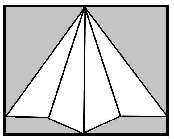
灰色区域为可折叠区域
白色区域为机身
三角形由border画出来的再经过各种平移翻转变成上图
写之前再补充个知识点:
我们颜色的设置不用rgba,
用hsl() h: 色调 0- 360 0(或360)表示红色,120表示绿色,240表示蓝色
s : 饱和度 0% -100%
l : 亮度 0% - 100%
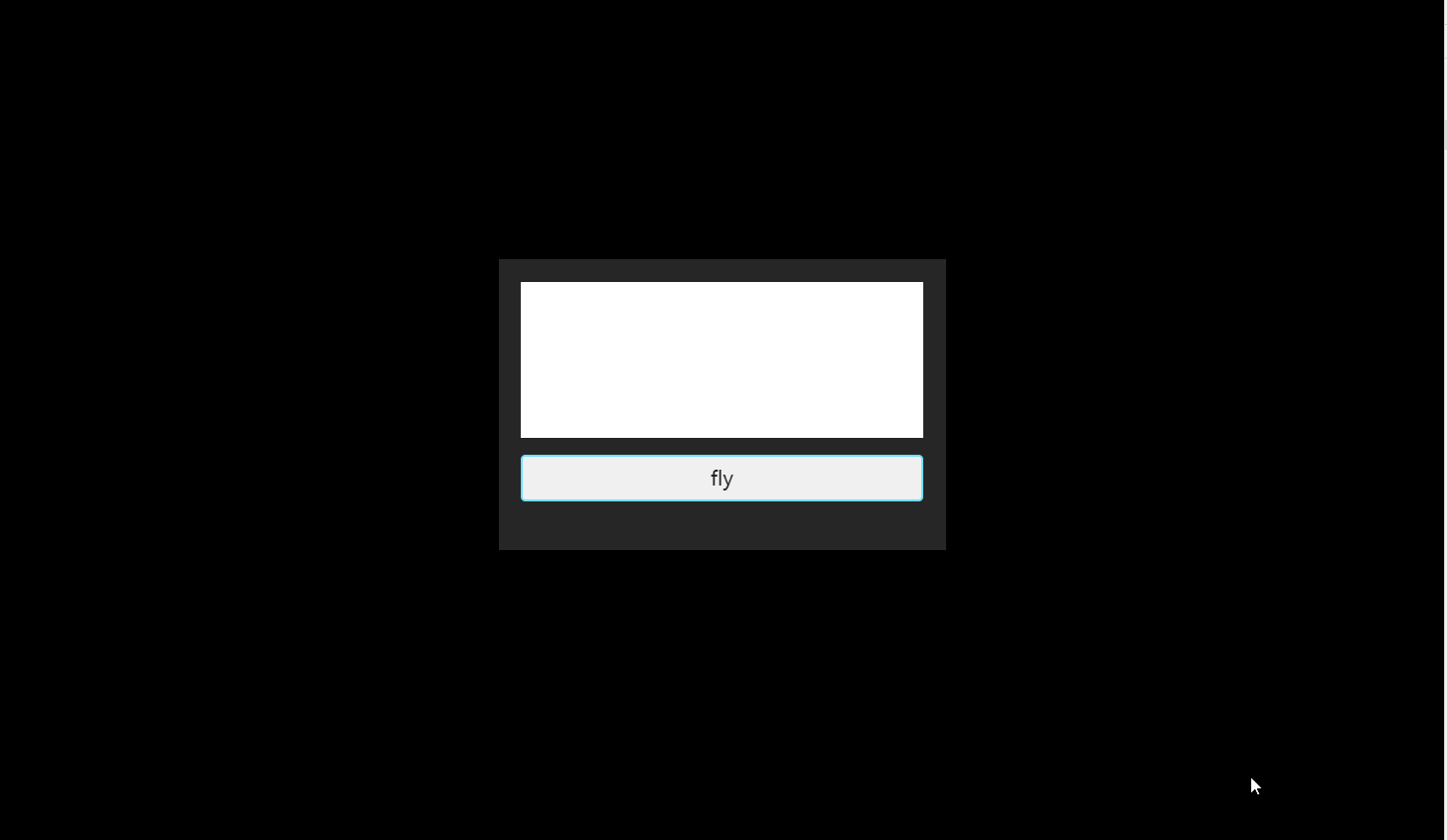
先看效果才有动力:
HTML:
<!--童年的纸飞机-->

<div class="airplane">

    <div class="front-end show-front">

        <!--宽高自适应的文本框-->

        <div class="text-input" contenteditable = true></div>

        <div class="fly">

            fly

        </div>

    </div>

    <div class="backup-end show-backup">

        <div class="left-plane">

            <!--左上角折叠区域-->

            <div class="left-top fold"></div>

            <!--左下角折叠区域-->

            <div class="left-bottom fold"></div>

            <!--机身-->

            <div class="wing wing1"></div>

            <div class="wing wing2"></div>

        </div>

        <div class="right-plane">

            <!--右上角折叠区域-->

            <div class="right-top fold"></div>

            <!--右下角折叠区域-->

            <div class="right-bottom fold"></div>

            <!--机身-->

            <div class="wing wing3"></div>

            <div class="wing wing4"></div>

        </div>

    </div>

</div>
css:
body{

    width: 100%;

    height: 680px;

    background-color: #000;

    background-repeat: no-repeat;

    overflow: hidden;

    transition: all 2s linear;

}

/*景深加在父级上*/

.airplane{

    width: 100%;

    height: 100%;

    -webkit-perspective: 800px;

    -webkit-perspective-origin: 50% 50%;

}

/*纸飞机前面*/

/*一开始不旋转*/

.front-end.show-front{

    transform: rotateY(0deg);

}

/*点击后旋转*/

.front-end{

    background: rgba(255, 255, 255, 0.15);

    *background: hsl(0, 0%, 88%);

    /*绕Y轴旋转-180度*/

    transform: rotateY(-180deg);

    position: relative;

    box-sizing: border-box;

    padding: 20px;

    text-align: center;

    backface-visibility: hidden;

    width: 400px;

    height: 260px;

    top: 240px;

    transition: all 0.8s ease-in-out;

    margin: auto;

}

/*文本框*/

.text-input{

    width: 100%;

    max-width:360px;

    min-height:100px;

    padding: 10px;

    box-sizing: border-box;

    height: 140px;

    background-color: #ffffff;

    font-smoothing: subpixel-antialiased;

    font-size: 18px;

    text-align: left;

    font-family: "Microsoft YaHei",Helvetica, Arial, Verdana;

    line-height: 20px;

}

.fly{

    transition: all 0.3s ease-in-out;

    /*hsl是色调/饱和度/亮度/*/

    border: 2px solid hsl(194, 100%, 72%);

    margin: 15px 0;

    padding: 10px;

    outline: none;

    font-size: 18px;

    cursor: pointer;

    font-family: "Microsoft YaHei";

    background-color: hsl(0, 0%, 94%);

    border-radius:4px;

    user-select: none;

}

/*点击按钮时缩小动画*/

.fly:active{

    transform: scale(0.85);

    transition: all 10ms ease-in-out;

    background-color: hsl(0, 0%, 85%);

    border: 2px solid hsl(194, 30%, 55%);

}

.backup-end{

    perspective: 600px;

    perspective-origin: 200px 131px;

    transform-style: preserve-3d;

    transition: all 0.8s ease-in-out;

    backface-visibility: hidden;

    position: relative;

    width: 400px;

    height: 260px;

    margin: auto;

}

/*一开始不显示飞机*/

.backup-end.show-backup{

    transform: rotateY(180deg);

}

/*飞机的左右两边公共样式*/

.left-plane, .right-plane{

    transform-style: preserve-3d;

    width: 200px;

    height: 260px;

    display: block;

    position: absolute;

    top: 0px;

    transition: all 1s ease-in-out;

}

/*左边*/

.left-plane{

    transform: rotateZ(0deg);

    transform-origin: 100% 50% 0;

    left: 0;

}

/*右边*/

.right-plane{

    transform: rotateZ(0deg);

    transform-origin: 0% 50%;

    left: 199px;

}

/*左右机身的公共样式*/

.wing{

    position: absolute;

    transform-origin: 0 0 0;

    perspective: 1px;

    perspective-origin: 50% 50%;

    backface-visibility: hidden;

    transition: all 1.3s linear;

    box-sizing: border-box;

    margin: 0;

    padding: 0;

    background: none;

    border: none;

    border-top: 240px solid hsla(0, 0%, 0%, 0);

    border-bottom: 0px solid hsla(0, 0%, 0%, 0);

    border-right: 100px solid hsl(0, 0%, 88%);

    width: 0;

    height: 0;

    bottom: 0;

}

/*绘制  飞机2d 雏形*/

.wing1 {

    transform-origin: 100% 100%;

    transform: translateY(-38px) translateX(8px) rotateZ(22.62deg) skewY(-22.62deg);/*2D图像的偏移 旋转*/

}

.wing2 {

    transform: rotateZ(22.62deg);

    transform-origin: 100% 100%;

    border-left: 100px solid hsl(0, 0%, 88%);

    border-right: none;

    left: 100px;

}

.wing3 {

    transform: rotateZ(-22.62deg);

    transform-origin: 0% 100%;

    border-right: 100px solid hsl(0, 0%, 88%);

}

.wing4 {

    transform: translateY(-38px) translateX(-8px) rotateZ(-22.62deg) skewY(22.62deg);

    transform-origin: 0% 100%;

    border-right: none;

    border-left: 100px solid hsl(0, 0%, 88%);

    left: 100px;

}

/*绘制可折叠区域*/

.left-top.fold{

    position: absolute;

    transform-origin: 100px 112px;

    transition-delay: 1300ms;

    width: 0;

    height: 0;

    top: 0;

    border-right: 202px solid hsla(0, 0%, 0%, 0);

    border-bottom: 202px solid hsla(0, 0%, 0%, 0);

    border-top: 222px solid hsl(0, 0%, 88%);

}

.right-top.fold{

    position: absolute;

    right: 0;

    border-left: 202px solid hsla(0, 0%, 0%, 0);

    border-bottom: 202px solid hsla(0, 0%, 0%, 0);

    border-top: 222px solid hsl(0, 0%, 88%);

    transform-origin: 96px 112px;

    transition-delay: 1650ms;

}

.left-bottom.fold{

    position: absolute;

    transform-origin: 109px 0;

    transition-delay: 2100ms;

    width: 109px;

    height: 38px;

    background: hsl(0, 0%, 88%);

    bottom: 0;

    left: 0;

}

.right-bottom.fold{

    position: absolute;

    transform-origin: 0 0;

    transition-delay: 2450ms;

    width: 109px;

    height: 38px;

    background: hsl(0, 0%, 88%);

    bottom: 0;

    right: 0;

}

/*补全 折叠尾翼 剩余 三角区域*/

.left-bottom.fold:after {

    position: absolute;

    content: "";

    border-right: 92px solid hsla(0, 0%, 0%, 0);

    border-bottom: 39px solid hsl(0, 0%, 88%);

    border-top: 37px solid hsla(0, 0%, 0%, 0);

    left: 109px;

    bottom: 0;

}

.right-bottom.fold:after {

    position: absolute;

    content: "";

    border-left: 92px solid hsla(0, 0%, 0%, 0);

    border-bottom: 39px solid hsl(0, 0%, 88%);

    border-top: 37px solid hsla(0, 0%, 0%, 0);

    left: -92px;

    bottom: 0;

}

/****************************/

/****此处开始配合js*****/

/*折叠效果*/

.fold {

    transition: transform 800ms ease-out;

    backface-visibility: hidden;

    position: absolute;

    background-color: transparent;

    z-index: 0;

    width: 0;

}

/* 折叠效果(左机翼、左尾翼) */

.left-top.fold.curved {

    transform: rotate3d(1,-1.11,0,180deg);

}

.left-bottom.fold.curved {

    transform: rotate3d(2.4867,1,0,-180deg);

}

/* 折叠效果(右机翼、右尾翼)*/

.right-top.fold.curved {

    transform: rotate3d(1,1.11,0,180deg);

}

.right-bottom.fold.curved {

    transform: rotate3d(-2.4867,1,0,180deg);

}

/* 平放一整个飞机 */

.airplane.hover {

    transform: rotateX(54deg) rotateY(-10deg) rotateZ(25deg);

    transition-delay: 0.5s;

}

/*放平之后 左侧整体倾斜 (体现折叠效果)*/

.backup-end.hover .left-plane {

    transform: rotateY(60deg);

}

.backup-end.hover .right-plane {

    transform: rotateY(-60deg);

}

/* 3d视觉中放平 左侧机翼*/

.backup-end.hover .wing1 {

    transform: translateY(-38px) translateX(8px) rotateZ(22.62deg) rotateY(-60deg) skewY(-22.62deg);

    border-right: 100px solid hsl(0, 0%, 95%);

}

/*左侧 飞机手持部位透明度降低*/

.backup-end.hover .wing2 {

    border-left: 100px solid hsl(0, 0%, 85%);

}

/* 3d视觉中放平 右侧机翼*/

.backup-end.hover .wing4 {

    transform: translateY(-38px) translateX(-8px) rotateZ(-22.62deg) rotateY(60deg) skewY(20deg);

    border-left: 100px solid hsl(0, 0%, 95%);

}

/*右侧 飞机手持部位透明度降低*/

.backup-end.hover .wing3 {

    border-right: 100px solid hsl(0, 0%, 71%);

}

/*机翼 折叠效果(右机翼、右尾翼) 之后 多余部分隐藏掉*/

.backup-end.hover .curved {

    display: none;

}

/* #wind_container.hover .wing {

    backface-visibility: visible;

} */

/* 飞机后退助跑 */

.backup-end.hover.fly_away_first {

    transform: translateX(-100px) translateZ(300px) rotateX(42deg) rotateY(-11deg) rotateZ(27deg);

    transition-delay: 0ms;

    transition-duration: 0.4s;

    transition-timing-function: ease-out;

}

/* 飞机向前飞翔至消失 */

.backup-end.hover.fly_away_first.fly_away {

    transform: translateX(600px) translateY(-400px) translateZ(-5000px) rotateX(66deg) rotateY(-12deg) rotateZ(36deg);

    transition: transform 2s ease-out, opacity 1.5s 0.5s linear;

    opacity: 0;

}
js:
// 童年的纸飞机

const fly = document.getElementsByClassName('fly')[0];

const front = document.getElementsByClassName('front-end')[0];

const backup = document.getElementsByClassName('backup-end')[0];

const fold = document.getElementsByClassName('fold');

fly.addEventListener('click', () => {

    first().then(second).then(third).then(fourth).then(fifth).catch((err)=> {

        console.log(err)

    });

}, false);

// 第一步

function first() {

    return new Promise((suc, err) => {

        setTimeout(() => {

            // 隐藏信息面板

            front.classList.remove('show-front');

            // 翻转至正面

            backup.classList.remove('show-backup');

            // 折叠效果(左翼、右翼)

            for (let i = 0; i < fold.length; i++) {

                fold[i].classList.add('curved')

            }

            // 颜色变换

            document.body.style.backgroundColor = "#54575A";

            suc(1)

        }, 200)

    })

}

function second() {

    return new Promise((suc, err) => {

        setTimeout(function () {

            backup.classList.add('hover');

            document.body.style.backgroundColor = "#AD8BD8";

            suc(2)

        }, 2800);

    })

}

//步骤三:飞机后退助跑

function third() {

    return new Promise((suc, err) => {

        setTimeout(function () {

            backup.classList.add('fly_away_first');

            document.body.style.backgroundColor = "#6E99C4";

            suc(3)

        }, 2000);

    })

}

// 步骤四:飞机向前飞翔至消失

function fourth() {

    return new Promise((suc, err) => {

        setTimeout(function () {

            backup.classList.add('fly_away');

            document.body.style.backgroundColor = "#3F9BFF";

            suc(4)

        }, 600);

    })

}

function fifth() {

    return new Promise((suc, err) => {

        setTimeout(function () {

            front.classList.add('show-front');

            backup.classList.remove('fly_away','fly_away_first','hover');

            backup.classList.add('show-backup');

            for (let i = 0; i < fold.length; i++) {

                fold[i].classList.remove('curved')

            }

            document.body.style.backgroundColor = "#000";

            suc(5)

        }, 3000);

    })

}
参考自:腾讯课堂渡一教育,有兴趣的同学可以去听一听他们的课,讲的蛮不错的, 对初学者很友好。
CSS3 之 童年的纸飞机的更多相关文章
- QQ音乐API分析记录
我一直是QQ音乐的用户,最近想做一个应用,想用QQ音乐的API,搜索了很久无果,于是就自己分析QQ音乐的API. 前不久发现QQ音乐出了网页版的,是Flash的,但是,我用iPhone打开这个链接的时 ...
- 纯CSS3实现的一些酷炫效果
之前在网上看到一些用纯CSS3实现的酷炫效果,以为实现起来比较困难,于是想看看具体是怎么实现的. 一.笑脸猫动画 实现效果如下: 这个实现起来确实比较麻烦,很多地方需要花时间,有耐心地调整. 1.先看 ...
- CSS3 border-radius边框圆角
在CSS3中提供了对边框进行圆角设定的支持,可对边框1~4个角进行圆角样式设置. 目录 1. 介绍 2. value值的格式和类型 3. border-radius 1~4个参数说明 4. 在线示例 ...
- CSS3 3D立方体效果-transform也不过如此
CSS3系列已经学习了一段时间了,第一篇文章写了一些css3的奇技淫巧,原文戳这里,还获得了较多网友的支持,在此谢过各位,你们的支持是我写文章最大的动力^_^. 那么这一篇文章呢,主要是通过一个3D立 ...
- 三分钟学会用 js + css3 打造酷炫3D相册
之前发过该文,后来不知怎么回事不见了,现在重新发一下. 中秋主题的3D旋转相册 如图,这是通过Javascript和css3来实现的.整个案例只有不到80行代码,我希望通过这个案例,让正处于迷茫期的j ...
- 使用CSS3实现一个3D相册
CSS3系列我已经写过两篇文章,感兴趣的同学可以先看一下CSS3初体验之奇技淫巧,CSS3 3D立方体效果-transform也不过如此 第一篇主要列出了一些常用或经典的CSS3技巧和方法:第二篇是一 ...
- Web大前端时代之:HTML5+CSS3入门系列
准备来一波新技术,待续.... Old: 联系源码:https://github.com/dunitian/LoTHTML5 文档下载:https://github.com/dunitian/LoTD ...
- 07. Web大前端时代之:HTML5+CSS3入门系列~H5 地理位置
Web大前端时代之:HTML5+CSS3入门系列:http://www.cnblogs.com/dunitian/p/5121725.html 源码:https://github.com/duniti ...
- 前端制作动画的几种方式(css3,js)
制作动态的网页是是前端工程师必备的技能,很好的实现动画能够极大的提高用户体验,增强交互效果,那么动画有多少实现方式,一直对此有选择恐惧症的我就总结一下,以便在开发的时候选择最好的实现方式. 1.css ...
随机推荐
- RA layer request failed
新整的Eclipse环境出现这个问题,细化内容是不能connect,后来想起切换Eclipse底层库的事情,然后打开Eclipse的SVN设置.把SVN Client借口由JavaHL改为PureJa ...
- pymongo "ServerSelectionTimeoutError: No servers found yet" 错误的解决
系统转移过程中,擅自把aptitude安装的mongoengine换成了pip安装,系统启动以后,报这个错误 报错提示: File "/usr/local/lib/python2.7/dis ...
- 杨老师课堂_Java核心技术下之控制台模拟记事本案例
预览效果图: 背景介绍: 编写一个模拟记事本的程序通过在控制台输入指令,实现在本地新建文件打开文件和修改文件等功能. 要求在程序中: 用户输入指令1代表"新建文件",此时可以从控制 ...
- MySQL 的性能(下篇)—— 性能优化方法
简介 文中内容均为阅读前辈的文章所整理而来,参考文章已在最后全指明 本文分为上下两篇: 上篇:MySQL 的 SQL 执行分析 下篇:MySQL 性能优化 下面为下篇内容,分为以下部分: 一.创建表时 ...
- Exchanger兄弟线程间数据信息交换
一.简述 Exchanger可以在两个线程之间交换数据,只能是2个线程,他不支持更多的线程之间互换数据.当线程A调用Exchange对象的exchange()方法后,他会陷入阻塞状态,直到线程B也调用 ...
- Linux下启动时间优化专题
1. 过往优化总结 陆陆续续在Linux进行启动时间优化,之前有两份文档,分别从内核和用户空间两个方向进行了优化. <Android/Linux boot time分析优化>和<Bu ...
- Java开源生鲜电商平台-订单抽成模块的设计与架构(源码可下载)
Java开源生鲜电商平台-订单抽成模块的设计与架构(源码可下载) 说明:订单抽成指的是向卖家收取相应的信息服务费.(目前市场上有两种抽成方式,一种是按照总额的抽成比率,另外一种是按照订单明细的抽成比率 ...
- 小黄鸡机器人和小I机器人的调用
<?php //---------------------------------聊天小机器人类---------------------------------------------- ...
- 集成学习之Boosting —— AdaBoost原理
集成学习大致可分为两大类:Bagging和Boosting.Bagging一般使用强学习器,其个体学习器之间不存在强依赖关系,容易并行.Boosting则使用弱分类器,其个体学习器之间存在强依赖关系, ...
- JavaScript设计模式 Item 5 --链式调用
1.什么是链式调用 这个很容易理解,例如: $(this).setStyle('color', 'red').show(); 一般的函数调用和链式调用的区别:调用完方法后,return this返回当 ...