使用matplotlib画双纵轴坐标
一、前言
本文主要使用matplotlib,实现双纵轴坐标的图表绘制。笔者python版本为2.7.15。
二、实践及效果
1. 需求
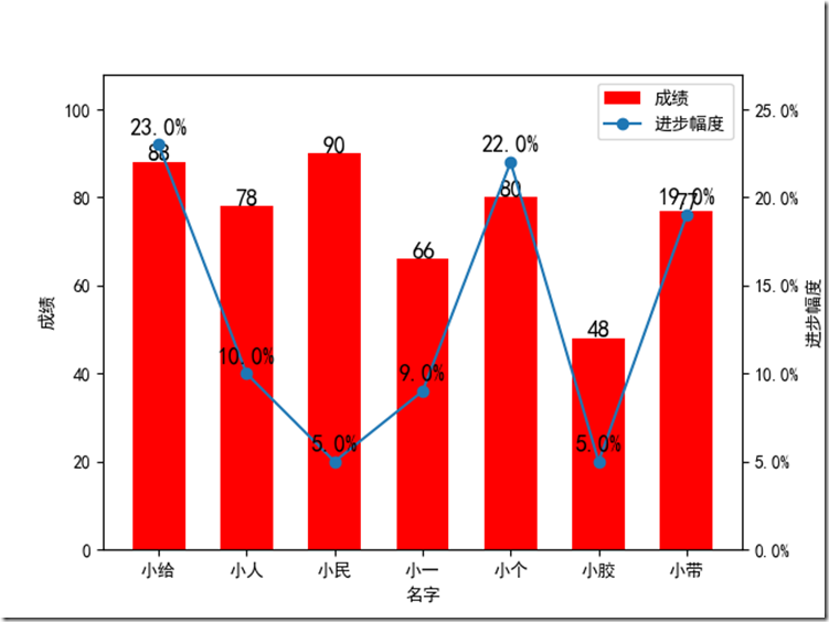
某个有这么一个成绩表,分别是名字,本次成绩以及进步幅度,现在需要把这个成绩单转为这样一个图表:
横轴是同学姓名,成绩用直方图表示,进步幅度用折线图表示,他们公用同一个横轴。
|
姓名 |
本次成绩 |
进步幅度 |
|
小给 |
88 |
23% |
|
小人 |
78 |
10% |
|
小民 |
90 |
5% |
|
小一 |
66 |
9% |
|
小个 |
80 |
22% |
|
小胶 |
48 |
5% |
|
小带 |
77 |
19% |
2. 核心函数Axes.twinx()
搬运官网的说明:
Create a twin Axes sharing the xaxis
Create a new Axes instance with an invisible x-axis and an independent y-axis positioned opposite to the original one (i.e. at right). The x-axis autoscale setting will be inherited from the original Axes.
大意就是使用这个函数,在原来的坐标系中新建一个共享x轴的双胞胎坐标系,类似的还有twiny。
3. 实现代码
#-*- coding:utf-8 -*-

import numpy as np

import matplotlib.pyplot as plt

import matplotlib.ticker as mtick

def main():

    plt.rcdefaults()

    plt.rcParams['font.sans-serif'] = ['SimHei'] # 指定默认字体

    plt.rcParams['axes.unicode_minus'] = False   # 解决保存图像是负号'-'显示为方块的问题

    info_list = [(u"小给", 88, 23), (u"小人", 78, 10), (u"小民", 90, 5), (u"小一", 66, 9), (u"小个", 80, 22), (u"小胶", 48, 5), (u"小带", 77, 19)]

    positions = np.arange(len(info_list))

    names = [row[0] for row in info_list]

    scores = [row[1] for row in info_list]

    proges = [row[2] for row in info_list]

    fig, ax1 = plt.subplots()

    # 成绩直方图

    ax1.bar(positions, scores, width=0.6, align='center', color='r', label=u"成绩")

    ax1.set_xticks(positions)

    ax1.set_xticklabels(names)

    ax1.set_xlabel(u"名字")

    ax1.set_ylabel(u"成绩")

    max_score = max(scores)

    ax1.set_ylim(0, int(max_score * 1.2))

    # 成绩标签

    for x,y in zip(positions, scores):

        ax1.text(x, y + max_score * 0.02, y, ha='center', va='center', fontsize=13)

    # 变动折线图

    ax2 = ax1.twinx()

    ax2.plot(positions, proges, 'o-', label=u"进步幅度")

    max_proges = max(proges)

    # 变化率标签

    for x,y in zip(positions, proges):

        ax2.text(x, y + max_proges * 0.02, ('%.1f%%' %y), ha='center', va= 'bottom', fontsize=13)

    # 设置纵轴格式

    fmt = '%.1f%%'

    yticks = mtick.FormatStrFormatter(fmt)

    ax2.yaxis.set_major_formatter(yticks)

    ax2.set_ylim(0, int(max_proges * 1.2))

    ax2.set_ylabel(u"进步幅度")

    # 图例

    handles1, labels1 = ax1.get_legend_handles_labels()

    handles2, labels2 = ax2.get_legend_handles_labels()

    plt.legend(handles1+handles2, labels1+labels2, loc='upper right')

    plt.show()

if __name__ == '__main__':

    main()
4. 效果图
三、参考
1. matplotlib图例:api example code: two_scales.py
(完)
使用matplotlib画双纵轴坐标的更多相关文章
- Matlab plotyy画双纵坐标图实例
Matlab plotyy画双纵坐标图实例 x = 0:0.01:20;y1 = 200*exp(-0.05*x).*sin(x);y2 = 0.8*exp(-0.5*x).*sin(10*x);[A ...
- python中matplotlib画折线图实例(坐标轴数字、字符串混搭及标题中文显示)
最近在用python中的matplotlib画折线图,遇到了坐标轴 "数字+刻度" 混合显示.标题中文显示.批量处理等诸多问题.通过学习解决了,来记录下.如有错误或不足之处,望请指 ...
- Matplotlib学习---用matplotlib画箱线图(boxplot)
箱线图通过数据的四分位数来展示数据的分布情况.例如:数据的中心位置,数据间的离散程度,是否有异常值等. 把数据从小到大进行排列并等分成四份,第一分位数(Q1),第二分位数(Q2)和第三分位数(Q3)分 ...
- Matplotlib学习---用matplotlib画雷达图(radar chart)
雷达图常用于对多项指标的全面分析.例如:HR想要比较两个应聘者的综合素质,用雷达图分别画出来,就可以进行直观的比较. 用Matplotlib画雷达图需要使用极坐标体系,可点击此链接,查看对极坐标体系的 ...
- matplotlib画线(2)
这篇随笔是matplotlib画线的补充>>> #nocl参数控制图例中有几列,>>> import numpy as np>>> import ...
- Python教程:matplotlib 绘制双Y轴曲线图
前言 本文的文字及图片来源于网络,仅供学习.交流使用,不具有任何商业用途,版权归原作者所有,如有问题请及时联系我们以作处理. 作者:数据皮皮侠 双X轴的可以理解为共享y轴 ax1=ax.twiny() ...
- Matplotlib学习---用matplotlib画面积图(area chart)
这里利用Nathan Yau所著的<鲜活的数据:数据可视化指南>一书中的数据,学习画图. 数据地址:http://book.flowingdata.com/ch05/data/us-pop ...
- Matplotlib绘图双纵坐标轴设置及控制设置时间格式
双y轴坐标轴图 今天利用matplotlib绘图,想要完成一个双坐标格式的图. fig=plt.figure(figsize=(20,15)) ax1=fig.add_subplot(111) ax1 ...
- Python 的 Matplotlib 画图库
Matplotlib安装 NumPy库方便数值运算,但枯燥的数据并不利于人们的直观理解. 数据需要可视化. Matplotlib:一个数据可视化函数库 使用前需要安装 利用Python自带 ...
随机推荐
- OPENCV Linux安装
https://docs.opencv.org/master/d7/d9f/tutorial_linux_install.html
- BI系统之统计图表的绘制[后端实现]
因为在开发内部BI系统中需要画出统计图表,我选了Jpgraph 开源绘图工具实现需求. 之前实现过需求,没想到这次又花了很多时间回忆,各种搜索,真的是好记性不如烂笔头, 不会总结的人没有未来啊. 常用 ...
- .net中的Dictionary字典类的使用方法
//定义字典 Dictionary<string, string> d = new Dictionary<string, string>(); //添加字典的元素 ; i &l ...
- C#中系统时间和UNIX时间戳互相转换
在项目开发过程中,有时会遇到不同程序之间相互调用数据,数据中不免会包含时间,比如ASP.NET调用PHP,牵扯到时间就要做一下处理,PHP程序中一般存取的都是UNIX时间,不像ASP.NET存储的是年 ...
- (转)类的sizeof
来源:http://www.360doc.com/content/12/0315/17/3349869_194600377.shtml
- <script type="text/template">是干什么的,为什么要把html写在js中? 这是什么编程语言风格,都能这样用吗?
这一段存放了一个模板.在js里面,经常需要使用js往页面中插入html内容.比如这样: var number = 123; $('#d').append('<div class="t& ...
- redis的maxmemory与maxmemory-policy关系
如果redis配置了maxmemory和maxmemory-policy策略,则当redis内存数据达到maxmemory时,会根据maxmemory-policy配置来淘汰内存数据,以避免OOM.r ...
- Python基础之文件
输出一行一行的,效率更高 一个任务: 主函数:
- Java-Runoob-高级教程-实例-环境设置实例:1.Java 实例 – 如何编译一个Java 文件?
ylbtech-Java-Runoob-高级教程-实例-环境设置实例:1.Java 实例 – 如何编译一个Java 文件? 1.返回顶部 1. Java 实例 - 如何编译 Java 文件 Java ...
- 网页中显示pdf的方法
非常好的在网页中显示pdf的方法 今天有一需求,要在网页中显示pdf,于是立马开始搜索解决方案,无意中发现一个非常好的解决方法,详见http://blogs.adobe.com/pdfdevjunki ...