前端(各种demo)一:css实现三角形,css实现梯形,pop弹层,css伪类before,after使用,svg使用(持续更新中)
各种demo:
1、css实现正方形
思路:width为0;height为0;使用boder-width为正方形的边长的一半,不占任何字节;border-style为固体;border-color为正方形的填充色。
<!DOCTYPE html>

<html>

    <head>

        <meta charset="UTF-8">

        <title></title>

        <style type="text/css">

            .triangle{

                width: 0;

                height: 0;

                border-width: 30px;

                border-style: solid;

                border-color:#e66161;

            }

        </style>

    </head>

    <body>

        <div class="triangle"></div>

    </body>

</html>
图形


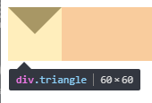
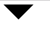
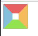
2、css实现三角形
思路:宽度width为0;height为0;border-width为直角三角形斜边的一半;border-color里有四个颜色属性,第一个为上--直角三角形内充填充色,第二个为右--直角三角形内填充色,第三个为下--直角三角形内填充色,第四个为左--直角三角形内填充色。
代码:
<!DOCTYPE html>

<html>

    <head>

        <meta charset="UTF-8">

        <title></title>

        <style type="text/css">

            .triangle{

                width: 0;

                height: 0;

                border-width: 30px;

                border-style: solid;

                border-color: #000000 transparent transparent transparent;

            }

        </style>

    </head>

    <body>

        <div class="triangle"></div>

    </body>

</html>
图形
代码:
.triangle{

                width: 0;

                height: 0;

                border-width: 30px;

                border-style: solid;

                border-color: #000000 #000000 transparent transparent;

            }
图形

代码:
.triangle{

                width: 0;

                height: 0;

                border-width: 30px;

                border-style: solid;

                border-color: #000000 #f50303 transparent transparent;

            }
图形

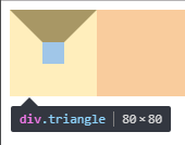
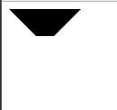
3、css实现正方形外梯形
思路:还是之前的思路,width为20;高度为20;梯形的短底边为div的width;梯形的长边=width+border-width*2;
代码:
<!DOCTYPE html>

<html>

    <head>

        <meta charset="UTF-8">

        <title></title>

        <style type="text/css">

            .triangle{

                width: 20px;

                height: 20px;

                border-width:30px;

                border-style: solid;

                border-color: #000000 transparent transparent transparent;

            }

        </style>

    </head>

    <body>

        <div class="triangle"></div>

    </body>

</html>
图形:
代码:
.triangle{

                width: 0;

                height: 0;

                border-width: 30px;

                border-style: solid;

                border-color:#e66161 #f3bb5b #94e24f #85bfda;

            }
图形:
4、css实现pop弹层
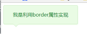
思路:利用两个三角形进行拼接,一个是背景色,一个是边框色,然后利用定位重叠在一起,定位要相差一个像素。
代码:
<!DOCTYPE html>

<html>

    <head>

        <meta charset="UTF-8">

        <title></title>

        <style type="text/css">

            .box{

                position: relative;

                width: 240px;

                height: 60px;

                line-height: 60px;

                background: #e9fbe4;

                box-shadow: 1px 2px 3px #e9fbe4;

                border: 1px solid #c9e9c0;

                border-radius: 4px;

                text-align: center;

                color: #0c7823;

            }

            .triangle-border{

                width: 0;

                height: 0;

                border-width: 10px;

                border-style: solid;

                position: absolute;

                left: 30px;

                overflow: hidden;

            }

            .border{

                bottom:-20px;

                border-color: #C9E9C0 transparent transparent transparent;

            }

            .background{

                bottom: -19px;

                border-color: #E9FBE4 transparent transparent transparent;

            }

        </style>

    </head>

    <body>

        <div class="box">

            <span>我是利用border属性实现</span>

            <div class="triangle-border border"></div>

            <div class="triangle-border background"></div>

        </div>

    </body>

</html>
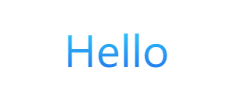
5、css实现字体渐变色
5.1使用gradient属性
存在的不足:IE浏览器都不支持。
<!DOCTYPE html>

<html>

    <head>

        <meta charset="utf-8" />

        <title></title>

        <style type="text/css">

            .promotion-floor-title {

                text-align: center;

                margin: 60px auto 40px;

            }

            .promotion-floor-title .title p {

                display: inline-block;

                text-align: center;

                font-size: 42px;

                background-image: -webkit-gradient(linear, 0 0, 0 bottom, from(#2ED4FB), to(#236BEC));

                -webkit-background-clip: text;

                -webkit-text-fill-color: transparent;

            }

        </style>

    </head>

    <body>

        <div class="promotion-floor-title">

            <div class="title">

                <p>Hello</p>

            </div>

        </div>

    </body>

</html>
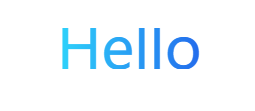
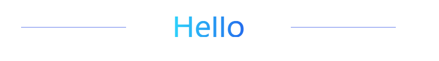
5.2使用svg,支持IE9以及以上
<!DOCTYPE html>

<html>

    <head>

        <meta charset="utf-8" />

        <title></title>

        <style type="text/css">

            .promotion-floor-title {

                text-align: center;

                margin: 60px auto 40px;

            }

            .promotion-floor-title .title {

                min-width: 590px;

                height: 41px;

                display: inline-block;

                position: relative;

            }

            .promotion-floor-title .title svg {

                margin: 0 223px;

                height: 41px;

            }

        </style>

    </head>

    <body>

        <div class="promotion-floor-title">

            <div class="title">

                <svg xmlns="http://www.w3.org/2000/svg" version="1.1">

                    <linearGradient id="grad1" x1="0%" y1="0%" x2="100%" y2="0%">

                        <stop offset="0%" style="stop-color:#2ED4FB;stop-opacity:1" />

                        <stop offset="100%" style="stop-color:#236BEC;stop-opacity:1" />

                    </linearGradient>

                    <text text-anchor="middle" x="50%" y="50%" dy=".36em" class="text" font-size="3.6rem" fill="url(#grad1)">Hello</text>

                </svg>

            </div>

        </div>

    </body>

</html>
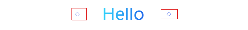
6、css实现一条线
思路:使用span标签,不占文档流,使用背景色background是线条颜色,定位使用position=absolute也是脱离原先的文档流,最主要的是设置高度height为1px,设置使用top来定位,以及宽度来限制线的长度。
<!DOCTYPE html>

<html>

    <head>

        <meta charset="utf-8" />

        <title></title>

        <style type="text/css">

            .promotion-floor-title {

                text-align: center;

                margin: 60px auto 40px;

            }

            .promotion-floor-title .title {

                min-width: 590px;

                height: 41px;

                display: inline-block;

                position: relative;

            }

            .promotion-floor-title .title svg {

                margin: 0 223px;

                height: 41px;

            }

            .promotion-floor-title .title span {

                background: #5672EB;

                position: absolute;

                height: 1px;

                width: 28%;

                top: 50%;

            }

            .promotion-floor-title .title .left-line {

                left: 0;

            }

            .promotion-floor-title .title .right-line {

                right: 0;

            }

        </style>

    </head>

    <body>

        <div class="promotion-floor-title">

            <div class="title">

                <svg xmlns="http://www.w3.org/2000/svg" version="1.1">

                    <linearGradient id="grad1" x1="0%" y1="0%" x2="100%" y2="0%">

                        <stop offset="0%" style="stop-color:#2ED4FB;stop-opacity:1" />

                        <stop offset="100%" style="stop-color:#236BEC;stop-opacity:1" />

                    </linearGradient>

                    <text text-anchor="middle" x="50%" y="50%" dy=".36em" class="text" font-size="3.6rem" fill="url(#grad1)">Hello</text>

                </svg>

                <span class="left-line"></span>

                <span class="right-line"></span>

            </div>

        </div>

    </body>

</html>
7、css使用伪类after实现旋转正方形
思路:在span使用伪类after,第一步设置content为"";第二步增加一个width和height相同的值;第三步使用border边框设定正方形颜色;第四步以及旋转transform等于rotateZ(45deg),设置兼容到webkit,moz,ms浏览器内核;使用position的absolute脱离原先的文档流;使用top来进行定位。
代码:
<!DOCTYPE html>

<html>

    <head>

        <meta charset="utf-8" />

        <title></title>

        <style type="text/css">

            .promotion-floor-title {

                text-align: center;

                margin: 60px auto 40px;

            }

            .promotion-floor-title .title {

                min-width: 590px;

                height: 41px;

                display: inline-block;

                position: relative;

            }

            .promotion-floor-title .title svg {

                margin: 0 223px;

                height: 41px;

            }

            .promotion-floor-title .title span {

                background: #5672EB;

                position: absolute;

                height: 1px;

                width: 28%;

                top: 50%;

            }

            .promotion-floor-title .title span:after {

                content: "";

                position: absolute;

                top: -5px;

                height: 9px;

                width: 9px;

                border: 1px solid #5672EB;

                border-radius: 1px;

                transform: rotateZ(45deg);

                -webkit-transform: rotateZ(45deg);

                -moz-transform: rotateZ(45deg);

                -ms-transform: rotateZ(45deg);

            }

            .promotion-floor-title .title .left-line {

                left: 0;

            }

            .promotion-floor-title .title .left-line:after {

                right: -13px;

            }

            .promotion-floor-title .title .right-line {

                right: 0;

            }

            .promotion-floor-title .title .right-line:after {

                left: -13px;

            }

        </style>

    </head>

    <body>

        <div class="promotion-floor-title">

            <div class="title">

                <svg xmlns="http://www.w3.org/2000/svg" version="1.1">

                    <linearGradient id="grad1" x1="0%" y1="0%" x2="100%" y2="0%">

                        <stop offset="0%" style="stop-color:#2ED4FB;stop-opacity:1" />

                        <stop offset="100%" style="stop-color:#236BEC;stop-opacity:1" />

                    </linearGradient>

                    <text text-anchor="middle" x="50%" y="50%" dy=".36em" class="text" font-size="3.6rem" fill="url(#grad1)">Hello</text>

                </svg>

                <span class="left-line"></span>

                <span class="right-line"></span>

            </div>

        </div>

    </body>

</html>
前端(各种demo)一:css实现三角形,css实现梯形,pop弹层,css伪类before,after使用,svg使用(持续更新中)的更多相关文章
- 【前端面试】Vue面试题总结(持续更新中)
Vue面试题总结(持续更新中) 题目参考链接 https://blog.csdn.net/weixin_45257157/article/details/106215158 由于已经有很多前辈深造VU ...
- 前端深入之js篇丨Array数组操作从入门到成神Up Up Up,持续更新中
写在前面 随着前端深入的不断学习,发现数组这个数据结构在前端中有着相当大的存在感,由于我初学前端的时候并没有系统性的学习数组,所以我将通过这篇文章同你一起学习数组,希望我们能一起进步,学会熟练操作数组 ...
- 后端码农谈前端(CSS篇)第四课:选择器补充(伪类与伪元素)
一.伪类: 属性 描述 :active 向被激活的元素添加样式. :focus 向拥有键盘输入焦点的元素添加样式. :hover 当鼠标悬浮在元素上方时,向元素添加样式. :link 向未被访问的链接 ...
- CSS(五):背景、列表、超链接伪类、鼠标形状控制属性
一.背景属性 1.背景属性用来设置页面元素的背景样式. 2.常见背景属性 属性 描述 background-color 用来设置页面的背景色,取值如red,#ff0000 background-ima ...
- 简单的纯css重置input单选多选按钮的样式--利用伪类
由于input单选多选的原生样式通常都不符合需求,所以在实现功能时通常都需要美化按钮 html <input type="radio" /> <input typ ...
- CSS层叠的问题、标准文档流、伪类选择器
一.层叠的问题 CSS有两个性质: 1.继承性 2.层叠性:选择器的一种选择能力,谁的权重大就选谁 层叠性又分为: 1).选不中:走继承性 (font.color.text.) 继承性的权重是0 若 ...
- CSS效果集锦(持续更新中)
高亮光弧效果 使用CSS3实现的一个高亮光弧效果,当鼠标hover到某一个元素上时,一道光弧从左向右闪过,效果如下: 代码如下: <!DOCTYPE html> <html lang ...
- 自己用的一套reset.css,打算整理一下方便以后用,持续更新中,各位大神,不喜勿喷
*{margin: 0; padding: 0;border:none;}img{vertical-align: top;width: 100%;border: none;}ul,li{list-st ...
- CSS相关知识(持续更新中)
1. 弹性布局 一种当页面需要适应不同的屏幕大小以及设备类型时确保元素拥有恰当的行为的布局方式.引入弹性布局模型的目的是提供一种更加有效的方式来对一个容器中的子元素进行排列.对齐和分配空白空间. 2. ...
随机推荐
- hbase 性能优化 (转载)
一.服务端调优 1.参数配置 1).hbase.regionserver.handler.count:该设置决定了处理RPC的线程数量,默认值是10,通常可以调大,比如:150,当请求内容很大(上MB ...
- php unicode编码和字符串互转
php字符串转Unicode编码, Unicode编码转php字符 百度了很多,都一样, 要么不对, 要不就是只是把字符串的汉字转Unicode 经过多次试验查找, 找到了如下方法, 注意:字符串编码 ...
- Codeforces 438E. The Child and Binary Tree 多项式,FFT
原文链接www.cnblogs.com/zhouzhendong/p/CF438E.html 前言 没做过多项式题,来一道入门题试试刀. 题解 设 $a_i$ 表示节点权值和为 $i$ 的二叉树个数, ...
- JIRA
https://www.jianshu.com/p/8c14b52ce692 JIRA这个工具接触有好几年了,在多个海外项目上都用过这个工具.去年又在项目上深度使用后就有点爱不释手了,回国后也在找机会 ...
- 创建线程的第三种方式——使用Callable接口
Callable是类似于Runnable的接口,实现Callable的类和实现Runnable的类都是可被其他线程执行的任务. 优点:有返回值 缺点:实现繁琐 简单实现: CallableAndFut ...
- QEMU, a Fast and Portable Dynamic Translator-Fabrice Bellard-翻译
Abstract We present the internals of QEMU, a fast machine emulator using an original portable dynami ...
- cgi、fast-cgi、php-pfm关系
CGI是一种规定了服务器和处理进程的数据传输格式的协议 如:nginx 和 php处理进程之间的数据传输是使用cgi格式来相互传输数据 CGI 是 接到请求,fork一条进程来处理,处理完后就退出. ...
- HDU-AcmKeHaoWanLe训练实录
菜鸡队训练实录. 现场赛记录:[名称:奖项/排名] 2017: ICPC Shenyang:Gold/3 CCPC Hangzhou:Gold/3 ICPC Beijing:Gold/13 CCPC ...
- 我们来谈谈最近最热门的微信小程序
最近微信小程序真是火到不行,我们的经理大人也就此给我做了一定的培训.他讲的太好,我实在忍不住跟大家简单分享一下: 1.什么是微信小程序? 一种不需要下载安装即可使用的应用,它实现了应用“触手可及”的梦 ...
- MySQL8主从配置
最近在看MySQL的主从配置,罗列一下过程. 一.环境介绍 我使用的是两个MySQL8.0.13Windows版,Master和Slave安装的在一个机器上,Master库的端口为3306,Slave ...