SciTech-Mathematics-Probability+Statistics- Pandas DataFrame Histogram/BarChart/Boxplot/Scatterplot + Relative Frequency Histogram: Definition + Example()
Links:
- How to Plot Multiple Series from a Pandas DataFrame
- How to Make a Scatterplot From a Pandas DataFrame
- Pandas: How to Plot Multiple Columns on Bar Chart
- How to Add a Title to Seaborn Plots (With Examples)
Histogram from Pandas DataFrame
BY ZACH BOBBITTPOSTED ON AUGUST 5, 2021
You can use the following basic syntax to create a histogram from a pandas DataFrame:
df.hist(column='col_name')
The following examples show how to use this syntax in practice.
import pandas as pd
#create DataFrame
df1 = pd.DataFrame({
'points': [25, 12, 15, 14, 19, 23, 25, 29, 29, 31, 31, 33],
'assists': [5, 7, 7, 9, 12, 9, 9, 4, 7, 7, 8, 9],
'rebounds': [11, 8, 10, 6, 6, 5, 9, 12, 10, 7, 7, 9]})
#view first five rows of DataFrame
df1.head()
points assists rebounds
0 25 5 11
1 12 7 8
2 15 7 10
3 14 9 6
4 19 12 6
#create histogram for 'points' column
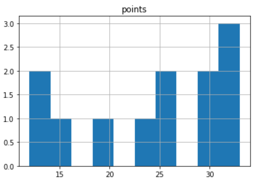
df1.hist(column='points')
#customize the histogram with specific colors, styles, labels, and number of bins:
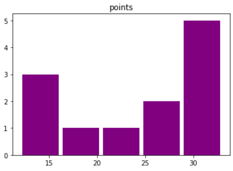
df1.hist(column='points', bins=5, grid=False, rwidth=.9, color='purple')
#create DataFrame
df2 = pd.DataFrame({
'team':['A', 'A', 'A', 'A', 'A', 'A',
'B', 'B', 'B', 'B', 'B', 'B'],
'points': [25, 12, 15, 14, 19, 23, 25, 29, 29, 31, 31, 33]})
#create histogram for each team
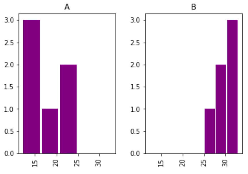
df2.hist(column='points', by='team', bins=3, grid=False, rwidth=.9,
color='purple', sharex=True)
| df1.hist(column='points') | df1.hist(column='points', bins=5,...) | df2.hist(column='points', by='team', bins=3,...) |
|---|---|---|
 |
 |
 |
The x-axis displays the points scored per player and the y-axis shows the frequency for the number of players who scored that many points.
Note that the sharex argument specifies that the two histograms should share the same x-axis.
This makes it easier to compare the distribution of values between the two histograms.
Additional Resources
The following tutorials explain how to create other common plots in Python:
How to Create Boxplot from Pandas DataFrame
How to Plot Multiple Pandas Columns on Bar Chart
Boxplot from Pandas DataFrame
BY ZACH BOBBITTPOSTED ON JULY 20, 2021
You can use the following syntax to create boxplots from a pandas DataFrame:
#create boxplot of one column

df.boxplot(column=['col1'])

#create boxplot of multiple columns

df.boxplot(column=['col1', 'col2'])

#create boxplot grouped by one column

df.boxplot(column=['col1'], by='col2')
The following examples show how to use this syntax in practice with the following DataFrame:
import pandas as pd
#create DataFrame
df = pd.DataFrame({'conference': ['A', 'A', 'A', 'B', 'B', 'B'],
'points': [5, 7, 7, 9, 12, 9],
'assists': [11, 8, 10, 6, 6, 5],
'rebounds': [4, 2, 5, 8, 6, 11],})
#view DataFrame
df
# Example 1: Boxplot of One Column
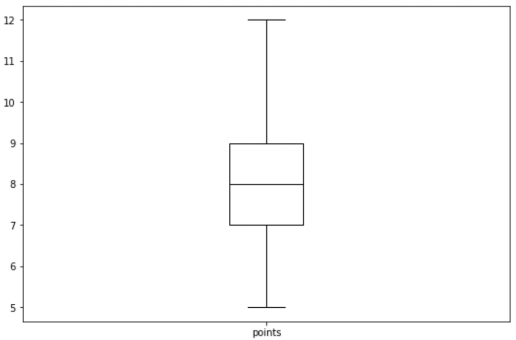
df.boxplot(column=['points'], grid=False, color='black')
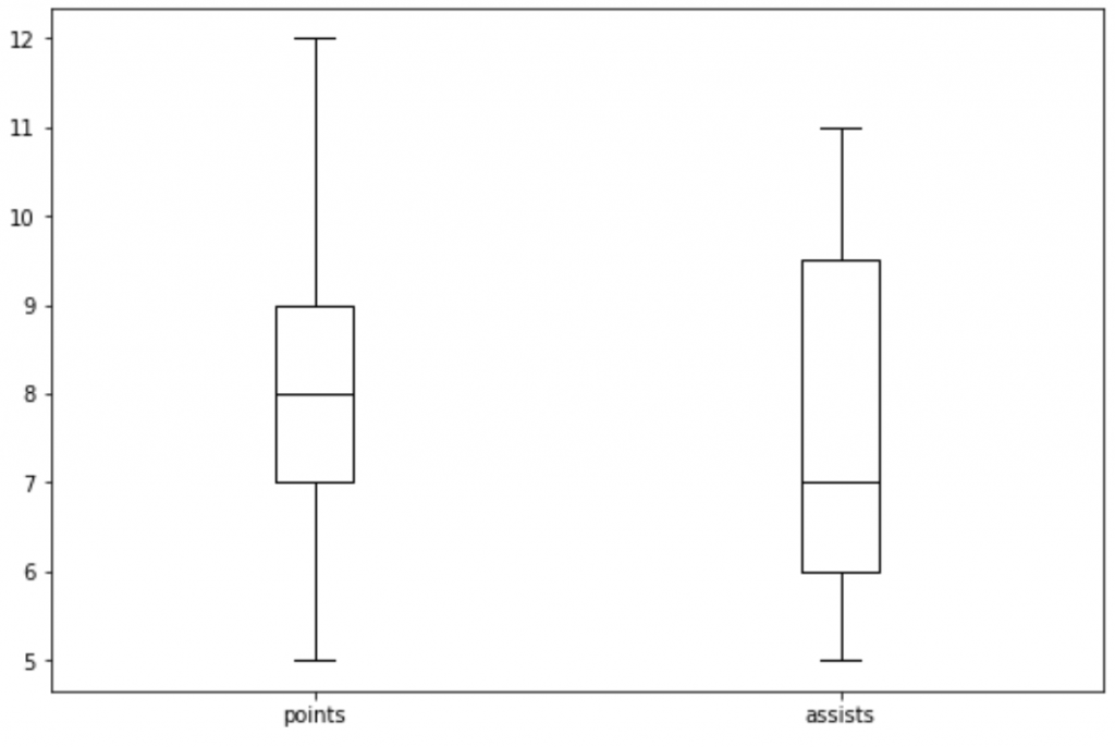
#Example 2: Boxplot of Multiple Columns
df.boxplot(column=['points', 'assists'], grid=False, color='black')
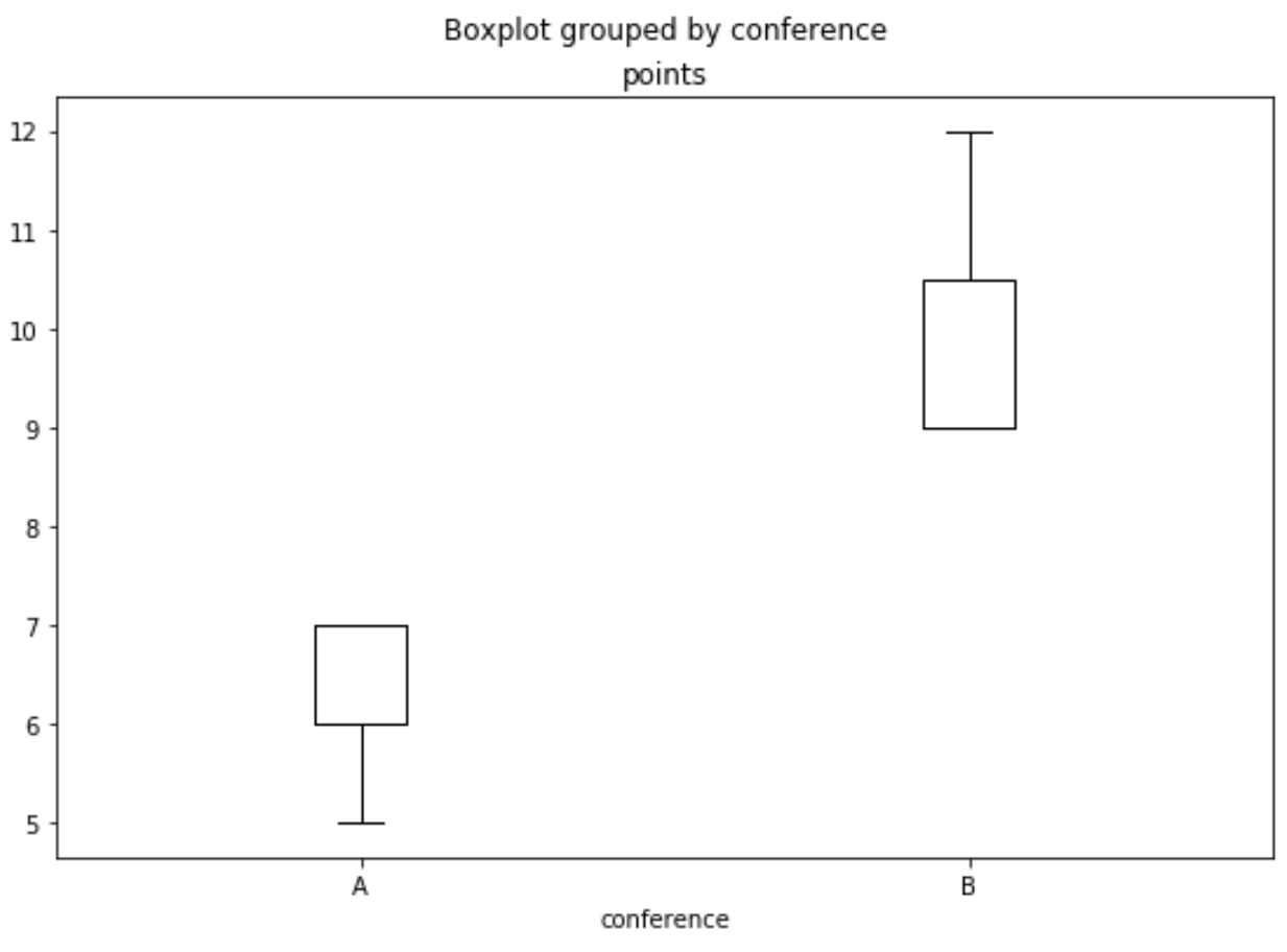
#Example 3: Boxplot Grouped by One Column
df.boxplot(column=['points'], by='conference', grid=False, color='black')
| Example 1: df.boxplot(column=['points'], | Example 2: df.boxplot(column=['points', 'assists'], | Example 3: df.boxplot(column=['points'], by='conference', |
|---|---|---|
 |
 |
 |
BarChart from Pandas DataFrame
Multiple Columns
Pandas: How to Plot Multiple Columns on Bar Chart
BY ZACH BOBBITTPOSTED ON APRIL 8, 2021
You can use the following syntax to plot multiple columns of a pandas DataFrame on a single bar chart:
df[['x', 'var1', 'var2', 'var3']].plot(x='x', kind='bar')
The x column will be used as the x-axis variable and var1, var2, and var3 will be used as the y-axis variables.
The following examples show how to use this function in practice.
Plot Columns on a Bar Chart
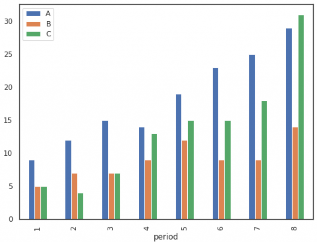
The following code shows how to plot three columns on a bar chart, specifying that the column named period should be used as the x-axis variable:
import pandas as pd
import matplotlib.pyplot as plt
#create fake data
df = pd.DataFrame({'period': [1, 2, 3, 4, 5, 6, 7, 8],
'A': [9, 12, 15, 14, 19, 23, 25, 29],
'B': [5, 7, 7, 9, 12, 9, 9, 14],
'C': [5, 4, 7, 13, 15, 15, 18, 31]})
#plot columns on bar chart
df[['period', 'A', 'B', 'C']].plot(x='period', kind='bar')
# We could also choose to plot only certain columns, such as A and B:
df[['period', 'A', 'B']].plot(x='period', kind='bar')
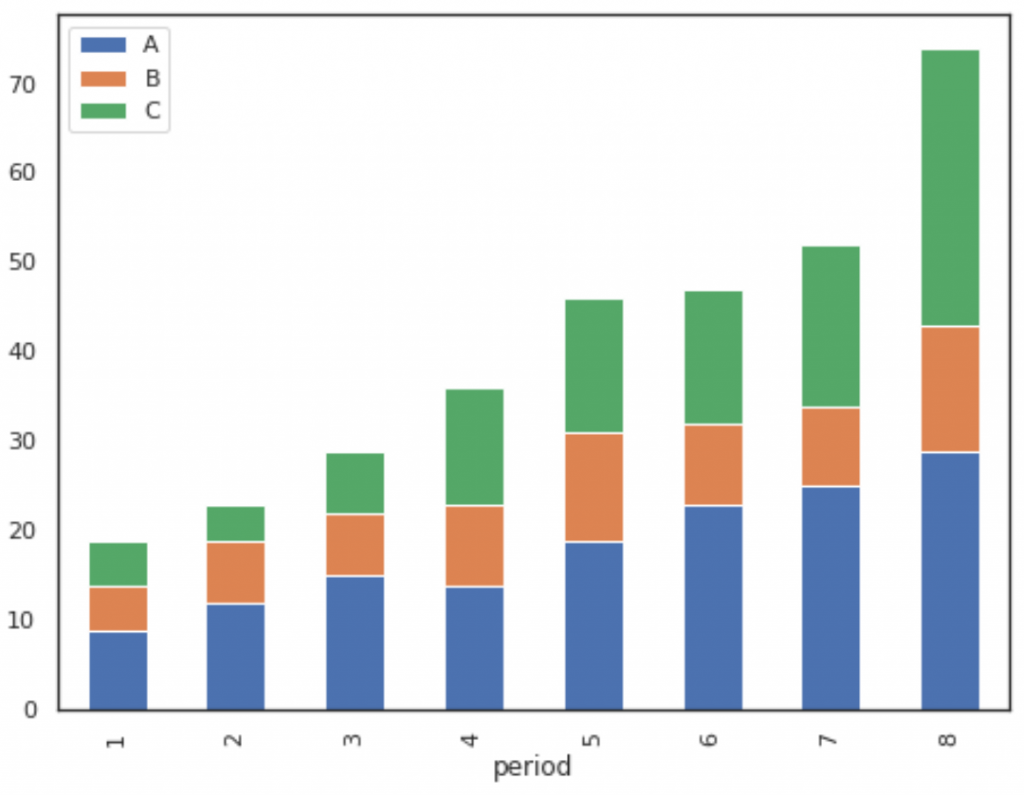
#create fake data
df = pd.DataFrame({'period': [1, 2, 3, 4, 5, 6, 7, 8],
'A': [9, 12, 15, 14, 19, 23, 25, 29],
'B': [5, 7, 7, 9, 12, 9, 9, 14],
'C': [5, 4, 7, 13, 15, 15, 18, 31]})
#create stacked bar chart
df[['period', 'A', 'B', 'C']].plot(x='period', kind='bar', stacked=True)
# To change the colors of the bars, simply use the color argument as follows:
df[['period', 'A', 'B', 'C']].plot(x='period', kind='bar', stacked=True,
color=['red', 'pink', 'gold'])
| Example 1: df[['period', 'A', 'B', 'C']].plot(x='period', kind='bar') | Example 2: df[['period', 'A', 'B', 'C']].plot(x='period', kind='bar', stacked=True) |
|---|---|
 |
|
 |
|
Relative Frequency Histogram: Definition + Example
BY ZACH BOBBITTPOSTED ON FEBRUARY 19, 2020
Often in statistics you will encounter tables that display information about frequencies.
Frequencies simply tell us how many times a certain event has occurred.
For example, the following table shows how many items a particular shop sold in a week based on the price of the item:
| Item Price(Unit: Dollar) | Frequency |
|---|---|
| 1 – 10 | 20 |
| 11 – 20 | 21 |
| 21 – 30 | 13 |
| 31 – 40 | 8 |
| 41 – 50 | 4 |
This type of table is known as a frequency table.
In one column we have the "class" and in the other column we have the frequency of the class.
Often we use frequency histograms to visualize the values in a frequency table,
since it's typically easier to gain an understanding of data when we can visualize the numbers.
A histogram lists the classes along the x-axis of a graph,
and uses bars to represent the frequency of each class along the y-axis.
The following frequency histogram provides a visual representation of the frequency table above:

Frequency histogram example
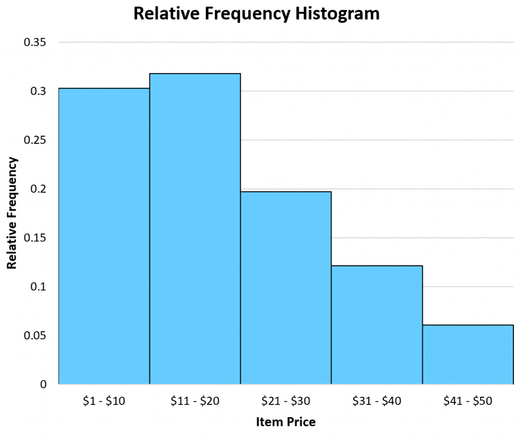
A close cousin of a frequency table is a relative frequency table, which simply lists the frequencies of each class as a percentage of the whole.
The following table shows the relative frequencies of the same dataset we saw earlier:
| Item Price(Unit: Dollar) | Frequency | Relative Frequency |
|---|---|---|
| 1 – 10 | 20 | 0.303 |
| 11 – 20 | 21 | 0.318 |
| 21 – 30 | 13 | 0.197 |
| 31 – 40 | 8 | 0.121 |
| 41 – 50 | 4 | 0.061 |
In total, there were 66 items sold. Thus, we found the relative frequency of each class by taking the frequency of each class and dividing by the total items sold.
For example, there were 20 items sold in the price range of $1 – $10. Thus, the relative frequency of the class $1 – $10 is 20 / 66 = 0.303.
Next, there were 21 items sold in the price range of $11 – $20. Thus, the relative frequency of the class $11 – $20 is 21 / 66 = 0.318.
We perform the same calculation for each class to get the relative frequencies.
Once we have the relative frequency of each class, we can then create a relative frequency histogram to visualize these relative frequencies.
Similar to a frequency histogram, this type of histogram displays the classes along the x-axis of the graph and uses bars to represent the relative frequencies of each class along the y-axis.
The only difference is the labels used on the y-axis. Instead of displaying raw frequencies, a relative frequency histogram displays percentages.
Example of a relative frequency histogram
When to Use a Relative Frequency Histogram
A frequency histogram can be useful when you're interested in raw data values.
For example, a shop might have a goal to sell at least 10 items each week in the $41 – $50 range.
By creating a frequency histogram of their data, they can easily see that they're not meeting their goal of selling 10 items per week in this price range:
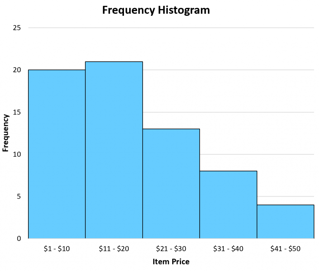
Frequency histogram example
Conversely, a relative frequency histogram is useful when you're interested in percentage values.
For example, a shop might have a goal of selling 5% of their total items in the $41 – $50 price range.
By creating a relative frequency histogram of their data, they can see that they are meeting this goal:

Example of a relative frequency histogram
Note that a frequency histogram and a relative frequency histogram will both look the exact same. The only difference is the values displayed on the y-axis.
Additional Resources
The following tutorials explain how to create relative frequency histograms in different statistical software:
How to Create a Relative Frequency Histogram in Python
SciTech-Mathematics-Probability+Statistics- Pandas DataFrame Histogram/BarChart/Boxplot/Scatterplot + Relative Frequency Histogram: Definition + Example()的更多相关文章
- [20170603]12c Top Frequency histogram.txt
---恢复内容开始--- [20170603]12c Top Frequency histogram.txt --//个人对直方图了解很少,以前2种直方图类型对于目前的许多应用来讲已经足够,或者讲遇到 ...
- pandas.DataFrame学习系列1——定义及属性
定义: DataFrame是二维的.大小可变的.成分混合的.具有标签化坐标轴(行和列)的表数据结构.基于行和列标签进行计算.可以被看作是为序列对象(Series)提供的类似字典的一个容器,是panda ...
- pandas.DataFrame的pivot()和unstack()实现行转列
示例: 有如下表需要进行行转列: 代码如下: # -*- coding:utf-8 -*- import pandas as pd import MySQLdb from warnings impor ...
- pandas DataFrame apply()函数(1)
之前已经写过pandas DataFrame applymap()函数 还有pandas数组(pandas Series)-(5)apply方法自定义函数 pandas DataFrame 的 app ...
- pandas DataFrame apply()函数(2)
上一篇pandas DataFrame apply()函数(1)说了如何通过apply函数对DataFrame进行转换,得到一个新的DataFrame. 这篇介绍DataFrame apply()函数 ...
- 把pandas dataframe转为list方法
把pandas dataframe转为list方法 先用numpy的 array() 转为ndarray类型,再用tolist()函数转为list
- pandas DataFrame.shift()函数
pandas DataFrame.shift()函数可以把数据移动指定的位数 period参数指定移动的步幅,可以为正为负.axis指定移动的轴,1为行,0为列. eg: 有这样一个DataFrame ...
- pandas DataFrame applymap()函数
pandas DataFrame的 applymap() 函数可以对DataFrame里的每个值进行处理,然后返回一个新的DataFrame: import pandas as pd df = pd. ...
- pandas DataFrame(3)-轴
和numpy数组(5)-二维数组的轴一样,pandas DataFrame也有轴的概念,决定了方法是对行应用还是对列应用: 以下面这个数据为例说明: 这个数据是5个车站10天内的客流数据: rider ...
- pandas DataFrame(4)-向量化运算
pandas DataFrame进行向量化运算时,是根据行和列的索引值进行计算的,而不是行和列的位置: 1. 行和列索引一致: import pandas as pd df1 = pd.DataFra ...
随机推荐
- VS2019 配置 protobuf3.8.0
1.下载protobuf3.8.0 https://github.com/protocolbuffers/protobuf/releases/tag/v3.8.0 2.准备工作 解压文件并在同级目录建 ...
- vs2017试用期结束问题
Visual Studio 2017 企业版 Enterprise 更新码:NJVYC-BMHX2-G77MM-4XJMR-6Q8QF
- 小白也能行!10分钟用Cursor搭建个人博客网站(零基础教程)
一.Cursor是什么?Cursor是一款基于AI的智能代码编辑器,它整合了GPT-4技术,可以帮助我们: 自动生成代码 解释代码含义 修复代码错误 对话式编程指导特别适合编程新手使用,传统搭建博客需 ...
- Linux 在文件中统计关键字出现的次数
摘要:在当前文件或者当前目录下所有文件中,使用Linux命令grep.awk.sed.rg或者cat统计关键字出现的次数. 目录 问题背景 解决办法 使用grep和wc命令 使用awk命令模式匹配 使 ...
- Java CountDownLatch的使用方法
摘要:介绍Java中CountDownLatch的使用方法,重点包括计数器的值.countDown和await.计数器的值表示任务线程的个数,每次countDown都会使计数减一,减到0的时候调用aw ...
- 双 CDN 加速 + 智能调度
转载自我的个人博客:双 CDN 加速 + 智能调度 |未名小站 DeepSeek 的官网是一个很典型的双 CDN 加速的场景,当我们使用 IT-Dog 对其发起多地 Ping 的时候,可以看到国内使用 ...
- redis碰到的问题
SpringBoot整合redis 连接报错: Unable to connect to Redis; nested exception is org.springframework.data.red ...
- 企业如何通过数据资产化,激活“数据要素x”,乘出新质生产力
放眼全球,数据作为一种新兴生产要素,在全球经贸活动中扮演着至关重要的角色,驱动着数字经济的蓬勃兴起.据前瞻预测,至2025年,全球数据流动对整体经济增长的贡献预估将达到惊人的11万亿美元. 近几年国家 ...
- .net入行第4年(续集)
.net入行第4年 - 园友2288976 - 博客园 .NET入行第4年 | 第二集的开始:账号封禁后的思考与转型 园友2288976 - 博客园 很多朋友希望我写得更详细一点,特别是"怎 ...
- C#/.NET/.NET Core优秀项目和框架2025年6月简报
前言 公众号每月定期推广和分享的C#/.NET/.NET Core优秀项目和框架(每周至少会推荐两个优秀的项目和框架当然节假日除外),公众号推文中有项目和框架的详细介绍.功能特点.使用方式以及部分功能 ...