几个页面loading样式
随手练习了几个loading样式,以后看到有意思的loading样式也会补充上。样式的兼容性建议还是去w3c上看下属性的兼容性,至少我习惯这么多,当然,w3c中文网貌似很久很久没更新过了,可能更好的还是去google下。
我给出的代码一般会把浏览器前缀样式给省略,因为像动画的关键帧这样的需要前缀的属性会使贴出来的代码很长。
下面给出示意图和代码:
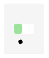
(1)两个小球:


 <!doctype html>

 <head>

 <title>两个小球</title>

 <style>

     .loading-area {

         position: fixed;

         top: 50%;

         left: 50%;

         margin: -50px 0 0 -40px;

         width: 80px;

         height: 100px;

         text-align: center;

         border-radius: 4px;

         background-color: rgba(0, 0, 0, .04);

     }

     .icon-ball:before, .icon-ball:after {

         content: '';

         position: absolute;

         display: inline-block;

         top: 20px;

         left: 50%;

         margin-left: -7px;

         width: 14px;

         height: 14px;

         border: 1px solid #999;

         border-radius: 50%;

         box-sizing: border-box;

         background-color: #999;

         /*-webkit-animation: loading 1.8s linear alternate infinite;*/

         animation: loading 1.8s linear alternate infinite;

     }

     .icon-ball:after {

         top: 70px;

         animation-name: another-loading;

         border-color: rgba(0, 0, 0, .04);

         background-color: rgba(0, 0, 0, .08);

     }

     @keyframes loading {

         0% {top: 20px;}

         100% {top: 70px;}

     }

     @keyframes another-loading {

         0% {top: 70px;}

         100% {top: 20px;}

     }

 </style>

 </head>

 <body>

 <div class="loading-area icon-ball">

 </div>

 </body>

 </html>
(2)时钟:


<!doctype html>

<head>

<title>时钟</title>

<style>

    .loading-area {

        position: fixed;

        top: 50%;

        left: 50%;

        margin: -50px 0 0 -40px;

        width: 80px;

        height: 100px;

        border-radius: 4px;

        background-color: rgba(0, 0, 0, .04);

    }

    .icon-timer {

        position: absolute;

        top: 50%;

        left: 50%;

        margin: -15px 0 0 -15px;

        width: 30px;

        height: 30px;

        border-radius: 50%;

        background-color: #fff;

    }

    .icon-timer:before, .icon-timer:after {

        content: '';

        display: inline-block;

        position: absolute;

        bottom: 50%;

        left: 50%;

        margin-left: -1px;

        width: 2px;

        height: 8px;

        background-color: #333;

        -webkit-transform-origin: 50% 100%;

        -ms-transform-origin: 50% 100%;

        transform-origin: 50% 100%;

        /*transform-origin: center bottom;*/

    }

    .icon-timer:before {

        /*-webkit-animation: hourhand 24s linear infinite;*/

        animation: hourhand 24s linear infinite;

    }

    .icon-timer:after {

        height: 12px;

        /*-webkit-animation: minutehand 2s linear infinite;*/

        animation: minutehand 2s linear infinite;

    }

    @keyframes hourhand {

        0% {transform: rotate(0deg)}

        100% {transform: rotate(360deg);}

    }

    @keyframes minutehand {

        0% {transform: rotate(0deg)}

        100% {transform: rotate(360deg);}

    }

</style>

</head>

<body>

<div class="loading-area">

    <i class="icon-timer"></i>

</div>

</body>

</html>
(3)、充电

<!doctype html>

<head>

<title>充电</title>

<style>

    .loading-area {

        position: fixed;

        top: 50%;

        left: 50%;

        margin: -50px 0 0 -40px;

        width: 80px;

        height: 100px;

        border-radius: 4px;

        background-color: rgba(0, 0, 0, .04);

    }

    .icon-charge {

        position: absolute;

        top: 50%;

        left: 50%;

        margin: -10px 0 0 -20px;

        width: 40px;

        height: 20px;

        /*border: 1px solid #333;*/

        border-radius: 4px;

        background-color: #fff;

    }

    .icon-charge:after {

        content: '';

        display: inline-block;

        position: absolute;

        top: 0;

        left: 0;

        width: 0;

        height: 20px;

        border-radius: 4px;

        background-color: #ddd;

        /*-webkit-animation: charge 2s linear alternate infinite;*/

        animation: charge 2s linear alternate infinite;

    }

    @keyframes charge {

        0% {width: 0;}

        100% {width: 40px; background-color: #3dec3a;}

    }

    .icon-charge:before {

        content: '';

        position: absolute;

        top: -12px;

        left: -12px;

        width: 8px;

        height: 8px;

        background-color: #000;

        animation: move 8s ease infinite;

    }

    @keyframes move {

        0% {top: -12px; left: -12px; transform: rotate(0deg); border-radius: 0;}

        25% {top: -12px; left: 52px; transform: rotate(360deg); border-radius: 50%;}

        50% {top: 32px; left: 52px; transform: rotate(0deg); border-radius: 0;}

        75% {top: 32px; left: -12px; transform: rotate(360deg); border-radius: 50%;}

        100% {top: -12px; left: -12px; transform: rotate(0deg); border-radius: 0;}

    }

</style>

</head>

<body>

<div class="loading-area">

    <i class="icon-charge"></i>

</div>

</body>

</html>
几个页面loading样式的更多相关文章
- A标签/按钮防止重复提交&页面Loading制作
[实现原理] 防止重复提交与页面的提交时的Loading设置,均是在提交,但是尚未处理完成进行的操作,且提交为异步提交(同步提交不需要考虑).因此,其实现原理是在点击按钮或A标签时,将按钮/A标签置为 ...
- 利用@keyframe及animation做一个页面Loading时的小动画
前言 利用@keyframe规则和animation常用属性做一个页面Loading时的小动画. 1 @keyframe规则简介 @keyframes定义关键帧,即动画每一帧执行什么. 要使用关键帧 ...
- 纯css3手机页面图标样式代码
全部图标:http://hovertree.com/texiao/css/19/ 先看效果: 或者点这里:http://hovertree.com/texiao/css/19/hoverkico.ht ...
- Form认证导致登陆页面的样式无效和图片不能显示的原因
最近在做企业内门户网站,一切进展还算顺利,部署到生产环境的时候也能没有什么大问题,只是登录页面的样式不起作用,不知为何,因为是使用了login控件,最初以为是此控件有内置默认样式或者什么原因,于是就不 ...
- 页面loading提示效果
前言: 现在做页面一般为了提示友好点,一般会做个页面正在加载的loading提示效果,当页面加载完毕后再显示内容!这个时候就需要监控页面的资源加载的情况,有时候这并不好做,因为页面涉及图片,视频,已经 ...
- 项目遇到的小问题(关于vue-cli中js点击事件不起作用和iconfont图片下载页面css样式乱的解答)
第一个:关于vue-cli中js点击事件不起作用 在vue的methods方法queryBtnFun()中拼接html和click操作事件的时候,发现点击事件一起未起作用: 后来发现是DOM执行顺序 ...
- 页面css样式找不到问题
出现了一个页面没有样式的问题: 问题: 1.路径不对, 可以打开页面f12看样式是否找到 检查路径是否正确. 2.样式没引全或者没引对. 查看引入的样式是否正确或缺少样式. 3.路径明明写对了却404 ...
- 页面重置样式reset.css
我把经常用到的一些页面重置样式归类到了一个.css文件中,这样可以减少代码冗余.当然还有其他的很多用处,比如h1~h5的样式全部统一的话,下面写东西很清晰很多. @charset 'utf-8'; h ...
- 页面loading效果
当网页太大,打开太慢的时候,为了增加良好的用户体验(不让用户眼巴巴的等,心中暗骂c,这么慢),我们需要加一个等待动画. 只需把以下代码加入页面中即可,图片可以根据自己的需求更换,更换图片之后需要改变l ...
随机推荐
- node.js前后台交互示例 -- 使用node.js实现用户注册功能
node.js环境自行搭建,参考菜鸟教程的node.js就可以. 1 通过ajax提交index.html中form表单 register.html文件如下: <!doctype html> ...
- 计算单词出现的次数--linq
1.直接给出代码:声明数据,也可以是txt等文件,通过File类的静态方法读取其中的文本,再转换成List<string>数组. private static List<string ...
- Js插件开发
简易JS插件开发,本文效果是一个简单的弹出层,意在记录插件的封装Demo. 完整源码压缩包:demo.rar 效果图(如下): 插件脚本: /** * 节点配置属性方式配置参数:专业的做法是配置到,每 ...
- 数据可视化之MarkPoint
MarkPoint是什么效果?如上图,一闪一闪亮晶晶的效果,这是在Echarts中对应的效果.我最早看到的是腾讯的一个Flash的版本,显示当前QQ在线人数的全国分布效果,感觉效果很炫,当时也在想,怎 ...
- 《Effective C#》读书笔记-1.C# 语言习惯-1.使用属性而不是可访问的数据成员
思维导图: 大纲: 1.使用属性而不是可访问的数据成员 属性 指定不同的访问权限 隐式属性降低了声明属性的工作量 允许将数据成员作为公共接口的一部分暴露 ...
- HTTP长连接、短连接使用及测试
概念 HTTP短连接(非持久连接)是指,客户端和服务端进行一次HTTP请求/响应之后,就关闭连接.所以,下一次的HTTP请求/响应操作就需要重新建立连接. HTTP长连接(持久连接)是指,客户端和服务 ...
- 天方夜谈·数据结构·Queue
"我在想Y的时候不能想X....." 什么叫做Queue(队列)?"队列是项的集合,对于每一项x和y,如果x在y之前离开对头,那么x一定在y之前进入队列--Sesh·Ve ...
- 【整理】hash算法原理及常见函数
简介 Hash,一般翻译做"散列",也有直接音译为"哈希"的,就是把任意长度的输入,通过散列算法,变换成固定长度的输出,该输出就是散列值. 散列表 ...
- RedHat 7.1 下安装 Zabbix监控程序详解(适合linux初级用户)
RedHat 7.1 安装 Zabbix 监控程序详解(适合对linux初级用户)2017-05-02 安装步骤: 1.zabbix需要安装LAMP架构 2.安装zabbix服务 3.初始化zabbi ...
- hdu1198 Farm Irrigation 并查集
题目链接:http://acm.hdu.edu.cn/showproblem.php?pid=1198 简单并查集 分别合并竖直方向和水平方向即可 代码: #include<iostream&g ...