Python交互图表可视化Bokeh:7. 工具栏
ToolBar工具栏设置
① 位置设置
② 移动、放大缩小、存储、刷新
③ 选择
④ 提示框、十字线
1. 位置设置
import numpy as np

import pandas as pd

import matplotlib.pyplot as plt

% matplotlib inline

import warnings

warnings.filterwarnings('ignore')

# 不发出警告

from bokeh.io import output_notebook

output_notebook()

# 导入notebook绘图模块

from bokeh.plotting import figure,show

from bokeh.models import ColumnDataSource

# 导入图表绘制、图标展示模块

# 导入ColumnDataSource模块

# 工具栏 tools
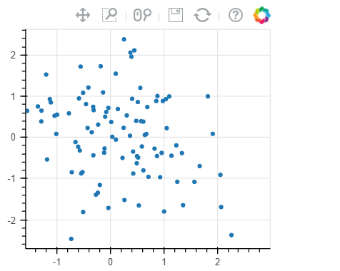
# (1)设置位置 p = figure(plot_width=300, plot_height=300,
toolbar_location="above")
# 工具栏位置:"above","below","left","right" p.circle(np.random.randn(100),np.random.randn(100))
show(p)
# 工具栏 tools
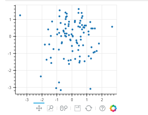
# (1)设置位置 p = figure(plot_width=300, plot_height=300,
toolbar_location="below",
toolbar_sticky=False)
# 工具栏位置设置为"below"时,可增加toolbar_sticky参数使得toolsbar不被遮挡
p.circle(np.random.randn(100),np.random.randn(100))
show(p)
2. 移动、放大缩小、存储、刷新
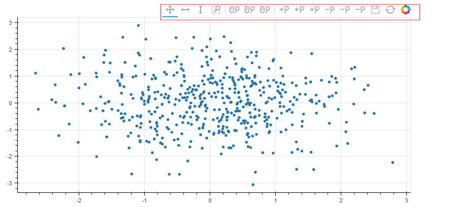
# 工具栏 tools
# (2)移动、放大缩小、存储、刷新 TOOLS = '''
pan, xpan, ypan,
box_zoom,
wheel_zoom, xwheel_zoom, ywheel_zoom,
zoom_in, xzoom_in, yzoom_in,
zoom_out, xzoom_out, yzoom_out,
save,reset
'''
#pan是直接移动;xpan和ypan分别是横轴、竖轴移动;box_zoom是矩形框放大,wheel_zoom滚轮缩放:直接缩放、X轴缩放、Y轴缩放;通过鼠标点击缩放zoom_in
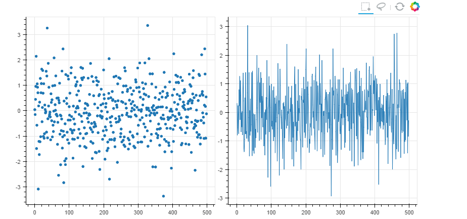
p = figure(plot_width=800, plot_height=400,toolbar_location="above",
tools = TOOLS)
# 添加toolbar
# 这里tools = '' 则不显示toolbar p.circle(np.random.randn(500),np.random.randn(500))
show(p)
3. 选择
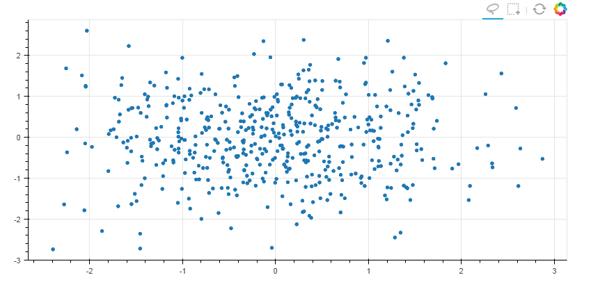
# 工具栏 tools

# (3)选择

TOOLS = '''

        box_select,lasso_select,

        reset

        '''

#画多边形和矩形

p = figure(plot_width=800, plot_height=400,toolbar_location="above",

           tools = TOOLS)

# 添加toolbar

p.circle(np.random.randn(500),np.random.randn(500))

show(p)
#联动

from bokeh.layouts import gridplot

TOOLS = '''

        box_select,lasso_select,

        reset

        '''

df = pd.DataFrame(np.random.randn(500,2), columns = ['A', 'B'])

source = ColumnDataSource(data=df)

p1 = figure(plot_width=400, plot_height=400,toolbar_location="above",tools = TOOLS)

p2 = figure(plot_width=400, plot_height=400,toolbar_location="above",tools = TOOLS)

p1.circle(x='index', y='A',source=source)

p2.line(x='index', y='B',source=source)

s = gridplot([[p1, p2]])

show(s)
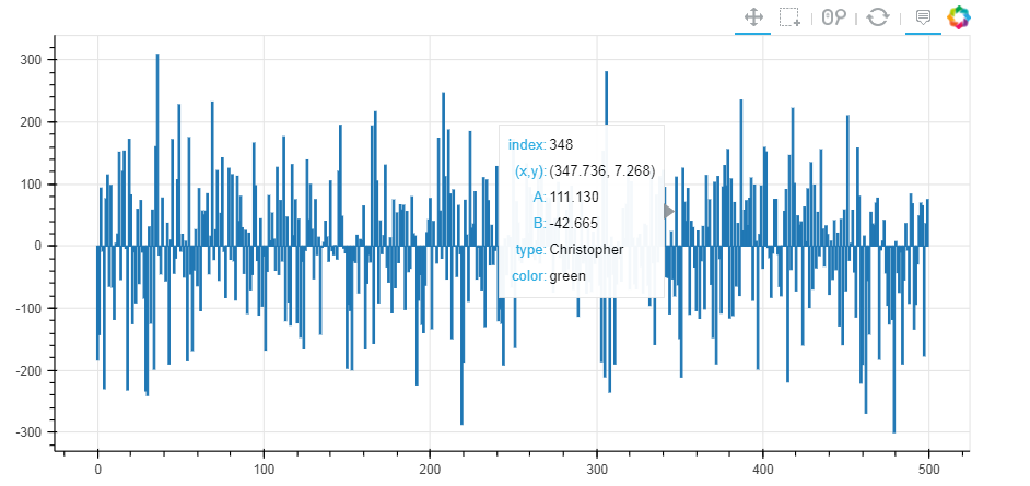
4. 提示框、十字线
# 工具栏 tools
# (4)提示框、十字线 from bokeh.models import HoverTool
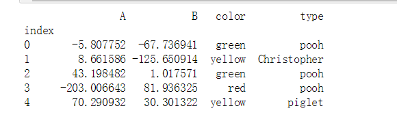
# 用于设置显示标签内容 df = pd.DataFrame({'A':np.random.randn(500)*100,
'B':np.random.randn(500)*100,
'type':np.random.choice(['pooh', 'rabbit', 'piglet', 'Christopher'],500),
'color':np.random.choice(['red', 'yellow', 'blue', 'green'],500)})
df.index.name = 'index'
source = ColumnDataSource(df)
print(df.head())
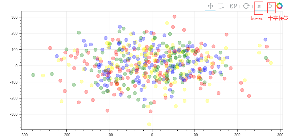
# 创建数据 → 包含四个标签 p1 = figure(plot_width=800, plot_height=400,toolbar_location="above",
tools=['hover,box_select,reset,wheel_zoom,pan,crosshair']) # 注意这里书写方式; hover它的作用是只是会显示出点的每个标签;crossshair是显示十字叉
# 如果不设置标签,就只写hover,例如 tools='hover,box_select,reset,wheel_zoom,pan,crosshair'
p1.circle(x = 'A',y = 'B',source = source,size = 10,alpha = 0.3, color = 'color')
show(p1)
from bokeh.models import HoverTool
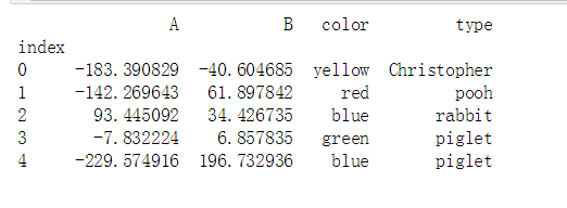
# 用于设置显示标签内容 df = pd.DataFrame({'A':np.random.randn(500)*100,
'B':np.random.randn(500)*100,
'type':np.random.choice(['pooh', 'rabbit', 'piglet', 'Christopher'],500),
'color':np.random.choice(['red', 'yellow', 'blue', 'green'],500)})
df.index.name = 'index'
source = ColumnDataSource(df)
print(df.head())
# 创建数据 → 包含四个标签 hover = HoverTool(tooltips=[
("index", "$index"),
("(x,y)", "($x, $y)"),
("A", "@A"),
("B", "@B"),
("type", "@type"),
("color", "@color"),
])
# 设置标签显示内容
# $index:自动计算 → 数据index
# $x:自动计算 → 数据x值
# $y:自动计算 → 数据y值
# @A:显示ColumnDataSource中对应字段值 p1 = figure(plot_width=800, plot_height=400,toolbar_location="above",
tools=[hover,'box_select,reset,wheel_zoom,pan,crosshair']) # 注意这里书写方式; hover它的作用是只是会显示出点的每个标签;crossshair是显示十字叉
# 如果不设置标签,就只写hover,例如 tools='hover,box_select,reset,wheel_zoom,pan,crosshair'
p1.circle(x = 'A',y = 'B',source = source,size = 10,alpha = 0.3, color = 'color')
show(p1) p2 = figure(plot_width=800, plot_height=400,toolbar_location="above",
tools=[hover,'box_select,reset,wheel_zoom,pan'])
p2.vbar(x = 'index', width=1, top='A',source = source)
show(p2)
print(hover) #就是一个生成器

HoverTool(id='3b80258a-2940-4c8a-af3e-9a3905cb7c09', ...)
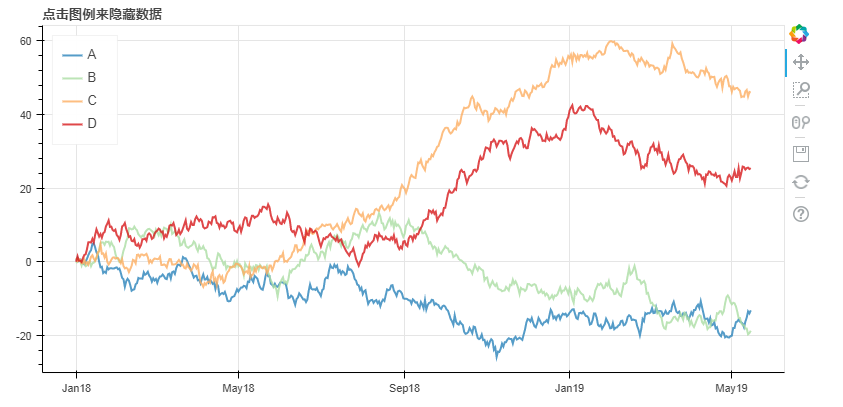
5. 筛选数据
隐藏
# 1、筛选数据 - 隐藏

# legend.click_policy

from bokeh.palettes import Spectral4

# 导入颜色模块

df = pd.DataFrame({'A':np.random.randn(500).cumsum(),

                  'B':np.random.randn(500).cumsum(),

                  'C':np.random.randn(500).cumsum(),

                  'D':np.random.randn(500).cumsum()},

                 index = pd.date_range('',freq = 'D',periods=500))

# 创建数据

p = figure(plot_width=800, plot_height=400, x_axis_type="datetime")

p.title.text = '点击图例来隐藏数据'

for col,color in zip(df.columns.tolist(),Spectral4):

    p.line(df.index,df[col],line_width=2, color=color, alpha=0.8,legend = col)

p.legend.location = "top_left"

p.legend.click_policy="hide"

# 设置图例,点击隐藏

show(p)

消隐
# 1、筛选数据 - 消隐

# legend.click_policy

from bokeh.palettes import Spectral4

# 导入颜色模块

df = pd.DataFrame({'A':np.random.randn(500).cumsum(),

                  'B':np.random.randn(500).cumsum(),

                  'C':np.random.randn(500).cumsum(),

                  'D':np.random.randn(500).cumsum()},

                 index = pd.date_range('',freq = 'D',periods=500))

# 创建数据

p = figure(plot_width=800, plot_height=400, x_axis_type="datetime")

p.title.text = '点击图例来隐藏数据'

for col,color in zip(df.columns.tolist(),Spectral4):

    p.line(df.index,df[col],line_width=2, color=color, alpha=0.8,legend = col,

           muted_color=color, muted_alpha=0.2)   # 设置消隐后的显示颜色、透明度 可以设置muted_color = 'black'

p.legend.location = "top_left"

p.legend.click_policy="mute"

# 设置图例,点击隐藏

show(p)
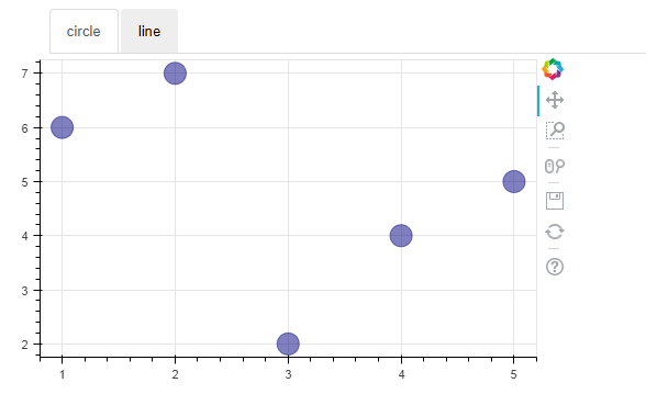
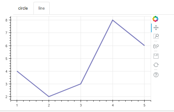
6. 交互工具
# 2、交互小工具

# 图表分页

from bokeh.models.widgets import Panel, Tabs

# 导入panel,tabs模块

p1 = figure(plot_width=500, plot_height=300)

p1.circle([1, 2, 3, 4, 5], [6, 7, 2, 4, 5], size=20, color="navy", alpha=0.5)

tab1 = Panel(child=p1, title="circle")

# child → 页码

# title → 分页名称

p2 = figure(plot_width=500, plot_height=300)

p2.line([1, 2, 3, 4, 5], [4, 2, 3, 8, 6], line_width=3, color="navy", alpha=0.5)

tab2 = Panel(child=p2, title="line")

tabs = Tabs(tabs=[ tab1, tab2 ])

# 设置分页图表

show(tabs)
Python交互图表可视化Bokeh:7. 工具栏的更多相关文章
- Python交互图表可视化Bokeh:1. 可视交互化原理| 基本设置
Bokeh pandas和matplotlib就可以直接出分析的图表了,最基本的出图方式.是面向数据分析过程中出图的工具:Seaborn相比matplotlib封装了一些对数据的组合和识别的功能:用S ...
- Python交互图表可视化Bokeh:5 柱状图| 堆叠图| 直方图
柱状图/堆叠图/直方图 ① 单系列柱状图② 多系列柱状图③ 堆叠图④ 直方图 1.单系列柱状图 import numpy as np import pandas as pd import matplo ...
- Python交互图表可视化Bokeh:6. 轴线| 浮动| 多图表
绘图表达进阶操作 ① 轴线设置② 浮动设置③ 多图表设置 1. 轴线标签设置 设置字符串 import numpy as np import pandas as pd import matplotli ...
- Python交互图表可视化Bokeh:4. 折线图| 面积图
折线图与面积图 ① 单线图.多线图② 面积图.堆叠面积图 1. 折线图--单线图 import numpy as np import pandas as pd import matplotlib.py ...
- Python交互图表可视化Bokeh:3. 散点图
散点图 ① 基本散点图绘制② 散点图颜色.大小设置方法③ 不同符号的散点图 1. 基本散点图绘制 import numpy as np import pandas as pd import matpl ...
- Python交互图表可视化Bokeh:2. 辅助参数
图表辅助参数设置 辅助标注.注释.矢量箭头 参考官方文档:https://bokeh.pydata.org/en/latest/docs/user_guide/annotations.html#col ...
- Python绘制六种可视化图表详解,三维图最炫酷!你觉得呢?
Python绘制六种可视化图表详解,三维图最炫酷!你觉得呢? 可视化图表,有相当多种,但常见的也就下面几种,其他比较复杂一点,大都也是基于如下几种进行组合,变换出来的.对于初学者来说,很容易被这官网上 ...
- Python 数据图表工具的比较
Python 的科学栈相当成熟,各种应用场景都有相关的模块,包括机器学习和数据分析.数据可视化是发现数据和展示结果的重要一环,只不过过去以来,相对于 R 这样的工具,发展还是落后一些. 幸运的是,过去 ...
- Python绘图与可视化
Python有很多可视化工具,本篇只介绍Matplotlib. Matplotlib是一种2D的绘图库,它可以支持硬拷贝和跨系统的交互,它可以在Python脚本.IPython的交互环境下.Web应用 ...
随机推荐
- 远程连接阿里云的mysql数据库
第一步 由于mysql版本问题 先尝试打开 sudo vim /etc/mysql/my.cnf 如空,再尝试打开 sudo vim /etc/mysql/mysql.conf.d/mysqld.cn ...
- 自定义redis连接池(字典操作)
pool=redis.ConnectionPool(host='127.0.0.1', port=6379,max_connections=1000)conn=redis.Redis(connecti ...
- Ajax 执行顺序
jQuery中各个事件执行顺序如下: 1.ajaxStart(全局事件) 2.beforeSend 3.ajaxSend(全局事件) 4.success 5.ajaxSuccess(全局事件) 6.e ...
- Python下划线的详解
本文将讨论Python中下划线(_)字符的使用方法.我们将会看到,正如Python中的很多事情,下划线的不同用法大多数(并非所有)只是常用惯例而已. 单下划线(_) 通常情况下,会在以下3种场景中使用 ...
- IOS UINavigationController 更改返回按钮
UIButton *back = [UIButton buttonWithType:UIButtonTypeCustom]; back.titleLabel.font = [UIFont boldSy ...
- Oracle_plsql_开发工具搭建最小化客户端
一:资源下载获取路径: 二:配置方法 1:前提是安装好plsql开发工具 具体安装步骤略 2:配置 简化版的客户端工具. 具体格式:可以参照下文来修改编写使用. orcl_1521 = (DESCRI ...
- Socket网络编程(二)
udp协议发送消息案例 1.创建UdpServer(udp服务器端) package com.cppdy.udp; import java.net.DatagramPacket; import jav ...
- Django 之缓存
一.缓存 由于Django是动态网站,所有每次请求均会去数据进行相应的操作,当程序访问量大时,耗时必然会更加明显,最简单解决方式是使用:缓存,缓存将一个某个views的返回值保存至内存或者memcac ...
- Python基础之继承与派生
一.什么是继承: 继承是一种创建新的类的方式,新建的类可以继承一个或过个父类,原始类成为基类或超类,新建的类则称为派生类 或子类. 其中,继承又分为:单继承和多继承. class parent_cla ...
- Allegro PCB Design GXL (legacy) 将指定的层导出为DXF
Allegro PCB Design GXL (legacy) version 16.6-2015 1.菜单:Display > Color/Visibility... 2.打开Color Di ...