Material Design 常用控件
Material Design
Material Design (原质化/材料化设计) 是在2014年Google I/O大会上推出的一套全新的界面设计语言。
意在解决Android平台界面风格不统一调的问题。
1.SwipeRefreshLayout (下拉刷新)
SwipeRefreshLayout 用来实现下拉刷新
把要实现下拉刷新的控件放置到 SwipeRefreshLayout 中,eg:
       <android.support.v4.widget.SwipeRefreshLayout

            android:id="@+id/activity_main_swipe_refresh"

            android:layout_width="match_parent"

            android:layout_height="match_parent">

            <ListView

                android:id="@+id/activity_main_lv"

                android:layout_width="match_parent"

                android:layout_height="match_parent"/>

        </android.support.v4.widget.SwipeRefreshLayout>
刷新事件:
	    swipeRefresh.setColorSchemeResources(R.color.colorPrimaryDark); //设置进度条颜色

		//刷新事件

        swipeRefresh.setOnRefreshListener(new SwipeRefreshLayout.OnRefreshListener() {

            @Override

            public void onRefresh() {

                /**

                 * 更新操作

                */

                //当执行完更新操作后,隐藏进度条

                swipeRefresh.setRefreshing(false);

            }

        });
SwipeRefreshLayout 的 set Refreshing() 方法传入 false,用于表示刷新事件结束,并隐藏刷新进度条
2.Toolbar
优点:继承了ActionBar的所有功能,而且灵活性很高。
Android studio 创建的项目默认是带ActionBar的,我们需要修改 res>values>styles.xml 文件,来不使用ActionBar
<style name="AppTheme" parent="Theme.AppCompat.Light.NoActionBar">
布局文件中添加Toolbar:
<android.support.v7.widget.Toolbar

    android:layout_width="match_parent"

    android:layout_height="50dp"

    android:background="@color/colorPrimary"

    android:layout_height="?attr/actionBarSize"

    android:theme="@style/ThemeOverlay.AppCompat.Dark.ActionBar"

    app:popupTheme="@style/ThemeOverlay.AppCompat.Light"/>
?attr/actionBarSize :》》 ?attr 表示使用当前样式(主题)中定义的对应属性值,默认值是56dp, 可以点进去看看
android :theme : 》》 toolbar 使用深色主题
app:popupTheme :》》 menu菜单设置为淡色主题 ;app 目的是为了兼容低版本手机
获取实例传入实例 : setSupportActionBar(toolbar) 很重要要不然不显示
        Toolbar toolbar=(Toolbar)findViewById(R.id.toolbar);

        toolbar.setTitle("Title");

        setSupportActionBar(toolbar);
2.2Toolbar 来显示更多内容:
右击res目录 ->New->Directory, 创建一个menu 菜单。右击menu文件夹->New->Menu resource file, 创建一个toolbar.xml文件,并写入如下代码:
<?xml version="1.0" encoding="utf-8"?>

<menu xmlns:android="http://schemas.android.com/apk/res/android"

      xmlns:app="http://schemas.android.com/apk/res-auto">

    <item

        android:id="@+id/item_back"

        android:icon="@drawable/ic_backup"

        android:title="Backup"

        app:showAsAction="always"/>

    <item

        android:id="@+id/item_delete"

        android:icon="@drawable/ic_delete"

        android:title="Delete"

        app:showAsAction="ifRoom"/>

    <item

        android:id="@+id/item_setting"

        android:icon="@drawable/ic_settings"

        android:title="Setting"

        app:showAsAction="never"/>

</menu>
showAsAction 有以下几种值可以选则:
always表示永远显示在Toolbar中,如果屏幕空间不够则不显示;
if Room表示屏幕空间足够的话显示在Toolbar中,不够的话就显示在菜单当中;
never 则表示永远显示在菜单当中。默认是never。
注意:Toolbar 中的action按钮只会显示图标,菜单中的action按钮只会显示文字
重写 onCreateOptionsMenu 和 onOptionsItemSelected 方法来实现创建菜单和菜单点击事件:
 @Override

    public boolean onCreateOptionsMenu(Menu menu) {

        //MenuInflater 菜单填充器

        getMenuInflater().inflate(R.menu.main,menu);

        return true; //表示是否显示菜单

    }

    @Override

    public boolean onOptionsItemSelected(MenuItem item) {

        //根据不同的 itemId 执行不同操作

        switch (item.getItemId()){

            case R.id.item_delete:

                toast("You clicked delete!");

                break;

            case R.id.item_setting:

                toast("You clicked setting!");

                break;

        }

        return true;

    }
效果图: 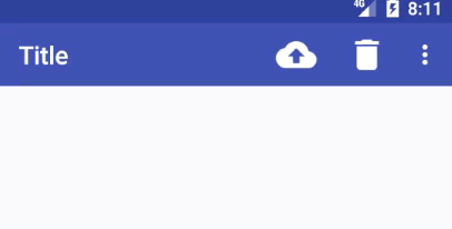
另外还有一个就是Home箭头显示 和 Icon 显示
       //显示Home箭头(返回箭头)

        getSupportActionBar().setDisplayHomeAsUpEnabled(true);

        //设置图标

        getSupportActionBar().setIcon(R.mipmap.ic_launcher);
点击事件:
  @Override

    public boolean onSupportNavigateUp() {

        toast("Back!");

        return super.onSupportNavigateUp();

    }
效果图:
Menu 也可以显示 Submenu:
效果图: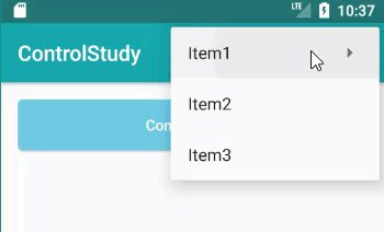
实现的时候只需要在Item中在嵌套一层 Menu就可以,Menu:
<?xml version="1.0" encoding="utf-8"?>

<menu xmlns:android="http://schemas.android.com/apk/res/android">

    <item android:id="@+id/menu_item1" android:title="Item1">

        <menu>

            <group android:checkableBehavior="none">

                <item

                    android:id="@+id/menu_item1_item1"

                    android:title="Item1_submenu1"/>

                <item

                    android:id="@+id/menu_item1_item2"

                    android:title="Item1_submenu1"/>

            </group>

        </menu>

    </item>

    <item android:id="@+id/menu_item2" android:title="Item2"/>

    <item android:id="@+id/menu_item3" android:title="Item3"/>

</menu>
3.DrawerLayout (侧滑菜单)
通过 DrawerLayout 来实现滑动菜单 ,这个控件由 support-v4库提供。
这个布局允许放入两个直接子控件(布局),第一个是主屏幕中显示的内容,第二个是滑动菜单中的显示内容。
eg:
<?xml version="1.0" encoding="utf-8"?>

<android.support.v4.widget.DrawerLayout

    xmlns:android="http://schemas.android.com/apk/res/android"

    xmlns:tools="http://schemas.android.com/tools"

    xmlns:app="http://schemas.android.com/apk/res-auto"

    android:id="@+id/activity_main_drawerLayout"

    android:layout_width="match_parent"

    android:layout_height="match_parent"

    tools:context="com.tiger.materialdesigntest.MainActivity">

  <RelativeLayout

      android:layout_width="match_parent"

      android:layout_height="match_parent">

    <android.support.v7.widget.Toolbar

        android:id="@+id/toolbar"

        android:layout_width="match_parent"

        android:layout_height="?attr/actionBarSize"

        android:titleTextColor="@color/myWhite"

        android:background="@color/colorPrimary"

        android:theme="@style/ThemeOverlay.AppCompat.Dark.ActionBar"

        app:popupTheme="@style/ThemeOverlay.AppCompat.Light"/>

  </RelativeLayout>

  <LinearLayout

      android:layout_gravity="left"

      android:orientation="vertical"

      android:background="#fff"

      android:layout_width="match_parent"

      android:layout_height="match_parent">

    <TextView

        android:text="Text1"

        android:textSize="30dp"

        android:layout_width="match_parent"

        android:layout_height="wrap_content"/>

    <TextView

        android:text="Text2"

        android:textSize="30dp"

        android:layout_width="match_parent"

        android:layout_height="wrap_content"/>

  </LinearLayout>

</android.support.v4.widget.DrawerLayout>
效果图: 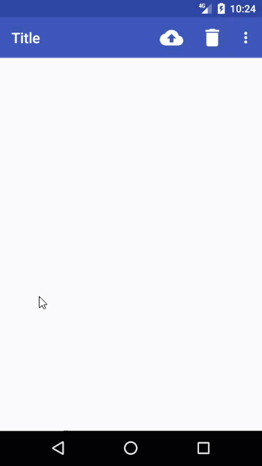
需要注意:
第二个子控件(布局) 必须指定 layout_gravity 属性(没有智能提示),来设置侧滑菜单实在屏幕的那边显示。
3.2 显示和隐藏侧滑菜单
        final DrawerLayout  mDrawerLayout=(DrawerLayout)findViewById(R.id.activity_main_drawerLayout);

        //显示侧滑菜单

        mDrawerLayout.openDrawer(Gravity.LEFT);

        //隐藏侧滑菜单

        mDrawerLayout.closeDrawer(Gravity.LEFT);
4.NavigationView
5.SwitchCompat
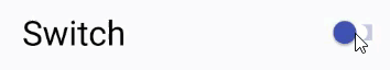
| 属性 | 描述 |
|---|---|
| showText: true/false | 决定是否显示开关按钮上的文字 |
| switchPadding | 文字和开关的最小距离 |
| trackTintMode | 轨道样式 |
| trackTint | 轨道颜色 |
| thumb | 引用主题颜色 |
| switchMinWidth | 开关宽度 |
| thumbTint | 开关上按钮的颜色 |
| textOff | 设置按钮关闭状态显示的文字 |
| textOn | 设置按钮打开状态显示的文字 |
| thumbTintMode | 按钮样式 |
| theme | 主题 |
关于主题:
在styles.xml 添加新的style ,再通过 app:theme="@style/MySwitch",指定主题
    <style name="MySwitch" parent="Theme.AppCompat.Light">

        <!--开启时的颜色-->

        <item name="colorControlActivated">@color/colorPrimary</item>

        <!--关闭时的颜色-->

        <item name="colorSwitchThumbNormal">@color/switch_color</item>

        <!--关闭时的轨迹颜色取30%的颜色-->

        <item name="android:colorForeground">@color/switch_color</item>

    </style>
注意:有些 属性不能正常显示,需要使用 app:attribute 的形式来赋值
6. FloatingActionButton (悬浮按钮)
FloatingActionButton 看起来有立体效果的按钮 ,
<android.support.design.widget.FloatingActionButton

    android:id="@+id/faBtn"

    android:src="@drawable/ic_done"

    app:elevation="8dp"

    android:layout_margin="20dp"

    android:layout_gravity="bottom|end"

    android:layout_width="wrap_content"

    android:layout_height="wrap_content"/>
| 属性 | 描述 |
|---|---|
| app:elevation | 阴影大小,默认6dp |
| backgroundTint | 背景色 |
app:elevation : 阴影大小
指定一个高度值,高度值越大,投影范围也越大,但是投影效果越淡,高度值越小,投影范围也越小,但是投影效果越浓。其实看起来差别也不大。
7.Snackbar
更好的提示工具-----Snackbar
Snackbar并不是Toast 的替代品,他们两者之间各有个的特点。
Toast更多的是提示信息,告诉用户发生了什么,而Snackbar则扩展了更多的功能,它允许在提示当中加入一个可交互的按钮,以便执行一些额外的逻辑操作。
应用场景:当删除一条记录后,如果用户想要撤销,那就可以用到Snackbar。
效果图: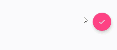
var snackbar = Snackbar.make(v!!, "Delete successfully.", Snackbar.LENGTH_LONG)

        .setAction("Undo") {

            toast("Data restored!")

        }

snackbar.setActionTextColor(Color.BLUE) // Action Button 文本颜色

snackbar.view.setBackgroundColor(Color.RED) // 背景色

snackbar.view.findViewById<TextView>(R.id.snackbar_text).setTextColor(Color.YELLOW) //文本颜色

snackbar.view.findViewById<Button>(R.id.snackbar_action).setAllCaps(false) // Action Button 显示小写

snackbar.show() // 弹出
在设置颜色时,大部分是不能够直接设置的,都是通过获取整个View然后在获取单个控件进行赋值。
8.CoordinatorLayout
CoordinatorLayout 是一个加强版的FrameLayout,由Design Support 提供。
**实现了多种Material Design中提到的滚动效果**
CoordinatorLayout 会自动监听所有子控件的各种事件,然后自动帮助我们做出最为合理的相应。
eg: 只需要改变外部布局为CoordinatorLayout
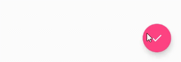
注意到效果了吧,悬浮按钮自动向上偏移了Snackbar的同等高度,从而保证不会被遮挡住。当Snackbar消失时,悬浮按钮会回到原先位置。
更多请参考:http://www.jcodecraeer.com/a/anzhuokaifa/androidkaifa/2015/0717/3196.html
9.CardView
CardView是实现卡片式布局的重要控件,由appcompat-v7库提供。
实际上CardView也是一个FrameLayout ,知识额外提供了圆角和阴影等效果,看上去会有立体的感觉。
**添加依赖引用 compile 'com.android.support:cardview-v7:25.3.1'**
<android.support.v7.widget.CardView

    android:layout_width="100dp"

    android:layout_height="100dp"

    android:layout_gravity="center"

    app:cardCornerRadius="4dp"

    app:cardElevation="5dp">

    <TextView

        android:text="TextView"

        android:gravity="center"

        android:layout_width="match_parent"

        android:layout_height="match_parent"/>

</android.support.v7.widget.CardView>
app:cardCornerRadius="4dp" 圆角弧度,数值越大哦,弧度越大
app:cardElevation="5dp" 阴影大小,数值越大,阴影越大
效果图: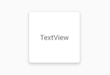
10.TextInputLayout
使用:直接将EdieText放到 TextInputLayout 中就可以,
意在解决Android平台界面风格不统一调的问题。
<android.support.design.widget.TextInputLayout

    android:id="@+id/activity_test_textinputlayoutusername"

    android:layout_width="match_parent"

    android:layout_height="wrap_content"

    android:layout_below="@+id/activity_test_scrollView">

    <EditText

        android:id="@+id/username"

        android:layout_width="match_parent"

        android:layout_height="wrap_content"

        android:hint="Username"/>

</android.support.design.widget.TextInputLayout>
效果图: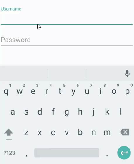
11.BottomNavigationView
它是官方提供的底部导航栏,最大支持显示5个Item。
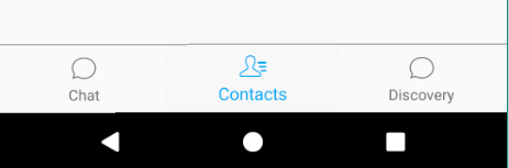
添加控件:
<android.support.design.widget.BottomNavigationView

    android:id="@+id/layout_weChat_bnv"

    android:layout_width="match_parent"

    android:layout_height="56dp"

    android:background="#f5f2f2"

    android:layout_alignParentBottom="true"

    app:menu="@menu/navigationview_menu"/>  //指定Menu
创建Menu指定Items:
<?xml version="1.0" encoding="utf-8"?>

<menu xmlns:android="http://schemas.android.com/apk/res/android">

    <item

        android:id="@+id/bnv_chat"

        android:icon="@drawable/chat_normal"

        android:title="Chat"/>

     ....

</menu>
选中项改变事件:
bnv.setOnNavigationItemSelectedListener( ...)
设置选中项:
bnv.setSelectedItemId(R.id.bnv_chat); //需要指定Menu Id
常用属性:
| 属性 | 描述 |
|---|---|
| app:itemBackground | 导航栏的背景色 |
| app:itemIconTint | 导航栏中图片的颜色 |
| app:itemTextColor | 导航栏文字颜色 |
| app:menu | 使用Menu的形式为指定导航栏元素 |
当Item 超过3个时会出现动画,通过反射取消动画:
学习自:https://stackoverflow.com/questions/40176244/how-to-disable-bottomnavigationview-shift-mode
    // 超过三个Menu后取消动画

    public static void disableShiftMode(BottomNavigationView view) {

        BottomNavigationMenuView menuView = (BottomNavigationMenuView) view.getChildAt(0);

        try {

            Field shiftingMode = menuView.getClass().getDeclaredField("mShiftingMode");

            shiftingMode.setAccessible(true);

            shiftingMode.setBoolean(menuView, false);

            shiftingMode.setAccessible(false);

            for (int i = 0; i < menuView.getChildCount(); i++) {

                BottomNavigationItemView item = (BottomNavigationItemView) menuView.getChildAt(i);

                item.setShiftingMode(false);

                item.setChecked(item.getItemData().isChecked());

            }

        } catch (NoSuchFieldException e) {

            e.printStackTrace();

        } catch (IllegalAccessException e) {

            e.printStackTrace();

        }

    }
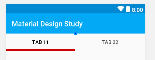
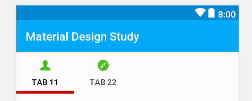
13.TabLayout
TabLayout 提供了一个水平的布局来展示Tabs.
| 属性 | 描述 |
|---|---|
| app:tabSelectedTextColor | 选中项字体颜色 |
| app:tabTextColor | 未选中项字体颜色· |
| app:tabIndicatorColor | 指示器下标颜色 |
| app:tabIndicatorHeight | 指示器下标颜色 |
| app:tabMode | Tab模式:默认fixed(固定的),scrollable(可以滑动的) |
| app:tabMinWidth | 每个 Tab 最小宽度 |
| app:tabMaxWidth | 每个 Tab 最大宽度 |
13.1 添加 Tab:
(1) 直接在布局文件中添加 android.support.design.widget.TabItem
(2) con_tabLayout.addTab(con_tabLayout.newTab().setText("Tab 1").setIcon(R.drawable.me_press))
13.2 设置默认选中
con_tabLayout.getTabAt(3)!!.select()
13.3 事件监听
con_tabLayout.addOnTabSelectedListener(object:TabLayout.OnTabSelectedListener{

    override fun onTabReselected(tab: TabLayout.Tab?) {

    }

    override fun onTabUnselected(tab: TabLayout.Tab?) {

    }

    override fun onTabSelected(tab: TabLayout.Tab?) {

    }

})
Material Design 常用控件的更多相关文章
- MaterialEditText——Android Material Design EditText控件
MaterialEditText是Android Material Design EditText控件.可以定制浮动标签.主要颜色.默认的错误颜色等. 随着 Material Design 的到来, ...
- 一个Activity掌握Design新控件 (转)
原文地址:http://blog.csdn.net/lavor_zl/article/details/51295364 谷歌在推出Android5.0的同时推出了全新的设计Material Desig ...
- Android support library支持包常用控件介绍(一)
谷歌官方推出Material Design 设计理念已经有段时间了,为支持更方便的实现Material Design设计效果,官方给出了Android support design library 支 ...
- Android support library支持包常用控件介绍(二)
谷歌官方推出Material Design 设计理念已经有段时间了,为支持更方便的实现 Material Design设计效果,官方给出了Android support design library ...
- android内部培训视频_第三节(3)_常用控件(ViewPager、日期时间相关、ListView)
第三节(2):常用控件之ViewPager.日期时间相关.ListView 一.ViewPager 实例:结合PagerAdapter滑动切换图片 二.日期时间相关:AnalogClock\Dig ...
- [WinForm]WinForm跨线程UI操作常用控件类大全
前言 在C#开发的WinForm窗体程序开发的时候,经常会使用多线程处理一些比较耗时之类的操作.不过会有一个问题:就是涉及到跨线程操作UI元素. 相信才开始接触的人一定会遇上这个问题. 为了解决这个问 ...
- android内部培训视频_第三节 常用控件(Button,TextView,EditText,AutocompleteTextView)
第三节:常用控件 一.Button 需要掌握的属性: 1.可切换的背景 2.9.png使用 3.按钮点击事件 1) onClick 3) 匿名类 4) 公共类 二.TextView 常用属性 1.a ...
- Xamarin Studio在Mac环境下的配置和Xamarin.iOS常用控件的示例
看过好多帖子都是Win环境装XS,Mac只是个模拟器,讲解在Mac环境下如何配置Xamarin Studio很少,也是一点点找资料,东拼西凑才把Xamarin Studio装在Mac上跑起来,如下: ...
- MFC编程入门之二十二(常用控件:按钮控件Button、Radio Button和Check Box)
本节继续讲解常用控件--按钮控件的使用. 按钮控件简介 按钮控件包括命令按钮(Button).单选按钮(Radio Button)和复选框(Check Box)等.命令按钮就是我们前面多次提到的侠义的 ...
随机推荐
- 省市区JSON
行政编码 ViewBag.CssLinks = ""; 行政编码 中国和韩国行政编码选择.数据来自json文件,但在前端通过json对象调用. 注意本地方式,是将json文件作为对 ...
- CF226D The table
题目链接 题意 给出一个\(n\times m\)的矩阵,可以把某些行和某些列上面的数字变为相反数.问修改那些行和哪些列可以使得所有行和所有列之和都为非负数. 思路 每次将负数的行或者列变为相反数.因 ...
- 我眼中的支持向量机(SVM)
看吴恩达支持向量机的学习视频,看了好几遍,才有一点的理解,梳理一下相关知识. (1)优化目标: 支持向量机也是属于监督学习算法,先从优化目标开始. 优化目标是从Logistics regressi ...
- CMDB资产管理系统开发【day26】:实现资产自动更新
1.需求分析 1.比对分析 比对的时候以那个数据源为主? old [1,2,3 ] db数据库 new [2,3,4 ] 客户端汇报过来的 当然以客户端汇报过来的数据为主 2.更新分析 不同的表到底拿 ...
- linux在线安装JDK(1.8版本)
在线下载JDK 命令: wget --no-check-certificate --no-cookies --header "Cookie: oraclelicense=accept-sec ...
- Spring Boot集成MyBatis的2种方式
目录 写在前面 准备工作 配置数据库驱动 配置数据源 原生集成MyBatis 依赖配置 注册MyBatis核心组件 定义并使用映射器 通过MyBatis-Spring-Boot-Starter集成 默 ...
- Geometric regularity criterion for NSE: the cross product of velocity and vorticity 2: $u\times \om\cdot \n\times \om$
在 [Lee, Jihoon. Notes on the geometric regularity criterion of 3D Navier-Stokes system. J. Math. Phy ...
- [物理学与PDEs]第4章第3节 一维反应流体力学方程组 3.1 一维反应流体力学方程组
1. 一维粘性热传导反应流体力学方程组 $$\beex \bea \cfrac{\p\rho}{\p t}&+\cfrac{\p}{\p x}(\rho u)=0,\\ \cfrac{\p}{ ...
- [物理学与PDEs]第1章第9节 Darwin 模型 9.1 拟静电模型及其修正形式
1. 拟静电模型: 当 $\cfrac{\omega}{c}\ll \cfrac{1}{c}\lra \omega\ll \cfrac{c}{l}$ 时, $$\bex \cfrac{1}{c}\cf ...
- Javaweb学习笔记——(二十八)——————Servlet3.0、动态代理、类加载器
web最后一天:完了. Servlet3.0 一.要求 1.MyEclipse10.0或以上版本 2.发布到Tomcat7.0或以上版本 二.步骤 ...