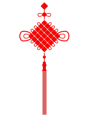
css3绘制中国结
<!doctype html>
<html>
<head>
<title></title>
<meta charset='utf-8'>
<style type="text/css">
:root,body{
height: 100%;
width: 100%;
}
.z{
width:200px;
height: 400px;
left: 400px;
position: absolute;
}
.z div{
position: absolute; }
.z .red{
background-color: red;
box-shadow: 0px 0px 1px 0 #666;
}
.f1{
width: 18px;
height: 18px;
-webkit-transform: rotate(45deg);
-moz-transform: rotate(45deg);
-ms-transform: rotate(45deg);
-o-transform: rotate(45deg);
transform: rotate(45deg);
top:0;
border-radius: 2px;
}
.l1,.l2,.l3,.l4{
width:2px;
height: 10px;
}
.c1{
width:14px;
height: 14px;
border-radius: 7px;
box-shadow: 0px 0px 1px 0 #666;
z-index: 10;
}
.c1-1 {
position: relative;
width: 40px;
height: 12px;
}
.c1-1:before,
.c1-1:after {
box-shadow: 0px 0px 1px 0 #666;
content: "";
position: absolute;
top: 0;
left: 0;
width: 8px;
height: 14px;
border: 2px solid red;
border-radius:50% 50% 50% 50% / 30% 30% 70% 70%;
-webkit-transform: rotate(-90deg);
-moz-transform: rotate(-90deg);
-ms-transform: rotate(-90deg);
-o-transform: rotate(-90deg);
transform: rotate(-90deg);
} .c1-1:after {
left: auto;
right: 0;
border-radius:50% 50% 50% 50% / 70% 70% 30% 30%;
-webkit-transform: rotate(-90deg);
-moz-transform: rotate(-90deg);
-ms-transform: rotate(-90deg);
-o-transform: rotate(-90deg);
transform: rotate(-90deg);
}
.r{
width:80px;
height: 80px;
z-index: 10;
-webkit-transform: rotate(45deg);
-moz-transform: rotate(45deg);
-ms-transform: rotate(45deg);
-o-transform: rotate(45deg);
transform: rotate(45deg);
}
.r .ro{
position: relative;
display: table;
border-collapse:separate;
border-spacing: 1px;
}
.r .b{
width:15px;
height: 14px;
position: relative;
display: table-cell;
border-radius: 2px;
}
.c2{
width:10px;
height: 10px;
border-radius: 5px;
}
.c3{
width:10px;
height: 10px;
border-radius: 5px 5px 0 0;
}
.c4{
width:14px;
height: 14px;
border-radius: 8px;
z-index: 10;
}
.k{
width: 10px;
height: 12px;
}
.k1{
width: 14px;
height: 6px;
}
.s{
height: 150px;
display: table;
border-collapse:separate;
border-spacing: 1px;
}
.ss{
width: 1px;
height: 100%;
position: relative !important;
display: table-cell;
}
.i1 {
position: relative;
width: 162px;
height: 46px;
} .i1:before,
.i1:after {
box-shadow: 0px 0px 1px 0 #666;
content: "";
position: absolute;
top: 0;
left: 0;
width: 30px;
height: 40px;
border: 3px solid red;
border-radius:50% 50% 50% 50% / 30% 30% 70% 70%;
-webkit-transform: rotate(-90deg);
-moz-transform: rotate(-90deg);
-ms-transform: rotate(-90deg);
-o-transform: rotate(-90deg);
transform: rotate(-90deg);
} .i1:after,.i2:after {
left: auto;
right: 0;
border-radius:50% 50% 50% 50% / 70% 70% 30% 30%;
-webkit-transform: rotate(-90deg);
-moz-transform: rotate(-90deg);
-ms-transform: rotate(-90deg);
-o-transform: rotate(-90deg);
transform: rotate(-90deg);
}
.i2 {
position: relative;
width: 136px;
height: 24px;
}
.i2:before,
.i2:after {
box-shadow: 0px 0px 1px 0 #666;
content: "";
position: absolute;
top: 0;
left: 0;
width: 12px;
height: 20px;
border: 2px solid red;
border-radius:50% 50% 50% 50% / 30% 30% 70% 70%;
-webkit-transform: rotate(-90deg);
-moz-transform: rotate(-90deg);
-ms-transform: rotate(-90deg);
-o-transform: rotate(-90deg);
transform: rotate(-90deg);
} .i2:after {
left: auto;
right: 0;
border-radius:50% 50% 50% 50% / 70% 70% 30% 30%;
-webkit-transform: rotate(-90deg);
-moz-transform: rotate(-90deg);
-ms-transform: rotate(-90deg);
-o-transform: rotate(-90deg);
transform: rotate(-90deg);
}
.e1 {
position: relative;
width: 12px;
height: 24px;
}
.e1:before,
.e1:after {
box-shadow: 0px 0px 1px 0 #666;
content: "";
position: absolute;
top: 0;
left: 0;
width: 12px;
height: 20px;
border: 2px solid red;
border-radius:50% 50% 50% 50% / 30% 30% 70% 70%;
-webkit-transform: rotate(-90deg);
-moz-transform: rotate(-90deg);
-ms-transform: rotate(-90deg);
-o-transform: rotate(-90deg);
transform: rotate(-90deg);
}
.m{
width:80px;
height: 80px;
-webkit-transform: rotate(45deg);
-moz-transform: rotate(45deg);
-ms-transform: rotate(45deg);
-o-transform: rotate(45deg);
transform: rotate(45deg); }
.n{
width:80px;
height: 80px;
-webkit-transform: rotate(-45deg);
-moz-transform: rotate(-45deg);
-ms-transform: rotate(-45deg);
-o-transform: rotate(-45deg);
transform: rotate(-45deg); }
.m .rx,.n .rx{
position: relative;
display: table;
border-collapse:separate;
border-spacing: 1px;
}
.m .rb , .m .rb-space,.n .rb , .n .rb-space{
position: relative;
width: 120px;
height: 14px;
display: table-cell;
} .m .rb:before,
.m .rb:after,.n .rb:before,
.n .rb:after {
box-shadow: 0px 0px 1px 0 #666;
content: "";
position: absolute;
top: 0;
left: -8px;
width: 6px;
height: 10px;
border: 2px solid red;
border-radius:50% 50% 50% 50% / 40% 40% 60% 60%;
-webkit-transform: rotate(-90deg);
-moz-transform: rotate(-90deg);
-ms-transform: rotate(-90deg);
-o-transform: rotate(-90deg);
transform: rotate(-90deg);
} .m .rb:after,.n .rb:after{
left: auto;
right: -8px;
border-radius:50% 50% 50% 50% / 60% 60% 60% 60%;
-webkit-transform: rotate(-90deg);
-moz-transform: rotate(-90deg);
-ms-transform: rotate(-90deg);
-o-transform: rotate(-90deg);
transform: rotate(-90deg);
}
</style>
<script type="text/javascript" src='../bower_components/jquery/dist/jquery.js'></script>
<script type="text/javascript">
$(document).ready(function(){
var $z = $('.z'), $f1 = $('.f1') , $l1 = $('.l1') , $c1 = $('.c1') , $l2 = $('.l2') , $r = $('.r') , $l3 = $('.l3') , $c2 = $('.c2') , $l4 = $('.l4') , $c3 = $('.c3') , $c4 = $('.c4'),
$k = $('.k') , $k1 = $('.k1') , $s = $('.s') , $i1 = $('.i1') , $i2 = $('.i2'),
$e1 = $('.e1') , $c1_1 = $('.c1-1'),
$m = $('.m') , $n = $('.n');
$f1.css({
left : ($z.width() - $f1.width()) / 2 ,
top : Math.sqrt(2 * Math.pow($f1.height() / 2 , 2)) - $f1.height() / 2
});
$l1.css({
left : ($z.width() - $l1.width()) / 2,
top : Math.sqrt(2 * Math.pow($f1.height() , 2))
});
$c1.css({
left : ($z.width() - $c1.width()) / 2,
top : Math.sqrt(2 * Math.pow($f1.height() , 2)) + $l1.height()
});
$l2.css({
left : ($z.width() - $l2.width()) / 2,
top : Math.sqrt(2 * Math.pow($f1.height() , 2)) + $l1.height() + $c1.height()
});
$r.css({
left : ($z.width() - $r.width()) / 2,
top : Math.sqrt(2 * Math.pow($f1.height() , 2)) + $l1.height() + $c1.height() + $l2.height() + Math.sqrt(2 * Math.pow($r.height() / 2 , 2)) - $r.height() / 2
});
$l3.css({
left : ($z.width() - $l3.width()) / 2,
top : Math.sqrt(2 * Math.pow($f1.height() , 2)) + $l1.height() + $c1.height() + $l2.height() + Math.sqrt(2 * Math.pow($r.height() , 2))
});
$c2.css({
left : ($z.width() - $c2.width()) / 2,
top : Math.sqrt(2 * Math.pow($f1.height() , 2)) + $l1.height() + $c1.height() + $l2.height() + Math.sqrt(2 * Math.pow($r.height() , 2)) + $l3.height()
});
$l4.css({
left : ($z.width() - $l4.width()) / 2,
top : Math.sqrt(2 * Math.pow($f1.height() , 2)) + $l1.height() + $c1.height() + $l2.height() + Math.sqrt(2 * Math.pow($r.height() , 2)) + $l3.height() + $c2.height()
});
$c3.css({
left : ($z.width() - $c3.width()) / 2,
top : Math.sqrt(2 * Math.pow($f1.height() , 2)) + $l1.height() + $c1.height() + $l2.height() + Math.sqrt(2 * Math.pow($r.height() , 2)) + $l3.height() + $c2.height() + $l4.height()
});
$c4.css({
left : ($z.width() - $c4.width()) / 2,
top : Math.sqrt(2 * Math.pow($f1.height() , 2)) + $l1.height() + $c1.height() + $l2.height() + Math.sqrt(2 * Math.pow($r.height() , 2)) + $l3.height() + $c2.height() + $l4.height() + $c3.height() - 4
});
$k.css({
left : ($z.width() - $k.width()) / 2,
top : Math.sqrt(2 * Math.pow($f1.height() , 2)) + $l1.height() + $c1.height() + $l2.height() + Math.sqrt(2 * Math.pow($r.height() , 2)) + $l3.height() + $c2.height() + $l4.height() + $c3.height() - 4 + $c4.height() - 4
});
$k1.css({
left : ($z.width() - $k1.width()) / 2,
top : Math.sqrt(2 * Math.pow($f1.height() , 2)) + $l1.height() + $c1.height() + $l2.height() + Math.sqrt(2 * Math.pow($r.height() , 2)) + $l3.height() + $c2.height() + $l4.height() + $c3.height() - 4 + $c4.height() - 4 + $k.height()
});
$s.css({
left : ($z.width() - $k1.width()) / 2,
top : Math.sqrt(2 * Math.pow($f1.height() , 2)) + $l1.height() + $c1.height() + $l2.height() + Math.sqrt(2 * Math.pow($r.height() , 2)) + $l3.height() + $c2.height() + $l4.height() + $c3.height() - 4 + $c4.height() - 4 + $k.height() + $k1.height()
}); $i1.css({
left : ($z.width() - $i1.width()) / 2,
top : Math.sqrt(2 * Math.pow($f1.height() , 2)) + $l1.height() + $c1.height() + $l2.height() + Math.sqrt(2 * Math.pow($r.height() , 2)) / 2 - $i1.height() / 2
});
$i2.css({
left : ($z.width() - $i2.width()) / 2,
top : Math.sqrt(2 * Math.pow($f1.height() , 2)) + $l1.height() + $c1.height() + $l2.height() + Math.sqrt(2 * Math.pow($r.height() , 2)) / 2 - $i2.height() / 2
});
$c1_1.css({
left : ($z.width() - $c1_1.width()) / 2,
top : Math.sqrt(2 * Math.pow($f1.height() , 2)) + $l1.height() + ($c1_1.height() - $c1.height()) / 2
});
$m.css({
left : ($z.width() - $m.width()) / 2,
top : Math.sqrt(2 * Math.pow($f1.height() , 2)) + $l1.height() + $c1.height() + $l2.height() + Math.sqrt(2 * Math.pow($m.height() / 2 , 2)) - $m.height() / 2
});
$n.css({
left : ($z.width() - $n.width()) / 2,
top : Math.sqrt(2 * Math.pow($f1.height() , 2)) + $l1.height() + $c1.height() + $l2.height() + Math.sqrt(2 * Math.pow($n.height() / 2 , 2)) - $n.height() / 2
});
});
</script>
</head>
<body>
<div class='z'>
<div class='f1 red'></div>
<div class='l1 red'></div>
<div class='c1 red'></div>
<div class='c1-1'></div>
<div class='l2 red'></div>
<div class='r'>
<div class='ro'>
<div class='b red'></div>
<div class='b red'></div>
<div class='b red'></div>
<div class='b red'></div>
<div class='b red'></div>
</div>
<div class='ro'>
<div class='b red'></div>
<div class='b red'></div>
<div class='b red'></div>
<div class='b red'></div>
<div class='b red'></div>
</div>
<div class='ro'>
<div class='b red'></div>
<div class='b red'></div>
<div class='b red'></div>
<div class='b red'></div>
<div class='b red'></div>
</div>
<div class='ro'>
<div class='b red'></div>
<div class='b red'></div>
<div class='b red'></div>
<div class='b red'></div>
<div class='b red'></div>
</div>
<div class='ro'>
<div class='b red'></div>
<div class='b red'></div>
<div class='b red'></div>
<div class='b red'></div>
<div class='b red'></div>
</div>
</div>
<div class='l3 red'></div>
<div class='c2 red'></div>
<div class='l4 red'></div>
<div class='c3 red'></div>
<div class='c4 red'></div>
<div class='k red'></div>
<div class='k1 red'></div>
<div class='s'>
<div class='ss red'></div>
<div class='ss red'></div>
<div class='ss red'></div>
<div class='ss red'></div>
<div class='ss red'></div>
<div class='ss red'></div>
<div class='ss red'></div>
</div>
<div class='i1'></div>
<div class='i2'></div>
<div class='m'>
<div class='rx'>
<div class='rb-space'></div>
</div>
<div class='rx'>
<div class='rb'></div>
</div>
<div class='rx'>
<div class='rb'></div>
</div>
<div class='rx'>
<div class='rb'></div>
</div>
<div class='rx'>
<div class='rb-space'></div>
</div>
</div>
<div class='n'>
<div class='rx'>
<div class='rb-space'></div>
</div>
<div class='rx'>
<div class='rb'></div>
</div>
<div class='rx'>
<div class='rb'></div>
</div>
<div class='rx'>
<div class='rb'></div>
</div>
<div class='rx'>
<div class='rb-space'></div>
</div>
</div>
</div>
</body>
</html>
css3绘制中国结的更多相关文章
- CSS3绘制六边形
因为很简单,所以先总结一下:使用CSS3绘制六边形主要使用伪类:before和:after在源元素之前和之后再绘制两个元素,并利用css3的边框样式,将这两个元素变成三角形放置在源元素的两端即可. ( ...
- CSS3绘制旋转的太极图案(一)
实现步骤: 基础HTML: <div class="box-taiji"> <div class="circle-01">< ...
- css3绘制几何图形
用css3绘制你需要的几何图形 1.圆形 示例: 思路:给任何正方形元素设置一个足够大的 border-radius ,就可以把它变成一个圆形.代码如下: html: <div class=&q ...
- 用纯CSS3绘制萌系漫画人物动态头像
大家已经见惯了用CSS3画的图标.LOGO.头像,这次台湾同学Rei给我们带来了用纯CSS3绘制的日本动漫<轻音少女>女主角秋山澪的动态头像.看到动图我震惊了!!!CSS3的强大再次霸气测 ...
- css3绘制腾讯logo
CSS3绘制的腾讯LOGO,下边是对比图. 演示地址
- 【项目1-1】使用HTML5+CSS3绘制HTML5的logo
作为一个WEB小萌新,自学了有一段时间,总是感觉停滞不前.最近反思中,想到前贤一句话:书读百遍其义自见.说到底,还是项目做的少,如果做多了,想必自然会得心应手. 利用HTML5+CSS3绘制HTML5 ...
- CSS3绘制砖墙-没实用不论什么图片
<!DOCTYPE html PUBLIC "-//W3C//DTD XHTML 1.0 Transitional//EN" "http://www.w3.org/ ...
- 使用 CSS3 绘制 Hello Kitty
偶然间看到了 SegmentFault 上的一篇文章,感觉这个 Hello Kitty 画的还不错,心血来潮也用 CSS3 画了个 Hello Kitty,现在在这里记录一下详细的绘制过程.想要源码. ...
- 详解使用CSS3绘制矩形、圆角矩形、圆形、椭圆形、三角形、弧
1.矩形 绘制矩形应该是最简单的了,直接设置div的宽和高,填充颜色,效果就出来了. 2.圆角矩形 绘制圆角矩形也很简单,在1的基础上,在使用css3的border-radius,即可. 3.圆 根据 ...
随机推荐
- [FOJ 1752] A^B mod C
Problem 1752 A^B mod C Accept: 750 Submit: 3205Time Limit: 1000 mSec Memory Limit : 32768 KB ...
- 【转】 Java虚拟机内存的堆区(heap),栈区(stack)和静态区(static/method)
JAVA的JVM的内存可分为3个区:堆(heap).栈(stack)和方法区(method) 堆区:1.存储的全部是对象,每个对象都包含一个与之对应的class的信息.(class的目的是得到操作指令 ...
- 处理Google Play的相关方法
1.打开Google play软件的详细页面 Intent intent = new Intent(); intent.setAction(Intent.ACTION_VIEW); intent.se ...
- 【CSS3】Advanced10:Gradient
1.background:linear-gradient(20deg/(to) bottom right,orange,red,hsl(60,100%,50%)); 2.-webkit-chrome/ ...
- 使用Visual Studio 2013 从头构建Web表单
在这篇文章中,我将采取VS 2013中特定的模板,也就是没有身份验证的Web表单模板,并说明如何构建这个项目从头开始.在本教程的最后,你会最终有一个模板,内容几乎是一样的使用Web表单模板没有认证(文 ...
- chmod chgrp chown
Linux系统中的每个文件和目录都有访问许可权限,用它来确定谁可以通过何种方式对文件和目录进行访问和操作. 文件或目录的访问权限分为只读,只写和可执行三种.以文件为例,只读权限表示只允许读其内容,而禁 ...
- Storm系列(一)集群的安装配置
安装前说明: 必须先安装zookeeper集群 该Storm集群由三台机器构成,主机名分别为chenx01,chenx02,chenx03,对应的IP分别为192.168.1.110,192.168. ...
- Android Studio 导入项目错误
Gradle DSL method not found: 'Android()' 错误原因: android studio 引进项目时,自动查找本机是否有项目设置的SDK版本,若发现没有,我们会在pr ...
- [Locked] Unique Word Abbreviation
Unique Word Abbreviation An abbreviation of a word follows the form <first letter><number&g ...
- android 获取当前版本号/修改自定义的应用程序的版本号
1.获取当前版本号 PackageManager pm = getPackageManager(); PackageInfo pi = pm.getPackageInfo(getPackageName ...