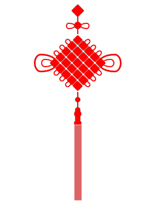
css3绘制中国结
<!doctype html>
<html>
<head>
<title></title>
<meta charset='utf-8'>
<style type="text/css">
:root,body{
height: 100%;
width: 100%;
}
.z{
width:200px;
height: 400px;
left: 400px;
position: absolute;
}
.z div{
position: absolute; }
.z .red{
background-color: red;
box-shadow: 0px 0px 1px 0 #666;
}
.f1{
width: 18px;
height: 18px;
-webkit-transform: rotate(45deg);
-moz-transform: rotate(45deg);
-ms-transform: rotate(45deg);
-o-transform: rotate(45deg);
transform: rotate(45deg);
top:0;
border-radius: 2px;
}
.l1,.l2,.l3,.l4{
width:2px;
height: 10px;
}
.c1{
width:14px;
height: 14px;
border-radius: 7px;
box-shadow: 0px 0px 1px 0 #666;
z-index: 10;
}
.c1-1 {
position: relative;
width: 40px;
height: 12px;
}
.c1-1:before,
.c1-1:after {
box-shadow: 0px 0px 1px 0 #666;
content: "";
position: absolute;
top: 0;
left: 0;
width: 8px;
height: 14px;
border: 2px solid red;
border-radius:50% 50% 50% 50% / 30% 30% 70% 70%;
-webkit-transform: rotate(-90deg);
-moz-transform: rotate(-90deg);
-ms-transform: rotate(-90deg);
-o-transform: rotate(-90deg);
transform: rotate(-90deg);
} .c1-1:after {
left: auto;
right: 0;
border-radius:50% 50% 50% 50% / 70% 70% 30% 30%;
-webkit-transform: rotate(-90deg);
-moz-transform: rotate(-90deg);
-ms-transform: rotate(-90deg);
-o-transform: rotate(-90deg);
transform: rotate(-90deg);
}
.r{
width:80px;
height: 80px;
z-index: 10;
-webkit-transform: rotate(45deg);
-moz-transform: rotate(45deg);
-ms-transform: rotate(45deg);
-o-transform: rotate(45deg);
transform: rotate(45deg);
}
.r .ro{
position: relative;
display: table;
border-collapse:separate;
border-spacing: 1px;
}
.r .b{
width:15px;
height: 14px;
position: relative;
display: table-cell;
border-radius: 2px;
}
.c2{
width:10px;
height: 10px;
border-radius: 5px;
}
.c3{
width:10px;
height: 10px;
border-radius: 5px 5px 0 0;
}
.c4{
width:14px;
height: 14px;
border-radius: 8px;
z-index: 10;
}
.k{
width: 10px;
height: 12px;
}
.k1{
width: 14px;
height: 6px;
}
.s{
height: 150px;
display: table;
border-collapse:separate;
border-spacing: 1px;
}
.ss{
width: 1px;
height: 100%;
position: relative !important;
display: table-cell;
}
.i1 {
position: relative;
width: 162px;
height: 46px;
} .i1:before,
.i1:after {
box-shadow: 0px 0px 1px 0 #666;
content: "";
position: absolute;
top: 0;
left: 0;
width: 30px;
height: 40px;
border: 3px solid red;
border-radius:50% 50% 50% 50% / 30% 30% 70% 70%;
-webkit-transform: rotate(-90deg);
-moz-transform: rotate(-90deg);
-ms-transform: rotate(-90deg);
-o-transform: rotate(-90deg);
transform: rotate(-90deg);
} .i1:after,.i2:after {
left: auto;
right: 0;
border-radius:50% 50% 50% 50% / 70% 70% 30% 30%;
-webkit-transform: rotate(-90deg);
-moz-transform: rotate(-90deg);
-ms-transform: rotate(-90deg);
-o-transform: rotate(-90deg);
transform: rotate(-90deg);
}
.i2 {
position: relative;
width: 136px;
height: 24px;
}
.i2:before,
.i2:after {
box-shadow: 0px 0px 1px 0 #666;
content: "";
position: absolute;
top: 0;
left: 0;
width: 12px;
height: 20px;
border: 2px solid red;
border-radius:50% 50% 50% 50% / 30% 30% 70% 70%;
-webkit-transform: rotate(-90deg);
-moz-transform: rotate(-90deg);
-ms-transform: rotate(-90deg);
-o-transform: rotate(-90deg);
transform: rotate(-90deg);
} .i2:after {
left: auto;
right: 0;
border-radius:50% 50% 50% 50% / 70% 70% 30% 30%;
-webkit-transform: rotate(-90deg);
-moz-transform: rotate(-90deg);
-ms-transform: rotate(-90deg);
-o-transform: rotate(-90deg);
transform: rotate(-90deg);
}
.e1 {
position: relative;
width: 12px;
height: 24px;
}
.e1:before,
.e1:after {
box-shadow: 0px 0px 1px 0 #666;
content: "";
position: absolute;
top: 0;
left: 0;
width: 12px;
height: 20px;
border: 2px solid red;
border-radius:50% 50% 50% 50% / 30% 30% 70% 70%;
-webkit-transform: rotate(-90deg);
-moz-transform: rotate(-90deg);
-ms-transform: rotate(-90deg);
-o-transform: rotate(-90deg);
transform: rotate(-90deg);
}
.m{
width:80px;
height: 80px;
-webkit-transform: rotate(45deg);
-moz-transform: rotate(45deg);
-ms-transform: rotate(45deg);
-o-transform: rotate(45deg);
transform: rotate(45deg); }
.n{
width:80px;
height: 80px;
-webkit-transform: rotate(-45deg);
-moz-transform: rotate(-45deg);
-ms-transform: rotate(-45deg);
-o-transform: rotate(-45deg);
transform: rotate(-45deg); }
.m .rx,.n .rx{
position: relative;
display: table;
border-collapse:separate;
border-spacing: 1px;
}
.m .rb , .m .rb-space,.n .rb , .n .rb-space{
position: relative;
width: 120px;
height: 14px;
display: table-cell;
} .m .rb:before,
.m .rb:after,.n .rb:before,
.n .rb:after {
box-shadow: 0px 0px 1px 0 #666;
content: "";
position: absolute;
top: 0;
left: -8px;
width: 6px;
height: 10px;
border: 2px solid red;
border-radius:50% 50% 50% 50% / 40% 40% 60% 60%;
-webkit-transform: rotate(-90deg);
-moz-transform: rotate(-90deg);
-ms-transform: rotate(-90deg);
-o-transform: rotate(-90deg);
transform: rotate(-90deg);
} .m .rb:after,.n .rb:after{
left: auto;
right: -8px;
border-radius:50% 50% 50% 50% / 60% 60% 60% 60%;
-webkit-transform: rotate(-90deg);
-moz-transform: rotate(-90deg);
-ms-transform: rotate(-90deg);
-o-transform: rotate(-90deg);
transform: rotate(-90deg);
}
</style>
<script type="text/javascript" src='../bower_components/jquery/dist/jquery.js'></script>
<script type="text/javascript">
$(document).ready(function(){
var $z = $('.z'), $f1 = $('.f1') , $l1 = $('.l1') , $c1 = $('.c1') , $l2 = $('.l2') , $r = $('.r') , $l3 = $('.l3') , $c2 = $('.c2') , $l4 = $('.l4') , $c3 = $('.c3') , $c4 = $('.c4'),
$k = $('.k') , $k1 = $('.k1') , $s = $('.s') , $i1 = $('.i1') , $i2 = $('.i2'),
$e1 = $('.e1') , $c1_1 = $('.c1-1'),
$m = $('.m') , $n = $('.n');
$f1.css({
left : ($z.width() - $f1.width()) / 2 ,
top : Math.sqrt(2 * Math.pow($f1.height() / 2 , 2)) - $f1.height() / 2
});
$l1.css({
left : ($z.width() - $l1.width()) / 2,
top : Math.sqrt(2 * Math.pow($f1.height() , 2))
});
$c1.css({
left : ($z.width() - $c1.width()) / 2,
top : Math.sqrt(2 * Math.pow($f1.height() , 2)) + $l1.height()
});
$l2.css({
left : ($z.width() - $l2.width()) / 2,
top : Math.sqrt(2 * Math.pow($f1.height() , 2)) + $l1.height() + $c1.height()
});
$r.css({
left : ($z.width() - $r.width()) / 2,
top : Math.sqrt(2 * Math.pow($f1.height() , 2)) + $l1.height() + $c1.height() + $l2.height() + Math.sqrt(2 * Math.pow($r.height() / 2 , 2)) - $r.height() / 2
});
$l3.css({
left : ($z.width() - $l3.width()) / 2,
top : Math.sqrt(2 * Math.pow($f1.height() , 2)) + $l1.height() + $c1.height() + $l2.height() + Math.sqrt(2 * Math.pow($r.height() , 2))
});
$c2.css({
left : ($z.width() - $c2.width()) / 2,
top : Math.sqrt(2 * Math.pow($f1.height() , 2)) + $l1.height() + $c1.height() + $l2.height() + Math.sqrt(2 * Math.pow($r.height() , 2)) + $l3.height()
});
$l4.css({
left : ($z.width() - $l4.width()) / 2,
top : Math.sqrt(2 * Math.pow($f1.height() , 2)) + $l1.height() + $c1.height() + $l2.height() + Math.sqrt(2 * Math.pow($r.height() , 2)) + $l3.height() + $c2.height()
});
$c3.css({
left : ($z.width() - $c3.width()) / 2,
top : Math.sqrt(2 * Math.pow($f1.height() , 2)) + $l1.height() + $c1.height() + $l2.height() + Math.sqrt(2 * Math.pow($r.height() , 2)) + $l3.height() + $c2.height() + $l4.height()
});
$c4.css({
left : ($z.width() - $c4.width()) / 2,
top : Math.sqrt(2 * Math.pow($f1.height() , 2)) + $l1.height() + $c1.height() + $l2.height() + Math.sqrt(2 * Math.pow($r.height() , 2)) + $l3.height() + $c2.height() + $l4.height() + $c3.height() - 4
});
$k.css({
left : ($z.width() - $k.width()) / 2,
top : Math.sqrt(2 * Math.pow($f1.height() , 2)) + $l1.height() + $c1.height() + $l2.height() + Math.sqrt(2 * Math.pow($r.height() , 2)) + $l3.height() + $c2.height() + $l4.height() + $c3.height() - 4 + $c4.height() - 4
});
$k1.css({
left : ($z.width() - $k1.width()) / 2,
top : Math.sqrt(2 * Math.pow($f1.height() , 2)) + $l1.height() + $c1.height() + $l2.height() + Math.sqrt(2 * Math.pow($r.height() , 2)) + $l3.height() + $c2.height() + $l4.height() + $c3.height() - 4 + $c4.height() - 4 + $k.height()
});
$s.css({
left : ($z.width() - $k1.width()) / 2,
top : Math.sqrt(2 * Math.pow($f1.height() , 2)) + $l1.height() + $c1.height() + $l2.height() + Math.sqrt(2 * Math.pow($r.height() , 2)) + $l3.height() + $c2.height() + $l4.height() + $c3.height() - 4 + $c4.height() - 4 + $k.height() + $k1.height()
}); $i1.css({
left : ($z.width() - $i1.width()) / 2,
top : Math.sqrt(2 * Math.pow($f1.height() , 2)) + $l1.height() + $c1.height() + $l2.height() + Math.sqrt(2 * Math.pow($r.height() , 2)) / 2 - $i1.height() / 2
});
$i2.css({
left : ($z.width() - $i2.width()) / 2,
top : Math.sqrt(2 * Math.pow($f1.height() , 2)) + $l1.height() + $c1.height() + $l2.height() + Math.sqrt(2 * Math.pow($r.height() , 2)) / 2 - $i2.height() / 2
});
$c1_1.css({
left : ($z.width() - $c1_1.width()) / 2,
top : Math.sqrt(2 * Math.pow($f1.height() , 2)) + $l1.height() + ($c1_1.height() - $c1.height()) / 2
});
$m.css({
left : ($z.width() - $m.width()) / 2,
top : Math.sqrt(2 * Math.pow($f1.height() , 2)) + $l1.height() + $c1.height() + $l2.height() + Math.sqrt(2 * Math.pow($m.height() / 2 , 2)) - $m.height() / 2
});
$n.css({
left : ($z.width() - $n.width()) / 2,
top : Math.sqrt(2 * Math.pow($f1.height() , 2)) + $l1.height() + $c1.height() + $l2.height() + Math.sqrt(2 * Math.pow($n.height() / 2 , 2)) - $n.height() / 2
});
});
</script>
</head>
<body>
<div class='z'>
<div class='f1 red'></div>
<div class='l1 red'></div>
<div class='c1 red'></div>
<div class='c1-1'></div>
<div class='l2 red'></div>
<div class='r'>
<div class='ro'>
<div class='b red'></div>
<div class='b red'></div>
<div class='b red'></div>
<div class='b red'></div>
<div class='b red'></div>
</div>
<div class='ro'>
<div class='b red'></div>
<div class='b red'></div>
<div class='b red'></div>
<div class='b red'></div>
<div class='b red'></div>
</div>
<div class='ro'>
<div class='b red'></div>
<div class='b red'></div>
<div class='b red'></div>
<div class='b red'></div>
<div class='b red'></div>
</div>
<div class='ro'>
<div class='b red'></div>
<div class='b red'></div>
<div class='b red'></div>
<div class='b red'></div>
<div class='b red'></div>
</div>
<div class='ro'>
<div class='b red'></div>
<div class='b red'></div>
<div class='b red'></div>
<div class='b red'></div>
<div class='b red'></div>
</div>
</div>
<div class='l3 red'></div>
<div class='c2 red'></div>
<div class='l4 red'></div>
<div class='c3 red'></div>
<div class='c4 red'></div>
<div class='k red'></div>
<div class='k1 red'></div>
<div class='s'>
<div class='ss red'></div>
<div class='ss red'></div>
<div class='ss red'></div>
<div class='ss red'></div>
<div class='ss red'></div>
<div class='ss red'></div>
<div class='ss red'></div>
</div>
<div class='i1'></div>
<div class='i2'></div>
<div class='m'>
<div class='rx'>
<div class='rb-space'></div>
</div>
<div class='rx'>
<div class='rb'></div>
</div>
<div class='rx'>
<div class='rb'></div>
</div>
<div class='rx'>
<div class='rb'></div>
</div>
<div class='rx'>
<div class='rb-space'></div>
</div>
</div>
<div class='n'>
<div class='rx'>
<div class='rb-space'></div>
</div>
<div class='rx'>
<div class='rb'></div>
</div>
<div class='rx'>
<div class='rb'></div>
</div>
<div class='rx'>
<div class='rb'></div>
</div>
<div class='rx'>
<div class='rb-space'></div>
</div>
</div>
</div>
</body>
</html>
css3绘制中国结的更多相关文章
- CSS3绘制六边形
因为很简单,所以先总结一下:使用CSS3绘制六边形主要使用伪类:before和:after在源元素之前和之后再绘制两个元素,并利用css3的边框样式,将这两个元素变成三角形放置在源元素的两端即可. ( ...
- CSS3绘制旋转的太极图案(一)
实现步骤: 基础HTML: <div class="box-taiji"> <div class="circle-01">< ...
- css3绘制几何图形
用css3绘制你需要的几何图形 1.圆形 示例: 思路:给任何正方形元素设置一个足够大的 border-radius ,就可以把它变成一个圆形.代码如下: html: <div class=&q ...
- 用纯CSS3绘制萌系漫画人物动态头像
大家已经见惯了用CSS3画的图标.LOGO.头像,这次台湾同学Rei给我们带来了用纯CSS3绘制的日本动漫<轻音少女>女主角秋山澪的动态头像.看到动图我震惊了!!!CSS3的强大再次霸气测 ...
- css3绘制腾讯logo
CSS3绘制的腾讯LOGO,下边是对比图. 演示地址
- 【项目1-1】使用HTML5+CSS3绘制HTML5的logo
作为一个WEB小萌新,自学了有一段时间,总是感觉停滞不前.最近反思中,想到前贤一句话:书读百遍其义自见.说到底,还是项目做的少,如果做多了,想必自然会得心应手. 利用HTML5+CSS3绘制HTML5 ...
- CSS3绘制砖墙-没实用不论什么图片
<!DOCTYPE html PUBLIC "-//W3C//DTD XHTML 1.0 Transitional//EN" "http://www.w3.org/ ...
- 使用 CSS3 绘制 Hello Kitty
偶然间看到了 SegmentFault 上的一篇文章,感觉这个 Hello Kitty 画的还不错,心血来潮也用 CSS3 画了个 Hello Kitty,现在在这里记录一下详细的绘制过程.想要源码. ...
- 详解使用CSS3绘制矩形、圆角矩形、圆形、椭圆形、三角形、弧
1.矩形 绘制矩形应该是最简单的了,直接设置div的宽和高,填充颜色,效果就出来了. 2.圆角矩形 绘制圆角矩形也很简单,在1的基础上,在使用css3的border-radius,即可. 3.圆 根据 ...
随机推荐
- 借助 ASR 和 System Center 执行基于 SAN 复制的企业级灾难恢复
Abhishek A. Hemrajani 云 + Enterprise项目经理 对于Azure Site Recovery,我们的优先级已经提升为每个人都可以在任意地点获取易于使用的灾难恢复 (DR ...
- Xcode 不提示, 引用失效等情况
在编写xcode的项目的时候出现过代码不高亮的症状,而且所有的warning都不再提示,include的内容也显示symbol not found,非常奇怪,解决方案如下: 方法一: 1.把.pch里 ...
- selenium1.0和selenium2.0页面等待处理详解
一.selenium1.0页面等待 1.……AndWait 经常会看到, selenium action命令中很多有这种……AndWait后缀, 例如click和clickAndWait命令: cli ...
- 怎样从官网下载Spring的jar包
第一种,简单粗暴直接http://repo.springsource.org/libs-release-local/org/springframework/spring/3.2.4.RELEASE/s ...
- jQuery技术内幕电子版5
4. 转换HTML代码为DOM元素 先创建一个文档片段DocumentFragment,然后调用方法jQuery.clean(elems, context, frag-ment, scripts)将H ...
- 动态加载JS脚本的4种方法
实现OPOA(One Page One Application)时,必须使用动态加载js. 也就是在用户选择某个菜单项后,再动态加载对应的全部js到客户端. 动态加载js的情况很多啊,比如解决ajax ...
- visual studio 2010 "创建控件时出错"解决办法[转]
之前我有在博问里面提问(http://space.cnblogs.com/q/16208/),但一直都没答案.我系统都重装了两次了,可还是出现这样的错误,我很郁闷啊.今天我终于找到原因了. 我写了一个 ...
- 教程-Delphi 调用控制面板设置功能
应用程序运行时,有时需要对系统环境有特殊要求.例如,在Delphi数据库应用程序中可能需要进行BDE(Borland Database Engine)或ODBC数据源名称(DSN:Data Sourc ...
- mongodb的查询操作符
本文地址:http://www.cnblogs.com/egger/archive/2013/05/04/3059374.html 欢迎转载 ,请保留此链接! 官方参考: http://docs. ...
- 8-15-Exercise
8-15-小练 这次的题目......只觉得泪奔啊......T T A.HDU 1042 N! 因为0<=n<=1000,故一定要用数组或字符串[同样因为n<=1000故用数组 ...