
《机器学习实战》2.2.2分析数据:使用matplotlib创建散点图
#输出散点图

def f():

    datingDataMat,datingLabels = file2matrix("datingTestSet3.txt")

    fig = plt.figure()

    # ax = fig.add_subplot(199,projection='polar')

    # ax = fig.add_subplot(111,projection='hammer')

    # ax = fig.add_subplot(111,projection='lambert')

    # ax = fig.add_subplot(111,projection='mollweide')

    # ax = fig.add_subplot(111,projection='aitoff')

    # ax = fig.add_subplot(111,projection='rectilinear')

    # ax = fig.add_subplot(111,projection='rectilinear')

    #此处的add_subplot参数的意思是把画布分为3行4列,画在从左到右从上到下的第2个格里

    ax = fig.add_subplot(3,4,2) #fig.add_subplot(342)也可以,但是这样无法表示两位数

    ax.scatter(datingDataMat[:,1],datingDataMat[:,2])

    # ax1 = fig.add_subplot(221)

    # ax1.plot(datingDataMat[:,1],datingDataMat[:,2])

    plt.show()
其中fig.add_subplot(3,4,2)的效果图如下(红框是我加的,原输出没有):

所以fig.add_subplot(3,4,12)的效果就是:

所以,第三个参数不能超过前两个的乘积,如果用fig.add_subplot(a,b,c)来表示的话,ab>=c,否则会报错。
对于fig.add_subplot(3,4,12)这个函数,官方网站的解释似乎有点问题,链接https://matplotlib.org/api/_as_gen/matplotlib.figure.Figure.html?highlight=add_subplot#matplotlib.figure.Figure.add_subplot
查询add_subplot(*args, **kwargs),得到如下解释:
*args
Either a 3-digit integer or three separate integers describing the position of the subplot. If the three integers are I, J, and K, the subplot is the Ith plot on a grid with J rows and K columns.
意思是,三个参数分别为I, J, K,表示J行K列,那I是什么?没有提及。
倒是下面的See also所指向的matplotlib.pyplot.subplot给出了正确的解释。
subplot(nrows, ncols, index, **kwargs)
In the current figure, create and return anAxes, at position index of a (virtual) grid of nrows by ncols axes. Indexes go from 1 tonrows *ncols, incrementing in row-major order.
If nrows, ncols and index are all less than 10, they can also be given as a single, concatenated, three-digit number.
For example, subplot(2, 3, 3) and subplot(233) both create an Axes at the top right corner of the current figure, occupying half of the figure height and a third of the figure width.
由于没有使用样本分类的特征值,我们很难看出来任何有价值的信息。Matplotlib库提供的scatter函数支持个性化标记散点图上的点。
#输出进行了分类的散点图

def g():

    datingDataMat,datingLabels = file2matrix("datingTestSet2.txt")

    fig = plt.figure()

    ax = fig.add_subplot(111)

    ax.set_title("scatter")

    #ax.scatter(datingDataMat[:,1],datingDataMat[:,2])

    #ax.scatter(datingDataMat[:,0],datingDataMat[:,1],15.0*array(datingLabels),15.0*array(datingLabels))

    print(datingLabels)

    ax.scatter(datingDataMat[:,1],datingDataMat[:,2],15.0 * array(datingLabels),15.0 * array(datingLabels))
  #上式的后两个参数15.0 * array(datingLabels)和15.0 * array(datingLabels),实际上是s和c两个参数,用于设置大小和颜色,可以不同,具体如下:
    #ax.scatter(datingDataMat[:,0],datingDataMat[:,1],s=15.0*array(datingLabels),c=15.0*array(datingLabels))
  #其中的15只是为了扩大倍数,使差别更明显,只要你愿意,你可以用1000,100000等等任何数字去乘。
plt.show()
这里着重说明一下scatter函数
Axes.scatter(x, y, s=None, c=None, marker=None, cmap=None, norm=None, vmin=None, vmax=None, alpha=None, linewidths=None, verts=None, edgecolors=None, *, data=None, **kwargs)
x,y表示点的位置

s表示点的大小,官方说明:
scalar or array_like, shape (n, ), optional,数值或类数组
size in points^2. Default is rcParams['lines.markersize'] ** 2
语焉不详,没太看懂,看到了size,以下是逐步测试出来的结果,从效果来看,s可能是scale的缩写
为了便于测试,我在datingTestSet2.txt中只保留了前5个样本
40920 8.326976 0.953952 3
14488 7.153469 1.673904 2
26052 1.441871 0.805124 1
75136 13.147394 0.428964 1
38344 1.669788 0.134296 1
ax.scatter(datingDataMat[:,1],datingDataMat[:,2],s=1)执行效果如下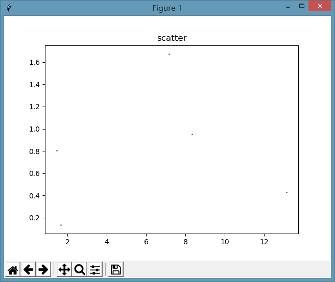
ax.scatter(datingDataMat[:,1],datingDataMat[:,2],s=100)
为了变化更明显,把s值扩大了100倍,执行效果如下:
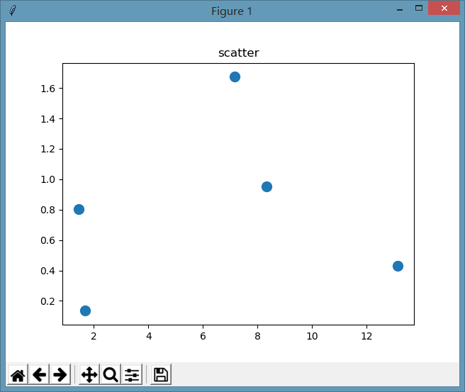
作为单一数值的效果我们看到了,官方说明中,还有一个array_like的形式,我们来测试一下
ax.scatter(datingDataMat[:,1],datingDataMat[:,2],s=[1]),这个就不贴图了,和数值1是一样的,所有点的大小是一样的。
ax.scatter(datingDataMat[:,1],datingDataMat[:,2],s=[1,50]),看看这是什么效果:

有些变,有些不变,规律是什么?经过一番测试,中间过程不说了,函数会根据样本的位置与s中对应位置元素的值进行设置,举个栗子,
第1个样本的值是x=8.326976, y=0.953952,s中对应的第1个值是1,所以这个点的大小是1
第2个样本的值是x=7.153469, y=1.673904,s中对应的第2个值是50,所以这个点的大小是50
第3个样本的值是x=1.441871, y=0.805124,s中只有两个值,所以现在回到第1个值,是1,所以这个点的大小是50
以下同理,循环。
s=[1,50,500]时,同理。
参数c
ax.scatter(datingDataMat[:,1],datingDataMat[:,2],s=[1,50], c='r')
参数c表示点的颜色
c : color, sequence, or sequence of color, optional, default: ‘b’
ccan be a single color format string, or a sequence of color specifications of lengthN, or a sequence ofNnumbers to be mapped to colors using thecmapandnormspecified via kwargs (see below). Note thatcshould not be a single numeric RGB or RGBA sequence because that is indistinguishable from an array of values to be colormapped.ccan be a 2-D array in which the rows are RGB or RGBA, however, including the case of a single row to specify the same color for all points.
Matplotlib recognizes the following formats to specify a color:
- an RGB or RGBA tuple of float values in
[0, 1](e.g.,(0.1, 0.2, 0.5)or(0.1, 0.2, 0.5, 0.3)); - a hex RGB or RGBA string (e.g.,
'#0F0F0F'or'#0F0F0F0F'); - a string representation of a float value in
[0, 1]inclusive for gray level (e.g.,'0.5'); - one of
{'b', 'g', 'r', 'c', 'm', 'y', 'k', 'w'}; - a X11/CSS4 color name;
- a name from the xkcd color survey; prefixed with
'xkcd:'(e.g.,'xkcd:sky blue'); - one of
{'tab:blue', 'tab:orange', 'tab:green', 'tab:red', 'tab:purple', 'tab:brown', 'tab:pink', 'tab:gray', 'tab:olive','tab:cyan'}which are the Tableau Colors from the ‘T10’ categorical palette (which is the default color cycle); - a “CN” color spec, i.e.
'C'followed by a single digit, which is an index into the default property cycle (matplotlib.rcParams['axes.prop_cycle']); the indexing occurs at artist creation time and defaults to black if the cycle does not include color.
All string specifications of color, other than “CN”, are case-insensitive.
c='r'表示所有点的颜色都变为红色

如果要设置不同的颜色,要用数组或元组,如下:
ax.scatter(datingDataMat[:,1],datingDataMat[:,2],s=[1,50], c=('r','b'))
设置规律同参数s,1、2、3循环

参数marker
marker : MarkerStyle, optional, default: ‘o’
表示图上的点的样式,默认是'o',也就是我们最常见的圆点,没看出来"."和"o"有什么区别。
All possible markers are defined here:
以下是所有可能的样式,各位有兴趣可以试一下,挺好玩的。 其中从TICKLEFT开始的几个英文单词,不知道怎么用。
| marker | description |
|---|---|
"." |
point |
"," |
pixel |
"o" |
circle |
"v" |
triangle_down |
"^" |
triangle_up |
"<" |
triangle_left |
">" |
triangle_right |
"1" |
tri_down |
"2" |
tri_up |
"3" |
tri_left |
"4" |
tri_right |
"8" |
octagon |
"s" |
square |
"p" |
pentagon |
"P" |
plus (filled) |
"*" |
star |
"h" |
hexagon1 |
"H" |
hexagon2 |
"+" |
plus |
"x" |
x |
"X" |
x (filled) |
"D" |
diamond |
"d" |
thin_diamond |
"|" |
vline |
"_" |
hline |
| TICKLEFT | tickleft |
| TICKRIGHT | tickright |
| TICKUP | tickup |
| TICKDOWN | tickdown |
| CARETLEFT | caretleft (centered at tip) |
| CARETRIGHT | caretright (centered at tip) |
| CARETUP | caretup (centered at tip) |
| CARETDOWN | caretdown (centered at tip) |
| CARETLEFTBASE | caretleft (centered at base) |
| CARETRIGHTBASE | caretright (centered at base) |
| CARETUPBASE | caretup (centered at base) |
"None", " " or "" |
nothing |
'$...$' |
render the string using mathtext. |
verts |
a list of (x, y) pairs used for Path vertices. The center of the marker is located at (0,0) and the size is normalized. |
| path | a Path instance. |
(numsides, style, angle) |
The marker can also be a tuple (
|
For backward compatibility, the form (verts, 0) is also accepted, but it is equivalent to just verts for giving a raw set of vertices that define the shape.
其它的参数暂时不去分析,以后用到时再说。
《机器学习实战》2.2.2分析数据:使用matplotlib创建散点图的更多相关文章
- Python数据可视化——使用Matplotlib创建散点图
Python数据可视化——使用Matplotlib创建散点图 2017-12-27 作者:淡水化合物 Matplotlib简述: Matplotlib是一个用于创建出高质量图表的桌面绘图包(主要是2D ...
- 机器学习实战python3 K近邻(KNN)算法实现
台大机器技法跟基石都看完了,但是没有编程一直,现在打算结合周志华的<机器学习>,撸一遍机器学习实战, 原书是python2 的,但是本人感觉python3更好用一些,所以打算用python ...
- 机器学习实战之k-近邻算法(3)---如何可视化数据
关于可视化: <机器学习实战>书中的一个小错误,P22的datingTestSet.txt这个文件,根据网上的源代码,应该选择datingTestSet2.txt这个文件.主要的区别是最后 ...
- python机器学习实战(一)
python机器学习实战(一) 版权声明:本文为博主原创文章,转载请指明转载地址 www.cnblogs.com/fydeblog/p/7140974.html 前言 这篇notebook是关于机器 ...
- 机器学习实战笔记-k-近邻算法
机器学习实战笔记-k-近邻算法 目录 1. k-近邻算法概述 2. 示例:使用k-近邻算法改进约会网站的配对效果 3. 示例:手写识别系统 4. 小结 本章介绍了<机器学习实战>这本书中的 ...
- 机器学习实战读书笔记(二)k-近邻算法
knn算法: 1.优点:精度高.对异常值不敏感.无数据输入假定 2.缺点:计算复杂度高.空间复杂度高. 3.适用数据范围:数值型和标称型. 一般流程: 1.收集数据 2.准备数据 3.分析数据 4.训 ...
- 机器学习实战 [Machine learning in action]
内容简介 机器学习是人工智能研究领域中一个极其重要的研究方向,在现今的大数据时代背景下,捕获数据并从中萃取有价值的信息或模式,成为各行业求生存.谋发展的决定性手段,这使得这一过去为分析师和数学家所专属 ...
- 机器学习实战笔记一:K-近邻算法在约会网站上的应用
K-近邻算法概述 简单的说,K-近邻算法采用不同特征值之间的距离方法进行分类 K-近邻算法 优点:精度高.对异常值不敏感.无数据输入假定. 缺点:计算复杂度高.空间复杂度高. 适用范围:数值型和标称型 ...
- 机器学习实战书-第二章K-近邻算法笔记
本章介绍第一个机器学习算法:A-近邻算法,它非常有效而且易于掌握.首先,我们将探讨女-近邻算法的基本理论,以及如何使用距离测量的方法分类物品:其次我们将使用?7««^从文本文件中导人并解析数据: 再次 ...
随机推荐
- Mac OS 电信3G上网设置
打开客户端后(安装客户端mobile partner需要先安装jdk),在“系统偏好设置”里选择“网络”,网络左侧添加“huaweimobile-modem”,“电话号码”填写电信卡号,“账户名称”和 ...
- Android内存泄漏检測与MAT使用
公司相关项目须要进行内存优化.所以整理了一些分析内存泄漏的知识以及工作分析过程. 本文中不会刻意的编写一个内存泄漏的程序,然后利用工具去分析它.而是通过介绍相关概念,来分析怎样寻找内存泄漏.并附上自己 ...
- Go之简单并发
func Calculate(id int) { fmt.Println(id) } 使用go来实现并发 func main() { for i := 0; i < 100; i++ { go ...
- 用JAVA发送一个XML格式的HTTP请求
import java.io.BufferedInputStream; import java.io.BufferedReader; import java.io.ByteArrayOutputStr ...
- 如何使用Web Service新建和更新Wiki页面的内容
公司内部有很多部门都创建了Wiki库,来做知识共享.公司是Hosting的SharePoint环境,不能写服务器端代码,要操作Wiki只能通过Web Service来完成,所以,碰到两个情况: 1)W ...
- Unity弹出MessageBox
[DllImport("User32.dll", SetLastError = true, ThrowOnUnmappableChar = true, CharSet = Char ...
- php安装xdebug后var_dump输出没有格式化的问题
开发环境,装了一个xdebug扩展方便调试代码. 但是环境配置好了之后却发现xdebug加载成功了但是var_dump输出的内容却没有使用html格式化 这时想到估计是php.ini里面的某个输出的配 ...
- nodelua
最近在学习go,对go中网络处理的方式比较喜欢,就用lua coroutine + C 模仿着接口实现一个玩具玩玩. 主要框架是lua导入C模块的时候会启动一个网络线程,lua和网络之间通过两个消息队 ...
- sqlserver服务器名称改成本地IP地址登录
在安装sqlserver2008.2012等时选择的是默认实例,服务器名称也就是电脑的名称,特别是登录本地的数据库,需要输入电脑用户名称加上SQLEXPRESS 例如:zhangsan\SQLEXPR ...
- css笔记 - 张鑫旭css课程笔记之 z-index 篇
一.z-index语法.支持的属性值等 z-index: 在支持z-index的元素上, z-index规定了元素(包括子元素)的垂直z方向的层级顺序, z-index可以决定哪个元素覆盖在哪个元素上 ...