Seaborn时间线图和热图
lineplot()
绘制与时间相关性的线图。
sns.lineplot(

    x=None,

    y=None,

    hue=None,

    size=None,

    style=None,

    data=None,

    palette=None,

    hue_order=None,

    hue_norm=None,

    sizes=None,

    size_order=None,

    size_norm=None,

    dashes=True,

    markers=None,

    style_order=None,

    units=None,

    estimator='mean',

    ci=95,

    n_boot=1000,

    sort=True,

    err_style='band',

    err_kws=None,

    legend='brief',

    ax=None,

    **kwargs,

)

Docstring:

Draw a line plot with possibility of several semantic groupings.

The relationship between ``x`` and ``y`` can be shown for different subsets

of the data using the ``hue``, ``size``, and ``style`` parameters. These

parameters control what visual semantics are used to identify the different

subsets. It is possible to show up to three dimensions independently by

using all three semantic types, but this style of plot can be hard to

interpret and is often ineffective. Using redundant semantics (i.e. both

``hue`` and ``style`` for the same variable) can be helpful for making

graphics more accessible.

See the :ref:`tutorial <relational_tutorial>` for more information.

By default, the plot aggregates over multiple ``y`` values at each value of

``x`` and shows an estimate of the central tendency and a confidence

interval for that estimate.

Parameters

----------

x, y : names of variables in ``data`` or vector data, optional

    Input data variables; must be numeric. Can pass data directly or

    reference columns in ``data``.

hue : name of variables in ``data`` or vector data, optional

    Grouping variable that will produce lines with different colors.

    Can be either categorical or numeric, although color mapping will

    behave differently in latter case.

size : name of variables in ``data`` or vector data, optional

    Grouping variable that will produce lines with different widths.

    Can be either categorical or numeric, although size mapping will

    behave differently in latter case.

style : name of variables in ``data`` or vector data, optional

    Grouping variable that will produce lines with different dashes

    and/or markers. Can have a numeric dtype but will always be treated

    as categorical.

data : DataFrame

    Tidy ("long-form") dataframe where each column is a variable and each

    row is an observation.

palette : palette name, list, or dict, optional

    Colors to use for the different levels of the ``hue`` variable. Should

    be something that can be interpreted by :func:`color_palette`, or a

    dictionary mapping hue levels to matplotlib colors.

hue_order : list, optional

    Specified order for the appearance of the ``hue`` variable levels,

    otherwise they are determined from the data. Not relevant when the

    ``hue`` variable is numeric.

hue_norm : tuple or Normalize object, optional

    Normalization in data units for colormap applied to the ``hue``

    variable when it is numeric. Not relevant if it is categorical.

sizes : list, dict, or tuple, optional

    An object that determines how sizes are chosen when ``size`` is used.

    It can always be a list of size values or a dict mapping levels of the

    ``size`` variable to sizes. When ``size``  is numeric, it can also be

    a tuple specifying the minimum and maximum size to use such that other

    values are normalized within this range.

size_order : list, optional

    Specified order for appearance of the ``size`` variable levels,

    otherwise they are determined from the data. Not relevant when the

    ``size`` variable is numeric.

size_norm : tuple or Normalize object, optional

    Normalization in data units for scaling plot objects when the

    ``size`` variable is numeric.

dashes : boolean, list, or dictionary, optional

    Object determining how to draw the lines for different levels of the

    ``style`` variable. Setting to ``True`` will use default dash codes, or

    you can pass a list of dash codes or a dictionary mapping levels of the

    ``style`` variable to dash codes. Setting to ``False`` will use solid

    lines for all subsets. Dashes are specified as in matplotlib: a tuple

    of ``(segment, gap)`` lengths, or an empty string to draw a solid line.

markers : boolean, list, or dictionary, optional

    Object determining how to draw the markers for different levels of the

    ``style`` variable. Setting to ``True`` will use default markers, or

    you can pass a list of markers or a dictionary mapping levels of the

    ``style`` variable to markers. Setting to ``False`` will draw

    marker-less lines.  Markers are specified as in matplotlib.

style_order : list, optional

    Specified order for appearance of the ``style`` variable levels

    otherwise they are determined from the data. Not relevant when the

    ``style`` variable is numeric.

units : {long_form_var}

    Grouping variable identifying sampling units. When used, a separate

    line will be drawn for each unit with appropriate semantics, but no

    legend entry will be added. Useful for showing distribution of

    experimental replicates when exact identities are not needed.

estimator : name of pandas method or callable or None, optional

    Method for aggregating across multiple observations of the ``y``

    variable at the same ``x`` level. If ``None``, all observations will

    be drawn.

ci : int or "sd" or None, optional

    Size of the confidence interval to draw when aggregating with an

    estimator. "sd" means to draw the standard deviation of the data.

    Setting to ``None`` will skip bootstrapping.

n_boot : int, optional

    Number of bootstraps to use for computing the confidence interval.

sort : boolean, optional

    If True, the data will be sorted by the x and y variables, otherwise

    lines will connect points in the order they appear in the dataset.

err_style : "band" or "bars", optional

    Whether to draw the confidence intervals with translucent error bands

    or discrete error bars.

err_band : dict of keyword arguments

    Additional paramters to control the aesthetics of the error bars. The

    kwargs are passed either to ``ax.fill_between`` or ``ax.errorbar``,

    depending on the ``err_style``.

legend : "brief", "full", or False, optional

    How to draw the legend. If "brief", numeric ``hue`` and ``size``

    variables will be represented with a sample of evenly spaced values.

    If "full", every group will get an entry in the legend. If ``False``,

    no legend data is added and no legend is drawn.

ax : matplotlib Axes, optional

    Axes object to draw the plot onto, otherwise uses the current Axes.

kwargs : key, value mappings

    Other keyword arguments are passed down to ``plt.plot`` at draw time.

Returns

-------

ax : matplotlib Axes

    Returns the Axes object with the plot drawn onto it.

See Also

--------

scatterplot : Show the relationship between two variables without

              emphasizing continuity of the ``x`` variable.

pointplot : Show the relationship between two variables when one is

            categorical.
#设置风格
sns.set_style('whitegrid')
#导入数据
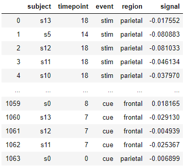
fmri = sns.load_dataset("fmri" , data_home='seaborn-data')
fmri
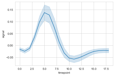
#时间线图

ax = sns.lineplot(data=fmri, x="timepoint", y="signal")
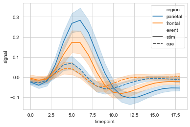
#hue设置分类

ax = sns.lineplot(data=fmri, x="timepoint", y="signal", hue="region")

#style使用线性进行再分类
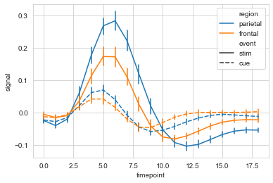
ax = sns.lineplot(data=fmri, x="timepoint", y="signal", hue="region", style="event")
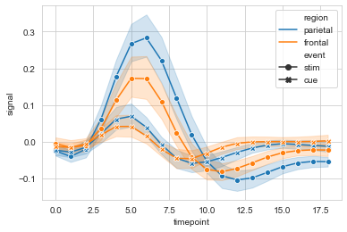
#markers设置是否显示散点,dashses设置是否显示虚线

sx = sns.lineplot(data=fmri, x="timepoint", y="signal",

             hue="region", style="event",

             markers=True, dashes=False

            )
#err_style设置误差线类型,默认band; ci设置置信区间,默认95%

ax = sns.lineplot(data=fmri, x="timepoint", y="signal",

             hue="region", style="event",

             err_style='bars', ci=68

            )
#选取部分数据,多条线显示
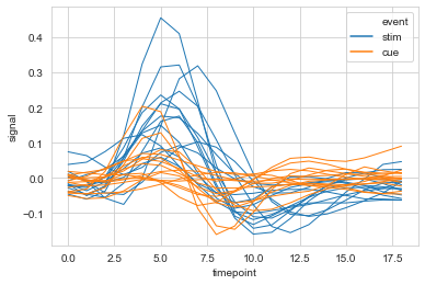
ax = sns.lineplot(data=fmri.query("region=='frontal'"),
x="timepoint", y='signal',
hue='event', units='subject',
estimator=None,lw=1
)
relplot()
用于分列绘制时间相关线图,relplot() = lineplot() + FaceGrid
sns.relplot(

    x=None,

    y=None,

    hue=None,

    size=None,

    style=None,

    data=None,

    row=None,

    col=None,

    col_wrap=None,

    row_order=None,

    col_order=None,

    palette=None,

    hue_order=None,

    hue_norm=None,

    sizes=None,

    size_order=None,

    size_norm=None,

    markers=None,

    dashes=None,

    style_order=None,

    legend='brief',

    kind='scatter',

    height=5,

    aspect=1,

    facet_kws=None,

    **kwargs,

)

Docstring:

Figure-level interface for drawing relational plots onto a FacetGrid.

This function provides access to several different axes-level functions

that show the relationship between two variables with semantic mappings

of subsets. The ``kind`` parameter selects the underlying axes-level

function to use:

- :func:`scatterplot` (with ``kind="scatter"``; the default)

- :func:`lineplot` (with ``kind="line"``)

Extra keyword arguments are passed to the underlying function, so you

should refer to the documentation for each to see kind-specific options.

The relationship between ``x`` and ``y`` can be shown for different subsets

of the data using the ``hue``, ``size``, and ``style`` parameters. These

parameters control what visual semantics are used to identify the different

subsets. It is possible to show up to three dimensions independently by

using all three semantic types, but this style of plot can be hard to

interpret and is often ineffective. Using redundant semantics (i.e. both

``hue`` and ``style`` for the same variable) can be helpful for making

graphics more accessible.

See the :ref:`tutorial <relational_tutorial>` for more information.

After plotting, the :class:`FacetGrid` with the plot is returned and can

be used directly to tweak supporting plot details or add other layers.

Note that, unlike when using the underlying plotting functions directly,

data must be passed in a long-form DataFrame with variables specified by

passing strings to ``x``, ``y``, and other parameters.

Parameters

----------

x, y : names of variables in ``data``

    Input data variables; must be numeric.

hue : name in ``data``, optional

    Grouping variable that will produce elements with different colors.

    Can be either categorical or numeric, although color mapping will

    behave differently in latter case.

size : name in ``data``, optional

    Grouping variable that will produce elements with different sizes.

    Can be either categorical or numeric, although size mapping will

    behave differently in latter case.

style : name in ``data``, optional

    Grouping variable that will produce elements with different styles.

    Can have a numeric dtype but will always be treated as categorical.

data : DataFrame

    Tidy ("long-form") dataframe where each column is a variable and each

    row is an observation.

row, col : names of variables in ``data``, optional

    Categorical variables that will determine the faceting of the grid.

col_wrap : int, optional

    "Wrap" the column variable at this width, so that the column facets

    span multiple rows. Incompatible with a ``row`` facet.

row_order, col_order : lists of strings, optional

    Order to organize the rows and/or columns of the grid in, otherwise the

    orders are inferred from the data objects.

palette : palette name, list, or dict, optional

    Colors to use for the different levels of the ``hue`` variable. Should

    be something that can be interpreted by :func:`color_palette`, or a

    dictionary mapping hue levels to matplotlib colors.

hue_order : list, optional

    Specified order for the appearance of the ``hue`` variable levels,

    otherwise they are determined from the data. Not relevant when the

    ``hue`` variable is numeric.

hue_norm : tuple or Normalize object, optional

    Normalization in data units for colormap applied to the ``hue``

    variable when it is numeric. Not relevant if it is categorical.

sizes : list, dict, or tuple, optional

    An object that determines how sizes are chosen when ``size`` is used.

    It can always be a list of size values or a dict mapping levels of the

    ``size`` variable to sizes. When ``size``  is numeric, it can also be

    a tuple specifying the minimum and maximum size to use such that other

    values are normalized within this range.

size_order : list, optional

    Specified order for appearance of the ``size`` variable levels,

    otherwise they are determined from the data. Not relevant when the

    ``size`` variable is numeric.

size_norm : tuple or Normalize object, optional

    Normalization in data units for scaling plot objects when the

    ``size`` variable is numeric.

legend : "brief", "full", or False, optional

    How to draw the legend. If "brief", numeric ``hue`` and ``size``

    variables will be represented with a sample of evenly spaced values.

    If "full", every group will get an entry in the legend. If ``False``,

    no legend data is added and no legend is drawn.

kind : string, optional

    Kind of plot to draw, corresponding to a seaborn relational plot.

    Options are {``scatter`` and ``line``}.

height : scalar, optional

    Height (in inches) of each facet. See also: ``aspect``.

aspect : scalar, optional

    Aspect ratio of each facet, so that ``aspect * height`` gives the width

    of each facet in inches.

facet_kws : dict, optional

    Dictionary of other keyword arguments to pass to :class:`FacetGrid`.

kwargs : key, value pairings

    Other keyword arguments are passed through to the underlying plotting

    function.

Returns

-------

g : :class:`FacetGrid`

    Returns the :class:`FacetGrid` object with the plot on it for further

    tweaking.
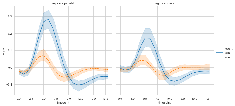
#col设置分栏绘制

ax = sns.relplot(data=fmri, x='timepoint', y='signal',

                 col='region', hue='event', style='event',

                 kind='line'

                )
heatmap()
用于绘制热点图。
sns.heatmap(

    data,

    vmin=None,

    vmax=None,

    cmap=None,

    center=None,

    robust=False,

    annot=None,

    fmt='.2g',

    annot_kws=None,

    linewidths=0,

    linecolor='white',

    cbar=True,

    cbar_kws=None,

    cbar_ax=None,

    square=False,

    xticklabels='auto',

    yticklabels='auto',

    mask=None,

    ax=None,

    **kwargs,

)

Docstring:

Plot rectangular data as a color-encoded matrix.

This is an Axes-level function and will draw the heatmap into the

currently-active Axes if none is provided to the ``ax`` argument.  Part of

this Axes space will be taken and used to plot a colormap, unless ``cbar``

is False or a separate Axes is provided to ``cbar_ax``.

Parameters

----------

data : rectangular dataset

    2D dataset that can be coerced into an ndarray. If a Pandas DataFrame

    is provided, the index/column information will be used to label the

    columns and rows.

vmin, vmax : floats, optional

    Values to anchor the colormap, otherwise they are inferred from the

    data and other keyword arguments.

cmap : matplotlib colormap name or object, or list of colors, optional

    The mapping from data values to color space. If not provided, the

    default will depend on whether ``center`` is set.

center : float, optional

    The value at which to center the colormap when plotting divergant data.

    Using this parameter will change the default ``cmap`` if none is

    specified.

robust : bool, optional

    If True and ``vmin`` or ``vmax`` are absent, the colormap range is

    computed with robust quantiles instead of the extreme values.

annot : bool or rectangular dataset, optional

    If True, write the data value in each cell. If an array-like with the

    same shape as ``data``, then use this to annotate the heatmap instead

    of the raw data.

fmt : string, optional

    String formatting code to use when adding annotations.

annot_kws : dict of key, value mappings, optional

    Keyword arguments for ``ax.text`` when ``annot`` is True.

linewidths : float, optional

    Width of the lines that will divide each cell.

linecolor : color, optional

    Color of the lines that will divide each cell.

cbar : boolean, optional

    Whether to draw a colorbar.

cbar_kws : dict of key, value mappings, optional

    Keyword arguments for `fig.colorbar`.

cbar_ax : matplotlib Axes, optional

    Axes in which to draw the colorbar, otherwise take space from the

    main Axes.

square : boolean, optional

    If True, set the Axes aspect to "equal" so each cell will be

    square-shaped.

xticklabels, yticklabels : "auto", bool, list-like, or int, optional

    If True, plot the column names of the dataframe. If False, don't plot

    the column names. If list-like, plot these alternate labels as the

    xticklabels. If an integer, use the column names but plot only every

    n label. If "auto", try to densely plot non-overlapping labels.

mask : boolean array or DataFrame, optional

    If passed, data will not be shown in cells where ``mask`` is True.

    Cells with missing values are automatically masked.

ax : matplotlib Axes, optional

    Axes in which to draw the plot, otherwise use the currently-active

    Axes.

kwargs : other keyword arguments

    All other keyword arguments are passed to ``ax.pcolormesh``.

Returns

-------

ax : matplotlib Axes

    Axes object with the heatmap.

See also

--------

clustermap : Plot a matrix using hierachical clustering to arrange the

             rows and columns.
# 导入数据

flights = sns.load_dataset('flights', data_home='seaborn-data')

flights = flights.pivot('month', 'year', 'passengers')

flights
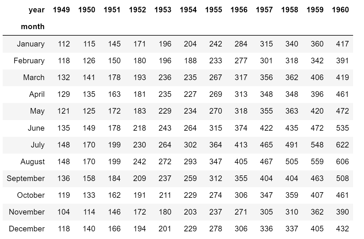
#简易热图
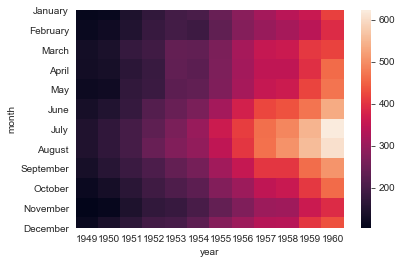
ax = sns.heatmap(flights)
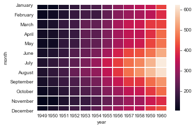
#linewidths设置线宽

ax = sns.heatmap(flights, linewidth=.5)
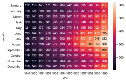
#annot设置是否显示数据,fmt设置数据显示的格式

ax = sns.heatmap(flights, annot=True, fmt='d')

#解决上下两行显示不全

ax = ax.set_ylim(len(flights)+0.1, -0.1)
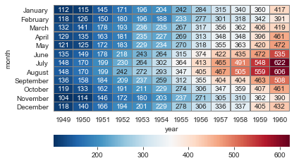
#cmap设置调色板,linewidths设置方格间隔, linecolor设置间隔线颜色, cbar_kws设置颜色条参数

ax = sns.heatmap(flights, annot=True, fmt='d', cmap='RdBu_r',

                 linewidths=0.3, linecolor='grey',

                 cbar_kws={'orientation': 'horizontal'}

                )

ax = ax.set_ylim(len(flights)+0.1, -0.1)
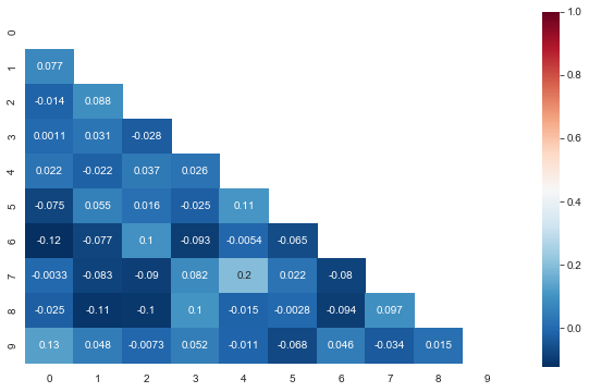
三角热力图
#布尔矩阵热图,若为矩阵内为True,则热力图相应的位置的数据将会被屏蔽掉(常用在绘制相关系数矩阵图)
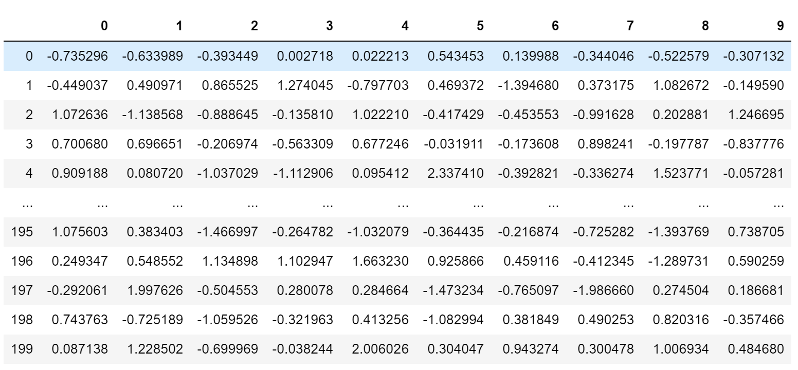
data_new = np.random.randn(200, 10)
pd.DataFrame(data_new)
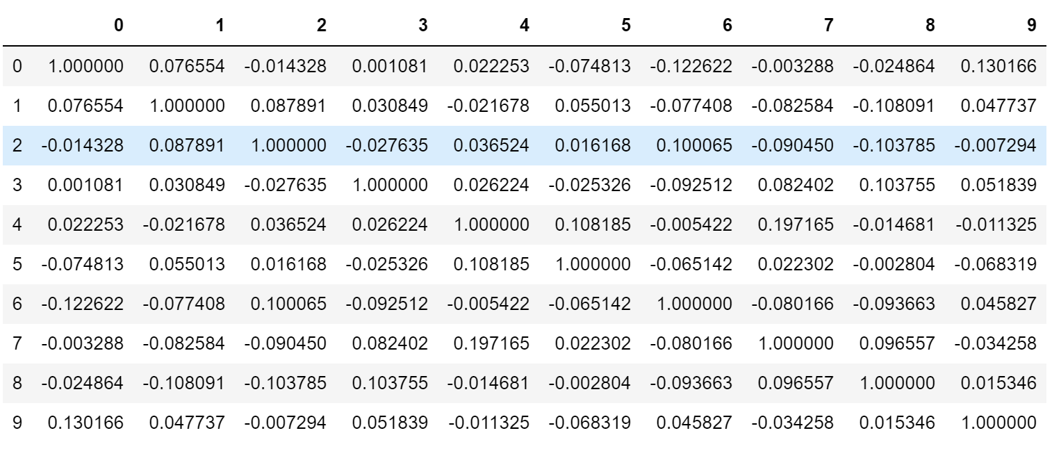
#相关系数矩阵(对称矩阵)

corr = np.corrcoef(data_new, rowvar=False)

pd.DataFrame(corr)
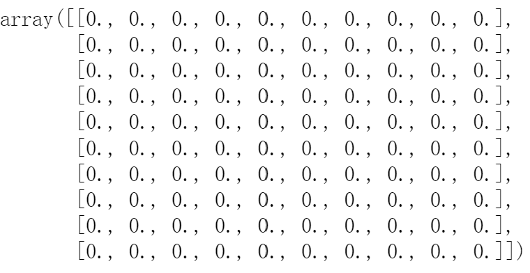
#以corr的形状生成一个零矩阵

mask = np.zeros_like(corr)

mask
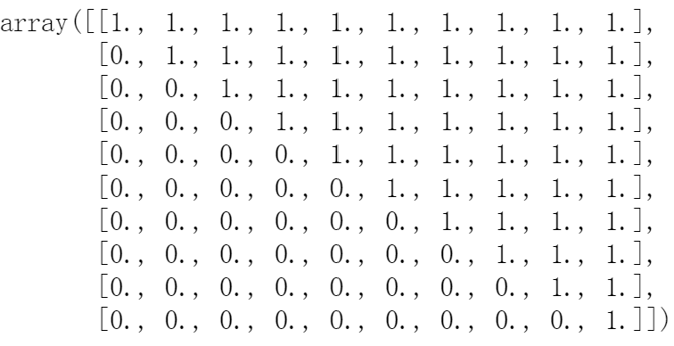
#设置mask对角线以上为True

mask[np.triu_indices_from(mask)] = True

mask
#绘制对称矩阵数据的热图

plt.figure(figsize=(10,6))

ax = sns.heatmap(corr, mask=mask, annot=True, cmap='RdBu_r')

ax.set_ylim(len(corr)+0.1, -0.1)
Seaborn时间线图和热图的更多相关文章
- python matplotlib绘图大全(散点图、柱状图、饼图、极坐标图、热量图、三维图以及热图)
//2019.7.14晚matplotlib七种常见图像输出编程大全 七种图形汇总输出如下: import numpy as np #导入数据结构nmupy模块import matplotlib.py ...
- seaborn线性关系数据可视化:时间线图|热图|结构化图表可视化
一.线性关系数据可视化lmplot( ) 表示对所统计的数据做散点图,并拟合一个一元线性回归关系. lmplot(x, y, data, hue=None, col=None, row=None, p ...
- 基于HTML5实现3D热图Heatmap应用
Heatmap热图通过众多数据点信息,汇聚成直观可视化颜色效果,热图已广泛被应用于气象预报.医疗成像.机房温度监控等行业,甚至应用于竞技体育领域的数据分析. http://www.hightopo.c ...
- 基于HTML5实现的Heatmap热图3D应用
Heatmap热图通过众多数据点信息,汇聚成直观可视化颜色效果,热图已广泛被应用于气象预报.医疗成像.机房温度监控等行业,甚至应用于竞技体育领域的数据分析. 已有众多文章分享了生成Heatmap热图原 ...
- 基于matplotlib的数据可视化 - 热图imshow
热图: Display an image on the axes. 可以用来比较两个矩阵的相似程度 mp.imshow(z, cmap=颜色映射,origin=垂直轴向) imshow( X, cma ...
- 扩增子图表解读3热图:差异菌、OTU及功能
热图是使用颜色来展示数值矩阵的图形.通常还会结合行.列的聚类分析,以表达实验数据多方面的结果. 热图在生物学领域应用广泛,尤其在高通量测序的结果展示中很流行,如样品-基因表达,样品-OTU相对丰度矩 ...
- Python图表数据可视化Seaborn:3. 线性关系数据| 时间线图表| 热图
1. 线性关系数据可视化 lmplot( ) import numpy as np import pandas as pd import matplotlib.pyplot as plt import ...
- HeatMap(热图)的原理和实现
先来看两张图: (1)10年世界杯决赛,冠军西班牙队中门将.后卫.中场及前锋的跑位热图 通过热图,我们可以很清楚的看出四个球员在比赛中跑动位置的差异. (2)历史地震震源位置的热图 也可以很清楚的看出 ...
- R语言学习 - 热图简化
绘制热图除了使用ggplot2,还可以有其它的包或函数,比如pheatmap::pheatmap (pheatmap包中的pheatmap函数).gplots::heatmap.2等. 相比于gg ...
- R语言学习 - 热图绘制heatmap
生成测试数据 绘图首先需要数据.通过生成一堆的向量,转换为矩阵,得到想要的数据. data <- c(1:6, 6:1, 6:1, 1:6, (6:1)/10, (1:6)/10, (1:6)/ ...
随机推荐
- Linux查看文件大小、磁盘使用情况
1.显示磁盘的可用情况: df -h 2.显示文件夹大小 du -ka folder | sort -rnk 1 | head -n 10
- 初识JavaScript逆向——以网易云音乐和招标网站为例
前言:需要掌握一定的JavaScript基础,能看懂基础的JavaScript代码. 我们平常在浏览网站的时候会看到许多加密的参数,如果需要知道它的原始数据,就需要知道整个加密过程,所以本篇文章就来介 ...
- git的 .gitignore 配置概述
git的 .gitignore 配置概述 学习背景:自己在使用git时发现有时会上传很多无用的配置文件,或者在项目中已经包含一个本地的git仓库,导致上一级项目上传总是报错,所以学习采用gitigno ...
- 开源好用的所见即所得(WYSIWYG)编辑器:Editor.js
@ 目录 特点 基于区块 干净的数据 界面与交互 插件 标题和文本 图片 列表 Todo 表格 使用 安装 创建编辑器实例 配置工具 本地化 自定义样式 今天介绍一个开源好用的Web所见即所得(WYS ...
- netcore 图片缩略图
/// <summary> /// 取小写文件名后缀 /// </summary> /// <param name="name">文件名< ...
- vue-helper 点击跳转插件 在 methods里面互相调用函数,会产生两个函数definitions ,然后就回弹出框让你选择,解决方案是加配置
vue-helper 点击跳转插件 在 methods里面互相调用函数,会产生两个函数definitions ,然后就回弹出框让你选择 原因:换了台电脑,又从新配置下vscode "edit ...
- day23-服务器端渲染技术01
服务器端渲染技术01 为什么需要jsp? 在之前的开发过程中,我们可以发现servlet做界面非常不方便: 引出jsp技术=> jsp=html+java代码+标签+javascript+css ...
- slf4j 和 log4j2 架构设计
1.日志框架背景 2.为什么会有 slf4j 和 log4j2 搭配一说? 3.log4j2 3.1.背景及应用场景 3.2.功能模块 4.slf4j 4.1.背景及应用场景 4.2.功能模块 5.s ...
- 纯前端实现 PNG 图片压缩 | UPNG.js
在线 Demo 体验地址 →: https://demos.sugarat.top/pages/png-compress/ 前言 最近在迭代自己的 图床 应用,由于使用时间的累计,存储空间占用越来越大 ...
- [503. 下一个更大元素 II] 单调栈
import java.util.ArrayDeque; import java.util.Deque; class Solution { public static void main(String ...