行高 line-height
<p>这是一行普通的文字,这里有个<em>em</em>标签</p>
<body>

  <p>这是一行普通的文字,这里有个<em>em</em>标签。</p>

  <script>

    console.log(document.querySelector("p").clientHeight);

    // mac chrome:22 firefox:23

    // windows chrome:21 ie:19 firefox:22

  </script>

</body>
<style>

  .test1{

    font-size: 36px;

    line-height: 0;

    border: 1px solid #ccc;

    background: #eee;

    margin-top:50px;

  }

  .test2{

    font-size: 0;

    line-height: 36px;

    border: 1px solid #ccc;

    background: #eee;

    margin-top:50px;

  }

</style>

<body>

  <div class="test1">测试1</div>

  <div class="test2">测试2</div>

</body>
<body>

  <p>这是一行普通的文字,这里有个<em style="line-height: 80px;">em</em>标签</p>

  <script>

    console.log(document.querySelector('p').clientHeight);

  </script>

</body>
发现clientHeight正好是80px。如果是这个例子看,那句话是正确的。
<body>

  <p>这是一行普通的文字,这里有个<em style="line-height: 80px; vertical-align:40px;">em</em>标签</p>

  <script>

    console.log(document.querySelector('p').clientHeight);

  </script>

</body>
<body>

  <p>这是一行普通的文字,这里有个<em>em</em>标签。</p>

  <script>

    console.log(document.querySelector("p").clientHeight);

    // mac chrome:22 firefox:23

    // windows chrome:21 ie:19 firefox:22

  </script>

</body>
<body>

  <div style="font-family:雅黑">字体</div>

</body>
<body>

  <div style="line-height:1.5; width:500px;">

    <span style="font-size:60px;">我的font-size为60px</span>

  </div>

  <div style="line-height:150%; width:500px;">

    <span style="font-size:60px;">我的font-size为60px</span>

  </div>

</body>
<p style="background:#eee"><img src="imgs/text.png" alt="" style="width:200px;"></p>
<body>

  <p style="background:#eee; line-height: 60px">

  <img src="imgs/text.png" alt="" style="width:200px;">

    <span style="display:inline-block; background:#fff;">图片高度177px,字体14px</span>

  </p>

</body>
1、图片块状话-无基线对齐

img{ display: block; }

2、图片底线对齐

img{ vertical-align: bottom; }

3、行高足够小-基线位置上移

.box{ line-height:0; }
<style>

  .box{

    line-height: 300px;

    text-align: center;

    background: #eee;

  }

  .box > img {

    vertical-align: middle;

  }

</style>

<body>

  <div class="box">

    <img src="imgs/text.png" style="width:200px" alt="">

  </div>

</body>
<style>

  .box{

    line-height: 250px; text-align: center; background: #eee;

  }

  .box > .text{

    display: inline-block; line-height: normal; text-align: left; vertical-align: middle;

  }

</style>

<body>

  <div class="box">

    <div class="text">

      多行文字水平垂直居中实现的原理跟上一页图片的实现是一样的,区别在于要把多行文本所在的容器的display水平转换成

      和图片一样的,也就是inline-block,以及重置外部继承的 text-align 和 line-height属性值。

    </div>

  </div>

</body>
<style>

  span {

    background: red;

  }

  .c1 {

    line-height: 20px;

  }

  .c2 {

    line-height: 8px;

  }

  .c3 {

    line-height: 30px;

  }

  .c5 {

    line-height: 28px

  }

</style>

<body>

  <div>

    <span class="c1">inline box xfg中文</span>

    <span class="c2">inline box</span>

    <span class="c3">inline box</span>

    inline box

    <span class="c5">inline box</span>

  </div>

</body>
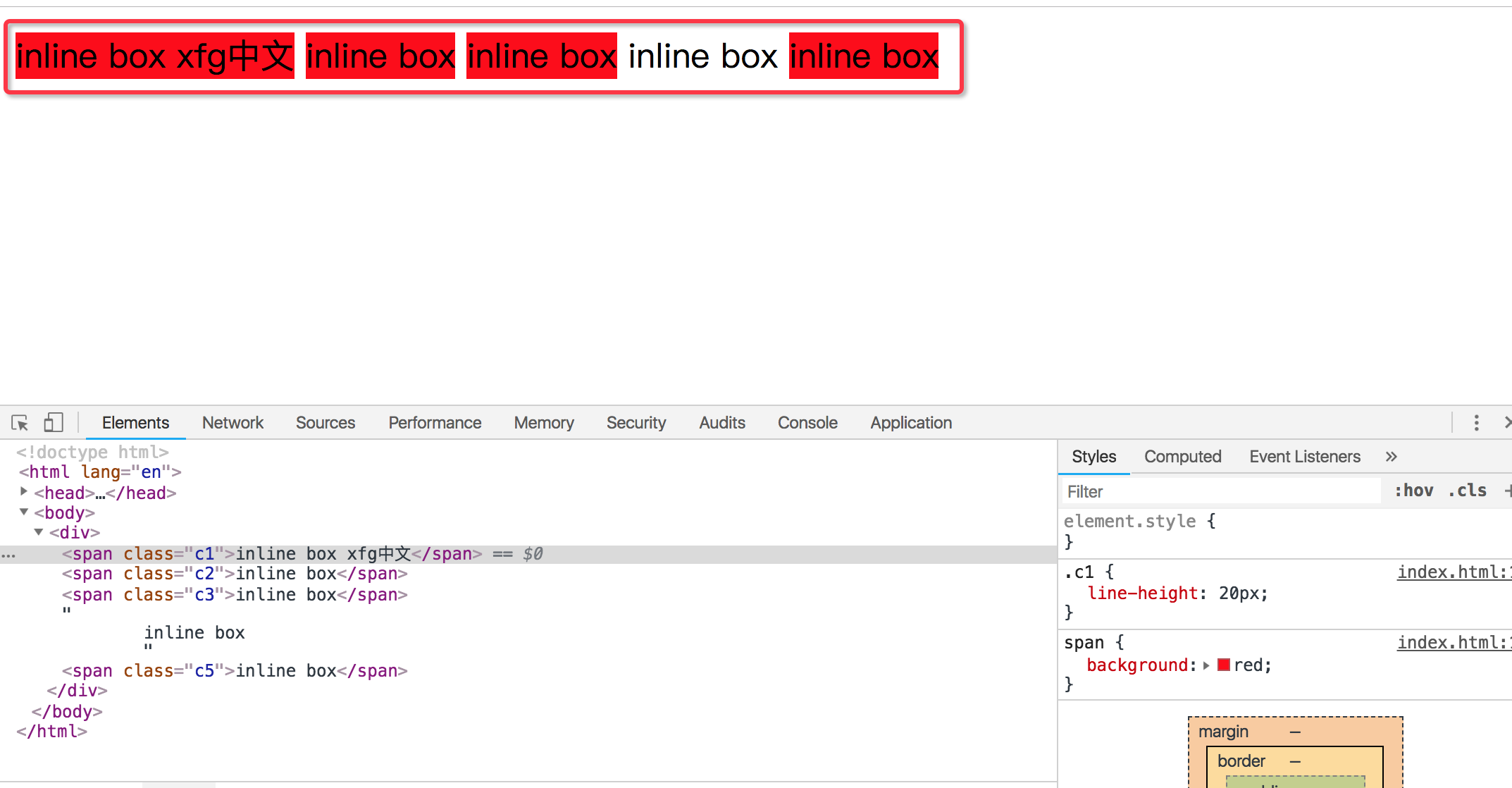
它们的行高不一样,但是为什么渲染的高度是一样的
<style>
.cc1 {
font-size: 12px;
}
.cc2 {
font-size: 18px;
}
.cc3 {
font-size: 24px;
}
</style>
<body>
<div style="border:1px solid red">
<span style="background:blue; color:#fff; font-size:20px; line-height:60px">
居中xfg             
</span>
</div>
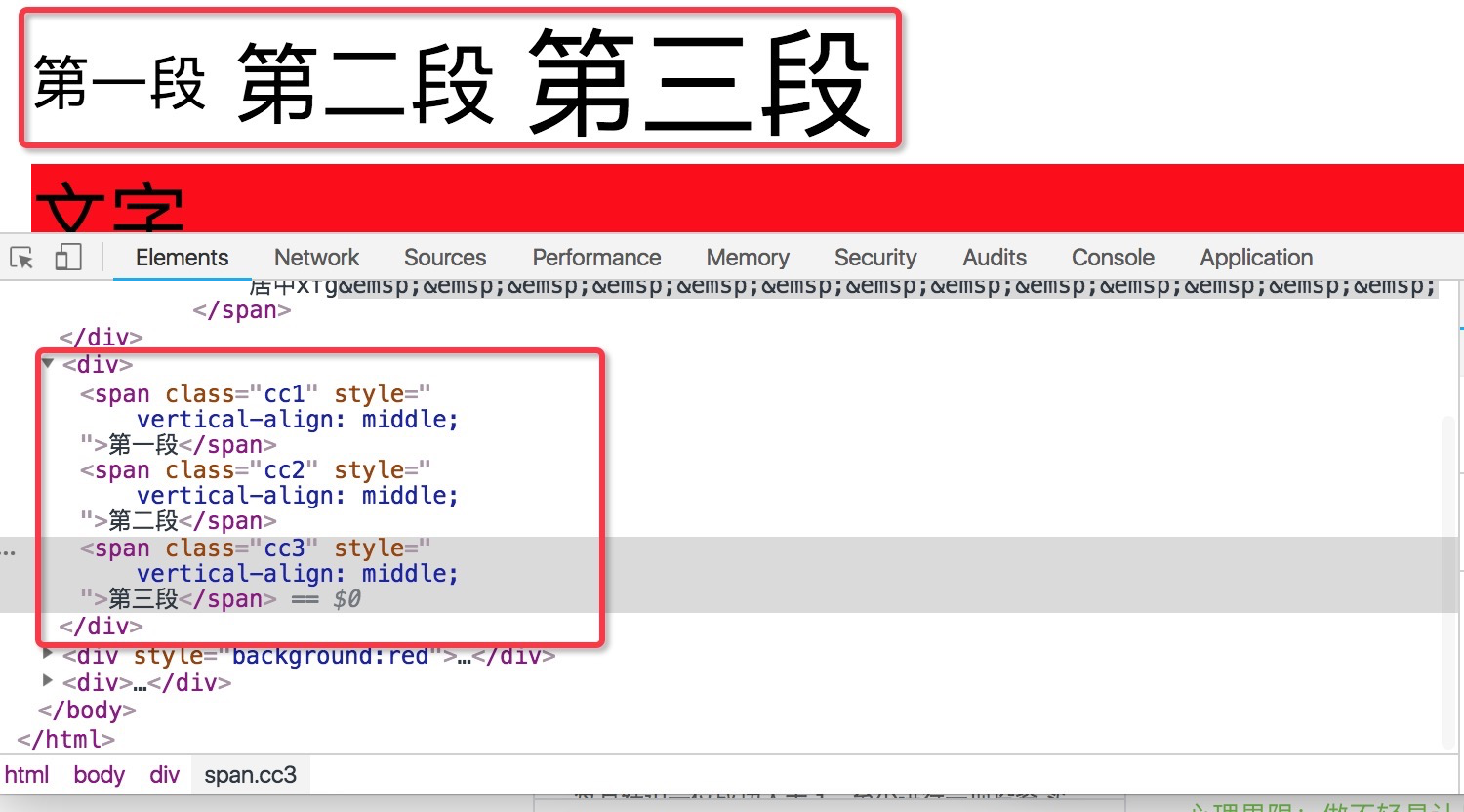
<div>
<span class="cc1">第一段</span>
<span class="cc2">第二段</span>
<span class="cc3">第三段</span>
</div>
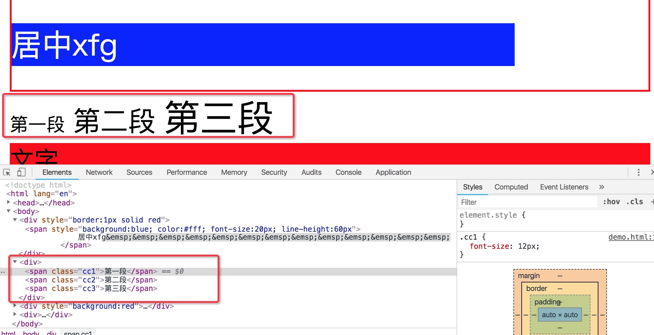
<div style="background:red">
<span>文字</span>
<img src="text.png" alt="">
</div>
<div>
<div style="float:left">
<span>第一段</span>
</div>
<div style="float:left">
<span>第二段</span>
</div>
</div>
</body>
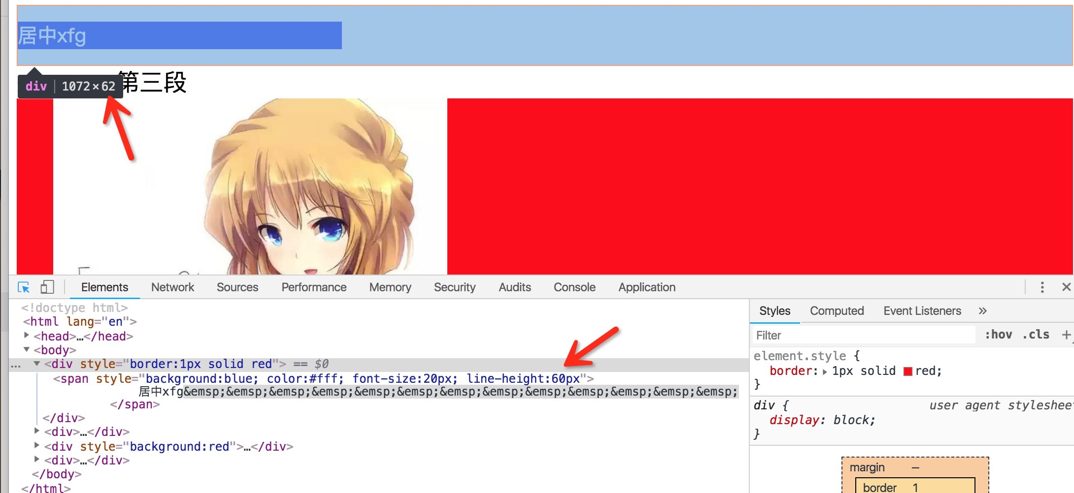
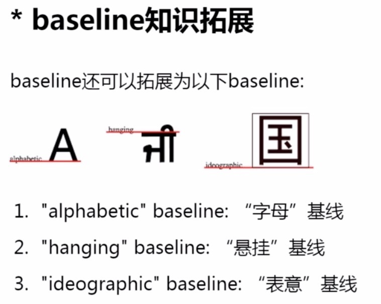
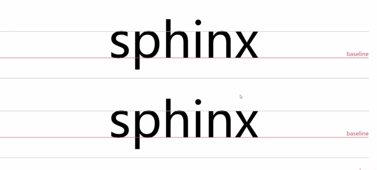
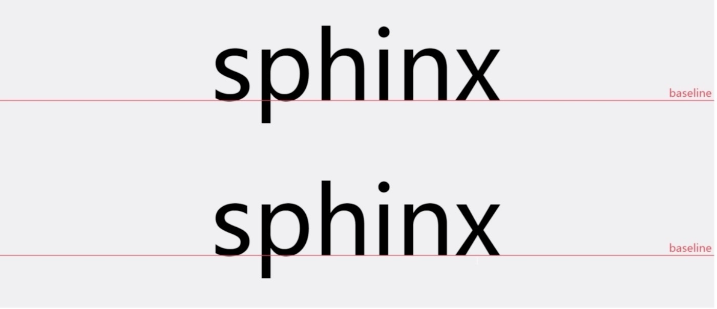
第二部分我们看到字体的大小是不一样的。字体大小不一样,那么按照什么对齐呢。默认情况呢,是按照base-line,基线对齐。对大部分中文来说,底部基本上是基线对位置。如果要居中对齐怎么办。
那我们就设置vertical-align:middle,居中对齐,三个部分都设置居中对齐。设置top就是根据顶线对齐。设置bottom就是根据底线对齐。这里根据顶线和底线对齐并不是根据文字都顶部和底部对齐。

第三部分有一个文本,有一个图片。然后会发现一个很奇怪的事情。这个图片下面有一段空白。有人说我是不想要这个空白的。那怎么办呢?首先他的原因是什么,原因是因为,img这个也相当于是一个inline的这样一个元素。inline的元素就要遵守行高的构成。他会按照base-line对齐。就是基线对齐。基线对齐的话,就意味着,基线到底线之间还是有一段空隙的。这是这个空隙产生的原因。那我们要去掉这个空隙怎么办?默认是按base-line对齐,base-line跟底线是有偏差的。这个偏差的大小视字体大小而定。如果是12px的大小,那么这个图片的空隙有可能就是3px左右。那么这就是经典的图片3px缝隙问题。这个问题怎么解决呢,很简单,默认是base-line。我们改成vertical-align:bottom,按底线对齐。这样缝隙就没有了
行高 line-height的更多相关文章
- 深入了解css的行高Line Height属性
什么是行间距? 古时候我们使用印刷机来出来文字.印刷出来的每个字,都位于独立的一个块中. 行间距,即传说中控制两行文字垂直距离的东东.在CSS中,line-height被用来控制行与行之间垂直距离. ...
- css - 行高
css - 行高 line-height行高 取值:px | em | rem | 百分比 | 纯数字 | normal | inherit 设置给:块.行内.行内块 应用给:文本 继承:块.行内.被 ...
- easyui datagird 解决行高不一致问题!
<style>.datagrid-btable .datagrid-cell {padding: 6px 4px;overflow: hidden;text-overflow: ellip ...
- wpf datagrid row height 行高自动计算使每行行高自适应文本
wpf 的datagrid的行高 要么是Auto,要么是定值:但会带来麻烦就是每行行高都一样. 当需要按内容(主要是wrap 换行的textbox或textblock)来动态调整行高的时候,需要用到d ...
- css中line-height行高的深入学习
之前对css中行高line-height的理解还是有些肤浅,深入后才发觉里面包罗万象.学习行高line-height,首先从基本原理开始 (标注该文章转载 http://www.cnblogs.com ...
- 第2月第24天 coretext 行高
1.NSMutableAttributedString 行高 NSMutableAttributedString *attributedString = [[NSMutableAttributedSt ...
- CSS行高——line-height
初入前端的时候觉得CSS知道display.position.float就可以在布局上游刃有余了,随着以后工作问题层出不穷,才逐渐了解到CSS并不是几个style属性那么简单,最近看了一些关于行高的知 ...
- CSS行高line-height的理解
一.行高的字面意思 “行高“顾名思义指一行文子的高度.具体来说是指两行文子间基线间的距离. 基线是在英文字母中用到的一个概念,我们刚学英语的时候使用到的那个英语本子每行有4条线,其中底部第二条线就是基 ...
- 深入理解 CSS 中的行高与基线
1.基本概念 1. 基线.底线.顶线.中线 注意:基线(base line)并不是汉字文字的下端沿,而是英文字母“x”的下端沿. 2. 内容区 内容区是指底线和顶线包裹的区域(行内元素display ...
- (转)CSS行高——line-height
原文地址:http://www.cnblogs.com/dolphinX/p/3236686.html 初入前端的时候觉得CSS知道display.position.float就可以在布局上游刃有余了 ...
随机推荐
- c#输入方法名来调用方法(反射)
using System; using System.Collections.Generic; using System.Linq; using System.Reflection; using Sy ...
- nyoj 10——skiing————————【记忆化搜索】
skiing 时间限制:3000 ms | 内存限制:65535 KB 难度:5 描述 Michael喜欢滑雪百这并不奇怪, 因为滑雪的确很刺激.可是为了获得速度,滑的区域必须向下倾斜,而且当 ...
- nyoj 349&Poj 1094 Sorting It All Out——————【拓扑应用】
Sorting It All Out 时间限制:3000 ms | 内存限制:65535 KB 难度:3 描述 An ascending sorted sequence of distinct ...
- node.js中的模板引擎jade、handlebars、ejs
使用node.js的Express脚手架生成项目默认是jade模板引擎,jade引擎实在是太难用了,这么难用还敢设为默认的模板引擎,过分了啊!用handlebars模板引擎写还说的过去,但笔者更愿意使 ...
- hdu 3642 覆盖3次以上体积
http://www.cnblogs.com/kane0526/archive/2013/03/06/2947118.html 题目大意:给你n个立方体,求相交区域大于等于三次的体积和. 这题需要前面 ...
- 用于模式匹配的String方法和RegExp方法
上一节总结了创建正则表达式的语法,这一篇笔者总结了用于模式匹配的String四个方法:search().replace().match().split()以及用于模式匹配的RegExp两个方法exec ...
- kafka基本机制
Kafka目前主要作为一个分布式的发布订阅式的消息系统使用,下面简单介绍一下kafka的基本机制 1.3.1 消息传输流程 Producer即生产者,向Kafka集群发送消息,在发送消息之前,会对消息 ...
- 使用Anaconda管理环境
Anaconda指的是一个开源的python发行版本,其包含了conda.Python等180多个科学包及其依赖项. Anaconda是一个开源的包.环境管理器,可以用于在同一个机器上安装不同版本的软 ...
- 初识rbac
一.权限组件 1.项目与应用 一个项目可以有多个应用:一个应用可以在多个项目下:前提:应用是组件. 2.什么是权限? 一个包含正则表达式的url就是一个权限. 可以理解为如下方程式: who what ...
- rest-framework框架——APIView和序列化组件
一.快速实例 Quickstart http://www.cnblogs.com/yuanchenqi/articles/8719520.html restful协议 ---- 一切皆是资源,操作只是 ...