
潭州课堂25班:Ph201805201 WEB 之 CSS 第三课 (课堂笔记)
在 CSS 中第个标签都可以认为是个盒子,盒子就有以下几层
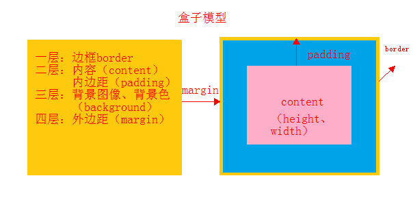
边框 border
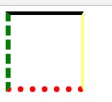
            border-top: 5px solid black;            /*上边框 实线*/

            border-right: 3px double yellow;        /*右边框 双线*/

            border-bottom: 8px dotted red;          /*下边框 点点*/

            border-left: 7px dashed green;          /*左边框 虚线*/
内边距 padding
内容和框音响的距离
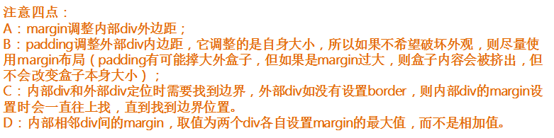
在实际操作使用中,一般不对内边距调,这样会影响整个盒子的大小,从而影响整个页面布局
    <style>

        div{

            height: 200px;

            width: 100px;

            border:  3px solid red;

            padding-top: 20px;          /*上内边距*/

            padding-right: 10px;        /*右内边距*/

            padding-bottom: 10px;        /*下内边距*/

            padding-left: 10px;        /*左内边距*/

        }

    </style>

</head>

<body>

    <div>

        博客园是面向开发者的知识分享社区,

    </div>
padding: 10px 20px 30px 40px; /*复合样式 ,上右下左,按顺序,哪个值缺少,就取对面的值,*/
外边距 margin
盒子间的距离
            background: #525d68;

            margin-top: 30px;           /*上边距*/

            margin-right: 100px;        /*右边距*/

            margin-bottom: 100px;       /*下边距*/

            margin-left: 100px;         /*左边距*/
margin10px 20px 30px 40px; /*复合样式 ,上右下左,按顺序,哪个值缺少,就取对面的值,*/
css 重置
    <style>

        *{

            margin: 0;

            padding: 0;

        }

    </style>
浮动
列变行用 float: left;
<!DOCTYPE html>

<html lang="en">

<head>

    <meta charset="UTF-8">

    <title>Title</title>

    <style>

        li{

            height: 20px;

            width: 20px;

            background: green;

            float: left;                /*列变行*/

            margin-left: 20px;

            border-radius: 50px;        /*圆角*/

        }

        ul{

            list-style: none;           /*把点去掉*/

        }

    </style>

</head>

<body>

    <ul>

        <li></li>

        <li></li>

        <li></li>

    </ul>

</body>

</html>
浮动问题:
高度塌陷
<!DOCTYPE html>

<html lang="en">

<head>

    <meta charset="UTF-8">

    <title>Title</title>

    <style>

        .box{

            border: 20px solid red;

            /*overflow: hidden;           !*防高度塌陷 方法1*!*/

        }

        .box div{

            height: 100px;

            width: 100px;

        }

        .left{

            float: left;

            background: green;

        }

        .ri{

            float: right;

            background: skyblue;

        }

        .clearfix::after{                /**防高度塌陷 方法3/

            display: block;             /*保证为块级元素*/

            clear: both;

            content: '';

        }

    </style>

</head>

<body>

    <div class="box clearfix" >             <!--/*防高度塌陷 方法3 加共同样式 clearfix-->

        <div class="left"></div>

        <div class="ri"></div>

        <!--<div></div>                             /*防高度塌陷 方法2*/-->

    </div>

</body>

</html>
清除浮动带来的影响
设置共同样式,
        .clearfix::after{

            display: block;

            clear: both;

            content: '';
}
在父级 div 中添加共同样式 clearfix 之后进行相关设置
固定定位
<!DOCTYPE html>

<html lang="en">

<head>

    <meta charset="UTF-8">

    <title>Title</title>

    <style>

        div{

            width: 100px;

            height: 100px;

            background: #525d68;

            position: fixed;                /*指明固定定位*/

            right: 20px;                    /*指定偏移*/

            bottom: 100px;

        }

    </style>

</head>

<body>

    <div></div>

</body>

</html>
不论浏览器怎么动,该 box 始终在这个偏移位置中
相对定位
相对自身而言,的位置偏移 ,不脱离文档流
在这个例子中,其父元素是浏览器,所以他的偏移是以浏览器为参照物,
<!DOCTYPE html>

<html lang="en">

<head>

    <meta charset="UTF-8">

    <title>Title</title>

    <style>

        div{

            width: 200px;

            height: 200px;

        }

        .text{

            background: #e7dede;

            position: relative;             /*相对定位*/

            left: 200px;

        }

        .box{

            background: blue;

        }

    </style>

</head>

<body>

    <div class="text"></div>

    <div class="box">参照</div>

</body>

</html>
绝对定位 position: absolute; /*绝对定位*/
脱离文档流,偏移反,位置将让出来,
<!DOCTYPE html>

<html lang="en">

<head>

    <meta charset="UTF-8">

    <title>Title</title>

    <style>

        div{

            width: 200px;

            height: 200px;

        }

        .text{

            background: #e7dede;

            position: absolute;             /*绝对定位*/

            left: 200px;

        }

        .box{

            background: blue;

        }

    </style>

</head>

<body>

    <div class="text"></div>

    <div class="box">参照</div>

</body>

</html>
父相子绝,(在绝对定位的 box 上设个父元素)
这个应用比较我,保证其不脱离文档流,不影响整个页面布局,子 box 实现随心所欲的放置,
<!DOCTYPE html>

<html lang="en">

<head>

    <meta charset="UTF-8">

    <title>Title</title>

    <style>

        .par{                               /*父元素*/

            height: 300px;

            width: 500px;

            background: #3e3d32;

            position: relative;         /*相对定位*/

        }

        .chi{                              /*子元素*/

            height: 100px;

            width: 100px;

            background: maroon;

            position: absolute;         /*绝对 定位*/

            /*居中操作*/

            left: 50%;

            margin-left:-50px;

            top: 50%;

            margin-top: -50px;

        }

    </style>

</head>

<body>

    <div class="par">父 box

        <div class="chi">子 box </div>

    </div>

</body>

</html>
z index
style="z-index: -1" 里边的数值越大戛越在上层,
<!DOCTYPE html>

<html lang="en">

<head>

    <meta charset="UTF-8">

    <title>Title</title>

    <style>

        *{

            margin-left: 0;

            padding: 0;

        }

        ul{

            list-style: none;       /*去掉列表的带的小点*/

        }

        div{

            height: 200px;

            width: 800px;

            background:black;

            margin: 20px auto;

            position: relative;                         /*相对定位*/

        }

        img{

            height: 200px;

            width: 800px;

            position: absolute;                         /*绝对定位*/

        }

    </style>

</head>

<body>

    <div>

        <ul class="pic">

            <li><img style="z-index: 0" src="https://res.shiguangkey.com//file/201806/19/20180619142252602590185.jpg"></li>

            <li><img style="z-index: 1" src="https://res.shiguangkey.com//file/201806/19/20180619141337485823895.jpg"></li>

            <li><img style="z-index: -2" src="https://res.shiguangkey.com//file/201806/21/20180621150342030454625.jpg"></li>

            <li><img style="z-index: -1" src="https://res.shiguangkey.com//file/201805/17/20180517113424433990524.jpg"></li>

        </ul>

    </div>

</body>

</html>
作业
<!DOCTYPE html>

<html lang="en">

<head>

    <meta charset="UTF-8">

    <title>Title</title>

    <style>

        *{

            margin:0;

            padding:0;

        }

        ul{

            list-style: none;       /*去掉列表的带的小点*/

        }

        img{

            height: 200px;

            width: 800px;

            position: absolute;                         /*绝对定位*/

        }

        div{

            height: 200px;

            width: 800px;

            background:yellow;

            margin: 40px auto;

            position: relative;                         /*相对定位*/

        }

        .btn{

            height: 200px;                          /*高度=行高,..*/

            line-height: 200px;                    /*行高,便于居中*/

            font-size: 50px;                      /*字体大小*/

            color: white;                       /*字体颜色*/

            font-weight: bold;

            display: none;                      /*不显示 */

        }

        .btn .left{

            position: absolute;

            left: 20px;

        }

        .btn .right{

            position: absolute;

            right: 20px;

        }

        div:hover .btn{

            display: block;

        }

        .dian{

            position: absolute;

            left: 50%;

            margin-left: -30px;

            top: 150px;

        }

        .dian li{

            width: 10px;

            height: 10px;

            border: 2px solid red;

            border-radius: 50%;

            float: left;

            margin-left: 20px;

        }

        .dian li:hover{

            background: #ffffff;

        }

    </style>

</head>

<body>

    <div>

        <ul class="pic">

            <li><img  src="https://res.shiguangkey.com//file/201806/19/20180619142252602590185.jpg"></li>

            <li><img  src="https://res.shiguangkey.com//file/201806/19/20180619141337485823895.jpg"></li>

            <li><img  src="https://res.shiguangkey.com//file/201806/21/20180621150342030454625.jpg"></li>

            <li><img  src="https://res.shiguangkey.com//file/201805/17/20180517113424433990524.jpg"></li>

        </ul>

         <ul class="btn" >

            <li class="left"><</li>

            <li class="right">></li>

        </ul>

        <ul class="dian">

            <li ></li>

            <li ></li>

            <li ></li>

            <li ></li>

        </ul>

    </div>

</body>

</html>

潭州课堂25班:Ph201805201 WEB 之 CSS 第三课 (课堂笔记)的更多相关文章
- 潭州课堂25班:Ph201805201 WEB 之 页面编写 第二课 (课堂笔记)
index.html <!DOCTYPE html> <html lang="en"> <head> <meta charset=&quo ...
- 潭州课堂25班:Ph201805201 WEB 之 页面编写 第一课 (课堂笔记)
index.html <!DOCTYPE html> <html lang="en"> <head> <meta charset=&quo ...
- 潭州课堂25班:Ph201805201 WEB 之 Ajax第八课 (课堂笔记)
js <——>jq <!DOCTYPE html> <html lang="en"> <head> <meta charset ...
- 潭州课堂25班:Ph201805201 WEB 之 jQuery 第七课 (课堂笔记)
jq 的导入 <body> <script src="https://cdn.bootcss.com/jquery/3.3.1/jquery.js">< ...
- 潭州课堂25班:Ph201805201 WEB 之 JS 第六课 (课堂笔记)
上节补充方法 <!DOCTYPE html> <html lang="en"> <head> <meta charset="UT ...
- 潭州课堂25班:Ph201805201 WEB 之 JS 第五课 (课堂笔记)
算数运算符 <!DOCTYPE html> <html lang="en"> <head> <meta charset="UTF ...
- 潭州课堂25班:Ph201805201 WEB 之 JS 第四课 (课堂笔记)
JS 引入方式 在 HTML 中写入 写在 的标签里 <script> </script>推荐 放在 </body> 结束之前 <!DOCTYPE html& ...
- 潭州课堂25班:Ph201805201 WEB 之 页面编写 第四课 登录注册 (课堂笔记)
index.html 首页 <!DOCTYPE html> <html lang="en"> <head> <meta charset=& ...
- 潭州课堂25班:Ph201805201 WEB 之 页面编写 第三课 (课堂笔记)
index.html <!DOCTYPE html> <html lang="en"> <head> <meta charset=&quo ...
随机推荐
- ubuntu14.04 + cuda8.0 + cudnnv5 + caffe + py-faster-rcnn配置
经过几天的奋战终于配置好了如题所述的配置,现在把配置大体过程写下来供大家配置时参考(由于电脑硬件和系统的千差万别,实在不适合写详细的) (一切不声明配置环境的配置教程都是耍流氓) 环境: Inter集 ...
- 【vim】按时间回退文本 :earlier 1m
Vim 会记录文件的更改,你很容易可以回退到之前某个时间.该命令是相当直观的.比如: :earlier 1m 会把文件回退到 1 分钟以前的状态. 注意,你可以使用下面的命令进行相反的转换: :lat ...
- git入门与实践【转】
转自:http://www.cnblogs.com/shenhaocn/archive/2011/03/13/1982957.html 什么是版本控制 要了解什么是git,首先需要了解什么是版本控制( ...
- jvm系列一、java类的加载机制
一.什么是类的加载 类的加载指的是将类的.class文件中的二进制数据读入到内存中,将其放在运行时数据区的方法区内,然后在堆区创建一个java.lang.Class对象,用来封装类在方法区内的数据结构 ...
- Jquert data方法获取不到数据,显示为undefined。
在使用jquery的data-xxxx自定义属性名使用小写 以下是我测试代码: 结果显示Undefined 现在将“data-Name”变为“data-name”,将大写的部分全部变为小写. 可以获取 ...
- CSS高度塌陷问题解决方案
高度塌陷的存在:原因分析 1 <!DOCTYPE html> <html> <head> <meta charset="utf-8" /& ...
- cocos2d-x在App中的应用
cocos2d-x是一个应用广泛的开源游戏引擎,主要是应用与开发2D游戏,开源运行于多个平台,如果只是针对于移动端平台而言,可以运行于android和ios平台. cocos2d-x目前的版本是3.1 ...
- saltstack自动化运维系列②之saltstack的数据系统
saltstack自动化运维系列②之saltstack的数据系统 grains:搜集minion启动时的系统信息,只有在minion启动时才会搜集,grains更适合做一些静态的属性值的采集,例如设备 ...
- [How to]HBase集群备份方法--Replication机制
1.简介 HBase备份的方法在[How to]HBase集群备份方法文章中已经有些介绍,但是这些方法都不是HBase本身的特性在支持,都是通过MR计算框架结合HBase客户端的方式,或者直接拷贝HB ...
- SonarQube代码质量管理工具安装与使用(sonarqube5.1.2 + sonar-runner-dist-2.4 + MySQL5.x)
1. SonarQube安装(sonarqube5.1.2 + sonar-runner-dist-2.4) 1.1 前提条件 1) 已安装Java环境(version:1.7+) 2) 已安装MyS ...