9、Android---UI---Material Design
9.1、什么是Material Design
由谷歌的设计师基于传统优秀设计原则,结合丰富的创意和科学技术所发明的一套全新的界面设计语言
包含了视觉、运行、互动等效果
Material Design的出现使得Android首次再UI方面全面超越了IOS
此时就能解决不同操作系统之间的统一界面
谷歌从5.0系统开始就将所有内置应用都使用Material Design风格来设计
主要是面向UI设计人员并不是开发者。
9.2、Toolbar
之前的标题栏
把系统的ActionBar隐藏
每个活动顶部的标题栏就是ActionBar
ActionBar由于设计原因只能用于活动的顶部
不能实现一些Material Design的效果
因此官方不建议使用ActionBar
Toolbar的枪法之处在于不仅继承了ActionBar的所有功能
而且灵活性高
可以配合其他控件完成一些Material Design的效果
任何一个项目默认都会显示ActionBar的

   <application

        android:allowBackup="true"

        android:icon="@mipmap/ic_launcher"

        android:label="@string/app_name"

        android:supportsRtl="true"

        android:theme="@style/AppTheme">

打开res/values/styles.xml文件
<resources>

    <!-- Base application theme. -->

    <style name="AppTheme" parent="Theme.AppCompat.Light.DarkActionBar">

        <!-- Customize your theme here. -->

        <item name="colorPrimary">@color/colorPrimary</item>

        <item name="colorPrimaryDark">@color/colorPrimaryDark</item>

        <item name="colorAccent">@color/colorAccent</item>

    </style>

</resources>
定义了一个AppTheme主题
然后指定它的parent主题
这里的DarkActionBar是一个深色的Actionbar主题
之前的实践中自带的ActionBar就是指定了这个主题才出现的
此时使用Toolbar来代替ActionBar
因此需要指定一个不带ActionBar的主题
通常用:

前者:深色主题,会将界面的主题颜色设计成深色,陪衬的颜色设计成淡色
后者:淡色主题,会将界面的主题颜色设计成淡色,陪衬的颜色设计成深色
<?xml version="1.0" encoding="utf-8"?>

<FrameLayout xmlns:android="http://schemas.android.com/apk/res/android"

    xmlns:app="http://schemas.android.com/apk/res-auto"

    android:layout_width="match_parent"

    android:layout_height="match_parent">

    <android.support.v7.widget.Toolbar

        android:id="@+id/toolbar"

        android:layout_width="match_parent"

        android:background="?attr/colorPrimary"

        android:theme="@style/ThemeOverlay.AppCompat.Dark.ActionBar"

        android:layout_height="?attr/actionBarSize"

        app:popupTheme="@style/Theme.AppCompat.Light"

        />

</FrameLayout>
这里首先引入app的约束
5.0系统之后才可以使用,之前的使用android:xx
所以需要引入新的约束
ToolBer控件由appcompat-v7库提供的
此时指定id、宽度设置为match_parent
高科设置为actionBar的高度
背景色设置为colorPrimary
再style.xml文件中将程序的主题指定成淡色主题
此时ToolBar的各种元素就会自动使用深色
目的是为了和主题颜色进行区分
这里可以使用android:theme属性,将主题指定为指定的主题
这里使用app:popupTheme将属性将菜单选项指定成淡色主题,5.0之后新增的
使用app:popupTheme可以兼容5.0之前的系统
MainActivity
public class MainActivity extends AppCompatActivity {

    @Override

    protected void onCreate(Bundle savedInstanceState) {

        super.onCreate(savedInstanceState);

        setContentView(R.layout.action_main);

        Toolbar toolbar = (Toolbar) findViewById(R.id.toolbar);

        setSupportActionBar(toolbar);

    }

}
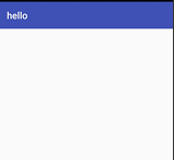
此时的效果

上述图片中的文字是在:AndroidManifest.xml文件中

使用android:label进行设置显示的内容
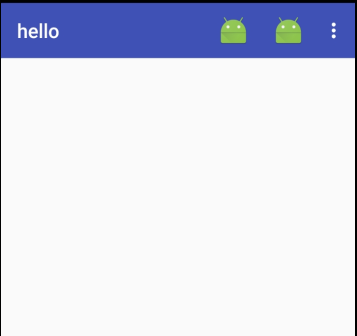
添菜单:
<?xml version="1.0" encoding="utf-8"?>

<menu xmlns:android="http://schemas.android.com/apk/res/android"

    xmlns:app="http://schemas.android.com/apk/res-auto">

    <item android:id="@+id/Back"

        android:title="返回"

        android:icon="@mipmap/ic_launcher"

        app:showAsAction="always"/>

    <item android:id="@+id/delete"

        android:title="删除"

        android:icon="@mipmap/ic_launcher"

        app:showAsAction="ifRoom"/>

    <item android:id="@+id/setting"

        android:title="设置"

        android:icon="@mipmap/ic_launcher"

        app:showAsAction="never"/>

</menu>
使用<item>标签来定义action按钮
app:showAsAction用于指定按钮的显位置可选值:
1、always:表示永远现在再Toolbar中,屏幕不够则不显式
2、ifRoom:表示再屏幕控件足够的情况下再Toolbar中显示,不够的话显示再菜单单中
3、never:永远显示再菜单选项当中
Toolbar中的action值会显示图标,菜单中只显示文件
MainActivity
   @Override

    public boolean onCreateOptionsMenu(Menu menu) {

        getMenuInflater().inflate(R.menu.toolbar,menu);

        return true;

    }

    @Override

    public boolean onOptionsItemSelected(MenuItem item) {

        switch (item.getItemId()){

            case R.id.Back:

                Toast.makeText(this,"Back",Toast.LENGTH_LONG).show();

                break;

            case R.id.delete:

                Toast.makeText(this,"delete",Toast.LENGTH_LONG).show();

                break;

            case R.id.setting:

                Toast.makeText(this,"setting",Toast.LENGTH_LONG).show();

                break;

            default:

                break;

        }

        return true;

    }
效果:
9.3、滑动菜单
是MaterialDesign中常见效果之一
9.3.1、DraweLayout

DrawerLayout是一个布局
再布局中允许放入两个直接控件
第一个控件就是主屏幕显示的内容
第二个控件就是滑动菜单中显示的内容
<?xml version="1.0" encoding="utf-8"?>
<android.support.v4.widget.DrawerLayout
xmlns:android="http://schemas.android.com/apk/res/android"
xmlns:app="http://schemas.android.com/apk/res-auto"
android:id="@+id/drawe_layout"
android:layout_width="match_parent"
android:layout_height="match_parent"> <FrameLayout
android:layout_width="match_parent"
android:layout_height="match_parent"> <android.support.v7.widget.Toolbar
android:id="@+id/toolbar"
android:layout_width="match_parent"
android:background="?attr/colorPrimary"
android:theme="@style/ThemeOverlay.AppCompat.Dark.ActionBar"
android:layout_height="?attr/actionBarSize"
app:popupTheme="@style/Theme.AppCompat.Light"
/> </FrameLayout> <LinearLayout
android:id="@+id/left_drawer_layout"
android:layout_width="match_parent"
android:layout_height="match_parent"
android:layout_gravity="start"
android:background="#FFFFFF">
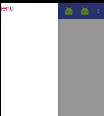
<TextView
android:layout_width="match_parent"
android:layout_height="match_parent"
android:text="This is menu"
android:textSize="25sp"
android:textColor="#dd033d"/>
</LinearLayout> </android.support.v4.widget.DrawerLayout>
DrawerLayout由support-v4库提供
第一个子控件式FrameLayout,用于再主屏幕显示内容
第二个子控件是LinearLayout,用于作为滑动显示内容
第二个控件注意:
layout_gravity这个属性是必须指定的
因为需要告诉DrawerLayout滑动菜单是在屏幕的左边还是右边
指定right再右边,指定start,系统会进行判断,系统语言是从左往右(英语,汉语等)滑动菜单再左边
系统语言是从右往左的(阿拉伯)滑动菜单就在右边
然后向左滑动菜单
或者点击一个菜单之外的区域,滑动菜单就会关闭
从而回到主界面
无论隐藏菜单还是滑动菜单都有很流畅的动画过度
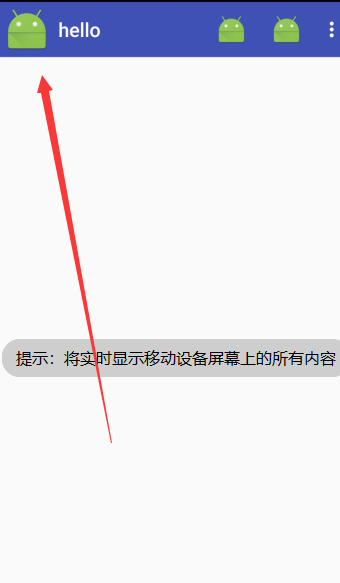
现在只有在屏幕的左侧边缘向右滑动才能显示滑动菜单
在没有提示的情况下,用户很难知道这个功能是如何实现的
Material Design建议在Toolbar的最左边介入一个导航按钮
点击了按钮也将会滑动菜单的内容显示出来
这样等于提供两种方式给用户
public class MainActivity extends AppCompatActivity {

    private DrawerLayout mdrawerLayout;

    @Override

    protected void onCreate(Bundle savedInstanceState) {

        super.onCreate(savedInstanceState);

        setContentView(R.layout.action_main);

        Toolbar toolbar = (Toolbar) findViewById(R.id.toolbar);

        setSupportActionBar(toolbar );

        mdrawerLayout = (DrawerLayout) findViewById(R.id.drawe_layout);

        ActionBar actionBar = getSupportActionBar();

        if (actionBar != null){

            actionBar.setDisplayHomeAsUpEnabled(true);

            actionBar.setHomeAsUpIndicator(R.mipmap.ic_launcher);

        }

    }

    @Override

    public boolean onCreateOptionsMenu(Menu menu) {

        getMenuInflater().inflate(R.menu.toolbar,menu);

        return true;

    }

    @Override

    public boolean onOptionsItemSelected(MenuItem item) {

        switch (item.getItemId()){

            case android.R.id.home:

                mdrawerLayout.openDrawer(GravityCompat.START);

                break;

        ....

        }

        return true;

    }

}
首先得到了DrawerLayout的实例
然后调用getSupportActionBar()方法得到ActionBar的实例
虽然只能个ActionBar具的实现由Toolbar来完成
然后调用ActionBar的serDisplayHomeAsUpEnabled()方法来让导航按钮显示出来
调用setHomeAsUpIndicator()方法来设置一个导航按钮图标
实际上,Toolbar最左侧的这个按钮叫做HomeAsUp按钮,默认图标是一个箭头
含义是返回上一个图标
最后在onOptionsItemSelected()方法中对HomeAsUp按钮点击事件进行处理
HomeAsUp按钮的id永远都是android.R.id.home
在调用DrawerLayout的openDrawer()方法将滑动菜单显示出来
此时传入一个Gravity参数
保持和XNL中的数据一直传入GravityCompat.START
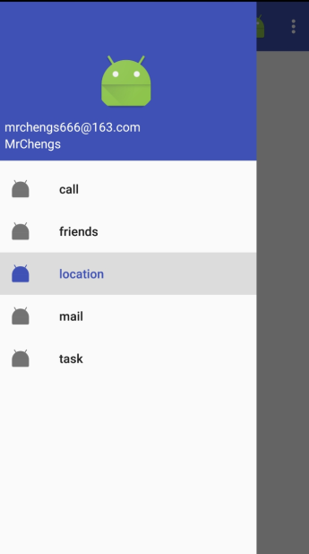
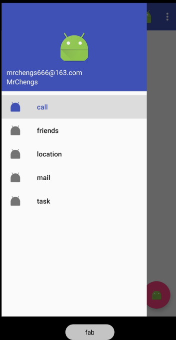
9.3.2、NavigationView

首先:
控件由Design Support库提供
需要引入库
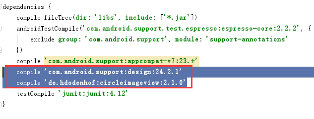
第一行是Design Supprot库
第二行是一个开源项目CircleImageView,可以轻松实现图片圆形化的功能
工程准备:menu、headerLayout
menu是在NavigationView中显示的具体菜单
headerLayout用来在NavigationLayout中显示头部布局的
nav_menu.xml
<?xml version="1.0" encoding="utf-8"?>

<menu

    xmlns:android="http://schemas.android.com/apk/res/android">

    <group android:checkableBehavior="single">

        <item

            android:title="call"

            android:id="@+id/nav_call"

            android:icon="@mipmap/ic_launcher"/>

        <item

            android:title="friends"

            android:id="@+id/nav_friends"

            android:icon="@mipmap/ic_launcher"/>

        <item

            android:title="location"

            android:id="@+id/nav_location"

            android:icon="@mipmap/ic_launcher"/>

        <item

            android:title="mail"

            android:id="@+id/nav_mail"

            android:icon="@mipmap/ic_launcher"/>

        <item

            android:title="task"

            android:id="@+id/nav_task"

            android:icon="@mipmap/ic_launcher"/>

    </group>

</menu>
使用<group>biaoqian
将group的checkableBehavior属性指定为single
标签表示一个组
single表示所有菜单的选项只能单选
nav_header.xml
<?xml version="1.0" encoding="utf-8"?>

<RelativeLayout

    xmlns:android="http://schemas.android.com/apk/res/android"

    android:layout_width="match_parent"

    android:layout_height="180dp"

    android:padding="10dp"

    android:background="?attr/colorPrimary">

    <de.hdodenhof.circleimageview.CircleImageView

        android:layout_width="70dp"

        android:layout_height="70dp"

        android:id="@+id/icon_image"

        android:src="@mipmap/ic_launcher"

        android:layout_centerInParent="true"

        />

    <TextView

        android:layout_alignParentBottom="true"

        android:id="@+id/username"

        android:textSize="14sp"

        android:textColor="#fff"

        android:text="MrChengs"

        android:layout_width="wrap_content"

        android:layout_height="wrap_content" />

    <TextView

        android:layout_above="@+id/username"

        android:id="@+id/mail"

        android:textSize="14sp"

        android:textColor="#fff"

        android:text="mrchengs666@163.com"

        android:layout_width="wrap_content"

        android:layout_height="wrap_content" />

</RelativeLayout>
实现头像、用户名、邮箱的显示
最外面使用RelativeLayout
将宽度设置为match_parent
高度设置为180dp
这是一个NavifationView适合的高度
然后指定背景色
CircleImageView是一个用于圆形化的控件
用法非常简单
和ImageView使用是完全一样的
指定一张图片作为头像
然后剧中显示
两个TextView分别用于显示用户名和邮箱地址
修改主界面的布局代码:
<?xml version="1.0" encoding="utf-8"?>

<android.support.v4.widget.DrawerLayout

    xmlns:android="http://schemas.android.com/apk/res/android"

    xmlns:app="http://schemas.android.com/apk/res-auto"

    android:id="@+id/drawe_layout"

    android:layout_width="match_parent"

    android:layout_height="match_parent">

            <FrameLayout

                android:layout_width="match_parent"

                android:layout_height="match_parent">

                <android.support.v7.widget.Toolbar

                    android:id="@+id/toolbar"

                    android:layout_width="match_parent"

                    android:background="?attr/colorPrimary"

                    android:theme="@style/ThemeOverlay.AppCompat.Dark.ActionBar"

                    android:layout_height="?attr/actionBarSize"

                    app:popupTheme="@style/Theme.AppCompat.Light"

                    />

            </FrameLayout>

    <LinearLayout

        android:layout_width="match_parent"

        android:layout_height="match_parent"

        android:layout_gravity="start">

            <android.support.design.widget.NavigationView

                android:id="@+id/nav_view"

                android:layout_width="match_parent"

                android:layout_height="match_parent"

                app:menu="@menu/nav_menu"

                app:headerLayout="@layout/nav_header"

                >

      </android.support.design.widget.NavigationView>

    </LinearLayout>

</android.support.v4.widget.DrawerLayout>
这里使用NavigationView
这样滑动菜单就变成了NavigationView
通过app:menu、app:headerLayout属性将menu和headerLayout设置进入
此时的NavigationView就定义完成
在MainActivity
在onCreate()方法中
 NavigationView navigationView = (NavigationView) findViewById(R.id.nav_view);

        navigationView.setCheckedItem(R.id.nav_call);

        navigationView.setNavigationItemSelectedListener(new NavigationView.OnNavigationItemSelectedListener() {

            @Override

            public boolean onNavigationItemSelected(@NonNull MenuItem item) {

                mdrawerLayout.closeDrawers();

                return true;

            }

        });
setCheckedItem()将call菜单项设置为默认选中
setNavigationItemSelectedListener()方法设置一个菜单选中事件的监听器
当用户点击菜单项中的监听器,就会回调onNavigationItemSelected()方法
此时掉哟给DrawerLayout的closeDrowers()方法将滑动菜单关闭
9.4、悬浮按钮和可交互提示
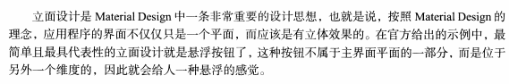
9.4.1、FloatingActionButton
是Design Support库提供的一个控件
可以帮助我们轻松的实现按钮悬浮效果
<?xml version="1.0" encoding="utf-8"?>

<android.support.v4.widget.DrawerLayout

    xmlns:android="http://schemas.android.com/apk/res/android"

    xmlns:app="http://schemas.android.com/apk/res-auto"

    android:id="@+id/drawe_layout"

    android:layout_width="match_parent"

    android:layout_height="match_parent">

            <FrameLayout

                android:layout_width="match_parent"

                android:layout_height="match_parent">

                <android.support.v7.widget.Toolbar

                    android:id="@+id/toolbar"

                    android:layout_width="match_parent"

                    android:background="?attr/colorPrimary"

                    android:theme="@style/ThemeOverlay.AppCompat.Dark.ActionBar"

                    android:layout_height="?attr/actionBarSize"

                    app:popupTheme="@style/Theme.AppCompat.Light"

                    />

                <android.support.design.widget.FloatingActionButton

                    android:layout_width="wrap_content"

                    android:layout_height="wrap_content"

                    android:layout_gravity="bottom|end"

                    android:layout_margin="16dp"

                    android:src="@mipmap/ic_launcher"

                    android:id="@+id/fab"

                    />

            </FrameLayout>

    <LinearLayout

        android:layout_width="match_parent"

        android:layout_height="match_parent"

        android:layout_gravity="start">

            <android.support.design.widget.NavigationView

                android:id="@+id/nav_view"

                android:layout_width="match_parent"

                android:layout_height="match_parent"

                app:menu="@menu/nav_menu"

                app:headerLayout="@layout/nav_header"

                >

      </android.support.design.widget.NavigationView>

    </LinearLayout>

</android.support.v4.widget.DrawerLayout>
悬浮球下方会有一点阴影
FloatingActionButton是在当前页面之上的
所以会有投影
使用app:elevation="8dp"指定悬浮高度
指定一个高度值,值越大投影范围越大,投影效果越淡
翻译亦然。
点击事件:
 FloatingActionButton fab = (FloatingActionButton) findViewById(R.id.fab);

        fab.setOnClickListener(new View.OnClickListener() {

            @Override

            public void onClick(View v) {

                Toast.makeText(MainActivity.this,"fab",Toast.LENGTH_LONG).show();

                mdrawerLayout.openDrawer(GravityCompat.START);

            }

        });
和普通按钮的使用方法一致
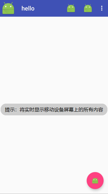
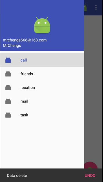
9.4.2、Snackbar
Snackbar不是Toast的替代品
两者之间有者不同的应用场景
Toast用于告诉用户现在发生了什么事情,同时用户只能被动接收这个事情,用户没办法进行选择
Snackbar允许在提示中加一个按钮,当用户点击的适合可以进行一些额外的操作
FloatingActionButton fab = (FloatingActionButton) findViewById(R.id.fab);
fab.setOnClickListener(new View.OnClickListener() {
@Override
public void onClick(View v) {
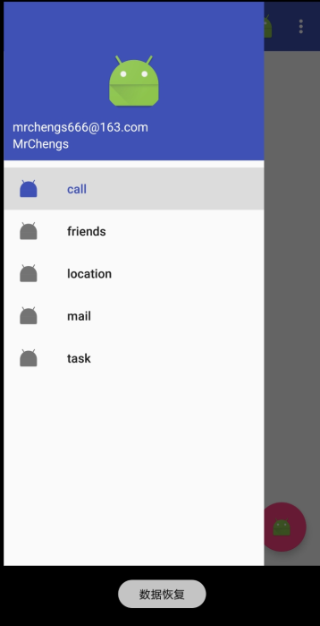
mdrawerLayout.openDrawer(GravityCompat.START); Snackbar.make(v,"Data delete ",Snackbar.LENGTH_SHORT)
.setAction("Undo", new View.OnClickListener() {
@Override
public void onClick(View v) {
Toast.makeText(MainActivity.this,"数据恢复",Toast.LENGTH_LONG).show();
}
}).show(); }
});
调用Snackerbar的make()方法来创建一个Snackbar对象
make()方法:
第一个参数是一个View,只需要当前页面布局的任意的一个View都可以
第二个参数是Snackbar中显示的内容
第三个参数是Snackbar的显示时长
setAction()方法来设置一个动作
让Snackbar不仅仅是一个提示,用于和用户进行交互
在点击事件中里面弹出一个Toast提示
最后调用show()方法让Snackbar显示出来
9.4.3、CoordinatorLayout
是一个加强版的FrameLayout
这个布局Design Support库提供的
普遍情况下与FrameLayout保持一致
还有一些其他的使用
CoordinatorLayout可以监听其所有子控件的各种事件
然后自动帮助我们做出最为合理的响应
实例:
Snackbar提示将悬浮窗按钮遮挡住了
如果能让CoordinatorLayout监听Snackbar的事件
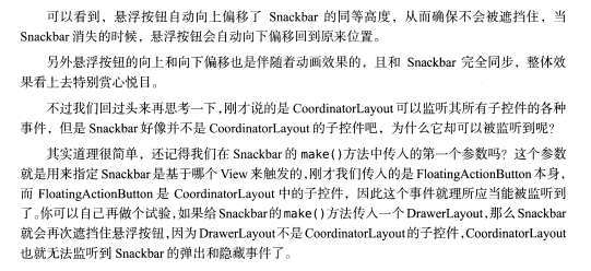
那么它会自动将内部的FloatingActionButton向上偏移
从而保证不会被Snackbar遮挡住
<?xml version="1.0" encoding="utf-8"?>

<android.support.v4.widget.DrawerLayout

    xmlns:android="http://schemas.android.com/apk/res/android"

    xmlns:app="http://schemas.android.com/apk/res-auto"

    android:id="@+id/drawe_layout"

    android:layout_width="match_parent"

    android:layout_height="match_parent">

    <android.support.design.widget.CoordinatorLayout

        android:layout_width="match_parent"

        android:layout_height="match_parent">

        <android.support.v7.widget.Toolbar

            android:id="@+id/toolbar"

            android:layout_width="match_parent"

            android:background="?attr/colorPrimary"

            android:theme="@style/ThemeOverlay.AppCompat.Dark.ActionBar"

            android:layout_height="?attr/actionBarSize"

            app:popupTheme="@style/Theme.AppCompat.Light"

            />

        <android.support.design.widget.FloatingActionButton

            android:layout_width="wrap_content"

            android:layout_height="wrap_content"

            android:layout_gravity="bottom|end"

            android:layout_margin="16dp"

            android:src="@mipmap/ic_launcher"

            android:id="@+id/fab"

            />

    </android.support.design.widget.CoordinatorLayout>

    <LinearLayout

        android:layout_width="match_parent"

        android:layout_height="match_parent"

        android:layout_gravity="start">

            <android.support.design.widget.NavigationView

                android:id="@+id/nav_view"

                android:layout_width="match_parent"

                android:layout_height="match_parent"

                app:menu="@menu/nav_menu"

                app:headerLayout="@layout/nav_header"

                >

    </android.support.design.widget.NavigationView>

    </LinearLayout>

</android.support.v4.widget.DrawerLayout>
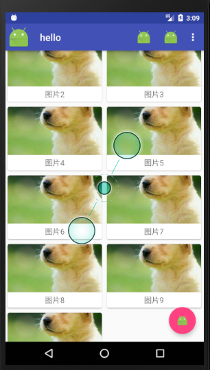
9.5、卡片式布局
此时的效果已经 比之前的实现更有显著的效果
此时页面上还有一块空白区域
通常用来防止应用的主题内容
可以使用一些图片来填充这部分区域
9.5.1、CradView
CradView用于实现卡片式布局效果的重要控件
由appcompat-v7提供
实际上也是FrameLayout,只是提供了圆角和阴影的等效果,看上去会有立体感
基本使用
在CradView布局中放置一个TextView,这个TextView就会显示在一张卡片之中了
需要引入依赖:
添加了一个Glide库依赖
是一个超级强大的 图片加载库
不仅可以用于加载本地图片还能加载网络图片、GIF甚至是本地时评等
用法非常简单
首先修改:
<?xml version="1.0" encoding="utf-8"?>

<android.support.v4.widget.DrawerLayout

    xmlns:android="http://schemas.android.com/apk/res/android"

    xmlns:app="http://schemas.android.com/apk/res-auto"

    android:id="@+id/drawe_layout"

    android:layout_width="match_parent"

    android:layout_height="match_parent">

    <android.support.design.widget.CoordinatorLayout

        android:layout_width="match_parent"

        android:layout_height="match_parent">

        <android.support.v7.widget.Toolbar

            android:id="@+id/toolbar"

            android:layout_width="match_parent"

            android:background="?attr/colorPrimary"

            android:theme="@style/ThemeOverlay.AppCompat.Dark.ActionBar"

            android:layout_height="?attr/actionBarSize"

            app:popupTheme="@style/Theme.AppCompat.Light"

            />

        //中间的空白页面

        <android.support.v7.widget.RecyclerView

            android:layout_width="match_parent"

            android:layout_height="match_parent"

            android:id="@+id/recycler_view"

            >

        </android.support.v7.widget.RecyclerView>

        <android.support.design.widget.FloatingActionButton

            android:layout_width="wrap_content"

            android:layout_height="wrap_content"

            android:layout_gravity="bottom|end"

            android:layout_margin="16dp"

            android:src="@mipmap/ic_launcher"

            android:id="@+id/fab"

            />

    </android.support.design.widget.CoordinatorLayout>

    <LinearLayout

        android:layout_width="match_parent"

        android:layout_height="match_parent"

        android:layout_gravity="start">

            <android.support.design.widget.NavigationView

                android:id="@+id/nav_view"

                android:layout_width="match_parent"

                android:layout_height="match_parent"

                app:menu="@menu/nav_menu"

                app:headerLayout="@layout/nav_header"

                >

    </android.support.design.widget.NavigationView>

    </LinearLayout>

</android.support.v4.widget.DrawerLayout>
添加一个RecyclerView
并且制定一个id
新建一个显示图片的实体类:
public class Images {

    private String name;

    private int imageId;

    public String getName() {

        return name;

    }

    public void setName(String name) {

        this.name = name;

    }

    public int getImageId() {

        return imageId;

    }

    public void setImageId(int imageId) {

        this.imageId = imageId;

    }

}
两个字段
name表示名字
id表示对应的图片id
新建一个布局文件用于显示Images

<?xml version="1.0" encoding="utf-8"?>

<android.support.v7.widget.CardView

    xmlns:android="http://schemas.android.com/apk/res/android"

    xmlns:app="http://schemas.android.com/apk/res-auto"

    android:layout_width="match_parent"

    android:layout_height="wrap_content"

    android:layout_margin="5dp"

    app:cardCornerRadius="4dp">

    <LinearLayout

        android:orientation="vertical"

        android:layout_width="match_parent"

        android:layout_height="wrap_content">

        <ImageView

            android:layout_width="wrap_content"

            android:layout_height="100dp"

            android:id="@+id/images_id"

            android:scaleType="centerCrop"

            />

        <TextView

            android:id="@+id/images_text"

            android:layout_gravity="center_horizontal"

            android:textSize="16sp"

            android:layout_margin="5dp"

            android:layout_width="wrap_content"

            android:layout_height="wrap_content" />

    </LinearLayout>

</android.support.v7.widget.CardView>
是哦用CradView来作为最外层布局
使得RecyclerView中的每个元素都是在卡片当中的
CardView由于是一个FrameLayout
因此没有什么方便的定位方式
这里在进行潜入一个LinearLayout中放置具体的内容
具体内容:
1、放置图片的ImageView
2、TextView用于放置是图片名字
新建一个适配器:
public class ImagesAdapter extends  RecyclerView.Adapter<ImagesAdapter.ViewHolder> {

    private Context mContext;

    private List<Images> mImagesList;

    public ImagesAdapter(List<Images> imagesList){

        mImagesList=imagesList;

    }

    @Override

    public ViewHolder onCreateViewHolder(ViewGroup parent, int viewType) {

        if (mContext == null){

            mContext=parent.getContext();

        }

        View view = LayoutInflater.from(mContext).inflate(R.layout.images_item,parent,false);

        return new ViewHolder(view);

    }

    @Override

    public void onBindViewHolder(ViewHolder holder, int position) {

        Images images = mImagesList.get(position);

        holder.textView.setText(images.getName());

        Glide.with(mContext).load(images.getImageId()).into(holder.imageView);

    }

    @Override

    public int getItemCount() {

        return mImagesList.size();

    }

    //内部类

    class ViewHolder extends RecyclerView.ViewHolder{

        CardView cardView;

        ImageView imageView;

        TextView textView;

        public ViewHolder(View itemView) {

            super(itemView);

            cardView = (CardView) itemView;

            imageView = (ImageView) itemView.findViewById(R.id.images_id);

            textView = (TextView) itemView.findViewById(R.id.images_text);

        }

    }

}
在MainActivity
package com.example.ccrr.material; import android.support.annotation.NonNull;
import android.support.design.widget.FloatingActionButton;
import android.support.design.widget.NavigationView;
import android.support.design.widget.Snackbar;
import android.support.v4.view.GravityCompat;
import android.support.v4.widget.DrawerLayout;
import android.support.v7.app.ActionBar;
import android.support.v7.app.AppCompatActivity;
import android.os.Bundle;
import android.support.v7.widget.GridLayoutManager;
import android.support.v7.widget.RecyclerView;
import android.support.v7.widget.Toolbar;
import android.util.Log;
import android.view.Menu;
import android.view.MenuItem;
import android.view.View;
import android.widget.Toast; import java.util.ArrayList;
import java.util.List; public class MainActivity extends AppCompatActivity { private DrawerLayout mdrawerLayout; private List<Images> imagesList = new ArrayList<>();
private ImagesAdapter imagesAdapter; private void init(){
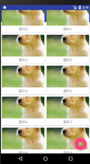
for (int i=0;i<=10;i++){
Images images = new Images();
images.setName("图片" + i);
images.setImageId(R.drawable.image);
imagesList.add(images);
}
} @Override
protected void onCreate(Bundle savedInstanceState) {
super.onCreate(savedInstanceState);
setContentView(R.layout.action_main);
...//卡片布局
init();
RecyclerView recyclerView = (RecyclerView) findViewById(R.id.recycler_view); GridLayoutManager layoutManager = new GridLayoutManager(this,2);
recyclerView.setLayoutManager(layoutManager);
imagesAdapter = new ImagesAdapter(imagesList);
recyclerView.setAdapter(imagesAdapter); }
...... }
此时有一个很严重的问题:
之前设置的Toolbar不见了
其实式被RecylerView遮挡住了
9.5.2、AppBarLayout
上述的测试中可以发现RecyclerLayout会把Toolbar遮挡住

解决方法:
使用位偏移是唯一的解决方法
即让RecylerView向下便宜一个Toolbar的高度
从而不会遮挡住Toolbar
项目中使用的不是简单的LinearLayout,使用的是CoordinatorLayout,会有更加简单的方法进行操纵
这里使用Design Support库中的另外一个工具---AppBarLayout
实际上是一个垂直方向上的LinearLayout
内部做了很多组件的封装
并且使用了一些Material Design的设计理念
<?xml version="1.0" encoding="utf-8"?>

<android.support.v4.widget.DrawerLayout

    xmlns:android="http://schemas.android.com/apk/res/android"

    xmlns:app="http://schemas.android.com/apk/res-auto"

    android:id="@+id/drawe_layout"

    android:layout_width="match_parent"

    android:layout_height="match_parent">

    <android.support.design.widget.CoordinatorLayout

        android:layout_width="match_parent"

        android:layout_height="match_parent">

        <android.support.design.widget.AppBarLayout

            android:layout_width="match_parent"

            android:layout_height="wrap_content">

            <android.support.v7.widget.Toolbar

                android:id="@+id/toolbar"

                android:layout_width="match_parent"

                android:background="?attr/colorPrimary"

                android:theme="@style/ThemeOverlay.AppCompat.Dark.ActionBar"

                android:layout_height="?attr/actionBarSize"

                app:popupTheme="@style/Theme.AppCompat.Light"

                />

        </android.support.design.widget.AppBarLayout>

        //中间的空白页面

        <android.support.v7.widget.RecyclerView

            android:layout_width="match_parent"

            android:layout_height="match_parent"

            android:id="@+id/recycler_view"

            app:layout_behavior="@string/appbar_scrolling_view_behavior"

            >

        </android.support.v7.widget.RecyclerView>

        <android.support.design.widget.FloatingActionButton

            android:layout_width="wrap_content"

            android:layout_height="wrap_content"

            android:layout_gravity="bottom|end"

            android:layout_margin="16dp"

            android:src="@mipmap/ic_launcher"

            android:id="@+id/fab"

            />

    </android.support.design.widget.CoordinatorLayout>

    <LinearLayout

        android:layout_width="match_parent"

        android:layout_height="match_parent"

        android:layout_gravity="start">

            <android.support.design.widget.NavigationView

                android:id="@+id/nav_view"

                android:layout_width="match_parent"

                android:layout_height="match_parent"

                app:menu="@menu/nav_menu"

                app:headerLayout="@layout/nav_header"

                >

      </android.support.design.widget.NavigationView>

    </LinearLayout>

</android.support.v4.widget.DrawerLayout>
首先定义一个AppBarLayout,并且将Toolbar放在在其中
然后再RecylerLayout中使用app:layout_beehavior属性
指定了一个布局的行为
其中appbar_scrolling_view_behavior这个字符串由Design support库支持的
此时完好的解决了遮挡问题
但是Material Design的设计里面并没有体现出来
实际上当RecylerView滚动的时候将事件通知给AppBarLayout
只是我们还没进行小狐狸
进一步优化
实现AppBarLayout的效果:
当AppBarLayout接收到滚动事件的时候
它内部的子控件其实是可以指定如何去影响这些事件的
通过app:layout_scrollFlags属性就能实现
<?xml version="1.0" encoding="utf-8"?>

<android.support.v4.widget.DrawerLayout

    xmlns:android="http://schemas.android.com/apk/res/android"

    xmlns:app="http://schemas.android.com/apk/res-auto"

    android:id="@+id/drawe_layout"

    android:layout_width="match_parent"

    android:layout_height="match_parent">

    <android.support.design.widget.CoordinatorLayout

        android:layout_width="match_parent"

        android:layout_height="match_parent">

        <android.support.design.widget.AppBarLayout

            android:layout_width="match_parent"

            android:layout_height="wrap_content">

            <android.support.v7.widget.Toolbar

                android:id="@+id/toolbar"

                android:layout_width="match_parent"

                android:background="?attr/colorPrimary"

                android:theme="@style/ThemeOverlay.AppCompat.Dark.ActionBar"

                android:layout_height="?attr/actionBarSize"

                app:popupTheme="@style/Theme.AppCompat.Light"

                app:layout_scrollFlags="scroll|enterAlways|snap"

                />

        </android.support.design.widget.AppBarLayout>

        //中间的空白页面

        <android.support.v7.widget.RecyclerView

            android:layout_width="match_parent"

            android:layout_height="match_parent"

            android:id="@+id/recycler_view"

            app:layout_behavior="@string/appbar_scrolling_view_behavior"

            >

        </android.support.v7.widget.RecyclerView>

        <android.support.design.widget.FloatingActionButton

            android:layout_width="wrap_content"

            android:layout_height="wrap_content"

            android:layout_gravity="bottom|end"

            android:layout_margin="16dp"

            android:src="@mipmap/ic_launcher"

            android:id="@+id/fab"

            />

    </android.support.design.widget.CoordinatorLayout>

    <LinearLayout

        android:layout_width="match_parent"

        android:layout_height="match_parent"

        android:layout_gravity="start">

            <android.support.design.widget.NavigationView

                android:id="@+id/nav_view"

                android:layout_width="match_parent"

                android:layout_height="match_parent"

                app:menu="@menu/nav_menu"

                app:headerLayout="@layout/nav_header"

                >

      </android.support.design.widget.NavigationView>

    </LinearLayout>

</android.support.v4.widget.DrawerLayout>
这里为Toolbbar添加一个app:layout_scrollFlags属性
并且指定了三个属性值
scroll:表示当RecylerView向上滚动的时候,Toolbar会跟着一起向上滚动实现隐藏
enterAlways:表示当RecylerView向下滚动的时候,Toolbar会跟着一起向下滚动的时候重现显示
snap:表示当当Toolbar还没有完全隐藏的时候或者还显示的时候,会根据当前滚动的距离,自动选择隐藏还是显示
随着RecylerView向上滚动,Toolbar会随着其一起滚动消失
随着RecyleView向下滚动,Toolbar又会重新出现
这事Material Design中的一个重要的设计思想
因为用户向上滚动的时候,其注意力肯定再RecyleView的内容上
这个时候如果Toolbar还占据着屏幕控件,就会在一定程度上影响用户的体验
将Toolbar隐藏可以让阅读体现出现
9.5、下拉刷新
下来刷新已经是一种常见的使用方式了
比如淘宝、快手等软件都可以实现下来进行刷新
谷歌为了让Android的下拉设计风范有一个统一的标准
于是再Material Design中规定了一个官方的设计规范
此时是拿来即用。
SwipeRefreshLayout就是实现用于下拉刷新的核心类
由support-v4提供的
将实现下来刷新的功能控件放置再SwipeRefershLayout中
就可以迅速让这个控件支持下来刷新
再xml文件中引入:
  //下拉刷新

        <android.support.v4.widget.SwipeRefreshLayout

            android:id="@+id/swipe_layout"

            android:layout_width="match_parent"

            android:layout_height="match_parent"

            app:layout_behavior="@string/appbar_scrolling_view_behavior"

            >

            //中间的空白页面

            <android.support.v7.widget.RecyclerView

                android:layout_width="match_parent"

                android:layout_height="match_parent"

                android:id="@+id/recycler_view"

                app:layout_behavior="@string/appbar_scrolling_view_behavior"

                >

            </android.support.v7.widget.RecyclerView>

        </android.support.v4.widget.SwipeRefreshLayout>
再RecylerView的外面嵌套了一层SwipeRefreshLayout
此时的Recyleriew
就拥有了下拉自动刷新的功能
由于RecylerView已经变成了SwipeRefreshLayout的子控件
因此可以使用app:layout_behavior声明布局行为现在也要移到SwipeRefreshLayout中
MainActivity
public class MainActivity extends AppCompatActivity {

    private DrawerLayout mdrawerLayout;

    private List<Images> imagesList = new ArrayList<>();

    private ImagesAdapter imagesAdapter;

    //下来刷新

    private SwipeRefreshLayout swipeRefreshLayout;

    private void init(){

        for (int i=;i<=;i++){

            Images images = new Images();

            images.setName("图片" + i);

            images.setImageId(R.drawable.image);

            imagesList.add(images);

        }

    }

    @Override

    protected void onCreate(Bundle savedInstanceState) {

        super.onCreate(savedInstanceState);

        setContentView(R.layout.action_main);

        Toolbar toolbar = (Toolbar) findViewById(R.id.toolbar);

        setSupportActionBar(toolbar );

        mdrawerLayout = (DrawerLayout) findViewById(R.id.drawe_layout);

        ActionBar actionBar = getSupportActionBar();

        if (actionBar != null){

            actionBar.setDisplayHomeAsUpEnabled(true);

            actionBar.setHomeAsUpIndicator(R.mipmap.ic_launcher);

        }

        NavigationView navigationView = (NavigationView) findViewById(R.id.nav_view);

        navigationView.setCheckedItem(R.id.nav_call);

        navigationView.setNavigationItemSelectedListener(new NavigationView.OnNavigationItemSelectedListener() {

            @Override

            public boolean onNavigationItemSelected(@NonNull MenuItem item) {

                mdrawerLayout.closeDrawers();

                return true;

            }

        });

        FloatingActionButton fab = (FloatingActionButton) findViewById(R.id.fab);

        fab.setOnClickListener(new View.OnClickListener() {

            @Override

            public void onClick(View v) {

                //Toast.makeText(MainActivity.this,"fab",Toast.LENGTH_LONG).show();

                mdrawerLayout.openDrawer(GravityCompat.START);

                Snackbar.make(v,"Data delete ",Snackbar.LENGTH_SHORT)

                        .setAction("Undo", new View.OnClickListener() {

                            @Override

                            public void onClick(View v) {

                                Toast.makeText(MainActivity.this,"数据恢复",Toast.LENGTH_LONG).show();

                            }

                        }).show();

            }

        });

        //卡片布局

        init();

        RecyclerView recyclerView = (RecyclerView) findViewById(R.id.recycler_view);

        GridLayoutManager layoutManager = new GridLayoutManager(this,);

        recyclerView.setLayoutManager(layoutManager);

        imagesAdapter = new ImagesAdapter(imagesList);

        recyclerView.setAdapter(imagesAdapter);

        //下拉刷新

        swipeRefreshLayout= (SwipeRefreshLayout) findViewById(R.id.swipe_layout);

        swipeRefreshLayout.setColorSchemeResources(R.color.colorPrimary);

        swipeRefreshLayout.setOnRefreshListener(new SwipeRefreshLayout.OnRefreshListener() {

            @Override

            public void onRefresh() {

                refreshImages();

            }

        });

    }

    private  void refreshImages(){

        new Thread(new Runnable() {

            @Override

            public void run() {

                try{

                    Thread.sleep(1000);

                }catch (Exception e){

                    e.printStackTrace();

                }

                runOnUiThread(new Runnable() {

                    @Override

                    public void run() {

                        for (int i=11;i<=25;i++){

                            Images images = new Images();

                            images.setName("图片" + i);

                            images.setImageId(R.drawable.image);

                            imagesList.add(images);

                        }

                        imagesAdapter.notifyDataSetChanged();;

                        swipeRefreshLayout.setRefreshing(false);

                    }

                });

            }

        }).start();

    }

    @Override

    public boolean onCreateOptionsMenu(Menu menu) {

        getMenuInflater().inflate(R.menu.toolbar,menu);

        return true;

    }

    @Override

    public boolean onOptionsItemSelected(MenuItem item) {

        switch (item.getItemId()){

            case android.R.id.home:

                Toast.makeText(this,"home",Toast.LENGTH_LONG).show();

                mdrawerLayout.openDrawer(GravityCompat.START);

                break;

            case R.id.Back:

                Toast.makeText(this,"Back",Toast.LENGTH_LONG).show();

                break;

            case R.id.delete:

                Toast.makeText(this,"delete",Toast.LENGTH_LONG).show();

                break;

            case R.id.setting:

                Toast.makeText(this,"setting",Toast.LENGTH_LONG).show();

                break;

            default:

                break;

        }

        return true;

    }

}
首先通过findViewById()方法拿到SwipeRefreshLayout的实例
调用setColorSchemeResources()方法来设置下拉进度条的颜色,这里使用主题中的colorPrimary作为进度条的颜色
在调用setOnRefreshListener()方法设置一个下来刷新器
当触发下拉操作就会回调这个监听器的onRefresh()方法,在这里处理具体的逻辑
通常情况下onRefresh()方法中应该是去网络上请求最新的数据
然后将这些数据展示出来
此时使用refreshImages()方法进行添加新的数据进行显示
首先开启开启一个线程,让线程沉睡两秒钟
因为刷新操作的速度非常快
沉睡之后
使用runOnUiThread()方法将线程切换到主线程
从而看不到刷新的过程
然后再产生的新的数据
接着调用ImagesAdapter方法的notifyDataSetChanged()方法通知数据发生了变化
最后调用SwipeRefreshLayout的setRefreshing()方法传入false,表示刷新事件结束,并且隐藏进度条
9.7、可折叠式标题栏
标题栏是使用Toolbar来编写的
看上去和传统的ActionBar其实没什么区别
只不过可以响应RecycleView的滚动事件进行隐藏和显示
而Material Design中并没有限定标题栏必须是什么样子的
事实上,可以根据自己的喜好随意定制标题栏的样式
需要借助CollapsingToolbarLayout这个工具
9.7.1、CoolapsingToolbarLayout
CollapsingToolbarLayout是一个作用于Toolbar基础之上的布局
由Design Support库提供的
CollaspingToolbarLayout可以让Toolbar的效果变得更加丰富
不仅仅展示一个标题栏,而是能够实现非常华丽的效果
不过CollaspingLayout是不能独立存在的
他在设计的时候就被限定只能作为AppBatLayout的直接子布局来使用
而AppBarLayout又必须是CorrdinatorLayout的子布局
.................................
9、Android---UI---Material Design的更多相关文章
- Android UI Material Design
Material Design 中文版: http://wiki.jikexueyuan.com/project/material-design/ Material Design开发文章系列1:App ...
- ANDROID L——Material Design详解(UI控件)
转载请注明本文出自大苞米的博客(http://blog.csdn.net/a396901990),谢谢支持! Android L: Google已经确认Android L就是Android Lolli ...
- ANDROID L——Material Design详细解释(UI控制)
转载请注明本文出自大苞米的博客(http://blog.csdn.net/a396901990),谢谢支持! Android L: Google已经确认Android L就是Android Lolli ...
- ANDROID L——Material Design综合应用(Demo)
转载请注明本文出自大苞米的博客(http://blog.csdn.net/a396901990),谢谢支持! Material Design: Material Design是Google推出的一个全 ...
- Material UI – Material Design CSS 框架
Material Design 是谷歌推出的全新的设计理念,采用大胆的色彩.流畅的动画播放,以及卡片式的简洁设计.Material Design 风格的设计拥有干净的排版和简单的布局,容易理解,内容才 ...
- [转]ANDROID L——Material Design详解(动画篇)
转载请注明本文出自大苞米的博客(http://blog.csdn.net/a396901990),谢谢支持! 转自:http://blog.csdn.net/a396901990/article/de ...
- ANDROID L——Material Design具体解释(动画篇)
转载请注明本文出自大苞米的博客(http://blog.csdn.net/a396901990),谢谢支持! Android L: Google已经确认Android L就是Android Lolli ...
- 十二、Android UI开发专题(转)
http://dev.10086.cn/cmdn/bbs/viewthread.php?tid=18736&page=1#pid89255Android UI开发专题(一) 之界面设计 近期很 ...
- Android实现Material Design风格的设置页面(滑动开关控件)
前言 本文链接 http://blog.csdn.net/never_cxb/article/details/50763271 转载请注明出处 參考了这篇文章 Material Design 风格的设 ...
- 4、Android UI测试
为你的APP进行UI测试是为了确保不出现意料之外的结果,提升用户的体验.如果你需要验证你的APP UI的正确性,你需要养成创建UI测试的习惯. Espresso测试框架是由Android Testin ...
随机推荐
- 悟空模式-java-单例模式
[那座山,正当顶上,有一块仙石.其石有三丈六尺五寸高,有二丈四尺围圆.三丈六尺五寸高,按周天三百六十五度:二丈四尺围圆,按政历二十四气.上有九窍八孔,按九宫八卦.四面更无树木遮阴,左右倒有芝兰相衬.盖 ...
- c#+arcAE对图层进行各种渲染操作
转载:http://blog.sina.com.cn/s/blog_6023833e0100t5t0.html using System;using System.Collections.Generi ...
- bzoj1061 NOI2018 志愿者招募——solution
Description 申奥成功后,布布经过不懈努力,终于成为奥组委下属公司人力资源部门的主管.布布刚上任就遇到了一个难 题:为即将启动的奥运新项目招募一批短期志愿者.经过估算,这个项目需要N 天才能 ...
- CSS中vertical-align的默认值baseline的理解
写在前面的话 在学校业余学习了一个月的CSS,人生中第一篇博客就献给CSS了,欢迎大家指正文章中不正确的地方,在此感谢.在尝试开始写博客的时候查了好多资料,原本以为写自己熟悉的知识的博客很容易,没想到 ...
- Spring Boot -01- 快速入门篇(图文教程)
Spring Boot -01- 快速入门篇(图文教程) 今天开始不断整理 Spring Boot 2.0 版本学习笔记,大家可以在博客看到我的笔记,然后大家想看视频课程也可以到[慕课网]手机 app ...
- Hive是读时模式
Hive处理的数据是大数据,在保存表数据时不对数据进行校验,而是在读数据时校验,不符合格式的数据设置为NULL: 读时模式的优点是,加载数据库快. 传统的数据库如mysql.oracle是写时模式,不 ...
- python中的字符串编码问题——3.各操作系统下的不同编码方式
各操作系统下的不同编码方式 先看一下 linux,python2.7 >>> B = b'\xc3\x84\xc3\xa8' >>> B.decode('utf- ...
- winform listbox增加鼠标双击事件
在Form.Designer.cs文件中对于listBox处理: listBox.MouseDoubleClick += new system.Windows.Forms.MouseEventHand ...
- 使用Babel和ES7创建JavaScript模块
[编者按]本文主要介绍通过 ES7 与 Babel 建立 JavaScript 模块.文章系国内 ITOM 管理平台 OneAPM 工程师编译呈现,以下为正文. 去年,新版的JavaScript发布了 ...
- 启用优酷html5播放器的办法
方法就是在浏览器中设置下sessionStorage window.sessionStorage.setItem("P_l_h5", true);