FCC---Create a More Complex Shape Using CSS and HTML---一个粉色爱心
One of the most popular shapes in the world is the heart shape, and in this challenge you'll create one using pure CSS.
But first, you need to understand the ::before and ::after pseudo-elements.
These pseudo-elements are used to add something before or after a selected element.
In the following example, a ::before pseudo-element is used to add a rectangle to an element with the class heart:
.heart::before {

  content: "";

  background-color: yellow;

  border-radius: %;

  position: absolute;

  height: 50px;

  width: 70px;

  top: -50px;

  left: 5px;

}
For the ::before and ::after pseudo-elements to function properly, they must have a defined content property.
This property is usually used to add things like a photo or text to the selected element. When the ::before and ::after pseudo-elements are used to make shapes, the content property is still required, but it's set to an empty string.
In the above example, the element with the class of heart has a ::before pseudo-element that produces a yellow rectangle with height and width of 50px and 70px, respectively.
This rectangle has round corners due to its 25% border radius and is positioned absolutely at 5px from the left and 50px above the top of the element.
练习题:
Transform the element on the screen to a heart. In the heart::after selector, change the background-color to pink and the border-radius to 50%.
Next, target the element with the class heart (just heart) and fill in the transform property. Use the rotate() function with -45 degrees.
Finally, in the heart::before selector, set its content property to an empty string.
练习代码:
 <style>

   .heart {

     position: absolute;

     margin: auto;

     top: ;

     right: ;

     bottom: ;

     left: ;

     background-color: pink;

     height: 50px;

     width: 50px;

     transform: rotate(-45deg);

   }

   .heart::after {

     background-color: pink;

     content: "";

     border-radius: %;

     position: absolute;

     width: 50px;

     height: 50px;

     top: 0px;

     left: 25px;

   }

   .heart::before {

     content: "";

     background-color: pink;

     border-radius: %;

     position: absolute;

     width: 50px;

     height: 50px;

     top: -25px;

     left: 0px;

   }

 </style>

 <div class="heart"></div>
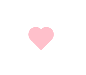
效果:
刚刚自己又抄写了一遍。
- 先做个粉色的方形
- 再做2个伪元素,调好边界半径,依次叠加出2个心型的圆屁股
FCC---Create a More Complex Shape Using CSS and HTML---一个粉色爱心的更多相关文章
- 怎样将多个CSS文件导入一个CSS文件中
问题: 在HTML中引入css的其中的两个方法: 导入式和链接式的目的都是将一个独立的css文件引入一个文件中,二者的区别不大,事实上,二者最大的区别在于链接式使用html的标记引入外部css文 ...
- 何使用CSS写出一个下拉菜单。
导航菜单是每个网站所必备的功能,也是每个学习制作网站的朋友所必须接触的,如何用css样式制作一个简单漂亮的二级下拉菜单呢? 下面为大家分享一下我的经验 方法步骤: 第一步 : 首页我们打开Subli ...
- 用HTML+CSS画出一个同心圆
参加web前端校招的同学们经常会遇到这样的面试题:用HTML+CSS画出一个同心圆. 例如: 这道题主要考验的是基础盒模型布局能力和倒圆角属性的巧用. 1.html代码 <body> &l ...
- div+css 怎么让一个小div在另一个大div里面 垂直居中
div+css 怎么让一个小div在另一个大div里面 垂直居中 方法1: 1 2 3 4 5 6 7 8 9 10 11 12 13 14 .parent { width:800 ...
- Css中实现一个盒子固定宽度,另一个盒子宽度自适应的方法
Css中实现一个盒子固定宽度,另一个盒子宽度自适应的方法 网上方法很多,个人认为以下两种思想是最为常用的. 一种是让第一个盒子脱离文档流,第二个盒子离左边有一定距离. 第二种方法是使用flex布局,不 ...
- 用css做出来一个三角形
用css做出来一个三角形 <!--不设置宽高 转换行内块 边线设置成宽度--> <div class="triangle"> 三角 ...
- No.6 - 利用 CSS animation 制作一个炫酷的 Slider
*{ margin:; padding:; } div{ margin: auto; width: 800px; height: 681px; position: relative; overflow ...
- 百度前端技术学院2018笔记 之 利用 CSS animation 制作一个炫酷的 Slider
前言 题目地址 利用 CSS animation 制作一个炫酷的 Slider 思路整理 首先页面包含三种东西 一个是type为radio的input其实就是单选框 二是每个单选框对应的label 三 ...
- HTML & CSS & JavaScript 从一个表格到一个灰阶颜色表(目录)
HTML & CSS & JavaScript 从一个表格到一个灰阶颜色表 01 HTML & CSS & JavaScript 从一个表格到一个灰阶颜色表 02 HT ...
随机推荐
- Spring Boot 2 快速教程:WebFlux 快速入门(二)
摘要: 原创出处 https://www.bysocket.com 「公众号:泥瓦匠BYSocket 」欢迎关注和转载,保留摘要,谢谢! 02:WebFlux 快速入门实践 文章工程: JDK 1.8 ...
- Python自动发送邮件--smtplib模块
import smtplib from email.mime.multipart import MIMEMultipart from email.mime.text import MIMEText f ...
- VUE项目中文件上传兼容IE9
项目使用VUE编写,UI是ElementUI,但是Element的Upload组件是不兼容IE9的.因为IE9中无法使用FormData. 查找资料基本有两种解决方法:1.引入JQuery和jQuer ...
- PEMDAS 操作順序
關於計算子 Operator 的操作順序,在"像計算機科學家一樣思考Python"這書 [1] 寫的明白扼要.它以 PEMDAS 這幾個簡單的英文字開頭表明: P (Parenth ...
- layui省市区三级联动城市选择
基于layui框架制作精美的省市区下拉框三级联动菜单选择, 支持三级联动城市选择,点击提交获取选中值代码. 示例图如下: 资源链接: https://pan.baidu.com/s/1s6l8iDBE ...
- docker改变默认存储路径到数据盘(自己实践)
一.首先将数据盘格式化分区并挂载(文章中提到的sdb(腾讯云)实践中是vdb(阿里云),文章中挂载在ssd目录下,实践中是挂载到data目录下的,后面安装docker部分以后是实践中的记录,上面数据盘 ...
- c# 获取sqlserver 运行脚本的print消息的方法分享
转自:http://www.maomao365.com/?p=6923 摘要: 在sql脚本的编写中,我们经常使用sql脚本print消息,作为输出测试, 通过获取print消息,我们可以快速获取程 ...
- CentOS7 忘记Root密码解决方法
1- 在启动grub菜单,选择编辑选项启动 2 - 按键盘e键,来进入编辑界面 3 - 找到Linux 16的那一行,将ro改为rw init=/sysroot/bin/sh 4 - 现在 ...
- 【转载】Spring学习(1)——快速入门--2019.05.19
原文地址:https://www.cnblogs.com/wmyskxz/p/8820371.html 认识 Spring 框架 Spring 框架是 Java 应用最广的框架,它的成功来源于理念 ...
- RabbitMQ学习笔记(六、RabbitMQ进阶)
目录: 性能 存储机制 内存及磁盘告警 性能: 影响RabbitMQ性能的因素有很多,主要的分为硬件性能与软件性能. )硬件性能:如网络.内存.CPU等等. )软件性能:消息持久化.消息确认.路由算法 ...