
CSS实现文本,DIV垂直居中
https://blog.csdn.net/linayangoo/article/details/88528774
1.水平居中
1.行内元素水平居中
- text-align:center;
利用text-align:center可以实现在块级元素内部的行内元素水平居中。此方法对inline,inline-block,inline-table,inline-flex元素水平居中都有效。
.parent{

		text-align:center;

}
- 1
- 2
- 3
此外,如果块级元素内部包着也是一个块级元素,我们可以先将其由块级元素变为行内块元素,再通过设置行内元素居中以达到水平居中。
<div class="parent">

  <div class="child">Demo</div>

</div>

<style>

  .parent{

    text-align:center;

  }

  .child {

    display: inline-block;

  }

</style>
- 1
- 2
- 3
- 4
- 5
- 6
- 7
- 8
- 9
- 10
- 11
2.块级元素的水平居中
- margin:0 auto ; (定宽)
- table+margin (不定宽)
- flex+margin(不定宽)
- absolute+transform:translateX(-50%);
- flex+justify-content:center;
- 将块级元素左右外边距margin:0 auto ; (定宽)
.child{

    width: 100px;//确保该块级元素定宽

    margin:0 auto;

}
- 1
- 2
- 3
- 4
- 使用 table+margin (不定宽)
先将子元素设置为块级表格来显示(类似),再将其设置水平居中
display:table在表现上类似block元素,但是宽度为内容宽。
<div class="parent">

  <div class="child">Demo</div>

</div>

<style>

  .child {

    display: table;

    margin: 0 auto;

  }

</style>
- 1
- 2
- 3
- 4
- 5
- 6
- 7
- 8
- 9
- 使用 flex+margin(不定宽)
通过flex将父容器设置为Flex布局,再设置子元素居中。
<div class="parent">

  <div class="child">Demo</div>

</div>

<style>

  .parent {

    display: flex;

  }

  .child {

    margin:0 auto;

  }

</style>
- 1
- 2
- 3
- 4
- 5
- 6
- 7
- 8
- 9
- 10
- 11
- 使用absolute+transform
先将父元素设置为相对定位,再将子元素设置为绝对定位,向右移动子元素,移动距离为父容器的一半,最后通过向左移动子元素的一半宽度以达到水平居中。
<div class="parent">

  <div class="child">Demo</div>

</div>

<style>

  .child {

    position:absolute;

    left:50%;

    transform:translateX(-50%);

  }

  .parent {

    position:relative;

  }

</style>
- 1
- 2
- 3
- 4
- 5
- 6
- 7
- 8
- 9
- 10
- 11
- 12
- 13
- 使用flex+justify-content
通过CSS3中的布局利器flex中的 justify-content:center;属性来达到水平居中。
<div class="parent">

  <div class="child">Demo</div>

</div>

<style>

  .parent {

    display: flex;

    justify-content:center;

  }

</style>
- 1
- 2
- 3
- 4
- 5
- 6
- 7
- 8
- 9
3.多级块元素水平居中
- display:flex; justify-content: center;
- inline-block; text-align:center;
- 利用flex
利用弹性布局(flex),实现水平居中,其中justify-content 用于设置弹性盒子元素在主轴(默认横轴)方向上的对齐方式,本例中设置子元素水平居中显示。
#container {

    display: flex;

    justify-content: center;

}
- 1
- 2
- 3
- 4
- 利用inline-block
.container {

   text-align: center;

}

.inline-block {

   display: inline-block;

}
- 1
- 2
- 3
- 4
- 5
- 6
4.浮动元素水平居中
- 子元素设置relative + 负margin (定宽)
- 父子容器都用相对定位 (不定宽)
- flex布局:通用方法(不管是定宽还是不定宽)
1.定宽的浮动元素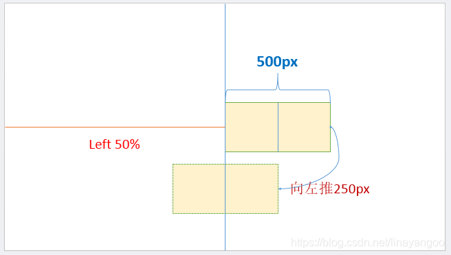
.child {

   position:relative;

   left:50%;

   margin-left:-250px;

}

<div class="parent">

  <span class="child" style="float: left;width: 500px;">我是要居中的浮动元素</span>

</div>
- 1
- 2
- 3
- 4
- 5
- 6
- 7
- 8
2.不定宽的浮动元素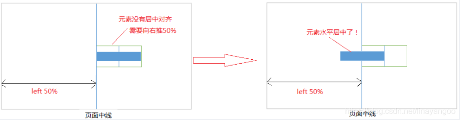
注意:要清除浮动,给外部元素加上float。这里的父元素就是外部元素
<div class="box">

    <p>我是浮动的</p>

    <p>我也是居中的</p>

</div>

.box{

    float:left;

    position:relative;

    left:50%;

}

p{

    float:left;

    position:relative;

    right:50%;

}
- 1
- 2
- 3
- 4
- 5
- 6
- 7
- 8
- 9
- 10
- 11
- 12
- 13
- 14
3.通用办法flex布局(不管是定宽还是不定宽)
.parent {

    display:flex;

    justify-content:center;

}

.chlid{

    float: left;

    width: 200px;//有无宽度不影响居中

}

<div class="parent">

  <span class="chlid">我是要居中的浮动元素</span>

</div>
- 1
- 2
- 3
- 4
- 5
- 6
- 7
- 8
- 9
- 10
- 11
5.绝对定位元素水平居中
这种方式非常独特,通过子元素绝对定位,外加margin: 0 auto来实现。
<div class="parent">

    <div class="child">让绝对定位的元素水平居中对齐。</div>

</div>

  .parent{

        position:relative;

    }

   .child{

         position: absolute; /*绝对定位*/

         width: 200px;

         height:100px;

         background: yellow;

         margin: 0 auto; /*水平居中*/

         left: 0; /*此处不能省略,且为0*/

         right: 0;/*此处不能省略,且为0*/

    }
- 1
- 2
- 3
- 4
- 5
- 6
- 7
- 8
- 9
- 10
- 11
- 12
- 13
- 14
- 15
垂直居中
- 单行内联元素垂直居中
line-height:设置为父元素高度
<div id="box">

     <span>单行内联元素垂直居中。</span>。

</div>

<style>

 #box {

    height: 120px;

    line-height: 120px;

    border: 2px dashed #f69c55;

    }

</style>
- 1
- 2
- 3
- 4
- 5
- 6
- 7
- 8
- 9
- 10
- 多行内联元素垂直居中
-利用flex布局 flex-direction: column; justify-content: center;
-利用表格布局 display: table-cell; vertical-align: middle;
<div class="parent">

    <p>Dance like nobody is watching, code like everybody is.

    Dance like nobody is watching, code like everybody is.

    Dance like nobody is watching, code like everybody is.</p>

</div>

<style>

    .parent {

        height: 140px;

        display: flex;

        flex-direction: column;

        justify-content: center;

        border: 2px dashed #f69c55;

    }

</style>
- 1
- 2
- 3
- 4
- 5
- 6
- 7
- 8
- 9
- 10
- 11
- 12
- 13
- 14
<div class="parent">

    <p class="child">The more technology you learn, the more you realize how little you know.

    The more technology you learn, the more you realize how little you know.

    The more technology you learn, the more you realize how little you know.</p>

</div>

 <style>

    .parent {

        display: table;

        height: 140px;

        border: 2px dashed #f69c55;

    }

    .child {

        display: table-cell;

        vertical-align: middle;

    }

</style>
- 1
- 2
- 3
- 4
- 5
- 6
- 7
- 8
- 9
- 10
- 11
- 12
- 13
- 14
- 15
- 16
- 块级元素垂直居中
- 使用 absolute+margin(定宽)
- absolute+transform (不定宽)
- flex+align-items
- table-cell+vertical-align
①使用absolute+负margin(已知高度宽度)
通过绝对定位元素距离顶部50%,并设置margin-top向上偏移元素高度的一半,就可以实现了。
<div class="parent">

    <div class="child">固定高度的块级元素垂直居中。</div>

</div>

.parent {

   position: relative;

}

.child {

   position: absolute;

   top: 50%;

   height: 100px;

   margin-top: -50px;

}
- 1
- 2
- 3
- 4
- 5
- 6
- 7
- 8
- 9
- 10
- 11
- 12
②使用absolute+transform
当垂直居中的元素的高度和宽度未知时,可以借助CSS3中的transform属性向Y轴反向偏移50%的方法实现垂直居中。但是部分浏览器存在兼容性的问题。
<div class="parent">

    <div class="child">未知高度的块级元素垂直居中。</div>

</div>

.parent {

   position: relative;

}

.child {

   position: absolute;

   top: 50%;

   transform: translateY(-50%);

}
- 1
- 2
- 3
- 4
- 5
- 6
- 7
- 8
- 9
- 10
- 11
③使用flex+align-items
通过设置flex布局中的属性align-items,使子元素垂直居中。
<div class="parent">

    <div class="child">未知高度的块级元素垂直居中。</div>

</div>

.parent {

    display:flex;

    align-items:center;

}
- 1
- 2
- 3
- 4
- 5
- 6
- 7
④使用table-cell+vertical-align
通过将父元素转化为一个表格单元格显示(类似 和 ),再通过设置 vertical-align属性,使表格单元格内容垂直居中。
<div class="parent">

  <div class="child">Demo</div>

</div>

<style>

  .parent {

    display: table-cell;

    vertical-align: middle;

  }

</style>
- 1
- 2
- 3
- 4
- 5
- 6
- 7
- 8
- 9
水平垂直居中
方法1.绝对定位与负边距实现(已知高度宽度)
// css部分

#container {

   position: relative;

}

#center {

   position: absolute;

   top: 50%;

   left: 50%;

   margin: -50px 0 0 -50px;

}
- 1
- 2
- 3
- 4
- 5
- 6
- 7
- 8
- 9
- 10
// html部分(这部分不做变化,下面例子直接共用)

<body>

  <div id='container'>

    <div id='center' style="width: 100px;height: 100px;background-color: #666">center</div>

  </div>

</body>
- 1
- 2
- 3
- 4
- 5
- 6
方法2:绝对定位与margin:auto(已知高度宽度)
这种方式无需知道被垂直居中元素的高和宽,但不能兼容低版本的IE浏览器。
#container {

   position: relative;

   height:100px;//必须有个高度

}

#center {

   position: absolute;

   top: 0;

   left: 0;

   right: 0;

   bottom: 0;

   margin: auto;//注意此处的写法

}
- 1
- 2
- 3
- 4
- 5
- 6
- 7
- 8
- 9
- 10
- 11
- 12
方法3:绝对定位+CSS3(未知元素的高宽)
利用Css3的transform,可以轻松的在未知元素的高宽的情况下实现元素的垂直居中。
CSS3的transform固然好用,但在项目的实际运用中必须考虑兼容问题,大量的hack代码可能会导致得不偿失。
#container {

  position: relative;

}

#center {

  position: absolute;

  top: 50%;

  left: 50%;

  transform: translate(-50%, -50%);

}
- 1
- 2
- 3
- 4
- 5
- 6
- 7
- 8
- 9
方法4:flex布局
利用flex布局,其中justify-content 用于设置或检索弹性盒子元素在主轴(横轴)方向上的对齐方式;而align-items属性定义flex子项在flex容器的当前行的侧轴(纵轴)方向上的对齐方式。不能兼容低版本的IE浏览器。
#container {//直接在父容器设置即可

   height: 100vh;//必须有高度

   display: flex;

   justify-content: center;

   align-items: center;

 }
- 1
- 2
- 3
- 4
- 5
- 6
方法5:flex/grid与margin:auto(最简单写法)
容器元素设为 flex 布局或是grid布局,子元素只要写 margin: auto 即可,不能兼容低版本的IE浏览器。
#container {

  height: 100vh;//必须有高度

  display: grid;

}

#center {

  margin: auto;

}
CSS实现文本,DIV垂直居中的更多相关文章
- CSS中设置DIV垂直居中的N种方法 兼容IE浏览器
在说到这个问题的时候,也许有人会问CSS中不是有vertical-align属性来设置垂直居中的吗?即使是某些浏览器不支持我只需做少许的CSS Hack技术就可以啊!所以在这里我还要啰嗦两句,CSS中 ...
- CSS中设置div垂直居中
在说到这个问题的时候,也许有人会问CSS中不是有vertical-align属性来设置垂直居中的吗?即使是某些浏览器不支持我只需做少许的CSS Hack技术就可以啊!所以在这里我还要啰嗦两句,CSS中 ...
- css 文本和div垂直居中方法汇总
https://blog.csdn.net/u014607184/article/details/51820508 https://blog.csdn.net/liuying1802028915/ar ...
- DIV+CSS如何让文字垂直居中?(转)
此篇文章转自网络,但是我忘了原文地址,如果有人知道,麻烦告知一声~ 在说到这个问题的时候,也许有人会问CSS中不是有vertical-align属性来设置垂直居中的吗?即使是某些浏览器不支持我只需做少 ...
- DIV+CSS如何让文字垂直居中?
在说到这个问题的时候,也许有人会问CSS中不是有vertical-align属性来设置垂直居中的吗?即使是某些浏览器不支持我只需做少许的CSS Hack技术就可以啊!所以在这里我还要啰嗦两句,CSS中 ...
- css 中 div垂直居中的方法
在说到这个问题的时候,也许有人会问CSS中不是有vertical-align属性来设置垂直居中的吗?即使是某些浏览器不支持我只需做少许的CSS Hack技术就可以啊!所以在这里我还要啰嗦两句,CSS中 ...
- div垂直居中 css div盒子上下垂直居中
div垂直居中 css div盒子上下垂直居中,让DIV盒子在任何浏览器中任何分辨率的显示屏浏览器中处于水平居中和上下垂直居中. div垂直居中常用于单个盒子,如一个页面里只有一个登录布局,使用div ...
- css的div垂直居中的方法,百分比div垂直居中
前言 我们都知道,固定高宽的div在网页中垂直居中很简单,相信大家也很容易的写出来,但是不是固定高宽的div如何垂直居中呢?我们在网页布局,特别是手机等web端网页经常是不固定高宽的div,那么这些d ...
- css中固定宽高div与不固定宽高div垂直居中的处理办法
固定高宽div垂直居中 如上图,固定高宽的很简单,写法如下: position: absolute; left: 50%; top: 50%; width:200px; height:100px; m ...
- CSS——div垂直居中及div内文字垂直居中
最近做demo时,经常需要div垂直居中或者让div内文字相对div垂直居中.水平居中比较简单,就不多说了,这里主要记录一下垂直居中的一些方法. 一.div垂直居中的一些方法: 1.当height.w ...
随机推荐
- javascript闭包的用处
谈及javascript的闭包,可能想到的就是内存泄露,慎用闭包,但是实际上闭包还有更多好的作用: 1,可以将for循环的变量封闭在闭包环境中,下面这种情况,无论点击1-5div,最终打印的都是5,因 ...
- Linux环境下安装MySQL 5.7.28
先进入MySQL官网: www.mysql.com 去下载安装包 进入DOWNLOADS选项,点击MySQL Community (GPL) Downloads. 点击进入MySQL Communit ...
- 关于QThread使用锁死的探索
在学习使用QT5的时候,发现要使用多线程处理多任务,按照https://www.cnblogs.com/liming19680104/p/10397052.html等很多网上的方法,测试一下,发现我写 ...
- iframe 框架父页面刷新子页面
1.父页面添加: <script> function testBtn(){ var reshSrc = document.getElementById('myFrame').src; ...
- python基础学习day03
基础数据类型总览 why:机器无法像人一样分编各种类型 int(数字) str(字符串)作用:存储少量信息. '12','我和你','qw' bool值 作用:判断真假 True False list ...
- 小程序中内容审核功能的使用(后台使用thinkPHP5.1)
本文包含文本和图片的检测 //接收要检测的文本内容并调用检测方法 public function textCheck(Request $request){ //内容安全识别 $data['conten ...
- Kafka 详解(转)
转载自:https://blog.csdn.net/lingbo229/article/details/80761778 Kafka Kafka是最初由Linkedin公司开发,是一个分布式.支持分区 ...
- Linux常用命令 - top命令详解(重点)
21篇测试必备的Linux常用命令,每天敲一篇,每次敲三遍,每月一循环,全都可记住!! https://www.cnblogs.com/poloyy/category/1672457.html top ...
- scrapy爬虫提取网页链接的两种方法以及构造HtmlResponse对象的方式
Response对象的几点说明: Response对象用来描述一个HTTP响应,Response只是一个基类,根据相应的不同有如下子类: TextResponse,HtmlResponse,XmlRe ...
- 强连通分量SCC 2-SAT
强连通分量SCC 2-SAT 部分资料来自: 1.https://blog.csdn.net/whereisherofrom/article/details/79417926 2.https://ba ...