一步一步构建手机WebApp开发——环境搭建篇
从2007年,乔布斯带来了第一代Iphone手机,整个移动互联网发生天翻地覆的变化,也同时证明了乔布斯的一句名言:“再一次改变世界”。
在当今的移动互联网,手机App居多,很多App对移动设备的要求也越来越高,当然,土豪就可以经常更新换代。我们这群屌丝只能望梅止渴。为了解决少部分由于硬件或者软件引起的问题,我们将App迁移到浏览器上,也就是人们常说的WebApp,WebApp相对与手机App客户端有以下优点:
1、免安装,一个浏览器就可以搞定。
2、不需要繁忙的迭代更新。
3、不需要担心存储不足无法安装。
4、时刻可以享受最新的功能。
5、轻量级App。
6、跨平台
7、...
废话少说,让我们直接进入WebApp构建教程
第一步:页面头部标签的申明
① 声明文档,在这里我们采用的是Html5的申明文档
<!DOCTYPE html>
② 禁止浏览器缩放
<meta name="viewport" content="width=device-width, initial-scale=1.0, minimum-scale=1.0, maximum-scale=1.0, user-scalable=no">
③ 设置浏览器编码类型
<meta http-equiv="Content-Type" content="text/html; charset=utf-8" />

<meta content="application/xhtml+xml;charset=UTF-8" http-equiv="Content-Type" />
④ 清除浏览器缓存
<meta http-equiv="pragma" content="no-cache">

<meta http-equiv="Cache-Control" content="no-cache, must-revalidate">

<meta http-equiv="expires" content="Wed, 26 Feb 1997 08:21:57 GMT">
⑤ iPhone 手机上设置手机号码不被显示为拨号链接
<meta content="telephone=no, address=no" name="format-detection" />
⑥ IOS私有属性,可以添加到主屏幕
<meta name="apple-mobile-web-app-capable" content="yes" />
⑦ IOS私有属性,网站开启对 web app 程序的支持
<meta name="apple-mobile-web-app-status-bar-style" content="black-translucent" />
对于上面的meta属性,有不了解的同志可以看看这篇文章:传送门
第二步:解决IE6~IE9对Html5和Css3的支持问题
① 让IE6~8支持CSS3伪类和属性选择器
<!--[if lte IE 8]>

        <script src="scripts/selectivizr.js"></script>

    <![endif]-->
② 让IE9以下的浏览器支持Html5标签和媒体查询器(主要用于响应式网站开发)
 <!--[if lt IE 9]>

        <script src="scripts/css3-mediaqueries.js"></script>

        <script src="scripts/html5shiv.js"></script>

    <![endif]-->
上面两步的具体代码:
<!DOCTYPE html>

<html xmlns="http://www.w3.org/1999/xhtml" id="test">

<head>

    <meta http-equiv="Content-Type" content="text/html; charset=utf-8" />

    <!--禁止浏览器缩放-->

    <meta name="viewport" content="width=device-width, initial-scale=1.0, minimum-scale=1.0, maximum-scale=1.0, user-scalable=no">

    <meta content="application/xhtml+xml;charset=UTF-8" http-equiv="Content-Type" />

    <!--清除浏览器缓存-->

    <meta http-equiv="pragma" content="no-cache">

    <meta http-equiv="Cache-Control" content="no-cache, must-revalidate">

    <meta http-equiv="expires" content="Wed, 26 Feb 1997 08:21:57 GMT">

    <!--iPhone 手机上设置手机号码不被显示为拨号链接)-->

    <meta content="telephone=no, address=no" name="format-detection" />

    <!--IOS私有属性,可以添加到主屏幕-->

    <meta name="apple-mobile-web-app-capable" content="yes" />

    <!--屏幕顶部条的颜色-->

    <meta name="apple-mobile-web-app-status-bar-style" content="black-translucent" />

    <title>手机webApp</title>

    <!--让IE8,IE9,支持Html5和Css3-->

    <!--[if lte IE 8]>

        <script src="scripts/selectivizr.js"></script>

    <![endif]-->

    <!--[if lt IE 9]>

        <script src="scripts/css3-mediaqueries.js"></script>

        <script src="scripts/html5shiv.js"></script>

    <![endif]-->

</head>
这样我们就部署好一个简单WebApp头部了
第三步:添加重置样式(reset.css)和解决手机WebApp字体和图片等标签问题
① 添加重置样式,主要为了解决浏览器部分标签在各大浏览器上显示的一致问题(reset.css)
html, body, div, span, applet, object, iframe, h1, h2, h3, h4, h5, h6, p, blockquote, pre, a, abbr, acronym, address, big, cite, code, del, dfn, em, font, img, ins, kbd, q, s, samp, small, strike, strong, sub, sup, tt, var, b, u, i, center, dl, dt, dd, ol, ul, li, fieldset, form, label, legend, table, caption, tbody, tfoot, thead, tr, th, td { margin: 0; padding: 0; border: 0; outline: 0; font-size: 100%; vertical-align: baseline; background: transparent; }

body { line-height: 1; }

ol, ul { list-style: none; }

blockquote, q { quotes: none; }

blockquote:before, blockquote:after, q:before, q:after { content: ''; content: none; }

/* remember to define focus styles! */

:focus { outline: 0; }

/* remember to highlight inserts somehow! */

ins { text-decoration: none; }

del { text-decoration: line-through; }

/* tables still need 'cellspacing="0"' in the markup */

table { border-collapse: collapse; border-spacing: 0; }
② 设置手机字体和部分标签样式问题(common.css)
/* 禁用iPhone中Safari的字号自动调整 */

html { -webkit-text-size-adjust: none; }

/* 设置HTML5元素为块 */

article, aside, details, figcaption, figure, footer, header, hgroup, menu, nav, section { display: block; }

/* 设置图片视频等自适应调整 */

img { max-width: 100%; height: auto; width: auto9; /* ie8 */ }

.video embed, .video object, .video iframe { width: 100%; height: auto; }
通过上面三个步骤,一个基本的手机WebApp框架就构建好了。
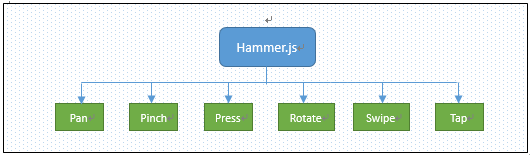
但是还缺点什么呢?那就是让手机支持触摸事件!在这里我推荐一个js插件,hammer.js。
相信大家对hammer.js还不够熟悉,为大家粗略介绍一下:
hammer.js是一款开源的移动端脚本框架,他可以完美的实现在移端开发的大多数事件,如:点击、滑动、拖动、多点触控等事件。不需要依赖任何其他的框架,并且整个框架非常小,在使用时非常简单。并且hammer.js的兼容性和拓展性非常好,hammer.js主要针对触屏的6大事件进行监听。如下图所示:
在这里我就不具体介绍:对于hammer.js的详细用法,请移步:hammer.js开发教程
第四步:为手机添加触屏插件:hammer.js
<script type="text/javascript" src="scripts/hammer.js"></script>
这样一个稍微完整的WebApp开发框架就搭配好了,详细代码:
HTML代码
<!DOCTYPE html>

<html xmlns="http://www.w3.org/1999/xhtml">

<head>

    <meta http-equiv="Content-Type" content="text/html; charset=utf-8" />

    <!--禁止浏览器缩放-->

    <meta name="viewport" content="width=device-width, initial-scale=1.0, minimum-scale=1.0, maximum-scale=1.0, user-scalable=no">

    <meta content="application/xhtml+xml;charset=UTF-8" http-equiv="Content-Type" />

    <!--清除浏览器缓存-->

    <meta http-equiv="pragma" content="no-cache">

    <meta http-equiv="Cache-Control" content="no-cache, must-revalidate">

    <meta http-equiv="expires" content="Wed, 26 Feb 1997 08:21:57 GMT">

    <!--iPhone 手机上设置手机号码不被显示为拨号链接)-->

    <meta content="telephone=no, address=no" name="format-detection" />

    <!--IOS私有属性,可以添加到主屏幕-->

    <meta name="apple-mobile-web-app-capable" content="yes" />

    <!--屏幕顶部条的颜色-->

    <meta name="apple-mobile-web-app-status-bar-style" content="black-translucent" />

    <title>手机webApp</title>

    <!-- 重置样式 -->

    <link type="text/css" href="css/reset.css" rel="stylesheet" />

    <!-- 主样式 -->

    <link type="text/css" href="css/common.css" rel="stylesheet" />

    <!-- Jquery库 -->

    <script type="text/javascript" src="scripts/jquery-1.11.1.min.js"></script>

    <!-- 手机触摸 -->

    <script type="text/javascript" src="scripts/hammer.js"></script>

    <!--让IE8,IE9,支持Html5和Css3-->

    <!--[if lte IE 8]>

        <script src="scripts/selectivizr.js"></script>

    <![endif]-->

    <!--[if lt IE 9]>

        <script src="scripts/css3-mediaqueries.js"></script>

        <script src="scripts/html5shiv.js"></script>

    <![endif]-->

</head>

<body>

</body>

</html>
Reset.css
html, body, div, span, applet, object, iframe, h1, h2, h3, h4, h5, h6, p, blockquote, pre, a, abbr, acronym, address, big, cite, code, del, dfn, em, font, img, ins, kbd, q, s, samp, small, strike, strong, sub, sup, tt, var, b, u, i, center, dl, dt, dd, ol, ul, li, fieldset, form, label, legend, table, caption, tbody, tfoot, thead, tr, th, td { margin: 0; padding: 0; border: 0; outline: 0; font-size: 100%; vertical-align: baseline; background: transparent; }

body { line-height: 1; }

ol, ul { list-style: none; }

blockquote, q { quotes: none; }

blockquote:before, blockquote:after, q:before, q:after { content: ''; content: none; }

/* remember to define focus styles! */

:focus { outline: 0; }

/* remember to highlight inserts somehow! */

ins { text-decoration: none; }

del { text-decoration: line-through; }

/* tables still need 'cellspacing="0"' in the markup */

table { border-collapse: collapse; border-spacing: 0; }
Common.css
/* 禁用iPhone中Safari的字号自动调整 */

html { -webkit-text-size-adjust: none; }

/* 设置HTML5元素为块 */

article, aside, details, figcaption, figure, footer, header, hgroup, menu, nav, section { display: block; }

/* 设置图片视频等自适应调整 */

img { max-width: 100%; height: auto; width: auto9; /* ie8 */ }

.video embed, .video object, .video iframe { width: 100%; height: auto; }

body { font: 14px/22px "Georgia", Helvetica, Arial, sans-serif; background: #fff; color: #595959; overflow-y: scroll; overflow-x: hidden; *overflow-y: auto !important; }

a { text-decoration: none; cursor: pointer; }

.Wrapper { width: 100%; padding: 0; margin: 0; }

li { list-style: none; }

a { text-decoration: none; color: #555756; }

a:hover { color: #141414; text-decoration: none; }

a img { border: none; }

a > img { vertical-align: bottom; }

.min-height { min-height: 0; height: auto; _height: 0; overflow: hidden; _overflow: visible; }

.position-absolute { position: absolute; }

.position-relative { position: relative; }

.overflow-hidden { overflow: hidden; }

/*

 * -----------------------------------------

 *  320 ~ 480

 * -----------------------------------------

 */

@media only screen and (min-width: 320px) and (max-width: 480px) {

}

/*

 * -----------------------------------------

 *  321 ~   宽大于321的设备

 * -----------------------------------------

 */

@media only screen and (min-width: 321px) {

}

/*

 * -----------------------------------------

 *  ~ 320  宽小于320的设备

 * -----------------------------------------

 */

@media only screen and (max-width: 320px) {

}

/*

 * -----------------------------------------

 *  ~ 480  宽小于480的设备

 * -----------------------------------------

 */

@media only screen and (max-width: 480px) {

}

/* medium screens (excludes iPad & iPhone) */

/*

 * -----------------------------------------

 * 481 ~ 767  宽大于480且小于767的iPad和iPhone

 * -----------------------------------------

 */

@media only screen and (min-width: 481px) and (max-width: 767px) {

}

/* ipads (portrait and landscape) */

/*

 * -----------------------------------------

 * 768 ~ 1024  宽大于480且小于1024的iPad和iPhone

 * -----------------------------------------

 */

@media only screen and (min-device-width: 768px) and (max-device-width: 1024px) {

}

/* ipads (landscape) */

/*

 * -----------------------------------------

 * 768 ~ 1024  宽大于480且小于1024的iPad和iPhone

 * -----------------------------------------

 */

@media only screen and (min-device-width: 768px) and (max-device-width: 1024px) and (orientation: landscape) {

}

/* ipads (portrait) */

/*

 * -----------------------------------------

 * 768 ~ 1024  宽大于480且小于1024的iPad和iPhone

 * -----------------------------------------

 */

@media only screen and (min-device-width: 768px) and (max-device-width: 1024px) and (orientation: portrait) {

}

/*

 * -----------------------------------------

 * 1444 ~ 1824  宽大于1444且小于1824的设备

 * -----------------------------------------

 */

@media only screen and (min-width: 1444px) and (max-width: 1824px) {

}

/*

 * -----------------------------------------

 * 1824 ~  宽大于1824的设备

 * -----------------------------------------

 */

@media only screen and (min-width: 1824px) {

}

/*

 * -----------------------------------------

 * 2224 ~  宽大于2224的设备

 * -----------------------------------------

 */

@media only screen and (min-width: 2224px) {

}

/* iphone 4 and high pixel ratio (1.5+) devices */

/*

 * -----------------------------------------

 * iphone4 ~

 * -----------------------------------------

 */

@media only screen and (-webkit-min-device-pixel-ratio : 1.5), only screen and (min-device-pixel-ratio : 1.5) {

}

/* iphone 4 and higher pixel ratio (2+) devices (retina) */

@media only screen and (-webkit-min-device-pixel-ratio: 2), only screen and (min-device-pixel-ratio: 2) {

}
框架搭建篇就此完毕,下一篇的教程为:实现手机滑动换屏特效及侧滑出菜单特效。
一步一步构建手机WebApp开发——环境搭建篇的更多相关文章
- 一步一步构建手机WebApp开发——页面布局篇
继上一篇:一步一步构建手机WebApp开发——环境搭建篇过后,我相信很多朋友都想看看实战案例,这一次的教程是页面布局篇,先上图: 如上图所示,此篇教程便是教初学者如何快速布局这样的页面.废话少说,直接 ...
- C++学习之开发环境搭建篇(一)
由于C++是一门非跨平台语言,其开发的程序编译生成的可执行文件,只能在相应的操作系统中被执行,离开此系统环境将无法执行. 主要原因是不同的操作系统,可执行文件的结构不同,最为常见的操作系统是有:MAC ...
- Android开发环境搭建篇详尽的教程实例汇
原文链接:http://android.eoe.cn/topic/android_sdk 一.android开发环境搭建图文教程整理篇: 1.Android开发环境搭建全程演示(jdk+eclip+a ...
- mac开发环境搭建篇(2)--brew与mysql
[brew]:参考 https://www.cnblogs.com/zoulifeng2017/p/7514139.html 安装brew: 终端执行:/usr/bin/ruby -e "$ ...
- 五步搞定Android开发环境部署——非常详细的Android开发环境搭建教程
在windows安装Android的开发环境不简单也说不上算复杂,本文写给第一次想在自己Windows上建立Android开发环境投入Android浪潮的朋友们,为了确保大家能顺利完成开发环境的搭 ...
- 使用Eclipse+Maven+Jetty构建Java Web开发环境(几个教程综合集成2014发行)
工作需要使用Jetty由于web集装箱,得知Eclipse+Maven+Jetty该组合是非常好的,因此,要在网上找了很多教程,但不写或多或少特定的或过时的内容而导致最终的配置失败,易于配置为未来的同 ...
- [.net 面向对象程序设计深入](5)MVC 6 —— 构建跨平台.NET开发环境(Windows/Mac OS X/Linux)
[.net 面向对象程序设计深入](5)MVC 6 —— 构建跨平台.NET开发环境(Windows/Mac OS X/Linux) 1.关于跨平台 上篇中介绍了MVC的发展历程,说到ASP.NET ...
- 为 Python Server Pages 和 Oracle 构建快速 Web 开发环境。
为 Python Server Pages 和 Oracle 构建快速 Web 开发环境. - 在水一方 - 博客频道 - CSDN.NET 为 Python Server Pages 和 Oracl ...
- 手机自动化测试:搭建appium手机自动化测试开发环境
手机自动化测试:搭建appium手机自动化测试开发环境 poptest是国内唯一一家培养测试开发工程师的培训机构,以学员能胜任自动化测试,性能测试,测试工具开发等工作为目标.如果对课程感兴趣,请大 ...
随机推荐
- iOS UI(布局)约束是什么?view1.attr1 = view2.attr2 * multiplier + constant
/* Create constraints explicitly. Constraints are of the form "view1.attr1 = view2.attr2 * mul ...
- 【洛谷5288】[HNOI2019] 多边形(二叉树模型)
点此看题面 大致题意: 给你一个多边形,用若干不重合.不相交的线段将其划分为若干三角形区域,并定义旋转操作\((a,c)\)为选定\(4\)个点\(a,b,c,d\)满足\(a<b<c&l ...
- 【题解】洛谷P1072 Hankson的趣味题 (gcd和lcm的应用)
洛谷P1072:https://www.luogu.org/problemnew/show/P1072 思路 gcd(x,a0)=a1 lcm(x,b0)=b1→b0*x=b1*gcd(x,b0) ( ...
- normal 普通身份 sysdba 系统管理员身份 sysoper 系统操作员身份 dba和sysdba
as sysdba 就是以sysdba登录,oracle登录身份有三种:normal 普通身份sysdba 系统管理员身份sysoper 系统操作员身份每种身份对应不同的权限 sysdba权限:●启动 ...
- SQL limit
employee 表 id name gender hire_date salary performance manage deparmant 1001 张三 男 2/12/1991 00:00:00 ...
- requireJs sass侧边栏
koala 下载 将sass编译为css文件 1 嵌套 2 $变量 3 @mixin 函数名(参数) 4 @include 函数 调用 5 @import "xxx" 引 ...
- sql树形查询
sql: 使用Common As:递归公用表 https://docs.microsoft.com/en-us/sql/t-sql/queries/with-common-table-expressi ...
- DataTables的相关问题集锦
1.修改头部问题,列表加载完重新修改表头内容 使用回调函数: headerCallback: function( thead, data, start, end, display ) { ...
- Oracle 数据导出注意事项
1.数据导出exp.expbd和imp.impbd 区别: exp,imp:既可以在客户端执行也可以在服务端执行,效率慢于expbd.impbd expbd.impbd:只能够在服务端执行,impbd ...
- poj_1306_Combinations
Computing the exact number of ways that N things can be taken M at a time can be a great challenge w ...