
【Flutter学习】之button按钮
一,概述
由于Flutter是跨平台的,所以有适用于Android和iOS的两种风格的组件。一套是Google极力推崇的Material,一套是iOS的Cupertino风格的组件。无论哪种风格,都是通用的。
二,Material与Cupertino风格比较
|
控件 |
Material |
Cupertino |
|---|---|---|
|
Button |
RaisedButton |
|
|
DatePick |
showDatePicker
|
CupertinoDatePicker |
从多年与设计师打交道来看,App更青睐于iOS,很多Android的App做的跟iOS一样一样的,就连设计个按钮图标啥的都是一样。
三,Material Style
RaisedButton(Material风格的按钮)
属性
RaisedButton({

    Key key,

  //点击按钮的回调出发事件

    @required VoidCallback onPressed,

  //水波纹高亮变化回调

    ValueChanged<bool> onHighlightChanged,

  //按钮的样式(文字颜色、按钮的最小大小,内边距以及shape)[ Used with [ButtonTheme] and [ButtonThemeData] to define a button's base

//colors, and the defaults for the button's minimum size, internal padding,and shape.]

    ButtonTextTheme textTheme,

    //文字颜色

    Color textColor,

    //按钮被禁用时的文字颜色

    Color disabledTextColor,

    //按钮的颜色

    Color color,

    //按钮被禁用时的颜色

    Color disabledColor,

    //按钮的水波纹亮起的颜色

    Color highlightColor,

    //水波纹的颜色

    Color splashColor,

    //按钮主题高亮

    Brightness colorBrightness,

    //按钮下面的阴影长度

    double elevation,

    //按钮高亮时的下面的阴影长度

    double highlightElevation,

    double disabledElevation,

    EdgeInsetsGeometry padding,

    ShapeBorder shape,

    Clip clipBehavior = Clip.none,

    MaterialTapTargetSize materialTapTargetSize,

    Duration animationDuration,

    Widget child,

  }
一张图了解RaisedButton
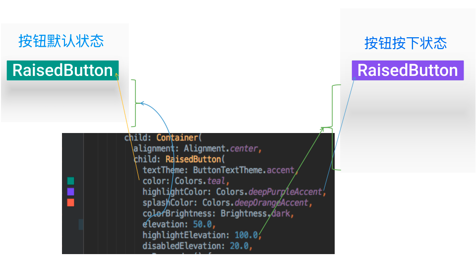
- 示例代码
RaisedButton(

            textTheme: ButtonTextTheme.accent,

            color: Colors.teal,

            highlightColor: Colors.deepPurpleAccent,

            splashColor: Colors.deepOrangeAccent,

            colorBrightness: Brightness.dark,

            elevation: 50.0,

            highlightElevation: 100.0,

            disabledElevation: 20.0,

            onPressed: () {

              //TODO

            },

            child: Text(

              'RaisedButton',

              style: TextStyle(color: Colors.white, fontSize: ),

            ),

          )
- 示例代码
FloatingActionButton(悬浮按钮)
- 属性
FloatingActionButton({

    Key key,

    //  按钮上的组件,可以是Text、icon, etc.

    this.child,

    //长按提示

    this.tooltip,

    // child的颜色(尽在child没有设置颜色时生效)

    this.foregroundColor,

    //背景色,也就是悬浮按键的颜色

    this.backgroundColor,

    this.heroTag = const _DefaultHeroTag(),

    //阴影长度

    this.elevation = 6.0,

    //高亮时阴影长度

    this.highlightElevation = 12.0,

    //按下事件回调

    @required this.onPressed,

    //是小图标还是大图标

    this.mini = false,

    //按钮的形状(例如:矩形Border,圆形图标CircleBorder)

    this.shape = const CircleBorder(),

    this.clipBehavior = Clip.none,

    this.materialTapTargetSize,

    this.isExtended = false,

  })
示例代码
FloatingActionButton(

      child: Icon(Icons.access_alarm),

      tooltip: "ToolTip",

      foregroundColor: Colors.white,

      backgroundColor: Colors.deepPurple,

      shape: const Border(),

      onPressed: () {

        //click callback

      },

    )
- 属性
- 效果
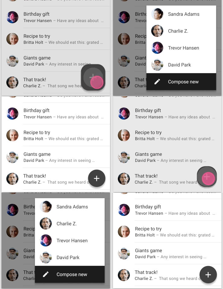

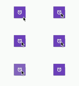
- 效果
FlatButton
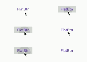
一个扁平的Material按钮,属性跟RaisedButton类似。
- 属性
FlatButton({

    Key key,

    @required VoidCallback onPressed,

    ValueChanged<bool> onHighlightChanged,

    ButtonTextTheme textTheme,

    Color textColor,

    Color disabledTextColor,

    Color color,

    Color disabledColor,

    Color highlightColor,

    Color splashColor,

    Brightness colorBrightness,

    EdgeInsetsGeometry padding,

    ShapeBorder shape,

    Clip clipBehavior = Clip.none,

    MaterialTapTargetSize materialTapTargetSize,

    @required Widget child,

  })
- 属性
示例代码FlatButton(
onPressed: () {},
child: Text(
"FlatBtn",
style: TextStyle(fontSize: , color: Colors.deepPurple),
));效果
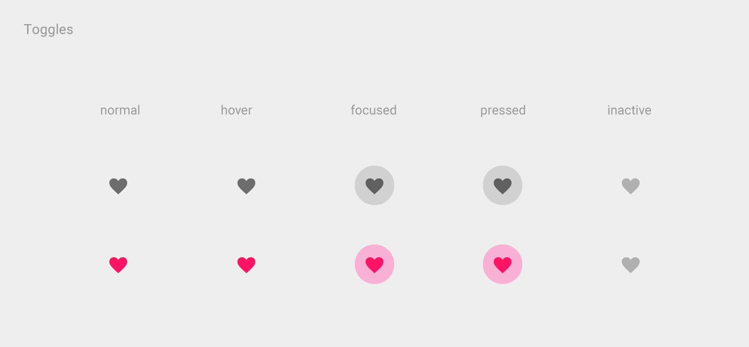
IconButton
图标按钮,按下时会产生水波纹效果。
- 属性
这几个属性跟前面讲的几个差不多,这里就不再讲了。 - 示例代码
IconButton({

    Key key,

    this.iconSize = 24.0,

    this.padding = const EdgeInsets.all(8.0),

    this.alignment = Alignment.center,

    @required this.icon,

    this.color,

    this.highlightColor,

    this.splashColor,

    this.disabledColor,

    @required this.onPressed,

    this.tooltip

  })
效果
- 属性
DropdownButton
Material Style 下拉菜单按钮
DropdownButton使用
DropdownButton({

Key key,

//要显示的列表

List<DropdownMenuItem<T>> @required this.items,

//下拉菜单选中的值(注意:在初始化时,要么为null,这时显示默认hint的值;

// 如果自己设定值,则值必须为列表中的一个值,如果不在列表中,会抛出异常)

T value,

//默认显示的值

Widget hint,

Widget disabledHint,

//选中时的回调

ValueChanged<T> @required this.onChanged,

this.elevation = ,

this.style,

this.iconSize = 24.0,

this.isDense = false,

this.isExpanded = false,

})
items使用方法
- 写法一
//返回城市列表,

List<DropdownMenuItem> _getItems() {

List<DropdownMenuItem> items = new List();

//value 表示DropdownButton.onChanged的返回值

items.add(DropdownMenuItem(child: Text("北京"), value: "BJ"));

items.add(DropdownMenuItem(child: Text("上海"), value: "SH"));

items.add(DropdownMenuItem(child: Text("广州"), value: "GZ"));

items.add(DropdownMenuItem(child: Text("深圳"), value: "SZ"));

return items;

}
写法二
//返回城市列表,

List<DropdownMenuItem<String>> _getCityList() {

var list = ["北京", "上海", "广州", "深圳"];

return list.map((item) => DropdownMenuItem(

value: item,

child: Text(item),

)).toList();

}
- 写法一
使用方法
由于我们在点击每一个条目后,展示的选中条目会变化,所以DropdownButton应当继承StatefulWidget,在选中条目后也就是onChange的回调中使用setState((){})更新对象的状态。
DropdownButton
class FlutterDropdownButtonStatefulWidget extends StatefulWidget {

@override

 State<StatefulWidget> createState() {

  return _DropdownState();

 }

}
_DropdownState
//下划线开头表示私有

class _DropdownState extends State<FlutterDropdownButtonStatefulWidget> {

// 下拉菜单选中的值(注意:在初始化时,要么为null,这时显示默认hint的值;

// 如果自己设定值,则值必须为列表中的一个值,如果不在列表中,会抛出异常)

String selectValue;

@override

Widget build(BuildContext context) {

 return DropdownButton(

  //要显示的条目

  items: _getItems(),

  //默认显示的值

  hint: Text("请选择城市"),

  //下拉菜单选中的值(注意:在初始化时,要么为null,这时显示默认hint的值;

  // 如果自己设定值,则值必须为列表中的一个值,如果不在列表中,会抛出异常)

  value: selectValue,

  onChanged: (itemValue) {//itemValue为选中的值

   print("itemValue=$itemValue");

   _onChanged(itemValue);

  },

 );

}

_onChanged(String value) {

  //更新对象的状态

  setState(() {

   selectValue = value;

  });

 }

}
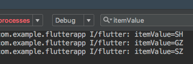
print log
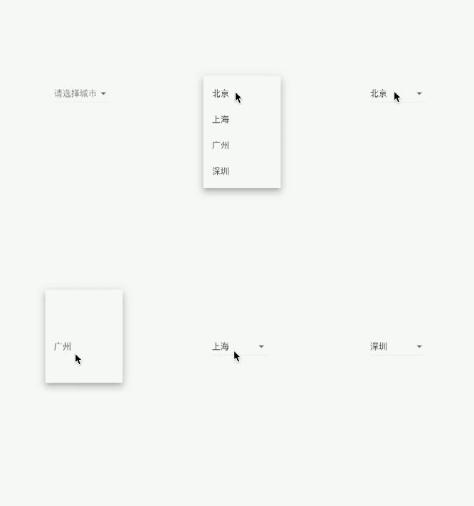
最终效果
PopupMenuButton
当菜单隐藏时,点击并且调用onSelected时显示一个弹出式菜单列表
- 属性
PopupMenuButton({

Key key,

//构建弹出式列表数据

PopupMenuItemBuilder<T> @required this.itemBuilder,

//初始值

T initialValue,

//选中时的回调

PopupMenuItemSelected<T> onSelected;,

//当未选中任何条目后弹窗消失时的回调

final PopupMenuCanceled onCanceled;,

//

this.tooltip,

//弹窗阴影高度

this.elevation = 8.0,

//边距

this.padding = const EdgeInsets.all(8.0),

//弹窗的位置显示的组件,默认为三个点...

this.child,

//跟child效果一致

this.icon,

//弹窗偏移位置

this.offset = Offset.zero,

}) - 示例demo
import 'package:flutter/material.dart';

class FlutterPopupMenuButton extends StatefulWidget {

@override

  State<StatefulWidget> createState() => _PopupMenuState();

}

const List<String> models = const <String>['白天模式', '护眼模式', '黑夜模式'];

class _PopupMenuState extends State<FlutterPopupMenuButton> {

String title = models[];

List<PopupMenuEntry<String>> _getItemBuilder() {

  return models.map((item) => PopupMenuItem<String>(

           child: Text(item),

           value: item,//value一定不能少

          )).toList();

         }

void _select(String value) {

  setState(() {

   title = value;

  });

}

@override

Widget build(BuildContext context) {

 return MaterialApp(

   home: Scaffold(

    appBar: AppBar(

    title: Text(title),

    actions: <Widget>[

      PopupMenuButton<String>(

        onSelected: _select,

        itemBuilder: (BuildContext context) {

          return _getItemBuilder();

        },

      )

    ],

   ),

  ),

 );

}

// List<PopupMenuEntry> _getItemBuilder() {

// List<PopupMenuEntry> list = List();

// list.add(PopupMenuItem(

//     child: Text("白天模式"),

//     value: "Day",

//    )
  );

// list.add(PopupMenuItem(

//      child: Text("黑夜模式"),

//      value: "Night",

//    )
  );

//   return list;

// }
} - 示例效果

- 属性
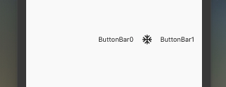
ButtonBar
水平排列的按钮组
属性
const ButtonBar({

Key key,

//子组件的间隔样式

this.alignment = MainAxisAlignment.end,

this.mainAxisSize = MainAxisSize.max,

//子children

this.children = const <Widget>[],

})
示例代码
class FlutterButtonBar extends StatelessWidget {

@override

Widget build(BuildContext context) {

  return ButtonBar(children: <Widget>[

    Text("ButtonBar0"),

    Icon(Icons.ac_unit),

    Text("ButtonBar1")

   ],
  );

 }

}- 效果
【Flutter学习】之button按钮的更多相关文章
- Android学习之Button按钮在程序运行时全部变大写的处理
问题: 在layout布局文件中,我们命名的按钮名称是“button1”,程序运行过后,在app上显示出来的是“BUTTON1”,先看源代码和效果: 按钮源代码: 运行效果: 解决办法: 方法一: 在 ...
- Android学习起步 - Button按钮及事件处理
按钮和文本框算是比较简单的控件了,以下主要讲按钮的事件响应,三种写法(匿名内部类响应事件.外部类响应事件.本类直接响应事件) 点击按钮后文本框中会显示 ”按钮被单击了”,先看效果: 以下是这个界面的布 ...
- Android学习笔记-Button(按钮)
Button是TextView的子类,所以TextView上很多属性也可以应用到Button 上!我们实际开发中对于Button的,无非是对按钮的几个状态做相应的操作,比如:按钮按下的时候 用一种颜色 ...
- Android 自定义Button按钮显示样式(正常、按下、获取焦点)
现在的用户对APP的外观看得很重要,如果APP内所有元件都用Android默认样式写,估计下面评论里就有一堆在骂UI丑的.今天学习自定义Button按钮样式.Button样式修改的是Button的背景 ...
- Flutter学习笔记(11)--文本组件、图标及按钮组件
如需转载,请注明出处:Flutter学习笔记(10)--容器组件.图片组件 文本组件 文本组件(text)负责显示文本和定义显示样式,下表为text常见属性 Text组件属性及描述 属性名 类型 默认 ...
- Flutter学习笔记(26)--返回拦截WillPopScope,实现1秒内点击两次返回按钮退出程序
如需转载,请注明出处:Flutter学习笔记(26)--返回拦截WillPopScope,实现1秒内点击两次返回按钮退出程序 在实际开发中,为了防止用户误触返回按钮导致程序退出,通常会设置为在1秒内连 ...
- Flutter学习笔记(5)--Dart运算符
如需转载,请注明出处:Flutter学习笔记(5)--Dart运算符 先给出一个Dart运算符表,接下来在逐个解释和使用.如下: 描述 ...
- Flutter学习笔记(13)--表单组件
如需转载,请注明出处:Flutter学习笔记(13)--表单组件 表单组件是个包含表单元素的区域,表单元素允许用户输入内容,比如:文本区域,下拉表单,单选框.复选框等,常见的应用场景有:登陆.注册.输 ...
- Flutter学习笔记(14)--StatefulWidget简单使用
如需转载,请注明出处:Flutter学习笔记(14)--StatefulWidget简单使用 今天上班没那么忙,突然想起来我好像没StatefulWidget(有状态组件)的demo,闲来无事,写一个 ...
- Flutter学习笔记(16)--Scaffold脚手架、AppBar组件、BottomNavigationBar组件
如需转载,请注明出处:Flutter学习笔记(15)--MaterialApp应用组件及routes路由详解 今天的内容是Scaffold脚手架.AppBar组件.BottomNavigationBa ...
随机推荐
- NuGet-Doc:NuGet.Server
ylbtech-NuGet-Doc:NuGet.Server 1.返回顶部 1. NuGet.Server 2018/03/13 NuGet.Server 是由 .NET Foundation 提供的 ...
- PostgreSQL 在视频、图片去重,图像搜索业务中的应用
摘要: PostgreSQL 在视频.图片去重,图像搜索业务中的应用作者digoal日期2016-11-26标签PostgreSQL , Haar wavelet , 图像搜索 , 图片去重 , 视频 ...
- idea中配置Resin运行环境
文章目录 背景 下载resin 配置idea 背景 为了能够读Resin的源码,只看源码看不到值,故想在idea中通过断点查看. 下载resin https://caucho.com/products ...
- sts测试流程
测试目的: 测试安全补丁打上了没 测试前提: 1.发货版本,user debug版本,相应安全补丁已合入,测试工具与安全补丁是对应的 2.selinux:Enable 3.连接ADB,stay awa ...
- jQuery基础--音乐视频操作
<!DOCTYPE html><html lang="en"><head> <meta charset="UTF-8" ...
- Mysql基础篇(笔记)
mysql数据库是由DB跟DBMS跟sql组成 DB 数据库仓库 DBMS 数据库管理系统 SQL 一门通用的数据库语言 数据库启动命令 : 关闭->net stop MySQL || 开启 ...
- 移动端web整理 移动端问题总结,移动web遇到的那些坑
meta基础知识 H5页面窗口自动调整到设备宽度,并禁止用户缩放页面 忽略将页面中的数字识别为电话号码 忽略Android平台中对邮箱地址的识别 当网站添加到主屏幕快速启动方式,可隐藏地址栏,仅针对i ...
- 如何写出没有 bug 的代码?
来源:www.cnblogs.com/sherrywasp/p/9262877.html 1947年9月9日,美国海军准将 Grace Hopper 在哈佛学院计算机实验室里使用 Mark II 和 ...
- [SOL] #148. 数字格子问题
说实话这题确实挺菜的... 废话少说,直接上代码^O^ Code: #include <bits/stdc++.h> using namespace std; inline int rea ...
- Codeforces - 1195D2 - Submarine in the Rybinsk Sea (hard edition) - 组合数学
https://codeforc.es/problemset/problem/1195/D2 很明显可以看出,任意一个长度为\(l_1\)的数串\(s_1\)和任意一个长度为\(l_2\)的数串\(s ...