WPF Slider滑动条的颜色修改
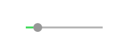
效果如下:
鄙人虽然开发WPF有些时间,但之前一直是一些简单Template和Style改改之类的工作,并没有深入研究过。此次为了完成工作,首先也是网上搜了半天,没有找到合适的代码直接拷贝(搜索能力待提高),干脆就直接静下心来琢磨琢磨。
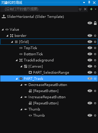
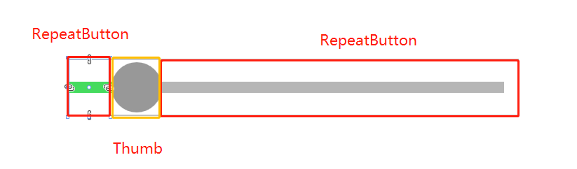
一开始在界面上就放了Slider,挠挠头,怎么修改Template才能达到效果呢?后来想到了Blend,之前一直听说很强大的界面设计工具,但是一直没有用过,就趁此机会就简单运用了一下。Blend中很牛逼的就是编辑模板,通过创建模板副本,可以看到Slider结构
       <Style x:Key="DecreaseBtn" TargetType="{x:Type RepeatButton}">

            <Setter Property="Template">

                <Setter.Value>

                    <ControlTemplate TargetType="{x:Type RepeatButton}">

                        <Border Background="{TemplateBinding Background}"

                                Height="{TemplateBinding Height}" Width="{TemplateBinding Width}">

                            <!--轨迹,设置Background-->

                            <Border Margin="0,0,-1,0" Background="{StaticResource SliderThumb.Track.DecreaseBackground}"

                                    VerticalAlignment="center" Height="4.0" />

                        </Border>

                    </ControlTemplate>

                </Setter.Value>

            </Setter>

        </Style>
完整代码(只是考虑水平的Slider):
  1 <ResourceDictionary xmlns="http://schemas.microsoft.com/winfx/2006/xaml/presentation"

  2                     xmlns:x="http://schemas.microsoft.com/winfx/2006/xaml">

  3

  4

  5     <SolidColorBrush x:Key="SliderThumb.Static.Foreground" Color="#FFE5E5E5"/>

  6     <SolidColorBrush x:Key="SliderThumb.MouseOver.Background" Color="Gray"/>

  7     <SolidColorBrush x:Key="SliderThumb.MouseOver.Border" Color="#FF7Eb4EA"/>

  8     <SolidColorBrush x:Key="SliderThumb.Pressed.Background" Color="Gray"/>

  9     <SolidColorBrush x:Key="SliderThumb.Pressed.Border" Color="Gray"/>

 10     <SolidColorBrush x:Key="SliderThumb.Disabled.Background" Color="#FFF0F0F0"/>

 11     <SolidColorBrush x:Key="SliderThumb.Disabled.Border" Color="#FFD9D9D9"/>

 12     <SolidColorBrush x:Key="SliderThumb.Static.Background" Color="#989898"/>

 13

 14     <ControlTemplate x:Key="SliderThumbHorizontalTop" TargetType="{x:Type Thumb}">

 15         <Grid HorizontalAlignment="Center" UseLayoutRounding="True" VerticalAlignment="Center">

 16             <Path x:Name="grip" Data="M 0,6 C0,6 5.5,0 5.5,0 5.5,0 11,6 11,6 11,6 11,18 11,18 11,18 0,18 0,18 0,18 0,6 0,6 z"

 17                   Fill="{StaticResource SliderThumb.Static.Background}"

 18                   Stretch="Fill" SnapsToDevicePixels="True"

 19                   Stroke="{Binding Path=Fill, RelativeSource={x:Static RelativeSource.Self}}" StrokeThickness="1" UseLayoutRounding="True" VerticalAlignment="Center"/>

 20         </Grid>

 21         <ControlTemplate.Triggers>

 22             <Trigger Property="IsMouseOver" Value="true">

 23                 <Setter Property="Fill" TargetName="grip" Value="{StaticResource SliderThumb.MouseOver.Background}"/>

 24                 <Setter Property="Stroke" TargetName="grip" Value="{StaticResource SliderThumb.MouseOver.Border}"/>

 25             </Trigger>

 26             <Trigger Property="IsDragging" Value="true">

 27                 <Setter Property="Fill" TargetName="grip" Value="{StaticResource SliderThumb.Pressed.Background}"/>

 28                 <Setter Property="Stroke" TargetName="grip" Value="{StaticResource SliderThumb.Pressed.Border}"/>

 29             </Trigger>

 30             <Trigger Property="IsEnabled" Value="false">

 31                 <Setter Property="Fill" TargetName="grip" Value="{StaticResource SliderThumb.Disabled.Background}"/>

 32                 <Setter Property="Stroke" TargetName="grip" Value="{StaticResource SliderThumb.Disabled.Border}"/>

 33             </Trigger>

 34         </ControlTemplate.Triggers>

 35     </ControlTemplate>

 36     <ControlTemplate x:Key="SliderThumbHorizontalBottom" TargetType="{x:Type Thumb}">

 37         <Grid HorizontalAlignment="Center" UseLayoutRounding="True" VerticalAlignment="Center">

 38             <Path x:Name="grip" Data="M 0,12 C0,12 5.5,18 5.5,18 5.5,18 11,12 11,12 11,12 11,0 11,0 11,0 0,0 0,0 0,0 0,12 0,12 z"

 39                   Fill="{StaticResource SliderThumb.Static.Background}"

 40                   Stretch="Fill"

 41                   SnapsToDevicePixels="True"

 42                   Stroke="{Binding Path=Fill, RelativeSource={x:Static RelativeSource.Self}}" StrokeThickness="1" UseLayoutRounding="True" VerticalAlignment="Center"/>

 43         </Grid>

 44         <ControlTemplate.Triggers>

 45             <Trigger Property="IsMouseOver" Value="true">

 46                 <Setter Property="Fill" TargetName="grip" Value="{StaticResource SliderThumb.MouseOver.Background}"/>

 47                 <Setter Property="Stroke" TargetName="grip" Value="{StaticResource SliderThumb.MouseOver.Border}"/>

 48             </Trigger>

 49             <Trigger Property="IsDragging" Value="true">

 50                 <Setter Property="Fill" TargetName="grip" Value="{StaticResource SliderThumb.Pressed.Background}"/>

 51                 <Setter Property="Stroke" TargetName="grip" Value="{StaticResource SliderThumb.Pressed.Border}"/>

 52             </Trigger>

 53             <Trigger Property="IsEnabled" Value="false">

 54                 <Setter Property="Fill" TargetName="grip" Value="{StaticResource SliderThumb.Disabled.Background}"/>

 55                 <Setter Property="Stroke" TargetName="grip" Value="{StaticResource SliderThumb.Disabled.Border}"/>

 56             </Trigger>

 57         </ControlTemplate.Triggers>

 58     </ControlTemplate>

 59     <SolidColorBrush x:Key="SliderThumb.Track.Background" Color="#b6b6b6"/>

 60     <SolidColorBrush x:Key="SliderThumb.Track.DecreaseBackground" Color="#45db5e"/>

 61     <Style x:Key="RepeatButtonTransparent" TargetType="{x:Type RepeatButton}">

 62         <Setter Property="OverridesDefaultStyle" Value="true"/>

 63         <Setter Property="Background" Value="Transparent"/>

 64         <Setter Property="Focusable" Value="false"/>

 65         <Setter Property="IsTabStop" Value="false"/>

 66     </Style>

 67

 68     <Style x:Key="DecreaseBtn" TargetType="{x:Type RepeatButton}" BasedOn="{StaticResource RepeatButtonTransparent}">

 69         <Setter Property="Template">

 70             <Setter.Value>

 71                 <ControlTemplate TargetType="{x:Type RepeatButton}">

 72                     <Border Background="{TemplateBinding Background}" Height="{TemplateBinding Height}" Width="{TemplateBinding Width}">

 73                         <Border Margin="1,0,-1,0" Background="{StaticResource SliderThumb.Track.DecreaseBackground}"

 74                                 VerticalAlignment="center" Height="4.0" />

 75                     </Border>

 76                 </ControlTemplate>

 77             </Setter.Value>

 78         </Setter>

 79     </Style>

 80

 81     <Style x:Key="IncreaseBtn" TargetType="{x:Type RepeatButton}" BasedOn="{StaticResource RepeatButtonTransparent}">

 82         <Setter Property="Template">

 83             <Setter.Value>

 84                 <ControlTemplate TargetType="{x:Type RepeatButton}">

 85                     <Border Background="{TemplateBinding Background}" Height="{TemplateBinding Height}" Width="{TemplateBinding Width}"/>

 86                 </ControlTemplate>

 87             </Setter.Value>

 88         </Setter>

 89     </Style>

 90

 91     <ControlTemplate x:Key="SliderThumbHorizontalDefault" TargetType="{x:Type Thumb}">

 92         <Grid HorizontalAlignment="Center" UseLayoutRounding="True" VerticalAlignment="Center">

 93             <Path x:Name="grip" Data="M0 512C0 229.230208 229.805588 0 512 0 794.769792 0 1024 229.805588 1024 512 1024 794.769792 794.194412 1024 512 1024 229.230208 1024 0 794.194412 0 512Z"

 94                       StrokeThickness="1" Fill="{StaticResource SliderThumb.Static.Background}" Stroke="{Binding Path=Fill, RelativeSource={x:Static RelativeSource.Self}}"

 95                       Width="18" Height="{Binding Path=Width, RelativeSource={x:Static RelativeSource.Self}}"

 96                       Stretch="Fill" SnapsToDevicePixels="True" UseLayoutRounding="True" VerticalAlignment="Center"/>

 97         </Grid>

 98         <ControlTemplate.Triggers>

 99             <Trigger Property="IsMouseOver" Value="true">

100                 <Setter Property="Fill" TargetName="grip" Value="{StaticResource SliderThumb.MouseOver.Background}"/>

101             </Trigger>

102             <Trigger Property="IsDragging" Value="true">

103                 <Setter Property="Fill" TargetName="grip" Value="{StaticResource SliderThumb.Pressed.Background}"/>

104                 <Setter Property="Stroke" TargetName="grip" Value="{StaticResource SliderThumb.Pressed.Border}"/>

105             </Trigger>

106             <Trigger Property="IsEnabled" Value="false">

107                 <Setter Property="Fill" TargetName="grip" Value="{StaticResource SliderThumb.Disabled.Background}"/>

108                 <Setter Property="Stroke" TargetName="grip" Value="{StaticResource SliderThumb.Disabled.Border}"/>

109             </Trigger>

110         </ControlTemplate.Triggers>

111     </ControlTemplate>

112

113     <ControlTemplate x:Key="SliderHorizontal" TargetType="{x:Type Slider}">

114         <Border x:Name="border" BorderBrush="{TemplateBinding BorderBrush}"

115                     BorderThickness="{TemplateBinding BorderThickness}" Background="{TemplateBinding Background}" SnapsToDevicePixels="True">

116             <Grid>

117                 <Grid.RowDefinitions>

118                     <RowDefinition Height="15"/>

119                     <RowDefinition Height="Auto" MinHeight="{TemplateBinding MinHeight}"/>

120                     <RowDefinition Height="15"/>

121                 </Grid.RowDefinitions>

122                 <TickBar x:Name="TopTick" Fill="{TemplateBinding Foreground}" Height="4" Margin="0,0,0,2" Placement="Top" Grid.Row="0"

123                              Visibility="Collapsed"/>

124                 <TickBar x:Name="BottomTick" Fill="{TemplateBinding Foreground}" Height="4" Margin="0,2,0,0" Placement="Bottom" Grid.Row="2"

125                              Visibility="Collapsed"/>

126

127                 <Border x:Name="TrackBackground" BorderBrush="{StaticResource SliderThumb.Track.Background}"

128                         BorderThickness="1" Background="{Binding Path=BorderBrush, RelativeSource={x:Static RelativeSource.Self}}"

129                         Height="4.0" Margin="5,0" Grid.Row="1" VerticalAlignment="center">

130                     <Canvas HorizontalAlignment="Stretch" Margin="0,-1">

131                         <Rectangle x:Name="PART_SelectionRange" Fill="{DynamicResource {x:Static SystemColors.HighlightBrushKey}}"

132                                    Height="{Binding Path=Height, ElementName=TrackBackground}" Visibility="Hidden"/>

133                     </Canvas>

134                 </Border>

135                 <Track x:Name="PART_Track" Grid.Row="1">

136                     <Track.DecreaseRepeatButton>

137                         <RepeatButton Command="{x:Static Slider.DecreaseLarge}" Style="{StaticResource DecreaseBtn}"/>

138                     </Track.DecreaseRepeatButton>

139                     <Track.IncreaseRepeatButton>

140                         <RepeatButton Command="{x:Static Slider.IncreaseLarge}" Style="{StaticResource IncreaseBtn}"/>

141                     </Track.IncreaseRepeatButton>

142                     <Track.Thumb>

143                         <Thumb x:Name="Thumb" Focusable="False" Height="20" OverridesDefaultStyle="True"

144                                Template="{StaticResource SliderThumbHorizontalDefault}" VerticalAlignment="Center"

145                                Width="{Binding Path=Height, RelativeSource={x:Static RelativeSource.Self}}"/>

146                     </Track.Thumb>

147                 </Track>

148             </Grid>

149         </Border>

150         <ControlTemplate.Triggers>

151             <Trigger Property="TickPlacement" Value="TopLeft">

152                 <Setter Property="Visibility" TargetName="TopTick" Value="Visible"/>

153                 <Setter Property="Template" TargetName="Thumb" Value="{StaticResource SliderThumbHorizontalTop}"/>

154                 <Setter Property="Margin" TargetName="TrackBackground" Value="5,2,5,0"/>

155             </Trigger>

156             <Trigger Property="TickPlacement" Value="BottomRight">

157                 <Setter Property="Visibility" TargetName="BottomTick" Value="Visible"/>

158                 <Setter Property="Template" TargetName="Thumb" Value="{StaticResource SliderThumbHorizontalBottom}"/>

159                 <Setter Property="Margin" TargetName="TrackBackground" Value="5,0,5,2"/>

160             </Trigger>

161             <Trigger Property="TickPlacement" Value="Both">

162                 <Setter Property="Visibility" TargetName="TopTick" Value="Visible"/>

163                 <Setter Property="Visibility" TargetName="BottomTick" Value="Visible"/>

164             </Trigger>

165             <Trigger Property="IsSelectionRangeEnabled" Value="true">

166                 <Setter Property="Visibility" TargetName="PART_SelectionRange" Value="Visible"/>

167             </Trigger>

168         </ControlTemplate.Triggers>

169     </ControlTemplate>

170

171     <Style x:Key="SliderStyle" TargetType="{x:Type Slider}">

172         <Setter Property="Stylus.IsPressAndHoldEnabled" Value="false"/>

173         <Setter Property="Background" Value="Transparent"/>

174         <Setter Property="BorderBrush" Value="Transparent"/>

175         <Setter Property="Template" Value="{StaticResource SliderHorizontal}"/>

176     </Style>

177 </ResourceDictionary>
其实最重要的还是控件的结构,只要对此很熟悉,做出理想的控件应该不难。
WPF Slider滑动条的颜色修改的更多相关文章
- 关于Unity中NGUI的Checkbox复选框、Slider滑动条和Button的6种触发回调事件的方式
Checkbox复选框 1.创建一个NGUI背景Sprite1节点 2.打开NGUI---->Open---->Prefab Toolbar---->选择一个复选框节点,拖拽到背景节 ...
- Slider( 滑动条) 组件
本节课重点了解 EasyUI 中 Slider(滑动条)组件的使用方法,这个组件依赖于Draggable(拖动)组件. 一. 加载方式//class 加载方式<input class=" ...
- 第二百二十节,jQuery EasyUI,Slider(滑动条)组件
jQuery EasyUI,Slider(滑动条)组件 学习要点: 1.加载方式 2.属性列表 3.事件列表 4.方法列表 本节课重点了解 EasyUI 中 Slider(滑动条)组件的使用方法,这个 ...
- Slider 滑动条效果
转载自:http://www.cnblogs.com/cloudgamer/archive/2008/12/24/Slider.html 这个滑动条(拖动条)效果,一开始是参考了BlueDestiny ...
- easyUI之slider滑动条框
<!DOCTYPE HTML PUBLIC "-//W3C//DTD HTML 4.01 Transitional//EN"> <html> <hea ...
- wpf slider进度条的样式模板,带有进度颜色显示
效果图: 仅仅需在前台加上这段代码就可以: <UserControl.Resources> <!--笔刷--> <LinearGradientBrush x:Key=&q ...
- Slider滑动条
Slider的Value Changed事件一般与Label结合让其显示数值 int mySlider = (int)sender.value; self.sliderLabel.text = [NS ...
- 利用OpenCV和MFC对话框建设一个有滑动条控制的播放器--转
(一)问题的提出: OpenCV有一个很简单的播放视频文件并加载滑动条的程序,但是如何用MFC对话框来创建一个有滑动条控制的播放器呢,网络上四处搜索都没有代码可以参考,下的都是些骗子链接文件,很过分, ...
- 实现滑动条与表单中的input中的value交互
最近在写一个考试系统的项目,遇到一些比较有意思的小知识,在这里分享给大家 下面是一个滑动条与input中的value值的交互,即滑动条的颜色会跟随给定input的value值实时变化,虽然表单中的ra ...
随机推荐
- ES开发的一些坑(一)
一.ES-Hadoop导数据的时候报"Could not write all entries"异常 ES-Hadoop是一个开源的数据导入项目,支持数据从hdfs,hive,sp ...
- linux上的工具或软件
1.下载软件 yum install axelaxel http://mirror.cse.iitk.ac.in/archlinux/iso/2015.04.01/archlinux-2015.04. ...
- springMVC学习 七 视图解析器
在springMVC中,如果不配置视图解析器,会走默认的视图解析器,但是有时候配置视图解析器,还有一定的作用 <bean id="viewResolver" class=&q ...
- unity在一个对象上挂多个一样的脚本怎么获取
使用GetComponents获取,存到一个该类的数组里
- ajax +jsp+iframe无刷新上传文件[转]
http://hi.baidu.com/zj360202/blog/item/f23e3711f929c774cb80c475.html ajax jsp 无刷新上传文件 2009-10-26 16: ...
- C++程序生成.exe文件,在文件夹中运行时闪现问题
问题描述:在IDE(此为Dev-C++)中编写C++程序,运行时会产生如下文字 但我想取消这三行的显示. 解决方法:1:在IDE中运行时,“请按任意键继续”是消失不掉的,但在该程序的保存路径下可以消灭 ...
- hdu-2795(线段树的简单应用)
题目链接:传送门 参考文章:https://blog.csdn.net/qiqi_skystar/article/details/50299743 题意:给出一个高h,宽w的方形画板,有高位1宽为wi ...
- 安装kafka 集群 步骤
1.下载 http://mirror.bit.edu.cn/apache/kafka/2.1.0/kafka_2.11-2.1.0.tgz 2.解压 tar -zxvf kafka_2.11-2.1 ...
- nullptr(c++11)
1.概念 用字面值常量nullptr来初始化或赋值来得到空指针 2.c++11之前使用NULL或0 1)NULL是一个宏定义(预处理变量),定义在cstdlib中,其值就是0:对于预处理变量,预处理器 ...
- MFC连接MySQL数据库方法
MFC连接数据库的三种方法: 1.ODBC(开放式数据互联) 2.OLEDB与ADO 3.用mysql为C语言提供的接口