关于H5页面在iPhoneX适配
1. iPhoneX的介绍
屏幕尺寸
我们熟知的iPhone系列开发尺寸概要如下:
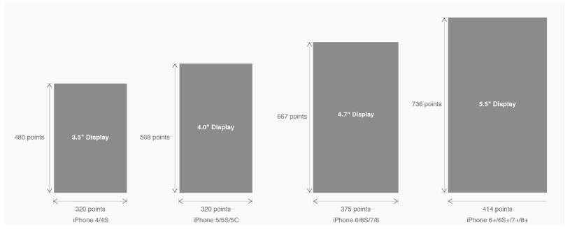
△ iPhone各机型的开发尺寸
转化成我们熟知的像素尺寸:

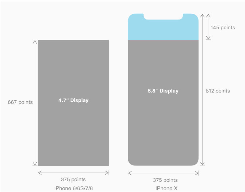
△ 每个机型的多维度尺寸
倍图其实就是像素尺寸和开发尺寸的倍率关系,但这只是外在的表现。倍图核心的影响因素在于PPI(DPI),了解屏幕密度与各尺寸的关系有助于我们深度理解倍率的概念:《基础知识学起来!为设计师量身打造的DPI指南》
iPhone8在本次升级中,屏幕尺寸和分辨率都遗传了iPhone6以后的优良传统;
然而iPhone X 无论是在屏幕尺寸、分辨率、甚至是形状上都发生了较大的改变,下面以iPhone 8作为参照物,看看到底iPhone X的适配我们要怎么考虑。
我们看看iPhone X尺寸上的变化:
2. iPhoneX的适配---安全区域(safe area)
苹果对于 iPhone X 的设计布局意见如下:
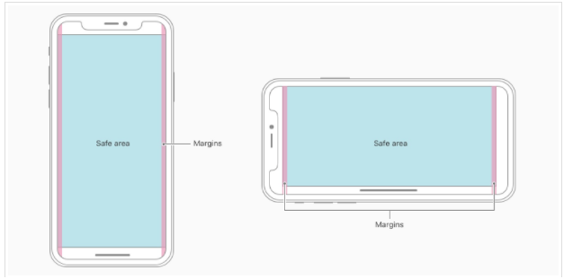

核心内容应该处于 Safe area 确保不会被设备圆角(corners),传感器外壳(sensor housing,齐刘海) 以及底部的 Home Indicator 遮挡。也就是说 我们设计显示的内容应该尽可能的在安全区域内;
3. iPhoneX的适配---适配方案viewport-fit
3.1 PhoneX的适配,在iOS 11中采用了viewport-fit的meta标签作为适配方案;viewport-fit的默认值是auto。
viewport-fit取值如下:
| auto | 默认:viewprot-fit:contain;页面内容显示在safe area内 |
| cover | viewport-fit:cover,页面内容充满屏幕 |
viewport-fit meta标签设置(cover时)
<meta name="viewport" content="width=device-width,initial-scale=1.0, minimum-scale=1.0, maximum-scale=1.0, user-scalable=no, viewport-fit=cover">
3.2 css constant()函数 与safe-area-inset-top & safe-area-inset-left & safe-area-inset-right & safe-area-inset-bottom的介绍
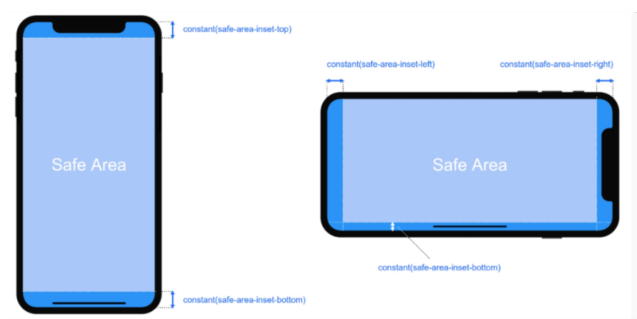

如上图所示 在iOS 11中的WebKit包含了一个新的CSS函数constant(),以及一组四个预定义的常量:safe-area-inset-left, safe-area-inset-right, safe-area-inset-top和 safe-area-inset-bottom。当合并一起使用时,允许样式引用每个方面的安全区域的大小。
3.1当我们设置viewport-fit:contain,也就是默认的时候时;设置safe-area-inset-left, safe-area-inset-right, safe-area-inset-top和 safe-area-inset-bottom等参数时不起作用的。
3.2当我们设置viewport-fit:cover时:设置如下
body {

    padding-top: constant(safe-area-inset-top);   //为导航栏+状态栏的高度 88px

    padding-left: constant(safe-area-inset-left);   //如果未竖屏时为0

    padding-right: constant(safe-area-inset-right); //如果未竖屏时为0

    padding-bottom: constant(safe-area-inset-bottom);//为底下圆弧的高度 34px

}
4. iPhoneX的适配---高度统计
viewport-fit:cover + 导航栏
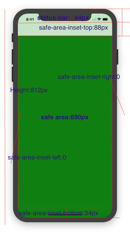

5.iPhoneX的适配---媒体查询
注意这里采用的是690px(safe area高度),不是812px;
        @media only screen and (width: 375px) and (height: 690px){

            body {

                background: blue;

            }

        }
6.iphoneX viewport-fit 问题总结
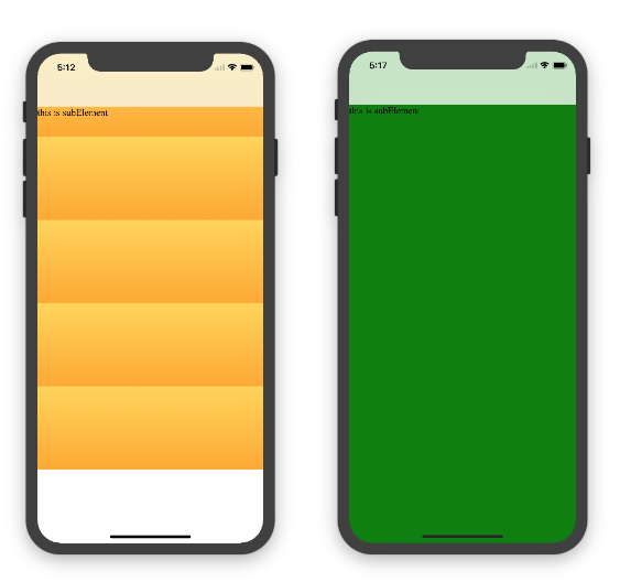
1.关于iphoneX 页面使用了渐变色时;如果viewport-fit:cover;
1.1在设置了背景色单色和渐变色的区别,如果是单色时会填充整个屏幕,如果设置了渐变色 那么只会更加子元素的高度去渲染;而且页面的高度只有690px高度,上面使用了padding-top:88px;
body固定为:
<body><div class="content">this is subElement</div></body>
1.单色时:
       * {

           padding:;

           margin:;

       }

       body {

           background:green;

           padding-top: constant(safe-area-inset-top); //88px

           /*padding-left: constant(safe-area-inset-left);*/

           /*padding-right: constant(safe-area-inset-right);*/

           /*padding-bottom: constant(safe-area-inset-bottom);*/

       }
2.渐变色
       * {

           padding:;

           margin:;

       }

       body {

           background:-webkit-gradient(linear, 0 0, 0 bottom, from(#ffd54f), to(#ffaa22));

           padding-top: constant(safe-area-inset-top); //88px

           /*padding-left: constant(safe-area-inset-left);*/

           /*padding-right: constant(safe-area-inset-right);*/

           /*padding-bottom: constant(safe-area-inset-bottom);*/

       }
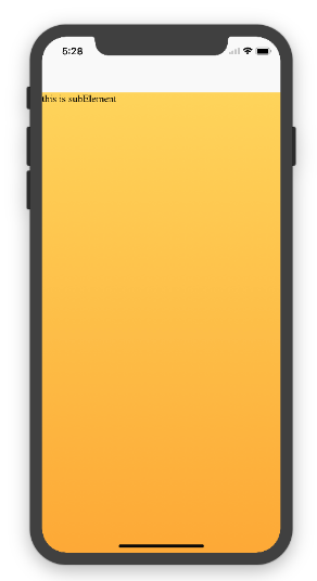
解决使用渐变色 仍旧填充整个屏幕的方法;CSS设置如下
<!DOCTYPE html>

<html>

<head>

   <meta name="viewport" content="initial-scale=1, viewport-fit=cover">

   <title>Designing Websites for iPhone X: Respecting the safe areas</title>

   <style>        * {

       padding: 0;

       margin: 0;

   }

   html, body {

       height: 100%;

   }

   body {

       padding-top: constant(safe-area-inset-top);

       padding-left: constant(safe-area-inset-left);

       padding-right: constant(safe-area-inset-right);

       padding-bottom: constant(safe-area-inset-bottom);

   }

   .content {

       background: -webkit-gradient(linear, 0 0, 0 bottom, from(#ffd54f), to(#ffaa22));

       width: 100%;

       height: 724px;

   }    </style>

</head>

<body>

<div class="content">this is subElement</div>

</body>

</html>
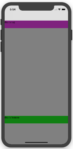
2.页面元素使用了固定定位的适配即:{position:fixed;}
2.1 子元素页面固定在底部时;使用viewport-fit:contain时;可以看到bottom:0时只会显示在安全区域内;

<!DOCTYPE html>

<html>

<head>

   <meta name="viewport" content="initial-scale=1">

   <!--<meta name="viewport" content="initial-scale=1, viewport-fit=cover">-->

   <title>Designing Websites for iPhone X: Respecting the safe areas</title>

   <style>

       * {

           padding: 0;

           margin: 0;

       }

       /*html,body {*/

           /*height: 100%;*/

       /*}*/

       body {

           background: grey;

           /*padding-top: constant(safe-area-inset-top);*/

           /*padding-left: constant(safe-area-inset-left);*/

           /*padding-right: constant(safe-area-inset-right);*/

           /*padding-bottom: constant(safe-area-inset-bottom);*/

       }

       .top {

           width: 100%;

           height: 44px;

           background: purple;

       }

       .bottom {

           position: fixed;

           bottom: 0;

           left: 0;

           right: 0;

           height: 44px;

           color: black;

           background: green;

       }

   </style>

</head>

<body>

   <div class="top">this is top</div>

   <div class="bottom">this is bottom</div>

</body>

</html>
2.1 子元素页面固定在底部时;使用viewport-fit:cover时;可以看到bottom:0时只会显示在安全区域内;
       * {

           padding: 0;

           margin: 0;

       }

       /*html,body {*/

           /*height: 100%;*/

       /*}*/

       body {

           background: grey;

           padding-top: constant(safe-area-inset-top);

           /*padding-left: constant(safe-area-inset-left);*/

           /*padding-right: constant(safe-area-inset-right);*/

           /*padding-bottom: constant(safe-area-inset-bottom);*/

       }

       .top {

           width: 100%;

           height: 44px;

           background: purple;

       }

       .bottom {

           position: fixed;

           bottom: 0;

           left: 0;

           right: 0;

           height: 44px;

           color: black;

           background: green;

       }
添加html,body {width:100%;heigth:100%}
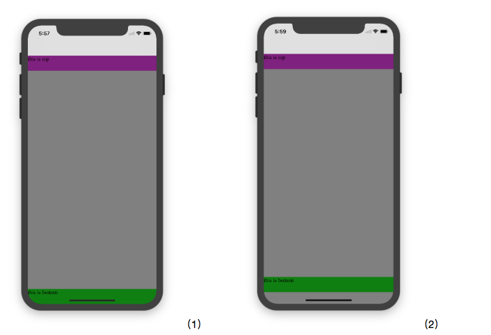
图1:
 * {

           padding:;

           margin:;

       }

       html,body {

           height: 100%;

       }

       body {

           background: grey;

           padding-top: constant(safe-area-inset-top);

           padding-left: constant(safe-area-inset-left);

           padding-right: constant(safe-area-inset-right);

           padding-bottom: constant(safe-area-inset-bottom);

       }

       .top {

           width: 100%;

           height: 44px;

           background: purple;

       }

       .bottom {

           position: fixed;

           bottom:;

           left:;

           right:;

           height: 44px;

           color: black;

           background: green;

       }
图2:
       * {

           padding:;

           margin:;

       }

       html,body {

           height: 100%;

       }

       body {

           background: grey;

           padding-top: constant(safe-area-inset-top);

           padding-left: constant(safe-area-inset-left);

           padding-right: constant(safe-area-inset-right);

           /*padding-bottom: constant(safe-area-inset-bottom);*/

       }

       .top {

           width: 100%;

           height: 44px;

           background: purple;

       }

       .bottom {

           position: fixed;

           bottom:;

           left:;

           right:;

           height: 44px;

           color: black;

           background: green;

       }
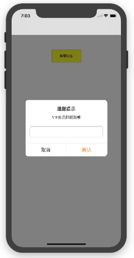
2.3 关于alertView弹框 遮罩层的解决方案
<!DOCTYPE html>

<html lang="en">

<head>

   <meta charset="UTF-8">

   <!--<meta name="viewport" content="width=device-width, initial-scale=1.0, minimum-scale=1.0, maximum-scale=1.0, user-scalable=no">-->

   <meta name="viewport" content="width=device-width,initial-scale=1.0, minimum-scale=1.0, maximum-scale=1.0, user-scalable=no, viewport-fit=cover">

   <meta http-equiv="pragma" content="no-cache">

   <meta http-equiv="cache-control" content="no-cache">

   <meta http-equiv="expires" content="0">

   <title>alertView</title>

   <script data-res="eebbk">

       document.documentElement.style.fontSize = window.screen.width / 7.5 + 'px';

   </script>

   <style>

       * {

           margin: 0;

           padding: 0;

       }

       html,body {

           width: 100%;

           height: 100%;

       }

       body {

           font-size: 0.32rem;

           padding-top: constant(safe-area-inset-top);

           padding-left: constant(safe-area-inset-left);

           padding-right: constant(safe-area-inset-right);

           padding-bottom: constant(safe-area-inset-bottom);

       }

       .content {

           text-align: center;

       }

       .testBut {

           margin: 50px auto;

           width: 100px;

           height: 44px;

           border: 1px solid darkgray;

           outline:none;

           user-select: none;

           background-color: yellow;

       }

   </style>

   <link href="alertView.css" rel="stylesheet" type="text/css">

</head>

<body>

   <section class="content">

       <button class="testBut" onclick="showLoading()">弹框加载</button>

   </section>

   <script type="text/javascript" src="alertView.js"></script>

   <script>

       function showLoading() {

           UIAlertView.show({

               type:"input",

               title:"温馨提示",              //标题

               content:"VIP会员即将到期",     //获取新的

               isKnow:false

           });

           var xx = new UIAlertView();

          console.log(xx);

       }

   </script>

</body>

</html>
参考资料:
关于H5页面在iPhoneX适配的更多相关文章
- 关于H5页面在iPhoneX适配(转)
1. iPhoneX的介绍 屏幕尺寸 我们熟知的iPhone系列开发尺寸概要如下: △ iPhone各机型的开发尺寸 转化成我们熟知的像素尺寸: △ 每个机型的多维度尺寸 倍图其实就是像素尺寸和开 ...
- 使用Flexible实现手淘H5页面的终端适配【转】
曾几何时为了兼容IE低版本浏览器而头痛,以为到Mobile时代可以跟这些麻烦说拜拜.可没想到到了移动时代,为了处理各终端的适配而乱了手脚.对于混迹各社区的偶,时常发现大家拿手机淘宝的H5页面做讨论—— ...
- 使用Flexible实现手淘H5页面的终端适配(转)
曾几何时为了兼容IE低版本浏览器而头痛,以为到Mobile时代可以跟这些麻烦说拜拜.可没想到到了移动时代,为了处理各终端的适配而乱了手脚.对于混迹各社区的偶,时常发现大家拿手机淘宝的H5页面做讨论—— ...
- (转)使用Flexible实现手淘H5页面的终端适配
原文链接 曾几何时为了兼容IE低版本浏览器而头痛,以为到Mobile时代可以跟这些麻烦说拜拜.可没想到到了移动时代,为了处理各终端的适配而乱了手脚.对于混迹各社区的偶,时常发现大家拿手机淘宝的H5页面 ...
- [转]使用Flexible实现手淘H5页面的终端适配
曾几何时为了兼容IE低版本浏览器而头痛,以为到Mobile时代可以跟这些麻烦说拜拜.可没想到到了移动时代,为了处理各终端的适配而乱了手脚.对于混迹各社区的偶,时常发现大家拿手机淘宝的H5页面做讨论—— ...
- vue移动端h5页面根据屏幕适配的四种方案
最近做了两个关于h5页面对接公众号的项目,不得不提打开微信浏览器内置地图导航的功能确实有点恶心.下次想起来了的话,进行总结分享一下如何处理.在vue移动端h5页面当中,其中适配是经常会遇到的问题,这块 ...
- ios下app内嵌h5页面是video适配问题
ios下做新闻详情用h5页面实现然后打包到app中,其中新闻详情页会有视频,安卓下video的poster可以做到适应video大小,但是ios下会按照poster图片大小将video等比撑大,但是视 ...
- 使用Flexible实现手淘H5页面的终端适配
拿到设计师给的设计图之后,剩下的事情是前端开发人员的事了.而手淘经过多年的摸索和实战,总结了一套移动端适配的方案--flexible方案. 这种方案具体在实际开发中如何使用,暂时先卖个关子,在继续详细 ...
- 使用Flexible 实现手淘H5 页面的终端适配学习
Amfe阿里无线前端团队双11技术连载之际,一个实战案例来展示多终端适配. Device metrics 1.0 mdpi 2.0 xhdpi 3.0xxhdpi(iphone 6 plus) 手淘h ...
随机推荐
- zookeeper在windows及linux(含多节点)环境下安装及其命令使用
zookeeper下载 下载url:http://www.apache.org/dyn/closer.cgi/zookeeper/ windows下安装zookeeper 解压到D盘 创建logs目录 ...
- Zabbix通过JMX方式监控java中间件
Zabbix2.0添加了支持用于监控JMX应用程序的服务进程,称为“Zabbix-Java-gateway”:它是用java写的一个程序. 工作原理: zabbix_server想知道一台主机上的特定 ...
- Spring mvc 整合PageHelper
Integer page=queryBean.getPage(); Integer pageSize=queryBean.getPageSize(); response.setContentType( ...
- mtd-utils 安装
title: mkdosfs 安装 tags: linux date: 2018/12/26/ 17:08:54 --- mtd-utils安装 for 主机 在制作根文件系统中需要使用它制作jffs ...
- 微服务之路由网关—zuul
Zuul 简介Zuul 是 Netflix 公司开发的一个开源 APIGateway,其本质上是一个 WebServlet 应用.Zuul 的核心是一系列的 Filter. 为什么要使用 Zuul微服 ...
- C++回顾day03---<异常>
一:传统错误处理机制(C中通过函数返回来处理) int CalcRes(int n, int m, char ch, int& res) { ; switch (ch) { case '+': ...
- Maven 学习总结(三) 之 依赖管理
聚合 为了要一次构建多个项目,而不是到每个模块目录下分别执行mvn命令.maven聚合这一特性就是为该需求服务的.为此我们需要创建一个额外的模块aggregator, 然后通过该模块构建整个项目的所有 ...
- Xvector in Kaldi nnet3
Xvector nnet Training of Xvector nnet Xvector nnet in Kaldi Statistics Extraction Layer in Kaldi ...
- 电子医疗设备创新研发应该用i.MX6Q开发板吗?为医疗设备提供解决方案
伴随医疗信息化.移动化.智能化的不断发展,居民对自身健康的关注度持续加强,全球医疗电子产业近年来持续保持快速增长态势.同时,源于庞大的人口基数以及迅速增长的老龄化人口带来持续增长的医疗服务需求,加之全 ...
- 20165237 2017-2018-2《Java程序设计》课程总结
20165237 2017-2018-2<Java程序设计>课程总结 每周作业链接汇总 我期望的师生关系 学习基础和C语言基础调查 Linux安装及学习 第一周学习总结 第二周学习总结 第 ...