
css3动画-加载中...
写几个简单的加载中动画吧。
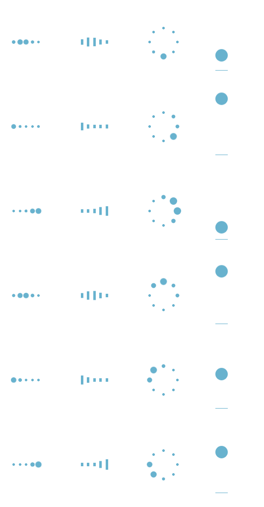
像前面三种都是相当于几个不同的点轮流来播放同一动画:变大变小。css3里面有一个用于尺度变换的方法:scale(x,y):定义 2D 缩放转换,改变元素的宽度和高度。
第四种就是一个小球从上往下跌落,再弹回去,在上面的时候速度最小,下面的时候速度最大。由于该小球只进行了上下的移动,所以我们可以运用:translateY(n):定义 2D 转换,沿着 Y 轴移动元素,从而实现小球沿Y方向来回移动。
废话不多说了,上代码。
首先,第一个加载中的动画:
 <div id="loading1">

         <div class="demo1"></div>

         <div class="demo1"></div>

         <div class="demo1"></div>

         <div class="demo1"></div>

         <div class="demo1"></div>

 </div>
html Code
 .demo1 {

     width: 4px;

     height: 4px;

     border-radius: 2px;

     background: #68b2ce;

     float: left;

     margin: 0 3px;

     animation: demo1 linear 1s infinite;

     -webkit-animation: demo1 linear 1s infinite;

 }

 .demo1:nth-child(1){

     animation-delay:0s;

 }

 .demo1:nth-child(2){

     animation-delay:0.15s;

 }

 .demo1:nth-child(3){

     animation-delay:0.3s;

 }

 .demo1:nth-child(4){

     animation-delay:0.45s;

 }

 .demo1:nth-child(5){

     animation-delay:0.6s;

 }

 @keyframes demo1

 {

     0%,60%,100% {transform: scale(1);}

     30% {transform: scale(2.5);}

 }

 @-webkit-keyframes demo1

 {

     0%,60%,100% {transform: scale(1);}

     30% {transform: scale(2.5);}

 }
css Code
第二个动画和第一个动画大同小异,第一个动画是将小球整体变大变小,第二动画则是将小方块的高度变大变小,而宽度不变:
 <div id="loading2">

     <div class="demo2"></div>

     <div class="demo2"></div>

     <div class="demo2"></div>

     <div class="demo2"></div>

     <div class="demo2"></div>

 </div>
html Code
 .demo2 {

     width: 4px;

     height: 6px;

     background: #68b2ce;

     float: left;

     margin: 0 3px;

     animation: demo2 linear 1s infinite;

     -webkit-animation: demo2 linear 1s infinite;

 }

 .demo2:nth-child(1){

     animation-delay:0s;

 }

 .demo2:nth-child(2){

     animation-delay:0.15s;

 }

 .demo2:nth-child(3){

     animation-delay:0.3s;

 }

 .demo2:nth-child(4){

     animation-delay:0.45s;

 }

 .demo2:nth-child(5){

     animation-delay:0.6s;

 }

 @keyframes demo2

 {

     0%,60%,100% {transform: scale(1);}

     30% {transform: scaleY(3);}

 }

 @-webkit-keyframes demo2

 {

     0%,60%,100% {transform: scale(1);}

     30% {transform: scaleY(3);}

 }
css Code
第三个动画就需要将小球的位置定位一下,让几个小球整体上看起来围成一个圆,然后就像第一个一样使小球变大变小:
 <div id="loading3">

      <div class="demo3"></div>

      <div class="demo3"></div>

      <div class="demo3"></div>

      <div class="demo3"></div>

      <div class="demo3"></div>

      <div class="demo3"></div>

      <div class="demo3"></div>

      <div class="demo3"></div>

 </div>
html Code
 #loading3 {

     position: relative;

     width: 50px;

     height: 50px;

 }

 .demo3 {

     width: 4px;

     height: 4px;

     border-radius: 2px;

     background: #68b2ce;

     position: absolute;

     animation: demo3 linear 0.8s infinite;

     -webkit-animation: demo3 linear 0.8s infinite;

 }

 .demo3:nth-child(1){

     left: 24px;

     top: 2px;

     animation-delay:0s;

 }

 .demo3:nth-child(2){

     left: 40px;

     top: 8px;

     animation-delay:0.1s;

 }

 .demo3:nth-child(3){

     left: 47px;

     top: 24px;

     animation-delay:0.1s;

 }

 .demo3:nth-child(4){

     left: 40px;

     top: 40px;

     animation-delay:0.2s;

 }

 .demo3:nth-child(5){

     left: 24px;

     top: 47px;

     animation-delay:0.4s;

 }

 .demo3:nth-child(6){

     left: 8px;

     top: 40px;

     animation-delay:0.5s;

 }

 .demo3:nth-child(7){

     left: 2px;

     top: 24px;

     animation-delay:0.6s;

 }

 .demo3:nth-child(8){

     left: 8px;

     top: 8px;

     animation-delay:0.7s;

 }

 @keyframes demo3

 {

     0%,40%,100% {transform: scale(1);}

     20% {transform: scale(3);}

 }

 @-webkit-keyframes demo3

 {

     0%,40%,100% {transform: scale(1);}

     20% {transform: scale(3);}

 }
css Code
接下来是第四个动画:
 <div id="loading5">

      <div class="demo5"></div>

 </div>
 #loading5 {

     width: 20px;

     height: 100px;

     border-bottom: 1px solid #68b2ce;

 }

 .demo5 {

     width: 20px;

     height: 20px;

     border-radius: 10px;

     background: #68b2ce;

     animation: demo5 cubic-bezier(0.5,0.01,0.9,1) 0.6s infinite alternate;

     -webkit-animation: demo5 cubic-bezier(0.5,0.01,0.9,1) 0.6s infinite alternate;

 }

 @keyframes demo5

 {

     0%{

         transform:translateY(0px);

         -webkit-transform:translateY(0px);

     }

     100% {

         transform:translateY(80px);

         -webkit-transform:translateY(80px);

     }

 }

 @-webkit-keyframes demo5

 {

     0%{

         transform:translateY(0px);

         -webkit-transform:translateY(0px);

     }

     100% {

         transform:translateY(80px);

         -webkit-transform:translateY(80px);

     }

 }
css Code
以上就是这几个简单的加载中小动画的内容了。
css3动画-加载中...的更多相关文章
- 纯CSS3技术 加载中
你能相信吗?这些都是由一个DIV元素实现的动画,纯CSS3技术 html <div class="loader">加载中...</div> css: 图( ...
- layui数据表格分页加载动画,自己定义加载动画,"加载中..."
记录思路,仅供参考 在表格渲染完成后,在done回调函数中给分页动态加点击事件, 关闭"加载中..."动画也是在 done回调函数中关闭 这是我实现的思路,记录给大家参考. , d ...
- 【Demo】CSS3 动画 加载进度条
实例结果图: 完整代码: <!DOCTYPE html> <html> <head> <meta charset="UTF-8"> ...
- CSS3实现加载中的动画效果
本篇文章由:http://xinpure.com/css3-implementations-of-loading-an-animation-effect/ Loading 的菊花图形组合的不太好,基本 ...
- CSS3实现加载中效果
代码: <!doctype html> <html> <head> <meta charset="utf-8" /> <tit ...
- 10个样式各异的CSS3 Loading加载动画
前几天我在园子里分享过2款很酷的CSS3 Loading加载动画,今天又有10个最新的Loading动画分享给大家,这些动画的样式都不一样,实现起来也并不难,你很容易把它们应用在项目中,先来看看效果图 ...
- 纯css3实现的动画加载条
之前大大家分享了很多款加载条.今天给大家带来一款纯css3实现的动画加载条. 这款加载条适用浏览器:360.FireFox.Chrome.Safari.Opera.傲游.搜狗.世界之窗. 不支持IE8 ...
- 纯css3实现的动画加载特效
之前给大家带了很多款进度加载条,今天再给大家分享一款纯css3实现的动画加载特效.效果图如下: 在线预览 源码下载 实现的代码. html代码: <div class="wrap& ...
- 2款不同样式的CSS3 Loading加载动画 附源码
原文:2款不同样式的CSS3 Loading加载动画 附源码 我们经常看到的Loading加载很多都是转圈圈的那种,今天我们来换一种有创意的CSS3 Loading加载动画,一种是声波形状的动画,另一 ...
随机推荐
- Impala介绍
Impala介绍 Impala支持的文件格式 Impala可以对Hadoop中大多数格式的文件进行查询.它能通过create table和insert的方式将一部分格式的数据加载到table中,但值得 ...
- Centos 查看机器型号
测试机器的硬件信息: 查看CPU信息(型号) # cat /proc/cpuinfo | grep name | cut -f2 -d: | uniq -c 8 Intel(R) Xeon(R) CP ...
- spider(一)
此爬虫内容无架构: 1.URL管理器:用集合,mysql表,缓存等 2.网页下载器:实现网页下载, urllib2:官方基础模块 requests:三方的(更强):伪装成浏览器访问,代理登录,http ...
- UVa 11468 Substring (AC自动机+概率DP)
题意:给出一个字母表以及每个字母出现的概率.再给出一些模板串S.从字母表中每次随机拿出一个字母,一共拿L次组成一个产度为L的串, 问这个串不包含S中任何一个串的概率为多少? 析:先构造一个AC自动机, ...
- php获取request_uri
urlParameters = http_build_query( filter_input_array( INPUT_GET, FILTER_SANITIZE_URL ) ); $_request_ ...
- CodeForces 110C 【构造】
思路: 7越多越好,然后从7最多个数枚举过去,判断一下剩下的能不能用4解决就好了: #include <bits/stdc++.h> using namespace std; typede ...
- Scrapy框架初探
Scrapy 貌似是 Python 最出名的爬虫框架 0. 文档 中文文档:https://scrapy-chs.readthedocs.io/zh_CN/0.24/intro/tutorial.ht ...
- JavaScript 性能优化
加载和执行 1. </body>闭合标签之前,将所有的<script> 标签放在页面底部,确保在脚步执行之前页面已经完成渲染. 2. 合并脚本.下载单个 100KB 的文件将比 ...
- Zookeeper下载方法
Zookeeper官网地址:http://zookeeper.apache.org/ Zookeeper下载链接:http://mirrors.tuna.tsinghua.ed ...
- CTS/APIO2019游记
退役后游记... 这次是真·游记了 ghj1222自从省选翻车后心情一直不错 5.12 (CTS 报到) 没去thupc(话说都不知道thupc这时候举行),于是就这天从衡水出发了 翻来覆去睡不着觉, ...