
旋转的球(animation与 transform)
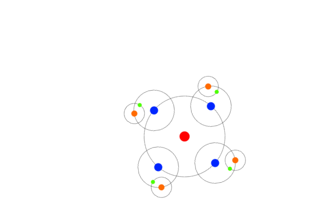
<html>

<head>

<meta http-equiv="Content-Type" content="text/html; charset=utf-8"/>

    <title></title>

    <meta charset="utf-8" />

    <style>

        * {

            padding:0px;

            margin:0px;

        }

        body {

            transform:scale(0.4)

        }

        .da {

            margin-top:10%;

            margin-left:30%;

            width:400px;

            height:400px;

            border:1px solid  #000000;

            position:relative;

            display:flex;

            border-radius:50%;

            animation:rot 10s infinite linear;

        }

        .hong{

            width:50px;

            height:50px;

            background-color:red;

            border-radius:50%;

            margin:auto;

        }

        .xiaoquan {

           width:200px;

           height:200px;

           border:1px solid #000000;

           position:absolute;

           top:50%;

           right:0;

           display: flex;

           border-radius:50%;

           animation:rot 10s infinite linear;

           margin:-100px -100px 0 0;

        }

        .lan {

           width:40px;

           height:40px;

           background-color:#0026ff;

           margin:auto;

           margin-left:80px;

           border-radius:50%;

        }

        .wuquan {

           width:100px;

           height:100px;

           border:1px solid #000000;

           position:absolute;

           top:50%;

           right:0;

           display: flex;

           border-radius:50%;

           animation:rot 10s infinite linear;

           margin:-50px -50px 0 0;

        }

        .cheng {

          width:30px;

          height:30px;

          background-color:#ff6a00;

          margin:auto;

          border-radius:50%;

        }

      .lv {

         width:20px;

         height:20px;

         background-color:#4cff00;

         position:absolute;

         margin:40px 0 0 -10px;

         border-radius:50%;

      }

        .xiaquan {

        width:200px;

        height:200px;

        border:1px solid #000000;

        position:absolute;

        top:50%;

        right:0;

        display: flex;

        border-radius:50%;

        animation:rot 10s infinite linear;

        margin:100px 100px 0 0;

      }

        .xiawuquan {

        width:100px;

        height:100px;

        border:1px solid #000000;

        position:absolute;

        top:50%;

        right:0;

        display: flex;

        border-radius:50%;

        animation:rot 10s infinite linear;

        margin:50px 50px 0 0;

      }

        .xialv {

        width:20px;

        height:20px;

        background-color:#4cff00;

        position:absolute;

        margin:-10px 0 0 40px;

        border-radius:50%;

      }

        .zuoquan {

        width:200px;

        height:200px;

        border:1px solid #000000;

        position:absolute;

        top:50%;

        right:0;

        display: flex;

        border-radius:50%;

        animation:rot 10s infinite linear;

        margin:-100px 300px 0 0;

     }

        .zuowuquan {

        width:100px;

        height:100px;

        border:1px solid #000000;

        position:absolute;

        top:50%;

        right:0;

         display: flex;

        border-radius:50%;

        animation:rot 10s infinite linear;

        margin:-50px 150px 0 0;

    }

        .zuolv {

        width:20px;

        height:20px;

        background-color:#4cff00;

        position:absolute;

        margin:40px 0 0 90px;

        border-radius:50%;

    }

        .shangquan {

        width:200px;

        height:200px;

        border:1px solid #000000;

        position:absolute;

        top:50%;

        right:0;

        display: flex;

        border-radius:50%;

        animation:rot 10s infinite linear;

        margin:-300px 100px 0 0;

     }

        .shangwuquan {

        width:100px;

        height:100px;

        border:1px solid #000000;

        position:absolute;

        top:50%;

        right:0;

        display: flex;

        border-radius:50%;

        animation:rot 10s infinite linear;

        margin:-150px 50px 0 0;

     }

        .shanglv {

        width:20px;

        height:20px;

        background-color:#4cff00;

        position:absolute;

        margin:90px 0 0 40px;

        border-radius:50%;

     }

        @keyframes rot {

        100% {transform:rotate(360deg) }

     }

    </style>

</head>

<body>

    <div class="da">

        <div class="hong"></div>

        <div class="xiaoquan">

            <div class="lan"></div>

            <div class="wuquan">

                <div class="cheng"></div>

                <div class="lv"></div>

            </div>

        </div>

        <div class="xiaquan">

            <div class="lan"></div>

            <div class="xiawuquan">

                <div class="cheng"></div>

                <div class="xialv"></div>

            </div>

        </div>

        <div class="zuoquan">

            <div class="lan"></div>

            <div class="zuowuquan">

                <div class="cheng"></div>

                <div class="zuolv"></div>

            </div>

        </div>

        <div class="shangquan">

            <div class="lan"></div>

            <div class="shangwuquan">

                <div class="cheng"></div>

                <div class="shanglv"></div>

            </div>

        </div>

    </div>

</body>

</html>
旋转的球(animation与 transform)的更多相关文章
- 用C3中的animation和transform写的一个模仿加载的时动画效果
用用C3中的animation和transform写的一个模仿加载的时动画效果! 不多说直接上代码; html标签部分 <div class="wrap"> <h ...
- 049——VUE中使用animation与transform实现vue的动画效果
<!DOCTYPE html> <html lang="en"> <head> <meta charset="UTF-8&quo ...
- CSS製作動畫效果(Transition、Animation、Transform)
CSS 2D Transforms https://www.w3schools.com/css/css3_2dtransforms.asp CSS 3D Transforms https://www. ...
- animation,transform属性
animation属性 使用@keyfarmes属性开启动画步骤 结构体:@keyfarmes name{ from{ } to{ } } @keyfarmes name{ 0%{ } 50%{ } ...
- animation transition transform
animation:动画名称 花费时间 运动曲线 何时开始 播放次数 是否反方向 div{width:100px;height:100px;background:red;animation:move ...
- #8.12.16总结#background transition、animation、transform
background-origin 设置元素背景图片的原始起始位置.必须保证背景是background-repeat为no-repeat此属性才会生效. background-origin :bord ...
- 基于CSS3新属性Animation及transform实现类似翻书效果
注:本实例JS部分均以原生JS编写,不善用原生JS的,可用jQuery等对三方框架改写 先上效果图:(样式有点丑,可以忽略一下下,效果出来了就好,后期加到其他项目中方便更改0.0) 类似翻书效果,原本 ...
- CSS3与动画有关的属性transition、animation、transform对比
最近应公司需求,需要用css3做动画,终于把以前一直傻傻分不清楚的三个属性理解了. 索性在这里进行一个简单的对比,加深自己的记忆. 浏览器兼容性 CSS3 transform 属性 Internet ...
- animation,transition,transform小练习
<!DOCTYPE html> <html lang="en"> <head> <meta charset="UTF-8&quo ...
随机推荐
- JAVA8 lambda表达式权威教程!
Java 8新特性----Stream流 jdk8是Java 语言开发的一个主要版本,它支持函数式编程,新的 JavaScript 引擎,新的日期 API,新的Stream API 等等.今天就重点介 ...
- 什么是NPS 客户净推荐值?
客户忠诚是企业在客户服务方面的最高目标. 客户是否忠诚通过一个问题即可判断,那就是--你会把这家企业推荐给朋友的可能性有多大?这就是著名的NPS指标,本文希望能讲清NPS客户净推荐值是什么,用好客服系 ...
- 普里姆算法(Prim)邻接矩阵法
算法代码 C#代码 using System; namespace Prim { class Program { static void Main(string[] args) { int numbe ...
- 客户端保存token到sessionStorage
将token保存到客户端的sessionStorage 一.区分localStorage和sessionStorage localStorage是本地持久化存储 sessionStorage是浏览器会 ...
- [c++] 二级指针的原理
示例 将值(实参)传递给值(形参),无法更改val 1 #include <iostream> 2 using namespace std; 3 4 void change(int mem ...
- QT相关书籍
文章转载自:http://www.cctry.com/thread-290005-1-1.html 最近一段时间,陆陆续续给大家更新了不少基于Qt开发的不错的书籍,可以说每本都不错.不过放在这一堆大家 ...
- 二进制部署K8S-2集群部署
二进制部署K8S-2集群部署 感谢老男孩教育王导的公开视频,文档整理自https://www.yuque.com/duduniao/k8s. 因为在后期运行容器需要有大量的物理硬件资源使用的环境是用的 ...
- JS中的高阶函数
JS中的高阶函数 高阶函数是指以函数作为参数的函数,并且可以将函数作为结果返回的函数. 1. 高阶函数 接受一个或多个函数作为输入 输出一个函数 至少满足以上一个条件的函数 在js的内置对象中同样存在 ...
- Java基础语法,常用知识复习
1.开发环境搭建 1.1JDK.JRE.JVM.的关系 JDK = JRE + 开发工具集(例如javac编译工具集等) JRE = JVM + Java SE 标准类库 2.基本语法 2.1.jav ...
- BASE理论之思考
一.什么是BASE理论? BASE理论是对CAP中一致性和可用性权衡的结果,它的核心思想是:即使无法做到强一致性,但每个应用都可以根据自身业务特点,采用适当的方式来使系统达到最终一致性. BASE理论 ...