Matplotlib图例
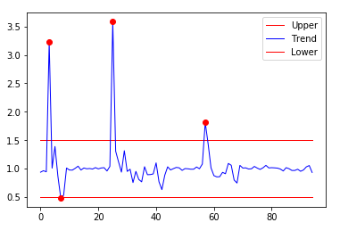
折线图示例
#!/usr/bin/python2.7

import numpy as np

from matplotlib import pyplot as plt

from dbtools import raw_data

from utils import moving_sum

def moving_sum(array, window):

    if type(array) is not np.ndarray:

        raise TypeError('Expected one dimensional numpy array.')

    remainder = array.size % window

    if 0 != remainder:

        array = array[remainder:]

    array = array.reshape((array.size/window,window))

    sum_arr = np.sum(array,axis=1)

    return sum_arr

def run():

    window = 3

    y_lst = raw_data('2018-08-03 00:00:00', length=3600*24)

    raw_arr = np.array(y_lst)

    sum_arr = moving_sum(raw_arr,window)

    res = np.true_divide(sum_arr[1:],sum_arr[:-1])

    threshold = 0.5

    upper = np.array([1+threshold]*res.size)

    lower = np.array([1-threshold]*res.size)

    plt.plot(upper,lw=1,color='red',label='Upper')

    plt.plot(res,lw=1,color='blue',label='Trend')

    plt.plot(lower,lw=1,color='red',label='Lower')

    r_idx = np.argwhere(np.abs(res-1) > 0.5)

    plt.plot(r_idx, res[r_idx], 'ro')

    plt.legend()

    plt.show()

    return (r_idx,res[r_idx])
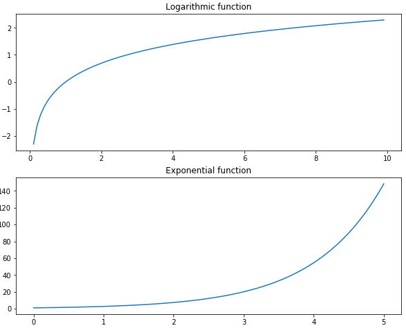
画布和子图
import numpy as np

import matplotlib.pyplot as plt

fig = plt.figure(figsize=[10,8])

ax1 = fig.add_subplot(2,1,1)

x1 = np.linspace(0.1,10,99,endpoint = False)

y1 = np.log(x1)

ax1.plot(x1,y1)

ax1.set_title('Logarithmic function')

x2 = np.linspace(0, 5, num = 100)

y2 = np.e**x2

ax2 = fig.add_subplot(2,1,2)

ax2.plot(x2,y2)

ax2.set_title('Exponential function')

plt.subplots_adjust(hspace =0.2)

fig.show()
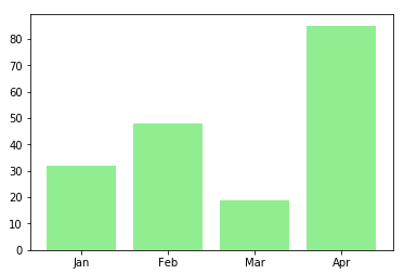
柱状图
import numpy as np

import matplotlib.pyplot as plt

data = [32,48,19,85]

labels = ['Jan','Feb','Mar','Apr']

plt.bar(np.arange(len(data)),data,color='lightgreen')

plt.xticks(np.arange(len(data)),labels)

plt.show()
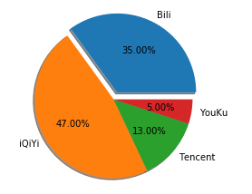
饼状图
import numpy as np

import matplotlib.pyplot as plt

data = [35,47,13,5]

labels = ['Bili','iQiYi','Tencent','YouKu']

plt.pie(data,labels=labels,autopct="%.2f%%",explode=[0.1,0,0,0],shadow=True)

plt.show()
Matplotlib画正弦余弦曲线
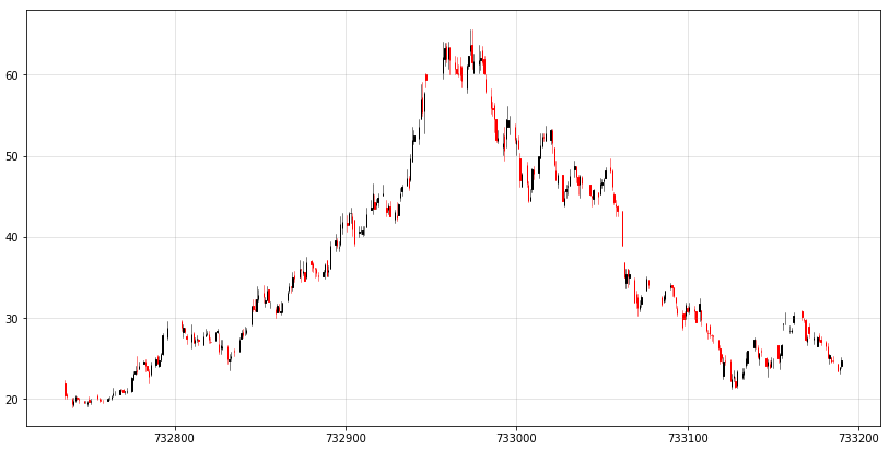
K线图
 pip3.6 install https://github.com/matplotlib/mpl_finance/archive/master.zip

 from mpl_finance import candlestick_ochl
matplotlib.finance has been deprecated
 # https://github.com/Gypsying/iPython/blob/master/601318.csv

 In [2]: import pandas as pd

 In [3]: df = pd.read_csv('601318.csv', index_col='date', parse_dates=['date'])

 In [4]: df.head()

 Out[4]:

             Unnamed: 0    open   close    high     low      volume    code

 date

 2007-03-01           0  21.878  20.473  22.302  20.040  1977633.51  601318

 2007-03-02           1  20.565  20.307  20.758  20.075   425048.32  601318

 2007-03-05           2  20.119  19.419  20.202  19.047   419196.74  601318

 2007-03-06           3  19.253  19.800  20.128  19.143   297727.88  601318

 2007-03-07           4  19.817  20.338  20.522  19.651   287463.78  601318

 In [5]: from matplotlib.dates import date2num

 In [6]: df['time'] = date2num(df.index.to_pydatetime())

 In [7]: df.head()

 Out[7]:

             Unnamed: 0    open   close    high     low      volume    code      time

 date

 2007-03-01           0  21.878  20.473  22.302  20.040  1977633.51  601318  732736.0

 2007-03-02           1  20.565  20.307  20.758  20.075   425048.32  601318  732737.0

 2007-03-05           2  20.119  19.419  20.202  19.047   419196.74  601318  732740.0

 2007-03-06           3  19.253  19.800  20.128  19.143   297727.88  601318  732741.0

 2007-03-07           4  19.817  20.338  20.522  19.651   287463.78  601318  732742.0

 In [8]: df.shape

 Out[8]: (2563, 8)

 In [9]: df.size

 Out[9]: 20504

 In [10]: 2563*8

 Out[10]: 20504

 In [11]:
数据源
import numpy as np

import pandas as pd

from matplotlib.dates import date2num

from mpl_finance import candlestick_ochl

# 构建 candlestick_ochl 的sequence of (time, open, close, high, low, ...)

df = pd.read_csv('601318.csv', index_col='date', parse_dates=['date'])

# time must be in float days format - see date2num

df['time'] = date2num(df.index.to_pydatetime())

# 原始数据比较多,截取一部分做展示

df = df.iloc[:300,:]

arr = df[['time','open','close','high','low']].values

fig = plt.figure(figsize=[14,7])

ax = fig.add_subplot(1,1,1)

candlestick_ochl(ax,arr)

plt.grid(True, which='major', c='gray', ls='-', lw=1, alpha=0.2)

fig.show()
Matplotlib图例的更多相关文章
- matplotlib图例-【老鱼学matplotlib】
图例是啥,直接上图就知道了: 怎么创建上面的图例呢? 很简单,首先在plt.plot()函数中设置label文本属性,然后调用plt.legend()生成图例就可以了,完整的代码如下: import ...
- Ubuntu环境下 matplotlib 图例中文乱码
最近做了一个最小二乘法的代码编写并用 matplotlib 绘制了一张图,但是碰到了中文乱码问题.简单搜索之后,发现有人总结出了比较好的方案,亲测可行.推荐给大家. 本文前提条件是 已经 安装好 ma ...
- 解决「matplotlib 图例中文乱码」问题
在学习用 matplotlib 画图时遇到了中文显示乱码的问题,在网上找了很多需要修改配置的方法,个人还是喜欢在代码里修改. 解决方法如下: 在第2.3行代码中加上所示代码即可. import mat ...
- Matplotlib图例中文乱码
plt.rcParams['font.sans-serif']=['SimHei'] #用来正常显示中文标签 plt.rcParams['axes.unicode_minus']=False #用来正 ...
- matplotlib 生成 eps 插入到 tex
matplotlib 生成 eps 插入到 tex matplotlib 生成 eps,就可以插入到 tex 中,而且是矢量图,放大不失真. 而且因为图中的元素都是嵌入到 pdf 中,所以图中的文字也 ...
- 使用matplotlib画双纵轴坐标
一.前言 本文主要使用matplotlib,实现双纵轴坐标的图表绘制.笔者python版本为2.7.15. 二.实践及效果 1. 需求 某个有这么一个成绩表,分别是名字,本次成绩以及进步幅度,现在需要 ...
- Mac下使用Matplotlib无法显示中文的解决办法
参考:matplotlib图例中文乱码? - 知乎用户的回答 - 知乎 https://www.zhihu.com/question/25404709/answer/309784195 1.下载字体安 ...
- matplotlib常规使用方法
1,指定图片大小和像素 Python绘图问题:Matplotlib中指定图片大小和像素 2,绘图命令的基本架构及其属性设置 绘图与可视化 3,python基础语法(二)--- plt的一些函数使用 p ...
- 小猪的Python学习之旅 —— 16.再尝Python数据分析:采集拉勾网数据分析Android就业行情...
一句话概括本文: 爬取拉钩Android职位相关数据,利用numpy,pandas和matplotlib对招人公司 情况和招聘要求进行数据分析. 引言: 在写完上一篇<浅尝Python数据分析: ...
随机推荐
- javafx--tableView笔记-----tableView里已经填充了实体类数据但是很狗血地显示不出来
private String cClass private String cUp private String cDown 刚开始实体类的字段 cClassCol.setCellValueFactor ...
- SQLServer之ISO游标使用
什么是游标 结果集,结果集就是select查询之后返回的所有行数据的集合. 游标则是处理结果集的一种机制吧,它可以定位到结果集中的某一行,多数据进行读写,也可以移动游标定位到你所需要的行中进行操作数据 ...
- MATLAB中“fitgmdist”的用法及其GMM聚类算法
MATLAB中“fitgmdist”的用法及其GMM聚类算法 作者:凯鲁嘎吉 - 博客园http://www.cnblogs.com/kailugaji/ 高斯混合模型的基本原理:聚类——GMM,MA ...
- Redis5.0.4复制
redis的复制很简单,由于资源限制,本例中采用两台虚拟机,每台虚拟机安装两个redis实例,共四个来测试 一.安装redis https://www.cnblogs.com/qq931399960/ ...
- 本地跑 spark ui 报错
java.lang.NoSuchMethodError: javax.servlet.http.HttpServletRequest.isAsyncStarted()Z at org.spark_pr ...
- SVN和GIT
一.SVN SVN使用起来还是比较简单的,我使用的SVN小乌龟版本是1.1的.(SVN已经可以正常使用了) 先说下自己了解的SVN流程吧,可能比较简单,不过这个也是实际的使用情况,忽略了很多其他功能( ...
- 自然人税收管理系统扣缴客户端Sqlite数据库有密码的,如何破解读取呢
https://www.cnblogs.com/Charltsing/p/EPPortal.html 有人问我能不能直接读自然人税收管理系统扣缴客户端,因为需要导出数据做处理. 看了一下,这个客户端是 ...
- 初识Haskell 五:自定义数据类型和类型类
对Discrete Mathematics Using a Computer的第一章Introduction to Haskell进行总结.环境Windows 自定义数据类型 data type de ...
- ORM简介
ORM就是object relational mapping,对象关系映射. 将关系型数据库转化为对象来进行处理. 数据表就是一个类,表的一行就是一个对象,一行的每个字段就是属性. 忽然想到了在MVC ...
- Linux centos ssh
创建m01.backup.nfs.web01.web02 m01(172.16.1.61).backup(172.16.1.41).nfs(172.16.1.31).web01(172.16.1.7) ...