python 数据可视化 -- 生成可控的随机数据集合
生成可控的随机数据集合 使用 numpy.random 模块
numpy.random.random(size=None) 返回 [0.0, 1.0) 区间的随机 floats, 默认返回一个 float
numpy.random.randint(low, high=None, size=None, dtype='l') 按照均匀分布,返回 [low, high) 区间的随机 integers
numpy.random.uniform(low=0.0, high=1.0, size=None) 按照均匀分布,返回 [low, high) 区间的随机 floats
numpy.random.normal(loc=0.0, scale=1.0, size=None) 按照正态分布,返回随机 floats
numpy.random.triangular(left, mode, right, size=None) 按照三角分布,返回随机 floats
numpy.random.beta(a, b, size=None) 按照 beta 分布,返回随机 floats
numpy.random.exponential(scale=1.0, size=None) 按照指数分布,返回随机 floats
numpy.random.gamma(shape, scale=1.0, size=None) 按照 gamma 分布,返回随机 floats
numpy.random.lognormal(mean=0.0, sigma=1.0, size=None) 按照指数正态分布,返回随机 floats
numpy.random.pareto(a, size=None) 按照 pareto 分布,返回随机 floats
更多分布见 numpy.random 官网教程:https://docs.scipy.org/doc/numpy/reference/routines.random.html?highlight=random#module-numpy.random
import matplotlib.pyplot as plt
import numpy as np SAMPLE_SIZE = 100 np.random.seed()
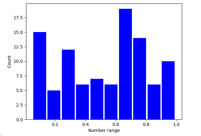
real_rand_vars = [np.random.random() for _ in range(SAMPLE_SIZE)] # 生成 100 个 [0.0, 1.0) 的随机小数 plt.figure()
plt.hist(x = real_rand_vars, bins=10, rwidth=0.9, color='blue')
plt.xlabel('Number range')
plt.ylabel('Count')
plt.show()
使用相似的方法,可以生成虚拟价格增长数据的时序图,并加上随机噪声
import matplotlib.pyplot as plt

import numpy as np

duration = 100

mean_inc = 0.2

std_dev_inc = 1.2

x = range(duration)

y = []

price_today = 0

for i in x:

    next_delta = np.random.normal(loc=mean_inc, scale=std_dev_inc)  # 按照给定的均值和方差的正态分布返回随机floats

    price_today += next_delta

    y.append(price_today)

plt.figure()

plt.plot(x, y, 'b.-')

plt.xlabel('Time')

plt.ylabel('Value')

plt.show()

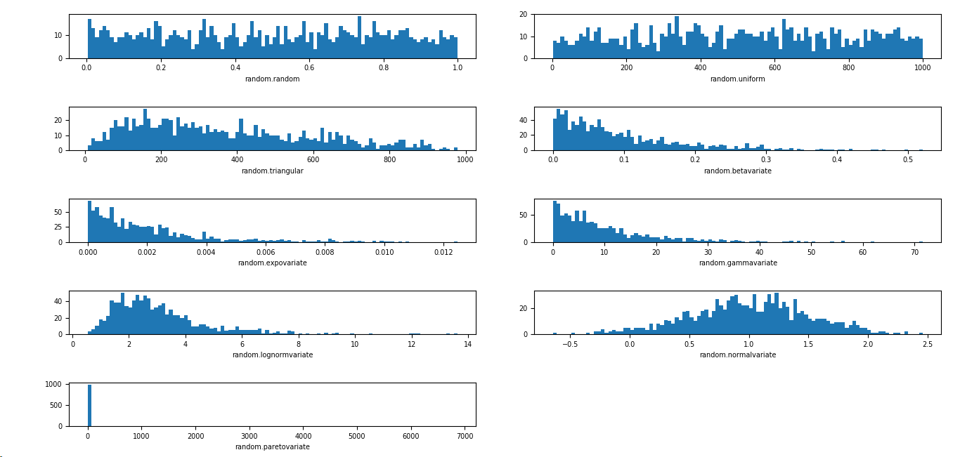
根据不同的需求,可以选择不同的分布
import matplotlib.pyplot as plt

import numpy as np

import matplotlib

SAMPLE_SIZE = 1000

buckets = 100

matplotlib.rcParams.update({'font.size':7})

plt.figure()

# 第一个图是 [0,1) 之间分布的随机变量

plt.subplot(521)

plt.xlabel('random.random')

res = [np.random.random() for _ in range(1, SAMPLE_SIZE)]

plt.hist(x=res, bins=buckets)

# 第二个图是一个均匀分布的随机变量

plt.subplot(522)

plt.xlabel('random.uniform')

a = 1

b = SAMPLE_SIZE

res = [np.random.uniform(a, b) for _ in range(1, SAMPLE_SIZE)]

plt.hist(x=res, bins=buckets)

# 第三个图是一个三角形分布

plt.subplot(523)

plt.xlabel('random.triangular')

low = 1

mode = 100.0

high = SAMPLE_SIZE

res = [np.random.triangular(low, mode, high) for _ in range(1, SAMPLE_SIZE)]

plt.hist(x=res, bins=buckets)

# 第四个图是一个 beta 分布

plt.subplot(524)

plt.xlabel('random.betavariate')

alpha = 1

beta = 10

res = [np.random.beta(alpha, beta) for _ in range(1, SAMPLE_SIZE)]

plt.hist(x=res, bins=buckets)

# 第五个图是一个指数分布

plt.subplot(525)

plt.xlabel('random.expovariate')

lambd = 1.0 / ((SAMPLE_SIZE + 1) / 2.0)

res = [np.random.exponential(lambd) for _ in range(1, SAMPLE_SIZE)]

plt.hist(x=res, bins=buckets)

# 第六个图是一个 gamma 分布

plt.subplot(526)

plt.xlabel('random.gammavariate')

alpha = 1

beta = 10

res = [np.random.gamma(alpha, beta) for _ in range(1, SAMPLE_SIZE)]

plt.hist(x=res, bins=buckets)

# 第七个图是一个 对数正态分布

plt.subplot(527)

plt.xlabel('random.lognormvariate')

mu = 1

sigma = 0.5

res = [np.random.lognormal(mu, sigma) for _ in range(1, SAMPLE_SIZE)]

plt.hist(x=res, bins=buckets)

# 第八个图是一个正态分布

plt.subplot(528)

plt.xlabel('random.normalvariate')

mu = 1

sigma = 0.5

res = [np.random.normal(mu, sigma) for _ in range(1, SAMPLE_SIZE)]

plt.hist(x=res, bins=buckets)

# 第九个图是一个帕累托分布

plt.subplot(529)

plt.xlabel('random.paretovariate')

alpha = 1

res = [np.random.pareto(alpha) for _ in range(1, SAMPLE_SIZE)]

plt.hist(x=res, bins=buckets)

plt.tight_layout()

plt.show()
python 数据可视化 -- 生成可控的随机数据集合的更多相关文章
- 开源 Web 相册程序: Photoview 和数据可视化生成工具:Datawrapper
Photoview Photoview是一个开源 Web 相册程序,Go 语言写的,使用 Docker 安装,可以用来快速架设个人相册. github地址:https://github.com/pho ...
- Python图表数据可视化Seaborn:3. 线性关系数据| 时间线图表| 热图
1. 线性关系数据可视化 lmplot( ) import numpy as np import pandas as pd import matplotlib.pyplot as plt import ...
- 使用vs2010生成SQL Server 随机数据
前几天做测试数据,偶然发现vs2010中有一个生成随机数据的功能,记录下来,方便以后使用,确实非常的好用灵活快捷. 为了简单扼要的说明,下面我用一个实例来说明如何快捷使用: 在VS2010创建数据库项 ...
- Python图表数据可视化Seaborn:2. 分类数据可视化-分类散点图|分布图(箱型图|小提琴图|LV图表)|统计图(柱状图|折线图)
1. 分类数据可视化 - 分类散点图 stripplot( ) / swarmplot( ) sns.stripplot(x="day",y="total_bill&qu ...
- python中faker模块:产生随机数据的模块
#pip install faker #产生各种随机数据的模块 想要运用更多的随机数据,可以百度查找下
- 学会这一招,小白也能使用数据可视化BI软件创建医院数据实时展示大屏
灯果数据可视化BI软件是新一代人工智能数据可视化大屏软件,内置丰富的大屏模板,可视化编辑操作,无需任何经验就可以创建属于你自己的大屏.大家可以在他们的官网下载软件. 本文以医院数据实时展示大屏为例 ...
- python脚本批量生成50000条插入数据的sql语句
f = open("xx.txt",'w') for i in range(1,50001): str_i = str(i) realname = "lxs"+ ...
- 数据科学速查手册(包括机器学习,概率,微积分,线性代数,python,pandas,numpy,数据可视化,SQL,大数据等方向)
介绍:https://redstonewill.com/2372/ 项目网址:https://github.com/FavioVazquez/ds-cheatsheets
- python 操作txt 生成新的文本数据
name: Jack ; salary: 12000 name :Mike ; salary: 12300 name: Luk ; salary: 10030 name :Tim ; salary: ...
随机推荐
- [UnityShader基础]07.MaterialPropertyDrawer
参考链接: https://blog.csdn.net/e295166319/article/details/60141677 https://docs.unity3d.com/ScriptRefer ...
- Spark启动报错|java.io.FileNotFoundException: File does not exist: hdfs://hadoop101:9000/directory
at org.apache.spark.deploy.history.FsHistoryProvider.<init>(FsHistoryProvider.scala:) at org.a ...
- Mysql时间差计算
Mysql如何计算两个时间字段的差值?可用函数 TIMESTAMPDIFF() ----------------------------- TIMESTAMPDIFF函数,有参数设置,可以精确到天(D ...
- layui时间控件,获取页面选中的时间值。
先贴上html文档 <div class='layui-form'> <div class="layui-form-item"> <div class ...
- MySQL多实例的环境下,服务器端本地连接到指定实例的问题(sock方式连接)
涉及到sock连接的问题. 为了测试MySQL的某些个特性,在一个机器上安装了多个MySQL的实例,如下截图,有两个实例,一个端口是8000,一个端口是8001.在使用mysql -uroot -p ...
- .net session 使用误区
1. this.Session["username"] = null HttpSessionState 内部使用 NameObjectCollection 类型的集合对象来存储用 ...
- API权限设计总结
最近在做API的权限设计这一块,做一次权限设计的总结. 1. 假设我们需要访问的API接口是这样的:http://xxxx.com/openapi/v1/get/user/?key=xxxxx& ...
- step_by_step_记录deepin下curl安装过程
记录 deepin 下 curl 安装过程 wget https://curl.haxx.se/download/curl-7.55.1.tar.gz .tar.gz cd curl-/ ./conf ...
- NET(C#):关于正确读取中文编码文件
https://blog.csdn.net/ma_jiang/article/details/53213442 首先如果读者对编码或者BOM还不熟悉的话,推荐先读这篇文章:.NET(C#):字符编码( ...
- 项目总结22:Java UDP Socket数据的发送和接收
项目总结22:Java UDP Socket数据的发送和接收 1-先上demo 客户端(发送数据) package com.hs.pretest.udp; import java.io.IOExcep ...