python 数据可视化 -- 生成可控的随机数据集合
生成可控的随机数据集合 使用 numpy.random 模块
numpy.random.random(size=None) 返回 [0.0, 1.0) 区间的随机 floats, 默认返回一个 float
numpy.random.randint(low, high=None, size=None, dtype='l') 按照均匀分布,返回 [low, high) 区间的随机 integers
numpy.random.uniform(low=0.0, high=1.0, size=None) 按照均匀分布,返回 [low, high) 区间的随机 floats
numpy.random.normal(loc=0.0, scale=1.0, size=None) 按照正态分布,返回随机 floats
numpy.random.triangular(left, mode, right, size=None) 按照三角分布,返回随机 floats
numpy.random.beta(a, b, size=None) 按照 beta 分布,返回随机 floats
numpy.random.exponential(scale=1.0, size=None) 按照指数分布,返回随机 floats
numpy.random.gamma(shape, scale=1.0, size=None) 按照 gamma 分布,返回随机 floats
numpy.random.lognormal(mean=0.0, sigma=1.0, size=None) 按照指数正态分布,返回随机 floats
numpy.random.pareto(a, size=None) 按照 pareto 分布,返回随机 floats
更多分布见 numpy.random 官网教程:https://docs.scipy.org/doc/numpy/reference/routines.random.html?highlight=random#module-numpy.random
import matplotlib.pyplot as plt
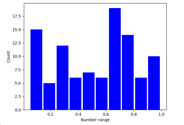
import numpy as np SAMPLE_SIZE = 100 np.random.seed()
real_rand_vars = [np.random.random() for _ in range(SAMPLE_SIZE)] # 生成 100 个 [0.0, 1.0) 的随机小数 plt.figure()
plt.hist(x = real_rand_vars, bins=10, rwidth=0.9, color='blue')
plt.xlabel('Number range')
plt.ylabel('Count')
plt.show()
使用相似的方法,可以生成虚拟价格增长数据的时序图,并加上随机噪声
import matplotlib.pyplot as plt

import numpy as np

duration = 100

mean_inc = 0.2

std_dev_inc = 1.2

x = range(duration)

y = []

price_today = 0

for i in x:

    next_delta = np.random.normal(loc=mean_inc, scale=std_dev_inc)  # 按照给定的均值和方差的正态分布返回随机floats

    price_today += next_delta

    y.append(price_today)

plt.figure()

plt.plot(x, y, 'b.-')

plt.xlabel('Time')

plt.ylabel('Value')

plt.show()

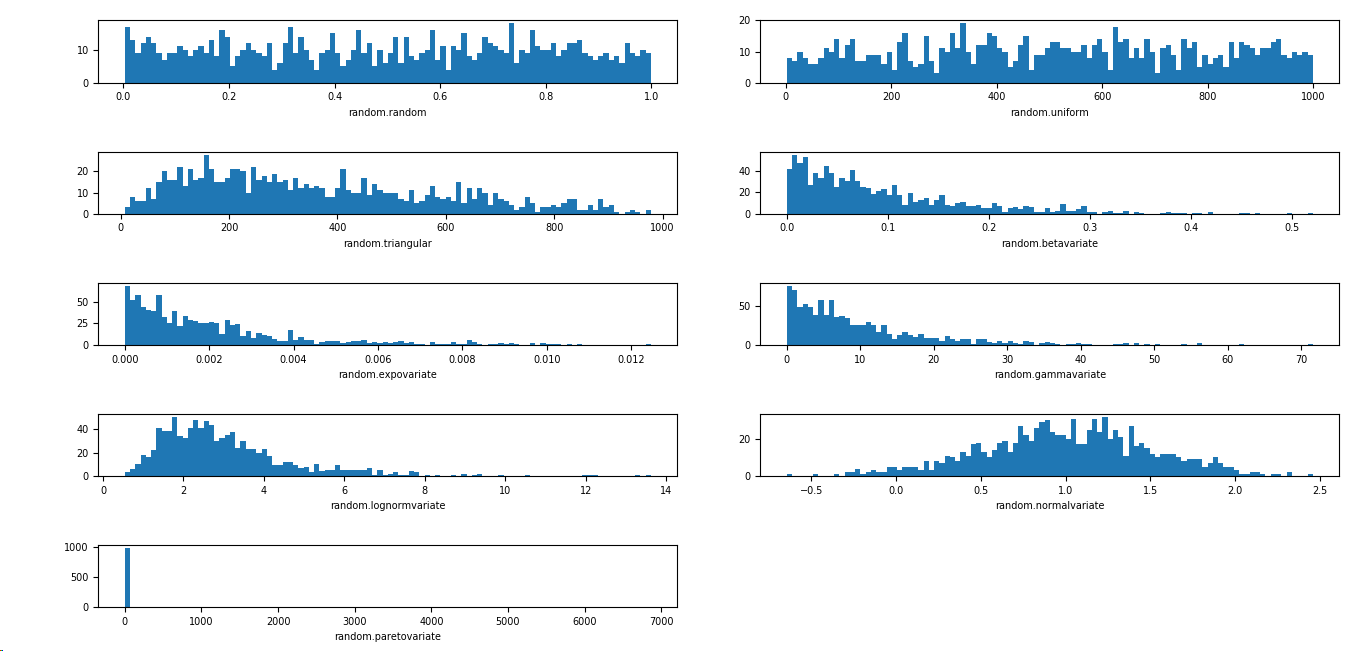
根据不同的需求,可以选择不同的分布
import matplotlib.pyplot as plt

import numpy as np

import matplotlib

SAMPLE_SIZE = 1000

buckets = 100

matplotlib.rcParams.update({'font.size':7})

plt.figure()

# 第一个图是 [0,1) 之间分布的随机变量

plt.subplot(521)

plt.xlabel('random.random')

res = [np.random.random() for _ in range(1, SAMPLE_SIZE)]

plt.hist(x=res, bins=buckets)

# 第二个图是一个均匀分布的随机变量

plt.subplot(522)

plt.xlabel('random.uniform')

a = 1

b = SAMPLE_SIZE

res = [np.random.uniform(a, b) for _ in range(1, SAMPLE_SIZE)]

plt.hist(x=res, bins=buckets)

# 第三个图是一个三角形分布

plt.subplot(523)

plt.xlabel('random.triangular')

low = 1

mode = 100.0

high = SAMPLE_SIZE

res = [np.random.triangular(low, mode, high) for _ in range(1, SAMPLE_SIZE)]

plt.hist(x=res, bins=buckets)

# 第四个图是一个 beta 分布

plt.subplot(524)

plt.xlabel('random.betavariate')

alpha = 1

beta = 10

res = [np.random.beta(alpha, beta) for _ in range(1, SAMPLE_SIZE)]

plt.hist(x=res, bins=buckets)

# 第五个图是一个指数分布

plt.subplot(525)

plt.xlabel('random.expovariate')

lambd = 1.0 / ((SAMPLE_SIZE + 1) / 2.0)

res = [np.random.exponential(lambd) for _ in range(1, SAMPLE_SIZE)]

plt.hist(x=res, bins=buckets)

# 第六个图是一个 gamma 分布

plt.subplot(526)

plt.xlabel('random.gammavariate')

alpha = 1

beta = 10

res = [np.random.gamma(alpha, beta) for _ in range(1, SAMPLE_SIZE)]

plt.hist(x=res, bins=buckets)

# 第七个图是一个 对数正态分布

plt.subplot(527)

plt.xlabel('random.lognormvariate')

mu = 1

sigma = 0.5

res = [np.random.lognormal(mu, sigma) for _ in range(1, SAMPLE_SIZE)]

plt.hist(x=res, bins=buckets)

# 第八个图是一个正态分布

plt.subplot(528)

plt.xlabel('random.normalvariate')

mu = 1

sigma = 0.5

res = [np.random.normal(mu, sigma) for _ in range(1, SAMPLE_SIZE)]

plt.hist(x=res, bins=buckets)

# 第九个图是一个帕累托分布

plt.subplot(529)

plt.xlabel('random.paretovariate')

alpha = 1

res = [np.random.pareto(alpha) for _ in range(1, SAMPLE_SIZE)]

plt.hist(x=res, bins=buckets)

plt.tight_layout()

plt.show()
python 数据可视化 -- 生成可控的随机数据集合的更多相关文章
- 开源 Web 相册程序: Photoview 和数据可视化生成工具:Datawrapper
Photoview Photoview是一个开源 Web 相册程序,Go 语言写的,使用 Docker 安装,可以用来快速架设个人相册. github地址:https://github.com/pho ...
- Python图表数据可视化Seaborn:3. 线性关系数据| 时间线图表| 热图
1. 线性关系数据可视化 lmplot( ) import numpy as np import pandas as pd import matplotlib.pyplot as plt import ...
- 使用vs2010生成SQL Server 随机数据
前几天做测试数据,偶然发现vs2010中有一个生成随机数据的功能,记录下来,方便以后使用,确实非常的好用灵活快捷. 为了简单扼要的说明,下面我用一个实例来说明如何快捷使用: 在VS2010创建数据库项 ...
- Python图表数据可视化Seaborn:2. 分类数据可视化-分类散点图|分布图(箱型图|小提琴图|LV图表)|统计图(柱状图|折线图)
1. 分类数据可视化 - 分类散点图 stripplot( ) / swarmplot( ) sns.stripplot(x="day",y="total_bill&qu ...
- python中faker模块:产生随机数据的模块
#pip install faker #产生各种随机数据的模块 想要运用更多的随机数据,可以百度查找下
- 学会这一招,小白也能使用数据可视化BI软件创建医院数据实时展示大屏
灯果数据可视化BI软件是新一代人工智能数据可视化大屏软件,内置丰富的大屏模板,可视化编辑操作,无需任何经验就可以创建属于你自己的大屏.大家可以在他们的官网下载软件. 本文以医院数据实时展示大屏为例 ...
- python脚本批量生成50000条插入数据的sql语句
f = open("xx.txt",'w') for i in range(1,50001): str_i = str(i) realname = "lxs"+ ...
- 数据科学速查手册(包括机器学习,概率,微积分,线性代数,python,pandas,numpy,数据可视化,SQL,大数据等方向)
介绍:https://redstonewill.com/2372/ 项目网址:https://github.com/FavioVazquez/ds-cheatsheets
- python 操作txt 生成新的文本数据
name: Jack ; salary: 12000 name :Mike ; salary: 12300 name: Luk ; salary: 10030 name :Tim ; salary: ...
随机推荐
- 【Python】爬虫
参考:http://www.cnblogs.com/fnng/p/3576154.html import urllib,re page = urllib.urlopen('http://trend.b ...
- An error occurred while starting the application.
一..net core 发布后的站点启动报错如下 An error occurred while starting the application. .NET Core 4.6.26328.01 X6 ...
- GP工具环境变量名称列表
帮助地址:http://resources.arcgis.com/en/help/arcobjects-net/conceptualhelp/#/Using_environment_settings/ ...
- Delphi中Inputbox 和Inputquery 函数的使用
原文转自:http://blog.csdn.net/zengcong2013/article/details/18355959 inputbox的返回值是,你在输入框中输入的文字.而inputquer ...
- H5使用codovar插件实现微信支付(微信APP支付模式,前端)
H5打包的app实现微信支付及支付宝支付,本章主要详解微信支付,支付宝支付请查看另一篇“H5使用codovar插件实现支付宝支付(支付宝APP支付模式,前端)” ps:本文只试用H5开发的,微信 AP ...
- opencv常用api
opencv常用api 一.图像及视频读写 img=cv2.imread('jiang.jpg',1) cv2.imwrite('jiang.jpg',img) cv2.imshow('ji ...
- OO第十五次作业
一.测试与正确性论证的效果差异 测试和正确性论证分别是从理论和实践两个角度去规范程序的正确性的,我认为其主要的区别在于对于程序透明度的需求上, 测试作为一种实践手段,他的实施的要求是比较低的:在完全了 ...
- 使用 nodeJs 开发微信公众号(获取access_token)
要使用微信提供的功能接口,就需要获取到access_token,这是开发公众号必不可少的一部 access_token有效期20分钟,建议保存起来,过期后在重新获取 获取流程如下: 我将微信相关的操作 ...
- 软件测试day1
Windows基础 一.什么是软件(software) 计算机(computer)=硬件(hardware)+软件(software) 软 件(software)=程序(program)+文档(do ...
- Winform 中写代码布局中遇到的控件遮盖问题
在winform中编程时,需要动态向主窗体中增加菜单栏和用户控件,菜单栏需要设置DockStyle为Top ,而设置用户控件的DockStyle为Fill,之后在加载的时候,出现了菜单栏遮盖用户控件的 ...