CSS3使用Animation steps属性实现指针时钟效果
本篇文章由:http://xinpure.com/css3-animation-steps-properties-for-analogue-effects/
animation默认以ease方式过渡,它会在每个关键帧之间插入补间动画,所以动画效果是连贯性的。除了ease,linear、cubic-bezier之类的过渡函数都会为其插入补间。但有些效果不需要补间,只需要关键帧之间的跳跃,这时应该使用steps过渡方式,而时钟的指针嘀嗒旋转,就应该使用这种方式。
时钟动画分析
时钟的动画效果其实就只有一种,就是指针旋转了。
圆为360deg,秒针每秒旋转6deg,分针每60秒旋转6deg, 时针每3600秒旋转6deg
因此,我们所需要实现的动画效果就是:
秒针旋转360deg,60秒一个周期,无限循环动画
分针旋转360deg,3600秒一个周期,无限循环动画
时针旋转360deg: 216000秒一个周期,无限循环动画
时钟旋转的嘀嗒效果,不需要补间动画,应该使用 steps 来过渡(将旋转360deg的动画分步执行)
由于秒针、分针和时针的步长均为6deg,因此,可以将360deg分成60步完成 steps(60, end)
指针旋转360deg动画定义
@keyframes tick-tock {

    to {

        transform: rotate(360deg);

    }

}

@-webkit-keyframes tick-tock {

    to {

        transform: rotate(360deg) translate3d(0, 0, 0);

    }

}
为动画DOM元素添加
CSS3样式-webkit-transform: transition3d(0,0,0)或-webkit-transform: translateZ(0),这两个属性都会开启GPU硬件加速模式,从而让浏览器在渲染动画时从CPU转向GPU,其实说白了这是一个小伎俩,也可以算是一个Hack,-webkit-transform: transition3d和-webkit-transform: translateZ其实是为了渲染3D样式,但我们设置值为0后,并没有真正使用3D效果,但浏览器却因此开启了GPU硬件加速模式。
绑定指针旋转动画
/* 秒针 */

-webkit-animation: tick-tock 60s steps(60, end) infinite;

        animation: tick-tock 60s steps(60, end) infinite;

/* 分针 */

-webkit-animation: tick-tock 3600s steps(60, end) infinite;

        animation: tick-tock 3600s steps(60, end) infinite;

/* 时针 */

-webkit-animation: tick-tock 216000s steps(60, end) infinite;

        animation: tick-tock 216000s steps(60, end) infinite;
综合示例
HTML Code
<div class="clock">

    <!-- 时钟刻度线条 -->

    <div class="line"></div>

    <div class="line line1"></div>

    <div class="line line2"></div>

    <div class="line line3"></div>

    <div class="line line4"></div>

    <div class="line line5"></div>

    <div class="line line6"></div>

    <!-- 内部白圆与线条配合形成刻度 -->

    <div class="white_circle"></div>

    <!-- 时钟中心圆点 -->

    <div class="black_circle"></div>

    <div class="hour"></div>

    <div class="minute"></div>

    <div class="second"></div>

</div>
CSS Code
.clock {
position: relative;
width: 150px;
height: 150px;
margin: 50px auto;
border: 10px solid black;
border-radius: 50%;
}
.line {
position: absolute;
left: 50%;
margin-left: -3px;
width: 6px;
height: 150px;
background-color: gray;
}
.line1 {
-webkit-transform: rotate(30deg);
transform: rotate(30deg);
}
.line2 {
-webkit-transform: rotate(-30deg);
transform: rotate(-30deg);
}
.line3 {
-webkit-transform: rotate(60deg);
transform: rotate(60deg);
}
.line4 {
-webkit-transform: rotate(-60deg);
transform: rotate(-60deg);
}
.line5 {
-webkit-transform: rotate(30deg);
transform: rotate(30deg);
}
.line6 {
-webkit-transform: rotate(90deg);
transform: rotate(90deg);
}
.line1, .line2, .line3, .line4, .line5 {
width: 2px;
margin-left: -1px;
}
.white_circle {
position: absolute;
left: 50%;
top: 50%;
margin: -60px 0 0 -60px;
width: 120px;
height: 120px;
border-radius: 50%;
background-color: #fff;
}
.black_circle {
position: absolute;
left: 50%;
top: 50%;
margin: -8px 0 0 -8px;
width: 16px;
height: 16px;
border-radius: 50%;
background-color: #000;
z-index: 1;
}
.hour {
position: absolute;
top: 50%;
right: 50%;
width: 35px;
height: 6px;
margin-top: -3px;
background-color: #000;
border-radius: 5px;
-webkit-transform-origin: right;
transform-origin: right;
-webkit-animation: tick-tock 216000s steps(60, end) infinite;
animation: tick-tock 216000s steps(60, end) infinite;
}
.minute {
position: absolute;
top: 50%;
left: 50%;
width: 6px;
height: 46px;
margin: -46px 0 0 -3px;
background-color: #000;
border-radius: 5px;
-webkit-transform-origin: bottom;
transform-origin: bottom;
-webkit-animation: tick-tock 3600s steps(60, end) infinite;
animation: tick-tock 3600s steps(60, end) infinite;
}
.second {
position: absolute;
left: 50%;
top: 50%;
width: 2px;
height: 50px;
margin: -50px 0 0 -1px;
background-color: red;
border-radius: 5px;
-webkit-transform-origin: bottom;
transform-origin: bottom;
-webkit-animation: tick-tock 60s steps(60, end) infinite;
animation: tick-tock 60s steps(60, end) infinite;
}
@keyframes tick-tock {
to {
transform: rotate(360deg);
}
}
@-webkit-keyframes tick-tock {
to {
transform: rotate(360deg) translate3d(0, 0, 0);
}
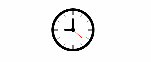
}结果示图
CSS3使用Animation steps属性实现指针时钟效果的更多相关文章
- animation steps属性实现帧动画
<!DOCTYPE html> <html> <head> <meta charset="utf-8" /> <meta na ...
- css3中animation属性animation-timing-function知识点以及其属性值steps()
在animation中最重要的其实就是时间函数(animation-timing-function)这个属性,他决定了你的动画将以什么样的速度执行,所以最关键的属性值也就是cubic-bezier(n ...
- 用animation的steps属性制作帧动画
昨天火急火燎地接到一个任务,说是要做一个掷骰子的游戏,关于掷骰子期间的过渡动画,我本来是想用css 3d制作一个立体的骰子,然后叫UI给6张平面图贴上去.再用translate3d来操作.然而UI考虑 ...
- CSS3 动画Animation的8大属性
animation复合属性.检索或设置对象所应用的动画特效. 如果有多个属性值时以","隔开,适用于所有元素,包含伪对象:after和:before 1.animation-nam ...
- 【CSS3】纯CSS代码实现模拟时钟,+js对时功能。
使用CSS3纯代码来实现模拟时钟,及指针动画功能. 在这里主要使用到css3一些基本元素: border-radius:圆角边框,画圆形:表盘 Transform:变换,旋转,扭曲:刻度盘,指针形状 ...
- 关于帧动画steps属性的理解
CSS3的Animation有八个属性 animation-name animation-duration animation-delay animation-iteration-count anim ...
- css动画-animation各个属性详解(转)
CSS3的animation很容易就能实现各种酷炫的动画,虽然看到别人的成果图会觉得很难,但是如果掌握好各种动画属性,做好酷炫吊炸天的动画都不在话下,好,切入正题. 一.动画属性: 动画属性包括:①a ...
- css3中Animation
CSS3我在5年之前就有用了,包括公司项目都一直在很前沿的技术. 最近在写慕课网的七夕主题,用了大量的CSS3动画,但是真的沉淀下来仔细的去深入CSS3动画的各个属性发现还是很深的,这里就写下关于帧动 ...
- 第100天:CSS3中animation动画详解
CSS3属性中有关于制作动画的三个属性:Transform,Transition,Animation: 一.Animation定义动画 CSS3的Animation是由“keyframes”这个属性来 ...
随机推荐
- 【费用流】NOI2008志愿者招募
1061: [Noi2008]志愿者招募 Time Limit: 20 Sec Memory Limit: 162 MBSubmit: 5171 Solved: 3089[Submit][Stat ...
- linux基础环境搭建(2)
打开虚拟机,用Xshell连接之前,首先我们要获取IP的地址 先输入获取 IP的命令 ip addr 获取ipifup (网卡名字) #网卡启动ifdown (网卡名字) #网卡关闭 没有获取到的 ...
- BZOJ 4032: [HEOI2015]最短不公共子串 后缀自动机 暴力
4032: [HEOI2015]最短不公共子串 题目连接: http://www.lydsy.com/JudgeOnline/problem.php?id=4032 Description 在虐各种最 ...
- 8VC Venture Cup 2016 - Elimination Round E. Simple Skewness 暴力+二分
E. Simple Skewness 题目连接: http://www.codeforces.com/contest/626/problem/E Description Define the simp ...
- 简单实现ToolStripMenuItem(菜单栏)的单选效果
来源:http://www.97world.com/archives/2194 这几天在写又拍云的客户端,老实说确实学到了不少东西!接下来的几天我会把一些技巧或者原来没有接触过的一些东西发上来,算是复 ...
- linux 端口占用查看 netstat -tunpl | grep 6379
端口占用查看 netstat -tunpl | grep 6379 netstat -luntpu|grep fdfs
- Eclipse中执行maven命令
1.如下图,右击需要执行maven命令的工程,选择"Debug As"或"Run As",再选择"Maven build..." 进行如上操 ...
- ylbtech-LanguageSamples-Pinvoke(平台调用)
ylbtech-Microsoft-CSharpSamples:ylbtech-LanguageSamples-Pinvoke(平台调用) 1.A,示例(Sample) 返回顶部 “平台调用”示例 本 ...
- python中在ubuntu中安装虚拟环境及环境配置
python中在ubuntu中安装虚拟环境及环境配置 1.升级python包管理工具pip pip install --upgrade pip 备注:当你想升级一个包的时候 `pip install ...
- Java笔记20:迭代器模式
迭代器模式 所谓Iterator模式,即是Iterator为不同的容器提供一个统一的访问方式.本文以Java中的容器为例,模拟Iterator的原理. 1 定义一个容器Collection接口 pub ...