wpf研究之道-datagrid控件(1)
一、datagrid继承体系
“想要说些什么 又不知从何说起”,每当想要写一些关于wpf的文章,总是沉思良久,怕自己写不好。今天我想要说的是wpf中datagrid控件。我们先来看看它在整个类的层次结构:
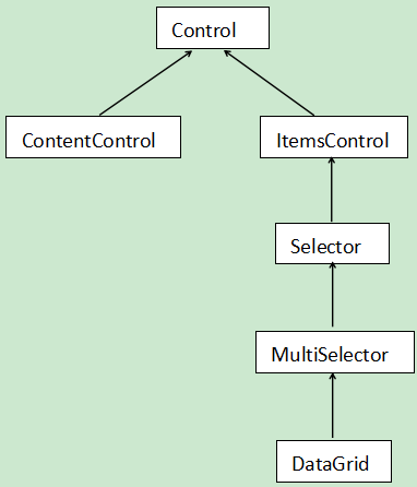

图1 wpf 图1.1 winform
wpf和winform顺便作个比较,看看Control之上的结构:
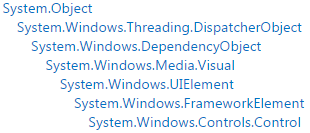
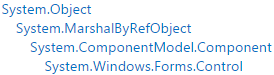
图2 wpf 图2.2 winform
从以上四幅图中,可以看出wpf的继承层次深一些。wpf中的DispatcherObject,用于控制UI界面的修改,在多线程场景下,如果其它线程需要修改界面,就需要调用它。如:
this.Dispatcher.BeginInvoke(DispatcherPriority.Normal,委托)
1、 每个wpf对象都可以调用到Dispatcher对象,从继承图上可以出看出来。Dispatcher对象把委托加入到内部的执行队列中,然后根据优先级,在不同的时间内,由UI线程执行。通过查阅相关资料,一个Dispatcher对象关联了一个UI线程,相反一个UI线程可能拥有多个Dispatcher对象。
2、winform中的MarshalByRefObject,它允许Control对象跨进程被调用。
二、datagrid样式
 <!--dataGrid通用样式-->

    <Style TargetType="DataGrid">

        <!--网格线颜色-->

        <Setter Property="CanUserResizeColumns" Value="True"/>

        <Setter Property="Background" Value="#edf2f8" />

        <Setter Property="AlternationCount" Value="" />

        <Setter Property="BorderBrush" Value="#d8e6f3" />

        <Setter Property="HorizontalGridLinesBrush">

            <Setter.Value>

                <SolidColorBrush Color="#d8e6f3"/>

            </Setter.Value>

        </Setter>

        <Setter Property="VerticalGridLinesBrush" Value="{x:Null}"/>

    </Style>
dataGrid通用样式
   <Style TargetType="DataGridColumnHeader" x:Key="ColumnBaseStyle">

        <Setter Property="SnapsToDevicePixels" Value="True" />

        <Setter Property="MinHeight" Value="" />

        <Setter Property="Foreground" Value="#323433" />

        <Setter Property="FontSize" Value="" />

        <Setter Property="FontWeight" Value="Bold" />

        <Setter Property="Cursor" Value="Hand" />

        <Setter Property="Height" Value=""/>

        <Setter Property="HorizontalContentAlignment" Value="Left" />

        <Setter Property="VerticalContentAlignment" Value="Center" />

        <Setter Property="IsTabStop" Value="False" />

        <Setter Property="BorderBrush" Value="#d9e5f3"/>

        <Setter Property="BorderThickness" Value="0 0 1 0"/>

        <Setter Property="Padding" Value="5 0"/>

    </Style>
DatagridColumnHeader样式
 <!--标题栏样式-->

    <Style TargetType="DataGridColumnHeader" BasedOn="{StaticResource ColumnBaseStyle}">

    </Style>
标题栏样式
 <!--行样式触发-->

    <Style  TargetType="DataGridRow">

        <Setter Property="Background" Value="White" />

        <Setter Property="Height" Value=""/>

        <Setter Property="Foreground" Value="Black" />

        <Style.Triggers>

            <!--隔行变色-->

            <Trigger Property="ItemsControl.AlternationIndex"

                         Value="">

                <Setter Property="Background" Value="#edf2f8" />

            </Trigger>

            <Trigger Property="ItemsControl.AlternationIndex"

                         Value="">

                <Setter Property="Background" Value="White" />

            </Trigger>

            <Trigger Property="IsMouseOver" Value="True">

                <Setter Property="Background" Value="#cde7ff"/>

            </Trigger>

            <Trigger Property="IsSelected" Value="True">

                <Setter Property="Foreground" Value="Black"/>

                <Setter Property="Background" Value="#cde7ff"/>

            </Trigger>

        </Style.Triggers>

    </Style>
DataGridRow样式
    <Style TargetType="DataGridCell" x:Key="CellBaseStyle">

        <Setter Property="Padding" Value="5 0"/>

        <Style.Triggers>

            <Trigger Property="IsSelected" Value="True">

                <Setter Property="Foreground" Value="Black"/>

                <Setter Property="Background" Value="#cde7ff"/>

            </Trigger>

        </Style.Triggers>

    </Style>

    <!--单元格样式触发-->

    <Style TargetType="DataGridCell" BasedOn="{StaticResource CellBaseStyle}">

        <Setter Property="Template">

            <Setter.Value>

                <ControlTemplate TargetType="DataGridCell">

                    <Border Background="{TemplateBinding Background}" SnapsToDevicePixels="True" BorderThickness="" Height="{TemplateBinding Tag}">

                        <TextBlock

                ToolTip="{Binding RelativeSource={RelativeSource TemplatedParent}, Path=Content.Text}"

                SnapsToDevicePixels="{TemplateBinding SnapsToDevicePixels}"

                HorizontalAlignment="Left"

                VerticalAlignment="Center"

                Margin="{TemplateBinding Padding}"

                Text="{Binding RelativeSource={RelativeSource TemplatedParent}, Path=Content.Text}"

                TextTrimming="CharacterEllipsis"

                />

                    </Border>

                </ControlTemplate>

            </Setter.Value>

        </Setter>

    </Style>

    <ControlTemplate x:Key="DataGridCheckboxCellControlTemplate1" TargetType="{x:Type DataGridCell}">

        <Border

                  BorderBrush="{TemplateBinding BorderBrush}"

                  BorderThickness="{TemplateBinding BorderThickness}"

                  Background="{TemplateBinding Background}"

                  SnapsToDevicePixels="True">

            <ContentPresenter

                      ContentTemplate="{TemplateBinding ContentTemplate}"

                      Content="{TemplateBinding Content}"

                      ContentStringFormat="{TemplateBinding ContentStringFormat}"

                      SnapsToDevicePixels="{TemplateBinding SnapsToDevicePixels}"/>

        </Border>

    </ControlTemplate>
DataGridCell样式
    <Style TargetType="DataGridColumnHeader" x:Key="documentColumnHead" BasedOn="{StaticResource ColumnBaseStyle}">

        <Setter Property="HorizontalContentAlignment" Value="Left" />

    </Style>

    <Style TargetType="DataGridCell" x:Key="documentCellStyle" BasedOn="{StaticResource CellBaseStyle}">

        <Setter Property="Template">

            <Setter.Value>

                <ControlTemplate TargetType="DataGridCell">

                    <Border Background="{TemplateBinding Background}" SnapsToDevicePixels="True" BorderThickness="" Height="{TemplateBinding Tag}">

                        <TextBlock

                ToolTip="{Binding RelativeSource={RelativeSource TemplatedParent}, Path=Content.Text}"

                SnapsToDevicePixels="{TemplateBinding SnapsToDevicePixels}"

                HorizontalAlignment="Left"

                VerticalAlignment="Center"

                Margin="{TemplateBinding Padding}"

                Text="{Binding RelativeSource={RelativeSource TemplatedParent}, Path=Content.Text}"

                TextTrimming="CharacterEllipsis"

                />

                    </Border>

                </ControlTemplate>

            </Setter.Value>

        </Setter>

    </Style>

    <Style TargetType="DataGridCell" x:Key="resultCellStyle" BasedOn="{StaticResource CellBaseStyle}">

        <Setter Property="BorderThickness" Value=""/>

    </Style>

    <Style TargetType="DataGridCell" x:Key="OperCellStyle" BasedOn="{StaticResource CellBaseStyle}">

        <Setter Property="Template">

            <Setter.Value>

                <ControlTemplate TargetType="DataGridCell">

                    <ContentPresenter HorizontalAlignment="Left" VerticalAlignment="Center"/>

                </ControlTemplate>

            </Setter.Value>

        </Setter>

    </Style>

    <!--checkbox列头样式和列单元格样式-->

    <Style x:Key="DataGridCheckboxCellStyle1" TargetType="{x:Type DataGridCell}">

        <Setter Property="ContentTemplate" Value="{DynamicResource CheckboxDataTemplate1}"/>

        <Setter Property="Template" Value="{DynamicResource DataGridCheckboxCellControlTemplate1}"/>

        <Style.Triggers>

            <Trigger Property="IsSelected" Value="True">

                <Setter Property="Background" Value="{x:Null}"/>

                <Setter Property="BorderBrush" Value="{x:Null}"/>

            </Trigger>

        </Style.Triggers>

    </Style>

    <Style x:Key="DataGridCheckboxColumnHeaderStyle1" TargetType="{x:Type DataGridColumnHeader}">

        <Setter Property="Padding" Value="13 0 0 0"/>

        <Setter Property="Background" Value="White"/>

        <Setter Property="BorderThickness" Value=""/>

        <Setter Property="ContentTemplate" Value="{DynamicResource CheckboxDataTemplate1}"/>

        <Setter Property="HorizontalAlignment" Value="Stretch"/>

        <Setter Property="VerticalAlignment" Value="Stretch"/>

    </Style>
特殊列头和单元格样式
 <DataTemplate x:Key="CheckboxDataTemplate1">

            <Grid>

                <CheckBox x:Name="chkSelected"

                        HorizontalAlignment="Center"

                        VerticalAlignment="Center"

                        VerticalContentAlignment="Center"

                        Click="chkSelected_OnClick"

                        IsThreeState="False"

                        IsChecked="{Binding IsSelected, Mode=TwoWay, UpdateSourceTrigger=PropertyChanged}"

                        />

            </Grid>

        </DataTemplate>
CheckboxDataTemplate
从datagrid、DataGridColumnHeader、DataGridRow、DataGridCell到特殊的列,如Checkbox列样式是层层递进,越来越精细,一个样式可以采用BaseOn继承父样式。
1、ControlTemplate
通过ControlTemplate控制控件的外观,比如我可以让一个button长成这样: 
 通过设置Template的值,而设定ControlTemplate。wpf UI中有两棵树,一个是visualTree(可视树),另一个是logicTree(逻辑树)。如果你在vs中,快速监视某一个控件的话,就可以显示出它的可视树。ControlTemplate所描述的控件内部结构正是属于可视树的范畴。那什么是逻辑树呢?就是你在代码中看到的控件组成的一棵树。显然,可视树包含了逻
辑树。你可以认为可视树是对一个控件的精细描述。比如,我们说,一个人是由眼睛、鼻子、耳朵等等构成,这种描述就是属于逻辑树,至于对眼睛、鼻子、耳朵的内部构造描述,这属于可视树。
2、DataTemplate

数据模板,它用来控制对象在控件上的绑定。
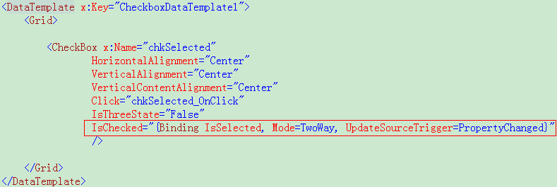
这是一个checkbox列头的数据绑定,绑定了对象的IsSelected属性。
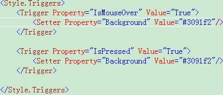
3、触发器
当一个单元格被选中的时候,它的前景色和背景色的变化。隔行变色的实现。下面是按钮的触发器,当鼠标经过和按下的时候,样式变化。
wpf研究之道-datagrid控件(1)的更多相关文章
- wpf研究之道——datagrid控件分页
这是我们的datagrid分页效果图,有上一页,下一页,可以跳到任何一页.当页码比较多的时候,只显示几页,其余用点点,界面实现如下: <!--分页--> <StackPanel Or ...
- wpf研究之道——datagrid控件数据绑定
前台: <DataGrid x:Name="TestCaseDataGrid" ItemsSource="{Binding}" > {binding ...
- wpf研究之道-grid控件
想要说些什么,却不知道从哪开始."形而上谓之道,形而下谓之器".与其坐而论道,不如脚踏实地,从最实用的地方开始. 我们先来看看wpf中的grid控件.grid控件是个网格的布局控件 ...
- WPF:获取DataGrid控件单元格DataGridCell
转载:http://blog.csdn.net/jhqin/article/details/7645357 /* ------------------------------------------- ...
- WPF的DataGrid控件从excel里复制数据然后粘贴
WPF的DataGrid控件不能像winform的DataGridView控件一样,支持值的粘贴.WPF的DataGrid控件本质上是跟数据绑定联系在一起,所以需要进行复制粘贴的操作,可以在wpf里用 ...
- WPF DataGrid 控件的运用
WPF DataGrid 控件的运用 运行环境:Window7 64bit,.NetFramework4.61,C# 6.0: 编者:乌龙哈里 2017-02-23 参考: King Cobra 博客 ...
- C# WPF DataGrid控件实现三级联动
利用DataGrid控件实现联动的功能,在数据库客户软件中是随处可见的,然而网上的资料却是少之又少,令人崩溃. 本篇博文将介绍利用DataGrid控件模板定义的三个ComboBox实现“省.市.区”的 ...
- WPF 4 DataGrid 控件(进阶篇一)
原文:WPF 4 DataGrid 控件(进阶篇一) 上一篇<WPF 4 DataGrid 控件(自定义样式篇)>中,我们掌握了DataGrid 列表头.行表头.行.单元格相关的 ...
- WPF 4 DataGrid 控件(进阶篇二)
原文:WPF 4 DataGrid 控件(进阶篇二) 上一篇<WPF 4 DataGrid 控件(进阶篇一)>中我们通过DataGridTemplateColumn 类自定义编辑 ...
随机推荐
- Scheme change not implemented
1.错误描述 2.错误原因 由于在改变Java代码中的方法或运行代码出现,导致Tomcat编译的代码不能替换工作空间的代码,即不能及时同步,出现错误 3.解决办法 (1)关闭Tomcat,clean一 ...
- java.lang.ArrayIndexOutOfBoundsException
1.错误描述 Exception in thread "main" java.lang.ArrayIndexOutOfBoundsException: 0 at com.you.m ...
- CF370 D Memory and Scores
dp题 并运用了前缀和 我看题目提示中有fft 我想了下感觉复杂度不过关还是未解 #include<bits/stdc++.h> using namespace std; typedef ...
- 手机端仿ios的日期组件脚本一
二,代码 <script> var calendar1 = new LCalendar(); calendar1.init({ 'trigger': '#startDate', //标签i ...
- MFC关于多线程中传递窗口类指针时ASSERT_VALID出错的另类解决 转
MFC关于多线程中传递窗口类指针时ASSERT_VALID出错的另类解决 在多线程设计中,许多人为了省事,会将对话框类或其它类的指针传给工作线程,而在工作线程中调用该类的成员函数或成员变量等等. ...
- 20165304《JAVA程序设计》第二周学习总结
课本内容总结 第一章 1.标识符与关键字 (1) 标识符由字母.数字.下划线"_".美元符号"$"组成,第一个字符不能是数字. 不能把java关键字和保留字作为 ...
- java中垃圾回收机制和引用类型
在java中JDK1.2版本以后,对象的引用类型分为四种,从高到低依次为:强引用.软引用.弱引用.虚引用. ①强引用的特点:垃圾回收机制绝不会回收它,即使内存不足时,JVM宁愿抛出OutOfMemor ...
- 【Luogu2458】保安站岗(动态规划)
[Luogu2458]保安站岗(动态规划) 题面 题目描述 五一来临,某地下超市为了便于疏通和指挥密集的人员和车辆,以免造成超市内的混乱和拥挤,准备临时从外单位调用部分保安来维持交通秩序. 已知整个地 ...
- [BZOJ2752][HAOI2012]高速公路
BZOJ Luogu sol 看上去是道数学期望题但实际上是个傻逼数据结构 首先答案的形式应该就是 \[\frac{\mbox{[l,r]区间内的子区间权值之和}}{\mbox{[l,r]区间内的子区 ...
- iOS开发--XMPPFramework--框架的导入(二)
创了一个XMPP即时通讯交流群140147825,欢迎大家来交流~我们是一起写代码的弟兄~ xmpp协议开发即时通讯,最常用的就是XMPPFramework. 第一种方法,是直接拖进项目 1.可以下载 ...